
JPMorgan is warning that a strong jobs print could send the S&P 500 down roughly 2% in a single session, and the July nonfarm payrolls report dropped at 8:30 a.m. ET this morning.
The release comes as the S&P 500 sits close to all-time highs near 7,600, buoyed by optimism around AI-driven earnings but vulnerable to any reading that gives the Federal Reserve grounds to hold rates higher for longer. JPMorgan Market Intelligence has mapped out the specific job creation thresholds that would move markets meaningfully in either direction, and the asymmetry in their scenario table leans bearish.
Here is what the numbers actually mean for your portfolio today, and the framework JPMorgan is using to read them.
How JPMorgan maps each jobs outcome to an S&P 500 move
JPMorgan’s scenario matrix breaks the July nonfarm payrolls (NFP), the monthly count of jobs added across the US economy, into three distinct outcome bands, each tied to a projected S&P 500 reaction. The table below captures the full framework.
| NFP range | S&P 500 projected move | JPMorgan probability |
|---|---|---|
| Above ~150,000 (strong) | Down ~2% | — |
| Above 60,000 (net negative range) | Negative for equities | ~65% |
| 20,000-60,000 (soft) | Up ~0.8% | ~25% |
Consensus economist forecasts heading into this morning clustered in the 80,000-150,000 range, which sits squarely in JPMorgan’s net-negative territory.
The NFP report framework that matters extends well beyond the headline jobs count: average hourly earnings, prior-month revisions, and the unemployment rate each carry independent weight in shaping how bond and equity markets reprice Fed expectations in the minutes after release.
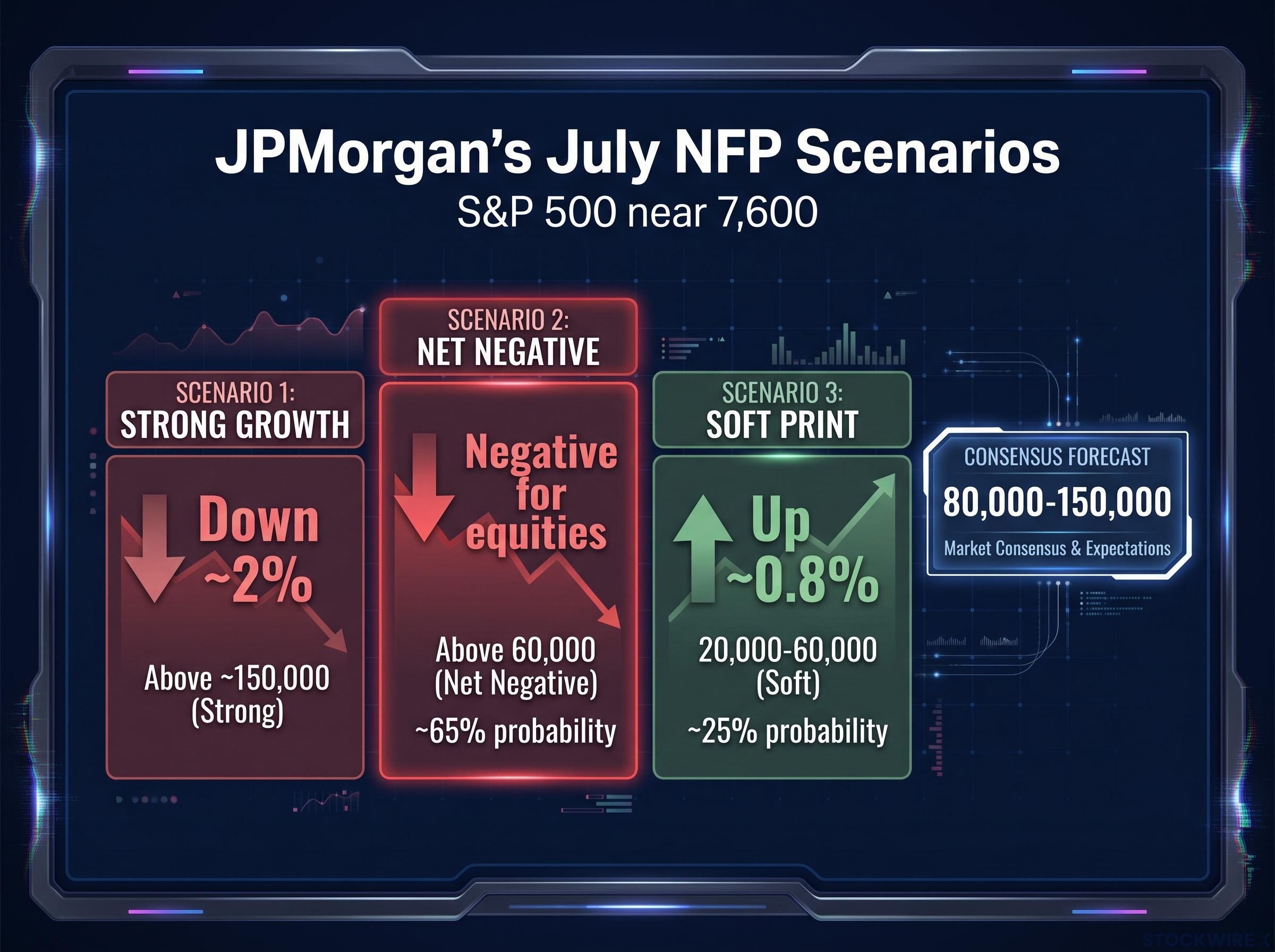
The asymmetry is the story. JPMorgan projects a 2% downside move on a hot print but only 0.8% upside relief on a soft one. The most likely outcome range, at 65% probability, is also the one that hurts.
That skew tells you the risk profile heading into this morning’s number was tilted against equities. The scenario where stocks rally is the less probable one, and even in that case, the projected gain is a fraction of the projected loss.
When big ASX news breaks, our subscribers know first
Why strong hiring data can push stock prices lower right now
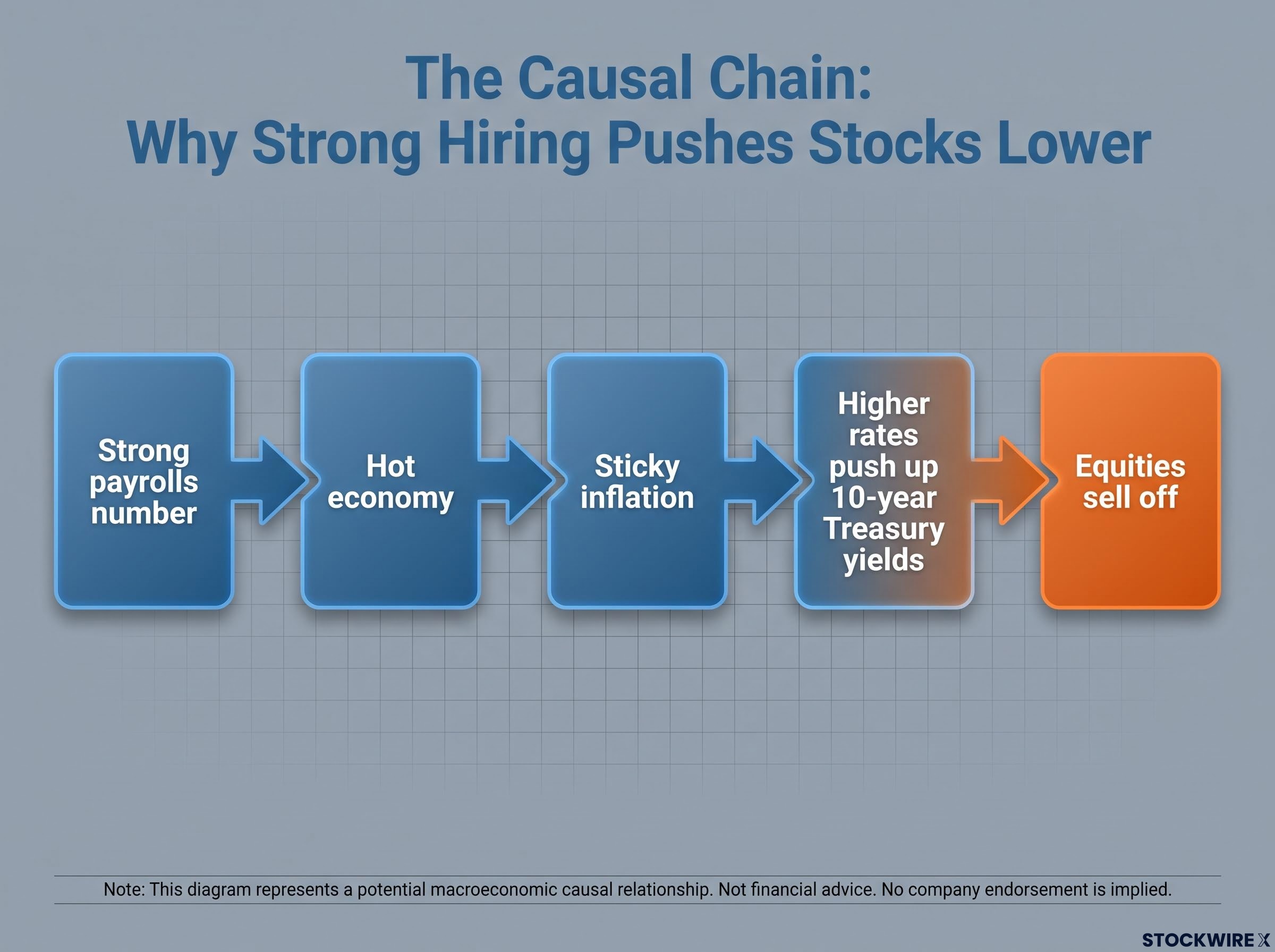
The logic behind “good news is bad news” is counterintuitive until you walk through it step by step. Here is the causal chain that connects a hot jobs print to an equity selloff:
- A strong payrolls number signals the economy is still running hot.
- A hot economy raises the risk that inflation stays sticky or re-accelerates.
- Sticky inflation means the Fed keeps interest rates higher for longer, or considers hiking again.
- Higher rates push up Treasury yields, which makes bonds more attractive relative to stocks and increases the discount rate applied to future corporate earnings, a measure of how much less those future profits are worth in today’s terms.
- The result: equities sell off, even though the economic data looks positive on the surface.
The real-time signal to watch
The 10-year Treasury yield is the clearest immediate indicator of how markets are interpreting the number. If it spikes sharply in the minutes after 8:30 a.m. ET, that tells you bond traders are pricing in tighter-for-longer Fed policy, which is the transmission mechanism that pulls equities lower.
Treasury yield signals have become more consequential for equity valuations and White House policy decisions than S&P 500 drawdowns across the current rate cycle, a structural shift that makes the 10-year yield the single most important number to track on any major macro release day.
The headline payrolls figure matters, but the yield reaction translates it into something your portfolio actually feels.
Jobs reports don’t always move markets the way the model predicts
JPMorgan’s framework is disciplined, but history shows the same data point can produce opposite market reactions depending on the broader backdrop.
Weak payrolls have at times sparked selloffs of more than 1% when investors interpreted them as a recession signal rather than a path to easier policy. In those episodes, fear of an economic contraction overwhelmed any relief about potential rate cuts.
In other cases, soft jobs data combined with benign inflation produced equity rallies and increased rate-cut pricing, exactly the outcome JPMorgan’s soft-landing scenario describes.
The same number can mean two different things. The market’s interpretation depends on what investors are already worried about, not just what the data says.
Three variables determine which reading dominates on any given release:
- The current inflation trend: falling inflation tips interpretation toward rate-cut relief; sticky inflation tips it toward hawkish concern.
- Investor positioning ahead of the release: heavily long positioning amplifies selloffs; cautious positioning limits downside.
- How close the Fed appears to a policy pivot: the nearer a rate cut seems, the more likely soft data gets a bullish read.
JPMorgan’s scenario probabilities are structured estimates, not certainties. Applying the framework well means tracking these three variables alongside the payrolls number itself.
The four-month payrolls deceleration heading into today’s release has already shifted Fed rate-cut pricing materially, with June printing just 57,000 jobs and May revised sharply lower, creating the trend backdrop against which JPMorgan’s scenario thresholds should be read.
Four things retail investors should do with this information today
- Watch the 10-year Treasury yield first. Before you react to the headline jobs number, check what yields are doing. A sharp move higher in the 10-year yield in the minutes after the release is the clearest signal that markets are pricing in tighter-for-longer policy, and that is the mechanism that pressures equities.
The Treasury yield move tells you more about the market’s direction than the payrolls number on its own.
- Read the number through the Fed lens. A strong print is not inherently good or bad for your portfolio. What matters is whether it changes the probability of a rate cut. If inflation is still above target and hiring is still strong, the Fed has less reason to ease. That is the connection that drives the equity reaction.
- Expect volatility without overreacting to it. A 2% single-day move in the S&P 500 is uncomfortable, but it is not unusual in macro-data-sensitive environments. Reacting to it without a framework, selling into a dip driven by a single data release, can be costly when the market re-prices over subsequent sessions.
- Treat JPMorgan’s scenario table as a risk tool, not a prediction. JPMorgan assigns a 65% probability that payrolls land in the net-negative range for equities. That is a probabilistic framework for setting expectations, not a guarantee of direction. Prior releases have surprised in both directions relative to scenario models.
What today’s number changes, and what it does not
Today’s NFP report is one data point in a multi-month Fed decision process, not a binary switch that resolves the rate outlook. A hot print changes near-term rate-cut probability and may produce the equity pressure JPMorgan projects. It does not, on its own, alter the longer-term trajectory of the inflation fight or reshape corporate earnings fundamentals.
The S&P 500 entered this morning near 7,600, close to record highs. Any correction from here occurs within a market that has absorbed geopolitical shocks, mixed economic signals, and an extended period of elevated rates throughout 2026 without breaking its broader uptrend. Context matters.
What JPMorgan’s framework gives you is a durable tool. The same scenario logic, mapping data releases to Fed policy implications and then to equity outcomes, applies to every major macro print between now and the Fed’s next decision. Use it again.
One jobs number rarely settles a policy debate. It sharpens the near-term probability distribution, and that is exactly what the scenario table is designed to capture.
For investors wanting a deeper grounding in why Fed policy operates with long and variable lags rather than immediate precision, our full explainer on Federal Reserve limitations covers how the overnight rate transmits through the economy and what that means for interpreting any single data release.
This article is for informational purposes only and should not be considered financial advice. Investors should conduct their own research and consult with financial professionals before making investment decisions. JPMorgan’s scenario projections are forward-looking estimates subject to change based on market developments and actual data outcomes.