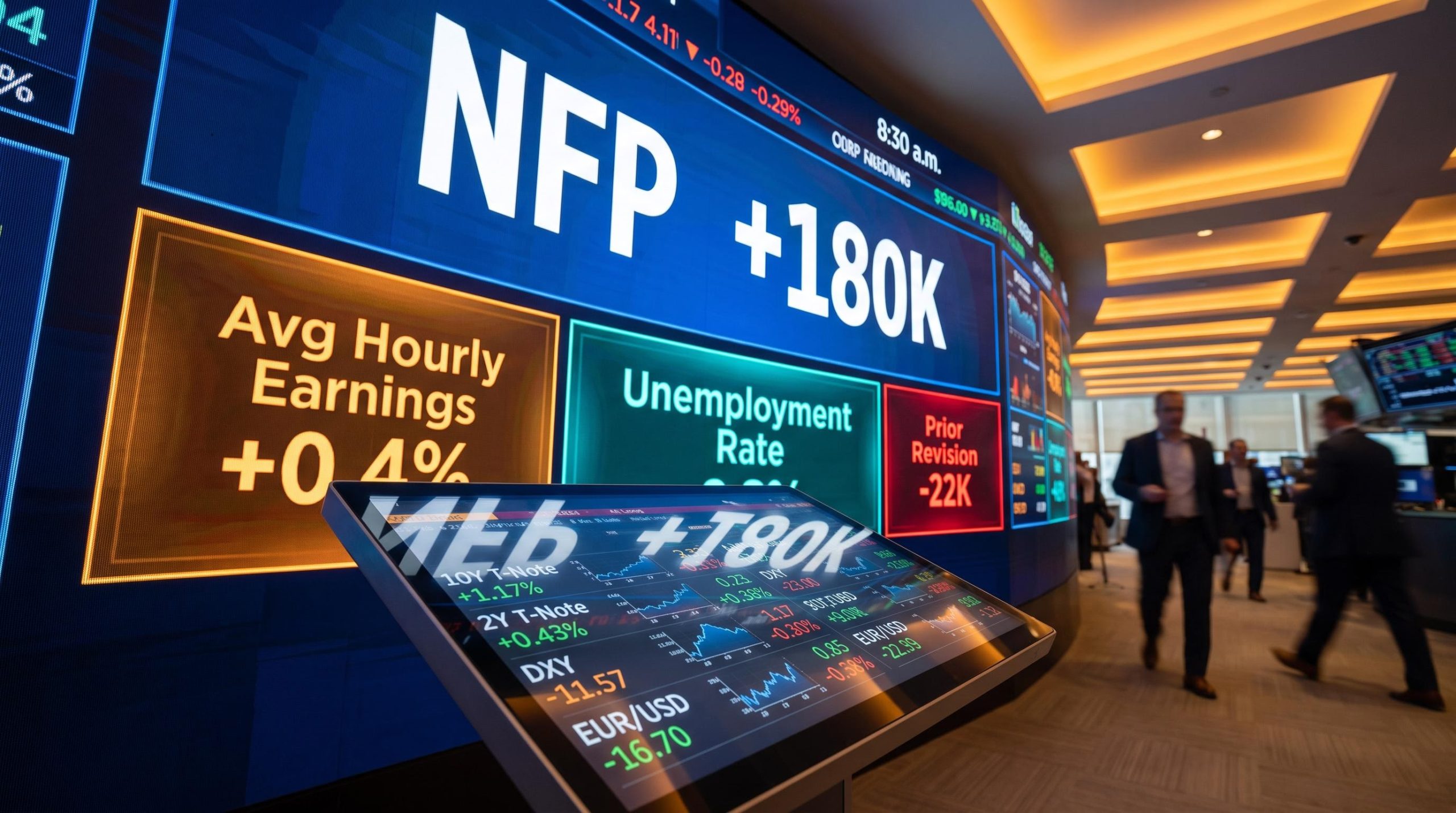
Most investors check the headline number on the jobs report, see something like 180,000 or 240,000, and wait to see what stocks do. That is the least useful way to read this report.
The monthly US Non-Farm Payrolls report is the single most market-moving scheduled data release on the economic calendar. By the time traders have processed the 8:30 a.m. ET print, gold prices have already shifted, currency pairs have repriced, Treasury yields have jumped or fallen, and Bitcoin has frequently moved in tandem with the broader reaction. Understanding why that happens, and which lines in the report actually drive the moves, gives you a genuine analytical edge over anyone watching only the headline.
Here is a durable framework for reading the full report: what the data measures, which sub-components professional traders prioritise, how each asset class tends to respond, and what to watch specifically for this Friday’s August 7, 2026 release.
What the Non-Farm Payrolls report actually measures
The report shows net job gains or losses across the US economy for the prior month. It is published by the Bureau of Labor Statistics (BLS) as part of its monthly Employment Situation release at 8:30 a.m. Eastern Time, typically on the first Friday of each month. This Friday, 7 August 2026, is the next scheduled release.
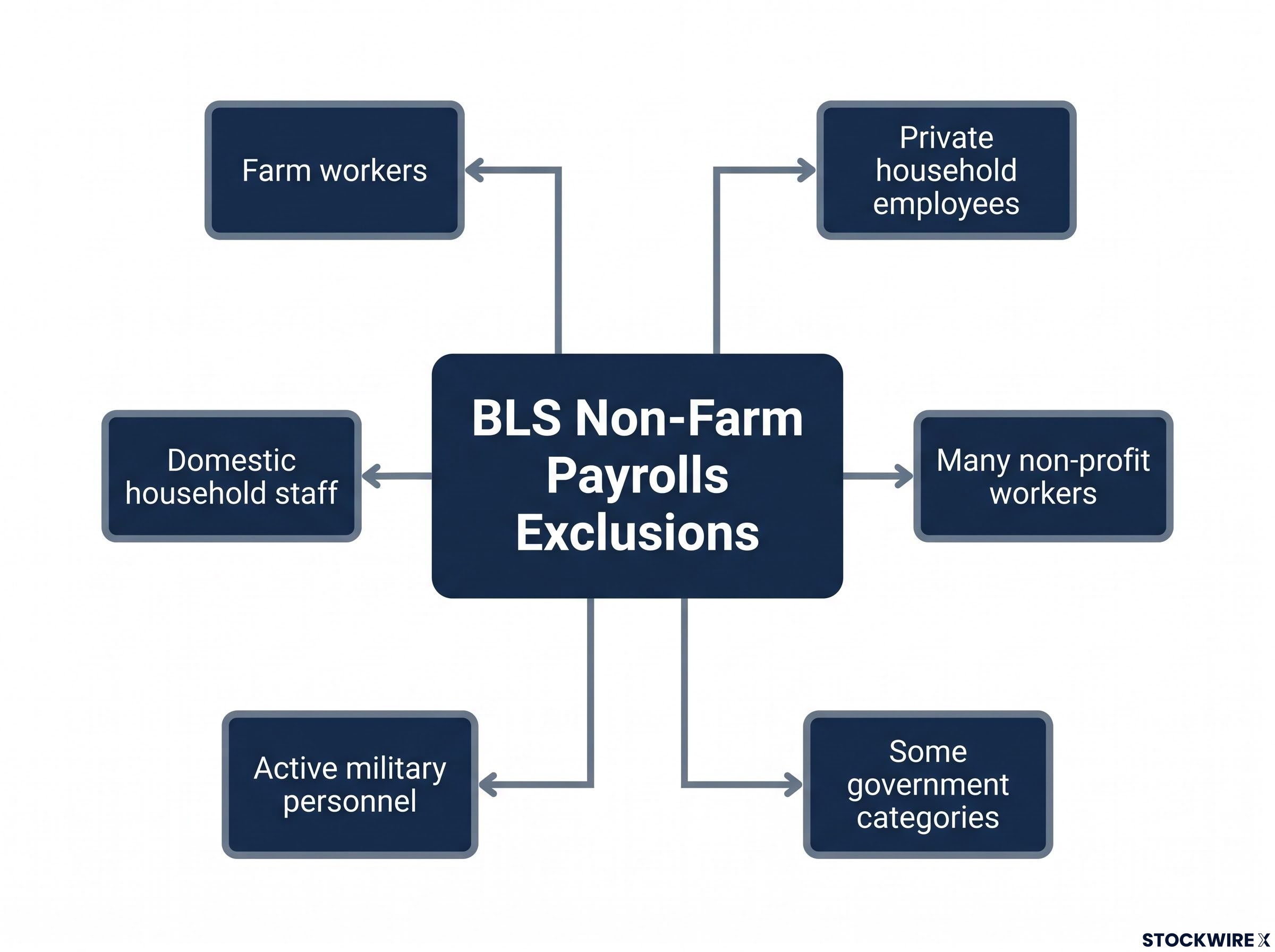
The “non-farm” label tells you exactly what gets excluded. The BLS deliberately strips out workers whose employment patterns are irregular or seasonal, so the remaining figure gives you a cleaner signal of mainstream economic activity. The excluded categories are:
- Farm workers
- Domestic household staff
- Private household employees
- Many non-profit workers
- Active military personnel
- Some government categories
These exclusions are not arbitrary. They are the reason this particular report, rather than broader employment surveys, became the benchmark traders trust for reading the economy’s engine. Seasonal farm hiring or military deployment cycles would inject noise into every monthly print; removing them lets you see what the private sector is actually doing.
One practical note: occasional US holidays can shift the release date. Professional traders confirm the exact date on the BLS calendar or their platform’s economic calendar each cycle, rather than assuming it is always the first Friday.
When big ASX news breaks, our subscribers know first
How employment data forces cross-asset repricing within minutes
The market’s response is not really about the raw jobs figure at all. What traders are pricing is what the data tells them about where the Federal Reserve will take interest rates next.
The Fed operates under a dual mandate: maximum employment and price stability. Robust hiring and a tight labour market increase the likelihood that the Fed keeps borrowing costs elevated, or pushes them higher still, since wage pressures can feed through into broader inflation. By contrast, a softer jobs picture points to spare capacity in the economy, and that typically brings forward expectations of rate reductions. That single shift in expected policy direction is what reprices virtually every major asset class within minutes.
The question every trader is really asking at 8:30 a.m. is not “how many jobs?” but “does this push the Fed toward tighter or looser policy than markets currently expect?” Every asset reaction follows from that answer.
Here is how that transmission typically plays out, with the caveat that these are directional tendencies, not mechanical guarantees. Positioning, narrative shifts, and prior-week price action can all influence the actual move.
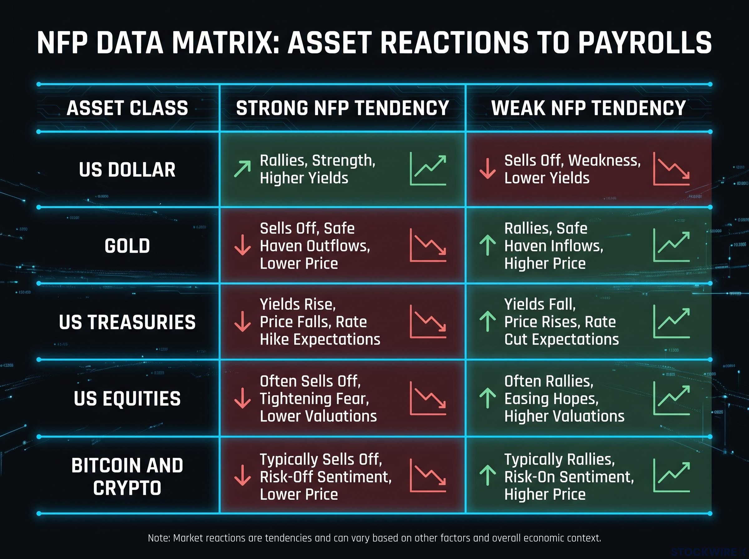
| Asset class | Strong NFP tendency | Weak NFP tendency |
|---|---|---|
| US dollar | Strengthens as markets price higher-for-longer rates | Weakens as traders price earlier or deeper cuts |
| Gold | Often falls on stronger dollar and higher real yields | Often gains from lower yields and a weaker dollar |
| US Treasuries | Yields rise (prices fall) on tighter policy expectations | Yields fall (prices rise) as markets anticipate easing |
| US equities | Mixed: growth optimism vs. valuation pressure from higher discount rates | Mixed: rate relief vs. earnings and growth concerns |
| Bitcoin and crypto | Often under pressure as dollar and yields spike | Can gain if weaker data reinforces lower-for-longer yields |
The practical implication for you is straightforward: if you understand which direction the data pushes rate expectations, you can anticipate which assets are most exposed to a surprise before the release, rather than scrambling to interpret moves after the fact.
The four sub-components professionals read before the headline
The headline payroll figure is the number you see first on every financial news ticker. It is also the least sophisticated signal in the report. Here are the four lines that carry more weight in shaping the market’s reaction, ranked from least to most obvious.
- Average hourly earnings (wages). This is the line that speaks most directly to inflation. When wages rise faster than expected, it signals that workers have bargaining power and the income to drive consumer spending, both of which feed into higher prices. A hot earnings print can move markets sharply even when the headline jobs number lands near consensus, because it tells the Fed exactly how hawkish it needs to be. If you are tracking this Friday’s release, wages deserve your attention before you even process whether the headline beat or missed.
- Unemployment rate. This comes from the Household Survey (the Current Population Survey, a separate dataset from the payroll survey). A rising unemployment rate can signal building slack in the labour market even when headline job growth looks solid. Conversely, a falling rate alongside strong payrolls is a clear confirmation that the labour market is tight.
- Revisions to prior months. Each release updates the previous two months of payroll estimates. Large downward revisions can blunt the impact of a current-month beat by showing the trend was weaker than initially reported. Large upward revisions can reinforce a strong trend even if the current month is softer. These numbers are often buried beneath the headline, and that is precisely why they carry edge.
- Gap versus consensus forecast. Markets trade surprises, not absolute levels. A 175,000 print against a 180,000 consensus may produce little reaction. The same 175,000 against a 240,000 consensus can trigger sharp cross-market moves. The deviation from expectations is what creates immediate volatility across currencies, rates, gold, and equities.
If you read wages, unemployment, and revisions together, you are working with the full report. If you read only the headline, you are working with a fraction of the information that is moving the market around you.
What the Non-Farm Payrolls report is, and why it became the benchmark
You have probably heard it called “the jobs report.” That shorthand undersells what you actually receive each month.
The Non-Farm Payrolls report sits within the broader BLS Employment Situation release, which also covers the unemployment rate, labour force participation, and average hourly earnings. It is a multi-signal document rather than a single data point. The NFP figure, the net change in payrolls, is the flagship metric, but the report’s power comes from the package.
The Fed’s dual mandate is “maximum employment and price stability.” Employment data is the direct input to policy decisions on both sides of that mandate.
Why did this particular release earn its status as the market’s most-watched monthly print? Four reasons. It is comprehensive, covering the vast majority of US workers. It is timely, arriving roughly one week after the reference period ends. It is methodologically consistent, with decades of comparable data. And it is directly relevant to the Fed’s dual mandate, making it the closest thing to a real-time read on the economy’s health that markets can price in advance.
Understanding that institutional role tells you why the report generates genuine price discovery rather than noise. It is the data point the Fed has explicitly said it watches, which means markets have no choice but to watch it too. For you, this foundation makes every subsequent NFP release legible, rather than a number that seems to move markets for unclear reasons.
How to read this Friday’s August 2026 NFP release
Everything above was building toward this: a concrete sequence you can apply at 8:30 a.m. ET on Friday, 7 August 2026.
- Know the consensus before the release. Pull up the current consensus for headline NFP, unemployment rate, and average hourly earnings on your platform’s economic calendar. You are trading the surprise versus these expectations, not the raw numbers.
- Map the Fed’s latest communication. Are officials emphasising inflation risks (wages, services prices) or labour market deterioration (job losses, rising unemployment)? This tells you which line in the report carries the most weight for rate expectations this cycle.
- Prioritise wages if inflation is still above target. A strong earnings number can overshadow a mildly weaker headline in shaping where rates go next.
- Check revisions immediately after the headline. Large downward revisions to prior months can blunt a current-month beat. Large upward revisions can reinforce a trend. These numbers reshape the narrative within minutes.
- Be cautious about the first-minute price action. The initial spike typically reflects algorithmic headline parsing. The more durable directional move usually emerges over the following 5-15 minutes as traders digest wages, unemployment, and revisions together.
- Respect positioning. If markets have spent the week already pricing a strong or weak print, “buy the rumour, sell the news” dynamics can produce counterintuitive moves even on a big beat or miss.
The first-minute spike is algorithmic noise, not informed price discovery. Even if you read the report correctly, entering a position in the first 60 seconds often means trading against machines that parsed only the headline. Wait for the full picture to be absorbed.
This checklist is not just for Friday. It is a repeatable process you can apply to every future NFP release.
Reading NFP with the Fed’s policy path as your north star
Every section of this guide converges on a single question: does this data push the Fed toward tighter or looser policy than markets currently expect?
That question applies to every line in the report, not just the headline. Wages tell you about inflationary pressure. Unemployment tells you about slack. Revisions tell you about the trend’s true direction. The gap versus consensus tells you about the size of the surprise. Each input feeds the same policy calculation, and each asset class, the dollar, gold, Treasuries, equities, and crypto, responds to the outcome.
Your key takeaways:
- The headline payroll number is the starting point, not the conclusion. Wages and revisions often carry more weight.
- Every cross-asset move on NFP day traces back to a shift in rate expectations. Understanding that transmission gives you an edge.
- Check the consensus and the Fed’s current emphasis before every release, so you are contextualising the data rather than reading it in isolation.
- This framework is durable across rate cycles. The specific direction of policy shifts changes, but the mechanism connecting employment data, Fed expectations, and asset prices remains the same each month.
You can apply this framework on Friday at 8:30 a.m., and again next month, and the month after that. The report changes. The question does not.
This article is for informational purposes only and should not be considered financial advice. Investors should conduct their own research and consult with financial professionals before making investment decisions.
—