Why Hyperscaler Capex Could Be $300 Billion Bigger Than Priced
1 hr ago

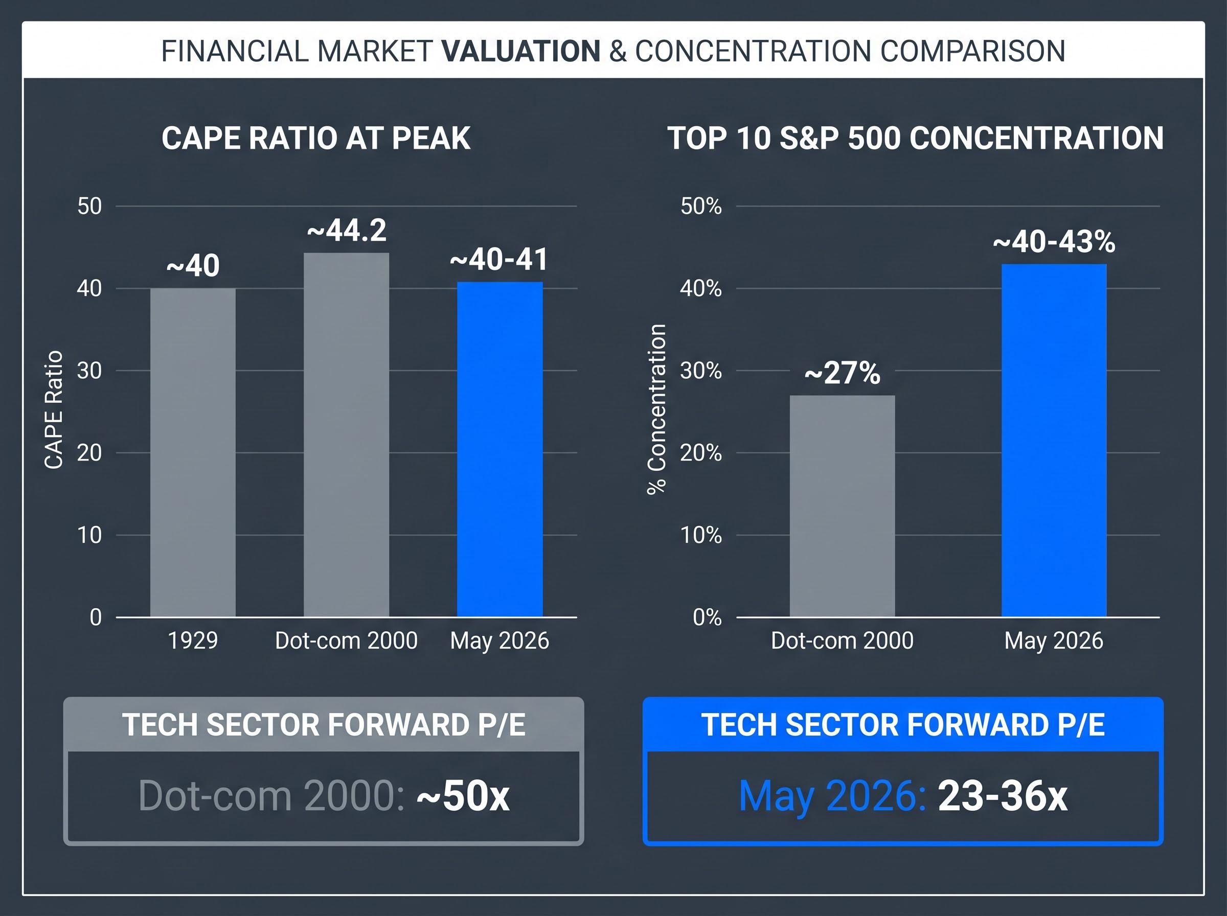
The S&P 500 Shiller CAPE ratio sits at approximately 40-41 as of May 2026, the second-highest reading in 155 years of market data. Only the dot-com peak of 44.2 exceeded it. In a December 2025 Deutsche Bank survey, 57% of institutional investors identified an AI and technology valuation crash as the single largest market risk for 2026. That near-consensus itself may be the most important data point of all.
The AI-driven equity rally has produced extraordinary returns since late 2022 and generated a parallel industry of bubble warnings. What most public discourse lacks is a structured way to evaluate the question. This analysis applies three durable analytical frameworks to the current moment: Robert Shiller’s CAPE ratio, Hyman Minsky’s financial instability model, and historical comparisons to the dot-com era and Japan’s 1980s asset bubble.
The goal is not a verdict. It is a working knowledge of each framework, a clear picture of where the AI rally sits within each, and the tools to apply this analysis to any future speculative cycle.
The Shiller CAPE ratio divides the S&P 500’s price by the average of its inflation-adjusted earnings over the prior 10 years. That long lookback window smooths out short-term distortions, whether from a single blockbuster earnings quarter or a temporary recession, producing a structural valuation reading rather than a cyclical one.
At 40-41, the current CAPE places this market among three historical episodes.
Shiller’s Yale CAPE dataset extends the historical record back to 1871, providing the 155-year baseline against which the current reading of 40-41 is measured, and confirms that only the dot-com peak of 44.2 has exceeded today’s level across that entire span.
“The S&P 500 Shiller CAPE ratio at 40-41 places the current market among the three most extreme valuation episodes in 155 years of data.”
| Era | CAPE at Peak | Tech Sector Forward P/E | Key Characteristic |
|---|---|---|---|
| 1929 | ~40 | N/A | Broad market leverage |
| Dot-com (2000) | ~44.2 | ~50x | Unprofitable tech at extreme multiples |
| Current (May 2026) | ~40-41 | 23-36x | Profitable tech, record concentration |
The forward earnings picture complicates a simple alarm. Technology sector forward multiples of 23-36x sit well below the dot-com’s 50x, and Q1 2026 blended S&P 500 earnings growth came in at 27.1% year-on-year, according to FactSet data. CAPE says the market is structurally expensive by any historical standard. Forward earnings say the companies driving that expense are actually making money. Both metrics matter, and they point in different directions.
The Buffett Indicator, which measures total US market capitalisation relative to GDP, reached 223.6% as of May 2026, approximately 2.4 standard deviations above its long-run historical trend and well above the 150-190% range that characterised the dot-com peak, adding a third independent valuation signal to the picture the CAPE ratio and earnings multiples already present.
The market is not just expensive. The expensive part is historically narrow.
The top 10 S&P 500 constituents now account for approximately 40-43% of total index market capitalisation as of March-May 2026, according to MacroMicro and Visual Capitalist data. To put that in context:
This matters because passive index exposure is structurally different from what it appears. When a small number of stocks drive most index returns, a correction in those names creates index-level damage disproportionate to their share count. Diversification through a broad index fund is less diversified than the label suggests.
The structural consequence of index fund concentration risk is most visible in performance attribution: the cap-weighted S&P 500 returned 86% over three years versus 43% for the equal-weighted version, with the entire gap driven by valuation expansion in a handful of mega-cap names rather than superior earnings growth across the index.
The bull case has a genuine counter here. Nvidia reported fiscal 2026 net income of approximately $120 billion, up roughly 65% year-on-year. Full-year 2026 S&P 500 earnings per share growth estimates stand at 22.6%, with the technology sector delivering approximately 44% earnings growth in Q1 2026. These are not dot-com phantom earnings.
Sector averages, however, can obscure individual excess. Palantir trades at approximately 74-78x price-to-sales as of May 2026, according to FinanceCharts and CompaniesMarketCap data. That multiple is among the most extreme for any major publicly traded company and sits in a different analytical category from the sector-wide 23-36x forward earnings figure.
The distinction matters. The technology sector average suggests moderation relative to 2000. Individual names like Palantir suggest that speculative excess is concentrated rather than absent.
Economist Hyman Minsky proposed that financial systems move through three stages of financing, each progressively more fragile. The progression describes how stability itself breeds instability, as participants take on riskier financing structures during periods of calm.
Minsky’s 1992 financial instability hypothesis, published by the Levy Economics Institute of Bard College, sets out the theoretical mechanics of hedge, speculative, and Ponzi financing in formal terms, establishing why the transition between stages is self-reinforcing rather than the result of any single external shock.
The Minsky Moment: The point at which Ponzi-stage financing structures collapse under their own weight, triggering forced selling and cascading defaults. It is only identifiable with certainty in hindsight.
The US mid-2000s housing market offers a concrete example. Mortgage lending migrated from conventional loans (hedge stage) to interest-only adjustable-rate products (speculative stage) to no-documentation, negative-amortisation loans (Ponzi stage) over roughly five years. When home prices stopped rising, the Ponzi-stage structures failed first, pulling the speculative structures down with them.
Charles Kindleberger’s five-stage bubble model operates in a related framework, describing displacement, boom, euphoria, profit-taking, and panic as a sequence. Minsky’s contribution is the specific financing mechanism that makes the sequence dangerous.
Two specific financing events from October 2025 illustrate where parts of the AI ecosystem have migrated along Minsky’s spectrum.
| Financing Event | Structure Type | Minsky Stage Equivalent | Key Risk |
|---|---|---|---|
| TeraWulf $3.2B junk bond | High-yield debt for data centre | Speculative | Revenue projections required to service debt |
| Meta $30B SPV for AI campus | Special purpose vehicle | Speculative | Ring-fenced structure dependent on AI returns |
| OpenAI loss trajectory | Anchor tenant, pre-profitability | Late speculative / early Ponzi risk | $14B loss (2026), $74B loss (2028) |
Both the TeraWulf junk bond and Meta’s special purpose vehicle (a ring-fenced legal entity created to finance a specific project) fit the speculative financing stage: revenue projections are required to service debt, but profitability at the asset level is not yet assured. Combined hyperscaler capital expenditure of $700-725 billion in 2026 represents the largest non-wartime corporate investment cycle in history, magnifying the stakes.
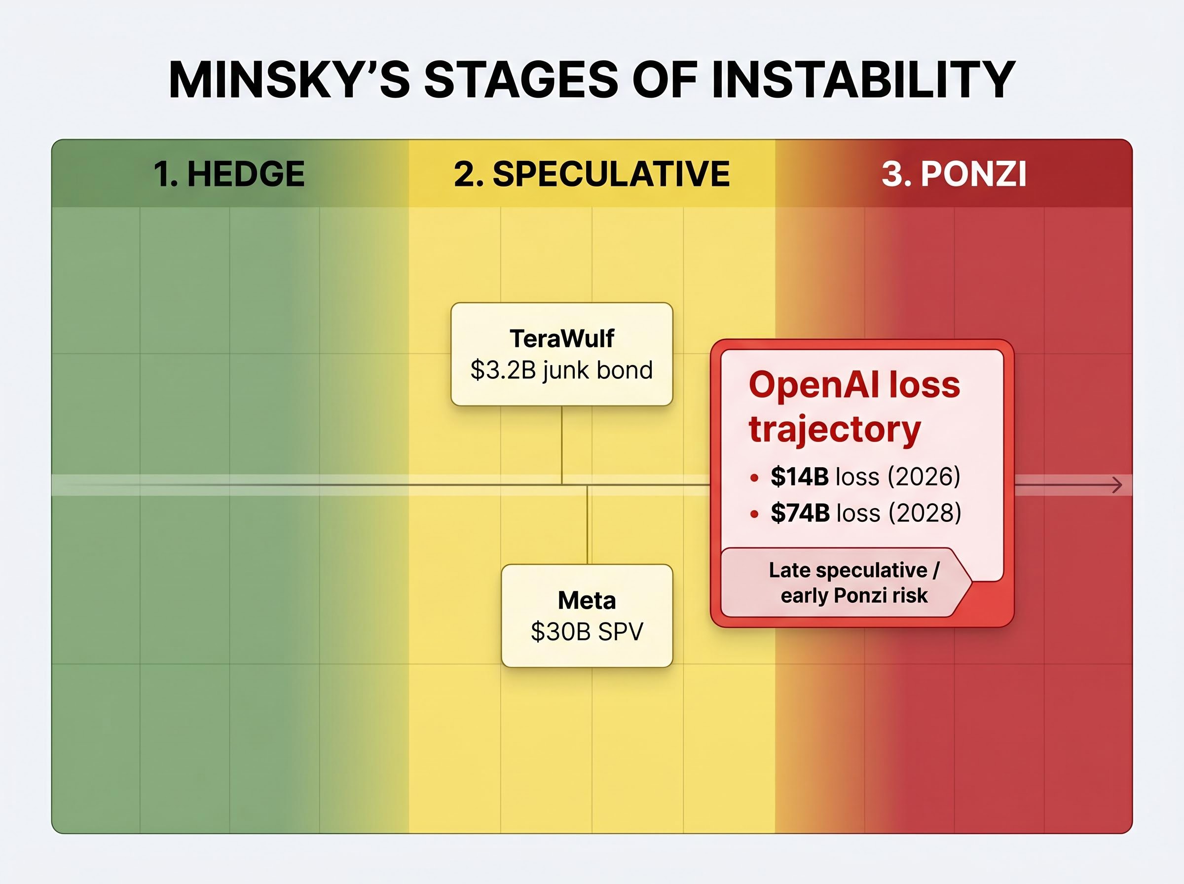
OpenAI sits at the centre of the infrastructure chain. The company is projected to lose $14 billion in 2026 and $74 billion in 2028, according to available financial projections. It is also the primary anchor tenant for Oracle’s Stargate initiative, which underpins $553 billion in remaining performance obligations.
If OpenAI’s revenue trajectory falters, the consequences ripple outward through the infrastructure financing chain. Anthropic, by contrast, is projected to reach breakeven by approximately 2028, the same year OpenAI projects its largest losses, underscoring divergent trajectories within frontier AI.
GMO, the investment firm founded by Jeremy Grantham, noted in January 2026 that no definitive bubble-top signals had yet materialised: no collapse in quality stocks, no capitulation, no speculative stock implosion. The Minsky sequence, by their assessment, is ongoing rather than terminal.
The dot-com collapse followed a specific mechanism. Technology companies with triple-digit revenue multiples and no profits had attracted capital on the premise that growth would eventually justify price. When growth decelerated, the Nasdaq declined approximately 78% from its March 2000 peak to its October 2002 trough. The CAPE ratio at the peak stood at approximately 44.2.
Japan’s 1980s asset bubble operated through a different channel: excess global liquidity concentrated into a single asset class narrative.
At the peak, the theoretical value of the Imperial Palace grounds in Tokyo was said to exceed the value of all real estate in California. The anecdote captures how liquidity-driven distortions can push valuations beyond any framework’s ability to rationalise them.
The current AI cycle shares specific structural features with both episodes and diverges from both in measurable ways:
The analytical question sharpens from “is this a bubble?” to “which type of bubble mechanism is operating?” That distinction changes both the signal to watch and the probable failure mode.
When 57% of institutional investors identify an AI valuation crash as the top risk for 2026, as reported in the Deutsche Bank survey from December 2025, it raises a counterintuitive question. Sir John Templeton observed that bull markets end in euphoria. Roger Montgomery’s framing of the Minsky model reinforces the same point: the mania phase is characterised by participants who have stopped asking whether prices are justified.
If the majority of professional investors are actively discussing bubble risk, the classical mania phase, where sceptics have been silenced and leverage is maximised, may not yet have arrived. The dot-com era generated no widespread mainstream discourse about whether technology stocks were a bubble until the correction was already underway.
Current sentiment registers as optimistic or greedy, not classically euphoric. GMO’s own bubble-top checklist, as of January 2026, found no quality underperformance, no speculative stock collapse, and no capitulation. The Greater Fool dynamic described by economist John Kenneth Galbraith, where participants buy purely for price appreciation rather than underlying value, may be present in individual names but has not saturated the broader market.
This is not reassurance. It is a timing signal that cuts both ways: the frameworks suggest the cycle has further to run, but the financing structures are migrating in a direction that narrows the margin for error.
Concurrent S&P 500 warning signals beyond the valuation frameworks include the geopolitical overlay: Brent crude trading above $112 per barrel and Goldman Sachs and JPMorgan assigning 30-35% recession probability over the next 12 months, a scenario that has historically produced an average 32% equity decline since 1957.
CAPE places the current market in historically dangerous territory, alongside 1929 and the dot-com peak. Minsky’s model identifies speculative financing structures that are real, from junk bonds funding data centres to a loss-making anchor tenant underpinning hundreds of billions in infrastructure commitments, but not yet terminal. Historical precedents reveal both the mechanisms of past collapses and the structural differences that complicate direct analogy.
None of the three frameworks delivers a verdict. That ambiguity is itself the signal. The most dangerous market conditions are often those where the data supports both continuation and collapse, and where participants must make decisions before the evidence resolves. The frameworks exist to navigate that ambiguity rather than resolve it prematurely. They apply to any speculative cycle, not just this one.
Investors exploring what a capex-to-revenue shortfall would look like at the application layer will find our deep-dive into AI-driven enterprise software repricing examines the $2 trillion wealth destruction already under way in legacy per-user licensing models, the $1.2 trillion in M&A activity it has triggered, and the divergence between infrastructure winners and software-layer losers that is beginning to fragment the AI trade.
This article is for informational purposes only and should not be considered financial advice. Investors should conduct their own research and consult with financial professionals before making investment decisions. Past performance does not guarantee future results. Financial projections are subject to market conditions and various risk factors.
—
The Shiller CAPE ratio divides the S&P 500 price by the average of its inflation-adjusted earnings over the prior 10 years, smoothing out short-term distortions to produce a structural valuation reading. At 40-41 as of May 2026, it places the current AI-driven market among only three historical episodes at this extreme level: 1929, the dot-com peak, and today.
The current market shares a comparable CAPE ratio with the dot-com peak but differs in key ways: technology sector forward multiples of 23-36x sit well below the dot-com era's 50x, and leading AI companies like Nvidia are generating real profits rather than phantom earnings. However, index concentration at 40-43% for the top 10 stocks exceeds the dot-com peak's 27% by more than 50%.
A Minsky Moment is the point at which speculative financing structures collapse under their own weight, triggering forced selling and cascading defaults, and it is only identifiable with certainty in hindsight. In the AI market, structures such as TeraWulf's $3.2 billion junk bond and OpenAI's projected $14 billion loss in 2026 show parts of the ecosystem have migrated toward speculative financing, though GMO assessed as of January 2026 that no definitive bubble-top signals had yet materialised.
Investors should watch whether the CAPE ratio remains at or above 40, whether Ponzi-stage financing characteristics such as leveraged entity distress or forced asset sales begin to emerge, whether top-10 index concentration rises beyond 40-43%, and whether hyperscaler capital expenditure of $700-725 billion annually is generating sufficient revenue returns or producing write-downs and project deferrals.
Not necessarily: when 57% of institutional investors identify an AI valuation crash as the top risk for 2026, as found in a December 2025 Deutsche Bank survey, it suggests the classical euphoria phase, where sceptics have been silenced and leverage is maximised, may not yet have arrived. Historically, bull markets end in euphoria rather than widespread professional scepticism, implying the cycle may have further to run even as financing structures become more fragile.