BOQ Share Price Discount: What NIM, ROE and CET1 Actually Show
19 mins ago

The S&P 500 closed at 6,128 on 8 May 2026, within a fraction of its all-time high. Over the preceding twelve months, the index gained 28.7%. Over the same period, US real median wages grew 0.1%, and eurozone real disposable income fell 2.1%. This is not a paradox. It is a pattern that has repeated after every major crisis of the past eighteen years, from the 2008 banking collapse to the COVID shutdown to the current conflict environment, and it carries direct implications for how investors interpret record highs arriving alongside deteriorating household finances.
Conventional explanations tied to interest rates have fraying credibility. Rates surged past 5% after COVID, yet asset prices kept climbing. Something else is driving the disconnect, and the mechanism is more structural than most market commentary acknowledges. What follows traces that mechanism, examines the evidence for and against the deficit-spending explanation, and offers a more complete framework for understanding why markets keep rising precisely when economies appear most fragile.
Four crises. Four different triggers. One outcome: asset prices higher than before.
The S&P 500 all-time high set on 27 April 2026 arrived alongside a closed Strait of Hormuz, Brent crude above $112, and a consumer confidence reading that had collapsed to 49.80, a combination that would historically have preceded a correction rather than a new peak.
The 2008 financial crisis destroyed banks, triggered mass unemployment, and wiped trillions from household balance sheets. Within five years, the S&P 500 had recovered its losses and begun setting new records. The 2011 European sovereign debt crisis imposed austerity on Greece, Portugal, and Ireland, yet European equity indices appreciated steadily through the aftermath. The triggering conditions were different; the destination was the same.
The COVID crash produced the fastest equity drawdown in modern history, followed by the fastest recovery. The current conflict environment has driven military spending to record levels, and markets have responded not with fear but with fresh highs. As of 8 May 2026, the S&P 500 is up 28.7% over twelve months. The Nikkei 225 has gained 35.2%. The FTSE 100 is up 21.4%. The DAX has added 26.3%.
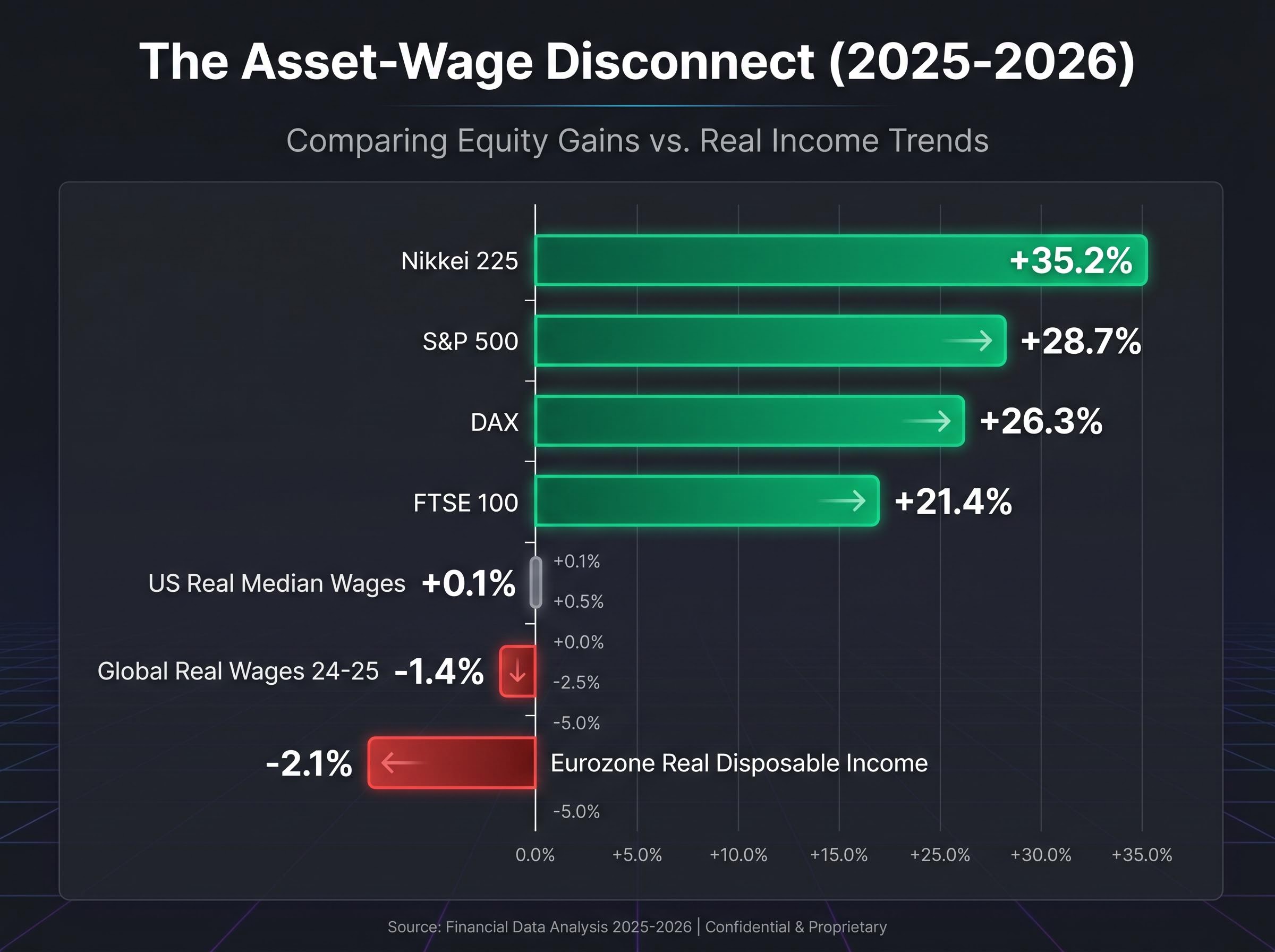
The pattern extends beyond equities. Gold has risen approximately 98.5% over two years. Silver is up approximately 174% over the same window. The IMF World Economic Outlook published in April 2026 reported that global real wages averaged -1.4% across 2024-25.
ECB President Christine Lagarde noted in April 2026 that “asset prices reflect fiscal backstops and tech productivity, but mask eroding purchasing power for 60% of households without equities.”
The four episodes share a common structure: crisis triggers government spending, spending flows through financial channels, and asset prices rise while broad living standards stagnate or decline. The question is why.
The standard account runs as follows:
From 2008 to 2020, this logic held. Pre-crisis benchmark rates in Western economies sat at approximately 4-5%. Post-crisis, they fell to effectively zero. A property generating $50,000 in annual income would be valued at roughly $1 million when rates are 5%, but closer to $5 million when rates drop to 1%. The maths was clean, and the theory tracked the data.
Then the post-COVID cycle broke the model. Rates climbed back to approximately 5% across multiple major economies. US CPI was running at 3.8% as of April 2026. Yet asset prices remained near record highs, a result the rate theory cannot produce without introducing additional variables.
Fed rate policy entered a new phase in May 2026, with rates held at 3.50%-3.75% for a fifth consecutive meeting while core PCE climbed to 3.2%, a combination that simultaneously invalidates the low-rate explanation for asset appreciation and introduces stagflation risk as a separate analytical variable.
| Era | Approximate Rate Level | Asset Price Direction | Rate Theory Predictive Accuracy |
|---|---|---|---|
| Pre-2008 | 4-5% | Moderate growth | Consistent |
| Post-GFC to 2020 | Near zero | Strong gains | Consistent |
| Post-COVID 2022-2026 | Approximately 5% | Record highs | Failed |
For any investor who relied on rate movements as a primary directional signal for asset prices, the post-2022 period produced persistent false negatives. The rate model remains a partial input. It is no longer sufficient on its own.
When a government runs a deficit, it spends more than it collects in tax. That gap is financed by borrowing, and the borrowed funds flow into the economy. Where those funds land determines what happens next.
Crisis-era spending operates through three primary channels: crisis relief payments, defence procurement, and green transition infrastructure. Each channel creates income for someone. When that income reaches individuals or institutions already meeting their consumption needs, it does not get spent on goods and services. It gets deployed into assets: equities, property, bonds, commodities. The deficit creates a corresponding accumulation of financial capital, and concentrated ownership ensures that capital flows disproportionately into asset markets rather than into broad consumption.
When deficit volumes are large enough to increase even wealthy consumption, inflationary pressure and rising asset prices occur simultaneously. That is precisely what has been observed from 2022 to 2026.
Fed Chair Jerome Powell stated in March 2026 that “the disconnect stems from concentrated ownership; the bottom 50% hold less than 2% of stocks, while fiscal multipliers amplify top-end wealth effects.”
The US 2025 federal deficit reached $2.1 trillion, approximately 18% of GDP, according to the Congressional Budget Office (February 2026). G7 combined deficits totalled approximately $5 trillion across 2024-25. To provide a sense of per-capita scale, UK COVID-era deficit spending amounted to roughly $20,000 per adult; in the US, the figure was approximately $40,000 per adult.
Fiscal sustainability thresholds matter for interpreting whether deficit spending at this scale can continue: the UK breached 100% debt-to-GDP in 2024 and subsequently delivered approximately 30% equity returns while retaining its Aa3 credit rating, suggesting the debt ceiling that investors often fear does not map directly to market stress.
The IMF Fiscal Monitor published in April 2026 found that each $1 trillion in deficit spending correlates with approximately +8% in asset inflation, with the top 10% capturing roughly 70% of those gains through portfolio holdings. Research by Saez and Zucman (NBER Working Paper 31247, February 2026) estimated that 2025-26 fiscal spending explains 25-30% of S&P 500 gains. Goldman Sachs models, reported by the Wall Street Journal in April 2026, attributed approximately 35% of the equity rally to G7 deficits.
Defence spending illustrates a specific contemporary variant. Global military expenditure rose 9% to $2.7 trillion in 2025, according to SIPRI. Lockheed Martin shares climbed 45% year-to-date. The BIS estimated in Working Paper 950 (February 2026) that conflict-related spending added 1.2-1.5% to global equity returns, with the top wealth quintile gaining approximately 15%.
SIPRI global military expenditure data places world military spending at approximately $2.9 trillion in 2025, a figure that underscores how defence procurement has become one of the largest single channels through which government deficits convert into concentrated asset gains, particularly for shareholders in major defence contractors.
The fiscal-to-asset-price transmission requires a specific precondition: concentrated ownership. Without it, government spending would distribute more evenly, producing broader consumption rather than asset inflation.
The Federal Reserve’s Distributional Financial Accounts for Q1 2026, released on 6 May 2026, showed that the top 1% hold 32.4% of US financial assets, up from 31.1% in Q1 2024. The bottom 50% share fell to 2.6%.
The Federal Reserve Distributional Financial Accounts track wealth concentration across percentile groups on a quarterly basis, providing the granular breakdown that confirms the top 1% share has risen while the bottom 50% share has contracted across the post-COVID fiscal cycle.
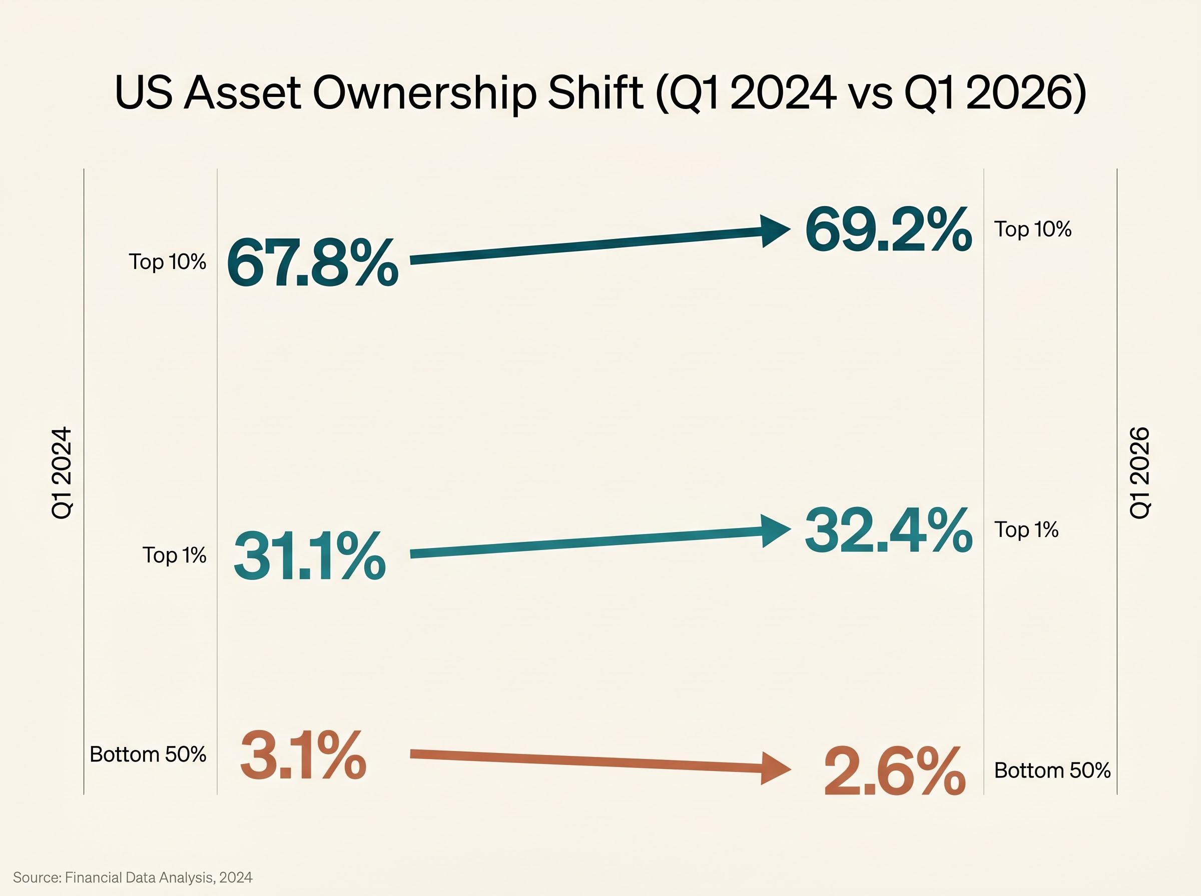
| Wealth Group | US Asset Share (Q1 2024) | US Asset Share (Q1 2026) | Direction |
|---|---|---|---|
| Top 1% | 31.1% | 32.4% | Rising |
| Top 10% | 67.8% | 69.2% | Rising |
| Bottom 50% | 3.1% | 2.6% | Falling |
The UBS Global Wealth Report 2026 placed the global top 1% wealth share at 45.8%, up from 44.2% in 2023. The top 10% captured 82% of all asset appreciation across the US and EU in 2024-25. Median global wealth per adult remained flat at $8,654.
According to Oxfam’s Inequality Inc. 2026 report, the top 1% gained $42 trillion in financial assets from 2020 to 2025.
Concentration has accelerated even during the high-rate environment of 2022-2026, which effectively rules out rate policy as the primary driver. The OECD Economic Outlook published in May 2026 offered a partial dissent, noting that stable price-to-earnings ratios at approximately 22x suggest earnings fundamentals are also contributing. The fiscal thesis is explanatory, but it is not the sole variable.
The strongest counter-argument centres on AI-driven productivity. JPMorgan analysis cited by FT Alphaville in March 2026 attributed approximately 40% of equity gains to AI productivity improvements and only about 20% to fiscal stimulus. The OECD’s May 2026 outlook reinforced this by pointing to stable P/E ratios, suggesting that earnings have kept pace with prices.
Larry Summers argued in April 2026 that the thesis “overstates the fiscal effect; earnings growth and asset scarcity drive prices, not deficits alone.”
Isabel Schnabel of the ECB Executive Board stated in March 2026 that “fiscal stimulus was necessary for macroeconomic stability; inequality is a secondary and separable concern.” The World Bank’s Global Economic Prospects report from June 2025 argued that stimulus “broadened the recovery” and that wealth concentration is a pre-existing structural condition.
Each explanation accounts for a portion of the observed gains. None accounts for the full pattern across asset classes, geographies, and crisis types. The deficit-spending thesis remains the most complete available framework, though intellectual honesty requires holding it alongside these competing variables rather than treating it as the sole driver.
Three conditions would need to materialise for the pattern to break:
None of these appears imminent.
The policy community recognises the distributional problem. The IMF recommended in April 2026 a 2% global billionaire wealth tax, projecting $250 billion in annual revenue. France and Spain introduced wealth levy increases to 1.5-2% in their 2026 budgets. The UK Labour government is considering a 1% wealth levy, according to FT reporting in April 2026. The Biden administration reintroduced its “Billionaire Minimum Tax” in March 2026, though it remains stalled in Congress. The G20 and Davos 2026 communique reflected growing consensus, but implementation timelines remain undefined.
Joseph Stiglitz wrote in February 2026 that fiscal stimulus delivers “disproportionate benefits via the portfolio channel.”
The gap between rhetorical consensus and legislative action tells investors the mechanism is likely to persist in the near term. Deficit spending decisions made in legislatures function as asset price signals. The degree of wealth taxation actually implemented will determine whether the pattern continues or eventually reverses.
For investors tracking the policy mechanisms most likely to alter the pattern, our full explainer on unrealized capital gains tax proposals covers the constitutional ambiguity left open by Moore v. United States, the California ballot initiative targeting net worth above $1 billion, and the specific legislative signals that would indicate a genuine shift in how concentrated asset wealth is taxed.
The S&P 500 gained 28.7% over twelve months. US real median wages grew 0.1%. Eurozone real disposable income fell 2.1%. The BIS concluded in its Annual Economic Report (updated January 2026) that quantitative easing and fiscal combinations since 2020 boosted equities by 40% while median wealth stagnated.
Thomas Piketty described crisis-era deficits in an April 2026 FT op-ed as “asset holder bailouts.”
Record highs during visible economic stress are not contradictions to be explained away. They are distributional signals, indicators of where government-created capital is flowing rather than verdicts on economic health. Short-term volatility will continue to produce corrections. The structural argument, however, remains durable as long as deficit spending persists at current volumes and asset ownership remains concentrated.
The investor who reads record highs as validation of economic strength is missing the signal. The investor who reads them as a map of fiscal capital flows has an analytical edge that will persist until either the spending reverses or the ownership structure changes. Neither appears likely in the near term.
This article is for informational purposes only and should not be considered financial advice. Investors should conduct their own research and consult with financial professionals before making investment decisions. Financial projections and forward-looking statements referenced herein are subject to market conditions and various risk factors. Past performance does not guarantee future results.
—
Government deficit spending flows through financial channels including crisis relief, defence procurement, and infrastructure investment; because asset ownership is highly concentrated, these funds disproportionately reach individuals who deploy surplus income into equities, property, and commodities rather than consumption, driving asset prices higher even as broad living standards stagnate.
The traditional rate-based model predicted that higher rates would suppress asset prices, but post-2022 data showed the opposite; analysts and institutions including Goldman Sachs and the IMF attribute a significant portion of equity gains to deficit spending and concentrated ownership rather than rate movements, which effectively broke the predictive accuracy of the rate theory.
When governments run large deficits, the borrowed funds create income streams for individuals and institutions that already meet their consumption needs, so surplus capital gets deployed into financial assets; the IMF found that each $1 trillion in deficit spending correlates with approximately 8% in asset inflation, with the top 10% capturing around 70% of those gains.
According to the Federal Reserve's Distributional Financial Accounts for Q1 2026, the top 1% hold 32.4% of US financial assets, up from 31.1% in Q1 2024, while the bottom 50% share fell to 2.6%, a concentration level that is central to explaining why fiscal spending amplifies asset prices rather than broad income growth.
The article identifies three conditions: a sustained reversal in deficit spending back to pre-crisis levels, a structural redistribution of asset ownership that reduces concentration, or an earnings collapse large enough to overwhelm the fiscal impulse; none of these currently appears imminent, suggesting the pattern is likely to persist in the near term.