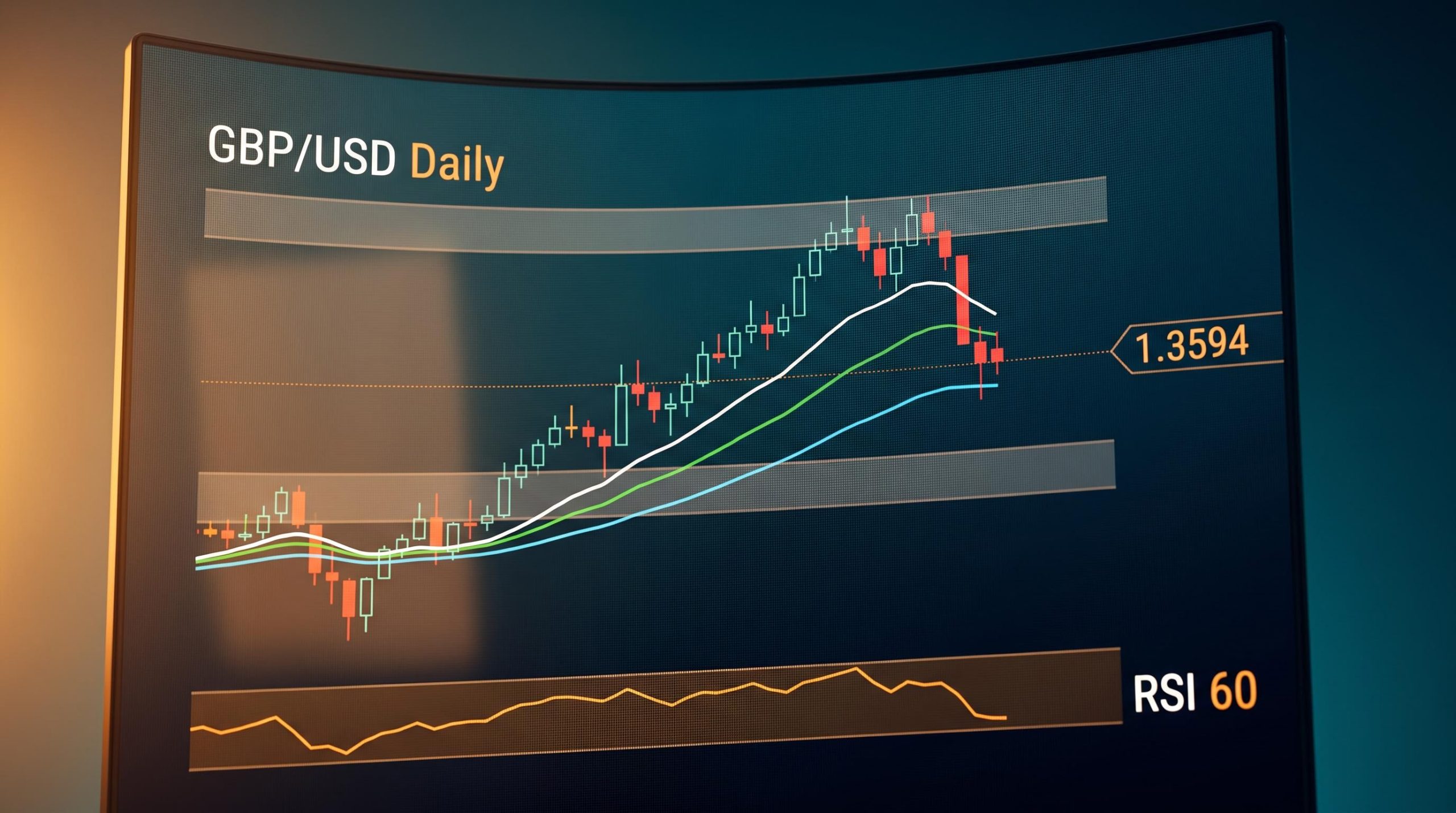
A currency pair rises for weeks, prints a clear uptrend on the daily chart, and then drops half a percent in a single session. Your instinct says something has changed. The buyers have left. The trend is over.
That instinct is wrong more often than it is right, and acting on it, selling into a pullback because the screen turned red, is one of the most common and costly mistakes in technical analysis.
GBP/USD is the live case study. On 26 August 2026, the pair is trading around 1.3594, having retreated from a session high near 1.3651. The catalyst is straightforward: the US Dollar staged a rebound after hotter-than-expected US inflation figures prompted markets to reprice rate expectations. This article is not about whether you should buy or sell sterling. It is about how to read the chart so you can make that judgement yourself.
By the time you finish, you will have a three-part framework for reading trend structure, momentum, and price levels on any major currency pair, using today’s GBP/USD session as the concrete example. This is skill-building, not a tips list.
Why a falling price does not always mean a broken trend
The first question most traders ask when they see a red candle is “is this going up or down?” That is the wrong question. The better one is: where is price relative to its structure?
An uptrend is not defined by every single candle closing higher than the last. It is defined by price remaining above key levels of prior support. Individual sessions can be negative, even sharply so, without the broader trend changing at all. The distinction between a short-term price decline and a structural trend break is the single most important concept in chart reading.
Separating trends from noise is the central challenge that structural frameworks have addressed for over a century, and Dow Theory’s confirmation requirement and three-phase cycle model offer a complementary lens to the moving-average and RSI approach applied here.
The rest of this article teaches you three tools for making that distinction:
- Trend structure: Moving averages and trend lines that define the floor beneath price
- Momentum: The Relative Strength Index (RSI), which tells you whether a trend is healthy or exhausted
- Price levels: Support and resistance zones that act as decision points for buyers and sellers
Each one answers a different question. Together, they give you a structured way to evaluate any pullback in real time.
Applying this to GBP/USD right now
The pair is down approximately 0.39-0.41% on the day, retreating from that 1.3651 intraday high to sit around 1.3594. That sounds bearish if all you read is the direction.
But price has not touched the first major structural support level at 1.3490. The RSI is sitting near 60, which signals positive momentum without overbought conditions. The broader moving-average cluster near 1.34 remains well below current price. The chart is not asking you to reconsider a bullish bias. It is asking you to watch specific levels.
For context, sterling’s weakest performance on the day was against the Australian Dollar (down 0.50%) and its strongest was against the New Zealand Dollar (up 0.20%), confirming this is a USD-strength story rather than a broad sterling collapse.
When big ASX news breaks, our subscribers know first
How moving averages and trend lines define the floor beneath price
A moving average calculates the average closing price over a set number of days, smoothing out daily noise to reveal the underlying direction of price. The 50-day, 100-day, and 200-day simple moving averages (SMAs) are the three most widely watched on any daily chart.
What matters here is not any single average but the fact that all three are currently clustered near the 1.34 area. When multiple moving averages converge in the same zone, the support signal is far stronger than any single line would provide alone. That cluster represents a concentration of the market’s own price memory, and a break below it would require sellers to overwhelm a much deeper base of historical buying interest.
Two additional layers of confluence sit within that same zone. A prior downward-sloping resistance line, which had been acting as a ceiling for the advance, gave way when price pushed through around 1.3396. Once that barrier was cleared, the principle of polarity came into effect. This is the principle of polarity in technical analysis:
Prior resistance levels, once broken, tend to flip into new support floors. The level around 1.3396 where that overhead resistance was breached now underpins the current advance, a concrete example of a ceiling becoming a floor.
The rising trend-line whose break occurred near 1.3390 contributes an additional layer of structural support to that same zone. Independent analyses also flag a demand zone from approximately 1.3415 down toward the mid-1.33s as an area where buyers have repeatedly stepped in.
The nearest support to where price currently trades sits around 1.3490, a level that corresponds to a reclaimed declining trend-line visible on the daily chart.
| Support Level | Technical Tools Converging | Break Signal | Implication |
|---|---|---|---|
| 1.3490 | Reclaimed descending trend-line; nearby intraday demand bands | Daily close below this level weakens the short-term bullish case | Focus shifts to whether the deeper 1.3390-1.3410 base can hold |
| 1.3390-1.3410 | 50-, 100-, and 200-day SMA cluster; broken resistance at 1.3396; rising trend-line break near 1.3390; demand zone into mid-1.33s | Sustained daily close below 1.3390 materially compromises the bullish bias | The structural base of the entire advance has failed; reassessment required |
The convergence of three major moving averages plus two reclaimed trend lines in the same zone tells you this is where the market’s own memory is concentrated. A daily close below 1.3390 would carry far more weight than any intraday dip, and until that happens, the structural floor is holding.
What the RSI tells you that price alone cannot
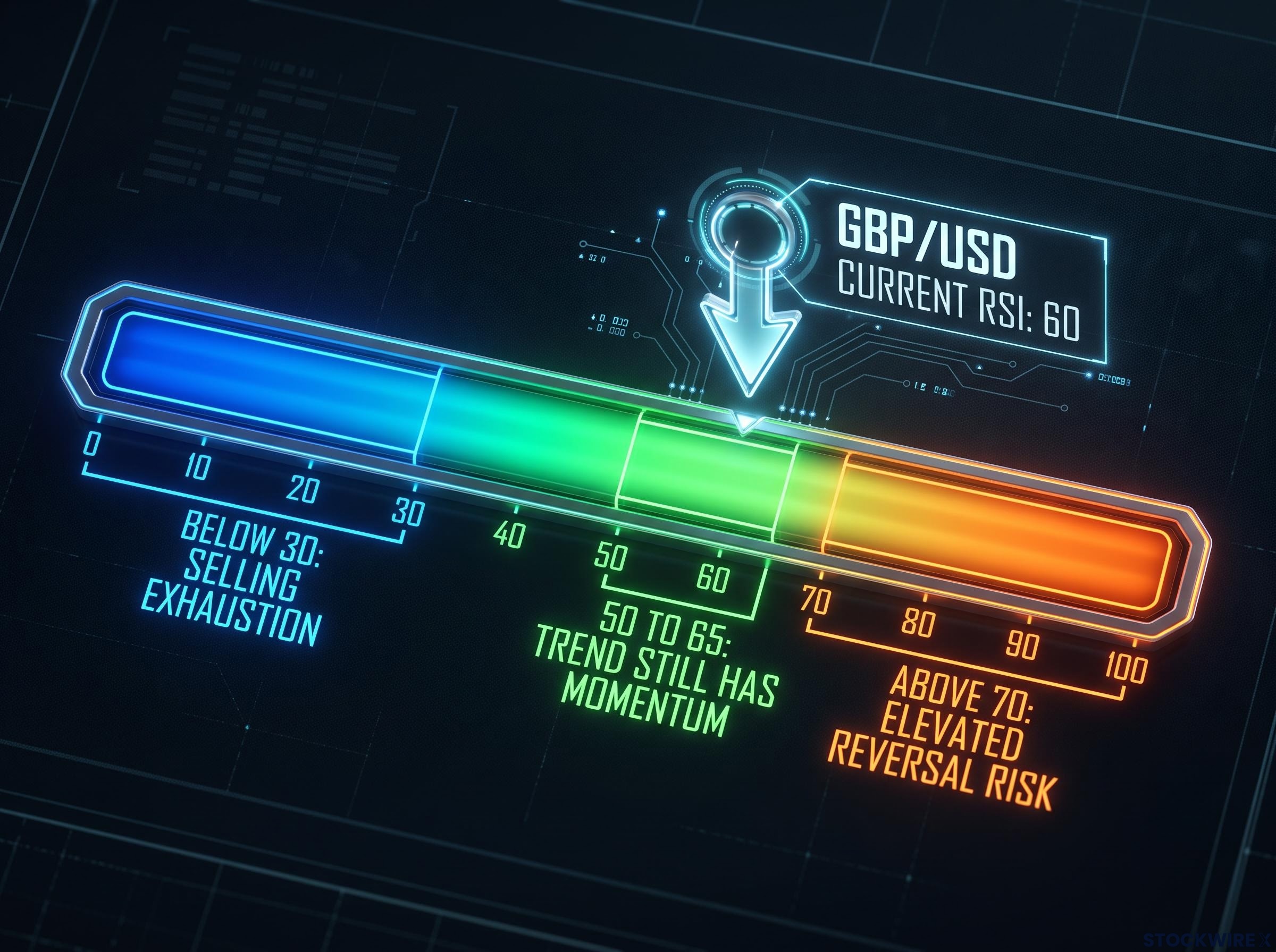
The Relative Strength Index (RSI) measures the speed and magnitude of recent price changes on a scale from 0 to 100. In plain terms, it tells you whether recent buying or selling pressure has been unusually strong relative to the pair’s recent history.
The two thresholds to know are 30 and 70. Below 30 typically signals that selling pressure may be exhausted. Above 70 suggests buying momentum is stretched and reversal risk is elevated. Between those two levels, momentum is in a neutral-to-healthy range.
The reason RSI matters alongside price is that it tells you something price alone cannot: whether the move behind a price level is running out of energy or still has room to extend.
- RSI below 30 (potential exhaustion of selling): Selling pressure has been extreme relative to recent history. A bounce becomes more probable, though not guaranteed.
- RSI between 50 and 65 during a pullback (trend still has momentum): The dip is likely corrective rather than the start of a reversal, because momentum had not overextended before the decline began.
- RSI above 70 during a rally (elevated reversal risk): Buying momentum is stretched. A pullback from this level is more likely to carry weight because the trend was already running hot.
The distinction between scenarios two and three is where many traders make the wrong call. A pullback from an RSI of 60 is structurally different from a pullback from an RSI of 75, even if the price decline looks identical on the chart. In the first case, momentum had not exhausted itself before the dip began; in the second, it already had.
The broader GBP/USD forecast from earlier in August reached 1.3659 on a UK CPI catalyst before an RSI reading of 70.49 flagged elevated pullback risk, providing direct historical context for the overbought-versus-constructive RSI distinction the framework above describes.
Reading RSI in the GBP/USD context today
GBP/USD’s RSI is currently sitting near 60. Price is at 1.3594, above the 1.3490 structural support level.
That combination places the current session squarely in scenario two from the framework above. The RSI is not warning of exhaustion. It is describing a trend that is resting, and research findings consistently show that pullbacks from non-overbought RSI readings make subsequent trend continuation more probable than pullbacks from already-stretched readings. For you, an RSI near 60 during a pullback is a signal that the chart is not flashing caution yet; it is telling you the current dip looks corrective.
The price levels that will determine sterling’s next move
Knowing the framework is one thing. Knowing where to apply it is what makes it useful. Here are the specific levels that define the boundaries of GBP/USD’s next move, and what each outcome would signal.
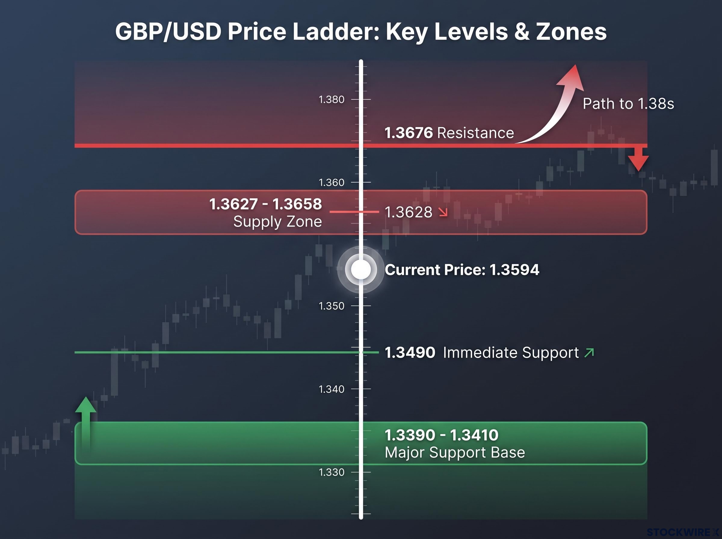
On the upside, the first area where sellers are likely to push back is around 1.3628, a former support turned overhead barrier on the daily chart. A supply zone from 1.3627 to 1.3658 clusters just above, indicating concentrated selling interest. Beyond that, a more meaningful obstacle lies at the 1.3676 level, where horizontal resistance is reinforced by a wider supply zone extending from approximately 1.3674 into the high-1.37s.
A daily close above 1.3676 would signal that overhead supply has been absorbed and open a path into the 1.38s. That is the level where the balance between buyers and sellers would shift materially in favour of further upside.
Volume confirmation adds a fourth dimension that the three-tool framework in this article does not cover: a breakout through the 1.3676 resistance or a breakdown below 1.3390 accompanied by well-above-average volume carries materially more informational weight than the same price move on thin participation.
On the downside, the two support levels covered in the trend-structure section, 1.3490 and 1.3390-1.3410, form the framework. At each level, the question is simple: did price hold on a daily close basis, or did it break through?
The area between 1.3490 and 1.3676 is the battle zone. Both the bullish and bearish scenarios remain live within this range, and the resolution depends on which boundary gives way first.
Watch daily closes, not intraday prints, when determining whether a support or resistance level has genuinely been breached.
| Scenario | Key Level | Technical Implication | What to Watch |
|---|---|---|---|
| Price holds above 1.3490 | 1.3490 | Pullback likely corrective; bullish daily bias intact | Whether price can retest 1.3628 resistance |
| Intraday break below 1.3490 with daily close back above | 1.3490 | Dip-buying evident; scope for another test of 1.3628+ | Volume and conviction of the recovery into the close |
| Daily close below 1.3490, follow-through toward 1.3390-1.3410 | 1.3490 broken | Short-term structure weakens; focus shifts to the major support base | Whether the 1.3390-1.3410 cluster attracts buyers |
| Daily close below 1.3390 | 1.3390 | Bullish daily bias materially compromised; deeper downside risk opens | Speed and follow-through of the breakdown |
| Daily close above 1.3676 | 1.3676 | Upside breakout confirmed; overhead supply absorbed | Extension potential into the higher 1.37s and 1.38s |
For you, the single most important data point to monitor is not any intraday swing but whether price ends the day above 1.3490. That daily close tells you whether the bullish structure is intact or whether the chart is beginning to show something more serious. An upcoming macro catalyst that could shift the USD dynamic is the Jackson Hole speech by Fed Chair Kevin Warsh, which is the kind of external event you should flag as a potential trigger for the levels outlined above.
What today’s GBP/USD chart is actually telling you
The three tools taught in this article, trend structure, RSI, and price levels, each independently support the same reading of today’s session.
Price sits at 1.3594, comfortably above the 1.3490 immediate support and well above the 1.3390-1.3410 structural cluster. With the RSI reading near 60, buying pressure remains constructive and well short of stretched territory. The moving-average cluster near 1.34 remains intact as the long-term base. The current decline is corrective within a bullish daily structure, not a trend reversal.
Dollar Index technical analysis published on 19 August showed every prior support level rotating into resistance, with the 200-day EMA near 99.70-99.75 becoming the line bulls need to reclaim, a deteriorating USD structure that directly underpins the sterling advance this article examines.
What would change that reading? A closing price below 1.3390 that persists across subsequent sessions. Not an intraday dip. Not a single session’s low wick. A close below that level, where three major moving averages, two reclaimed trend lines, and a demand zone all converge, would seriously undermine the bullish case and call for a fundamental rethink of the trade setup.
Three chart takeaways for the sessions ahead:
- The current structure: Bullish on the daily chart, with today’s pullback corrective within that trend
- The level that changes everything: A sustained daily close below 1.3390 is the specific threshold that would invalidate the bullish setup
- The next catalyst to watch: Fed Chair Kevin Warsh’s Jackson Hole speech, which has the potential to shift USD dynamics and test the levels outlined above
Technical analysis does not predict the future. It tells you what conditions have to be met for each scenario to activate. That clarity about conditions, rather than certainty about outcomes, is exactly what makes it useful. The framework you have built here, trend structure, momentum, and price levels, works on any major currency pair, not just GBP/USD. Apply it wherever you need a structured way to separate a pullback from a reversal.
This article is for informational purposes only and should not be considered financial advice. Investors should conduct their own research and consult with financial professionals before making investment decisions. Past performance does not guarantee future results. Technical analysis reflects historical price behaviour and is subject to change based on market developments.