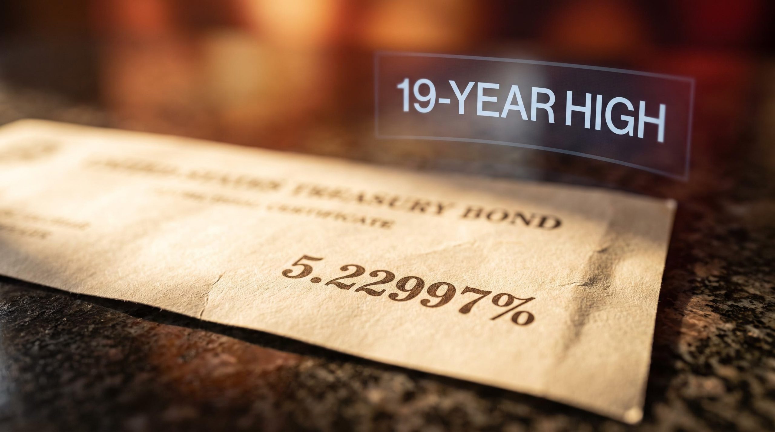
The 10-year US Treasury yield touched an intraday high of 5.2297% on 25 September 2026, a level not seen since 2007.
That single number reframes everything else in the market. A 19-year high in the world’s most important interest rate is not a bond-market curiosity. It sets the discount rate for every equity, the refinancing cost for every leveraged company, and the return hurdle for every portfolio on the planet.
The pressure has not eased, either. Market-implied odds of a further Federal Reserve hike climbed to 70.3% overnight, up from 64.2% the previous day, according to the original reporting, sharpening the sense that the move still has room to run.
So what actually happens now. This piece maps the mechanics behind the move, what a sustained 5% yield does to stock valuations and corporate debt, what the yield curve is really signalling beneath its reassuring shape, and why at least one major institution has just turned bullish on government bonds for the first time in four years. The aim is to leave you with a working analytical frame, not a recap.
What is driving Treasury yields to their highest level since 2007?
Read this move as a jury would read evidence. No single force explains a 19-year high; several are pushing in the same direction at once, which is precisely what makes it harder to fade than a one-cause shock.
The inverse relationship at the core of bond yield mechanics, where a lower purchase price automatically produces a higher yield, is what connects a fiscal supply shock to immediate pressure on equity discount rates and mortgage benchmarks.
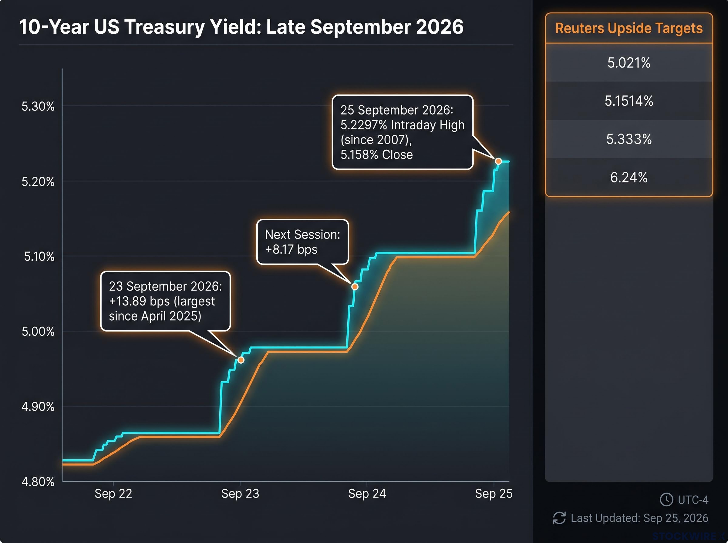
The timing tells its own story. On 23 September 2026, the 10-year jumped 13.89 basis points, its largest single-day move since April 2025. The next session added a further 8.17 basis points, and by 25 September the yield closed at 5.158% after that 5.2297% intraday print.
Cyclical pressures: growth, inflation, and oil
The near-term catalysts are the ones traders can watch in real time.
- Business activity surged to a more-than-five-year high, driven by a jump in new orders, pushing traders to price in higher real yields.
- Inflation expectations firmed as the economy ran hot rather than cooled.
- Oil prices did the heavy lifting on the long end. Reuters tied the 24 September surge in 10-year and 30-year yields directly to an oil jump, then noted yields stabilised as oil fell, describing “battered bonds” drawing support from softer crude.
The oil linkage matters because it works both ways. When a cyclical driver reverses, the long end responds quickly, which tells you part of this move is genuinely mean-reversible.
Structural forces: fiscal supply and term-premium repricing
The structural drivers are slower, deeper, and far harder to reverse.
- Heavy Treasury issuance is forcing investors to demand more yield to absorb the supply.
- Fiscal and deficit concerns are lifting the term premium, the extra return investors want for holding longer-dated debt.
- Reduced central-bank demand for duration removes a large, price-insensitive buyer from the long end.
Technical momentum then amplified the fundamentals. Reuters confirmed a significant chart break, flagging upside targets at 5.021%, 5.1514%, 5.333%, and 6.24%. Once psychological levels gave way, systematic selling piled on.
Kay Haigh of Goldman Sachs Asset Management noted the Fed “does not at this stage envisage an aggressive tightening cycle,” with most FOMC members projecting only two hikes in 2026.
The Federal Reserve September 2026 economic projections show FOMC members clustering around a shallow rate path, with most participants pencilling in only two additional hikes, a distribution that makes long-end moves beyond that pace a product of term-premium repricing rather than rate-hike expectations alone.
That observation is the analytical hinge. If the committee itself expects only two more hikes, long-end moves beyond that pace reflect structural term-premium repricing, not pure rate-hike fear.
Here is the practical read for you. Because cyclical and structural drivers coexist, you cannot wait for one cooler inflation print to call the all-clear. Even if CPI softens, fiscal supply and term-premium concerns can sustain elevated yields on their own.
When big ASX news breaks, our subscribers know first
How does a 5% yield hit equity valuations and corporate credit?
Yields are high in the abstract. Here is where you actually feel it, moving through equities first, then household credit, then corporate debt.
Start with the discount-rate mechanism. Higher risk-free yields raise the hurdle against which future earnings are valued, which compresses the multiple investors are willing to pay. Goldman Sachs Research, cited by CNBC, observed that equities struggle most when yields rise for reasons other than improved growth, because higher discount rates squeeze valuations without any offsetting lift to earnings.
Discount-rate compression of this kind does not require an earnings deterioration to hit valuations; the IMF has estimated that a 100 basis point rise in global long-term real rates lowers the equilibrium price-to-earnings ratio of advanced-economy indices by 10-15%, even when underlying profits are unchanged.
Reuters warned that a 10-year above 5% “could ripple through the U.S. economy and threaten the bull market in stocks by denting the relative appeal of U.S. equities.”
The real-economy channel is slower but just as real. The 10-year is the benchmark for mortgages, auto loans, and consumer credit, so a sustained spell above 5% tightens household finances with a lag, quarters rather than days.
Corporate credit is the third channel. Higher Treasury yields lift the entire corporate yield curve, and the original reporting noted that surging speculative-grade issuance is currently overwhelming buyers, producing elevated risk premiums and raising refinancing risk for the most leveraged issuers. Reuters underlined how broad the repricing has become: except for the two-year note, all Treasury maturities are now trading above 5%.
| Channel | Mechanism | Speed of impact | Key risk metric |
|---|---|---|---|
| Equities | Higher discount rates compress valuation multiples | Days | Earnings yield vs risk-free yield |
| Household credit | 10-year benchmarks mortgage, auto and consumer rates | Quarters | Debt-service burden |
| Corporate debt | Entire corporate curve lifts, refinancing costs rise | Weeks to months | Speculative-grade risk premium |
For an equity holder, the question is not whether yields will peak. It is whether the reason for the rise is the type that compresses multiples without a compensating earnings boost. Right now it is fiscal concern, which is exactly the wrong kind.
Knowing where transmission is fastest tells you where to look first. Equity multiples reprice within days; corporate credit and household consumption grind through over quarters. That gives you a sequence to monitor rather than a single moment to fear.
What the yield curve’s shift from inversion to positive slope actually signals
Most investors are trained to read an inverted yield curve as a recession warning. So a curve that has climbed back to a positive slope should be reassuring. The problem is that the mechanism behind the steepening matters far more than the shape itself.
Here is how to read the current configuration in three steps.
- Establish the spread. The 10s-2s gap has moved from deep inversion to a modestly positive slope, roughly +27.8 basis points on CNBC’s 16 September snapshot and about +17 basis points in the later original reporting, with the 2-year at 4.738% and the 10-year ranging from 5.016% to 5.2297% across the window.
- Identify the type of steepener. A bear steepener, where the long end sells off on fiscal and inflation fear, is negative for risk assets. A recovery steepener, driven by improving growth expectations, is positive. Same shape, opposite meaning.
- Apply the historical precedent. The last time the 10-year sustained these levels was 2006-2007, when a steepening from inversion preceded sharp repricing in housing and leveraged credit rather than a benign recovery.
Reuters noted that except for the two-year note, all Treasury maturities are now trading above 5%, a reminder that the entire curve, not just the long end, has repriced higher.
The distinction is the whole point. If long yields are climbing because of fiscal fear rather than growth optimism, then a positively sloped curve is a warning dressed as a recovery signal.
This is where a more sophisticated tool pays off. A positively sloped curve is not automatically the all-clear that conventional reading suggests, and understanding why the driver outranks the shape lets you evaluate current conditions on their merits rather than on habit.
For readers wanting to stress-test the historical precedent in more depth, our full explainer on yield curve recession signals examines the steep-front, flat-back configuration that has appeared in only 5.4% of months since 1990 and what it has reliably preceded.
Why one institutional voice just turned bullish on bonds, and what that contrarian call means
Against that backdrop, one call stands out. A Goldman Sachs-attributed analyst turned positive on government bonds for the first time since 2020, according to the original reporting. What makes it notable is the timing: it arrives after a historic sell-off, not before one.
Consider the bullish case on its own terms.
- Elevated real yields and term premia offer attractive long-run returns if inflation normalises from here.
- The Fed appears closer to the end than the start of its tightening cycle, meaning duration risk is increasingly compensated.
- Inflation-normalisation potential underpins the return math, and Kay Haigh’s observation that the committee does not envisage an aggressive tightening cycle points to a visible ceiling on rates.
Intellectual honesty demands the other side of the ledger, though.
- Structural supply pressures could sustain yields above 5% even if near-term inflation cools.
- Bank of America was projecting a further 50 basis points of tightening through year-end 2026.
- Term-premium persistence driven by deficits may keep the long end elevated regardless of the Fed’s near-term path.
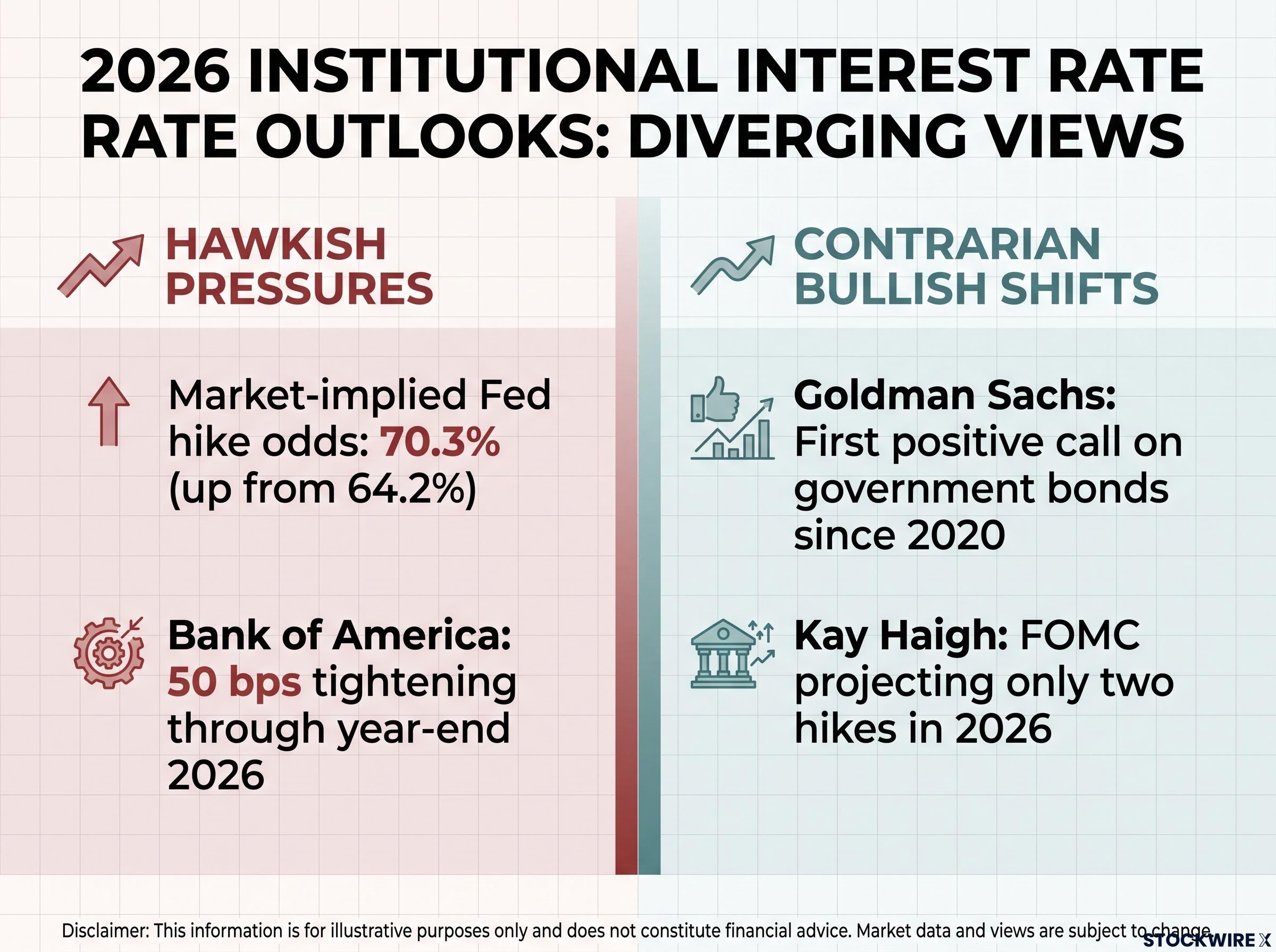
Kay Haigh of Goldman Sachs Asset Management noted that the Fed “does not at this stage envisage an aggressive tightening cycle.”
Reuters offered a supporting data point for the mean-reversion side of the argument, describing how battered bonds drew support as oil prices fell, showing that when a cyclical driver reverses, the long end responds within sessions.
Here is the read to take from this. A first bullish institutional call since 2020 does not mean the sell-off is finished. It does mean sophisticated long-duration money is beginning to see risk-reward shifting, and the useful question is whether your own duration exposure reflects that same calculation or still assumes yields have further to climb.
Contrarian pivots from major institutions at cycle extremes have, historically, preceded turning points in duration markets. Whether or not this is that moment, understanding the analytical basis for the call gives you a framework to test each new data release against.
What the yield move changes, and what portfolio positioning it demands now
Two interpretations run through everything above. The structural case argues for sustained yields above 5%, driven by supply and term-premium repricing. The cyclical case argues for stabilisation once oil, Fed signalling, or inflation data turn. The 5.23% intraday high remains the reference anchor for judging whether conditions are worsening or settling.
Your positioning decision should hinge on which scenario the next four to six weeks of data actually support. Here is how to resolve it.
Three indicators to resolve the structural-versus-cyclical debate
- Fed language on the pace of tightening. Any softening in the committee’s tone tilts the read toward the cyclical, peak-is-near case.
- Month-over-month core inflation. Cooling prints strengthen the mean-reversion argument; sticky readings validate the structural view.
- Treasury auction bid-to-cover ratios. Weak demand at 10-year and 30-year auctions confirms that supply and fiscal fear, not growth, are driving the long end.
Cross-asset implications in order of transmission speed
Equity discount rates reprice immediately, so multiple compression is the first place a sustained 5% shows up. Speculative-grade credit spreads widen over weeks to months as refinancing windows arrive. Mortgage and corporate capex costs drag on the real economy over quarters.
This is not a US-only story. The Reserve Bank of Australia was projected to lift its benchmark to 4.6%, the highest since November 2011, and European monetary leadership warned that rising bond yields were restricting regional growth faster than modelled. The move sits inside a globally synchronised tightening backdrop.
Treat the Goldman bullish turn as a signal worth watching, not a buy trigger. It tells you institutional risk-reward calculus is evolving, and that alone earns your attention.
Investors tracking how the 5% yield threshold ripples beyond equities and credit will find our deep-dive into cross-asset yield transmission, which maps the direct session-by-session connections between 10-year moves and gold, Bitcoin, and currency carry unwind risk.
This article is for informational purposes only and should not be considered financial advice. Investors should conduct their own research and consult with financial professionals before making investment decisions. Past performance does not guarantee future results. Financial projections are subject to market conditions and various risk factors, and forward-looking statements are speculative and subject to change based on market developments.