
Rising interest rates are supposed to be a sign of strength. When yields climb, the story goes, it means the economy is growing, borrowing demand is healthy, and confidence is high. That story is often wrong.
The bond market has a long record of seeing trouble that stock markets and official statistics miss entirely. Yield curve inversions preceded the recessions of 1990 and 2007, typically flashing their warning six to eighteen months before the downturn arrived.
Right now, the signals coming from US Treasuries are unusually tangled. Nominal yields sit near multi-year highs, the yield curve has just un-inverted into positive territory, and inflation expectations remain oddly calm even as energy costs climb.
Reading these bond market recession signals correctly matters because they contradict each other on the surface. This piece gives you a framework for cutting through that noise: how the yield curve actually works, what the rare shape of late September 2026 is telling institutions, why flat inflation pricing is its own warning, and where the traditional playbook may now be broken.
The anatomy of a macro warning signal
Pull up a chart of US Treasury yields on any given day and you are looking at a curve plotting interest rates across different maturities. The standard reference points are the 3-month Treasury bill, the 2-year note, the 10-year note, and the 30-year bond.
In a healthy economy, this curve slopes upward. You get paid more to lock your money away for 30 years than for three months, which compensates you for the risk that inflation or interest rates could shift over that longer stretch. That extra reward for time is the natural resting state of the market.
An inversion flips that logic. When short-term yields rise above long-term yields, the curve slopes downward, and that has historically acted as a countdown clock.
The reason is buried in what an inversion actually means. If investors are willing to accept lower yields on 10-year bonds than on 2-year notes, they are effectively betting that the Federal Reserve will be forced to slash rates in the future. Rates get cut when the economy weakens, so an inverted curve is the market pricing in future damage.
That is why the shape of the curve carries the real signal, not the headline level of rates. A yield of 5% tells you little on its own. The relationship between the short end and the long end tells you how institutions view future growth, and you need that baseline before you can diagnose anything unusual in the current market.
How to read the inflation protection market
There is a second signal hiding inside the bond market, and it comes from a comparison between two types of government debt.
A standard, or nominal, Treasury pays a fixed rate regardless of what inflation does. A Treasury Inflation-Protected Security (TIPS) adjusts its value upward as consumer prices rise, protecting the holder from inflation eroding their returns.
The gap between the yield on a nominal Treasury and a TIPS of the same maturity is called the breakeven inflation rate. It isolates one thing: the average annual inflation the market expects over that horizon.
The breakeven inflation rate embedded in TIPS pricing can deviate from actual inflation by up to 80 basis points at shorter horizons due to liquidity and risk premia, meaning raw readings should be adjusted before drawing conclusions about genuine inflation sentiment.
The two most watched versions are the 5-year and 10-year breakevens. When the 5-year breakeven sits at, say, 2%, the market is telling you it expects consumer prices to rise around 2% per year for the next five years. Watching how these numbers move gives you a direct read on whether investors believe inflation is about to accelerate or fade.
When big ASX news breaks, our subscribers know first
Decoding the rare steep-front yield curve of late September 2026
The curve on display this month is not what most investors expect to see, and its shape deserves close attention.
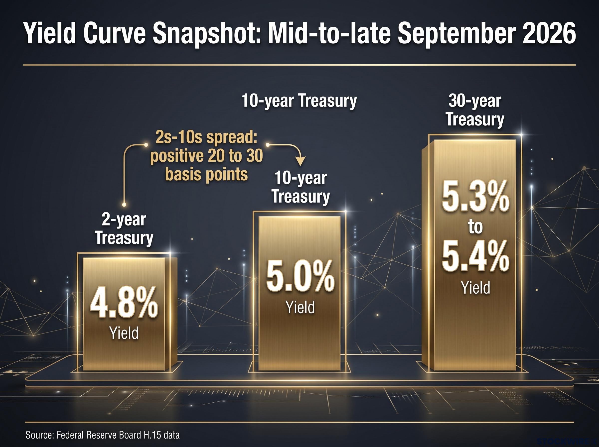
According to Federal Reserve Board H.15 data from mid-to-late September 2026, the 2-year Treasury yield sat near 4.8%, the 10-year near 5.0%, and the 30-year near 5.3% to 5.4%. The 2s-10s spread, the difference between the 2-year and 10-year yields, is now positive at roughly 20 to 30 basis points.
The Federal Reserve H.15 selected interest rates release publishes daily Treasury yields across all standard maturities, giving you the raw numbers needed to track curve shape changes as they happen rather than waiting for commentary to catch up.
On the surface, this looks like relief. The curve has un-inverted. Rates are normal again, sloping gently upward the way a textbook says they should.
That surface reading is precisely the trap. A curve that un-inverts and turns positive after a deep inversion is historically one of the more ominous configurations, not one of the safest.
Here is why. When a curve steepens because short-term rates are falling faster than long-term rates, it usually means the market is pricing in emergency rate cuts. The Fed slashes the short end because economic damage has already begun. The un-inverting is not the all-clear; it is the market beginning to price in the downturn the inversion warned about.
This matters because it looks nothing like a genuine recovery. In reflationary periods such as 2013 and 2016, the back end of the curve steepened first as growth expectations improved and investors demanded more yield for the future. The current shape is the opposite: a steep front end paired with a moderately flat back end.
That specific configuration is rare. Since 1990, a steep-front, flat-back curve has appeared only about 5.4% of the time, clustering around periods of elevated economic stress.
| Curve shape | 2Y yield action | 10Y yield action | Historical frequency | Traditional economic signal |
|---|---|---|---|---|
| Normal upward slope | Lower than 10Y | Rising with growth | Most common state | Healthy expansion |
| Inverted | Above 10Y | Below 2Y | Around 25% of the time at 30bps or below | Recession within 6-18 months |
| Reflationary steepening (2013, 2016) | Anchored low | Rising first on growth | Periodic | Improving growth outlook |
| Steep front, flat back (Sept 2026) | Falling on cut expectations | Moderately flat | About 5.4% since 1990 | Pricing in imminent slowdown |
Understanding why a positive slope can be a more urgent warning than a deep inversion helps you time defensive moves accurately, rather than buying into a false sense of security when the curve finally looks normal.
What subdued breakevens reveal about the inflation narrative
Energy prices are climbing. Consumers feel it at the pump and in their utility bills. Yet the bond market’s long-term inflation expectations have barely moved. That divergence is the second signal worth decoding.
If rising fuel costs were feeding into structural inflation, you would expect 5-year and 10-year breakeven rates to jump. Instead they remain anchored. The bond market is treating higher energy prices not as the start of a spiral, but as a relative-price shock that will fade.
The logic runs deeper than it first appears. When one category of prices rises sharply, it drains spending power from everything else. The bond market appears to be betting that expensive fuel will eventually crush consumer demand, slow the wider economy, and pull inflation back down on its own.
In other words, flat long-term inflation pricing despite rising energy costs tells you the bond market expects consumers to break before inflation runs away. That should change how you view commodity-driven price shocks in your own portfolio, treating them as potential brakes on growth rather than as pure inflation threats.
There is an important caveat, though. Breakeven rates are not a clean measurement, and several technical factors can artificially suppress them:
TIPS real yields near 3.05% on the 30-year tenor place investors in the top quartile of real yield opportunity since 2000, a data point that changes the relative attractiveness of inflation protection instruments even if breakeven rates appear subdued.
- Liquidity premiums: TIPS trade less freely than nominal Treasuries, so investors may demand extra compensation to hold them, which distorts the breakeven calculation.
- Quantitative tightening: As the Federal Reserve shrinks its balance sheet, the reduced demand for TIPS can push their real yields up and compress the apparent inflation expectation.
- Institutional hedging flows: Pension funds, insurers, and commodities desks trade TIPS to hedge specific exposures, which can move prices for reasons that have nothing to do with genuine inflation forecasts.
History offers a warning here. The main TIPS ETF rose through 2020 and 2021 as inflation surged, then declined once the Fed began raising rates in 2022, even while inflation stayed sticky. That drop had as much to do with rising real yields as with inflation views, a reminder that these instruments do not always mean what they appear to.
The practical takeaway is filtering. Rather than reacting to every monthly inflation headline, watch whether these deeper structural expectations shift. They are what actually drive institutional asset allocation.
The new era of quantitative tightening and structural false positives
Everything above assumes the yield curve still works the way it did in 1990 and 2007. A growing chorus of major institutions argues that assumption may no longer hold.
The counter-argument centres on term premiums, the extra yield investors demand for holding long-dated bonds. For over a decade, the Federal Reserve’s quantitative easing, its programme of buying bonds to push yields down, suppressed these premiums to unusually low levels.
That era has reversed. With quantitative tightening now shrinking the Fed’s holdings and the US Treasury issuing enormous volumes of debt, term premiums are being rebuilt. Long yields are being pushed higher by the sheer supply of bonds and by fiscal concerns, not necessarily by any signal about economic health.
If that is correct, a 5% ten-year yield might simply be the new cost of capital rather than a warning. The steep-front, flat-back curve could reflect structural repricing instead of an imminent recession, which forces you to question whether the traditional model is even measuring the right thing anymore.
Supply-driven steepening from record Treasury issuance and roughly $220 billion in AI hyperscaler bond supply competing for long-duration capital provides an alternative structural explanation for the current curve shape, one that JPMorgan has framed as capital demand rather than capital dysfunction.
J.P. Morgan Asset Management adjusted its fair value range for the 10-year Treasury higher to 4.00% to 4.50% to reflect these structural changes and the Fed’s reaction function. Research from the Bank for International Settlements similarly argues that large Treasury supply and the end of quantitative easing have altered the term premium, meaning the curve’s re-steepening no longer guarantees a downturn.
Assessing the Fed’s 2026 trajectory
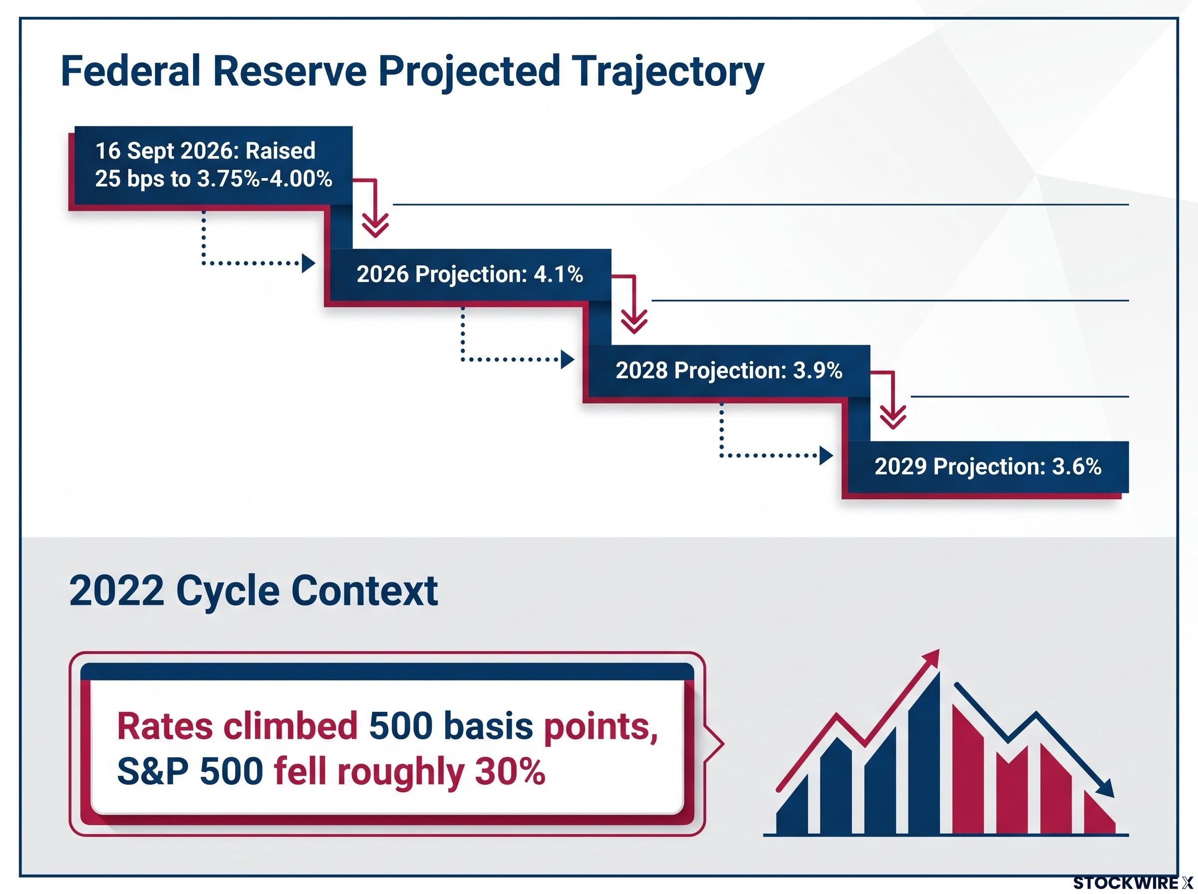
The Federal Reserve’s own path adds to the uncertainty. At the meeting on 16 September 2026, the Federal Open Market Committee raised its target range by 25 basis points to 3.75% to 4.00%.
Its Summary of Economic Projections, the dot plot showing where officials expect rates to head, points to gradual easing. The median projected federal funds rate sits at 4.1% for 2026, easing to 3.9% by 2028 and 3.6% by 2029.
The open question is whether the Fed engineers a genuine soft landing or hikes until something breaks. Critics argue central banks tend to keep tightening until stress forces a reversal, at which point the pivot to cuts confirms the economy was fragile all along.
Conflicting bond market signals become harder to resolve when futures markets and professional consensus diverge sharply; rate futures priced an 83-90% probability of a September 2026 hike that most economists rejected, a gap that illustrates why anchoring duration positioning to a single indicator carries substantial risk.
That debate is unsettled even about the recent past. The 2022 cycle saw rates climb by 500 basis points while the S&P 500 fell roughly 30%, and there were two quarters of negative real GDP growth. Yet the National Bureau of Economic Research never declared a recession, because employment, income, and industrial production held up, reinforcing the soft-landing narrative that some analysts still dispute.
Navigating your portfolio through the Fed’s policy transition
Put the pieces together and the environment is genuinely awkward: a federal funds rate of 3.75% to 4.00% sitting beneath a 10-year yield near 5.0%, with real doubt about which signal to trust.
Those elevated discount rates ripple across every asset class. In credit markets, higher risk-free yields raise corporate borrowing costs and can widen spreads, lifting default risk in lower-quality debt over a multi-year horizon. In equities, a 5% discount rate compresses price-to-earnings multiples, tending to favour value stocks and companies with strong balance sheets over expensive growth names. In housing, mortgage rates tied to the 10-year yield stay high, squeezing affordability even without a formal recession.
Fixed-income strategists are responding with three positioning themes worth understanding:
- Adding intermediate duration: Gradually buying intermediate Treasuries on the view that tight conditions will eventually force the Fed down its own projected easing path.
- Curve-steepening trades: Positioning for the front end to fall faster than the back end, favouring high-quality credit at shorter maturities.
- Diversified real asset hedging: Using commodities and real assets rather than relying solely on TIPS, given their liquidity limitations.
The single most useful skill here is recognising when a trusted indicator may be broken. Position too aggressively for a downturn and you lose out if the economy proves resilient; ignore the warning entirely and you are exposed if it does not.
This article is for informational purposes only and should not be considered financial advice. Investors should conduct their own research and consult with financial professionals before making investment decisions.
Past performance does not guarantee future results. Financial projections are subject to market conditions and various risk factors, and forward-looking interpretations of bond market signals are speculative and subject to change.