One of the most dangerous moments in a stock’s life passes by unremarked on most trading screens. A stock reports earnings, gaps up hard on the open, then spends the session bleeding back to where it started and closes roughly flat. Most retail traders read that day as neutral, a wash. Professional short-sellers read it as one of the highest-conviction sell signals a chart can produce.
Reading a chart bearishly is not the mirror image of reading it bullishly. The signals are rarer, harder to trust, and far more time-sensitive, and most people who try to trade them get the timing catastrophically wrong.
To see how practitioners actually do it, consider two live setups running right now. One trader is short three healthcare names at once, UnitedHealth Group, Humana, and Centene, all built on the same topping structure. Another is short Carvana on a longer horizon, structured around a diamond top formation that has appeared in this exact stock before.
These are not textbook diagrams. They are working positions, and they show how bearish chart patterns get translated into conviction, position size, and risk.
After reading this, you will be able to look at a chart and recognise the specific signatures short-sellers act on, understand why those signatures carry informational weight, and know exactly what can go wrong when you act on them. That is the difference between knowing a pattern’s name and knowing what it means for price.
What bearish chart patterns are actually telling you
The shape on your screen is not the point. It is a proxy for something happening underneath: a shift in the balance between the people who want to buy and the people who want to sell.
A bearish chart pattern is a visual record of that shift. It is not a formula with a guaranteed outcome. When a pattern forms, it is telling you that the crowd of buyers who drove a stock higher is losing the argument to a growing crowd of sellers, and that the balance may be about to tip.
The three patterns anchoring this article each encode a specific kind of participant behaviour:
- Topping structures: a stock stalls after a strong run as early buyers cash out and new demand fails to replace them.
- Post-earnings gap-and-fade reversals: good news arrives, the stock spikes, and larger holders use the flood of buyers to quietly exit before the close.
- Diamond top formations: price swings widen and then contract at the peak of an uptrend, marking the handoff from aggressive buying to distribution to breakdown.
Here is the part most people skip. Pattern reading is probabilistic, and the numbers prove it. Research on the diamond top alone swings wildly depending on who is measuring and how.
Depending on the methodology, diamond top patterns show accuracy rates ranging from 38% to 81%, a spread wide enough to demand that traders apply additional filters before acting.
An algorithmic study of 904 formations put the downward-break accuracy near 38%. LiteFinance’s analysis placed it as high as 81%. The widely cited Bulkowski data lands in the middle, around a 69% downward break rate with an average decline of roughly 21%, a failure rate near 10%, and pullbacks in around 55% of cases even when the pattern eventually works.

That variance is not a flaw in the data. Different methods measure different things, and the honest reading is that no single number is the truth.
Bearish chart patterns carry a baseline median win rate of just 52.8% across more than 2,800 trades, but strict volume and trend filtering pushes completion rates to 83%, making the confirmation filter the entire source of edge rather than the shape itself.
What that range should tell you is simple and important: no chart pattern should ever be traded on its own. The practitioners running these setups are not betting on certainties. They are managing probabilities, and they only act when the shape lines up with something else that confirms it.
When big ASX news breaks, our subscribers know first
The healthcare topping structure: how UNH, HUM, and CNC set up simultaneously
A topping trade does not arrive as a finished thesis. It accumulates, stage by stage, and the healthcare short shows exactly how.
Start with the rally. UnitedHealth Group climbed nearly 100% from its spring lows before the move began to stall. That scale matters, because the bigger the run, the more meaningful the stall that follows it.
Through the summer, the same arc played out across the managed-care group. Humana and Centene both traced a rally, a topping process, and then a breakdown, creating three short candidates at once inside a single sector.
That simultaneity is the first source of conviction. A single stock rolling over could be noise. Three correlated names doing it together is a structure, and a structure is harder to dismiss.
| Stock | Approx. spring rally | Topping phase | 22 Sept 2026 price | Key risk event |
|---|---|---|---|---|
| UnitedHealth (UNH) | ~100% from lows | Summer 2026 | ~$372.95 | April 2026 CMS rate rally |
| Humana (HUM) | Substantial | Summer 2026 | ~$372.00 | April 2026 CMS rate rally |
| Centene (CNC) | Substantial | Summer 2026 | ~$63.30 | June 2026 buy-point reclaim |
Worth noting, this is not a macro call on healthcare. These names are conventionally labelled defensive, meaning demand for their services holds up regardless of the economy. The short thesis treats them not as defensive stocks but as momentum names caught in a topping phase, a distinction that changes everything about how the trade is managed.
The risk in that approach is real and it is asymmetric. In April 2026, UNH, HUM, CNC, and Elevance all rallied between 5% and 11% in extended trading after the Centers for Medicare & Medicaid Services announced a 2.48% increase in payments to private insurers running Medicare Advantage plans.
That single-day move on one policy headline is the most important number in this section for you. It shows that shorting a defensive group is never a set-and-forget trade. A policy surprise can trigger a violent short-covering rally that forces you to manage the position actively or get run over.
The chart also stayed contested. In June 2026, Investors Business Daily flagged buy signals across the same group, with Centene reclaiming a $60.76 buy point from a three-weeks-tight pattern. A short thesis on a stock that other technicians are calling a buy is a short thesis living on a knife-edge.
When good earnings are a sell signal
So where did the conviction come from? One of the three names staged a large post-earnings intraday rally that faded all the way back and closed roughly flat, an unusual range that the trader read as a clear bearish tell.
The logic is revealed preference. Everyone saw the same good earnings report, yet the buyers who piled in on the open could not hold the stock up through the close.
The earnings expectations gap is why a strong report can still function as a sell signal: with 84% of S&P 500 companies beating EPS estimates in Q1 2026, the market had already priced in the beat, so the gap-and-fade pattern carries information not about the reported results but about whether institutional holders believe the next quarter will be equally strong.
The sellers used the liquidity of a strong earnings gap to exit, not to add. When good news cannot sustain a higher price, the order flow has quietly shifted from net buying to net selling.
This is why the close matters more than the open. Practitioner and academic work on earnings announcements broadly finds that the direction of the closing return carries more information about what happens next than the size of the opening gap. A gap that fades is not neutral. It is informed money using retail enthusiasm as an exit.
The Carvana diamond top: reading a longer-duration pattern
Look at Carvana’s chart and one shape dominates: a diamond. Price swings broaden out, then contract into a narrowing range, forming the diamond outline that marks the transition from aggressive accumulation to distribution to breakdown.
Now add the history. Carvana printed a diamond top once before, and that formation preceded a severe price collapse. The stock then recovered fully, and more, before building the current pattern, which the trader describes as larger and better formed than the first.
Before the analyst says a word about conviction, you can already build the case yourself. A rare bearish pattern is more trustworthy under specific conditions:
- Symmetry: balanced, well-shaped diamonds fail less often than cramped, irregular ones.
- Occurrence after an extended uptrend: the pattern means most at the peak of a strong, sustained run.
- Volume confirmation on breakdown: a break lower backed by heavy volume is the filter that separates a real reversal from a false one.
- Higher timeframe appearance: diamonds on longer charts tend to mark genuine cycle tops.
The current pattern being larger and better formed than the prior occurrence is the specific technical justification for higher conviction. This is not a trader repeating an old trade out of habit. It is a stronger version of a setup that already worked once in this exact name.
The fundamentals corroborate rather than drive the view. Carvana’s in-house lending arm is reported to approve around 99% of applicants (unverified), with a minimum annual income requirement of just $10,000 (unverified) and auto-loan APRs as high as 27.99%. Critics have framed this as loading leveraged, often subprime borrowers with expensive debt.
The rate backdrop matters too. Carvana profited through 2025 from wide interest-rate spreads on the loans it originated and sold. As used-car loan rates normalised toward roughly 7.75% to 10% in late 2025, some analysts questioned whether that spread income was plateauing, weakening a key pillar of the story.
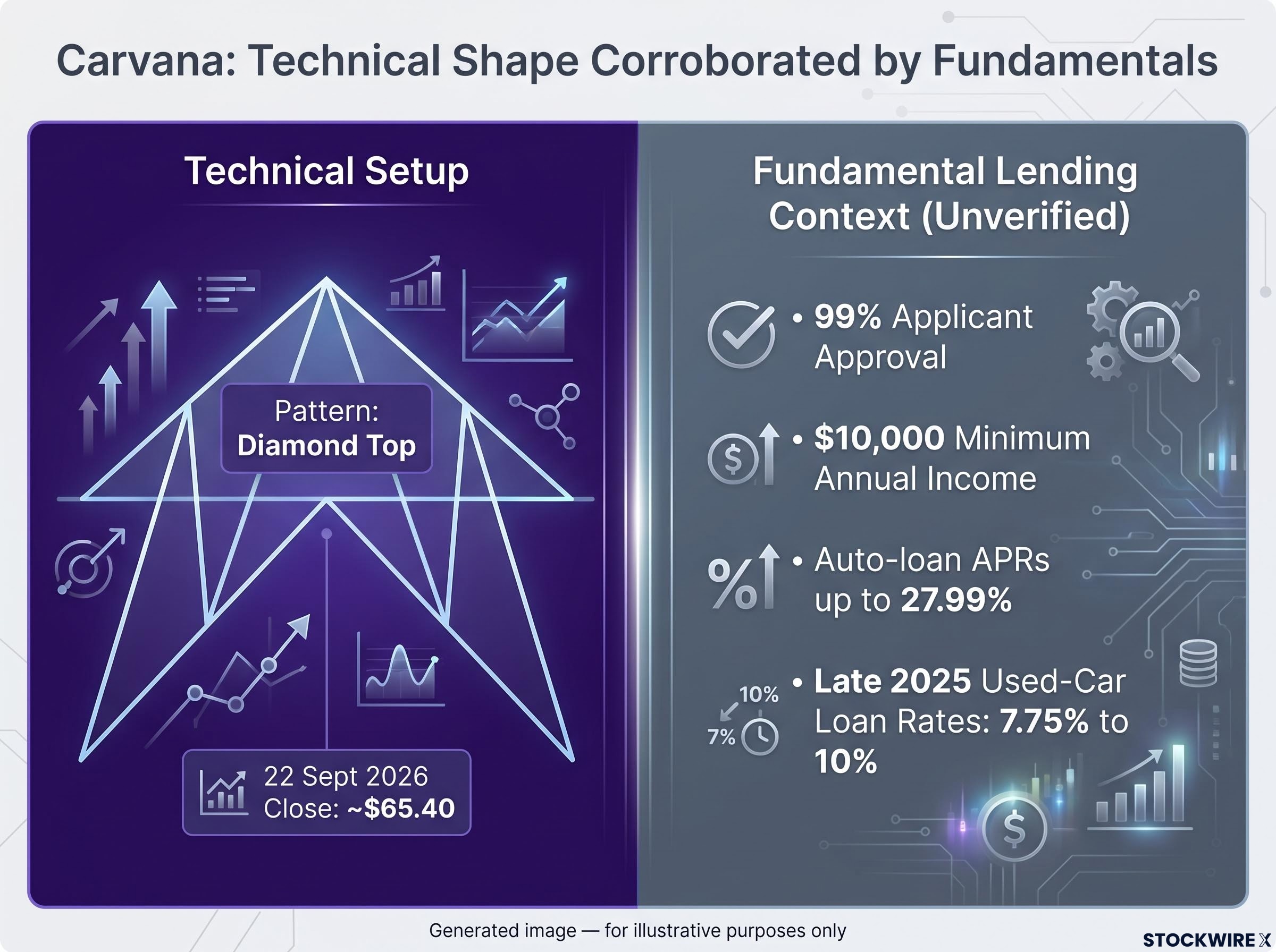
Carvana closed near $65.40 on 22 September 2026, and the trader is willing to hold through noise until the following spring.
That patience has already been tested. After breaking down, the stock pushed back into the upper portion of the diamond, described as frustrating but not pattern-invalidating.
Which is exactly why the position is structured as a hybrid: short equity plus long March put options. That tells you something precise. Even a high-conviction technical setup can move violently against you before it resolves, and position structure is how experienced traders survive the wait.
Equity short versus put options: why structure matters
The two legs solve different problems. A short equity position gives full directional exposure but carries unlimited mark-to-market loss risk if the stock squeezes higher.
Long put options do the opposite. They cap your risk at the premium paid, but they bleed value over time through theta, the daily erosion in an option’s price as expiry approaches.
The hybrid uses each to cover the other’s weakness: the equity short for directional participation, the puts as a hedge against a sharp, sentiment-driven rally before the thesis has time to play out.
Managing risk when the pattern is right but the timing is not
Here the register shifts. The confidence that built these theses gives way to a harder truth: even these traders are working with probabilities under real timing pressure, not executing known outcomes.
The primary risk in a technical short is timing, not direction. A correct topping call can still inflict severe losses if the stock grinds higher for longer than your position can absorb.
Kathryn Staley’s The Art of Short Selling and institutional risk literature consistently point to timing uncertainty, not the directional call, as the main risk in technical short positions.
Both live examples show it. Carvana pushed straight back into its diamond after breaking down. The healthcare group jumped 5% to 11% in a single session on the April 2026 CMS decision, the kind of policy-driven short-covering that can be rapid and brutal.
For high-story names with crowded short interest, that squeeze risk is amplified. Positive catalysts can trigger forced buying that turns a clean-looking top into a parabolic rally before fundamentals ever get a chance to reassert. The theta decay on any options overlay only sharpens the pressure, punishing you the longer a slow breakdown takes.
Short selling costs extend well beyond the obvious directional risk: daily borrow fees on heavily shorted names can exceed 15% annualised, mandatory margin requirements tie up capital, and a 2025 CFA Institute study found retail short sellers lost an average of 18% annually even when their directional thesis proved correct.
The practitioner response is a defined framework:
- Position sizing: keep each short small enough that a squeeze cannot force you out at the worst moment.
- Diversification across correlated names: the simultaneous UNH, HUM, and CNC shorts spread exposure so one stock’s earnings or policy surprise cannot break the whole book.
- Defined exit criteria: decide in advance how wrong you can be before you close.
- Willingness to hold within the pattern’s noise: accept that price will wander inside the expected range, as the Carvana spring timeline shows.
The lesson for anyone eyeing a bearish setup is blunt. The difference between a professional and an amateur is not the ability to spot the pattern. It is having a pre-defined answer to two questions: how wrong can I be before I exit, and how long am I prepared to wait?
What these setups reveal about how technical short-selling actually works
Step back and the four names tell one story. Technical patterns are proxies for shifts in supply and demand, and none of these setups is convincing because the shape is clean.
They are convincing because each shape is corroborated. Healthcare had a sector-wide topping structure and a post-earnings gap-and-fade revealing institutional exit. Carvana had a historical diamond precedent in the same stock plus a deteriorating auto-lending backdrop. In every case, a second and third signal pointed the same way as the first.
Stacking confirmation signals from genuinely independent analytical families raises the estimated probability of a trade moving in the anticipated direction from roughly 60% with one factor to approximately 85% with three, which is precisely why each setup described here requires a pattern, a sector context reading, and a participant behaviour signal before conviction is established.
That is the framework to carry into your own charts. The value is not in memorising pattern names. It is in asking what participant behaviour a pattern encodes and whether anything else confirms it.
Stay honest about the failure modes. The diamond top’s 38% to 81% accuracy range is a permanent reminder that even a high-conviction pattern carries real risk of being wrong, which is why the traders here run structured positions and defined timelines rather than betting on certainties.
The takeaway answers the question you arrived with. Bearish chart patterns are most actionable when the shape, the sector context, and the participant behaviour all point in the same direction. They are least reliable when someone trades the shape alone.
This article is for informational purposes only and should not be considered financial advice. Investors should conduct their own research and consult with financial professionals before making investment decisions. Past performance does not guarantee future results, and the setups described here are speculative and subject to change based on market developments.