
Most traders study chart patterns to buy the bottom. Far fewer learn to read the same shapes for the moment demand quietly collapses and a stock is set up to fall.
That gap matters right now. As of mid-2026, active short interest across US equities has climbed to roughly $2.50 trillion, one of the highest readings since tracking began in 2010, and professional short sellers are acting on distribution patterns across technology, healthcare, and retail.
The problem is that most people short blindly. They see a shape that looks bearish, place a trade, and get run over by a false breakout or an overriding bull market.
This guide fixes that. You will learn to read the supply and demand mechanics behind short selling chart patterns, understand the hard statistics on how often they actually work, see how a professional applies them across a live 2026 portfolio, and build a defensive framework that assumes your pattern will fail before it pays.
The anatomy of institutional distribution
Before you short anything, look at what a topping pattern actually is. On a chart, a head-and-shoulders top, a diamond top, or a descending triangle looks like a set of lines and peaks. Underneath, each one is a record of a fight between buyers and sellers, and the shape tells you who is losing.
Decoding the head-and-shoulders top
The head-and-shoulders top marks a systematic handover from a rising market to a falling one. A head-and-shoulders pattern is a formation with three peaks, where the middle peak (the head) is higher than the two on either side (the shoulders).
The left shoulder and the head are built on strong buyer conviction, with each surge finding fresh demand. The right shoulder tells a different story: it forms a lower high, which shows buyers can no longer push price back to the previous peak.
The trigger is the neckline. A neckline is the support level connecting the lows between the peaks, and a decisive close below it confirms that selling pressure has overwhelmed buying. That break traps everyone still holding long and fires their stop-loss orders, which accelerates the drop.
The diamond top contraction
Diamond tops form at the peak of an extended uptrend and unfold in two phases. First comes a broadening phase, a stretch of higher highs and lower lows where buyers and sellers clash with rising volatility and neither side wins.
Then the range contracts into lower highs and higher lows. This narrowing is exhaustion: demand is drying up while supply quietly accumulates, and the market drifts into indecision before a downside break resolves it.
A descending triangle works on the same logic in a simpler shape. It combines a flat support floor with a series of lower highs, and each lower high shows sellers pressing down while buyers defend the same price repeatedly until supply finally breaks the floor.
You need to stop reading these formations as lines on a screen and start reading them as a real-time record of institutional buyers running out of cash and conviction. That shift is what stops you shorting blindly and keeps you patient until the psychology has clearly turned in your favour.
For readers new to price and volume analysis who want to build the foundational layer before applying bearish patterns, our full explainer on reading stock charts covers candlestick formats, multi-year timeframe selection, and how volume confirms whether a price move had real participation behind it.
When big ASX news breaks, our subscribers know first
The statistical edge behind bearish formations
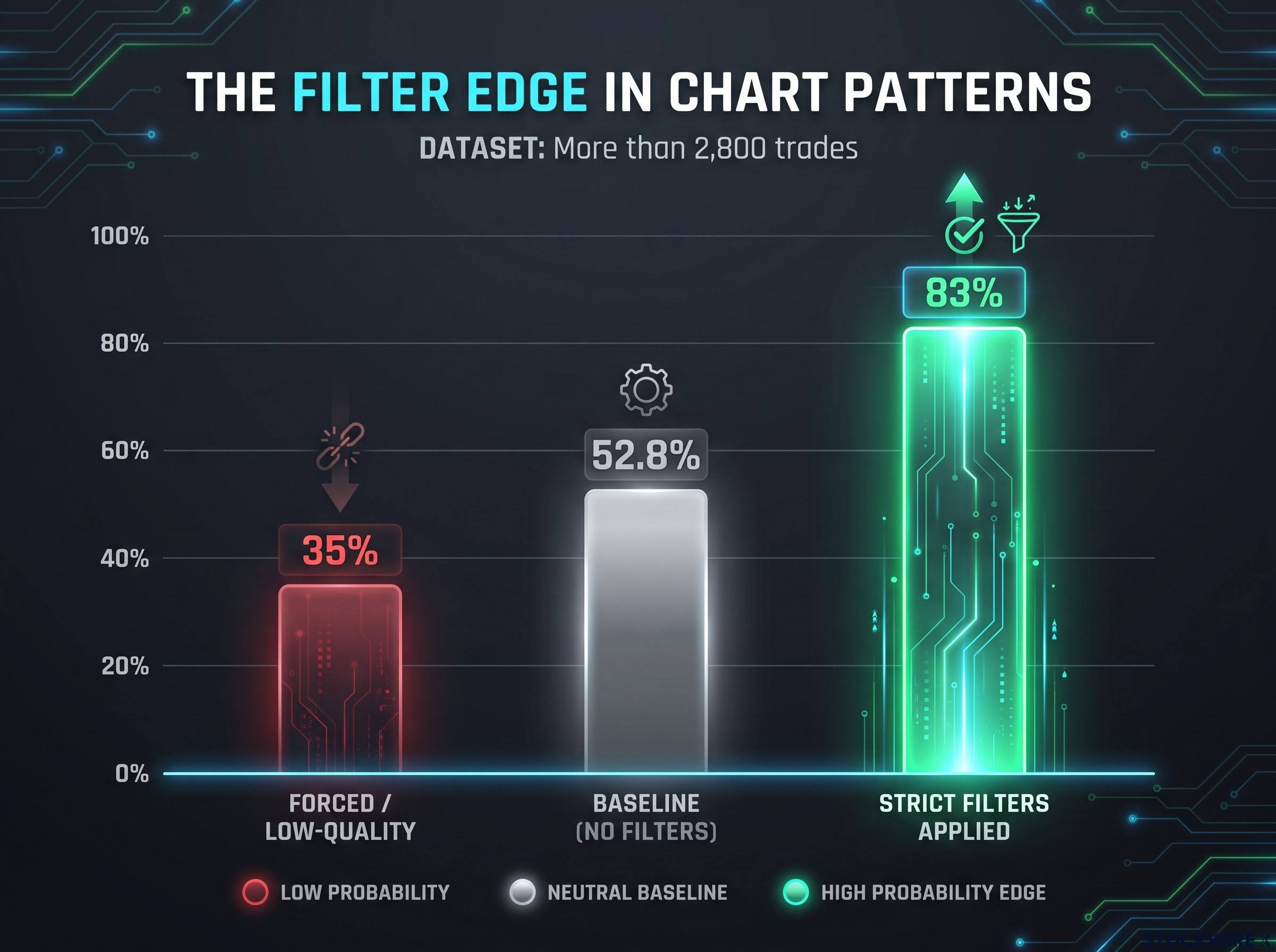
Here is the part most pattern-trading content skips: these setups are not crystal balls. According to Thomas Bulkowski’s extensive US equity datasets, drawn from more than 2,800 trades, chart patterns carry a baseline median win rate of just 52.8% with no additional filters. That is barely better than a coin flip.
The edge does not live in the shape. It lives in the filter.
Studies show that patterns meeting strict trend and volume criteria reach their target completion rates 83% of the time, compared with only 35% for forced or low-quality patterns. That gap between 83 and 35 is your entire strategy.
Combining technical indicators from independent analytical families, trend, volume, momentum, and price structure, is what pushes a bearish pattern’s completion probability from a coin-flip baseline toward the 83% threshold the strict-filter studies document.
Take the head-and-shoulders top. Under bull-market conditions, 81% of confirmed neckline breaks continue at least 5% in the expected direction. The average post-breakout decline sits around 16-17% overall, but the break-even failure rate, where price fails to move at least 5% lower, is 19%. Roughly one in five confirmed breaks still lets you down.
Descending triangles are even less certain. They resolve downward only about 47% of the time, which means more than half break the other way, though the average move when they do break down is roughly 15%.
| Pattern type | Filtered completion rate | Average expected decline | Break-even failure rate |
|---|---|---|---|
| Head-and-shoulders top | 81% continue at least 5% (bull conditions) | 16-17% | 19% |
| Descending triangle | 47% resolve downward | 15% | 23% |
| Diamond top | Strict-filter dependent | 6-8% over 1-3 months | Qualitative |
Your edge does not come from finding a perfect shape. It comes from only deploying capital when volume and trend criteria line up to push your probability past 80%.
Anchoring your strategy in these numbers keeps you honest. It stops you over-leveraging on a mediocre setup, and it keeps your expectations grounded when you open a short.
Trading the setups: inside an active 2026 short portfolio
Statistics are one thing. Watching them deployed with real money is another. One analyst is currently running a portfolio of roughly 30 active short positions, most opened around two weeks ago, with stop-losses tightened daily as prices move favourably.
The US market’s active short interest has climbed to approximately $2.50 trillion in 2026, spread across technology, healthcare, and retail, one of the largest bearish positioning readings on record since tracking began in 2010.
The head-and-shoulders trades in the book show the pattern in different stages:
- Hilton Hotels: a clean neckline break, with the short targeting a measured-move objective near $270.
- Johnson & Johnson (JNJ): a major top near $163 that broke its neckline in November 2024 for a completed downside move.
- iShares Russell 2000 ETF (IWM): a neckline violation on surging volume in late 2025.
The semiconductor and technology corner shows how these theses evolve rather than stay static:
- SMH Semiconductor ETF: originally shorted on a diamond top, though recent higher lows weakened conviction. The analyst re-entered a direct short plus a January put position, placing a stop-loss at $592, just above a relevant price gap.
- KORU leveraged ETF: described as the cleanest bearish setup left in the tech and semiconductor sphere, with a stop-loss near $26 tied to a nearby gap.
- GameStop: shorted on a right-triangle pattern.
Consumer names round out the sector-agnostic approach:
- Cracker Barrel: a step-down pattern of progressively lower bounces.
- Shake Shack (SHAK): a large distribution top resolving to the downside.
Notice a common thread. Nearly every stop-loss sits just above a structural level, a price gap, or a previous lower high, not at an arbitrary percentage. When Shopify broke down after a rally from roughly $95 to $160, the analyst moved the stop to the prior session’s low rather than guessing at a round number.
Price gap analysis is the structural anchor for stop placement in the live portfolio, with nearly every position in the book sitting its stop just above a nearby gap rather than at an arbitrary percentage distance from entry.
By studying how this professional tightens stops and respects price gaps on live positions, you learn how to protect your own capital, whether a thesis is playing out or starting to unravel. The pattern gets you in. The stop placement decides how much a mistake costs you.
Failure modes and defensive risk management
You should finish this section slightly paranoid, because pattern failure is not rare. It is the base case you plan around.
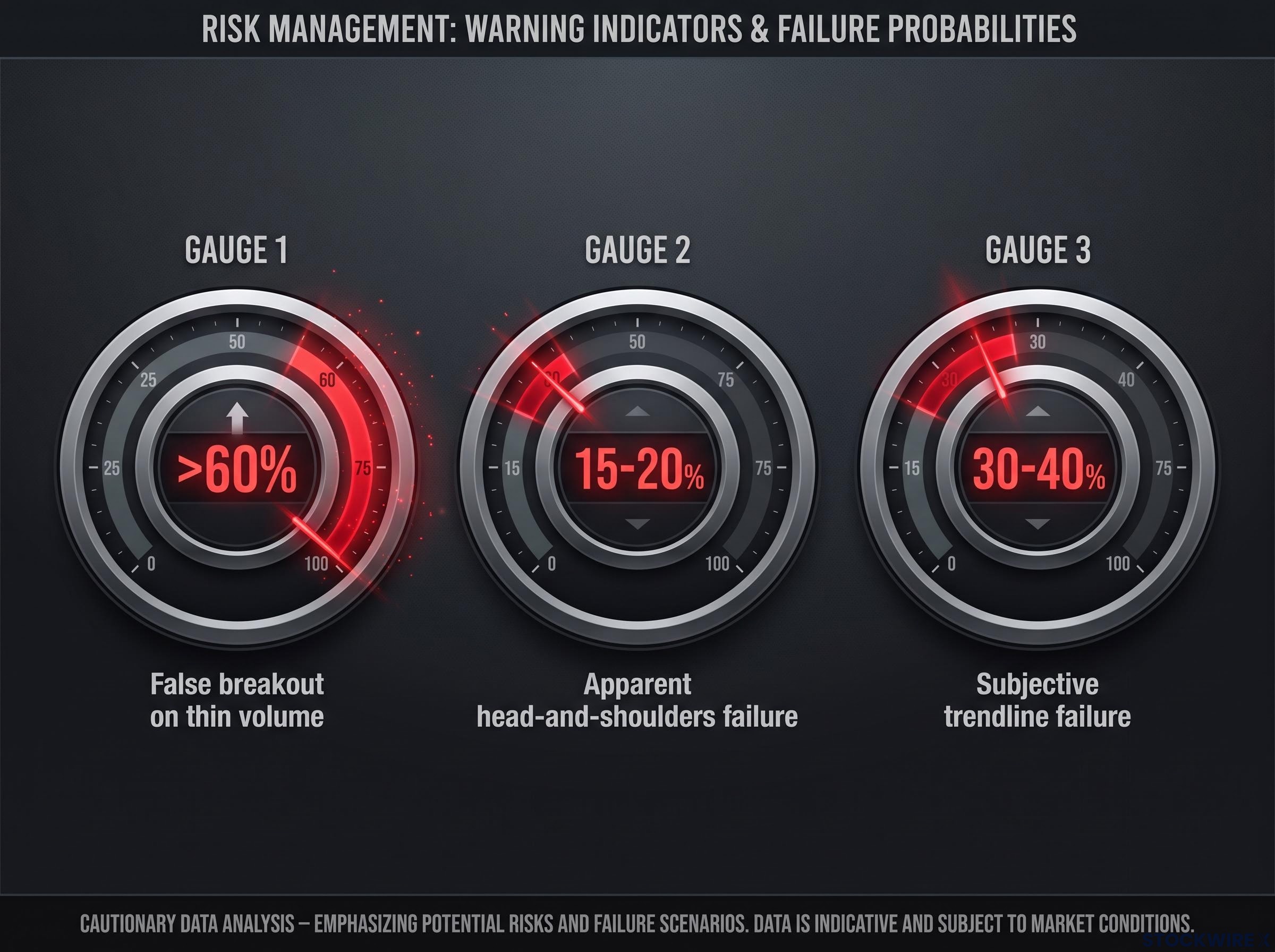
The biggest threat is the false breakout, also called a bull trap. When a neckline breaks on thin volume without confirmation, the probability of a fakeout exceeds 60%, and 15-20% of apparent head-and-shoulders formations fail entirely after briefly piercing the neckline.
Short squeeze mechanics are the most dangerous overriding force a bearish chart setup can encounter: when short interest climbs above roughly 20% of float and days-to-cover exceed 7-10, forced buying from margin calls can overwhelm any pattern signal and push price sharply against the position.
The volume trap
The mechanics matter. A neckline break needs expanding volume to be credible, because a downside move on light volume often means the sellers pushing price down lack the size to keep it there. Buyers step back in, price snaps above the neckline, and your stop gets hit on the reversal.
There are two more failure sources worth respecting. Subjective trendline drawing on patterns like descending triangles produces base failure rates of 30-40% when traders act on loosely defined shapes without confluence. And overriding market trends can wreck a technically perfect setup: the analyst dropped AMD from the short watchlist after it became too technically strong, and a textbook Bitcoin top in early 2024 failed outright because traders ignored macro drivers such as ETF approvals.
Here is a defensive framework built on the assumption that the trade will fail:
- Wait for confirmation. Require a confirmed daily or weekly close below the neckline or support, on expanding volume, before you enter. No intraday guesswork.
- Anchor your stop to structure. Place it just above the nearest lower high or price gap, so a genuine reversal, not normal noise, is what stops you out.
- Resolve the exit debate. Decide in advance whether you are taking the measured-move target as a minimum objective or trailing a stop to capture extended downside. Many professionals do both, banking partial profit at the target and trailing the rest.
Build your risk management around the assumption that your pattern will fail. Done right, a sudden reversal costs you a fraction of what a true breakdown earns, and that asymmetry is the whole game.
This article is for informational purposes only and should not be considered financial advice. Investors should conduct their own research and consult with financial professionals before making investment decisions. Past performance does not guarantee future results, and short selling carries the risk of unlimited losses.
Mastering distribution signals for portfolio protection
Pull the three pieces together and the strategy becomes clear. The shape tells you demand is exhausting, the statistics tell you the odds only tilt your way when strict volume and trend filters push completion rates toward that 83% threshold, and the risk framework tells you how to survive the times you are wrong.
Identifying a pattern is only step one. Survival depends on execution: confirmed closes before entry, stops anchored to structure just as the 30-position active portfolio trails them daily, and a pre-planned exit.
Treat these bearish setups for what they are, tools for capital preservation and tactical profit when markets rotate or decline. Equipped with these structural blueprints and clear risk parameters, you can approach today’s elevated valuations not with anxiety but with a calculated plan to profit from the rotations that inevitably come.