How to Know Whether to Hold Cash or Stay Invested
19 mins ago

Most investors carry a simple assumption into every Federal Reserve tightening cycle: rising rates are bad for stocks. The historical data, across multiple decades and numerous hiking campaigns, says that assumption is mostly wrong.
That does not mean rate hikes are painless. The short-term discomfort is real, statistically documented, and sometimes sharp enough to test your conviction. But the longer-term record tells a story that is more nuanced than the headlines suggest. The 2022 cycle is a large part of why this question feels so urgent today; it left a scar that colours how many investors think about the next tightening episode.
Here is a framework for reading the historical record accurately, understanding the mechanism behind the pattern, and calibrating your own positioning the next time the Fed begins raising rates, rather than reacting to the first red day on instinct.
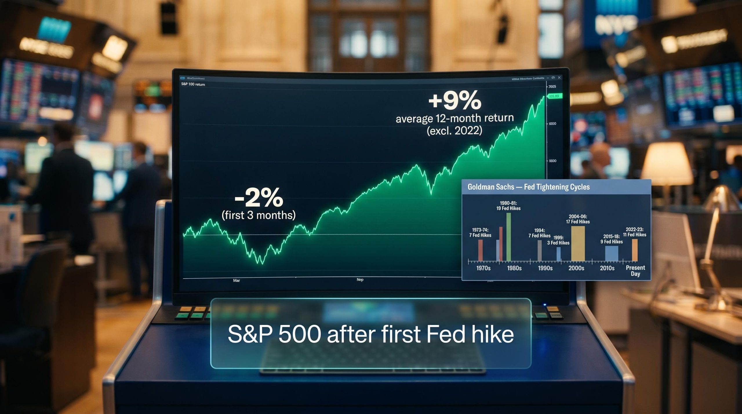
The near-term weakness is not a myth. Goldman Sachs data shows the S&P 500 has typically shed around 2% in the three months after the first rate hike of a new tightening cycle. That early drawdown is consistent enough across cycles to treat it as a baseline expectation, not a surprise.
What happens next is where the assumption breaks down.
When measured across the full 12 months from the start of a tightening cycle, Goldman Sachs data shows the S&P 500 has typically returned around 9% on average, with the 2022 episode excluded from that figure. Across multiple cycles stretching back to the 1970s and 1980s, positive 6-12 month returns have been the norm rather than the exception.
The roughly 9% average 12-month gain after the first hike, per Goldman Sachs (excluding 2022), is the single most important number to hold in your head when early-cycle volatility arrives.
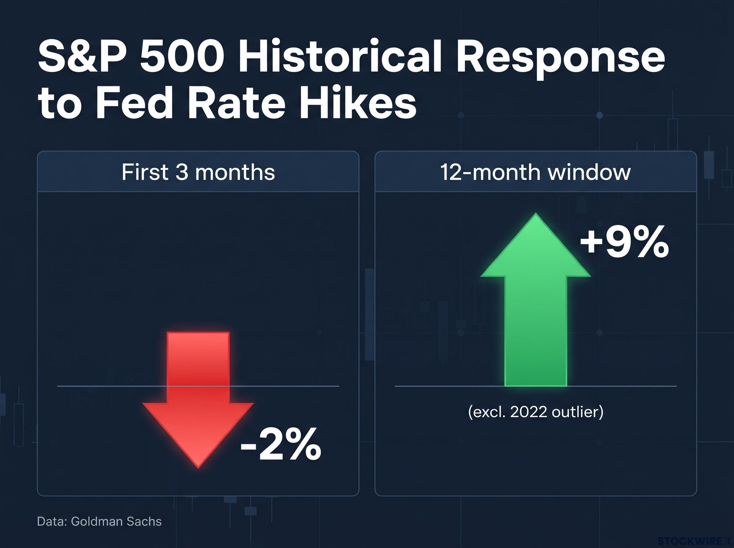
The practical implication is straightforward. The 2% near-term dip is real but small relative to the average recovery that follows. If you react to early volatility by reducing equity exposure, the historical record says you have typically made a costly timing error, selling into the discomfort and missing the recovery that followed.
| Time Window | Average S&P 500 Return | Key Caveat |
|---|---|---|
| First 3 months | Approximately -2% | Consistent across most cycles since the 1970s |
| 12-month window | Approximately +9% (excl. 2022) | Positive returns have been the norm, not the exception |
| 12-month window (incl. 2022) | Lower than +9% | 2022 drags the average; identified by Goldman Sachs as an outlier |
If the average is so favourable, why does the question feel so loaded? Because 2022 did not follow the script, and it is the most recent data point in your memory.
Goldman Sachs explicitly identified the 2022 tightening cycle as an exception to the generally positive longer-term pattern. But calling it an exception is only useful if you understand what made it one.
The 2022 cycle was not a standard rate-hiking campaign. It was emergency-style tightening into a supply-shock inflation spike, and virtually every condition that normally makes a hiking cycle manageable was absent simultaneously:
A gradual, well-telegraphed hiking campaign in a stable inflation environment is a fundamentally different animal. When the Fed raises rates because the economy is strong enough to absorb it, and does so at a pace markets can digest, the conditions that produced the 2022 outcome simply are not present.
The 2022 episode tells you that the variable to monitor is not whether rates are rising but how fast, from what starting point, and against what inflation and valuation backdrop. Those conditions determine whether a given cycle tracks the historical average or departs from it.
Understanding the two-phase pattern (early dip, then recovery) is more useful when you understand why it exists. The mechanism runs through two channels: valuation repricing and real economy transmission.
When the Fed raises rates, the most immediate impact hits through a concept called the discount rate. Discounted cash flow (DCF) models, which are the standard method for valuing a company based on its expected future profits, use a rate to translate future earnings into their present-day value. When that rate rises, the present value of future earnings falls, even if the earnings themselves have not changed.
Discounted cash flow models translate expected future earnings into a present-day value using a discount rate, and the terminal value assumption alone typically drives 60-80% of a model’s total implied intrinsic value, making it the most sensitive variable when the Fed begins moving rates.
This hits long-duration growth stocks hardest, because more of their value sits in earnings expected years from now.
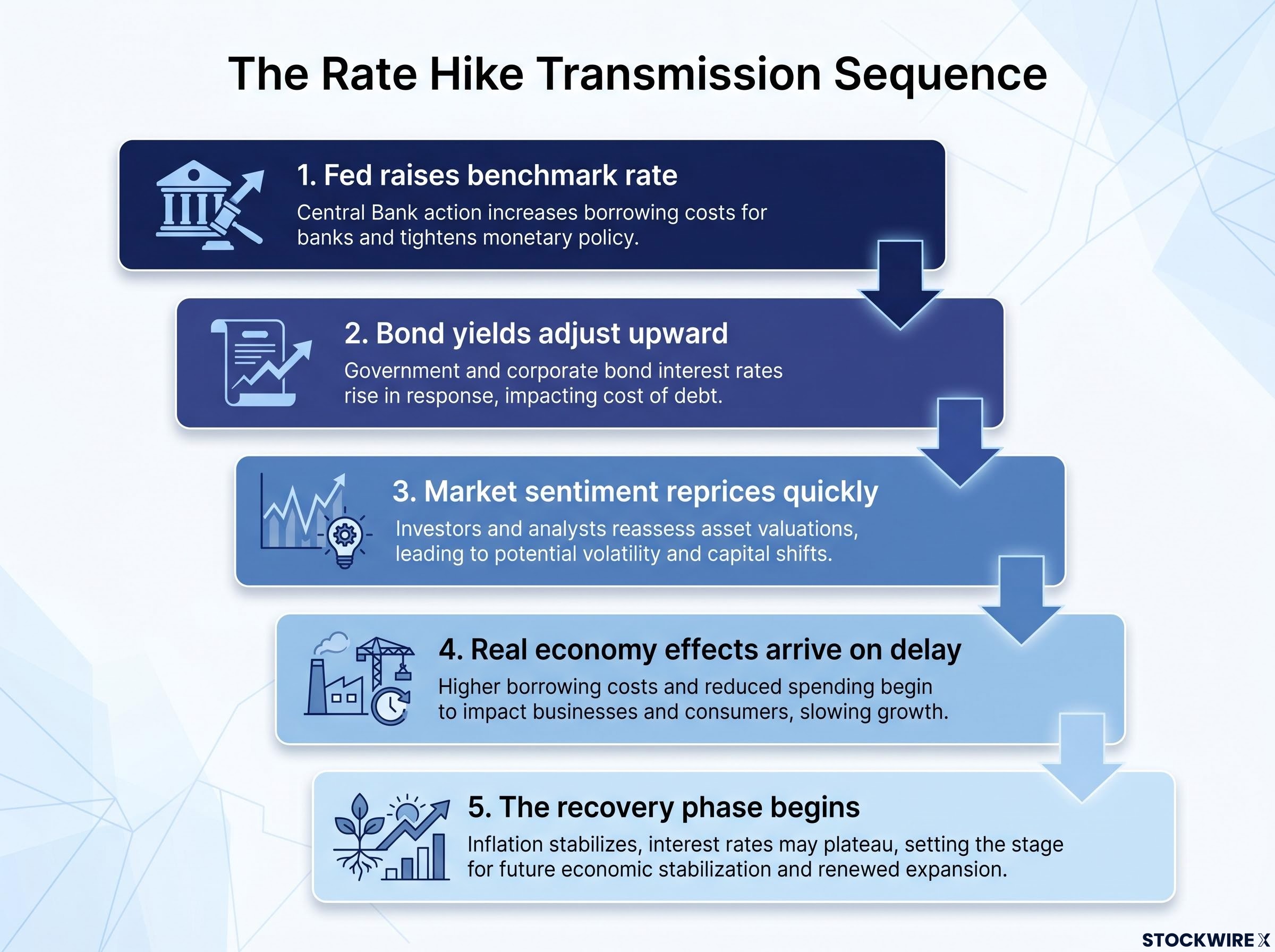
The transmission sequence works like this:
Long and variable lags in monetary policy transmission mean that rate increases often take well over a year to fully reach the real economy, which helps explain why the short-term equity selloff and the eventual corporate earnings impact rarely arrive at the same time.
Goldman Sachs research pointed to companies carrying high proportions of floating-rate debt and those with weaker overall balance sheet quality as the businesses most exposed when interest rate expectations shift during a tightening cycle.
Once you see this mechanism, the early dip becomes predictable and the recovery makes sense. The market initially overshoots the valuation adjustment on sentiment. Then it corrects as actual earnings data arrives and either validates the initial panic or, more commonly, reveals that the economy and corporate profits are absorbing the hikes better than the first reaction implied.
The distinction that matters for your portfolio: a valuation-driven selloff, where prices fall because the discount rate changed rather than because the business deteriorated, often recovers. A fundamentals-driven deterioration, where earnings are genuinely falling because the real economy is contracting, may not. Knowing which one you are looking at in real time is the difference between holding through normal volatility and holding through genuine damage.
Sector performance during hiking cycles rarely follows the intuitive narrative. Goldman Sachs identified divergent historical patterns that challenge some of the most common assumptions investors carry into tightening environments.
| Sector / Factor | Historical Tendency During Early Tightening | Key Driver | Key Risk |
|---|---|---|---|
| Technology | Relative strength | Earnings momentum offsets valuation pressure when growth is strong | Speculative, long-duration names vulnerable if hikes are fast |
| Financials | Historical underperformance | Yield curve flattening and loan demand concerns offset net interest margin benefit | Credit quality deterioration if hikes slow the economy sharply |
| Value / Quality factors | More stable performance | Strong balance sheets and cash flow absorb higher funding costs | Less upside capture if the cycle remains benign and risk appetite holds |
According to Goldman Sachs, the technology sector has historically demonstrated relative strength during the initial phase of Fed rate-hiking cycles. When hikes begin against a backdrop of strong economic growth, cash-generative technology and growth names have often continued to perform well because revenue and earnings momentum offsets some of the valuation pressure. The important caveat: this applies to profitable, cash-generating technology businesses, not highly speculative long-duration names, which are more vulnerable when hikes are fast and starting valuations stretched.
Value and quality factor exposures have also provided steadier performance during tightening cycles. Companies with strong balance sheets, lower leverage, and consistent cash flow navigate rising funding costs better than more stretched peers, regardless of what sector label they carry.
The financials finding is the one that challenges intuition most directly. Goldman Sachs analysis showed that financial sector stocks have historically underperformed during early tightening periods, despite the theoretical benefit from wider net interest margins (the gap between what a bank earns on loans and what it pays on deposits). When the yield curve is flattening, loan demand is softening, and credit quality concerns are rising, those headwinds offset the margin tailwind.
The financials story should recalibrate how you think about “rate beneficiaries.” Higher rates do not automatically translate to higher bank profits when the conditions that accompany the rate increases are simultaneously compressing loan growth and raising credit risk.
Across all sectors, firms with large floating-rate debt loads and thin interest coverage see interest expense rise immediately, creating earnings headwinds as hikes accumulate. This amplifies dispersion within sectors: your choice of individual company matters as much as your sector allocation.
The historical data is only useful if you can apply it in real time. Here is the framework that pulls together the key findings into something you can use at the start of any future hiking cycle.
The first step is holding the two-phase mental model. Expect near-term volatility and sector rotation as typical responses to the initial hike, not as signals to exit equities entirely. The approximately 2% average first-quarter dip and approximately 9% average 12-month gain are your baseline, the starting probability you carry into any cycle.
The second step is assessing whether the current cycle is likely to track that baseline or depart from it. Four variables determine the answer:
The inflation regime entering a tightening cycle is the variable with the longest tail risk: a 1.3 percentage-point gap between headline and core CPI in May 2026 confirmed that the current energy-driven uptick shares the supply-shock character of 2022, rather than the demand-overheating pattern that typically precedes gradual, well-telegraphed Fed campaigns.
Goldman Sachs research emphasised that quality and balance sheet screens become particularly important in rising-rate environments, where funding cost increases create dispersion between strong and weak balance sheets.
The most actionable takeaway from this framework is a shift in the question you ask. Rather than “should I reduce equities,” the right question at the start of any hiking cycle is: “what conditions in this specific cycle differ from the historical average, and do those differences justify a different positioning?”
The historical pattern, a modest early dip followed by a positive 12-month average return, is not a single-study finding. It is a base rate documented across multiple decades of Fed tightening cycles stretching back to the 1970s and 1980s, with the Goldman Sachs data providing specific quantification of the approximately 2% early dip and approximately 9% subsequent gain.
That base rate is durable, but it is not a guarantee. Historical averages mask dispersion: some cycles delivered returns well above 9%, and 2022 demonstrated that tail outcomes exist when the conditions are sufficiently extreme. Every cycle has idiosyncratic features, whether in the inflation backdrop, the geopolitical environment, the starting valuations, or the Fed’s own communication and pacing.
The value of this historical record is not that it predicts the next cycle’s return. It is that it establishes a prior probability, a starting point that shifts the burden of proof. Anyone arguing for a dramatic departure from the historical baseline should be able to point to specific conditions, like those present in 2022, that justify the departure. Without those conditions, the historical record says the odds favour staying invested through the early volatility rather than reacting to it.
Use it as a calibration tool, not a prediction engine. Hold the base rate, but update your prior as the specific conditions of the current cycle become clearer.
For investors wanting to see how the four variables in this framework apply to the current policy environment, our full explainer on the 2026 Fed outlook shift traces how markets moved from pricing 50-75 basis points of cuts to a 65-70% probability of a hike in just ten weeks.
This article is for informational purposes only and should not be considered financial advice. Investors should conduct their own research and consult with financial professionals before making investment decisions. Past performance does not guarantee future results. Financial projections are subject to market conditions and various risk factors.
Goldman Sachs data shows the S&P 500 has typically returned around 9% in the 12 months following the first rate hike of a tightening cycle, excluding the 2022 outlier, while the initial three-month period tends to produce a modest dip of approximately 2%.
The 2022 cycle combined the fastest tightening in decades, multi-decade high inflation driven by supply-chain disruption, elevated starting valuations, and simultaneous commodity and geopolitical shocks, conditions that were absent in more typical hiking cycles and that Goldman Sachs identified as the reason 2022 was an outlier.
Goldman Sachs found that technology stocks with strong earnings momentum have historically shown relative strength in early tightening cycles, while value and quality factor exposures, companies with strong balance sheets and consistent cash flow, have also held up better than more leveraged peers.
Despite the theoretical benefit of wider net interest margins, Goldman Sachs analysis found that financials have historically underperformed early in tightening cycles because yield curve flattening, softer loan demand, and rising credit quality concerns offset the margin tailwind.
The four key variables are the speed of hikes, starting equity valuations, the inflation regime entering the cycle, and the balance sheet quality of holdings, specifically leverage, interest coverage, and the mix of fixed versus floating-rate debt.