
A green index does not always mean a healthy market. In the late September 2025 session used here as a teaching case, the semiconductor ETF SMH climbed 2.23% while the Russell index lagged and non-tech stocks trailed behind. Reading market divergence like this is a skill, and it starts with asking what the headline number is actually measuring.
The reason it matters is concentration. According to RBC Wealth Management, the top 10 S&P 500 stocks hold roughly 37-40% of the index’s weight through 2026, so index moves can say more about a few names than about the market.
That session is now more than a year old as of October 2026. It is not news; it is a worked example you can reuse.
Here is a repeatable checklist for telling a broad rally from a narrow one, built on indices and ETFs you can check yourself for free.
Why can a tech-led rally hide weakness in the rest of the market?
Imagine an index rising every day while the typical stock in your portfolio goes nowhere. That is not a paradox. It is what happens when a handful of companies carry the arithmetic.
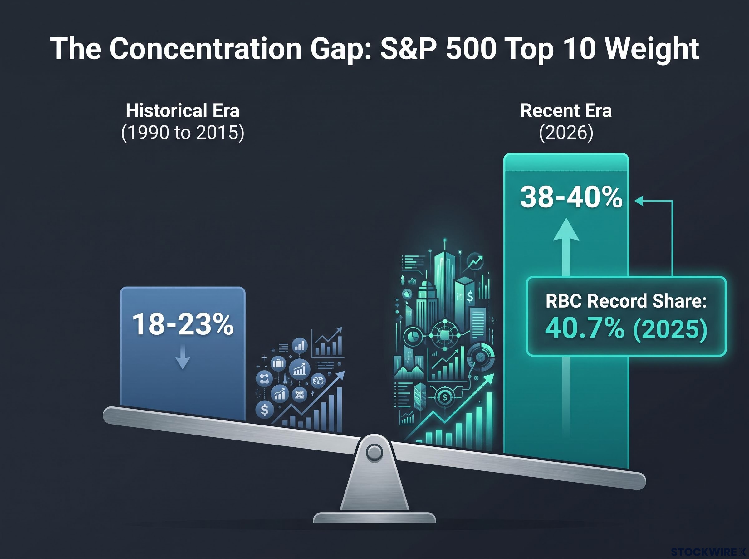
The numbers show how unusual the setup has become. From 1990 to 2015, the top 10 stocks hovered between 18% and 23% of the S&P 500. RBC cited a record 40.7% for 2025, and 2026 readings cluster around 38-40% (37.5% in June, 38.69% in late September).
The concentration gap Historic top-10 weight: roughly 18-23% (1990 to 2015). Recent readings: roughly 38-40% (2026).
Apollo Academy has documented the “extreme weight of AI” in the index, with Nvidia, Microsoft, Apple, Amazon, Alphabet, Meta and Broadcom all in the top 10. It links this to earlier single-theme episodes such as the dot-com era, housing and commodities.
Cap-weight versus equal-weight in plain terms
The S&P 500 is capitalisation-weighted (cap-weighted), meaning each company’s influence is proportional to its market value. An equal-weight index gives each constituent about 0.2% (1/500) at each rebalance, according to Franklin Templeton.
Here is the contrast. If a stock with a 7% weight rises 3%, it adds about 0.21 percentage points to a cap-weighted index. A typical stock at 0.2% would need to rise more than 100% to add the same amount.
The choice between cap-weighted and equal-weighted ETFs shapes how much of your exposure rides on a few giants, and the two can diverge sharply for years at a time.
Sources also disagree on the top-10 figure, and you should check both the methodology and the as-of date before trusting any single number.
| Source | As-of date | Top-10 weight | Definition note | Why it differs |
|---|---|---|---|---|
| Nasdaq / Slickcharts | 5 February 2025 | 36% | Top 10 by index weight | Earlier date, provider method |
| AInvest | 31 July 2025 | 30.7% | Mag 7 alone contributed 23% | Different grouping and method |
| Mitrade | 16 September 2025 | 39.1% | Group of 10 growth stocks | Growth-stock selection |
| RBC Wealth Management | 2025 | 40.7% | Record share | Full-year framing |
Tech weight varies the same way, from the mid-30s for pure GICS information technology to about 47% for broader tech-related definitions that pull in selected communication-services and consumer-discretionary names.
When the top 10 hold close to 40% of the index, a rising S&P 500 tells you about a few companies, not necessarily about the stocks you own. RBC makes the point directly: concentration makes index performance highly sensitive to a few stocks and weakens diversification.
When big ASX news breaks, our subscribers know first
How do you spot a divergence in the data?
Start with the session itself. Tech carried the day: SMH rose 2.23%, the telecom ETF XTL gained 2.12%, and Tesla jumped about 5%. Amazon and Tesla lifted consumer discretionary.
Meanwhile, an S&P 500 ex-tech ETF (SPXT) showed a clear gap between tech and everything else. The Russell index was comparatively weak, and non-tech equities lagged.
That is a divergence: two measures that should move together, pulling apart. Each comparison tells you something different.
- Index versus ex-tech. If the S&P 500 rises but SPXT stalls, tech is doing the lifting.
- Cap-weight versus equal-weight. If the equal-weight version trails, a few giants are outrunning the median stock.
- Large versus small caps. A weak Russell alongside a strong index points to narrow participation.
- Leaders versus the median. Strong semis with a flat typical stock mean one theme is driving results.
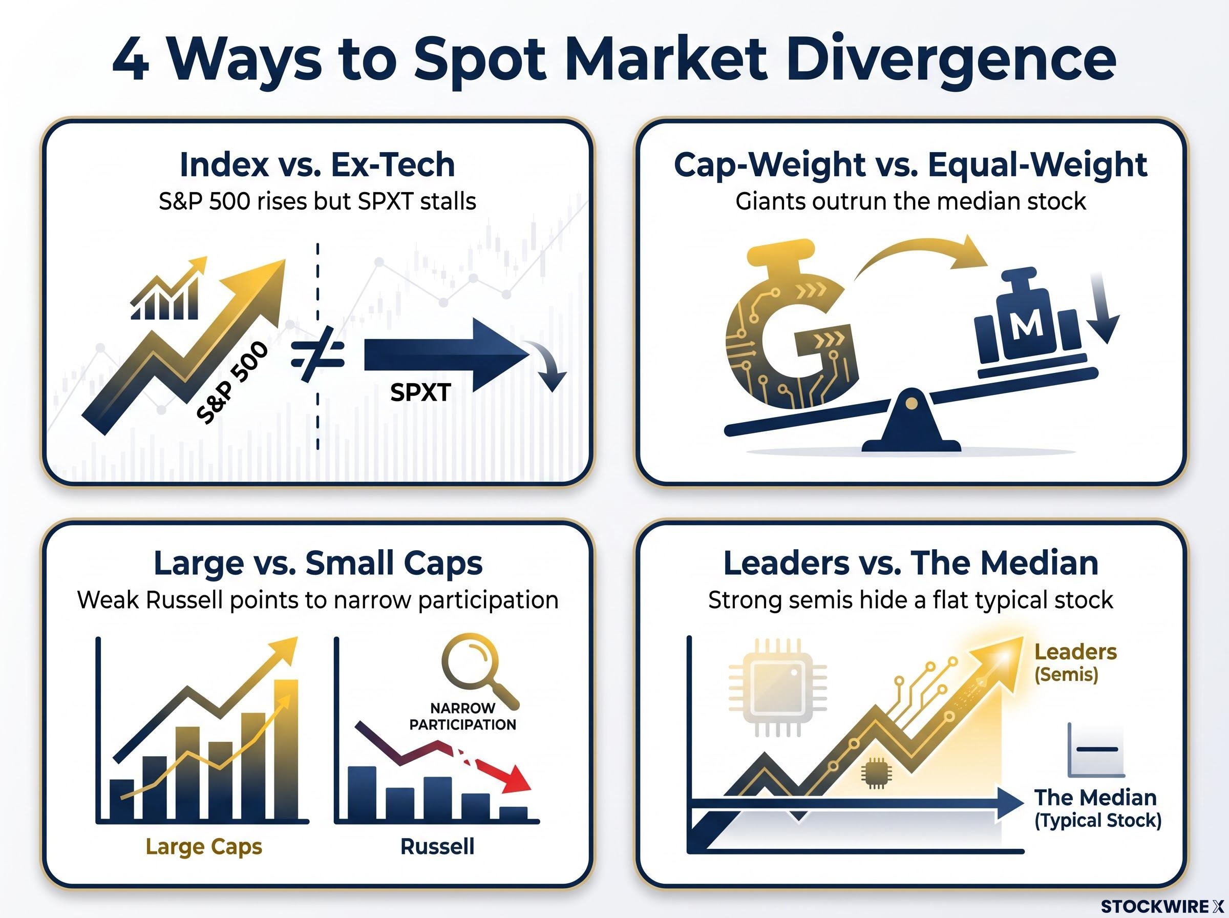
The rule: Breadth, not price alone, tests a rally.
If the index and semis rise while the ex-tech and small-cap gauges stall, you are looking at a rally that depends on one theme, and your risk is tied to that theme.
One caution on small caps. Later accounts, which are unverified, describe Russell 2000 highs alongside heavy dispersion, with the average member still well below its peak. One session’s lag is not a verdict.
What happened in 1999-2000 and what it does and does not prove
In 1999-2000, indices were dominated by a few tech and telecom names, and breadth deteriorated as they hit highs. The narrow leadership then reversed violently, leading to a multi-year tech bear market.
It proves that narrow rallies can end badly. It does not prove that every one will, since the research also points to periods where leadership broadened instead.
Concentration near 40% now exceeds the levels seen at the dot-com peak, and every prior extreme has resolved through a repricing of the premium that dominance was assumed to justify.
Does the European close really shape the intraday low?
Here is the tantalising part. On two consecutive days, the session low landed within roughly 5-10 minutes of the 11:30 ET European close (US Eastern time), after which equities rebounded.
Practitioners offer three explanations, though no systematic published study was found:
- Liquidity handoff: European dealers and managers cut risk and close index hedges around the close, which may drain US liquidity.
- Hedging flows: Global funds hedging US exposure through European futures or options may adjust at the close.
- Options rebalancing: Desks managing gamma and vega (sensitivity to price swings and to volatility) around European expiry may cause short-lived volatility.
Thin late-morning US liquidity makes such flows more visible, not necessarily more predictive. The early-2010s Eurozone crisis offers a loose parallel: weak European hours, selling into the close, then stabilisation.
Two days is an observation, not an edge.
Treat the 11:30 ET window as a time to watch for exhaustion or stabilisation, not a trigger to trade. Practitioners typically treat it as one signal among many, confirmed by breadth, futures flow and US macro releases.
What do bonds, metals, oil and the VIX curve add to the picture?
A signal gains weight when other markets agree with it. That is cross-asset confirmation, and it keeps you from trusting any single indicator.
Cross-asset confirmation
In the session, Treasuries tried to rally but failed. The 10-year note reached a high of 105-08, then fell back to about 104-11.5, and ZB (the long bond future) finished down 11 ticks. Bonds also failed to close above their one-week average for the first time since 23 September.
| Asset | Risk-off confirmation | Observed session reading | What it implied |
|---|---|---|---|
| Treasuries | Rallying duration, falling yields | Gains faded; ZB down 11 ticks | No flight to safety |
| Gold and silver | Strength alongside weak equities | Slightly lower; silver disappointing | Equity-specific, not broad stress |
| Oil | Weakness from growth worries | Down nearly 3% early, about 1.8% later | Mixed, no clear slowdown signal |
This was not a classic risk-off pattern. A volatility signal that bonds and safe havens do not confirm deserves less weight from you than one all three assets support.
The VIX term-structure study and its limits
The VIX measures expected stock-market volatility. Its term structure compares expectations across time horizons:
- Upward slope: usually a calm, risk-on regime.
- Flat or inverted: associated with stress, where near-term worry exceeds longer-term expectations.
The program’s own study found that the VIX 3-month versus VIX spread rose 1.09 points on 17 September. That has historically been a bullish signal: there were 58 signals since January 2020, only two during drawdowns (2022 and 2023). The median one-week return was 0.87%, and the S&P 500 returned exactly 0.87% from 17 to 26 September.
The caveats are real. A sample of 58 is small, results shift by regime, and data-mining risk is high. Some strategists also read a rising 3-month reading during a grind higher as “stealth hedging,” which conflicts with the bullish interpretation.
A checklist for reading market divergence without overreading it
Work through it in order. Check concentration and the source’s as-of date. Compare cap-weight, equal-weight and small caps. Note intraday timing as context only. Then look for bond, metals and volatility confirmation.
Historically, extreme concentration has resolved in two ways: healthy broadening or a sharp reversal. No single session decides which.
Next, watch whether the equal-weight index and small caps start keeping pace with tech, and whether bonds and metals begin agreeing with the VIX curve. Be humble about small samples, including the two-day and 58-signal ones above.
For readers weighing whether concentration signals a bubble, our full explainer on AI bubble frameworks tests the Shiller CAPE ratio and Minsky’s financing stages.
The example data comes from late September 2025. This article is for informational purposes only and should not be considered financial advice. Investors should conduct their own research and consult with financial professionals before making investment decisions. Past performance does not guarantee future results. These statements are speculative and subject to change based on market developments.