Most investors watching the artificial intelligence rally are staring at the wrong screen. They track the price charts for Meta, Broadcom, and the rest of the semiconductor complex, watching support levels and moving averages while assuming the candles tell the whole story.
They do not.
Underneath those tidy price charts sits a second market, the derivatives market, where institutions position for moves before they happen. Names like Meta and Broadcom are being pushed and pulled by structural forces that never appear on a standard stock chart: dealer hedging flows, put-selling programmes, and volatility term structures that quietly telegraph where the next hurdle sits.
This is where the real tells live. When you learn to read options market signals in tech stocks, you gain a framework for spotting exhaustion points and opportunities before they show up on the tape.
Here is what the derivatives data actually reveals right now, broken into the five signals that matter: the metrics retail traders misread, the dispersion warnings, the put flow floor, the single-stock call skew, and the forward-looking catalyst pricing heading into October.
The core options metrics retail traders get wrong
Start with the metric everyone quotes and almost everyone misreads: implied volatility rank.
Implied volatility rank measures where a stock’s current implied volatility sits within its own 52-week range. A reading of 90% means the option market is pricing bigger expected moves than it has almost all year. A reading of 10% means the opposite.
Implied volatility is extracted by reverse-engineering the Black-Scholes model from live market prices, making it a real-time measure of expected move magnitude, not direction; that single distinction is the foundation of every signal this guide builds on.
Here is the misconception that costs retail traders money. A high implied volatility rank does not mean a stock is about to fall. It measures the expected size of the move, not the direction. When that number spikes ahead of a binary tech event like earnings, it is telling you the market expects a violent move, and nothing about which way.
That single misunderstanding changes how you should position ahead of any major catalyst.
Then there are risk reversals, which compare the price of calls to puts. A positive risk reversal means calls are priced richer than puts, which retail traders often read as an outright bullish signal. It is not that simple. Skew embeds dealer inventory, structural hedging demand, and positioning flows, and it can stay elevated even when the underlying stock goes nowhere.
The last trap is put selling. When institutions sell puts in size, they help stabilise the market, a mechanic worth understanding in its own right. But when a retail trader sells puts on a crowded AI name without appreciating the margin and gap risk involved, they are underwriting disaster insurance on a trade that can mean-revert without warning.
The three most common ways retail traders misread these signals:
- Treating a high implied volatility rank as inherently bearish, when it only signals expected move size.
- Assuming events cannot reset the volatility regime, then getting gapped through the implied range when earnings or a product launch lands.
- Reading a positive risk reversal as a clean buy signal, ignoring the hedging and inventory flows baked into skew.
Once you accept that your instincts on these metrics are probably backward, the more sophisticated signals start to make sense.
When big ASX news breaks, our subscribers know first
Reading the dispersion index for rally exhaustion warnings
The index can look perfectly calm while its individual components quietly fracture. The tool that measures that gap is the Cboe S&P 500 Dispersion Index (DSPX).
The DSPX measures how widely implied volatility is spread across individual stocks relative to the index as a whole. A rising reading tells you single-stock options are getting expensive compared to index-level volatility, which is another way of saying traders expect large, independent moves in individual names.
The Cboe S&P 500 Dispersion Index methodology calculates dispersion using a modified VIX framework, measuring the spread of implied volatilities across individual S&P 500 components relative to the broader index, which is what makes the DSPX a structurally different signal from VIX itself.
As of 16 September 2026, the DSPX sat near 31.99, with annualised S&P 500 implied dispersion around 29.69%. That is elevated versus calm regimes, though still shy of the spikes seen earlier in 2025, when the index touched 32.29 on 22 January 2025 and 32.11 on 19 February 2025.
Why does this matter to you? Because the last time dispersion surged alongside single-stock implied volatility, during the April to May reversal earlier this year, it marked the second-highest recorded DSPX reading on an upside move and preceded a notable pullback.
When high dispersion, high implied volatility, and steep call skew show up together across major single stocks, that combination has historically flagged a narrative-driven rally running out of road. Near-record dispersion has repeatedly arrived just before the market turned.
A rising dispersion reading is essentially institutional money betting on violent, idiosyncratic moves in individual tech names. For you, that is the signal to lean away from broad index exposure and focus on specific stock setups instead.
There is a competing read worth holding in mind. A DSPX drifting toward a one-year low near 27% implied dispersion can also reflect a macro-dominant market, where single-stock fundamentals take a back seat rather than an imminent top. The current reading sits between those poles, elevated but not extreme, which is exactly why the other signals matter so much.
How institutional put flow creates a floor under tech stocks
Every warning sign has a counterweight, and right now the counterweight is heavy institutional put flow building a structural floor beneath tech.
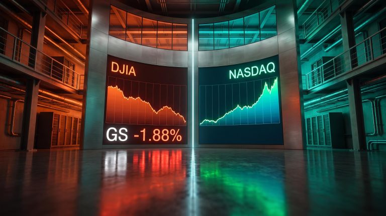
The key is separating two layers of positioning that look contradictory but coexist comfortably. Single-stock call skew reflects traders chasing upside in individual names. Index-level put hedging reflects institutions buying or selling downside protection. Heavy put flow can sit right alongside rich upside skew.
Heavy single-stock put selling is widely read as a bullish forward indicator, associated with near-term stability or upside. Heavy put buying tends to foreshadow the opposite. SpotGamma’s opening setup report recently logged a highly bullish single-stock put flow reading of 89, carrying forward a bullish tone that had been present through the prior week when prices were lower.
In recent sessions, traders were seen selling to open put options in names including Apple and Taiwan Semiconductor, coinciding with a strong upside move.
The mechanics of dealer gamma
Here is why that put selling matters mechanically. When institutions sell puts in size, the market makers on the other side end up long put gamma and short downside convexity.
Being long put gamma forces those dealers to buy the underlying stock as prices dip, to keep their books hedged. That buying is systematic and price-insensitive, which is what stabilises the market on the way down.
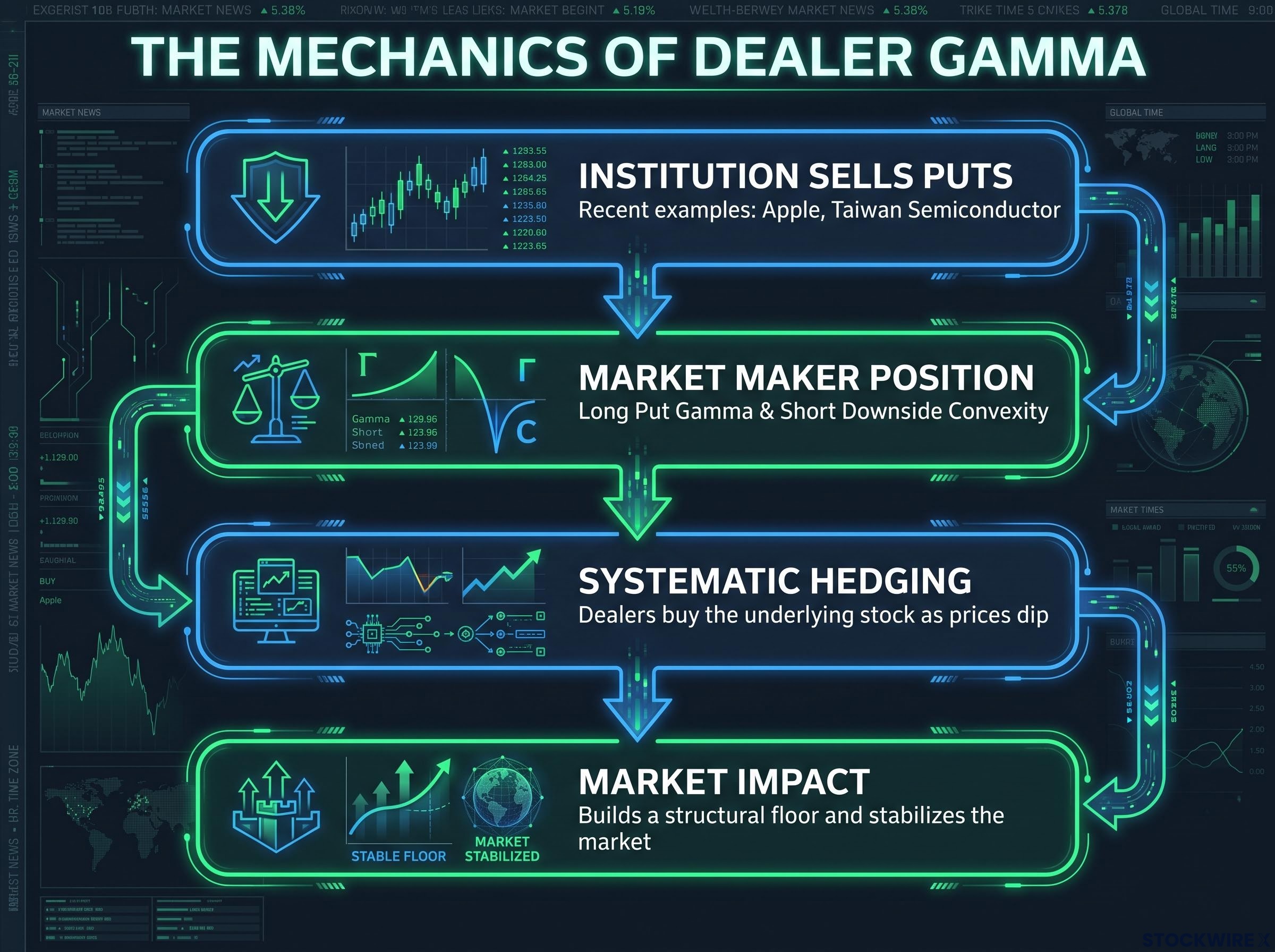
So when you see heavy institutional put selling in semiconductor names, you are looking at a bullish structural floor, not a bearish warning. Dealers are mathematically obliged to buy your favourite tech stocks to hedge against minor declines.
Dealer gamma dynamics shift dramatically when the S&P 500 crosses the zero-gamma flip level, moving market makers from a stabilising regime into one that mechanically accelerates selling, which is why the current bullish floor described here is regime-dependent rather than permanent.
One more data point sharpens the picture. When the correlation index falls near 8, reflecting low correlation between single names and the index, it often signals renewed single-stock options buying and stretched bullish positioning across the tech leaders. That low correlation is the same fracturing the dispersion index is picking up.
For you, understanding this dealer gamma dynamic is the difference between panicking on a minor pullback and holding with confidence, knowing there is a mechanical bid underneath you.
Spotting the upside chase through single-stock call skew
Signals are useful. Tradeable contrasts between specific names are better. This is where the semiconductor complex splits into the expensive and the reasonable.
The majority of top Nasdaq 100 components are currently showing elevated call skew relative to put skew, which tells you upside demand is concentrated. But overall implied volatility ranks remain moderate, and the dispersion between individual names is stark.
Upside call skew across S&P 500 and Nasdaq-100 names turned positive in mid-September 2026, meaning calls were priced richer than puts, the reverse of the default equity market structure that has held for decades and a signal that concentrates the exhaustion risk this article describes.
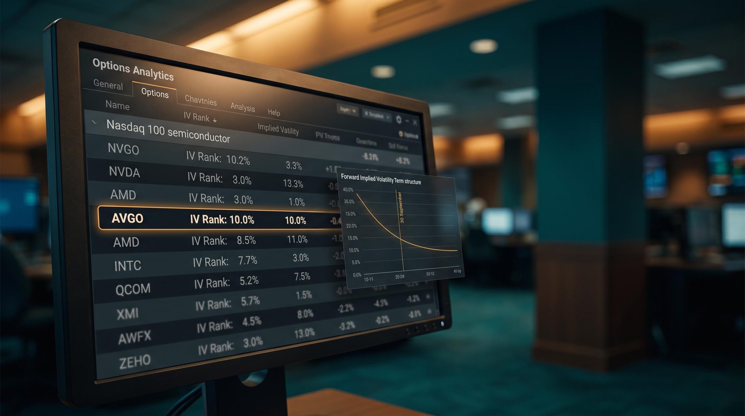
Broadcom stands out as cheap. It carries an implied volatility rank of just 10.0% with an at-the-money implied volatility of 35.0%, which flags it as a favourable structure for upside exposure. Meta, by contrast, shows an implied volatility of 53.1%, and AMD sits at an implied volatility rank of 46.8 with implied volatility of 41.7%.
The comparison itself is the filter:
| Ticker | Implied Volatility Rank | At-The-Money Implied Volatility | Current Pricing Assessment |
|---|---|---|---|
| Broadcom (AVGO) | 10.0% | 35.0% | Low volatility, favourable for outright upside structures |
| Meta (META) | Moderate | 53.1% | Richer volatility, outright calls less attractive |
| AMD | 46.8 | 41.7% | Mid-range, upside premium already building |
By comparing implied volatility ranks across the sector like this, you can quickly separate the AI names that are too expensive to chase with outright calls from those still offering reasonably priced upside. Broadcom looks like the reasonable end of that spectrum.
For names where volatility has already run hot, and certain AI stocks are pushing Skew Ranks above 90, buying outright calls means overpaying. In those cases, alternative structures such as broken-wing call butterflies are noted as potentially more appropriate, letting you take upside exposure without paying full premium for already-elevated volatility.
That is a direct valuation filter for your trade ideas: stop overpaying in crowded trades, and point yourself toward lagging names with better risk-to-reward.
Pricing the catalysts: Micron earnings and the autumn term structure
Look forward, and the options market has already mapped where the next hurdles sit. The forward volatility term structure, the pricing between consecutive expirations, tells you exactly which dates the smart money is treating as dangerous.
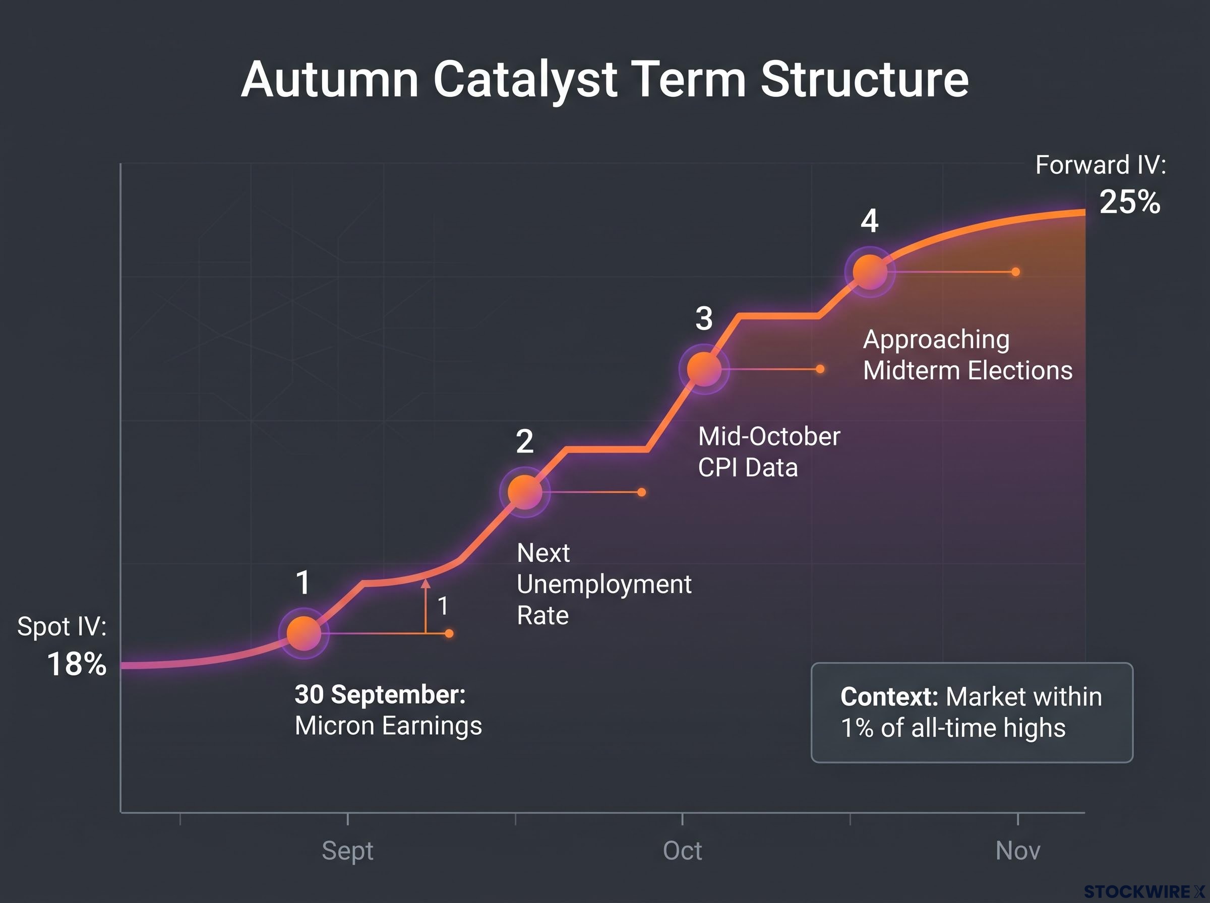
The first hurdle is close. Micron Technology reports earnings on 30 September, and with no imminent Nvidia data point to drive Nasdaq 100 implied volatility, Micron becomes the final major AI catalyst before regular earnings season resumes. Its distinct weight is why the NDX term structure looks so different from the SPX right now.
The steepness is measurable. Ahead of the event, forward implied volatility through the upcoming week was priced near 25%, against a spot implied volatility of roughly 18%. That gap is a risk premium for near-term uncertainty, not a bearish verdict; these events frequently resolve without breaking trend.
The upcoming catalysts distorting the forward curve, in order:
- Micron earnings on 30 September, the last major AI-sentiment driver before earnings season proper.
- The next unemployment rate release, which aligns with the larger peak in the S&P 500 term structure.
- Mid-October CPI data, elevating implied volatility further out on the curve.
- The approaching midterm elections, adding a longer-dated risk premium.
Here is the twist. Despite those looming events, the current fixed-strike implied volatility term structure reads statistically lower than at any point in the prior 90-day window, a genuine decompression as the market rallied to within roughly 1% of all-time highs.
For you, that elevated forward curve is a schedule of danger dates. It lets you tighten risk limits or adjust hedges before those specific events hit, and sidestep the premium crush that inevitably follows a major earnings release.
For investors wanting to see how the term structure and put convexity data translate into a full portfolio hedging framework, our dedicated guide to autumn volatility signals maps the December SPX put premium, VIX futures term structure, and the specific price zones where broad index support thins heading into year-end.
Translating the options tape into a clear tech playbook
Two forces are pulling against each other, and holding both in view is the whole game.
On one side, heavy institutional put selling and dealer long gamma are building a mechanical floor under tech, forcing market makers to buy dips and dampening sell-offs. On the other, elevated dispersion, concentrated call skew, and stretched single-stock positioning carry the fingerprints of an aging, narrative-driven rally.
The read that reconciles them: the structural forces currently point to near-term stability for the broader index, even as individual names begin to fracture beneath the surface.
So your playbook for the October earnings season writes itself from the term structure. Treat 30 September and mid-October CPI as your marked danger dates, hold through minor pullbacks where the dealer bid supports you, and favour lower-volatility names like Broadcom over chasing premium in crowded, high-skew trades.
This article is for informational purposes only and should not be considered financial advice. Investors should conduct their own research and consult with financial professionals before making investment decisions.
Past performance does not guarantee future results, and these forward-looking readings are speculative and subject to change as market conditions and events develop.