Two of the most-watched stock indices in America are pointing in opposite directions today, and the reason has nothing to do with mixed economic data. It has everything to do with how each one is built.
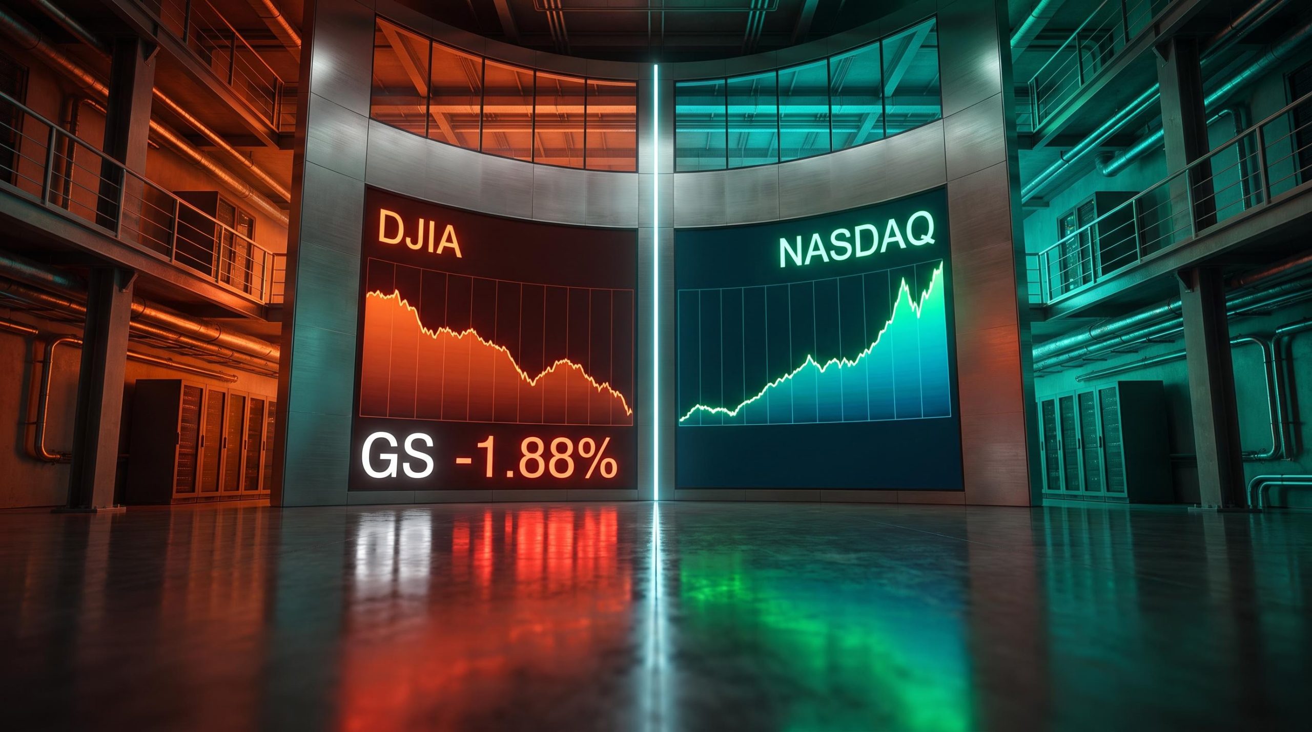
On 22 September 2026, the Dow Jones Industrial Average (DJIA) retreated from multi-week highs while the NASDAQ Composite tested all-time levels in the same session. The S&P 500 sat essentially flat between them. On a ticker screen, that looks like a contradiction. Once you understand index construction and how capital actually flows between sectors, it reads as a coherent story.
What follows maps exactly where the money is moving and why the two most-watched indices in America are giving you completely different readings on the same economy at the same moment. More usefully, it gives you a lens for interpreting the next divergence too, because this pattern recurs whenever capital rotates between the old economy and the new one.
Why the DJIA and NASDAQ track different Americas
Here is the paradox worth sitting with: the same economy, on the same day, producing opposite signals from two indices that supposedly measure it. The resolution is that neither index measures the whole market. Each was built to measure a different slice of it.
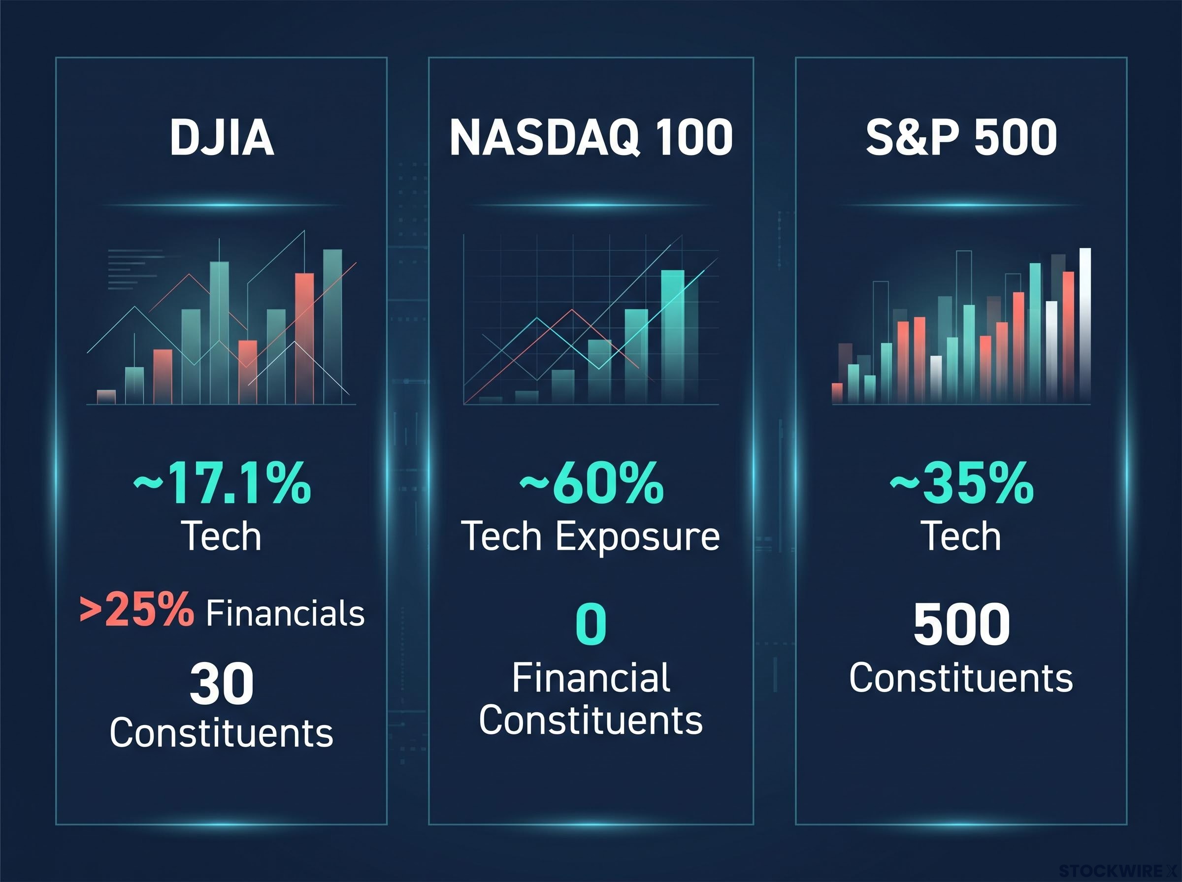
The DJIA leans heavily on the old economy. According to Investing.com analysis (unverified), the Dow is weighted more than 25% to financials and 16% to industrials. The NASDAQ 100, by contrast, holds nearly 60% technology exposure and zero financial constituents.
That is not a flaw in either index. It is a design choice that turns each one into a selective barometer for a different economic era.
| Index | Approx. tech weighting | Approx. financial weighting | Number of constituents |
|---|---|---|---|
| DJIA | ~17.1% | >25% | 30 |
| NASDAQ Composite | Technology-dominated | Minimal / none in NASDAQ 100 | Thousands |
| S&P 500 | ~35% | Meaningful but diversified | 500 |
When capital rotates between sectors, these two indices will necessarily move apart. That is precisely the moment they become most informative, not least.
What each index was actually designed to measure
The DJIA was conceived as a proxy for industrial America. Established by Charles Dow, co-founder of the Wall Street Journal, it comprises just 30 widely traded U.S. stocks and has evolved slowly over its long history. The NASDAQ was built from the outset around growth-oriented, exchange-listed technology companies.
The DJIA’s legacy benchmark origins help explain why institutional strategists at Morgan Stanley, JPMorgan, and Fidelity rely primarily on the S&P 500 for economic analysis rather than the Dow, treating the older index as a media reference point rather than a rigorous proxy for U.S. equity conditions.
Information technology accounts for only 17.1% of the Dow compared to 35% of the S&P 500. That gap tells you the Dow is not a broad market mirror; it is a sensitive reading of cyclical and financial health.
The 30-stock universe matters here. A single sector rotation can materially shift the Dow in a way that a 500-stock or 3,000-stock index absorbs far more easily.
So when you read these two indices against each other on a day like today, you are not seeing contradictory signals. You are watching a real-time vote on whether capital favours the old industrial and financial economy or the new technology-driven one.
When big ASX news breaks, our subscribers know first
The hidden amplifier: how price-weighting turns Goldman Sachs into a wrecking ball
A 1% drop in Goldman Sachs moves the Dow more than a 1% drop in JPMorgan, even though JPMorgan is worth more than three times as much. That is not a typo. It is arithmetic, and it explains a large part of today’s Dow decline.
The DJIA is price-weighted. That means the index is calculated purely from the share prices of its 30 members, so a higher-priced stock carries more influence regardless of how big the underlying company actually is. Here is how the maths works:
- Sum the share prices of all 30 constituent stocks.
- Divide that total by the divisor, currently set at approximately 0.168.
- The result is the index level you see quoted.
Under that divisor, every one-dollar move in any Dow stock shifts the index by roughly 6 points. A $10 decline in any single component strips out about 60 points, whether that $10 represents a 1% slide or a 10% collapse for that stock.
Dow divisor mechanics also affect index continuity across corporate actions: every time a constituent stock splits, is replaced, or pays a special dividend, the divisor is adjusted to ensure the index level does not jump artificially, which is why the divisor has fallen steadily from its original value of 30 toward its current level near 0.168.
Now apply it to today. Goldman Sachs traded around $941 on 22 September 2026, down 1.88% or $18.08 on the day, according to TradingEconomics (unverified), and off 9.16% over four weeks. JPMorgan traded near $337.79, down a steeper 4.05% or $14.25 intraday, per MarketBeat (unverified).
Goldman fell by a smaller percentage than JPMorgan, yet its higher share price meant it dragged more points out of the Dow. JPMorgan carries more than three times Goldman’s total market capitalisation, but in a price-weighted index, market cap is irrelevant. Only the share price matters.
The “fatal flaw” Commentary from Fisher Investments (unverified), reviewing the “Dow 50,000” milestone, described price-weighting as a “fatal flaw” that makes the index unrepresentative during mega-cap technology rallies.
Compare that with the S&P 500 and the NASDAQ, which weight companies by total value. That is why a mega-cap tech rally lifts the NASDAQ far more than the Dow, and why a high-priced financial stock can distort the Dow out of proportion to its economic footprint.
The takeaway for you is practical: today’s Dow decline is partly a methodological artefact. Goldman’s share price move is punching above its economic weight. If you use the Dow as a health check on the broader market, you need to account for that distortion and ask which specific stocks are actually driving the number.
Where the money is actually going, and why AI agents are the catalyst
Watch the flow rather than the headline. Capital is leaving financial sector names, banks, brokerages and insurers, and moving into technology stocks perceived as direct AI beneficiaries. Meta Platforms is the clearest current example of the receiving end.
Meta matters to the NASDAQ but not to the Dow, because it is not a DJIA constituent. Every dollar flowing into Meta shares widens the NASDAQ-Dow gap without any offsetting lift in the Dow. That single fact explains a chunk of today’s divergence on its own.
The catalyst is the AI agent narrative, and the analyst action makes it concrete.
JPMorgan’s upgrade On 10 September 2026, JPMorgan analyst Doug Anmuth upgraded Meta from Neutral to Overweight, raising the price target from $640 to $820, implying roughly 30% upside (multiple outlets, unverified). Anmuth cited Meta’s Muse AI agent and Model API access.
Meta’s Muse agent, designed to act autonomously on a user’s behalf, climbed as high as No. 3 in the U.S. app store, according to CryptoBriefing (unverified). The market is rewarding companies seen as building the AI, and punishing those seen merely as paying for it.
The financial sector sits firmly in that second camp, and the return data explains the scepticism:
- Banks spent over $40 billion on AI in the prior year, yet only about 20% of bank leaders report widespread, sustained value, per BankingDive (unverified).
- More than 80% of executives in corporate and investment banking view new technology implementations as failing to lift revenue or deliver promised cost savings, according to Capgemini and McKinsey research (unverified).
- Incumbent banks spend up to 70% of their IT budgets simply maintaining legacy systems, McKinsey and BCG estimate (unverified), leaving fintechs and AI-native platforms free to move faster.

There is a deeper structural worry too. Moody’s has warned that the banks’ AI adoption increases their dependence on a small group of Silicon Valley infrastructure providers, shifting value along the chain toward the technology firms rather than the banks buying the services.
Put those pieces together and the rotation stops looking like sector fashion. The market is pricing in a structural view: that AI’s economic gains will accrue to the platforms building the agents, not the financial institutions paying to deploy them. That is the thesis moving institutional capital today, and it is why the two indices are drifting apart.
Sector rotation signals often lead official economic data by weeks or months because institutional capital repositions ahead of confirmed changes, which is why the financial-to-technology flow visible in today’s index divergence may be pricing in an earnings trajectory for banks that has not yet appeared in reported results.
Has this happened before, and what does it usually mean?
The clearest historical parallel is the late-1990s technology boom. According to the Los Angeles Times (unverified), the NASDAQ Composite surged 85.6% in 1999 while the DJIA rose a comparatively modest 25.2%. A WilmerHale review (unverified) cited similar figures, with the NASDAQ up around 86% and the Dow up 25%.
The driver then was the same bifurcation you see today: investors splitting portfolios between old-economy blue chips and high-beta technology shares.
| Period | NASDAQ performance | DJIA performance | Primary catalyst |
|---|---|---|---|
| 1999 calendar year | +85.6% | +25.2% | Dot-com / tech boom |
| 2026 (current) | Testing all-time highs | Retreating from multi-week highs | AI agent rotation |
The 1999 comparison is instructive but not a verdict. The tech rally of that era continued for a while, and then it did not. History rhymes; it does not repeat on schedule.
Two readings of the same signal
Serious market observers currently hold two competing interpretations, and both have evidence behind them.
The bearish reading treats extreme divergence as a warning. A MarketWatch analysis (unverified) noted that large gaps, such as the Dow outpacing the NASDAQ by 5.5 percentage points over seven sessions through 25 June 2026, have historically preceded bear markets 66.9% of the time within three months, often near major bull-market tops.
The benign reading treats it as healthy rotation. Investing.com strategists (unverified) characterise the current disparities as thematic rotation tied to Federal Reserve policy and cyclical concerns, not a broad deterioration signal. The 23 August 2026 session, where the NASDAQ 100 gained 0.74% and the Dow closed down 0.04%, was explicitly linked to AI equity concentration by Findices (unverified).
Which reading proves correct depends on variables outside the indices themselves: the Fed’s rate path, the trajectory of bank earnings, and the pace at which AI agents actually generate revenue. Those are the numbers to watch. The divergence itself does not tell you what to do; understanding its drivers lets you judge your own exposure with your eyes open.
What the divergence tells you that neither index tells you alone
The DJIA and NASDAQ are not rivals telling contradictory stories. They are complementary instruments, each measuring exactly what it was designed to measure, and the gap between them is itself the information.
Today makes the point plainly. The Dow retreated from near 51,800 with Goldman Sachs down roughly 1.88%, dragging index points through the price-weighting quirk. The NASDAQ tested all-time highs, lifted in part by Meta on the back of JPMorgan’s upgrade. Meta’s gains never touched the Dow at all, a reminder that which stocks an index contains matters as much as how it weights them.
The Dow’s price-weighting is a genuine limitation, but its light 17.1% technology exposure, against 35% for the S&P 500, is also what makes it a useful sensor for cyclical and financial health precisely because mega-cap tech does not dominate it.
When you next see the two indices diverge sharply, work through three steps before drawing any conclusion:
- Identify which sector is the source of pressure on each index.
- Check whether the move is being amplified by price-weighting in specific high-priced Dow stocks like Goldman Sachs.
- Consult the historical rotation context before deciding whether it signals risk or routine cycling.
An investor who checks only one index is reading half the market. Today’s split is the clearest demonstration of why both numbers matter and what each one is genuinely built to tell you.
For readers wanting a framework to act on today’s rotation rather than simply observe it, our dedicated guide to cyclical and defensive stock allocation covers how to blend both categories across economic phases, including the barbell approach that institutional allocators are using in the current mixed-signal environment.
This article is for informational purposes only and should not be considered financial advice. Investors should conduct their own research and consult with financial professionals before making investment decisions.
Past performance does not guarantee future results, and the interpretations discussed here are speculative and subject to change based on market developments.