Most investors know inflation is bad for their money. Far fewer can explain why a hot inflation reading, the kind that erodes your purchasing power, often makes the US dollar stronger and gold weaker on the same afternoon.
That contradiction sits at the heart of how inflation actually works, and it trips up more retail portfolios than almost anything else.
Here is the current backdrop. As of August 2026, US headline inflation as measured by the Consumer Price Index (CPI) is running at 3.4% year-over-year, with core inflation at 2.4%. The Federal Reserve is holding its target range at 3.50%-3.75%, and the 10-year Treasury yield sits near 5.1%. These are not abstract numbers. They are moving real portfolios right now.
This guide gives you a practical toolkit for reading any future CPI release. By the time you finish, you will know which assets a given print tends to push, in which direction, and, more importantly, why. That last part is what separates reacting to your portfolio from anticipating it.
What CPI is actually measuring, and why the basket matters
The CPI is not a complete price census of the economy. It is a sample.
Specifically, the CPI for All Urban Consumers (CPI-U) tracks price changes across a fixed basket of goods and services that the US Bureau of Labor Statistics (BLS) has determined represents typical urban consumer spending. The basket is built from consumer expenditure surveys, then weighted by category. Shelter, food, energy, medical care, and transportation each carry a different share of the total.
That weighting is the whole game. A category that takes up more of the average household budget moves the index more when its prices change.
Here are the major categories, roughly ordered by their weight in the index:
- Shelter (rent and owners’ equivalent rent), the single largest component
- Food at home
- Food away from home
- Energy (petrol, electricity, natural gas)
- Medical care
- Transportation services
- Other goods and services
Because shelter and owners’ equivalent rent dominate the basket, they exert an outsized pull on the total. Hold that thought, because it sets up a limitation we will get to later.
For August 2026, the numbers looked like this:
| Indicator | MoM (SA) | YoY (NSA) | Key driver |
|---|---|---|---|
| Headline CPI | +0.4% | +3.4% | Petrol and energy |
| Core CPI (less food and energy) | +0.3% | +2.4% | Services and shelter |
According to the BLS release dated 11 September 2026, petrol and energy were the primary reason the monthly headline number climbed. That single point illustrates something important: one volatile category can swing the all-items figure and make inflation look hotter than the broader trend actually is.
The August 2026 CPI breakdown published by StockWire X puts precise numbers behind that energy distortion, showing that gasoline alone accounted for more than a third of the entire monthly all-items increase while broad money supply remained nowhere near the conditions that fuelled the 2021-2022 surge.
Here is what that means for you. A CPI print tells you what happened to a hypothetical average consumer’s costs, not necessarily what happened to yours. If petrol spikes and drives the headline up, but your portfolio has no direct energy exposure, that print is less urgent for your decisions than it first appears. Reading the number critically starts with understanding that gap.
Month-over-month vs. year-over-year: which number should you watch?
The BLS reports CPI two ways, and each answers a different question.
The month-over-month (MoM) figure, which is seasonally adjusted, captures momentum. It tells you what prices did in the most recent single month, which is your read on short-term direction.
The year-over-year (YoY) figure, not seasonally adjusted, captures sustained pressure over a full 12 months. It smooths out the noise and shows you the bigger trend.
Watch both. A declining YoY number can sit right alongside an accelerating MoM number if base effects are shifting, meaning the comparison month a year ago was unusually high or low. One number without the other gives you half the picture.
When big ASX news breaks, our subscribers know first
Headline vs. core inflation: why the Fed ignores your gas bill
There is something genuinely frustrating about core inflation. The Fed strips out food and energy, which for most households are the prices that hurt the most, then treats what remains as the number that matters.
It feels like the central bank is ignoring your actual life. So why do it?
Core CPI is defined as the all-items index minus food and energy. The rationale is that food and energy prices are volatile and driven by supply shocks, weather, geopolitics, and commodity cycles, that monetary policy simply cannot address in the short run. Raising interest rates does nothing to bring a barrel of oil back down next month.
Strip those out, and you get a cleaner signal of the underlying inflation trend, which is precisely what a central bank setting medium-term policy needs to see.
The August 2026 data shows why this matters. Core CPI eased from 2.5% in July to 2.4% in August, a modest softening in the underlying trend, even as the headline number accelerated on energy.
Headline CPI +3.4% YoY vs. Core CPI +2.4% YoY, August 2026. That one-percentage-point gap is doing significant analytical work.
That spread tells you something the headline alone hides. Current inflation pressure is partly cyclical and energy-driven, not purely entrenched across the whole economy. And that distinction changes how urgently you should reposition anything in response to a single print.
Here are the three reasons the Fed leans on core rather than headline:
- Energy prices are too volatile and swing on factors monetary policy cannot influence.
- Food prices are similarly exposed to supply shocks, from droughts to shipping disruptions.
- The underlying trend, once you remove the noise, is far more stable and useful for setting policy months ahead.
One technical footnote. The Fed’s official 2% target is actually expressed in terms of core PCE, a related but different inflation index. Core CPI is still the most watched real-time proxy because it is released earlier and cited more often in market commentary.
Why does this matter to your portfolio? Because if you only track headline CPI, you risk misreading the Fed’s reaction function. The Fed is watching core. That is where market-moving rate expectations form, and that is what ultimately drives bond yields and currency moves. The 3.50%-3.75% target range is the Fed’s response to core sitting above target, not to your petrol bill.
How a CPI print moves markets in real time
Open your brokerage app just after 8:30 AM Eastern on a CPI release day and you will often see everything moving at once. Yields, the dollar, gold, equities, all reacting inside the same few minutes.
It looks like chaos. It is actually a sequence, and once you can follow it, the chaos becomes readable.
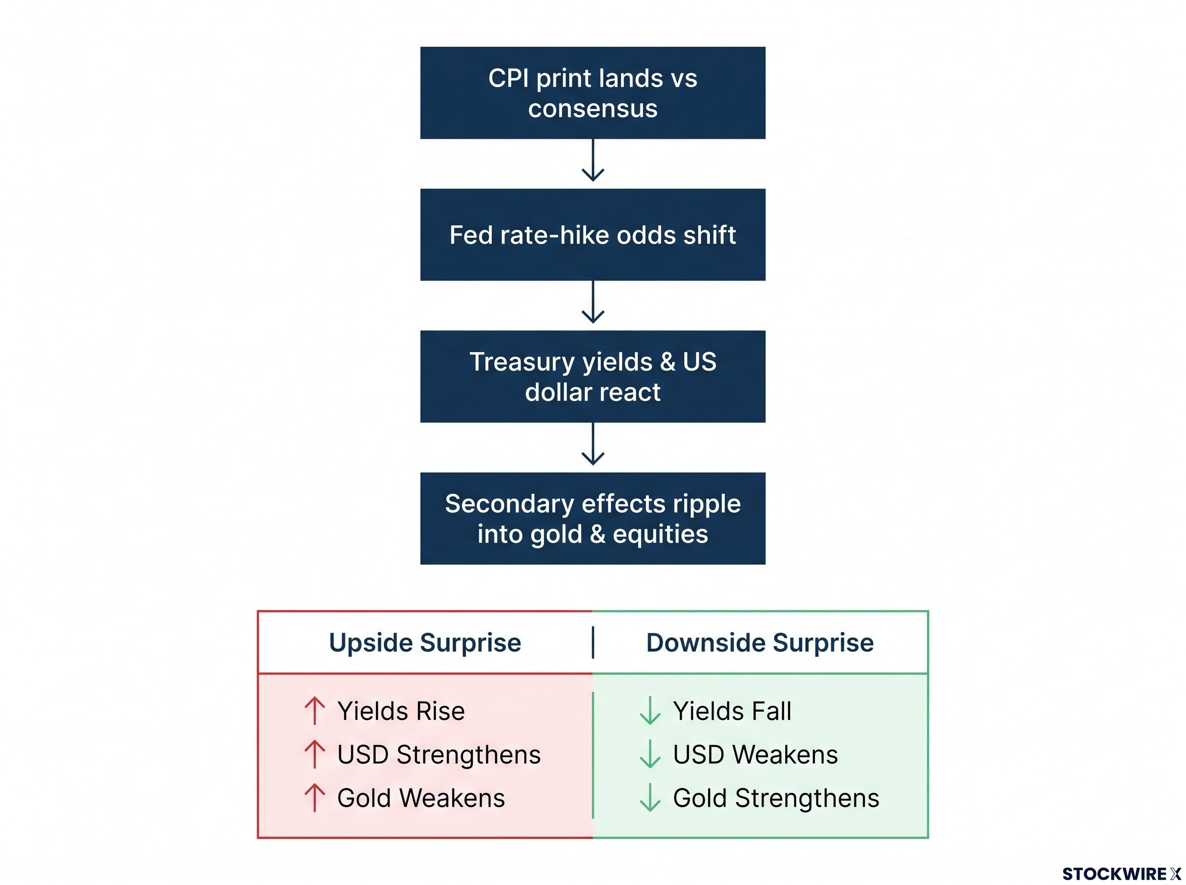
The transmission chain runs in four steps:
- The CPI print lands and is measured against consensus expectations. The surprise, not the number itself, is what matters.
- Fed rate-hike odds shift in response, tracked in real time by tools such as the CME FedWatch Tool.
- Treasury yields and the US dollar react to the new rate expectations.
- Secondary effects ripple into gold and equities.
The single most important thing to internalise here is step one. On release day, the number that moves markets is not the print itself but the gap between the print and what the market already expected. That gap drives the trades. A 3.4% reading that everyone expected does very little; a 3.4% reading when the market priced 3.1% can move billions.
This is not a one-off pattern. Across 2022 and 2023, upside CPI surprises consistently strengthened the dollar and spiked yields, while downside surprises produced the reverse. The mechanism is stable enough to plan around.
A core CPI downside surprise can be just as market-moving as an upside beat: in June 2026, core flatlined at 0.0% month-over-month in the largest miss relative to consensus in over a year, immediately repricing rate-cut expectations and rallying Treasuries, REITs, and growth equities in the same session.
| CPI surprise | Fed hike odds | 10-year yield | US dollar | Gold |
|---|---|---|---|---|
| Upside (hotter than expected) | Rise | Rise | Strengthen | Weaken |
| Downside (cooler than expected) | Fall | Fall | Weaken | Strengthen |
The August 2026 CPI release as a live example
Watch the chain play out on real data.
The August 2026 headline came in at +0.4% MoM, stronger than the market had expected, driven by petrol and energy. That upside surprise pushed rate-hike probability for the October meeting toward 66% on the CME FedWatch Tool, according to the source cited at the time.
Step three followed immediately. The 10-year Treasury yield climbed to roughly 5.106%, its highest since 2007, according to Reuters on 24 September 2026, including a one-day jump of nearly 14 basis points. The US Dollar Index (DXY) rallied to near 101, peaking at 101.40, its highest in about two months.
Here is the subtle part. Energy drove the headline, not core. Markets reacted to the headline surprise first, then recalibrated as traders parsed the softer core number underneath. That two-stage reaction is why the same release can look one way at 8:31 AM and slightly different by the afternoon.
Knowing this chain lets you anticipate direction rather than scramble for an explanation after prices have moved. When an upside surprise strengthens the dollar and pressures gold, you can read your own portfolio moves in real time instead of guessing.
Why inflation tends to strengthen the dollar and weaken gold
Now back to the contradiction from the opening. Inflation erodes the purchasing power of a currency, so surely it should make that currency weaker. Yet a hot US inflation print often makes the dollar stronger.
The paradox dissolves once you follow the interest-rate mechanism.
When inflation runs above target, the central bank is pushed toward tighter policy: higher rates, higher yields. Those higher yields on dollar-denominated assets, cash and government bonds, attract foreign capital chasing better returns. That inflow lifts demand for the dollar, and the currency strengthens. The inflation is doing damage, but the policy response to it is what the currency market is actually pricing.
Gold gets caught in the crossfire, and its relationship with inflation is conditional, not automatic.
Gold pays no yield. When real yields rise, meaning nominal yields outpace inflation, the opportunity cost of holding a non-yielding metal goes up. With the 10-year near 5.1% and core inflation at 2.4%, real yields are meaningfully positive right now, which weakens gold’s appeal and tends to pull capital toward bonds and cash instead.
Real yields and gold prices share an inverse relationship that holds most of the time but broke down meaningfully during 2020-2022, when surging inflation expectations kept real yields negative even as nominal rates climbed aggressively, which is why gold held its ground through one of the most intense hiking cycles in modern Fed history.
There is a second downward channel. Gold is priced in US dollars, so a stronger dollar makes it more expensive for buyers outside the US, dampening global demand on top of the yield effect.
Gold tends to underperform during inflation episodes when:
- Real yields are rising
- The dollar is strengthening
- Central bank credibility remains intact
Gold tends to outperform when:
- Real yields are negative
- Central bank credibility is in doubt
- Fiscal deterioration raises fears about the currency itself
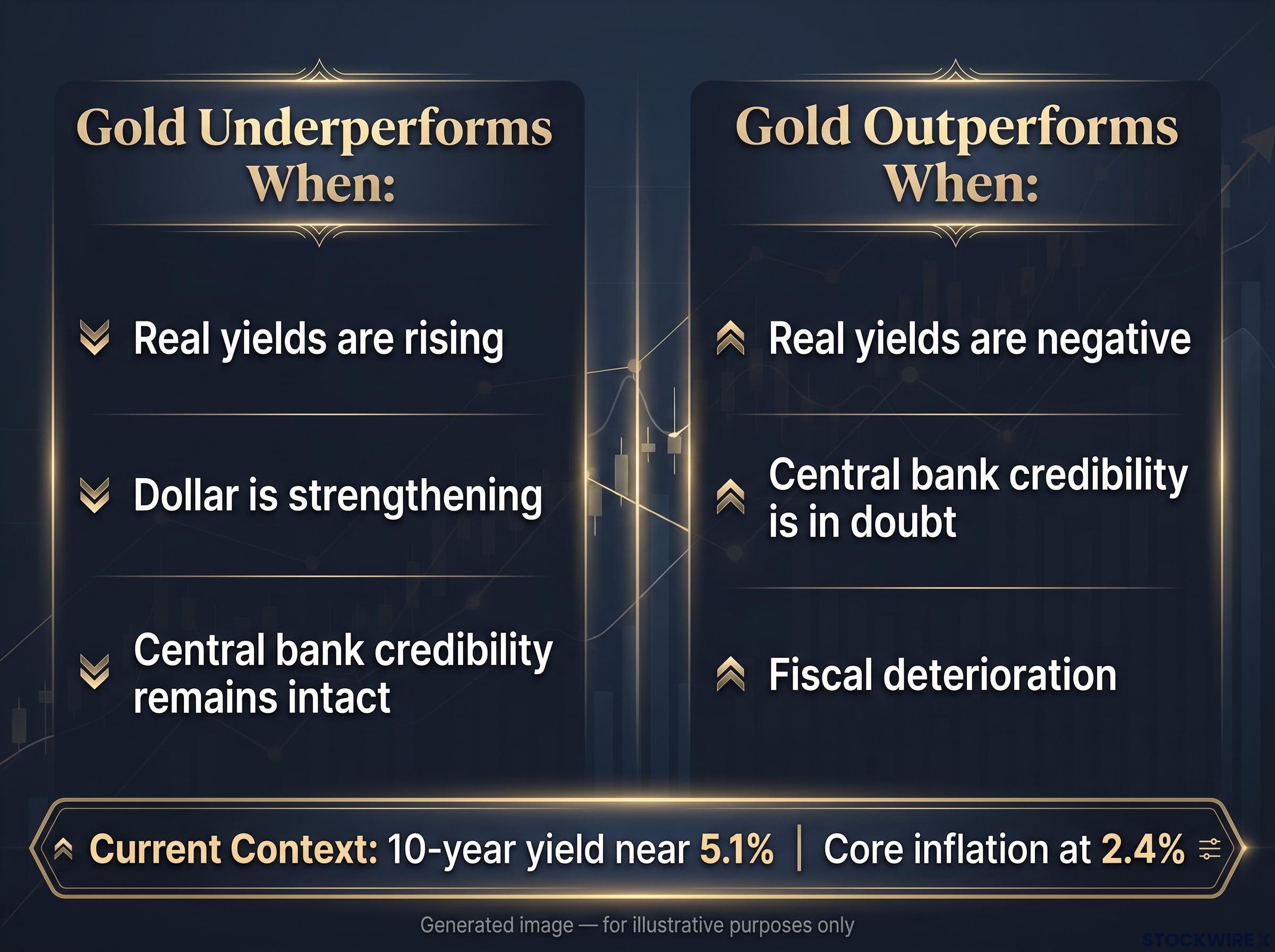
Gold is not an inflation hedge automatically. It is a real-yield and credibility hedge. That distinction matters.
The World Gold Council makes a similar point, framing gold as a tail-risk hedge against currency debasement, financial crises, and geopolitical shocks, not simply a bet on rising prices.
For your portfolio, the practical takeaway is direct. If you hold both dollar-denominated assets and gold, elevated US inflation in a tightening cycle tends to push those two positions in opposite directions. That is a hedging insight worth knowing before you double down on gold expecting an inflation hedge, just as rising real yields and a firming dollar are working against it.
The limits of CPI: what the number does not tell you
You now have a framework for using CPI data. Time to sharpen it, because the measure has genuine limitations, and the most sophisticated position is to use CPI while triangulating around it, not treating it as truth.
The five main limitations are:
- Core exclusions of food and energy
- The shelter lag
- Substitution bias and quality adjustment
- Political pressure and credibility risks
- Over-reliance on any single metric
Start with the exclusion debate, honestly. Removing food and energy from core is methodologically sound for policy, because those prices swing on shocks the Fed cannot control. But when energy prices stay elevated for a sustained stretch, the gap between headline and core is real money out of household budgets, even if it should not drive rate decisions. Both things can be true at once.
Policymakers deal with this by never relying on CPI alone. The Fed watches core PCE alongside CPI, monitors wage growth, reads market-based inflation breakevens, and tracks consumer survey expectations. CPI is one input into judgment, never the complete picture.
That uncertainty is baked into the Fed’s own numbers. Its 16 September 2026 projections show the near-term inflation confidence interval clustering around 1-3%, which is a wide band for the institution that actually sets the rate. Research from Brookings and the IMF has also long flagged substitution bias, when consumers switch to cheaper alternatives, and quality adjustment issues that make CPI an approximation of the true cost of living rather than a perfect measure.
When a print surprises you, your first question should always be which components drove it, and whether those are components the Fed is likely to look through. The market’s knee-jerk reaction and the Fed’s considered response can point in different directions.
The shelter lag: the one distortion most investors miss
Of all these limitations, the shelter lag is the one with the most practical bite right now.
Owners’ equivalent rent (OER) is the largest single piece of the shelter component, and it is calculated from surveys asking homeowners what they estimate they would pay to rent their own home. That survey-based method produces a slow-moving series that adjusts gradually.
The consequence is significant. In periods when new lease rates are decelerating quickly, CPI shelter can stay elevated for six to twelve months after rents have actually peaked. Fed staff research explicitly notes this lag and warns that overreacting to shelter readings can lead policymakers to misjudge the true pace of housing disinflation. In plain terms, the data can be pointing backward while the housing market has already moved on.
For readers wanting to see the shelter distortion in granular detail, our full explainer on shelter re-acceleration inside core CPI examines how a single 0.4% monthly shelter reading kept the all-items index elevated even as the annual shelter trend reached its lowest point since October 2021.
Reading the next CPI release with a framework that actually holds up
Put it all together and you have a repeatable checklist for the next release day, one that turns a wall of moving prices into a set of readable signals.
Run these four steps in order:
- Check headline vs. core first. The gap tells you whether pressure is broad or concentrated in volatile categories.
- Identify which categories drove any surprise. Energy and food are one story; shelter and services are another.
- Assess whether the surprise sits in sticky components (shelter, services) or volatile ones (energy, food).
- Evaluate the likely Fed response based on where the pressure actually is.
That third step is really a portfolio-positioning question in disguise. If services and shelter inflation stay elevated, the case for a prolonged rate-plateau strengthens, which matters for bonds, equities, and rate-sensitive holdings. If energy is doing the heavy lifting on any given headline surprise, the policy implication is far more muted, because the Fed is likely to look straight through it.
The broader debate frames your positioning too. Institutions such as the IMF and Brookings argue that services, housing constraints, geopolitical fragmentation, and fiscal dynamics could keep inflation above 2%, or sustain higher rates for longer, than market consensus assumes. The Fed’s own 1-3% near-term confidence interval concedes there is genuine uncertainty even inside the building where rates are set.
Core CPI 2.4%, headline 3.4%, Fed funds 3.50%-3.75%, 10-year yield approximately 5.1%. These are your anchors for the next read.
This is exactly the environment where a framework earns its keep. Core is above target but easing, headline is bouncing on energy, and the Fed is holding while signalling vigilance. Interpreting each release on its own terms, rather than reacting to the headline number, is where a self-directed investor gains a real edge.
This article is for informational purposes only and should not be considered financial advice. Investors should conduct their own research and consult with financial professionals before making investment decisions. Past performance does not guarantee future results, and financial projections are subject to market conditions and various risk factors.