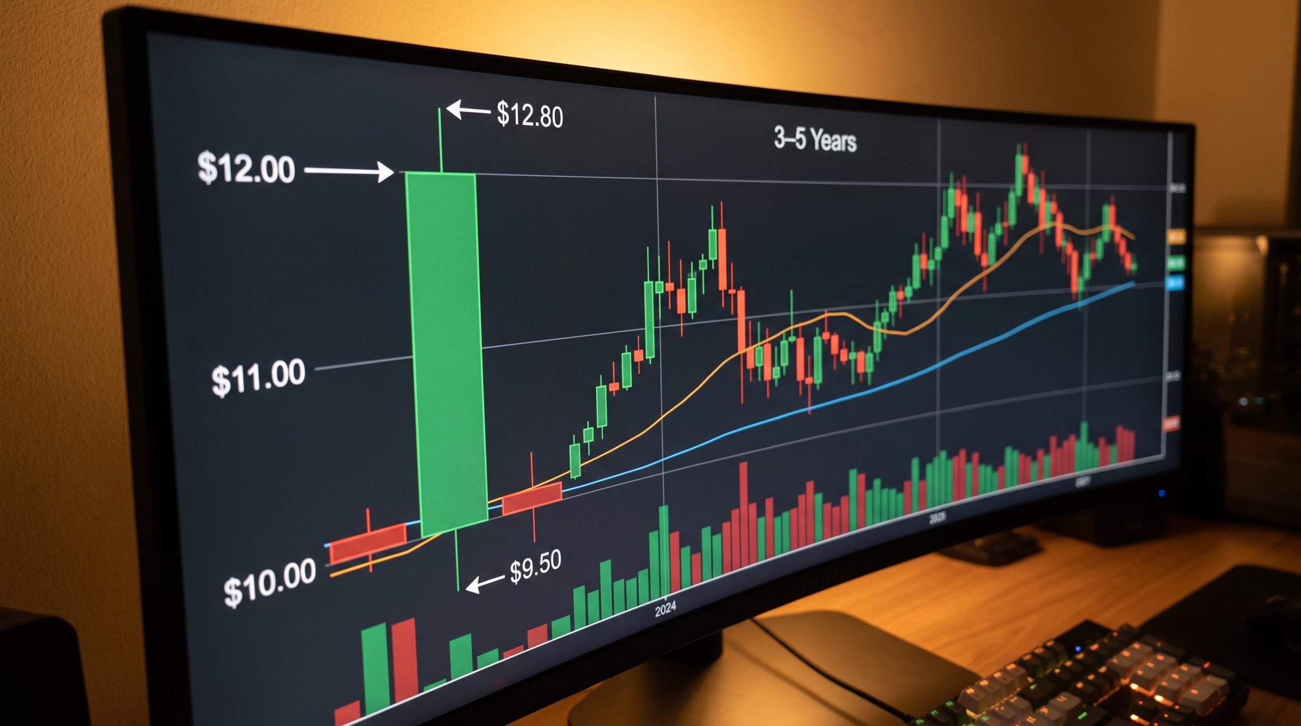
You just opened a trading app, tapped on a stock, and a chart filled the screen. Lines, coloured bars, numbers on every axis. Every data point on that display means something specific. The problem is that almost nobody explains what.
Stock charts appear everywhere: investing apps, broker platforms, financial news segments. They are the most common visual tool in investing, yet most beginners are never taught how to actually read one. That gap between seeing charts constantly and understanding what they are telling you is where costly assumptions take root.
Here is what this guide gives you: a clear, working framework for interpreting any stock chart you encounter, covering chart types, timeframes, trends, volume, and the specific limitations most tutorials skip entirely. You will finish with a practical, step-by-step workflow you can apply the next time you open a chart, and realistic expectations about how to use that information alongside the rest of your research.
Understanding what price and time are telling you on a stock chart
Most people who open a stock chart for the first time assume it is trying to show them where the price is going. It is not. A stock chart maps two fundamental variables: the price a stock traded at (plotted vertically on the y-axis) against the point in time it traded there (plotted horizontally on the x-axis). That is the entire foundation.
Every other element you see on a chart, whether it is coloured candles, trend lines, or overlaid indicators, is simply a different method of interpreting the same two raw inputs: price data and volume data. Nothing more is being added. The visualisation changes; the underlying information does not.
Getting this distinction right from your first session changes the questions you ask. Instead of “what will this stock do?” you start asking “what has this stock done, and what context does that give me?” That shift is the single most important thing you can take from this section.
Three principles to carry forward:
- Charts show you the past. They are historical records, not forecasting tools.
- They are context tools. They tell you where a stock has traded and how, not where it will trade next.
- They must be combined with fundamental research. Pattern-matching on price history alone is not a reliable basis for predicting future returns.
When big ASX news breaks, our subscribers know first
Choosing between chart formats: a beginner’s comparison
Three primary chart formats exist, and they sit on a spectrum of information density. Understanding them in order, from simplest to richest, makes the more complex formats feel logical rather than overwhelming.
A line chart draws a single continuous line through each period’s closing price, giving you a stripped-back view of overall direction. The simplicity is its appeal, but the cost is significant: everything that happened between open and close each period is invisible.
A bar chart (also called an OHLC chart) steps up the detail. The full extent of each period’s trading range is shown as a vertical line, with small horizontal ticks on each side indicating where the price opened and where it closed. You now have all four data points per period: open, high, low, close. The trade-off is that bar charts take practice to read quickly.
Candlestick charts package those same four data points into a format designed for faster visual scanning, and they are the recommended starting point for beginners on most broker platforms.
Alternative chart formats exist beyond the line, bar, and candlestick types covered here; Renko charts, for example, remove the time axis entirely and plot uniform price-based bricks, which filters short-term noise structurally rather than through indicator overlays.
| Chart Type | Data Points Shown | Best Used For | Limitation |
|---|---|---|---|
| Line | Closing price only | Broad directional overview | No intra-period detail |
| Bar (OHLC) | Open, high, low, close | Detailed price action analysis | Takes practice to read quickly |
| Candlestick | Open, high, low, close | Visual direction and momentum at a glance | Can feel visually busy at first |
How to read a candlestick
The body is the rectangle between the opening price and the closing price. The wicks (sometimes called shadows) are the thin lines extending above and below the body, reaching to the period’s high and low.
Here is a concrete example. A green candle that opened at $10 and closed at $12 has a body spanning that $2 range. If the price dipped to $9.50 before recovering, a lower wick extends down to that level. If it briefly touched $12.80 before pulling back to close at $12, an upper wick stretches to $12.80.
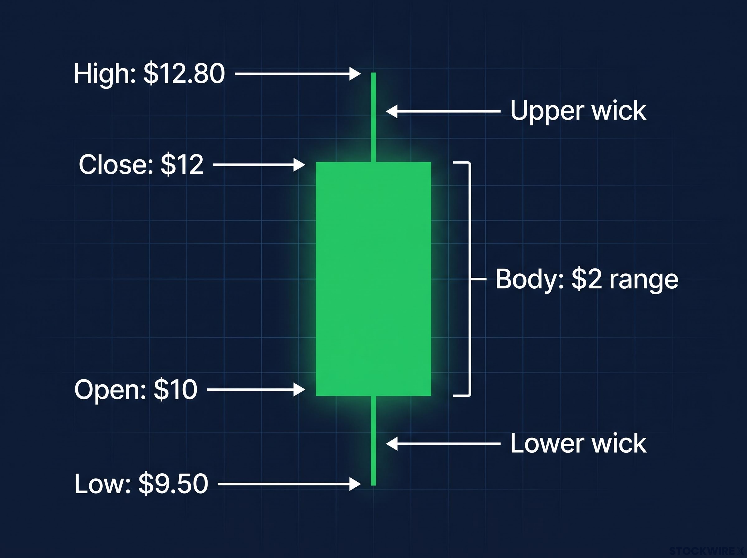
When the closing price sits above the opening price, the body is shown in green (or hollow); when the closing price falls below the opening price, the body appears red (or filled). One important point: a single candle’s colour tells you only the direction within that one period. It does not tell you the overall trend.
Choosing candlestick charts from the start means you are reading richer information with every glance. Did the price open high and sell off, or push through resistance and close near the top? That additional context gives you a more honest picture of what buyers and sellers were doing.
Timeframes: why zooming out changes everything
The same stock can look alarming on a daily chart and completely unremarkable on a monthly one. That is not a contradiction; it is the single most important thing to understand about timeframes.
Intraday charts (1-minute to 1-hour intervals) show granular price movement within a trading session. Daily charts give you one candle per trading day. Weekly charts compress each week into a single candle, and monthly charts do the same for each calendar month.
Shorter timeframes expose more noise, meaning random short-term price fluctuations that carry limited relevance if you plan to hold a stock for years. Longer timeframes filter that noise out and reveal the underlying directional trend. For you, as a long-term investor, obsessing over a one-day or one-week chart is the equivalent of judging a road trip by looking only at the last 100 metres. Technically accurate, but completely missing the bigger picture.
When each timeframe makes sense for you:
- Intraday: Active traders monitoring positions throughout the day.
- Daily: Short-term research or monitoring a specific developing situation.
- Weekly: Long-term investors assessing a stock’s broader trend.
- Monthly: Long-term investors reviewing multi-year directional behaviour, ideally across 3-10 years of price history.
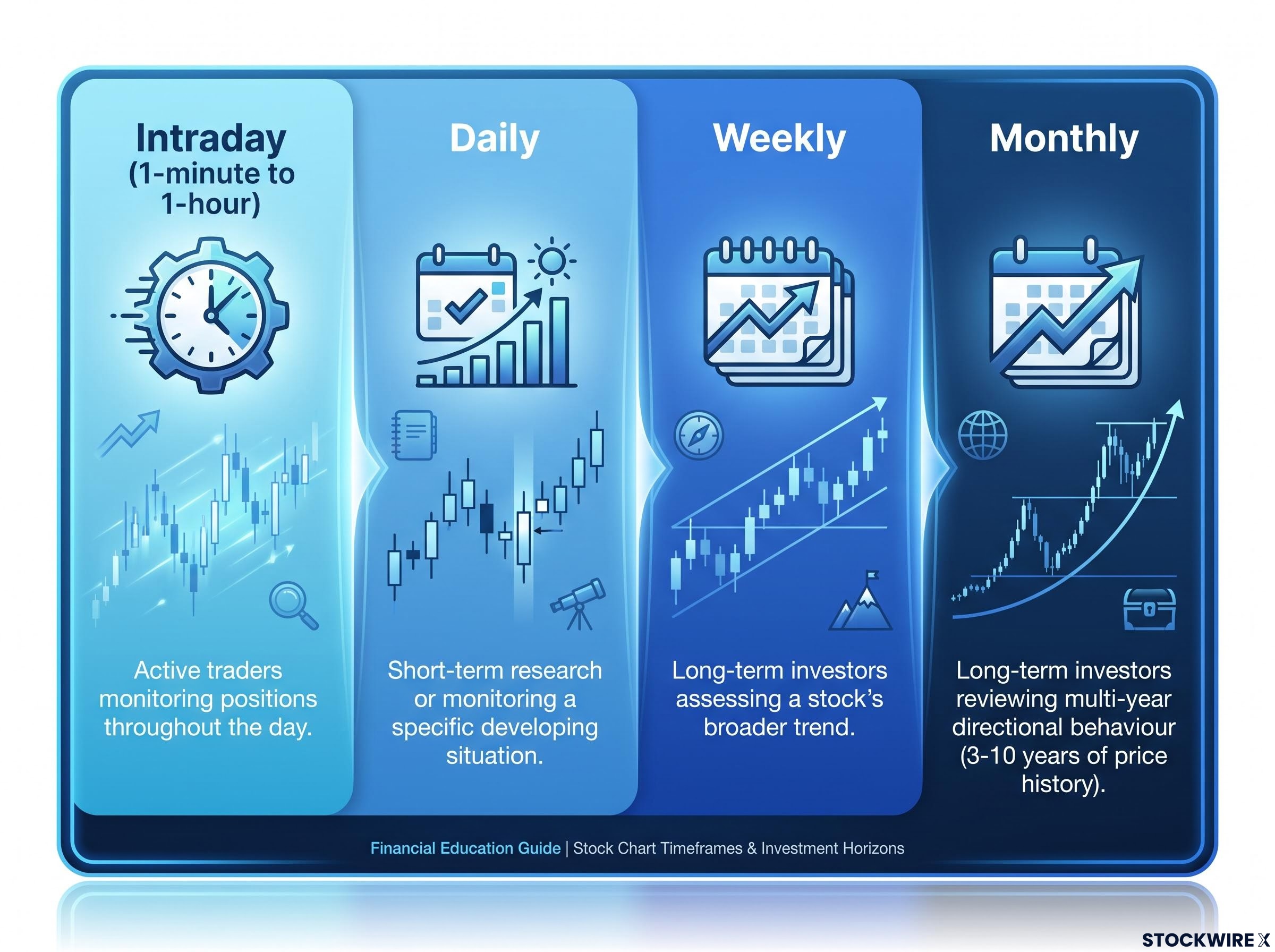
If your investment horizon is measured in years, start with a weekly or monthly view and at least 3-5 years of history. That single adjustment transforms what can be an emotionally charged short-term picture into the context you actually need.
For readers wanting to see how chart-intensive active strategies compare to a passive long-term approach over time, our deep-dive into day trading versus long-term investing models identical monthly contributions across three strategies over 30 years, with the passive investor finishing with $1.78 million compared to $511,000 for a top-performing day trader.
Trends, support, and resistance: the core vocabulary of price history
These three concepts form the vocabulary used in nearly every chart discussion you will encounter in financial media. Getting clear definitions now, and understanding their limits, makes you a sharper reader of investing commentary from this point forward.
Uptrends, downtrends, and sideways markets
A trend is a backward-looking description of the direction price has been moving. It is not a prediction.
- Uptrend: Each successive peak and trough in price climbs higher than the last, reflecting sustained buying interest across the observed period.
- Downtrend: Each successive peak and trough in price falls lower than the last, as sellers consistently accept reduced levels over time.
- Sideways (range-bound): Price fluctuates back and forth within a broadly flat channel, with no sustained push in either direction.
These labels describe what has happened. Even a strong multi-year uptrend can reverse suddenly on material new information. Read them as context, not as commitments the stock has made.
Support and resistance zones
Once you can identify a trend, the next layer is noticing the recurring levels where price behaviour has historically clustered.
- Support is a price zone where buying interest has historically been strong enough to absorb selling pressure and push prices back upward. Lows cluster around a similar level and “bounce” from it. This reflects a zone where enough buyers have historically stepped in to offset selling pressure.
- Resistance is a price zone where rallies have repeatedly stalled and reversed downward. Highs cluster in a band the stock has struggled to break above.
These levels can be broken at any time. When significant new information enters the market, whether an earnings announcement, a policy change, or a broader economic shift, prices can move cleanly through previously established support or resistance without hesitation. Treat these levels as contextual reference points, not as guaranteed barriers or buy and sell triggers.
Knowing where a stock has historically found buyers and where sellers have historically pushed it back gives you a richer sense of the price context you are operating in. It does not tell you what will happen next.
Volume and moving averages: two tools that add context
These are the two additions most commonly recommended for beginners because they add meaningful context without requiring deep technical expertise. Together, they help you distinguish between a price move that carried real market conviction and one that was essentially noise.
Volume
Each period’s trading activity is captured by a single figure: the total number of shares that changed hands. It appears as a bar chart positioned directly below the main price chart, with each volume bar aligning with the price candle above it.
The core principle is straightforward: when a significant price move coincides with a sharp rise in trading activity well above the recent norm, the move reflects much broader market participation than usual, which gives it greater informational weight than a similar move on thin volume. That context is worth noting before drawing any conclusions about what the move means.
Moving averages
A moving average takes the closing prices across a defined number of past periods, calculates their mean, and tracks that figure forward as new sessions are added, producing a smoothed line that follows the underlying trend without the distraction of day-to-day swings. In plain language: a 50-day moving average takes the closing prices from the most recent 50 trading days, averages them, and plots that single point. It recalculates every day as a new closing price enters the window.
Three standard periods serve as reference points:
- 20-day MA: Short-term trend reference.
- 50-day MA: Intermediate trend reference (the most commonly cited in beginner resources).
- 200-day MA: Long-term trend reference.
Price sitting above a rising moving average suggests a broadly bullish trend over that window. Price below a falling moving average suggests a broadly bearish trend. Start with one or two moving averages rather than layering multiple indicators. Stacking too many tools at once creates visual clutter without improving your understanding.
| Indicator | What It Shows | How to Interpret | Beginner Tip |
|---|---|---|---|
| Volume | Shares traded per period | High volume confirms stronger participation; low volume may signal a less meaningful move | Compare today’s volume bar to the recent average, not to an absolute number |
| 20-day MA | Short-term trend direction | Price above a rising 20-day MA suggests short-term bullish momentum | Useful for monitoring recent price behaviour |
| 50-day MA | Intermediate trend direction | Price above a rising 50-day MA suggests a sustained positive trend | The most widely referenced beginner moving average |
| 200-day MA | Long-term trend direction | Price above a rising 200-day MA suggests a broadly positive long-term trajectory | Start here if you are a buy-and-hold investor |
Both tools are confirmatory context. Neither is a standalone buy or sell signal.
The gaps in chart analysis that every beginner should know about
This is where most chart tutorials stop, and it is exactly where the most important information begins. Stock charts display only price and volume history. What they carry no trace of is the quality, health, or prospects of the business behind the ticker.
Charts do not show you:
- Earnings growth or decline
- Debt levels or balance sheet health
- Management quality
- Competitive position within the industry
- Whether current valuation is reasonable relative to fundamentals
- Dividend sustainability
A stock with a compelling multi-year uptrend on its chart can still be overvalued, overleveraged, or about to face a material earnings disappointment that charts alone would never have warned you about. Treating prior price behaviour as a reliable guide to what a stock will do going forward is a mistake that experienced investors consistently caution against.
Mainstream investing guidance is consistent on this point: technical analysis is strongest when integrated with fundamental research. Using charts as the sole trigger for buying or selling decisions, without accompanying business analysis, is explicitly cautioned against across mainstream investing sources.
Charts display price and volume history; the business quality behind that history is revealed through fundamental analysis metrics such as P/E ratio, earnings per share, profit margins, and return on equity, each of which answers a different question about whether the company behind the ticker is actually worth owning.
Understanding what charts cannot tell you is just as important as understanding what they can. That knowledge protects you against one of the most common retail investor mistakes: treating visual price patterns as a substitute for business research.
This article is for informational purposes only and should not be considered financial advice. Investors should conduct their own research and consult with financial professionals before making investment decisions.
A practical workflow for reading your first chart
Theory is useful. A repeatable process is better. Here is a nine-step workflow you can apply the next time you open a trading platform.
- Open the chart for a stock you own or are researching.
- Select candlestick format so you can see open, high, low, and close clearly in each period.
- Set a weekly or monthly timeframe and zoom out to 3-5 years of history (or more if available).
- Identify the main trend by observing the pattern of highs and lows: uptrend, downtrend, or sideways.
- Mark obvious support and resistance zones, the price levels where the stock has repeatedly bounced or stalled.
- Add a 50-day and/or 200-day moving average to view the smoothed intermediate and long-term trend.
- Check the volume bars for notable spikes and relate elevated or suppressed volume to the corresponding price moves.
- Write down your observations, explicitly separating what the chart objectively shows from any interpretation you are forming.
- Bring in fundamental data, including earnings history, debt, profit margins, dividend yield, and industry outlook, to complete the picture before any investment decision.
Separating what the chart objectively shows (historical levels, trends, volume patterns) from any expectation you are forming is the habit that keeps chart reading honest. Your interpretations should be grounded in broader research, not in pattern-matching alone.
Step 8 is the one most beginners skip, and it is the one that matters most. Following a structured workflow from your first chart session builds the discipline that separates investors who use charts as genuine context tools from those who use them to rationalise decisions they have already emotionally made.
For long-term investors, dollar-cost averaging, investing a fixed amount at regular intervals regardless of the current chart position, is a complementary strategy that reduces timing pressure. It pairs naturally with using charts for context rather than precise entry signals.
Building chart literacy into a broader research habit
Stock charts are genuinely useful context tools when used honestly. They become most powerful when integrated with fundamental research rather than used in isolation. That is the central argument of everything you have read here.
As a long-term investor, you can use charts without falling into timing traps by building a few specific habits:
- Check historical price range context. Where does the current price sit relative to the stock’s multi-year range?
- Observe behaviour during past market shocks. How did the stock respond during previous sell-offs, and what does that tell you about its volatility profile?
- Match your timeframe to your horizon. If you plan to hold for years, your primary chart view should be weekly or monthly, not daily.
- Use longer timeframes to manage emotional responses. Zooming out makes short-term volatility appear proportionate and helps you maintain conviction in a well-researched position.
Chart literacy is not a binary skill you either have or do not. It builds incrementally. Start with the basics covered here: candlestick format, a 3-5 year weekly view, one moving average, and a volume check. Expand from there as familiarity grows. Most trading platforms display charts alongside supplementary stock information such as recent company announcements and dividend history, making integration into your broader research straightforward.
The investing mistakes that compound most quietly are rarely bad stock picks; delaying contributions by even a single year can cost tens of thousands in terminal wealth through lost compounding time, a structural penalty that dwarfs the losses most beginners attribute to poor chart reading.
CME Group technical analysis education covers chart types, candlestick construction, and moving average mechanics in detail, providing a structured reference from one of the world’s largest derivatives exchanges for readers building on the foundations covered here.
A well-read chart does not tell you what to buy. It tells you the context in which you are considering buying. That shift in framing is what separates informed investors from those reacting to noise.
—