
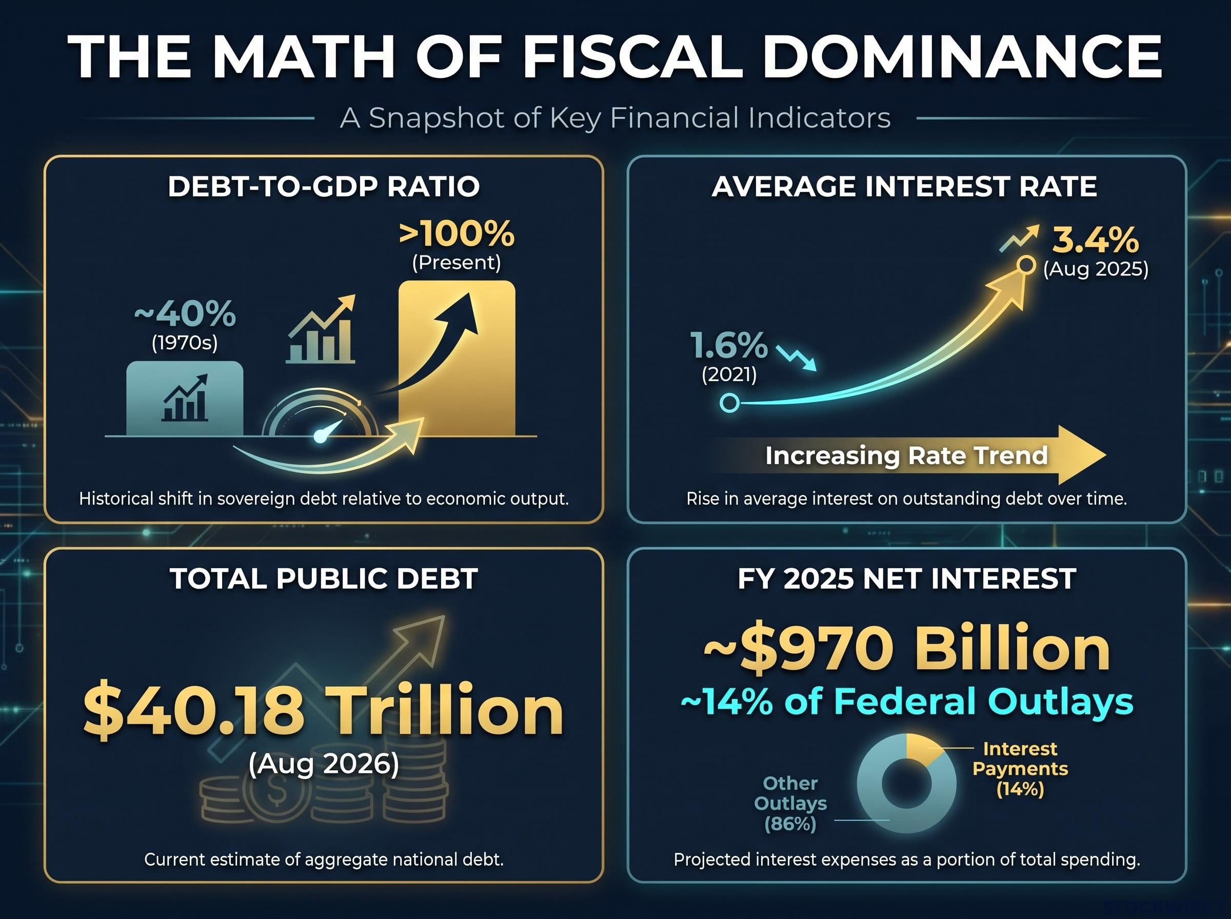
The US government now spends more servicing its debt than it does defending the country. In fiscal year 2025, net interest on the federal debt reached roughly $970 billion, and the figure is still climbing.
Most people registered that interest rates went up. Far fewer have worked through what that means for the one entity in the economy that owes more than $40 trillion.
The investing rules you built your framework around assume something specific: that the central bank can raise rates whenever inflation demands it, without blowing up the government’s own balance sheet. When that holds, the inverse relationship between bond yields and equity prices behaves predictably. That assumption is now under more pressure than at any point since the 1940s.
This piece gives you a structured lens for the regime that pressure creates. You will come away understanding why gold has outpaced equities over recent multi-year stretches, why nominal stock gains can mislead you about real wealth, and where the failure modes lie for anyone who positions too aggressively for this thesis.
What fiscal dominance actually means, and why it matters now
Start with the arithmetic, because the concept falls out of it on its own. The average interest rate the US Treasury pays on its outstanding debt rose from 1.6% in 2021 to 3.4% by August 2025. That doubling happened in four years, and it compounds across a debt pile that keeps growing.
Now layer in the scale. Total public debt sat at approximately $40.18 trillion as of August 2026, with debt held by the public around $32.4 trillion. Debt-to-GDP has pushed above 100%, compared with roughly 40% back in the 1970s.
The debt-to-GDP limitations that dominate headlines obscure the more actionable measure: interest payments as a share of tax revenue, which at roughly 18.5% in FY2025 sits closer to the warning threshold than the raw ratio suggests.
When the interest bill grows faster than tax receipts, something has to give. The central bank faces a choice: let bond yields rise to whatever level the market demands, risking a disorderly rout in the Treasury market, or step in and suppress those yields by expanding its balance sheet. Fiscal dominance is the name for what happens when the second option becomes the only politically survivable one.
Put simply, fiscal dominance is the condition where rising interest costs constrain the central bank’s ability to raise rates freely, forcing it to accommodate even when inflation sits above target. The doubling of the average rate on federal debt is not an abstract fiscal metric. It means the government’s interest bill is structurally locking in pressure that forces the Fed’s hand whether or not inflation cooperates.
Federal Reserve Bank of St. Louis research on fiscal dominance identifies the precise debt-to-GDP thresholds and deficit trajectories that shift the balance of power from monetary to fiscal authorities, providing a central bank system perspective on the mechanism the article’s arithmetic is tracing.
You can spot the condition by four markers:
- The interest share of federal outlays rising (net interest hit roughly 14% of total spending in FY 2025)
- Debt-to-GDP sitting above 100%
- The average rate on debt rising faster than nominal GDP growth
- Central bank balance-sheet expansion continuing despite above-target inflation
This is not a switch that flips. Analyst commentary describes the US as a leaking container that keeps losing capacity rather than collapsing in a single moment. Lyn Alden, founder of Lyn Alden Investment Strategy, characterises it as a “gradual print” regime, where Fed independence is compromised not by political control but by the math of the debt itself.
The practical takeaway is calibration. Fiscal dominance is a spectrum, not a crisis date. Your job is not to time a collapse. It is to recognise a persistent regime shift that changes which assets protect your purchasing power over the years ahead.
The mechanism: from debt math to monetary accommodation
The Treasury does not refinance its whole debt load at once. It rolls over notes, bills, and bonds on a staggered schedule, so higher rates feed into total interest costs gradually but relentlessly as older low-rate debt matures and gets replaced at today’s levels.
That gradualism is why the pressure is so hard to escape. In the current environment, a 50 to 100 basis point move in long-end yields shifts total interest expense by roughly 10% from where it stood six months earlier.
Here is the incentive it creates. When the Treasury is rolling over trillions of dollars every year, the Fed cannot afford a bond-market rout, because a spike in yields would detonate the interest bill. That structural constraint, not any speech or policy statement, is what quietly erodes monetary independence.
When big ASX news breaks, our subscribers know first
How the bond-yield-to-equity relationship breaks down
You already know the rule: when bond yields rise, stocks are supposed to fall, because higher yields make safe bonds more attractive and raise the cost of capital. It is one of the most dependable relationships in markets. Under fiscal dominance, it stops being dependable.
The conventional inverse relationship rests on two conditions. The central bank has to be independent enough to set rates purely on inflation and growth, and the inflation anchor has to be stable. Both weaken when the government’s interest bill starts dictating policy.
Fed independence is not merely an institutional ideal; at 3.8% headline inflation and with a newly confirmed chair confirmed by a narrow Senate vote, it has become a live market variable that bond yields, the dollar, and equity multiples are actively pricing.
Once the Fed is suppressing real interest rates to keep the Treasury market orderly, the currency debases over time. Stocks can keep rising in nominal dollar terms while losing ground against hard assets. Emerging markets have shown this repeatedly: domestic equities climb in local currency while falling when measured in dollars or gold.
The US is now exhibiting early-stage versions of those characteristics. One live example is the gap between record-high equity prices and near-record-low consumer sentiment, a disconnect that tends to appear when nominal gains mask real pressure.
| Condition | Traditional expectation | Fiscal dominance outcome |
|---|---|---|
| Rising bond yields | Equity prices fall | Equities can keep rising in nominal terms |
| High inflation | Central bank raises rates to cool it | Rates held below inflation to protect the Treasury |
| Central bank balance-sheet expansion | Reserved for crisis and recession | Used to suppress yields despite above-target inflation |
| Nominal equity gains | Signal genuine wealth creation | Can coincide with real losses against hard assets |
For you, this means watching nominal index levels alone is no longer enough. The real question is whether your gains are outrunning inflation and preserving purchasing power, not simply whether the number in dollars went up.
The yield curve offers a useful check on how far this has progressed. By October 2026, 10-year Treasury yields sat near 20-year highs, yet the spread between the 10-year and 2-year has not breached roughly 1% in recent years. A genuine loss of control over the long end would more credibly show up as a spread above 3%, around 300 basis points. One telling anomaly: the most recent yield-curve uninversion, historically a reliable recession warning, did not produce a US recession, breaking a long-standing pattern.
What yield curve control looks like when it arrives
Yield curve control (YCC) is the policy where a central bank commits to buying any bond whose yield rises above a stated ceiling, using an effectively unlimited balance sheet. It is a last-resort tool that damages credibility, not an early-response measure.
The two clearest analogues are historical and recent. During World War II, the US capped the 10-year yield at 2.5% while year-over-year inflation reached roughly 19%, letting inflation quietly erode the real value of the debt. Japan implemented its own version more recently, holding its 10-year yield below its inflation rate before unwinding the policy under market pressure.
Explicit YCC is not imminent in the US. The point is that the pressures that eventually produce it are already present in the arithmetic.
Gold versus equities: reading the multi-year scorecard
Treat the performance data as a pattern-recognition exercise. The numbers are not random noise, and read in sequence they tell you something legible about fiscal conditions.
Gold gained roughly 48% in 2025, its strongest year in more than four decades. It then peaked near $5,000 per ounce and corrected back toward $4,000, closing July 2026 in the $4,043 to $4,049 range.
Gold’s 48% advance in 2025 was its best annual performance in over forty years, the kind of move that tends to appear when investors are hunting for a store of value rather than a yield.
The medium-term scorecard is where the signal sharpens. Between October 2023 and October 2026, gold rose 28% while the S&P 500 rose 21%. A three-year stretch where gold outpaces equities is unusual, and it lines up with exactly the dynamics fiscal dominance would predict.
| Time period | Gold annualised return | S&P 500 annualised return | Context |
|---|---|---|---|
| Since 1971 | ~8.8% | ~11.2% | Equities hold the long-run edge |
| Since 2000 | ~8.2% | ~10.1% | Equities ahead across two decades |
| Oct 2023 to Oct 2026 | +28% total | +21% total | Gold outpaces in a regime-specific window |
| 2025 alone | ~48% | Trailed gold | Gold’s strongest year in 40-plus years |
Now the honest caveat. Over long horizons, equities still win. Since 1971, the S&P 500 has returned roughly 11.2% annually against 8.8% for gold, and since 2000 it is 10.1% versus 8.2%. Gold’s outperformance episodes are regime-specific, not structural.
The cleanest way to read the signal is the gold-to-equity ratio rather than the nominal gold price, because the ratio filters out the dollar debasement that lifts both assets at once. That recent three-year window where gold beat the S&P 500 is your clearest indication that something structural has shifted. It is not a case for gold as a permanent compounder. It is a regime indicator worth taking seriously when you build a portfolio.
If you dismissed gold as a non-productive asset, you missed the period’s most important macro signal. Understanding when and why gold outperforms lets you monitor the ratio as a regime gauge rather than a speculation.
The structural link between gold prices and fiscal dominance has been tested most sharply by the political pressure on Fed rate decisions, with market-implied hike probabilities shifting from 68% to 51% inside a single week on a change in Fed tone, a speed of repricing that nominal index levels alone cannot capture.
Where the fiscal dominance thesis breaks down, and what to watch for
Every structural thesis has conditions under which it fails, and naming them is what separates analysis from advocacy. A portfolio tilted hard toward fiscal dominance, overweight gold and hard assets, light on nominal bonds, faces three distinct ways to be wrong.
- Fiscal consolidation. If Congress raises revenue, cuts spending, or restrains entitlements credibly, interest costs could stabilise. Net interest is still only about 14% of federal outlays, which means 86% of the budget remains open to legislative adjustment. Credible repair would likely strengthen the dollar, deliver real disinflation, and reward high-quality duration and US equities, the exact opposite of the hard-asset trade.
- A deflationary growth shock. The strain of the average rate on federal debt more than doubling could trigger a broader downturn. In a deflationary or sharp-slowdown scenario, cash, high-quality government bonds, and defensive equities would tend to outperform gold and pro-reflation positions.
- Timing risk. Because equities beat gold over long non-stress horizons, roughly 11.2% versus 8.8% annually since 1971, positioning too early in a regime that takes years to arrive is expensive. You can be directionally right and still underperform for a long stretch.
The Ashmore Group stated in July 2025 that “the US is not yet in full-scale fiscal dominance,” noting that the current administration is attempting to steer away from it. That institutional disagreement is itself a signal: serious analysts still see the situation as addressable through orthodox policy.
Mainstream policy voices back that reading. The Cato Institute projects a $1.9 trillion deficit for FY 2026 and frames fiscal dominance as an emerging constraint, not a present reality.
The Fed versus Treasury structural conflict over the long end of the yield curve is not symmetric: the Fed’s balance sheet near $6.75 trillion dwarfs Treasury’s finite debt-management tools, which means the fiscal dominance thesis depends on political and mathematical pressure rather than Treasury having the mechanical ability to cap yields directly.
For you, the failure modes mean this is a directional macro bet with a genuine cost of carry if the timeline slips. Sizing the position so it survives a multi-year delay matters as much as the thesis itself. Converting wholesale to hard assets and watching equities compound for another decade is its own kind of loss.
Positioning for a regime you cannot time precisely
The goal is not to call the exact moment fiscal dominance fully arrives. No one can. The goal is to make sure your portfolio does not catastrophically underperform the regime if it deepens, while still participating if it does not.
That starts with changing what you measure. Set your target in real terms, not nominal, and ask whether your asset mix is keeping pace with inflation rather than simply growing in dollars. A portfolio up 10% in a year where purchasing power fell is not the win the headline number suggests.
Then build a watchlist instead of a static allocation, because the signals move. Track whether conditions are heading toward the thesis or away from it, and adjust your position sizing in response.
Signals the thesis is accelerating:
- The 10-year-minus-2-year spread widening materially past 2%, toward the 300 basis point loss-of-control threshold
- The gold-to-equity ratio making new highs
- Continued balance-sheet expansion while inflation runs above target
Signals the thesis is moderating:
- Credible Congressional fiscal reform on spending or revenue
- Real yields rising without disrupting equities
- The dollar strengthening on genuine disinflation
History says these regimes can persist for years when they take hold. WWII-era US and post-war UK both ran long stretches of financial repression in which real assets ultimately outperformed nominal bonds. The recent gold correction from near $5,000 to roughly $4,000 is a reminder that even within the thesis, the ride is volatile.
This article is for informational purposes only and should not be considered financial advice. Investors should conduct their own research and consult with financial professionals before making investment decisions.
Past performance does not guarantee future results, and these forward-looking scenarios are speculative and subject to change as fiscal and monetary conditions develop.