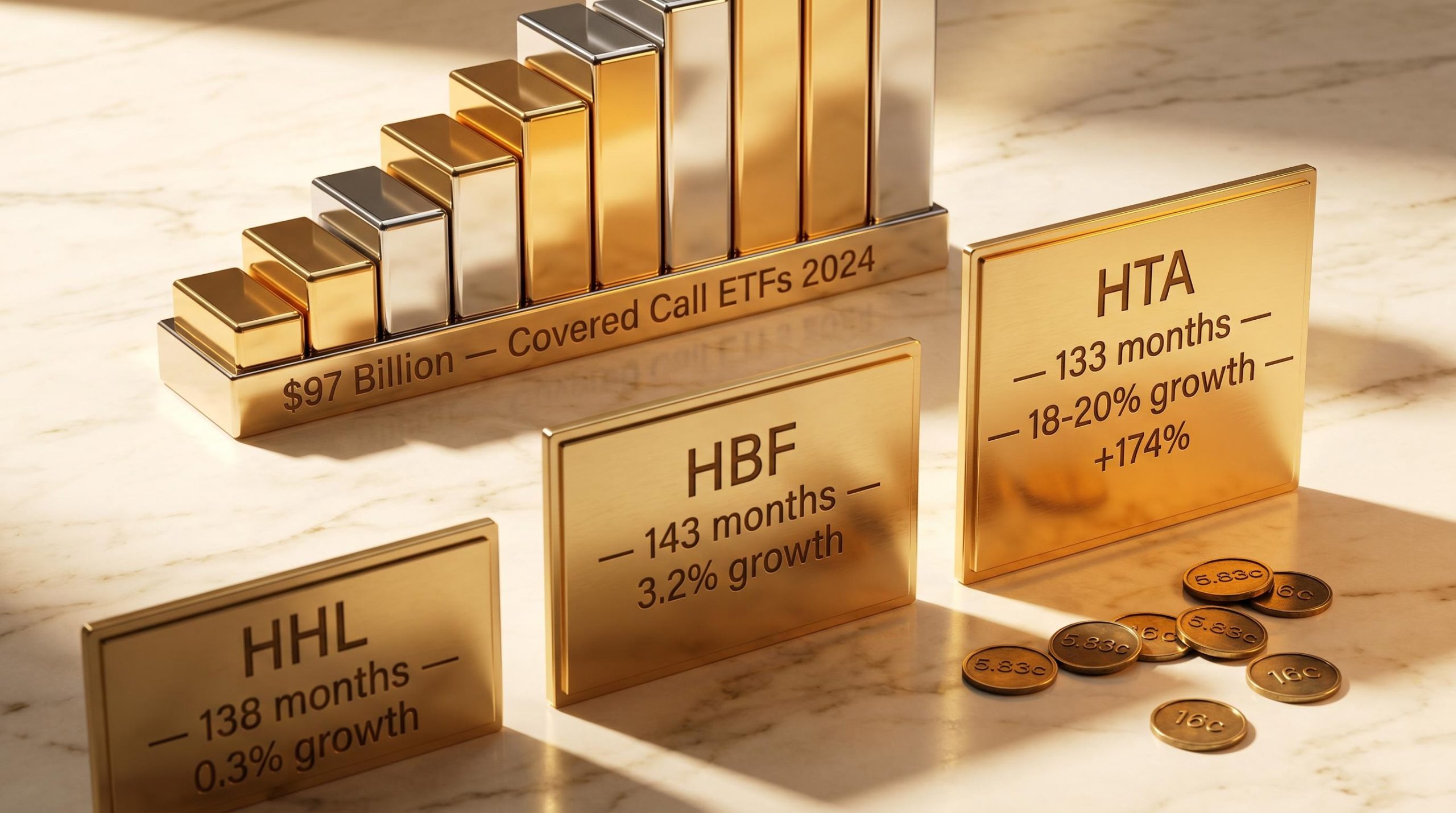
A covered call ETF advertising a 10% yield is not necessarily a better income vehicle than one paying 6%. The data to prove that point exists in plain sight, but most investors walk past it because they screen on yield alone. Covered call ETFs have grown from a niche institutional product into a mainstream retail income category, with derivative income funds holding $97 billion in assets by the end of 2024, up $33 billion in a single year. Record inflows of $7.5 billion followed in July 2025 alone. That pace of adoption means a large number of investors are selecting funds primarily on headline yield without understanding the metrics that predict whether income will grow, hold steady, or quietly erode over time. What follows is a repeatable framework for evaluating covered call ETFs using three linked metrics: distribution streak length, lifetime payout growth rate, and total return context. Real fund examples illustrate how the same framework produces different recommendations depending on an investor’s specific income needs.
Why yield alone is a misleading scorecard for income investors
The intuitive logic seems sound: a higher yield means more income, so the fund with the biggest number wins. In practice, that assumption breaks down over any holding period longer than a single distribution cycle. Nominal yield is a point-in-time snapshot. It captures what a fund paid most recently relative to its current price, not whether that payment is growing, flat, or shrinking in real terms.
The limitations of yield as a wealth metric become most visible when a distribution payment mechanically reduces a fund’s net asset value by a near-equivalent amount, meaning the income received is partly a reclassification of existing capital rather than a net addition to investor wealth.
Two funds with an identical 8% current yield can sit on radically different income trajectories. One may have grown its distribution by 10% per year for five consecutive years. The other may have peaked two years ago and has been gradually declining since. The yield figure on a screener treats them as equivalent. They are not.
Distribution history, specifically the length of an unbroken payment streak and the direction of change over a fund’s lifetime, tells a more complete story than any single yield figure. The $97 billion now sitting in this category, and the record $7.5 billion that arrived in a single month, suggests retail adoption has outpaced investor education on how to read that history.
The framework covered in this guide relies on three metrics that, together, replace headline yield as the primary evaluation tool:
- Distribution streak length: the number of consecutive months a fund has maintained or increased its distribution without a cut
- Lifetime payout growth rate: the total percentage change from inception to current distribution, annualised
- Total return context: the fund’s price performance plus reinvested distributions over a multi-year window, which reveals whether income is sustainable or partially funded by capital erosion
Among experienced income investors, a benchmark of roughly 10% annual distribution growth is often cited as a healthy target for dividend-growth-oriented strategies, though funds below that threshold may still serve specific income needs.
Against a backdrop where the S&P 500 has delivered approximately 7-8% average annual returns historically, these metrics help calibrate expectations for what a covered call strategy can realistically deliver.
When big ASX news breaks, our subscribers know first
The metrics that actually predict income quality: a three-part framework
The three metrics described above are not a checklist to tick off independently. They function as a system, where the insight comes from reading them together. A long streak with no growth tells a different story from a shorter streak with strong growth. Both tell a different story again when total return context is layered in.
- Distribution streak length is the first filter. An unbroken record of stable or rising payments through varying market conditions, including drawdowns, volatility spikes, and sector rotations, is meaningful evidence of fund management discipline. A fund that maintained its distribution through the April 2025 volatility event, for example, demonstrated a commitment that a fund cutting its payout in the same period did not. Funds that have cut distributions at any point lose their streak status and belong in a separate evaluation category from consistent payers.
- Lifetime payout growth rate is the second metric and the one most investors overlook entirely. This measures the total percentage change from a fund’s first distribution to its most recent, annualised over the fund’s operating life. Short-term yield movements can be distorted by one-off events, a single elevated distribution, or a temporary market condition. The lifetime figure smooths those distortions and reveals the structural trajectory.
- Total return context completes the picture. A fund can sustain high distributions for years while its unit price steadily declines. The income looks attractive in isolation, but total return (price change plus reinvested distributions) reveals whether the fund is generating genuine returns or gradually returning investors’ own capital as income. No fixed formula connects total return performance to expected distribution increases; experienced analysis develops a sense of reasonable ranges rather than precise rules.
How to read a distribution history at a glance
A healthy distribution history shows steady payouts with periodic step-up increases. The visual pattern is a rising staircase, not a jagged line of cuts and recoveries.
Funds with structural changes, such as mandate shifts, manager replacements, or sector rotations, require extra scrutiny. Their historical data may reflect a different fund from the one currently operating. Where such changes have occurred, the data before the change is context rather than evidence.
Three real funds, three very different income profiles
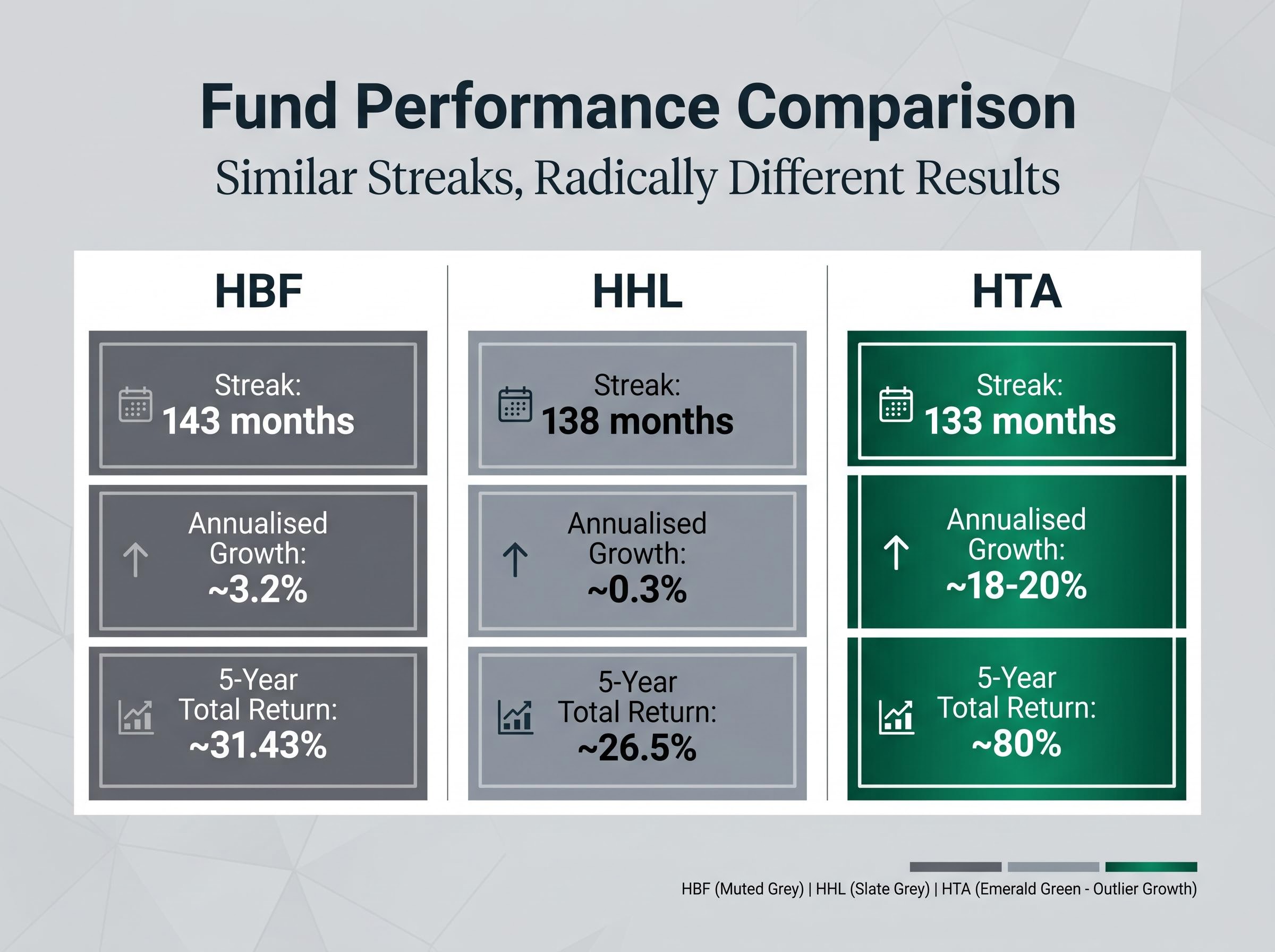
The framework becomes concrete when applied to three funds with similar streak lengths but very different income trajectories: HBF, HHL, and HTA. The following comparison uses publicly available distribution data and performance figures.
| Fund | Streak Length | Lifetime Distribution Change | Annualised Growth Rate | Five-Year Total Return |
|---|---|---|---|---|
| HBF | 143 consecutive months | ~38% (5.15c to 7.12c) | ~3.2% | ~31.43% |
| HHL | 138 consecutive months | ~2.92% (5.83c to 6c) | ~0.3% | ~26.5% |
| HTA | 133 consecutive months | ~174% (5.83c to 16c) | ~18-20% | ~80% |
HTA is the high-growth outlier. Its 133 consecutive months of unbroken payments are paired with a lifetime distribution increase of 174% over 11 years, from approximately 5.83 cents to approximately 16 cents. Annualised distribution growth sits at approximately 18-20%, and the five-year total return of approximately 80% confirms the income trajectory is backed by genuine fund-level returns, not capital erosion.
HBF is the longevity benchmark. Its 143 consecutive months without a distribution cut represents a 12-year track record of unbroken payments. The initial distribution of approximately 5.15 cents has grown to approximately 7.12 cents, translating to annualised growth of roughly 3.2% per year. Its five-year total return of approximately 31.43% sits alongside a five-year price return of roughly -2%, meaning distributions have done most of the work.
HHL presents the consistency-without-growth case. At 138 consecutive months, the streak is nearly as long as HBF’s. Yet the distribution has barely moved, from approximately 5.83 cents in January 2015 to approximately 6 cents currently. The fund manages approximately $1.6 billion in assets and has delivered a five-year total return of approximately 26.5%, despite a five-year price decline of roughly -16.77%. Income has offset capital erosion, but distribution growth has been effectively flat.
HTA’s lifetime distribution increase of 174% stands in sharp contrast to HBF’s more modest growth. Both funds have maintained unbroken payment streaks exceeding a decade. Streak length alone would not have separated them.
What sector exposure and fund structure mean for distribution growth
The gap between HTA’s 18-20% annualised distribution growth and HBF’s 3.2% is not random. It reflects structural differences in what each fund owns and how option premiums are generated from those holdings.
Sector exposure is a primary driver. Technology-heavy funds like HTA benefit from higher underlying stock volatility, which translates directly into richer option premiums. When the stocks in the portfolio move more, the options written against them command higher prices. That premium income feeds both current distributions and the potential for distribution growth over time. Stronger capital appreciation in tech holdings also supports the total return context that sustains rising payouts.
Healthcare and broad equity mandates tend to produce more stable but slower-growing premium income. Lower index volatility means the options written against those portfolios generate smaller premiums relative to tech-heavy mandates. The trade-off is greater consistency; the cost is a structurally lower growth ceiling.
Gold-focused covered call ETFs (such as GLCC and GLCL) have recently demonstrated exceptional distribution growth linked to gold price appreciation. This illustrates how commodity exposure creates a different growth dynamic from equity mandates, one driven by the price trajectory of the underlying asset rather than by volatility-driven premium income alone.
The structural factors that influence distribution growth potential include:
Leveraged covered call ETFs represent a structural variant on the category that compounds the sector volatility dynamics described above: by combining 1.25x equity exposure with a call-writing overlay, these products produce a portfolio delta of approximately 0.92 and yields exceeding 13%, while concentrating the borrowing-cost sensitivity that makes the interest rate environment a primary performance variable.
- Sector volatility of underlying holdings
- The option premium environment for those sectors
- Use of leverage within the fund structure
- Mandate stability over the fund’s operating life
- Continuity of the portfolio management team
Matching the right fund to your income strategy
The framework has identified what separates a growing income stream from a flat one. The remaining question is personal: how does the investor actually use their distributions?
The distinction matters more than it appears. An investor who can reinvest distributions, purchasing additional units each month, controls the most powerful compounding lever available in this category. For that investor, reinvestment itself is the primary growth mechanism. HTA’s 18-20% annual distribution growth, compounded monthly through reinvestment into additional units, accelerates the effective income stream far beyond what the fund’s organic payout increases deliver alone. Natural distribution growth is a welcome bonus, but the reinvestment decision is the more controllable variable.
An investor who depends on distributions as live income (a retiree drawing cash each month, for example) cannot substitute reinvestment compounding for fund-level growth. For that investor, natural payout growth becomes the primary mechanism for maintaining purchasing power. HBF’s 3.2% annual growth at least keeps pace with moderate inflation, making it more suitable than a flat-distribution fund for someone drawing income over a decade or more.
Reinvestment remains the most controllable compounding lever available to income investors in this category. The decision to reinvest or draw income shapes the evaluation criteria more than any single fund metric.
The expanded range of covered call ETF options available since approximately 2021, when the modern wave of leveraged and innovative income ETFs gained traction, has given investors at different risk tolerances a wider selection. The framework applies consistently across that range.
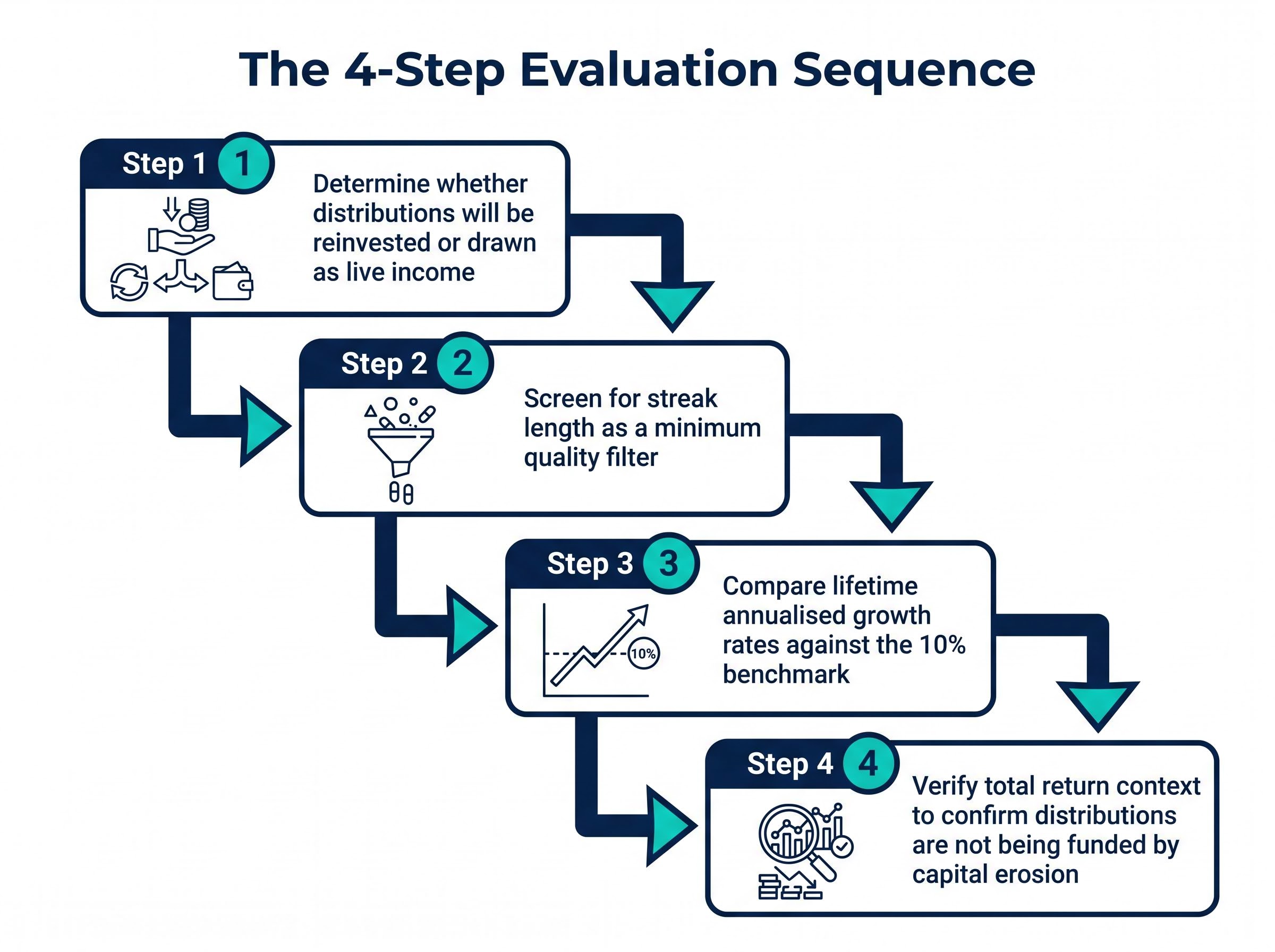
A four-step decision sequence draws the evaluation together:
- Determine whether distributions will be reinvested or drawn as live income
- Screen for streak length as a minimum quality filter
- Compare lifetime annualised growth rates against the 10% benchmark
- Verify total return context to confirm distributions are not being funded by capital erosion
Individual investor circumstances vary significantly, and no universal portfolio allocation applies across all situations. The framework described here is a selection tool, not a prescription.
For investors who have identified appropriate fund types using the streak and growth-rate framework above, our dedicated guide to blending covered call ETFs walks through the Anchor, Booster, and Juicer allocation framework, the return-of-capital warning thresholds, and how blended portfolios targeting 10-12% yield can achieve meaningfully higher distribution sustainability than single-fund allocations.
When historical data no longer describes the current fund
Not all distribution histories tell a straight story. HYLD is a useful case. The fund transitioned from a fund-of-funds model holding third-party products to an internally managed options-writing strategy around 2023. During banking sector disruption, its distribution was cut from approximately 14 cents to approximately 12 cents, before recovering to approximately 15 cents over roughly three years. Lifetime distribution change stands at approximately 12.73%, or roughly 3% annualised.
That headline figure partially describes a different fund from the one currently operating. Investors evaluating HYLD should identify the date of the structural change and treat pre-change data as context rather than predictive evidence. The same applies to any fund that has undergone a mandate shift, manager replacement, or strategy overhaul. The distribution history before the change may be accurate but no longer relevant to the fund’s current trajectory.
The numbers are a starting point, not the final answer
Distribution streak length, lifetime growth rate, and total return context together provide a significantly richer picture than any single yield figure. They reveal whether income is growing, holding, or eroding, and they separate management discipline from marketing claims. That said, they describe the past.
Cost drag over time is a compounding factor that sits outside the three-metric framework described in this guide but can materially alter the outcome: total annual cost differences of up to 2.32 percentage points between concentrated and index-proxy covered call ETFs erode income advantages that look meaningful at inception into negligible differences over multi-year holding periods.
The covered call ETF market is evolving rapidly. New zero-day-to-expiry (0DTE) strategies, weekly distribution products, and single-stock option exchange-traded products have arrived in the past two years. Many of these funds carry track records measured in months rather than years, limiting the predictive value of their historical data within this framework.
The April 2025 volatility event offered a reminder that discrete market events can temporarily alter distribution patterns in ways that do not reflect a fund’s long-run income trajectory. Analyst consensus broadly supports covered call ETFs as income vehicles best suited to investors who accept the trade-off of capped upside (the 2024 S&P 500 total return of approximately 25% created a headwind for covered call relative performance) in exchange for more predictable current income.
With $97 billion in category assets and record monthly inflows, the covered call ETF market has reached a scale where analytical rigour in fund selection is no longer optional for serious income investors.
As the category matures and more funds accumulate meaningful multi-year histories, the analytical framework described in this guide will become more powerful, not less, as a selection tool. The yield number on a screener will always be the easiest figure to find. The three metrics that sit behind it are the ones worth the effort.
This article is for informational purposes only and should not be considered financial advice. Investors should conduct their own research and consult with financial professionals before making investment decisions. Past performance does not guarantee future results. Financial projections are subject to market conditions and various risk factors.