
A share price falling 50% does not make a dividend twice as attractive. It makes the yield formula twice as misleading.
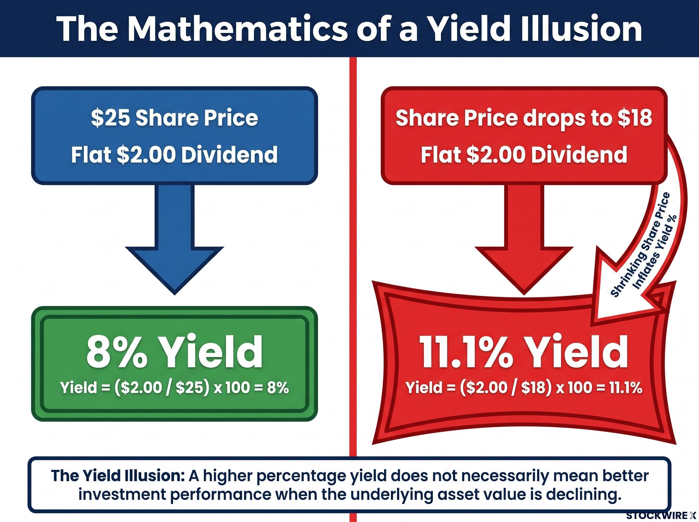
That distinction sits at the centre of one of the most common screening errors in income investing. Dividend yield, the single number most investors use first when filtering for income ideas, has a structural flaw built into its construction. A yield rising because a company is thriving looks identical to a yield rising because a company is collapsing, until you know which path produced the number. Consider a $2.00 annual dividend. At a $25 share price, that is an 8% yield. At $18, the same dividend produces 11.1%. The yield looks more generous precisely as your capital base shrinks and the payout becomes less defensible.
After reading this, you will know exactly which data points to pull before trusting a high yield, and why the highest number on any screener is the one most likely to deceive you. This is not a one-off warning. It is a framework you will carry into every income screen you run from here.
Why the yield number lies to you before anything else does
The formula is simple. Annual dividend per share divided by current share price equals dividend yield. The problem is that two completely opposite economic realities produce the same output:
- Path one: A company raises its dividend because earnings are growing. The yield rises because the numerator (dividend) increased. This is genuine income strength.
- Path two: A company’s share price falls because the business is deteriorating. The yield rises because the denominator (price) collapsed. This is a warning signal dressed as an opportunity.
The yield figure itself contains no information about which path produced it. Any screener ranking by yield places both situations on equal footing, which means the highest-yielding names on any list divide into two groups that are indistinguishable by yield alone: businesses that may genuinely be mispriced, and companies already in decline whose upcoming dividend cut has simply not been made official yet.
The dividend yield formula divides annual dividends per share by the current share price, a construction that treats a rising dividend and a collapsing price as mathematically interchangeable inputs, which is precisely why the output can look most attractive at the moment it is most dangerous.
Fidelity notes there are “2 ways a stock gets a high dividend yield: the company raises its dividend… or the dividend remains flat while the stock price declines. Often, it’s the latter.”
Morningstar confirms that a high yield driven by a low share price is typically more common in distressed situations than in undervalued ones. The yield number is not a signal about business quality. It is an output of a ratio that treats a rising dividend and a falling share price as interchangeable inputs, and trusting it uncritically is a structural error, not a matter of bad luck.
When big ASX news breaks, our subscribers know first
How a collapsing price makes a failing company look generous
The reason the yield formula deceives so reliably comes down to timing. Markets and boards operate on fundamentally different clocks. Markets reprice securities continuously as new information about earnings, credit conditions, or outlook arrives. Boards adjust dividends quarterly at best, and they are structurally reluctant to cut because dividend reductions signal distress and can trigger forced selling by income-focused funds.
That gap creates a predictable sequence:
- Business deteriorates. Earnings weaken, margins compress, or the balance sheet comes under pressure. The market begins repricing the shares lower.
- Price falls and yield spikes. Because markets respond to bad news rapidly while boards move slowly, the share price drops well before any dividend reduction is announced. The old dividend remains on the books, so the yield formula inflates automatically and the stock surfaces on income screens looking like a high-yield opportunity.
- Board eventually cuts the dividend. Weeks or months later, the board formally acknowledges what the market had already priced in. Investors who bought the yield now face both a capital loss and an income loss simultaneously.
TSI Network describes this sequence explicitly: the price falls first, the dividend cut comes later, leaving investors exposed on both fronts at once. Fidelity warns that high-yield stocks often reflect companies already in distress with a high probability of further deterioration, yet the dividend may still be listed at its old level.
What makes the yield trap so effective is that it presents itself at precisely the wrong moment. When a share price collapses and yield spikes, the screen shows an apparently attractive income opportunity. In reality, the market has already repriced the business to reflect deteriorating fundamentals; the board simply has not followed yet. The interval between those two events is where the trap lives.
Inside a real yield trap: what the 18.55% number was hiding
A mortgage real estate investment trust (mREIT) is a company that raises capital at short-term rates, deploys it into government-backed mortgage bonds, and earns the spread between the two. One such company was carrying an advertised yield of 18.55%. To generate $60,000 per year at that rate, an investor would need to commit roughly $323,450.
The number looked generous. The quarterly data told a different story.
The company’s payout ratio had reached 155%, meaning it was paying out far more in distributions than the underlying business was actually earning.
In Q1, the company distributed $0.36 per share while its book value per share dropped by $0.46, producing a net total return of negative $1.00 per share for shareholders.
Each $1.00 distributed to shareholders during Q1 came at a cost of roughly $1.28 in book value. The dividend was being funded, in part, by eroding the asset base itself.
Q2 offered a slightly better picture: $0.30 per share paid, book value up $0.14, and total return of positive 6.21%. But one improved quarter did not reverse the structural pattern. Quarter-to-quarter variation is inherent in the mREIT model; the multi-year trend is what reveals whether the business can sustain its distributions.
| Quarter | Dividend paid per share | Book value change per share | Total return |
|---|---|---|---|
| Q1 | $0.36 | -$0.46 | -$1.00 per share |
| Q2 | $0.30 | +$0.14 | +6.21% |
What matters most here is not simply that the dividend was eventually cut. It is that the yield figure showed no stress throughout the entire deterioration, because the share price was falling at roughly the same rate as the dividend, keeping the ratio artificially stable. Yield offered no warning at any point in the process.
The dividend sequence that yield never flagged
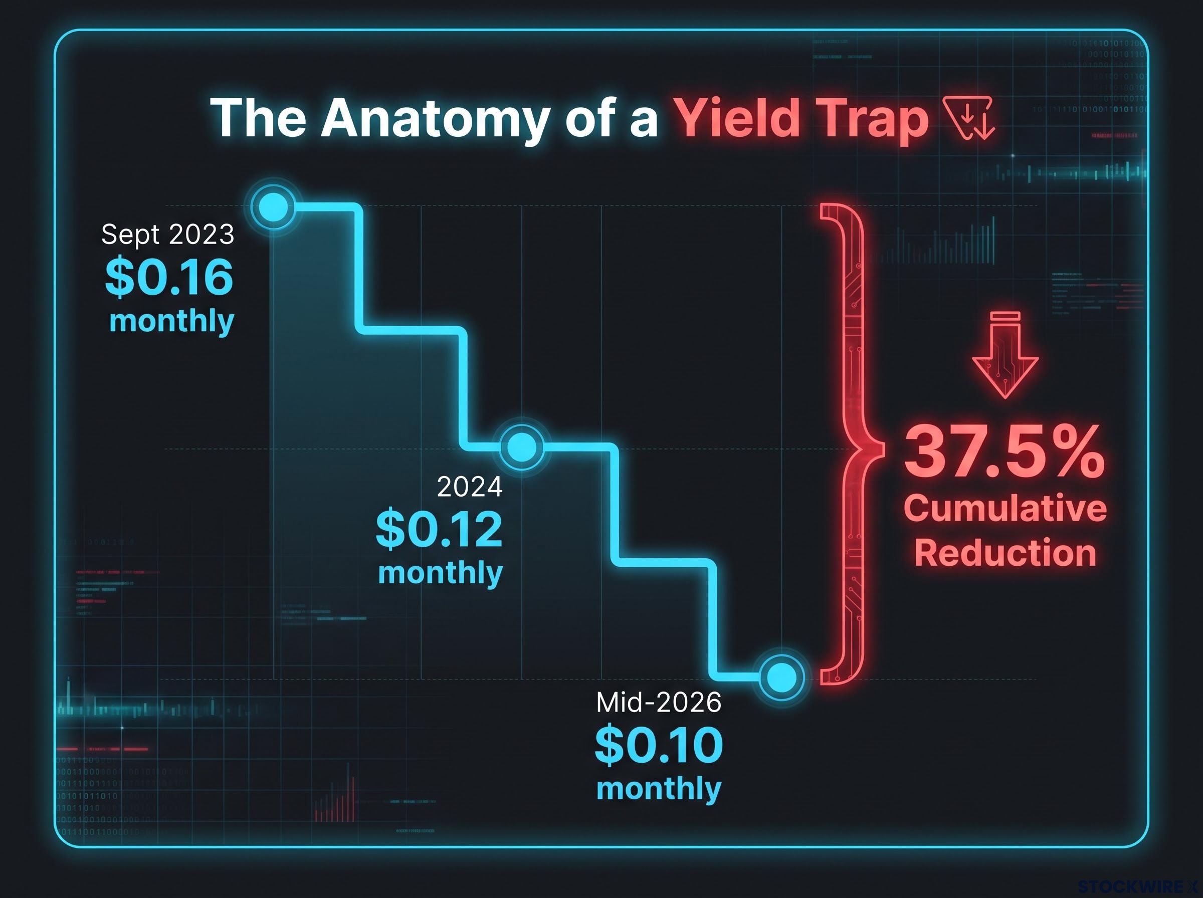
Distributions per share fell progressively: $0.16 monthly in September 2023, then trimmed to $0.12 across 2024, and cut again to $0.10 by mid-2026, representing a cumulative reduction of 37.5% in the actual cash paid to shareholders:
- September 2023: $0.16 per share monthly
- 2024: reduced to $0.12 per share monthly
- Mid-2026: further reduced to $0.10 per share monthly
Measured across five years, the compound annual change in dividends per share averaged negative 21%, and the most recent trailing twelve months recorded a further decline of negative 6.67%. Over the same window, the share price moved from $6.98 down to $6.47.
Despite three successive reductions, the advertised yield held elevated because the share price was contracting in parallel with the dividend. When both the numerator and the denominator of the yield fraction shrink together, the ratio changes very little. This is the structural failure made concrete: throughout a 37.5% cumulative reduction in income, the yield column signalled nothing. The $60,000 annual income the yield appeared to promise was partly a return of invested capital rather than a return on it, and the yield figure never captured that distinction.
Five checks that catch a yield trap before you buy
Each of the five steps below maps to a specific data point you can locate in public filings or free screening tools. Applied to the 18.55% yield case study, all five would have returned warning signals before the first dividend cut was announced.
- Identify why the yield is high. Compare price history to dividend history over 12-24 months. If the yield rose mainly because the price fell, not because the dividend grew, you are looking at a collapsing denominator. That is a potential warning, not a bargain.
- Check the payout ratio against earnings and cash flow. For most companies, a payout ratio above 80% of earnings is a danger zone. For REITs, evaluate coverage against funds from operations (FFO) or adjusted FFO (AFFO), the cash-flow measures that strip out non-cash accounting items. A ratio above 100% over multiple quarters, as in the 155% case study, usually means the company is liquidating capital to maintain the dividend.
Payout sustainability requires comparing distributions against underlying earnings and cash flow across multiple quarters, not just the most recently reported period, because a single improved quarter, as in the Q2 case study data, can temporarily obscure a multi-year deterioration trend.
- Track book value per share. For asset-intensive businesses (REITs, business development companies, banks, insurers), follow book value per share across quarters. The Q1 figure, book value down $0.46 while $0.36 was distributed, is exactly the kind of data point to locate in quarterly filings before committing capital. If book value is falling while dividends are being paid, you may be receiving your own capital back as income.
DividendCalc flags payout ratios above 80-100% of earnings as a danger threshold. Above 100% across multiple quarters typically signals capital liquidation, not income generation.
- Evaluate the dividend trend, not just the current yield. Review five-year dividend growth rates and the sequence of changes. A long-term negative growth rate, such as the negative 21% five-year average in the case study, signals structural deterioration rather than a one-off adjustment. The negative 6.67% trailing-12-month figure combined with that five-year pattern confirms systematic erosion. A high yield with no dividend growth for three or more years is a strong warning sign.
- Assess the business model’s sensitivity to external factors. For mREITs, analyse exposure to the yield curve (the relationship between short-term and long-term interest rates), credit spreads, refinancing cycles, and leverage. High-yield stocks are disproportionately concentrated in sectors with macroeconomic sensitivity, including financials, energy, and REITs. Understanding what external conditions the business model depends on tells you whether the payout is structurally stable or inherently cyclical.
Interest rate sensitivity is particularly acute in the mREIT model because the business earns a spread between short-term borrowing costs and long-term mortgage bond yields, meaning a flattening or inverting yield curve compresses the very income the distribution is meant to pass on to shareholders.
One additional tool worth noting: the trailing yield versus forward yield distinction. Trailing yield uses dividends already paid; forward yield uses analyst estimates of future dividends. In distressed situations, trailing yield often overstates what you will actually receive because it has not yet reflected cuts the market already anticipates.
What genuine high-yield opportunities actually look like
The correct takeaway from all of this is not “avoid high yield.” It is “require evidence of sustainability before accepting yield as real income.” Genuinely attractive high-yield investments exist. They are simply far rarer than screener results suggest, and they almost never appear as unexplained outliers above 10% without accompanying signs of stress in the underlying data.
The safe-haven narrative around high-dividend stocks intensified in early 2026 as bearish sentiment spiked, but the MSCI World High-Dividend Yield Index fell nearly as steeply as the broader market and lagged significantly during the subsequent recovery, confirming that yield level alone provides no structural downside protection.
The distinguishing features of healthier high-yield situations include:
- Moderate yield range: often 4-7% depending on asset class, not extreme outliers. This range is not a universal threshold and will vary by sector, but it captures where most sustainable income situations tend to cluster.
- Payout ratios comfortably below 75-80% of earnings, or below sector-appropriate cash flow thresholds for REITs and BDCs.
- Stable or growing book value per share, indicating dividends are funded from operations, not erosion of capital.
- Consistent dividend history without frequent cuts, and at least occasional raises across a normal business cycle.
- Price declines driven by sector-wide or market-wide repricing rather than company-specific deterioration, suggesting the business itself may not be impaired.
| Characteristic | Yield trap profile | Sustainable yield profile | Case study example |
|---|---|---|---|
| Yield level | Above 10%, often extreme outlier | 4-7% range | 18.55% |
| Payout ratio | Above 100% of earnings/cash flow | Below 75-80% of earnings | 155% |
| Book value trend | Declining across quarters | Stable or growing | Down $0.46 in Q1 |
| Dividend trend (5-year) | Negative growth, repeated cuts | Stable or growing | Negative 21% annually |
A 5% yield from a company with a 60% payout ratio, growing book value, and a ten-year dividend growth record is not the same asset class as an 18% yield from a company with a 155% payout ratio and five consecutive quarterly cuts, even though both appear on the same income screener. Your job is to distinguish between them before you buy, not after.
The screen is a starting point, not a decision
Dividend yield is a filter. It surfaces candidates for investigation. It is not a measure of income quality, business health, or what you will actually receive over the next twelve months. The same yield can come from two completely opposite situations, and the five-step framework above is what resolves what the yield number alone cannot.
When a yield appears unusually high, the first question is no longer “how do I access this income?” According to TSI Network, a high yield often signals widespread investor scepticism that the company can maintain its dividend. That reframes the question entirely.
Applied to the case study, the 18.55% yield would have failed checks at Steps 1, 2, 3, and 4 before the first dividend cut was announced in September 2023. The framework works retrospectively and prospectively. The data was available. The yield column simply never showed it.
The specific question you now carry into every screen is this:
“What is the market pricing in when it puts this yield at this level?”
That single question, asked before you act on any high yield, changes the entire process. You stop asking whether the yield is real and start asking what the market knows that you do not yet. The screen gave you a number. Your job is to find out what it is hiding.
This article is for informational purposes only and should not be considered financial advice. Investors should conduct their own research and consult with financial professionals before making investment decisions.