
US 30-year Treasury yields sitting at approximately 5.1% in May 2026 have generated a steady stream of alarmed commentary. Financial headlines frame the number as a warning, a signal that something has broken in government bond markets. But that framing depends entirely on which baseline readers choose. The same yield was unremarkable for most of the early 2000s, before any central bank had attempted quantitative easing at scale. What follows is an examination of the historical data, the mechanics of policy withdrawal, the inflation picture, auction demand, and volatility, five evidence streams that together offer a framework for distinguishing genuine stress in bond markets from statistical reversion to a familiar range.
What the yield charts actually show when you zoom out
The alarm around rising bond yields becomes harder to sustain the further back the chart extends. US 30-year yields at approximately 5.1% are comparable to levels seen during much of the early-to-mid 2000s, and they sit well beneath the elevated rates of the 1980s and early 1990s. A dataset spanning 31 December 1979 through 18 May 2026 places the current level squarely within a range that prevailed for years before the post-2008 suppression era began.
The six-nation sovereign yield surge of 18 May 2026, when Germany, France, Italy, Spain, the United States, and Japan all moved to generational highs simultaneously, was the specific market event that sharpened much of the alarm this analysis addresses; Brent crude’s 57% rise from around $70 to above $110 in under three months supplied the inflation repricing catalyst that bond markets were responding to.
US 30-year yields at 5.1% are comparable to levels seen during much of the early-to-mid 2000s and well beneath the elevated rates of the 1980s and early 1990s.
Across developed economies, the picture is consistent. Yields have risen since 2022, but the increases remain within ranges established over that period rather than breaching into uncharted territory:
- United States: 10-year and 30-year benchmark yields elevated but within post-2022 ranges
- United Kingdom: 30-year Gilt yields (continuous data available from April 1998) tracking a similar normalisation pattern
- Germany: Bund yields reflecting the European Central Bank’s own policy withdrawal
- Japan: 30-year yields (data from 1999) rising as the Bank of Japan steps back from its decades-long intervention
The baseline chosen determines whether the current environment looks like a crisis or a correction. Measured against the suppressed rates of the 2010s, yields look alarming. Measured against the half-century before that, they look like a return to a familiar address.
When big ASX news breaks, our subscribers know first
How a decade of central bank intervention distorted the baseline
The yields of the 2010s were not set by open markets. They were set by central banks buying enormous quantities of government bonds to push long-term borrowing costs below where supply and demand would otherwise have placed them. That programme, quantitative easing (QE), was a deliberate policy tool designed to stimulate economic growth by making borrowing cheaper across the economy.
The QE mechanic
When a central bank purchases government bonds in bulk, it increases demand for those bonds, pushing their prices up and their yields down. The intended effect was lower mortgage rates, cheaper corporate borrowing, and stronger economic activity. Whether it achieved those objectives as designed remains a subject of debate; source commentary notes that the stated growth-stimulation goals were not realised as intended.
The unwinding
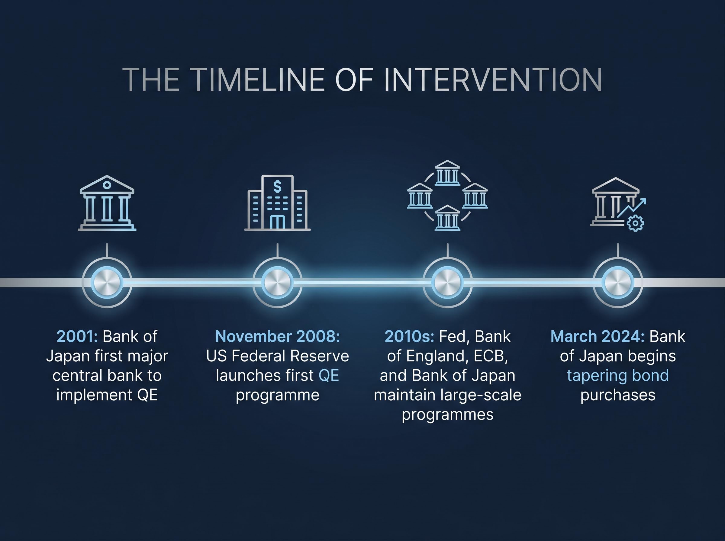
The timeline of intervention spans more than two decades:
- 2001: The Bank of Japan becomes the first major central bank to implement QE
- November 2008: The US Federal Reserve launches its first QE programme in response to the global financial crisis
- 2010s: The Fed, Bank of England, ECB, and Bank of Japan all maintain large-scale bond-purchasing programmes
- March 2024: The Bank of Japan begins tapering its bond purchases, marking a concrete step in the global withdrawal from QE
Current yield increases are the mechanical consequence of this withdrawal. As central banks step back from buying, the artificial demand that compressed yields fades, and market pricing reasserts itself. The rise in yields is less a signal of deterioration and more the predictable result of gravity reasserting itself after a decade of policy suspension.
What inflation data tells us about where yields are headed
Inflation is the most common reason cited for anxiety about the current yield environment. The logic is straightforward: if inflation is rising or expected to rise, bond investors demand higher yields to compensate for the erosion of their purchasing power. The question is whether the data supports that fear.
Milton Friedman framed inflation as fundamentally a monetary phenomenon, tied to excess money supply relative to the goods and services available in an economy.
Applying that framework to current conditions produces a more measured picture than the headlines suggest. Money supply growth rates across developed economies have returned to levels consistent with the pre-pandemic period, when inflation was subdued. Companies across many markets are reporting limited ability to raise prices, indicating constrained consumer pricing power rather than an environment where inflation spirals unchecked.
The energy-driven CPI transmission chain that pushed headline inflation to 3.8% year-over-year in April 2026 is the primary factor complicating a clean read on whether current money supply conditions are structurally inflationary or temporarily elevated by an exogenous supply shock.
The pre-QE decade offers a useful calibration point:
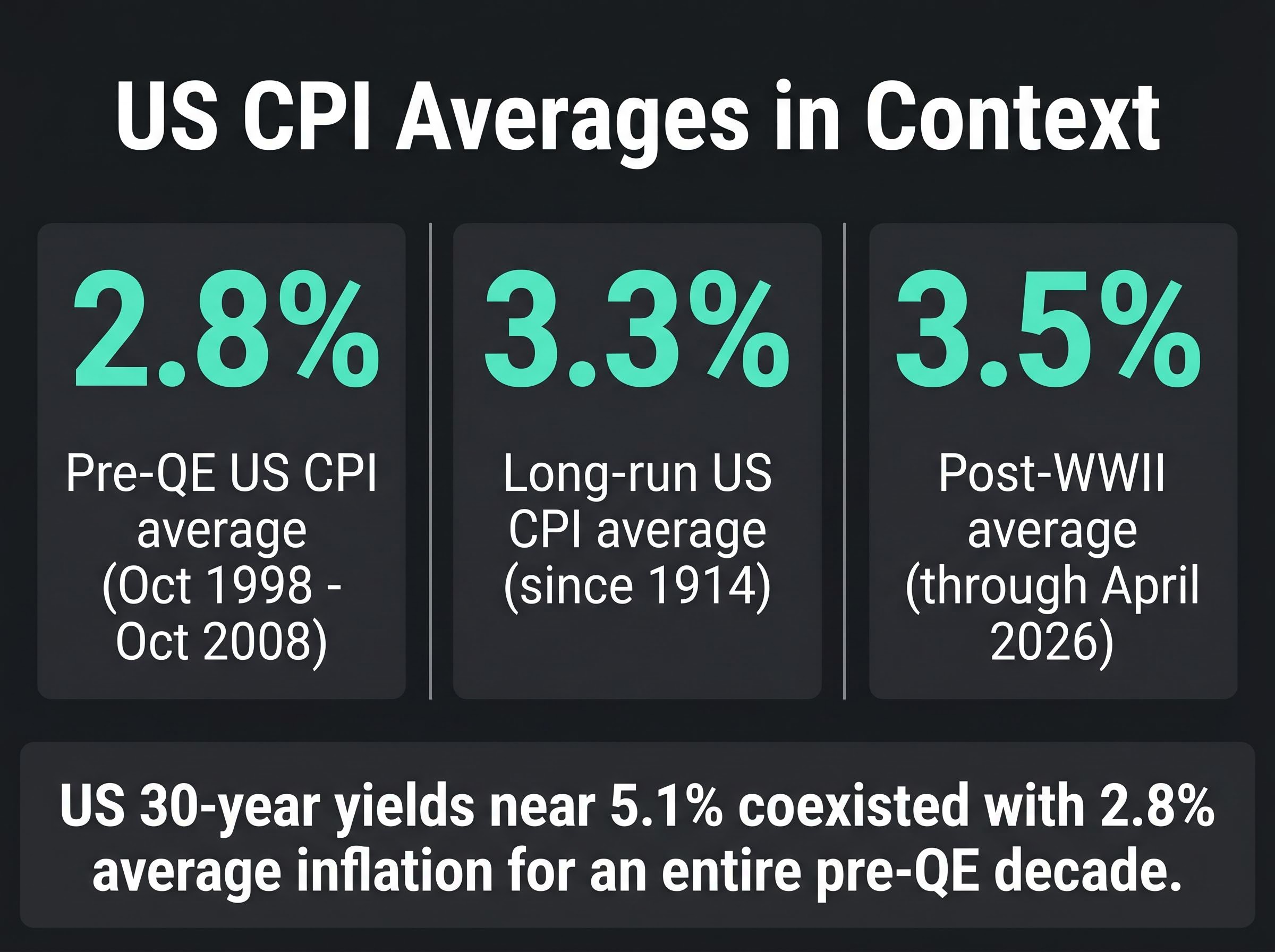
- Pre-QE US CPI average: 2.8% year-over-year (October 1998 through October 2008, per FactSet), a period when yields were near current levels
- Long-run US CPI average: approximately 3.3% since data collection began in 1914; approximately 3.5% in the post-World War II period (FactSet, through April 2026)
- Current pricing power signals: companies reporting difficulty passing costs through to consumers, consistent with contained rather than accelerating inflation
Yields near 5.1% coexisted with 2.8% average inflation for an entire decade. The data does not eliminate inflation as a risk, but it does challenge the assumption that current yield levels require an inflationary surge to justify them.
Auction demand as a stress test for the “no one wants bonds” narrative
One of the more persistent claims in bond market commentary is that institutional investors are losing appetite for government debt. Auction data provides a direct, real-time way to test that claim.
What bid-to-cover ratios measure
A bid-to-cover ratio measures total bids received relative to the amount of bonds offered at auction. A ratio of 2.5, for example, means investors collectively bid for two and a half times the amount of debt available. Higher ratios indicate stronger demand. When this metric falls substantially below historical averages, it signals genuine reluctance among buyers. When it holds at or above those averages, the demand-collapse narrative does not survive contact with the data.
What the 2026 auction results show
Across five major sovereign debt markets, recent auction results as of 21 May 2026 show bid-to-cover ratios at or above their respective ten-year averages.
The US Treasury auction results published by TreasuryDirect for the 20-year bond auction held on 20 May 2026 recorded a bid-to-cover ratio of 2.55, consistent with the pattern of healthy institutional demand the broader auction data reflects.
| Country | Benchmark | Result vs. 10-Year Average |
|---|---|---|
| United States | Treasury auctions | At or above average |
| United Kingdom | Gilt auctions | At or above average |
| Germany | Bund auctions | At or above average |
| Japan | JGB auctions | At or above average |
| Italy | BTP auctions | 10-year auction not yet held in May 2026 |
Sources: US Treasury, UK Debt Management Office, Germany Finance Agency, Japan Ministry of Finance, Italy Ministry of Economy and Finance.
A genuine flight from government bonds would produce substantially lower bid-to-cover ratios than those currently observed. The data, across four of the five markets with available results, is inconsistent with a demand collapse.
Bond volatility versus equity volatility: what the 2026 data shows
The narrative around bonds in 2026 has centred on losses. The ICE BofA 7-10 Year US Corporate and Government Bond Index has delivered a year-to-date price return of approximately -2.6% through 21 May 2026, while the S&P 500 has returned approximately 9.3% over the same period. On return alone, bonds look like the weaker asset.
Volatility tells a different story.
| Asset | YTD Price Return | Volatility Profile | Notable Drawdown |
|---|---|---|---|
| S&P 500 | ~9.3% | Considerably greater price swings | March 2026 equity correction (energy/geopolitical) |
| ICE BofA 7-10Y Bond Index | ~-2.6% | Substantially lower swing profile | No comparable drawdown event |
The March 2026 equity pullback, tied to energy supply concerns from geopolitical conflict, was more severe than any bond market drawdown over the same period. The S&P 500 experienced considerably greater price swings than the bond index throughout the year.
Volatility cuts both ways, and the bond index’s lower swing profile persisted even in a period of yield-driven headlines.
For investors who hold bonds as a stabilising allocation within a broader portfolio, the volatility data matters as much as the return data. A -2.6% price return with low volatility may be doing exactly what a bond allocation is designed to do: absorbing shocks that equities cannot.
What investors can actually do with their bond allocations right now
The analysis above provides a framework; the question is how to apply it. Three portfolio considerations follow logically from the evidence:
- Assess duration exposure relative to time horizon. Duration is a measure of how sensitive a bond’s price is to changes in interest rates. Shorter-maturity bonds carry less interest rate sensitivity than longer-duration instruments, making duration adjustment the primary lever for managing exposure without abandoning fixed income entirely.
- Weigh the timing risk of reactive shortening. Pivoting to short-duration bonds after yields have already risen means locking in a position that could underperform if yields subsequently decline. The reactive move carries its own cost.
- Evaluate whether the rationale for the bond allocation remains intact. For investors with a legitimate long-term reason for holding bonds, a yield increase driven primarily by sentiment and policy normalisation does not eliminate that rationale. Yields near current US levels coexisted with moderate inflation for an entire pre-QE decade.
The distinction between normalisation and crisis is not academic. It determines whether the appropriate response is adjustment or abandonment, and the data presented here favours the former.
The normalisation case, assessed on its own terms
Five evidence streams converge on the same conclusion. Historical yield data places current levels within a familiar pre-QE range. The mechanics of quantitative easing explain why the 2010s baseline was artificially suppressed. Inflation data, with a pre-QE average of 2.8% and a long-run average of 3.3%, does not require a surge to justify yields at 5.1%. Auction bid-to-cover ratios confirm that institutional demand for sovereign debt remains healthy. And volatility comparisons show bonds continuing to function as the lower-volatility asset class even in a year dominated by yield anxiety.
Normalisation is the most data-consistent interpretation. It is not the only possible one. A sustained deterioration in auction demand, a breakout in money supply growth, or a loss of fiscal credibility in a major sovereign issuer could shift the assessment. Readers should know what signals would change the picture, not just which interpretation fits today.
Beyond portfolio mechanics, yields as a policy forcing mechanism represent a regime shift that analysts at Wolfe Research, Bloomberg Opinion, and Apollo have each independently identified: bond market pressure on federal debt servicing now constrains White House fiscal flexibility more directly than equity market selloffs, a dynamic that makes yield monitoring a political as much as a financial exercise.
The core intellectual error this analysis set out to correct is recency bias: treating the suppressed yields of the post-2008 era as a permanent baseline rather than a policy experiment with an expiry date. Correcting that error does not make the current environment comfortable. It makes it legible.
This article is for informational purposes only and should not be considered financial advice. Investors should conduct their own research and consult with financial professionals before making investment decisions. Past performance does not guarantee future results.