Your savings account balance went up last month. It went up the month before that, too. The number on the screen has never gone down, and that stability feels like proof that your money is safe.
It is not. A force you cannot see on any bank statement is working against that balance every single day. Inflation, the slow annual rise in the cost of everything you buy, is quietly reducing what your dollars can actually purchase. Your account shows a number that is flat or gently rising. The real value of that number, measured in what it can buy you at the supermarket, the petrol station, or the mortgage broker’s office, is moving in the opposite direction.
Here is what changes when you see this clearly: you will know how to calculate the right amount of cash to hold, where to park it so it earns meaningfully more than a standard savings account, and how much your idle cash is costing you in real terms every year it sits untouched. What separates most households from the wealthiest ones is not a matter of having access to different investments. It comes down to a single decision about how capital is allocated, one you could make this week.
Why your savings account balance is not telling you the whole story
There are two numbers attached to every dollar you hold in cash. The first is the nominal value: the figure on your statement. The second is the real value: what that figure can actually buy. Your bank shows you the first number. It never shows you the second.
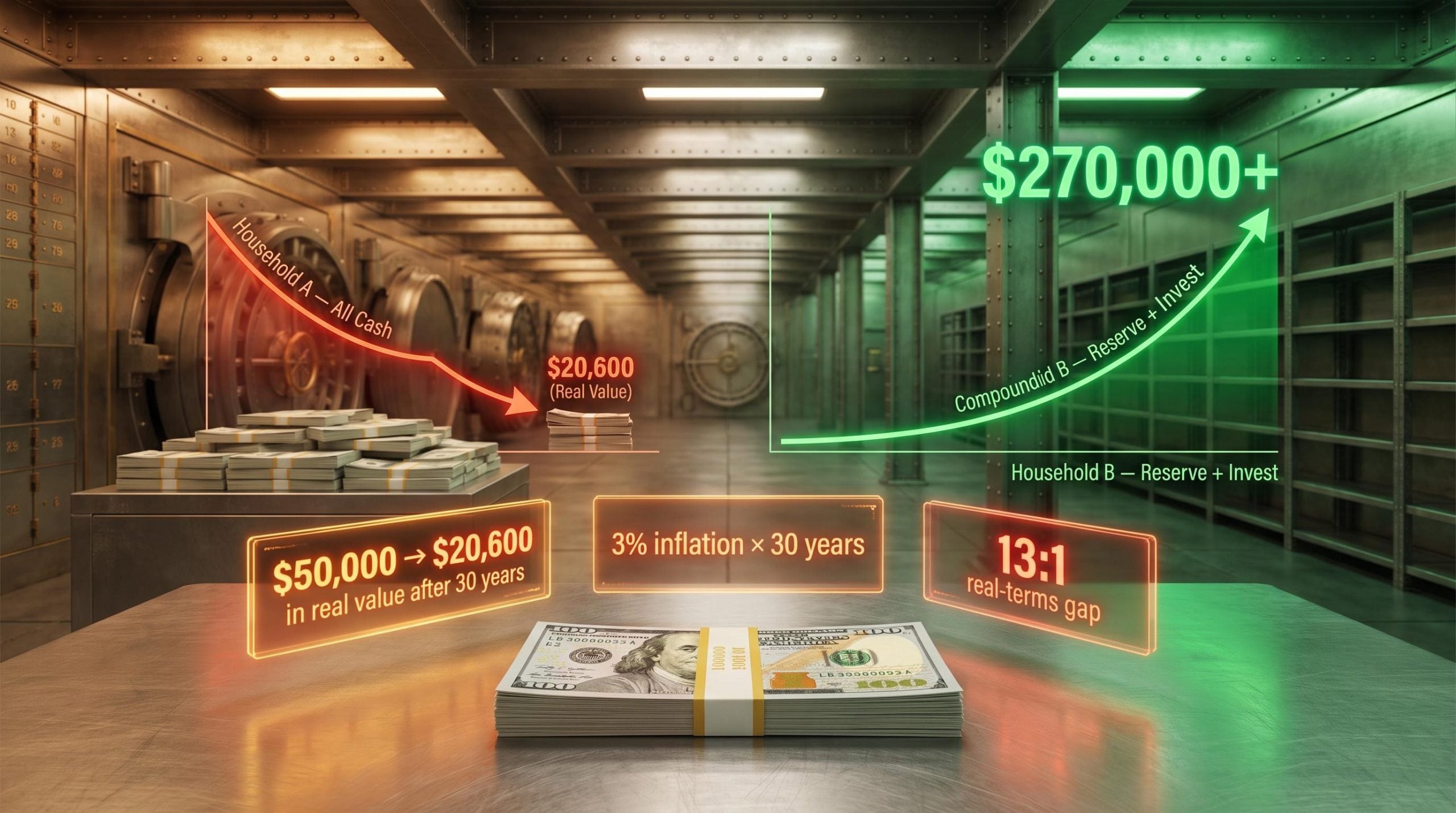
That gap between nominal and real value is where the damage happens. If inflation averages 3% per year and your savings account earns close to 0%, the purchasing power of your cash declines every year without your balance ever dropping. After a decade, $50,000 buys what $37,200 would have bought when you deposited it. After two decades, it buys what $27,700 would have. After three decades, it buys what roughly $20,600 would have.
Purchasing power erosion operates through a compounding mechanism that accelerates over time: the first decade of a 3% inflation environment strips roughly 26% of a cash balance’s real value, and each subsequent decade removes a larger absolute dollar amount because the base has already been reduced.
The numbers your statement never shows
The table below illustrates how $50,000 erodes in real purchasing-power terms over 10, 20, and 30 years at three different average inflation rates, assuming the cash earns approximately 0% nominal return.
| Inflation Rate | Real Value After 10 Years | Real Value After 20 Years | Real Value After 30 Years |
|---|---|---|---|
| 2% | $41,000 | $33,600 | $27,600 |
| 3% | $37,200 | $27,700 | $20,600 |
| 4% | $33,800 | $22,800 | $15,400 |
Your account might show $51,000 or $52,000 after a few years of modest interest. The statement gives you an accurate nominal figure, but it only tells part of the story. The part it leaves out is precisely the part that determines whether your financial position is genuinely improving or gradually eroding in real terms.
When big ASX news breaks, our subscribers know first
How much cash is the right amount, and why the answer depends on your situation
The standard framework in financial planning calls for a liquid emergency reserve covering 3-6 months of essential expenses. That reserve is insurance. It exists to cover you if your income stops, not to grow your wealth.
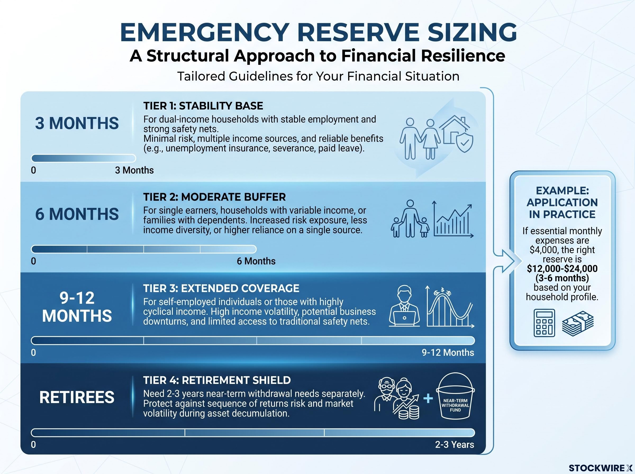
The right number within that range depends on your household’s specific circumstances:
- 3 months: Appropriate for dual-income households with stable employment and strong safety nets.
- 6 months: Better suited to single earners, households with variable income, or families with dependents.
- 9-12 months: Warranted for self-employed individuals or those with highly cyclical income.
- Retirees: May need to segment 2-3 years of near-term withdrawal needs separately from their core reserve.
What counts as an essential expense
Essential expenses are the costs you would still need to pay if your income disappeared tomorrow. That means fixed obligations: rent or mortgage, insurance, utilities, and minimum debt payments. It means basic living costs: groceries and transport. It means necessary recurring spending that cannot be paused.
What it does not mean is your current lifestyle spending. Subscriptions, dining out, travel, and discretionary entertainment are excluded from this calculation. You are sizing a survival buffer, not replicating your monthly credit card statement.
The reframe that matters
If your essential monthly expenses are $4,000, the right reserve is $12,000-$24,000. What most people overlook is that every dollar above that threshold is not simply extra savings sitting safely in reserve. It is capital that has not been put to work, and it carries a real, calculable cost for every year it remains parked in a low-yield account. The line between insurance money and idle money is the central question in this entire decision. The reserve marks the floor. Everything above it represents a deployment choice you have yet to make.
What Federal Reserve data reveals about how different households actually hold cash
Wealthier households do hold more cash than lower-wealth ones in raw dollar terms, which might seem to suggest they simply accumulate more in savings. But when you look at cash as a proportion of total assets rather than as a headline figure, the relationship reverses sharply.
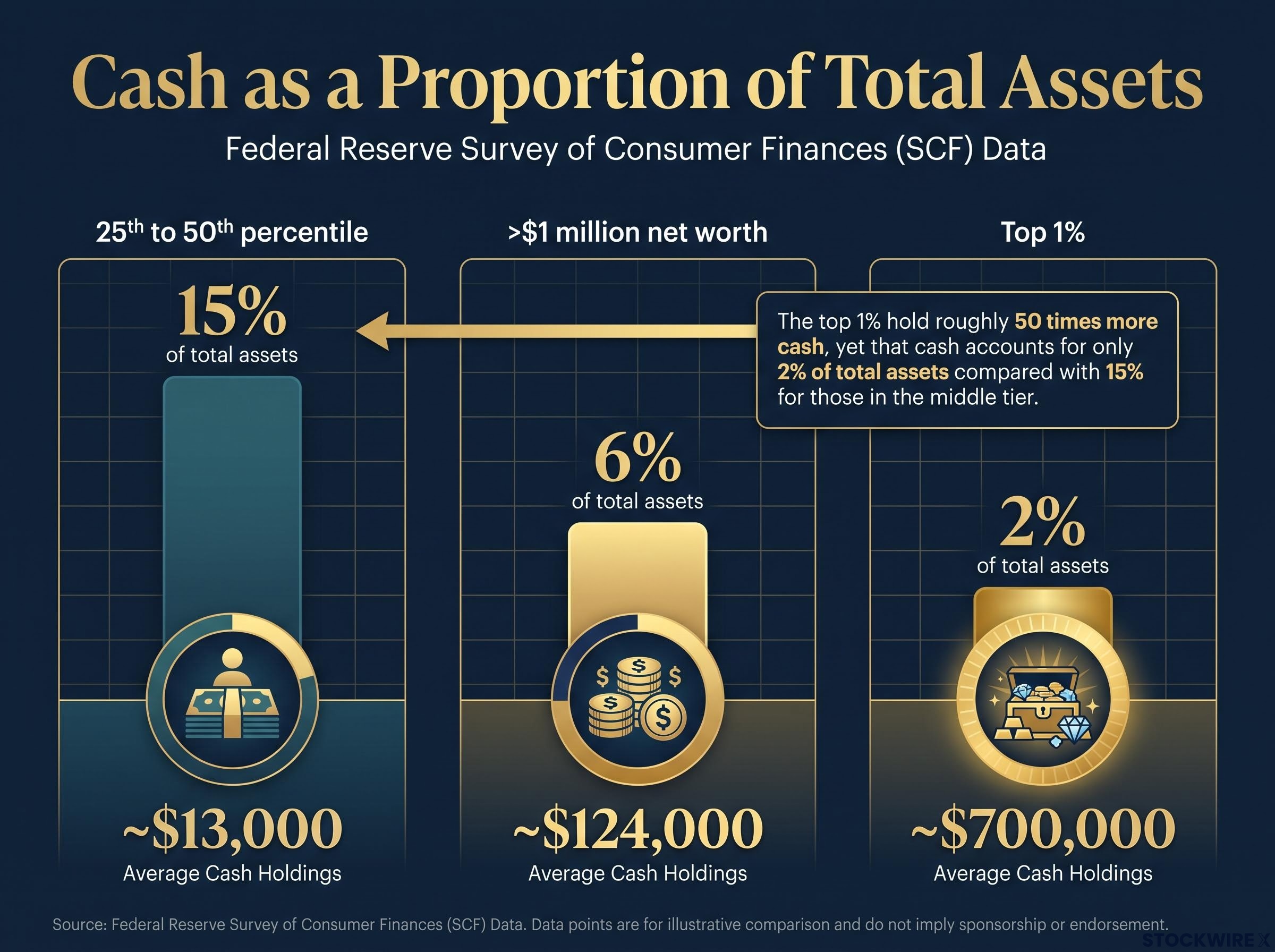
Data from the Federal Reserve Survey of Consumer Finances (SCF) shows a consistent structural pattern across wealth tiers:
Cash as a fraction of total assets is the metric institutional allocators use to evaluate whether a cash position reflects strategic discipline or structural inertia: Berkshire Hathaway’s record cash build illustrates how even the most sophisticated capital allocators assign cash a bounded, purpose-specific role rather than treating it as a permanent store of value.
- Among households in the 25th to 50th percentile of net worth, cash accounts for around 15% of total assets, which works out to roughly $13,000 in absolute terms.
- For households with net worth above $1 million, that cash share drops to approximately 6% of total assets, or around $124,000 in dollar terms.
- At the top 1% of the wealth distribution, cash represents just 2% of total assets, though that still amounts to roughly $700,000 in absolute dollars.
In absolute terms, the top 1% hold roughly 50 times more cash than middle-wealth households, yet that cash accounts for only 2% of their total assets compared with 15% for those in the middle tier.
The behavioural pattern underneath those numbers is where the real insight sits. Middle-income households tend to use their cash accounts as multi-purpose containers: part emergency fund, part savings, part informal retirement proxy. The account serves every financial function at once, and because it feels stable, it rarely gets questioned.
Higher-wealth households operate on a different structural logic. Rather than letting cash accumulate without limit, they assign it a narrow, specific function: covering short-term liquidity needs and day-to-day transactions. Capital beyond that defined purpose is directed into productive assets, whether that means equities, real estate, retirement accounts, or business ownership. The account is a utility, not a repository.
What distinguishes these groups is not privileged access to complex financial products, nor inside knowledge of particular opportunities. It is the consistent habit of giving cash a bounded role and directing everything beyond that boundary into assets that can grow. Any household that can identify the line between its genuine reserve and its surplus idle cash can apply the same logic.
(Note: SCF figures are approximate and drawn from the most recent survey cycle. Readers should verify against the latest release for precise figures.)
The real cost of idle cash, illustrated over 30 years
Consider two households beginning with identical circumstances: $50,000 each, the same income, the same time horizon, and the same economic environment. The only variable is the decision each makes about how to hold that money.
Household A keeps the full $50,000 in a low-yield savings account for 30 years. The balance ticks up slightly from nominal interest, but inflation averaging 3% annually erodes the real purchasing power year after year. After three decades, that $50,000 buys what roughly $20,600 would have bought at the start.
Household B sets aside $15,000 as a properly sized emergency reserve and puts the remaining $35,000 into a diversified mix of productive assets. Using an approximate 7% real return (reflecting long-run historical U.S. equity performance of roughly 10% nominal minus 3% inflation), that $35,000 compounds to more than $270,000 in inflation-adjusted purchasing power across the same thirty-year window.
| Metric | Household A (All Cash) | Household B (Reserve + Invest) |
|---|---|---|
| Starting Capital | $50,000 | $50,000 |
| Cash Allocation | $50,000 | $15,000 |
| Investment Allocation | $0 | $35,000 |
| Real Value at Year 10 | ~$37,200 | Reserve + ~$68,800 |
| Real Value at Year 20 | ~$27,700 | Reserve + ~$135,400 |
| Real Value at Year 30 | ~$20,600 | Reserve + ~$270,000+ |
The real-terms difference between the two outcomes is approximately 13 to 1, produced entirely by how each household chose to allocate its capital at the outset.
What separates the two results is purely the deployment decision. Income played no role. Neither did investment skill or market timing. This is not a comparison between a sophisticated investor and a passive saver. It is a comparison between capital that sat unused and capital that was put to work in productive assets.
(All figures are illustrative, based on historical averages for U.S. inflation and equity returns. Real-world outcomes vary due to sequence-of-returns risk, portfolio construction, and investor behaviour. Past performance does not guarantee future results.)
Better places to keep your cash reserve working harder
Your reserve, the portion covering a right-sized 3-6 months of essential expenses, does not need to earn almost nothing simply because it must remain accessible. Across the main alternatives, the gap in safety is minimal. The gap in yield is substantial.
| Instrument | Yield Range | Safety | Liquidity | Best Use |
|---|---|---|---|---|
| Standard savings (major retail banks) | ~0.01-0.05% | FDIC-insured | Immediate | Daily transactions |
| High-yield savings accounts | ~4.0-4.5% | FDIC-insured | Same-day or next-day | Primary emergency reserve |
| Short-term U.S. Treasury bills | ~3.8-4.0% | U.S. government-backed | Tradeable; best held to maturity | Reserve parking with government backing |
| Government money market funds | ~3.5-4.0% | Invests in Treasury/agency securities | Daily | Cash management with yield |
A $15,000 reserve held in a standard savings account at 0.01% produces roughly $1.50 in annual interest. That same $15,000 placed in short-term Treasury bills at approximately 3.8-4.0% yields around $570 per year, a difference of roughly 380 times in annual income from the same starting balance.
For most households, moving cash reserves into these higher-yielding instruments is not a trade-off involving additional risk. Short-term U.S. Treasury bills carry the full backing of the federal government. Government money market funds hold Treasury and agency securities and are structured to preserve capital with daily access. From a credit-quality standpoint, these instruments sit in the same category as FDIC-insured bank deposits. The practical differences are operational rather than financial: a different account type, a slightly different interface, and for Treasury bills specifically, a small degree of interest rate sensitivity if sold before maturity (which short-dated maturities largely eliminate).
Earning $570 rather than $1.50 per year on your reserve is not a question of appetite for risk. It is a question of whether you are willing to spend an afternoon opening a different kind of account. The cost of not doing so accumulates quietly but reliably each year.
Beyond Treasury bills and government money market funds, a broader set of savings account alternatives including Series I bonds and brokered CDs adds further options for households structuring the reserve tier, each with distinct liquidity constraints and tax treatment worth comparing before committing.
(All rates are as of mid-2026 and are time-dependent. Readers should verify current rates at the time of reading, as yields shift with monetary policy.)
The next major ASX story will hit our subscribers first
Making the transition from idle cash to right-sized reserves
Everything above converts into a four-step process you can start with your next banking session:
- Calculate your essential monthly expenses. Add up fixed obligations (rent or mortgage, insurance, utilities, minimum debt payments), basic living costs (groceries, transport), and necessary recurring spending. Exclude discretionary items.
- Multiply by the appropriate reserve multiplier. That is 3-6 months for most households, 9-12 for self-employed or cyclical-income earners, and a separate 2-3 year near-term withdrawal segment for retirees.
- Identify everything above that threshold. This is your undeployed capital. It is not surplus savings; it is money carrying a measurable opportunity cost every year it sits idle.
- Deploy the excess into productive assets matched to your time horizon:
- 1-3 years: Short-duration bonds, Treasury bills, or conservative balanced funds.
- 10 years or more: Diversified equity or equity-heavy portfolios.
The step where most households stall is not the calculation. It is the follow-through. Setting up automated recurring transfers from your checking or savings account into an investment account removes the friction point between knowing what to do and actually doing it. Automation turns a one-time decision into a durable structural change.
You are not taking on more risk by following this framework. You are correcting a structural imbalance in how your capital is allocated. The process takes a single afternoon to initiate and an automated schedule to maintain.
Investors wanting a stage-based framework for deciding when to hold cash versus deploy into equities will find our dedicated guide to cash versus investing decisions, which walks through the specific portfolio stage criteria that determine whether a cash position is disciplined optionality or a compounding penalty.
This article is for informational purposes only and should not be considered financial advice. Investors should conduct their own research and consult with financial professionals before making investment decisions.
The account balance that looks fine is the one worth questioning
A cash balance that holds steady is not evidence your money is performing well. It is evidence that the erosion happening to it is designed to be invisible. What your bank statement reports is a nominal figure that does not fall. What it withholds is the purchasing power declining steadily in the background and the compounding returns that idle capital could have been generating in productive assets.
The Federal Reserve data reinforces what the 13:1 real-terms comparison shows at the household level: at higher wealth levels, households hold more cash in raw dollar terms and far less as a fraction of total assets. They assign cash a specific, limited function rather than treating it as a catch-all store of value. Applying that same logic does not require a seven-figure portfolio. It requires identifying where your genuine reserve ends and where capital without a clear purpose begins, and then acting on that distinction.
The instruments exist. The framework is clear. The only variable left is whether you treat your next bank statement as a complete picture of your financial position, or recognise it for what it is: half the story, and the less important half at that.