The S&P 500 sits roughly 1% below its all-time high. On the surface, that looks like a market at ease. Underneath, only about a quarter of its stocks trade above their 50-day moving average, the average closing price over the past 50 trading sessions.
That gap matters. A calm index does not mean a calm market, and the weakness beneath the surface is now hard to dismiss.
One bearish commentator argues this is how turning points tend to look: months of quiet, followed by a sudden break. This opinion-based analysis, written in October 2026, tests that argument against published data and historical precedent, with balanced context on both sides.
You will come away knowing which breadth claims the data supports and which it does not. You will also see why even a correct warning makes a poor timing tool.
What does the breadth data actually show beneath a calm index?
Start with a simple question. If the index is near a record, how many of its members are actually rising with it?
Fewer than you might expect. Ned Davis Research, cited by Business Insider on 30 September 2026, found fewer than 25% of S&P 500 stocks above their 50-day average. The Kobeissi Letter, via TheStreet on 2 October, put the figure at 25%, down from about 70% in mid-August.
That is a collapse in participation over roughly six weeks, while the headline number barely moved. The longer-term picture is weaker too, with only about 45-49% of stocks above their 200-day average across sources.
| Source | Date | Above 50-day | Above 200-day |
|---|---|---|---|
| SentimenTrader (NYSE universe for 200-day) | 22 Sept 2026 | 44% | 47.21% |
| Ned Davis Research (via Business Insider) | 30 Sept 2026 | Fewer than 25% | Fewer than 45% |
| The Kobeissi Letter (via TheStreet) | 2 Oct 2026 | 25% | 47% |
| Chartrow dashboard | 9 Oct 2026 | 35% | 48% |
| Ground News aggregation | 10 Oct 2026 | Not given | About 49% |
The figures differ by date and data provider, so treat them as a range rather than a single reading. The direction, however, is consistent across every source.
SentimenTrader‘s NYSE “Risk-Off” model triggered on 22 September as new lows expanded. Charles Schwab called the levels some of the lowest in over a year on 2 October, while noting they were beginning to revert. Ground News reported on 10 October that more than half of stocks were down 20% or more from their highs, without publishing an exact figure.
Concentration is the other half of the story
Weak breadth only becomes striking when you pair it with where the gains are going. Three measures sharpen the picture:
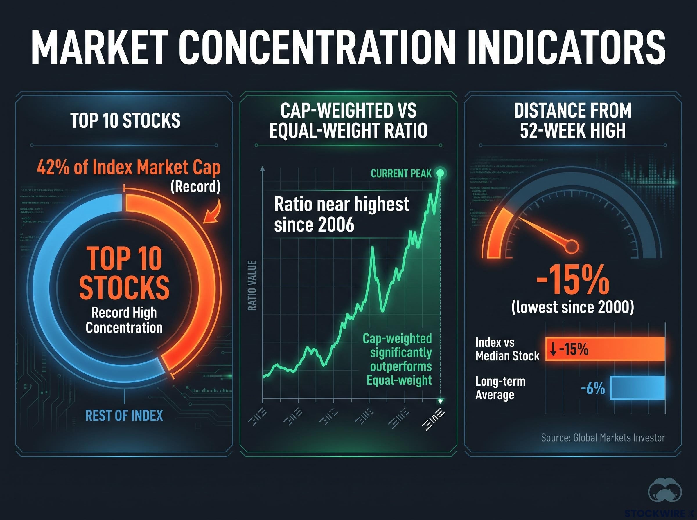
- The top 10 stocks account for a record 42% of the index’s market capitalisation.
- The ratio of the cap-weighted S&P 500 to its equal-weight version is near its highest since 2006.
- Global Markets Investor’s gauge, comparing the index’s distance from its 52-week high with the median stock’s, sits at about -15% against a long-term average near -6%, the lowest since 2000.
That last reading is the sharpest comparison available. The index is being carried by a small group of mega-caps, so if your portfolio mirrors the index, you are far more exposed to those few names than the headline suggests.
Concentration alone has rarely ended a rally; the more dangerous setup is when concentration meets high yields, because rising rates compress the premium that mega-cap dominance was assumed to justify.
When big ASX news breaks, our subscribers know first
Which of the bearish claims hold up, and which do not?
The bearish story is persuasive because its core is true. The problem lies in the most dramatic numbers attached to it.
The speaker, in their own opinion, claimed about 57-58% of S&P 500 stocks are in a bear market and about 45% have shown negative beta over three months. Beta measures how a stock moves relative to the market; negative beta means it tends to fall when the market rises. The speaker said this has never happened before.
The distinction matters because a bear market is a fundamentals-driven decline of 20% or worse, so the claim that 57-58% of stocks sit in one is a different statement from saying the index itself is in trouble.
| Claim | Speaker’s figure | Published evidence | Status |
|---|---|---|---|
| Stocks in a bear market | 57-58% | “More than half” down 20%+ (Ground News) | Direction supported, exact figure unconfirmed |
| Negative-beta stocks | 45% | About 18-24% (roughly 90-121 names) | Overstated |
| “Never happened before” | Unprecedented | Evercore compares to 2000-2001 | Contradicted |
Adam Parker of Trivariate, formerly of Evercore, wrote on 17 August 2026 that 121 S&P 500 stocks had negative beta, the most since the dot-com bust.
The key contradiction Evercore’s analysis places the negative-beta peak alongside 2000-2001, a documented precedent that directly undercuts the “never happened before” claim.
Subodh Warekar noted in a 27 June post that more than 90 names, roughly 18%+, had negative beta, and that only about 60% of stocks sat above their 200-day averages at record highs, versus a historical norm near 73%. Different beta windows may explain part of the gap with the speaker’s figure, but the research did not establish this.
The speaker also tied the rotation to OpenAI revenue fears. No source documents a tech-to-consumer rotation linked to OpenAI, whose documented story is growth: an annualised run rate of about $40 billion, with enterprise revenue now exceeding consumer, alongside heavy costs.
Midterms and Trump accounts: what is and is not documented
The speaker believes heavily contested midterms have pulled their expected market top earlier than a December or January window. They also claim Trump accounts were recently made mandatory. No Treasury or IRS guidance, mandatory versus opt-in confirmation, or 2026 midterm polling was found, so these rest on the speaker’s opinion alone.
General seasonality offers some context. Research attributed to LPL Financial, CFRA, Ryan Detrick and Sam Stovall suggests midterm years tend to bring larger intra-year drawdowns, followed by firmer markets after the vote, though these findings were not independently verified and remain tendencies, not guarantees.
The lesson for you: a thesis can be right on breadth yet unproven on its boldest numbers. Weight each claim on its evidence before acting.
Why do turning points so often look calm first?
If the data is mixed, why do so many experienced investors watch breadth at all? The answer starts with what breadth measures.
Market breadth is the share of stocks taking part in a market move. Analysts track the percentage above moving averages and the number of new lows because both show whether a rally is broad or resting on a few names.
When the index rises but fewer stocks join in, that divergence tells you the advance has become dependent. Fewer supports means each one carries more weight.
Calm conditions can make this worse. Long stretches of low volatility and strong headlines often coincide with rising risk-taking and leverage, so the market grows more fragile precisely when it feels safest.
The speaker recalls early 2020 this way: roughly two months passed between awareness of the virus and the mid-February drop, while markets rallied and volatility fell. The actual timing, though, came from an outside shock rather than the indicators.
History shows the pattern repeatedly:
- Late 1990s-2000: Tech pushed indices to highs while smaller and value stocks rolled over, a divergence that lasted many months before the 2000-2002 bear market.
- 2007-2008: Cyclical and financial stocks peaked and slid while major indices held near their highs.
- Early 2020: Strong headline performance and low volatility gave way to a violent selloff once the pandemic hit.
State, not trigger Breadth describes the condition of the market. It tells you where fragility sits, not when it will matter.
So a calm tape is not evidence of safety. It may simply mean the stress has not been tested yet.
Can breadth actually time a top? The record of early and wrong warnings
Knowing where fragility sits is useful. Knowing when it breaks is another matter entirely, and the record here is humbling.
| Period | Breadth warning | What happened | Outcome for a breadth-only seller |
|---|---|---|---|
| 2013-2015 | Narrow, growth-led leadership | S&P 500 delivered strong returns | Missed years of gains |
| 2017 | Mega-cap-led advance | Market kept rising | Sat out a profitable year |
| 2018-2019 | Q4 2018 selloff signals | Federal Reserve pivots revived risk appetite | Sold into a recovery |
| 2021-early 2022 | Small caps and cyclicals in bear markets | Index peaked in January 2022 | Right, but underperformed for months first |
Three of those four episodes punished the cautious. The fourth rewarded them, but only after a long, uncomfortable wait.
Today’s readings fit the same tension:
- Ned Davis Research: a “rare signal” that the rally may be close to peaking.
- The Kobeissi Letter: falling breadth while prices hold up is a risk signal.
- Charles Schwab: breadth can improve without a major index decline.
Ground News called it the sharpest breadth deterioration since the Fed’s hawkish pivot at Jackson Hole. Yet broader research, not independently verified, suggests narrow leadership can persist for extended periods. Treat breadth as a yellow light.
Earlier in 2026, 30-year low breadth readings preceded drawdowns of 5-15% in roughly 80% of comparable episodes since 1994, though those episodes show timing still varied widely.
For you, acting on breadth alone risks years of underperformance. The practical response is to review risk and position sizing, not to make an all-or-nothing call.
What a weak market breadth breakdown does and does not tell you
The weakness beneath the index is real and well documented across several independent sources. The speaker’s most dramatic statistics, along with the midterm, Trump account and OpenAI links, remain unverified opinion. History adds the hardest truth: timing is where breadth warnings most often fail.
Three checks are worth making now. How concentrated is your exposure to the index’s top 10 names? How much of your return depends on a handful of mega-caps? Is your position sizing one you could hold through a sharp drawdown?
Then watch two signals: whether the share of stocks above their 50-day and 200-day averages recovers, and whether the equal-weight index starts confirming the cap-weighted one.
Investors exploring ways to reduce mega-cap exposure will find our full explainer on equal-weight ETFs useful, including how quarterly rebalancing trims winners but can lag in mega-cap rallies.
This article is for informational purposes only and should not be considered financial advice. Investors should conduct their own research and consult with financial professionals before making investment decisions. Past performance does not guarantee future results, and the views discussed are speculative and subject to change.