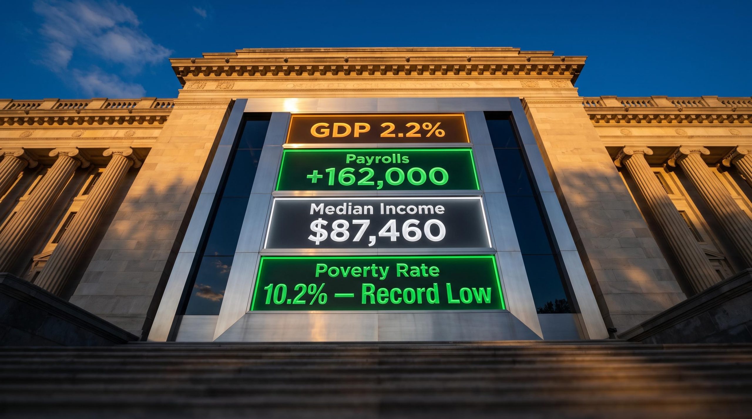
Four separate official data releases dropped within weeks of each other this autumn, and every one of them beat expectations. A GDP revision roughly 50% larger than the prior estimate. A payrolls print that came in at triple the consensus forecast. A record median household income. And a poverty rate at its lowest in recorded history. That kind of clustering does not happen by accident.
The releases arriving in late September and early October 2026 are reshaping how investors should read the US economy heading into Q4. They do not come from a single report or a single agency. They arrive independently from the Bureau of Economic Analysis (BEA), the Bureau of Labor Statistics (BLS), and the Census Bureau, which gives the pattern more weight than any one figure carries on its own.
This piece lays out a clear framework for reading that cluster as an investor: what each figure actually shows, what they mean together for rate expectations and equity positioning, and where the specific risks sit that could interrupt the trend.
Four data releases, one coherent picture of accelerating growth
Start with the headline. Second-quarter GDP grew at a 2.2% annualised rate, according to the BEA’s third estimate released on 30 September 2026. That is a revision up from the previously reported 1.5% pace, a move of roughly 50%. As Reuters reported in its coverage, “US second-quarter GDP revised higher amid robust consumer spending,” economists had not expected a revision anywhere near this size.
The BEA’s third estimate methodology incorporates the most complete source data available for a given quarter, which is why the revision from 1.5% to 2.2% carries more statistical weight than earlier preliminary readings would have.
Then widen the lens. Q1 2026 growth was revised up to 2.5% annualised. Put the two quarters side by side and the picture is back-to-back solid growth, not a one-off bounce. The BEA attributes the Q2 upgrade primarily to robust consumer spending, the single most important engine of the US economy.
That tells you something important. The growth slowdown thesis that has circulated since the middle of 2026 is not supported by the data as it stands right now.
What the Q3 tracker adds to the picture
The quarterly BEA figures are backward-looking by nature. The Atlanta Fed GDP Now tracker is not. It is a real-time estimate that updates as fresh data arrive, which makes it a more current read on where the economy sits today rather than where it sat last quarter.
The Atlanta Fed GDP Now tracker was running at approximately 3.7% for Q3 as of the most recent reading, suggesting the upside trend did not stop at Q2.
If that 3.7% holds, it would mark the strongest quarterly growth in several years. More to the point for positioning, it would turn three consecutive quarters at or above 2% into a sustained trend rather than a short recovery. Structural tailwinds the quarterly data do not fully capture, from re-industrialisation to the AI infrastructure buildout, add weight to the case that this momentum has legs.
When big ASX news breaks, our subscribers know first
The August jobs report was not just a beat, it was a category shift
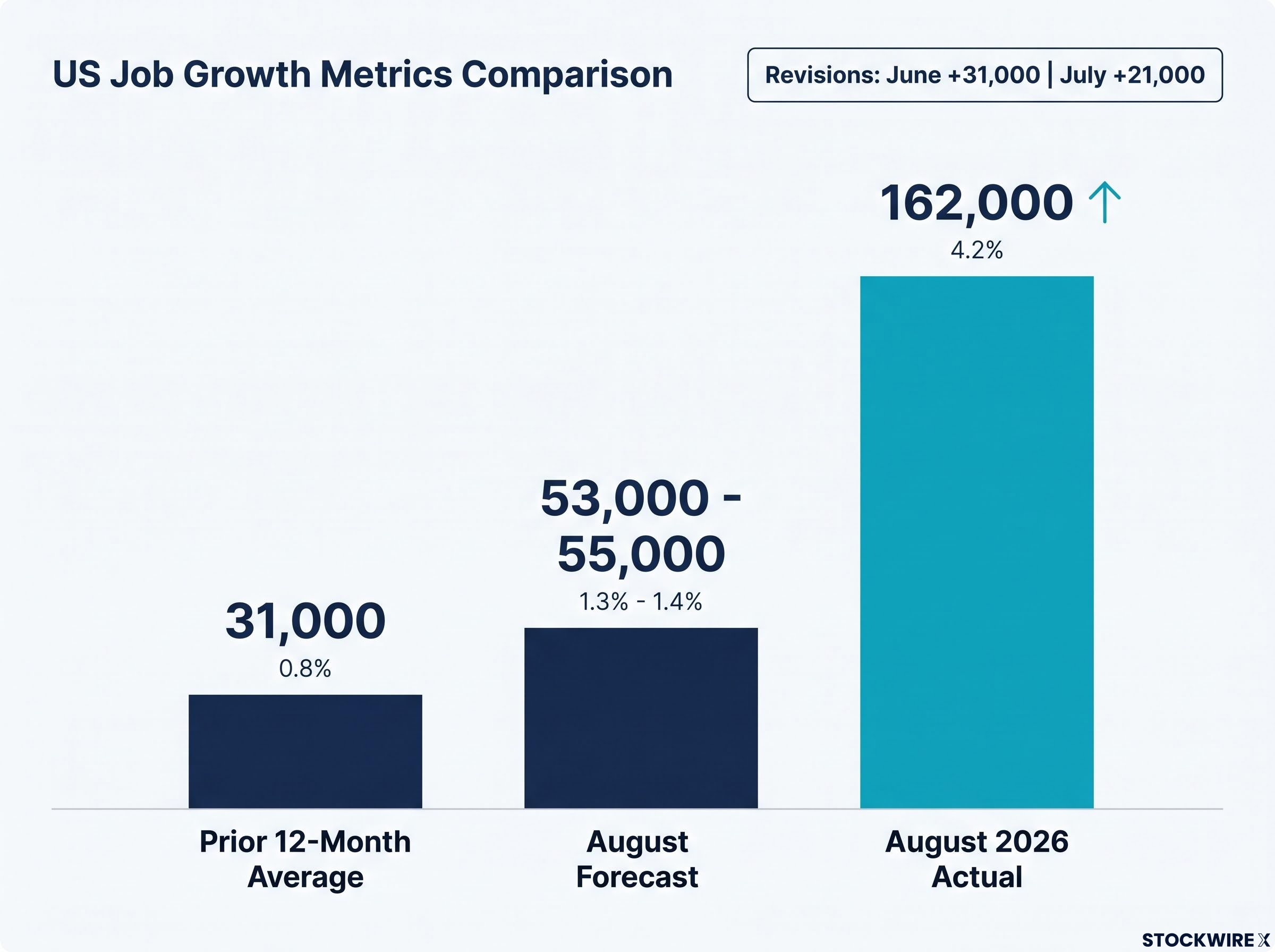
Nonfarm payrolls rose by 162,000 in August 2026, according to the BLS Employment Situation released on 4 September 2026. Economists had forecast somewhere around 53,000 to 55,000. That is a beat of roughly 107,000 jobs, a surprise large enough to stand on its own.
The more revealing number is what came before it. Over the prior 12 months, monthly payroll gains averaged just 31,000. August did not merely clear a low forecast. It ran at more than five times the trend that preceded it.
The revisions to earlier months tell the same story. June was revised up to +31,000 and July flipped from an initially reported loss of 23,000 to a gain of 21,000, a combined upward revision of 55,000. Prior months were understated, which means the strength is not confined to a single August print.
NFP report revisions are among the most mispriced data points in the entire release; the June and July combined upward revision of 55,000 moved markets less than the August headline despite containing equally important information about the underlying demand trend.
| Month | Initial Print | Revised Print | vs. 12-Month Average (31,000) |
|---|---|---|---|
| June 2026 | +20,000 | +31,000 | In line |
| July 2026 | -23,000 | +21,000 | Below |
| August 2026 | +162,000 | +162,000 | More than 5x above |
The companion statistics reinforce the strength:
- Unemployment rate: 4.1%, unchanged, with 7.0 million people unemployed
- Labour force participation: 61.6% in August, up from 61.4% in July
- Prior-month revisions: June and July combined were 55,000 higher than first reported
Here is the detail that matters most. The unemployment rate held at 4.1% even as participation rose 0.2 percentage points. When more people enter the labour force and the jobless rate does not budge, it means the market absorbed those additional workers without pushing anyone out. That is the clearest sign of genuine demand strength rather than statistical noise.
For positioning, strength of this kind reduces the odds of an imminent Fed rate cut. That shifts the risk calculus for the rate-sensitive corners of the equity market: utilities, real estate, and long-duration growth stocks whose valuations lean heavily on where rates are headed.
The Fed communication regime under Chair Warsh has removed the forward-guidance buffer that previously dampened market reactions to strong data prints; in that environment, a payrolls beat of the magnitude described here carries more direct rate-expectations weight than the same beat would have in any prior cycle since 2022.
Record income and falling poverty: what the household data tell investors that GDP does not
GDP and payrolls describe the economy from the top down. The Census Bureau data describe it from the household up, and that is where you find out whether the growth in the aggregates is actually reaching people.
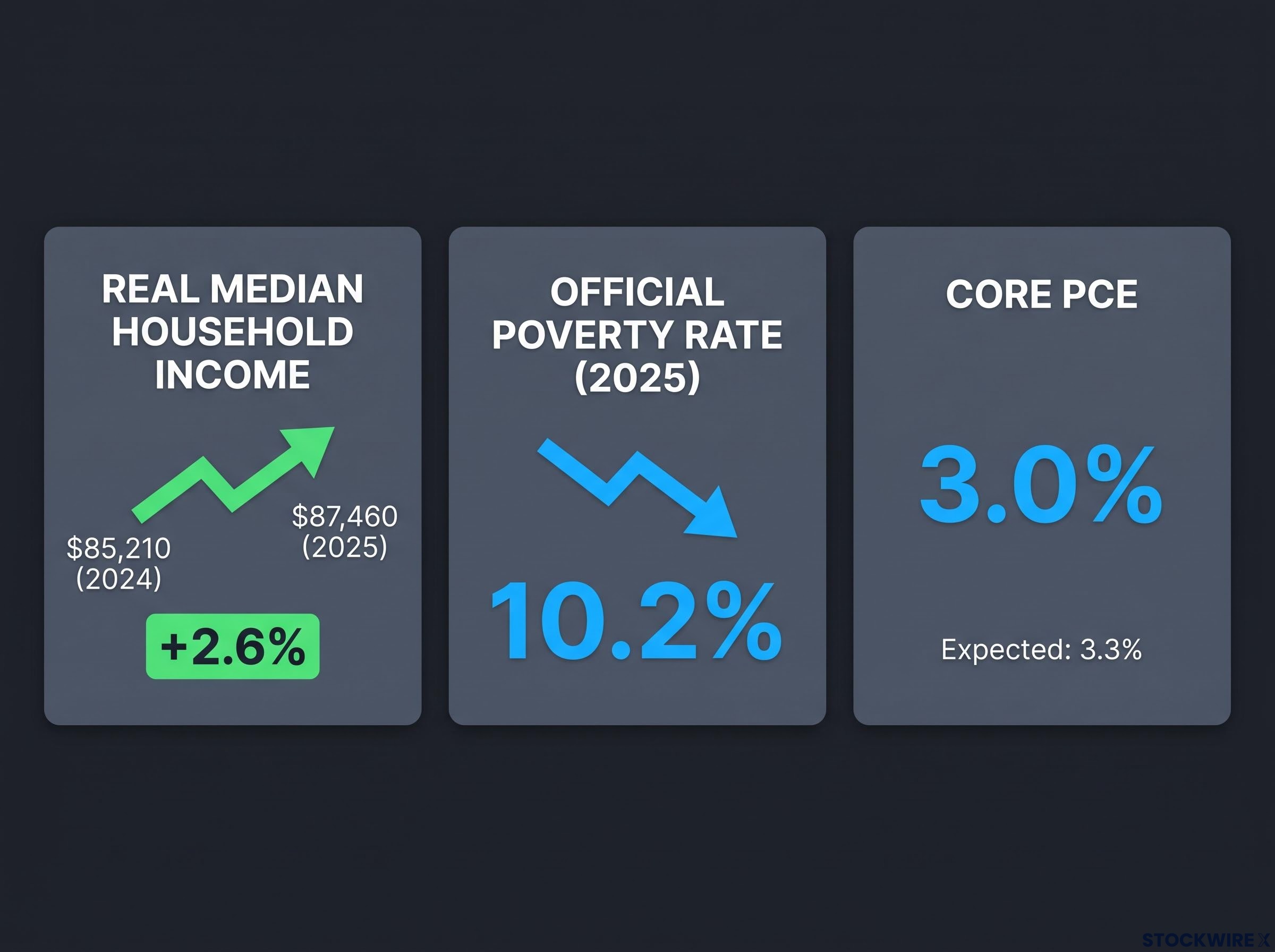
Real median household income hit $87,460 in 2025, the highest level in the 58 years the Census Bureau has tracked the series.
That figure, released on 15 September 2026, represents a 2.6% increase on 2024’s $85,210. A record income number on its own could still mask a top-heavy distribution. The poverty data close that gap:
- Official poverty rate: 10.2% in 2025, down 0.5 percentage points, the lowest in recorded history
- Child poverty rate: 13.4%, also a record low
- People in poverty: 34.5 million
- Poverty threshold, family of four: $32,970
Falling poverty alongside rising median income tells you the gains are not concentrated at the top. The improvement is reaching the lower end of the distribution at the same time it lifts the middle.
Now layer in inflation. Core PCE, the Fed’s preferred inflation gauge, came in at 3.0% against expectations of roughly 3.3%, a meaningful downside surprise. Rising real incomes and undershooting inflation at the same time is the household-level combination that sustains consumer spending, and consumer spending is what drove the Q2 GDP revision in the first place.
Real PCE growth is the mechanism connecting rising median household income to the GDP revision: when real incomes expand and inflation underperforms, nominal spending converts more directly into volume gains, and Bank of America card transaction data through mid-2026 confirm the consumption acceleration is showing up in actual transactions, not just survey readings.
That combination matters for how you read the consumer. When real incomes are at a record and inflation is cooling faster than forecast, the spending base is not a one-quarter anomaly running on credit and drawn-down savings. It reflects a household sector with more purchasing power than the headline inflation narrative has suggested.
The practical read for Q4 positioning sits in the consumer-facing sectors. Discretionary retail and services carry a very different earnings risk when household finances are at a recorded high than when the economy is leaning on borrowing to keep spending afloat. That distinction is where the household data earn their place in the analysis.
Where the growth story could break down: yields, bank stress, and energy prices
None of this makes the outlook risk-free. The positive data describe where the economy is. The risk layer determines whether the trend survives into 2027, and three specific pressures stand out.
- Short-term Treasury yields have jumped roughly 60 basis points over the past 30 days, reaching levels last seen around 2002. Higher short-term yields feed directly into bank balance sheets, mortgage rates, and corporate refinancing costs, which is how a bond-market move becomes a real-economy drag.
- Bank equity impairment is a bounded but real concern: approximately 95 of 4,295 FDIC-reporting banks with positive equity face projected equity impairments exceeding 20%, with the full picture due around 30 October 2026 when Q3 balance sheet reports land.
- Diesel and energy prices remain the primary lever left for further inflation reduction. Record oil volumes through the Strait of Hormuz, as reported by The Guardian, are a supply-side development worth watching as a potential input to the next Fed rate decision.
| Risk Factor | Current Signal | Key Date or Trigger | What to Watch |
|---|---|---|---|
| Yield surge | +60 bps in 30 days, highest since ~2002 | Ongoing | Mortgage and refinancing cost pass-through |
| Bank equity impairment | ~95 of 4,295 banks face >20% impairment risk | ~30 October 2026 | Concentration in consumer or CRE lenders |
| Energy prices | Diesel the key remaining inflation lever | Ongoing | Strait of Hormuz oil flows |
The bank number sounds alarming in isolation. In context, 95 banks out of 4,295 is a targeted exposure, not a systemic one. What matters is whether the 30 October Q3 reports show those impairments concentrated in institutions with heavy consumer or commercial real estate lending, which would change the read considerably. Treasury Secretary Scott Bessent’s stated target of reducing the federal deficit to 3% of GDP sits behind all of this as the fiscal backdrop against which yields are moving.
The point for you is that these are not vague macro worries. Each risk carries a specific price signal or trigger date, which makes this a watchlist rather than a caution.
What the data cluster means before you reposition for Q4
Pull the four sections together and the structure of the decision becomes clear:
- Q2 GDP: 2.2% annualised, revised up from 1.5%
- August payrolls: 162,000, against consensus of 53,000 to 55,000
- Median household income: a record $87,460
- Poverty rate: a record-low 10.2%, with core PCE at 3.0% versus 3.3% expected
Growth, employment, and household finances are not pointing in the same direction by coincidence. They are mutually reinforcing: strong demand supports hiring, hiring lifts incomes, and rising real incomes feed back into the spending that drives corporate revenues. That combination historically supports upward, not downward, revisions to earnings expectations.
The risk layer is time-stamped. The yield stress and the bank balance sheet picture will be materially clearer by 30 October 2026. Until then, the positive data is the dominant signal, which gives you a defined window before new risk data arrives.
For Q4, the data argue against a defensive crouch built on the pessimistic expectations of earlier this year. The single variable most likely to decide whether the trend holds is energy prices and their effect on the Fed’s rate path. Investors who positioned defensively on now-outdated assumptions are holding a stance the data no longer supports, and 30 October is the next real checkpoint to test it.
For investors wanting to map the historical base rate against current institutional positioning data, our full explainer on Q4 seasonal positioning signals examines the 87% historical win rate for year-end rallies when the S&P 500 is up 5% or more by mid-September, including the specific conditions that have historically broken that pattern.
This article is for informational purposes only and should not be considered financial advice. Investors should conduct their own research and consult with financial professionals before making investment decisions.
Past performance does not guarantee future results. Financial projections, including the Atlanta Fed Q3 tracker reading, are subject to market conditions and various risk factors, and these forward-looking figures remain to be confirmed.