Most investors ask how much an asset returns. Here is the question almost nobody asks first: could you hold it for 30 years before you got your money back in real terms? That is exactly what happened to anyone who bought gold at its 1980 peak.
The standard way investors are taught to compare assets, lining up long-run average returns side by side, is structurally incomplete. It leaves out the one variable that decides whether you actually capture those averages: survival. Three major asset classes, equities, leveraged real estate, and gold, each carry a documented worst-case recovery window running between 13 and 30 years in real terms. That range stretches from a long bear market to an entire working career.
So the real measure of an investment is not just its return; it is your investment recovery time under the worst historical case, and whether you could survive that window without being forced to sell. Here is what the historical worst cases actually were, why they are harder to live through than they look on paper, and how to match each asset to the financial reality it genuinely suits.
Why the right question is survival, not performance
Long-run average returns are a real number, but they carry a hidden assumption most investors never examine: that you stayed invested through the entire period, including the worst years, and never sold a share.
Almost nobody does. And the reason is structural, not a character flaw.
Two mechanics explain the gap. The first is sequence-of-returns risk, which simply means the order in which gains and losses arrive matters as much as the average itself. A severe drawdown early in your holding period, especially when you also need to withdraw cash, does lasting damage that a strong average return cannot undo. The second is volatility drag: assets with deep occasional losses compound at a lower rate than their arithmetic average suggests, so the headline number quietly overstates what you actually keep.
Sequence-of-returns risk is the structural reason why two investors with identical average returns can end up in completely different financial positions: the one who experiences deep losses early in the withdrawal phase can exhaust a portfolio that a luckier-sequenced peer grows for decades.
This is why the diagnostic question needs to change. Not “which asset returns the most” but “which asset’s worst-case scenario can I survive, financially and psychologically, without selling at the bottom.”
The evidence that most investors are already failing this test is direct. DALBAR’s Quantitative Analysis of Investor Behavior and Morningstar’s “Mind the Gap” reports both document a persistent gap between what funds return and what the average investor in those funds actually earns.
Research from DALBAR and Morningstar consistently finds that the average investor underperforms the very funds they own, because they sell during drawdowns and miss the recovery. The gap is not theoretical. It is the return you lose by not surviving the worst years.
That gap is proof you may already be failing the survival test on assets you hold right now. Financial planners draw a sharp line here between risk tolerance, how much volatility you can stomach emotionally, and risk capacity, how much your actual finances can absorb. Economist Zvi Bodie has long argued that your future earnings and debt obligations, not a historical return chart, should drive how you allocate. The question “can I survive the worst case” is more useful than “what is the average” precisely because it forces your assets to match your real financial life.
When big ASX news breaks, our subscribers know first
The three worst cases: what the historical record actually shows
The historical record is unusually specific about how bad each asset’s worst case got, and how long the wait to break even lasted in real terms. Ranked from least to most severe, the numbers escalate faster than most investors expect.
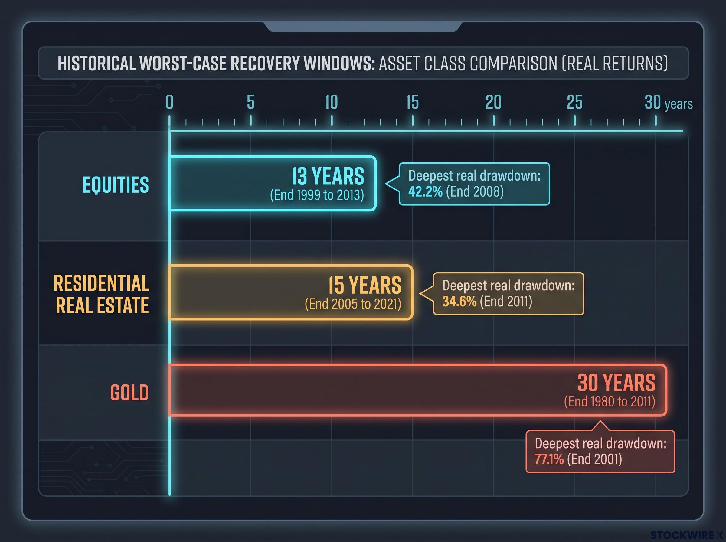
Equities carry the shortest recovery horizon of the three. From the end of 1999 to 2013, a broad U.S. equity position spent 13 years below its prior inflation-adjusted peak, with the deepest real decline hitting 42.2% at the end of 2008. A long wait, but the shortest on this list.
Residential real estate ran longer. Measured from the end of 2005 to 2021, real home values stayed below their prior real peak for 15 years, with the worst real drawdown reaching 34.6% at the end of 2011.
Then comes gold. From the end of 1980 to 2011, gold spent 30 years below its prior inflation-adjusted peak, with a maximum real decline of 77.1% at the end of 2001. Not a hypothetical tail risk. A documented episode that real buyers lived through.
| Asset class | Worst-case recovery window | Deepest real drawdown | Period covered |
|---|---|---|---|
| Equities | 13 years | 42.2% | End 1999 to 2013 |
| Residential real estate | 15 years | 34.6% | End 2005 to 2021 |
| Gold | 30 years | 77.1% | End 1980 to 2011 |
A 30-year recovery is not a bad year. It is an entire working career spent waiting to get back to where you started, in real terms, with nothing to show for it in the meantime.
These figures are not arguments against any of these assets. They are the admission price each one charges. You need to know that price before you buy the ticket.
What makes each asset’s worst case harder than the numbers suggest
Duration is only half the story. What makes each worst case genuinely hard to survive is the specific mechanism behind it, and those mechanisms differ completely across the three assets.
- Equities: purely psychological. You hold a liquid, unleveraged position. Nobody can force you out. The only enemy is your own compulsion to sell through up to 13 years of negative real returns, with only dividends to soften the wait.
- Leveraged real estate: operational and financial. Leverage turns a passive price decline into an active cash-flow emergency. The drawdown is not something you watch; it is something you fund, month after month.
- Gold: opportunity cost and concentration. Gold pays nothing while you hold it, so a 30-year recovery is 30 years without compounding. The most damaging error is treating gold as a growth engine rather than portfolio insurance.
Loss aversion is the cognitive engine behind equity capitulation. Research by Daniel Kahneman and Amos Tversky found that investors feel losses roughly twice as intensely as equivalent gains, which is why a decade of red numbers becomes almost unbearable to sit through.
Leveraged real estate as a business operation, not a passive holding
The standard real estate price index is structurally misleading for anyone using a mortgage. It assumes an all-cash purchase and quietly excludes vacancy rates, property taxes, maintenance, and selling costs, none of which a real landlord can ignore.
The 2006-2015 scenario shows what that omission hides. A property bought at the start of 2006 at the national average of $185,200, with 20% down and a 6.41% mortgage, faced a decade where prices fell at roughly 0.28% annually and vacancy averaged 9.7%. Rental income at national average rates did not cover the mortgage, so the owner had to subsidise the property out of pocket every year.
Over that ten-year hold, an investor contributed roughly $210,000 in personal capital and walked away with about $84,000 in proceeds. More than half the invested capital was destroyed, while the owner was actively working to manage the asset.
For context, over the same 2006-2015 decade equities returned around 7.25% annually and gold around 7.53%. This is the most instructive case in the entire discussion, because it shows how a routine investment approach, applied at the wrong point in the cycle, can systematically eat capital. Leveraged property must be judged as a small-business operation with a real cash-flow test, not as a price-appreciation vehicle.
Gold’s difficulty is quieter but no less real. Its 77.1% real decline by end 2001 came with zero income during the wait, so the opportunity cost of that lost compounding is the true damage. Understanding each mechanism, not just the size of the loss, lets you spot in advance the specific conditions that would force you to sell.
Why most investors fail the survival test even when the asset recovers
Here is the uncomfortable part. Even when an asset eventually recovers, most investors do not, because they sell before it does. This is not weakness. It is a predictable response to sustained financial stress, and it follows a documented sequence.
- Loss aversion. Because losses register roughly twice as hard as gains (Kahneman and Tversky), a prolonged drawdown creates emotional pressure far heavier than the raw numbers imply.
- Time-horizon shrinkage. An investor who genuinely intended to hold for 20 years starts checking performance monthly, then weekly, as a bear market grinds on. Rising stress compresses the effective decision window until “long term” quietly disappears.
- Recency bias and capitulation. After years of flat or negative returns, the mind extrapolates. During the 2000-2013 flat stretch for U.S. large-caps, continued underperformance began to feel not just likely but obvious, so investors abandoned the plan and missed the recovery.
- Social and media pressure. Constant exposure to whatever asset is winning this cycle drives style-drift, pushing you out of an allocation that was correctly matched to your risk profile and into one that simply looks better right now.
Recency bias is particularly damaging during extended flat periods because years of underperformance begin to feel like structural evidence of a broken thesis rather than the noise that long-run return data shows it almost always is.
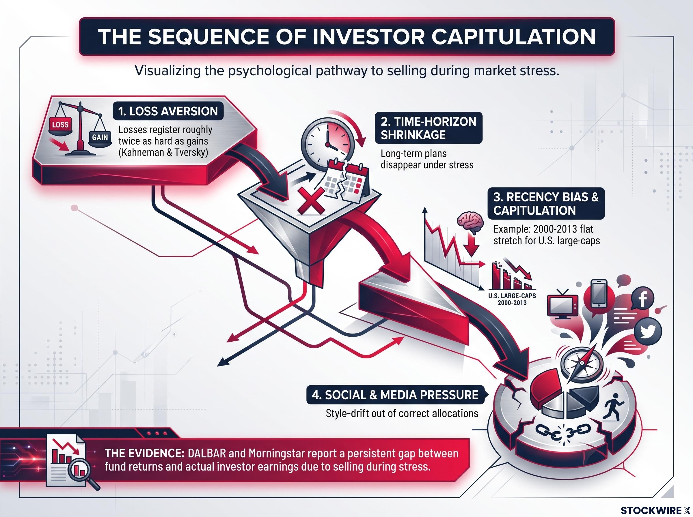
The DALBAR and Morningstar performance gap is the empirical fingerprint of exactly this pattern: the average investor earns less than their own funds because they sell during the stress and buy back after the recovery.
The 13-year equity recovery is the clearest test case. That is long enough for recency bias to fully set in, long enough for capitulation to feel like an empirically justified conclusion rather than a panic. That is the point. The question is not whether you believe you are emotionally strong enough to hold on. It is whether your financial situation gives you the structural ability to hold without being forced to sell.
Matching each asset to the financial situation it actually suits
Once you accept that survival is the real test, the framework stops being “which asset is best” and becomes “which asset’s worst case can my finances actually pass.” For most people, that honest answer narrows the field considerably.
Equities are core growth capital. The admission price is clear: the financial and psychological capacity to stay invested through up to 13 years of negative real returns, with no near-term need to touch that money. What that price buys access to is real upside, an inflation-adjusted annualised return of 14.69% across 1990-1999 being one example of the decade-long compounding equities can deliver.
Leveraged real estate is a business, and it comes with a two-part qualification test:
- Rental income must demonstrably cover the mortgage after vacancy, taxes, maintenance and selling costs are subtracted.
- You must hold enough cash reserves to fund the operation through an extended price stagnation or a rent decline.
When those conditions are met, the upside is genuine. In the 2000-2005 boom, an investor’s roughly $111,000 capital outlay turned into about $223,000 in proceeds. The difference between that outcome and the 2006-2015 loss was timing and cash flow, not the asset itself.
Gold is portfolio insurance, not a growth engine. The World Gold Council, BlackRock, and Bridgewater all frame it as a hedge against systemic risk, inflation, and currency debasement, sized as a small, single-digit percentage of a portfolio to protect against tail events rather than to drive returns. Oversizing it to 20-50% dramatically increases concentration and path risk.
BlackRock’s case for gold as a portfolio diversifier frames the metal explicitly as a hedge against elevated government debt, inflation uncertainty, and geopolitical stress, sized as a small allocation rather than a primary return driver, which reinforces why oversizing it dramatically increases your path risk.
The current price action makes the point. Gold rose roughly 66.22% in 2025, its strongest year since 1979, then pulled back around 25% from its January 2026 peak, falling from about $5,501 per troy ounce to roughly $4,121-4,153 by late September 2026. Even after a spectacular run, a late entrant can absorb a serious short-term hit.
| Asset | Functional role | Worst-case survival requirement | Who it actually suits |
|---|---|---|---|
| Equities | Core growth | Hold through 13 years of negative real returns | Long horizons, no near-term cash need |
| Leveraged real estate | Business operation | Positive cash flow plus reserves for stagnation | Active operators with cash buffers |
| Gold | Portfolio insurance | Tolerate 30 years of zero income | Small single-digit tail-risk hedgers |
This article is for informational purposes only and should not be considered financial advice. Investors should conduct their own research and consult with financial professionals before making investment decisions. Past performance does not guarantee future results.
The question to ask before your next allocation
The return-comparison framework this piece opened by dismantling can be replaced with a single, portable diagnostic. Before any allocation, ask: what does this asset’s worst-case recovery look like in real terms, how long did it historically last, and could my current financial situation survive that window without a forced sale?
The answer is not the same for everyone. Someone with 25 years of runway and no near-term liquidity need faces a completely different calculation than someone five years out from a major financial obligation. The framework does not tell you which asset to buy. It tells you which asset’s worst case you are actually built to withstand.
That matters most right now. As of 28 September 2026, the S&P 500 is up roughly 15.65% year-to-date, gold sits near multi-year highs at about $4,121-4,153 despite its recent pullback, and U.S. real home prices have fallen for 14 consecutive months even as nominal values edge up. All three assets are entering their worst-case scenarios from elevated starting points.
That does not mean avoid them. It means the survival test each one demands deserves more weight than it would at a lower entry point, because where you start determines the shape of your worst case.
Speculative leverage at record levels in 2026 raises the stakes of the entry-point argument materially: when margin debt grows 54% year-over-year while equities and gold sit near multi-year highs, the forced-selling cascade that amplifies worst-case drawdowns becomes a more proximate risk than it was at lower debt levels.
Before your next allocation, do not ask what this asset returns. Ask whether you could survive its worst case without being forced to sell.