Ask most Americans to name the best long-term investment, and the answer usually comes back as real estate or gold. Something you can hold, live in, or lock away. Something that feels solid when markets do not.
The 51-year record tells a substantially different story. From the start of 1975 to the end of 2025, U.S. stocks, gold, and real estate performance can finally be compared over a window in which all three were legally available to private investors at once. That start date is not a marketing choice. It is anchored to the day U.S. citizens regained the right to own gold bullion, and once you strip out inflation, the gap between the crowd’s favourite assets and the one that actually compounded wealth becomes hard to ignore.
Here is what this analysis gives you: the ability to spot when a long-term return claim in the media or an investment pitch is quietly using a cherry-picked window, and what the fuller record actually shows once inflation and methodology are accounted for.
Why 1975 is the only fair starting line for this comparison
Every asset comparison starts with a decision that most readers never see: the start date. Move it a few years in either direction and you can make almost any asset look like the long-run winner. That is why the anchor matters more than the numbers that follow it.
U.S. law prohibited ordinary citizens from owning gold bullion until the final day of 1974. That makes 1 January 1975 the first full year in which equities, gold, and residential real estate were all simultaneously accessible to American private investors. The start date is set by legal history, not by whichever year flatters a preferred asset.
Executive Order 11825, signed by President Gerald Ford on December 31, 1974, formally revoked the restrictions on private gold ownership, making January 1, 1975 the legally defensible start date for any comparison that includes all three asset classes simultaneously.
That distinction is the whole point. When a start date is externally fixed rather than hand-picked, it removes the single most common manipulation in asset-class debates: choosing the year that makes your favourite investment look unbeatable.
One caveat travels with you through the rest of this piece. The three assets are not measured identically:
- Equities: total return, with dividends reinvested
- Residential real estate: price appreciation only, excluding rental income and the effect of leverage
- Gold: spot price only
That asymmetry is real, and it works against equities in one direction (real estate’s figure ignores rental income) while the dividend reinvestment works for them. Carry that awareness forward. It matters most when a real estate advocate points out, correctly, that price appreciation alone understates what a leveraged, income-earning property actually returns.
The residential real estate divergence between single-family and multifamily performance in 2026 illustrates why a single price index cannot capture the full picture: the national appreciation figure used in the 51-year record smooths over conditions where one segment is genuinely distressed while another is supported by stabilising mortgage rates.
One more anchor for the sections ahead: average annual inflation across the 51-year window ran at 3.66%, derived from the same dataset as the returns and built on the Bureau of Labor Statistics CPI-U methodology. Every nominal figure below is a gross number before that erosion is removed. The moment you subtract it, the ranking changes character entirely.
When big ASX news breaks, our subscribers know first
What the 51-year scoreboard actually shows
Start with the headline nominal figures, before inflation touches anything. Over the full 1975 to 2025 period, U.S. equities returned 12.37% annualised with dividends reinvested. Gold returned 6.37%. Residential real estate prices appreciated at 5.2%.
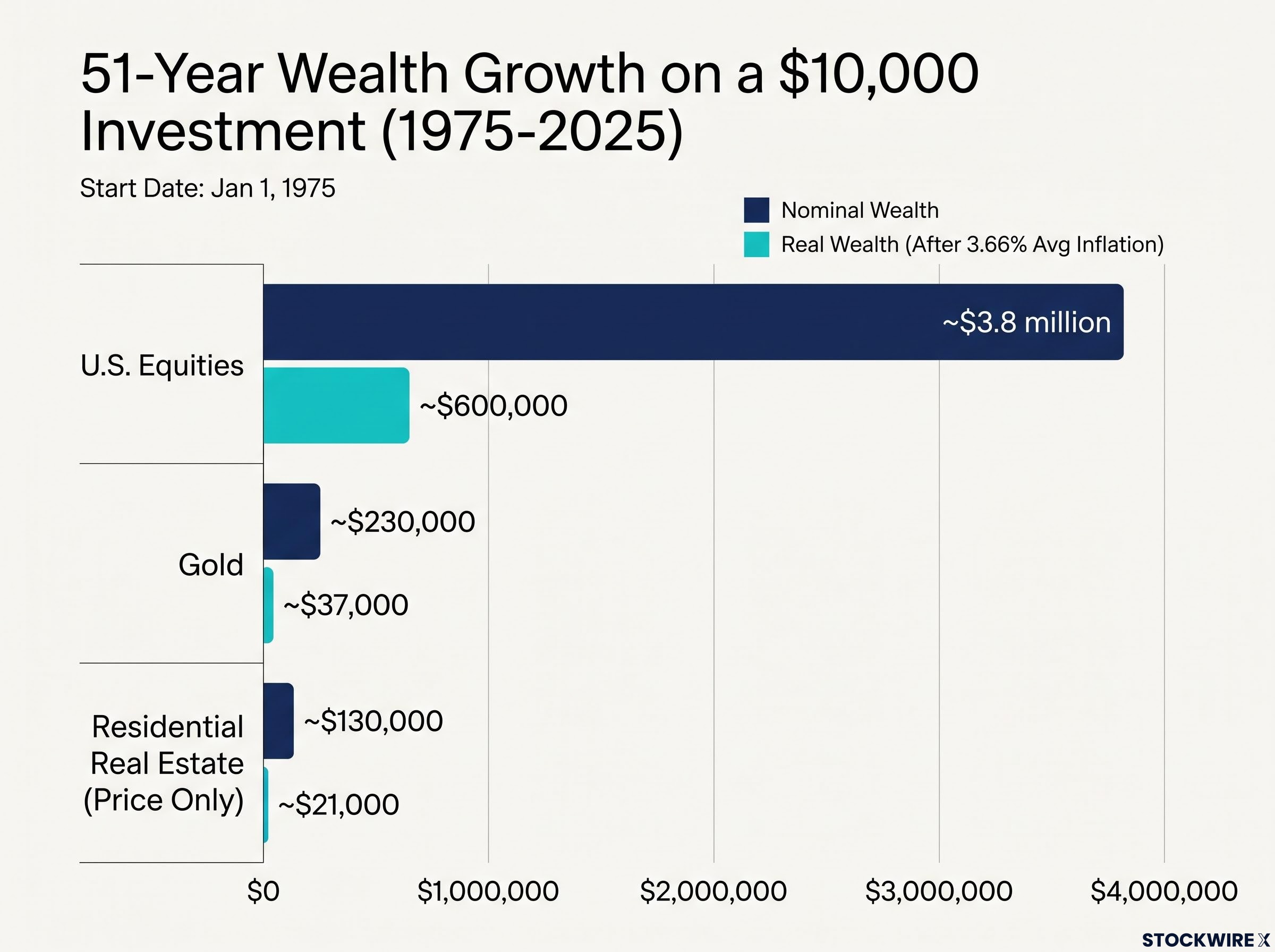
Those percentages feel abstract until you translate them into a single starting stake. Put $10,000 into each asset at the start of 1975 and hold through the end of 2025, and the nominal outcomes diverge dramatically.
Terminal nominal wealth on $10,000 invested in 1975 Equities: approximately $3.8 million Gold: approximately $230,000 Residential real estate (price only): approximately $130,000
That is the compounding gap in its rawest form. Equities did not finish twice ahead or three times ahead. They finished more than sixteen times ahead of gold and nearly thirty times ahead of residential property prices, from an identical starting cheque.
After inflation, the picture shifts further
Now apply the lens that changes everything: that 3.66% average annual inflation. Nominal returns tell you how many dollars you ended with. Real returns tell you what those dollars could actually buy.
Strip inflation out, and equities returned roughly 8.4% annually. Gold dropped to approximately 2.61%. Residential real estate prices fell to approximately 1.48%.
| Asset class | Nominal annualised return (51yr) | Real annualised return (51yr) | Terminal real wealth on $10,000 |
|---|---|---|---|
| U.S. equities (total return) | 12.37% | approx. 8.4% | approx. $600,000 |
| Gold (spot) | 6.37% | approx. 2.61% | approx. $37,000 |
| Residential real estate (price only) | 5.2% | approx. 1.48% | approx. $21,000 |
Here is where the story turns for gold and property. A 2.61% real return and a 1.48% real return are barely above what cash-like instruments would have preserved in purchasing power. In real terms, gold and residential property prices did little more than tread water against the rising cost of living across half a century.
The terminal real wealth column is where the abstraction becomes concrete. That same $10,000, expressed in today’s purchasing power, grew to roughly $600,000 in equities, $37,000 in gold, and $21,000 in residential property prices. The gap you were looking at in nominal dollars does not close after inflation. It stays wide.
A shorter horizon corroborates the ranking without reproducing the exact figures. A CNBC analysis published 8 October 2025, drawing on Morningstar Direct data, reported 30-year annualised total returns of 10.67% for the S&P 500, 8.89% for a broad U.S. real estate series, and 7.96% for gold. Note the caveat: that Morningstar real estate figure includes commercial exposure and income, so it sits above the residential price-only number and is not a direct substitute for it. Different window, different methodology, same hierarchy.
The decade that made each asset famous, and why that matters
Look at the full 51 years and equities win comfortably. Look at any single decade, and the winner changes. That is not a contradiction. It is the reason the debate never ends, because each asset genuinely has a highlight reel it can point to.
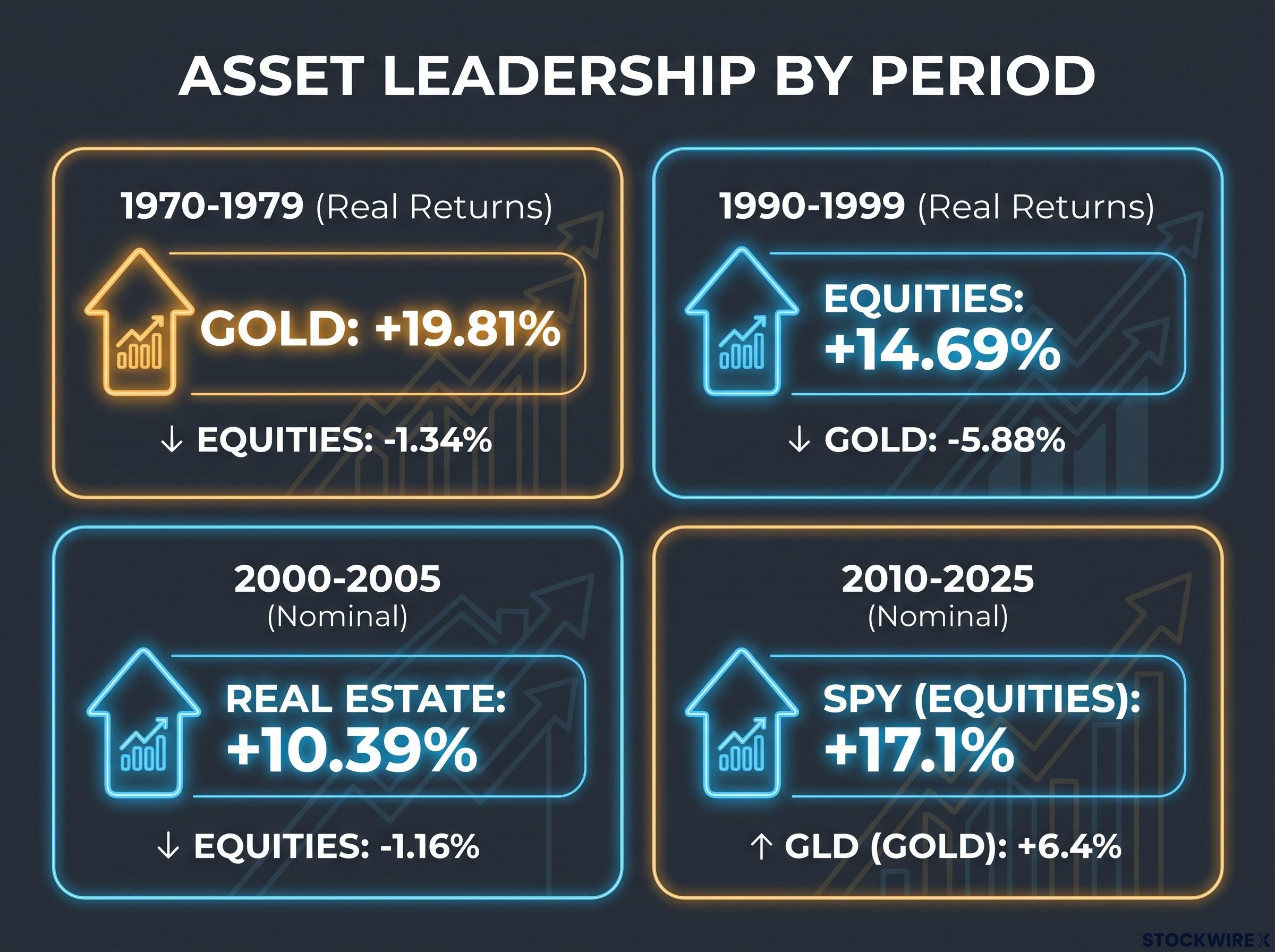
Gold owns the 1970s. From 1970 to 1979, gold returned roughly 19.81% annually in real terms while equities lost about 1.34% a year in real terms and real estate stayed broadly flat. If you were sold gold on the strength of that decade alone, the pitch would have been overwhelming.
Equities own the 1990s. From 1990 to 1999, stocks returned approximately 14.69% annually in real terms while gold shed around 5.88% a year and real estate declined modestly in real terms. Then real estate took its turn: from 2000 to 2005, residential prices climbed roughly 10.39% annually in nominal terms while equities fell about 1.16% and gold rose 9.96%.
| Decade / period | Best performer | Return | Worst performer | Return |
|---|---|---|---|---|
| 1970-1979 (real) | Gold | +19.81% | Equities | -1.34% |
| 1990-1999 (real) | Equities | +14.69% | Gold | -5.88% |
| 2000-2005 (nominal) | Real estate | +10.39% | Equities | -1.16% |
| 2010-2025 (nominal, ETF) | SPY (equities) | +17.1% | GLD (gold) | +6.4% |
The most recent 15-year window belongs to stocks again. From 2010 to 2025, SPY returned roughly 17.1% annualised, VNQ about 8%, and GLD around 6.4%, according to Investopedia analysis by Mark Stroup and Andrew Reinike published 22 July 2025.
One year can quietly rewrite a decade’s average. Tony H. Chaime’s 2026 rolling-return analysis, shared on LinkedIn and unverified, argues that gold’s apparent 10-year strength was heavily concentrated in a single exceptional year; remove it, and the average drops sharply. Treat the specific figures as illustrative, but the mechanism is the point.
So when someone cites gold’s 1970s run or equities’ 2010s surge as proof of long-run superiority, they are selecting the decade that flatters their conclusion. Three questions defuse that move every time:
- Identify the start date, and ask whether it was chosen freely or anchored to something external.
- Check the decades on either side for the same asset, because peak decades are almost never repeated.
- Ask for the inflation-adjusted figure, not the nominal one.
Why equities have compounded faster over the full horizon
The equity lead is not luck stretched over 51 years. It comes from what a stock actually is. A share is an ownership claim on a business that generates earnings and pays dividends, and those dividends, reinvested, are the engine behind that 12.37% nominal return. Gold produces no cash flow at all. Residential property produces rental income, but the price-only index deliberately excludes it.
Three structural advantages sit underneath the compounding gap:
- Productive cash flows and dividends, which can be reinvested to buy more ownership, compounding on themselves
- Earnings growth that can outpace inflation, because businesses raise prices and grow output as economies expand
- Deep liquidity, which makes low-cost total-return reinvestment practical at scale
Kommerstad’s research on risk-adjusted returns reaches the same conclusion in narrative terms, finding equities delivered the highest long-term compound annual growth rate and the best Sharpe ratio, a measure of return earned per unit of risk taken, of the three assets. The specific figures cited (a 14.2% CAGR and a 0.44 Sharpe ratio) are not independently verified, so weigh the direction of the finding rather than the precise numbers.
None of this makes the equity premium free. It is compensation for tolerating volatility that many investors find genuinely hard to sit through.
Compounding drag on equity returns from concentration, tax inefficiency, and behavioural error can erode a material portion of the structural equity premium identified in the 51-year record, which is why the method of equity exposure matters alongside the asset class decision itself.
The drawdown that defines the trade-off Gold’s maximum drawdown: approximately 8.4% Equities’ maximum drawdown: approximately 59.4% during the Global Financial Crisis
That contrast is the single strongest card gold advocates hold, and it deserves to be taken seriously before it is contextualised. The question you should ask is whether your own time horizon and temperament actually let you hold through a near-60% fall. If they do not, the long-run equity premium is not fully available to you, because you would have sold near the bottom.
What gold and real estate actually offer that equities do not
The advocates are not wrong about what their assets do well. Gold is a tail-risk hedge. It tends to hold or gain value precisely when equities are collapsing, which is why its 8.4% maximum drawdown matters to anyone whose portfolio, or nerve, cannot absorb a 60% equity fall.
Real estate offers something equities structurally cannot: leverage and income. That 1.48% real figure is price appreciation only. A mortgaged property earning rent can produce materially higher effective returns depending on financing and local conditions, and both assets carry the psychological comfort of tangibility.
Estrada’s 2016 work at IESE frames the honest ceiling on all of this. Adding gold or real estate to a stock-bond portfolio can improve risk-adjusted returns, but the improvement is modest, on the order of 10 to 30 basis points of Sharpe ratio. These are diversifiers and hedges with specific portfolio roles. They are not long-run growth substitutes for equities.
The World Gold Council’s research on gold portfolio diversification finds that a 2.5-10% allocation has historically improved risk-adjusted returns during market downturns, reinforcing Estrada’s finding that gold’s role as a hedge is real but modest, and distinct from its role as a long-run wealth compounder.
The gap between what data shows and what investors believe
Here is the uncomfortable part. The record points one way, and investor preference points the other. Americans routinely name real estate or gold as the best long-term investment, yet the inflation-adjusted evidence consistently favours equities. The most consequential allocation decisions are frequently made on emotional salience, not the full historical record.
Kommerstad’s survey work captures the inversion, though the specific figures are unverified: only around 28.8% of respondents ranked equities first on risk-adjusted attractiveness, while roughly 55.9% preferred gold, despite equities holding the stronger long-run record.
Preference versus evidence A majority of surveyed investors preferred gold on risk-adjusted attractiveness, even though equities produced the superior long-run real return. (Figures unverified, but directionally consistent with broader survey evidence.)
The behavioural mechanisms behind that gap are recognisable. Loss aversion is amplified by equity drawdowns, so a 59% fall imprints far harder than a 12.37% average feels reassuring. Tangibility bias favours property you can stand inside. Crisis memory keeps gold’s reputation elevated long after each crisis passes.
An illustration from Investopedia stretches the horizon back further still: $100 invested in the S&P 500 in 1928 would be worth roughly $983,000 today, against about $12,650 for gold and $5,550 for real estate. Those figures are flagged as illustrative and unverified, but the scale of the divergence echoes the 51-year record.
The horizon caveat matters too. Robert Jenkins’ “100-Year Portfolio” framework, published on AdvisorAnalyst on 24 August 2026, stresses that sequence-of-returns risk and horizon mismatch are the real threats for shorter-horizon investors who over-rely on long-run averages.
So when the next performance claim reaches you, run it through three questions before you accept it:
- What start date is being used, and was it chosen freely or externally anchored?
- Are the returns nominal or real, after inflation?
- Are dividends and income included, or is this price appreciation only?
What a 51-year record can and cannot tell you about your own allocation
Start with what the data genuinely settles. Across the 15-year, 30-year, and 51-year windows, equities have compounded real wealth at a rate that gold and residential property prices have not matched. The three real annualised anchors hold as the reference points: equities at roughly 8.4%, gold at 2.61%, and residential real estate at 1.48%, price appreciation only. That hierarchy is not in serious doubt.
What the record does not settle is your allocation. It does not prove any individual should hold 100% equities, and it does not promise the next decade will look like the last one. Estrada’s finding stands as the honest counterweight: diversifying into alternatives can improve risk-adjusted returns even while modestly lowering expected returns, which means the data hierarchy does not eliminate the case for holding more than one asset type.
A layered inflation hedge portfolio structure that combines broad index equity exposure with targeted dividend positions and real asset sleeves addresses the gap the 51-year record reveals: equities are the structural compounder, but the specific implementation determines how much of that real 8.4% annualised return any individual investor actually captures.
Three variables the 51-year record cannot resolve on your behalf:
- Your personal investment horizon relative to the full 51-year window, which determines how much of the long-run average you can actually capture
- Your access to leverage, particularly relevant for real estate, which price-index figures cannot capture
- Your behavioural capacity to stay invested through a drawdown approaching 60%
Jenkins’ point closes the loop: sequence-of-returns risk makes the long-run average far less useful if you are within 10 to 15 years of needing the capital. The 51-year comparison is the most methodologically defensible one available, which makes it the right place to start your thinking, not the place to end it. Apply the three evaluation questions to every claim you meet next, and hold every single-asset advocate accountable for their start date and their methodology.
This article is for informational purposes only and should not be considered financial advice. Investors should conduct their own research and consult with financial professionals before making investment decisions. Past performance does not guarantee future results. Financial projections are subject to market conditions and various risk factors.