A single analyst has put a specific year on what he calls the most dangerous financial configuration in U.S. history. That year is 2027, and as of September 2026, it is less than 18 months away.
Michael Pinto’s central claim is not simply that markets are overvalued. It is that equities, real estate, and credit have all reached extreme valuations simultaneously, a configuration he argues has no historical precedent, and that the convergence itself is what turns the coming unwind from painful into catastrophic.
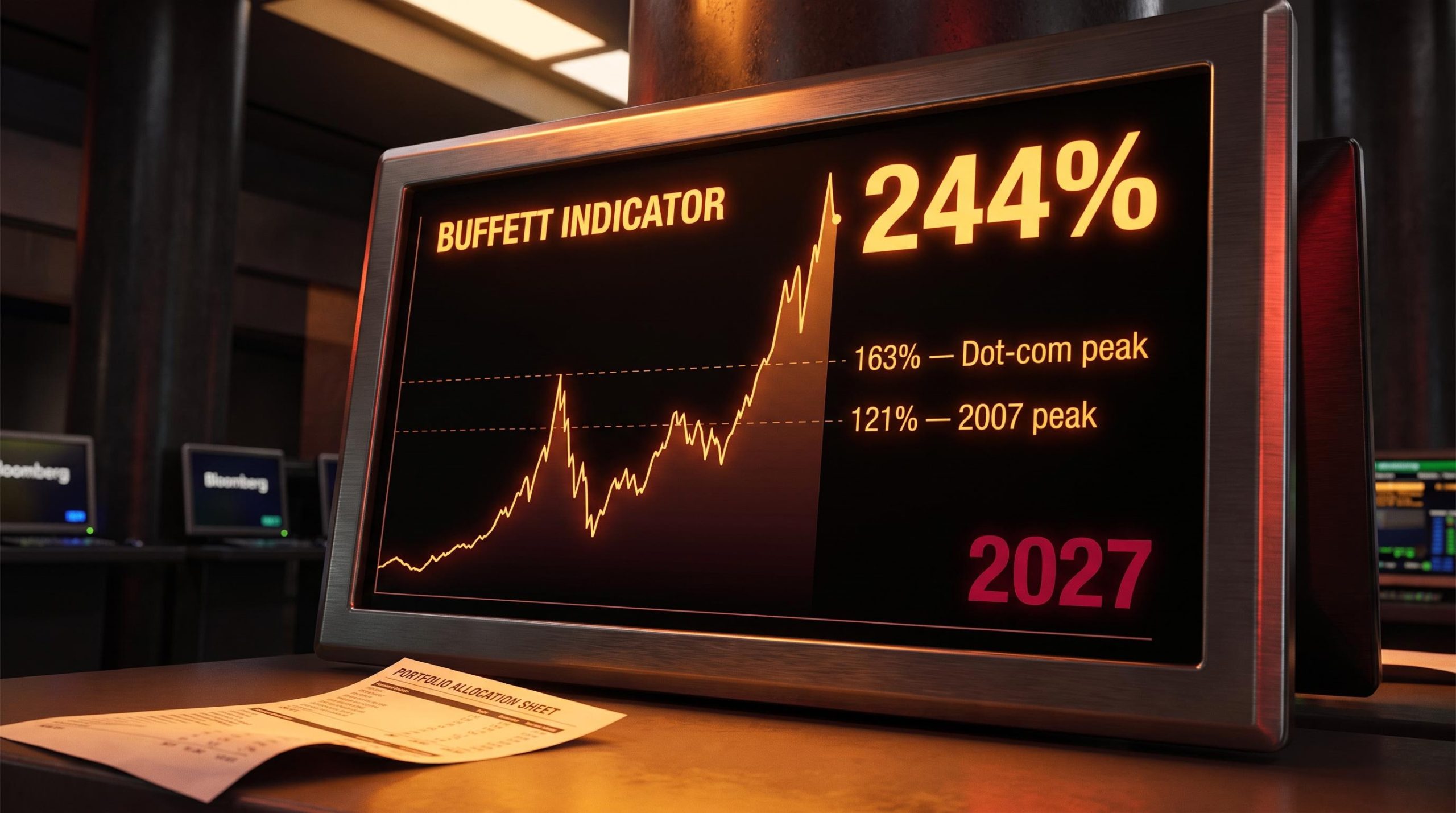
The data he cites is not obscure. The Buffett Indicator, which measures total stock market capitalisation as a percentage of GDP, sits near 244%, more than double its dot-com peak. Private credit has expanded from $46 billion in 2000 to over $1 trillion today. What is contested is not the numbers. It is the conclusion Pinto draws from them.
This piece lays out the full architecture of that thesis: the historical and institutional evidence that supports or challenges it, and what the analysis actually implies for portfolio positioning in the months leading up to his forecast window. By the time you finish, you will know not just what Pinto believes, but how much weight it deserves.
Three markets, one problem: why simultaneous bubbles change the risk calculus
Pinto’s thesis pivots on a single historical observation: past crises were contained events. The Nasdaq collapse of 2000 was confined largely to technology equities. The 2007 crisis centred on real estate. Each was a single-market failure with the rest of the financial system left standing to absorb it.
What Pinto argues today is that all three major asset classes have reached extremes at the same time. Start with equities.
The Buffett Indicator, named after Warren Buffett’s observation that it may be the single best measure of where valuations stand, currently registers around 244% as of 30 June 2026, according to CurrentMarketValuation models. That reflects a market capitalisation of $78.10 trillion against GDP of $32.06 trillion.
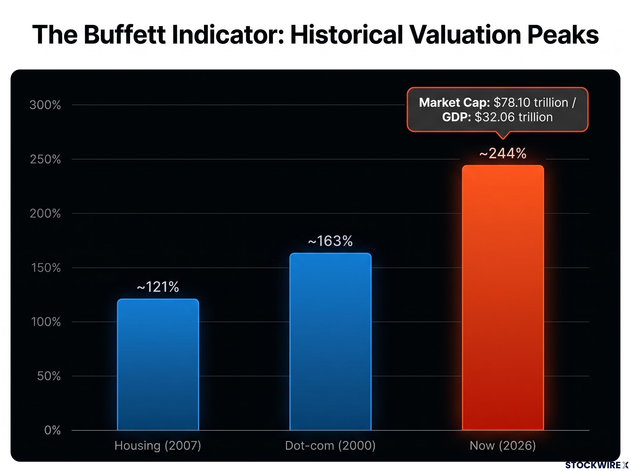
The anchor statistic At roughly 244%, the Buffett Indicator sits far above the dot-com peak near 163% and the 2007 high near 121%. Separate Eco3min data placed the all-time high near 229% in Q4 2025.
Sources vary on the precise figure, and that variation matters for credibility. Throughout 2025, various outlets reported the ratio fluctuating between 190% and 221%. The point is not the decimal. It is the distance from every prior peak on record.
The FRED market capitalisation to GDP series, which draws on IMF International Financial Statistics and Standard & Poor’s data, provides the long-run historical baseline that makes the current 244% reading legible: every prior peak on record sits well below it.
To reach what Pinto calls equilibrium, he estimates equity markets would need to fall more than 50%, comparable to the S&P 500 declines seen in 2000-2002 and 2007-2009.
Beyond a single indicator, other independent valuation frameworks are simultaneously signalling that the margin of safety in current equity prices has compressed to historic lows.
Real estate tells a parallel story. Pinto asserts that the home-price-to-income ratio now exceeds the 2006 peak, itself considered historically extreme at the time. His estimate for the correction needed to restore balance is a residential price decline of 25% to 30%.
| Era | Buffett Indicator | Real Estate Condition | Credit Vehicle | Single or Multi-Market |
|---|---|---|---|---|
| Dot-com (2000) | ~163% | Not stretched | Tech equity margin | Single-market |
| Housing (2007) | ~121% | Peak affordability stress | Mortgage-backed securities | Single-market |
| Now (2026) | ~244% | Exceeds 2006 peak | Private credit and CLOs | Multi-market |
Here is what the 244% figure actually tells you. It does not automatically predict a crash. But it does mean that the margin of safety in U.S. equities, by this measure, is thinner than at any prior market peak in recorded history. That is the foundation Pinto builds everything else on.
When big ASX news breaks, our subscribers know first
The credit fuse: how private debt and leverage become the detonation mechanism
Credit is where Pinto’s thesis stops being a valuation observation and becomes a theory of how the collapse actually detonates. In his proprietary 12-point market model, credit conditions are not a symptom of a bursting bubble. They are the mechanism that bursts it.
He points to precedent. Rising debt servicing costs, the amount borrowers must pay to keep loans current, were the specific trigger that deflated both the 2000 and 2007 bubbles. He expects the same trigger this time.
What makes this cycle different is the sheer scale and reach of the credit complex that has grown up over two decades.
- Private credit: U.S.-specific estimates run between $1.0 trillion and $1.4 trillion, up from just $46 billion in 2000.
- CLOs (total U.S. market): around $977 billion to $1.2 trillion.
- Private-credit CLOs: roughly $150-155 billion, about 10-16% of the total CLO market.
- High-yield bonds: the U.S. market sits in the $1.35-2.0 trillion range.
- Margin debt: approximately $1.5 trillion across the market.
- AI sector borrowing: roughly $1 trillion annually.
That private credit expansion, from $46 billion to over $1 trillion in roughly twenty years, means a credit contraction today would reach into corners of the economy that prior crises never touched: middle-market firms, leveraged buyouts, AI infrastructure. When you build your own risk model, that breadth is the variable to factor in.
How a credit contraction spreads across all three markets
The transmission runs as a loop, and once you see it, you understand why Pinto expects a simultaneous collapse rather than a sequential one.
Falling asset prices compress collateral values, the worth of the assets lenders hold as security against loans. Compressed collateral tightens credit conditions. Tighter credit accelerates defaults and forces sales of assets. Those forced sales depress prices further, and the loop turns again.

The academic record gives this concern partial support. A 2016 study from the Federal Reserve Bank of San Francisco, examining 23 historical asset-price booms, found that nearly half involved simultaneous equity and real estate bubbles. When combined with high pre-crisis credit growth, the resulting recessions were significantly deeper and longer.
The Financial Stability Board (FSB) and the European Central Bank (ECB) have separately noted that stress in private-credit CLOs could tighten conditions for middle-market firms, then feed back into banks through shared exposures. That is the wire connecting equities, housing, and credit into a single circuit.
What the mainstream gets right, and where Pinto diverges
A thesis this bearish deserves honest stress-testing, and the institutional counter-case is stronger than Pinto’s framing sometimes allows.
Take the Buffett Indicator first. Mainstream analysts argue its elevation is partly structural. The indices are now dominated by high-margin technology firms and companies rich in intangible capital, assets like software, patents, and brand value that do not show up cleanly in GDP. On this reading, a high ratio does not guarantee an imminent crash.
While structural changes explain some of this elevation, index concentration among mega-cap tech stocks has reached historical bubble extremes, rivalling the vulnerability seen at the height of the dot-com era.
The credit case has an even sharper rebuttal. The American Investment Council notes that U.S. private debt of $1.13 trillion represents just 1.5% of total U.S. non-financial debt of $74.58 trillion. The London Stock Exchange Group (LSEG) adds that private-credit CLOs remain around 10% of the private credit universe. Both figures undercut the tidy analogy to the 2006-2007 mortgage-backed securities crisis.
Add the soft-landing supports: stronger household balance sheets, improved bank capital ratios, and central banks with active policy tools. Together they make a moderate-cycle outcome genuinely plausible.
| Dimension | Pinto’s Position | Institutional Counter | Where the Counter Falls Short |
|---|---|---|---|
| Equity valuation | >50% overvalued | Partly structural, tech-driven | Does not address simultaneity with housing and credit |
| Credit risk scale | Systemic detonation risk | Only 1.5% of non-financial debt | Ignores feedback-loop transmission across markets |
| Policy response | Fiscal insolvency limits tools | Central banks retain capacity | Concedes liquidity can delay, not prevent |
There is one point the counter-arguments consistently sidestep. They address each bubble individually. They do not engage with Pinto’s actual claim, which is about convergence: whether all three extremes occurring at once produces systemic dynamics that single-market analysis cannot see. The 2016 San Francisco Fed study is the closest thing to academic validation of that specific worry.
Pinto also carries a real credibility scar worth weighing. He misjudged 2023 as negative, holding short positions into modest losses, because he underweighted the return of Federal Reserve reverse repo liquidity into the economy. That is not a disqualifying error. But it is a material one, and when you evaluate a 2027 forecast, you should account for the possibility that another underweighted policy intervention extends the cycle past his timeline again.
Hyper-stagflation, portfolio fragility, and where Pinto sees relative shelter
If the collapse arrives, Pinto does not expect a clean recovery. He expects what he calls hyper-stagflation: a prolonged, potentially decade-long stretch of stagnant or negative real growth paired with elevated inflation.
The mechanics are specific. Nominal yields get suppressed through money printing while inflation climbs faster, producing deeply negative real interest rates, meaning the return on your money after inflation is meaningfully below zero.
He projects the fiscal picture worsening fast. Automatic economic stabilisers alone could push federal deficits sharply higher without any new legislation.
The deficit projection Pinto expects federal deficits to rise from roughly $2 trillion currently to between $4 trillion and $6 trillion annually, driven by automatic stabilisers rather than fresh Congressional action.
On rates, he sees roughly three more hikes from the current level near 4%, followed by a cut path toward 1% or zero in a severe contraction, one he reluctantly calls a depression, with double-digit unemployment comparable to the roughly 10% reached during the global financial crisis.
What passive indexing gets wrong about a stagflation decade
This is where the scenario maps directly onto your portfolio, and the 60/40 split is the first casualty.
The classic assumption is that when equities fall, bonds rise and cushion the blow. In 2022, that broke. Both fell together because bond yields had been compressed so low, the 30-year Treasury dropped below 1% at one point, that bonds had no room left to act as a hedge.
Here is the part worth sitting with. The 2022 failure was a single-year stress event. Pinto is describing a potentially decade-long environment where that same breakdown persists. If you have not revisited your allocation assumptions since 2022, treat that gap as an active risk, not a historical footnote.
In prolonged stagflationary or debt monetisation scenarios, the valuation compression from rising yields actively erodes the purchasing power of passive index holdings.
Passive indexing is structurally exposed here. A fund that simply holds the whole market cannot rotate out of broad equity risk when broad equity risk is the problem. Pinto favours active, sector-rotating management, alongside real assets: commodities, energy, agriculture, and precious metals, with roughly 10% of his own portfolio in precious metals across physical metal and mining equities.
Those hedges are not free of risk, and honesty requires naming the limits.
- Cyclicality: commodity and energy prices can suffer large drawdowns in a demand-driven recession, even with inflation high.
- Credit-linked transmission: many commodity and energy producers rely on leveraged loans, so a credit crunch can drag down fundamentally sound resource assets.
- Futures and roll mechanics: commodity strategies built on futures face basis and contango costs, where near-term contracts price above longer-dated ones and erode returns on each roll.
- Policy and climate risk: shifting climate policy and technological change can alter long-term returns on fossil-fuel exposures.
Reading the 2027 timeline with 18 months to go
The honest starting point is that Pinto has been directionally right on structural fragility and wrong on timing before. His 2023 miss was a timing error, not a structural one, and the 2027 call faces exactly the same risk.
He treats that risk as secondary, and his reasoning is instructive.
The 1929 anchor Pinto compares the potential fallout to 1929, when the stock market took roughly 15 years to return to breakeven. His view is that today is more dangerous, because a triple bubble did not exist then. When recovery is measured in years rather than months, the exact starting year matters less than the structural setup.
The reverse repo episode is the precedent to keep in mind: a Fed intervention that delayed the underlying pressure without removing it. From a current federal funds rate near 4%, another such move could push his timeline out again.
So the most useful way to read this is not as a crash prediction to accept or reject, but as a structural risk map. Here are the three variables to watch before 2027.
- Credit spread movement in the CLO and high-yield markets. Widening spreads are the earliest sign that debt is repricing for risk.
- Debt servicing costs versus corporate earnings. Pinto identifies rising servicing costs as the historical trigger; watch whether they outrun earnings.
- Fed liquidity interventions beyond his current model, the kind of move that caught him out in 2023.
The signal his model says to watch is specific: if credit spreads begin widening materially while equity valuations stay near current levels, that combination is the one that matters. You still have time to monitor it rather than react to it.
For readers wanting to watch these specific leading indicators, our deep-dive into tracking credit stress signals outlines the bankruptcy filing trends and bank lending standards that precede broader market downturns.
What the triple bubble thesis demands of serious investors now
The central tension of this analysis is now clear. The Buffett Indicator near 244%, the private credit expansion from $46 billion to over $1 trillion, and real estate affordability past its 2006 peak all point to genuine structural fragility. Mainstream analysis explains much of it. What it does not engage is Pinto’s simultaneity argument, and that gap is the whole ballgame.
So the decision-relevant question is not “will the crash happen in 2027?” It is sharper and more personal: how much of your current allocation rests on assumptions that Pinto’s scenario would invalidate?
The 2022 failure of the 60/40 portfolio is the most recent real-world test of exactly those assumptions, and it failed. That is worth more than any forecast.
The 2027 date may prove wrong. But the structural conditions Pinto describes are visible in the data today, and anyone who waits for confirmation before acting will, by definition, be acting after the signal has already fired. The real value here is not the prediction. It is the pressure-test.
This article is for informational purposes only and should not be considered financial advice. Investors should conduct their own research and consult with financial professionals before making investment decisions.
Past performance does not guarantee future results. Financial projections are subject to market conditions and various risk factors. The scenarios described are speculative and subject to change based on market developments.