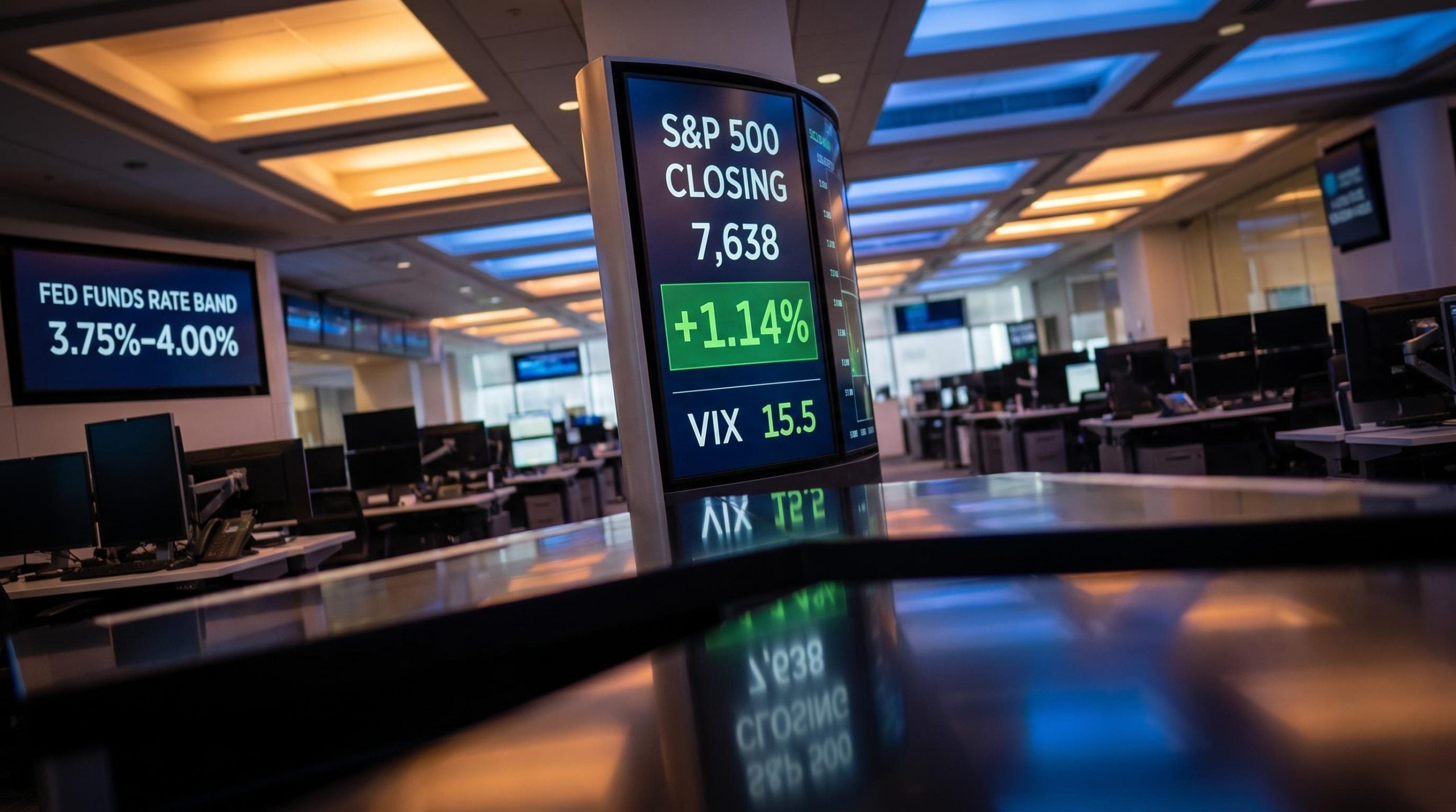
The Federal Reserve raised rates for the first time in three years on 16 September 2026, and stocks rallied. That reaction, markets climbing sharply on news of tighter monetary policy, is not a paradox once you understand what investors were actually responding to.
The Federal Open Market Committee’s unanimous 25-basis-point hike to 3.75%-4.00% arrived alongside a dot plot showing 12 of 18 policymakers expecting further tightening, a new Fed chair with a deliberately opaque communication style, and Treasury yields retreating from multi-year highs. Each of those variables is doing something distinct to asset prices, and treating them as a single signal produces the wrong read.
This piece unpacks the mechanics behind the rally, lays out what the dot plot and yield retreat actually signal for different asset classes, and identifies where the real vulnerabilities sit. The move has been made. What matters now is what comes next, and which sectors will bear the cost.
Why the market rallied on a rate hike that was supposed to hurt
The equity market’s response ran in two directions inside a single session, and both moves were rational. The initial drop and the rally that erased it were responding to different pieces of the same announcement, not to confusion about what the Fed had done.
The initial sell-off and why it reversed
The session opened sharply lower. The Dow fell more than 600 points as traders digested Chair Kevin Warsh’s hard-line comments on inflation, which read as a signal that the tightening cycle was only beginning rather than a one-off adjustment.
Then two things shifted the tape. Treasury yields, which had climbed for nine straight sessions, began retreating from their multi-year peak, and oil prices softened. Those two moves were the pivot points that flipped sentiment before the closing bell.
Once the Fed’s first move was confirmed, the uncertainty that had hung over positioning lifted. This is the “buy the news” dynamic: professional participants had been selling the ambiguity, not the rate itself, and the resolution released pent-up risk appetite back into equities.
S&P 500 performance after first hikes has historically averaged roughly 9% over the following 12 months, with the initial three-month dip of around 2% reflecting a valuation-repricing event rather than genuine earnings deterioration, a pattern that reframes the session’s rally as consistent with historical precedent rather than anomalous.
By the close, the rally was broad. Nine of the eleven S&P 500 sectors advanced, and the index-level numbers told the story of rotation back into risk:
- S&P 500: closed at 7,638, up 1.14%
- Nasdaq: closed at 26,418, up 1.69%
- Dow: closed at 51,778, up 0.61%
- Russell 2000: up 0.55%
Pre-meeting, CME FedWatch data had shown roughly 58.4% odds of a hike, swelling to above 90% just before the decision. The market had already priced the outcome. What it had not priced was the relief of certainty.
The clearest evidence of that relief sat in the volatility market.
The signal to watch: the VIX The VIX, Wall Street’s measure of expected market volatility, fell approximately 12% to roughly 15.5 intraday. That compression is not complacency. It is professional money confirming the hike had been fully anticipated and the tail risk around it had cleared.
For your positioning, the distinction matters. This was not a fundamental repricing of growth expectations. It was uncertainty resolving, which means reading the rally as a durable risk-on green light would be a mistake.
When big ASX news breaks, our subscribers know first
What the dot plot and Warsh’s silence are actually telling you
The rally answered a question about the past. The dot plot and the new chair’s communication style raise a harder question about the path ahead, and the answer is less comfortable than the equity close suggests.
Start with the raw projections. The Summary of Economic Projections, released on 16 September 2026, showed the committee leaning decisively toward more tightening rather than a pause.
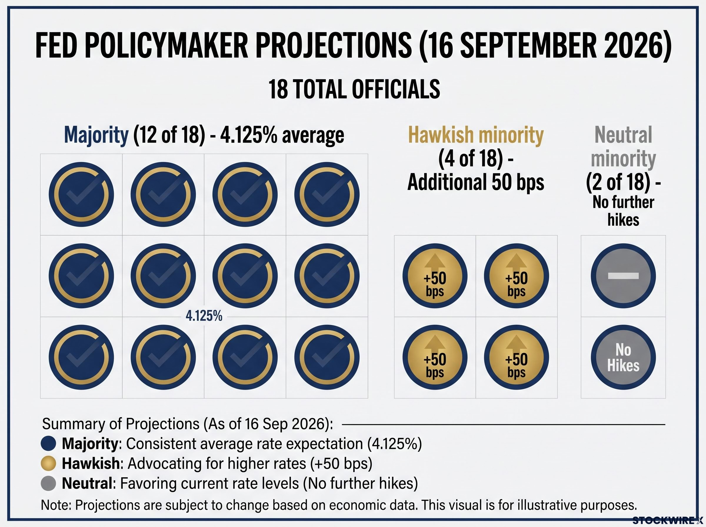
| Policymaker group | Projected 2026 rate | Number of officials |
|---|---|---|
| Majority | 4.125% average | 12 of 18 |
| Hawkish minority | Additional 50 bps | 4 |
| Neutral minority | No further hikes | 2 |
Markets took the hint. Traders are now pricing three more rate rises by mid-2027, with an 85% probability that rates sit higher by December 2026. Deutsche Bank analysts projected 50 basis points of additional tightening by year-end.
Here is where it gets structurally different. Warsh runs what observers have called a “skinny Fed” approach: tight-lipped, standardised in his commentary, and openly resistant to detailed forward guidance. He wants investors to respond to what the Fed does, not to parse what the chair hints.
That is a sharp break from the Jerome Powell era, when forward guidance was the primary tool for steering expectations. Warsh withholds explicit reaction-function parameters on purpose, which means the dot plot is now the anchor, not the chair’s tone.
Fed forward guidance expanded from 130-word statements in 2002 to nearly 900 words at its 2014 peak, a trajectory that explains why Warsh’s return to brevity registers as a structural regime shift rather than a stylistic preference.
An analyst at SGH Macro Advisors read the September press conference as revealing exactly this posture.
The read on Warsh According to SGH Macro Advisors, the September press conference showed Warsh to be firmly on the hawkish side of the committee, with the firm noting he signalled a clear commitment to continuing rate increases until inflation is durably under control. The absence of hand-holding is the message.
The practical implication for you is significant. Positioning around anticipated Fed pivots worked in the Powell era because the chair telegraphed turns. Warsh will not do that. Regime uncertainty is now structurally higher until the hiking cycle ends, and the cost of being wrong on Fed timing has risen accordingly.
Sector winners and losers in a high-rate, yield-retreating environment
The sector map from the rally is not a scoreboard. It is a picture of which business models the market believes can sustain earnings when borrowing costs stay elevated, and the pattern is worth reading closely against your own holdings.
| Sector | 17 September return |
|---|---|
| Information Technology | +2.20% |
| Consumer Discretionary | +1.43% |
| Utilities | +0.86% |
| Health Care | +0.64% |
| Materials | +0.62% |
| Communication Services | +0.60% |
| Energy | +0.55% |
| Real Estate | +0.33% |
| Industrials | +0.21% |
| Consumer Staples | -0.01% |
| Financials | -0.10% |
Information Technology led, up 2.20%, with a closely tracked semiconductor index rising around 3%. That leadership sits on a specific foundation: AI-driven electricity and infrastructure demand gives tech a structural growth story that partially insulates it from rate headwinds in this cycle. The demand is long-duration and, in the market’s current thesis, not easily derailed by higher discount rates.
Utilities advancing alongside tech is the tell. Both are being rewarded for the same reason, structural demand tied to the AI build-out, which is why they moved together rather than in the opposite directions rate cycles usually dictate.
Financials, down 0.10%, are the more interesting case. Higher rates should eventually widen net-interest margins, the gap between what banks earn on loans and pay on deposits, which is a long-term positive. The near-term drag comes from credit-quality concerns, funding-cost pressure, and elevated bond-market volatility, all of which weigh before the margin benefit arrives.
The takeaway for your tilts is direct: the market is paying up for confirmed structural demand and penalising sectors where higher borrowing costs compress near-term earnings or asset quality. Map your existing holdings against that split before adding to anything rate-sensitive.
Where the housing sector fits in the rate picture
No sector is more acutely exposed to sustained tightening than housing, and the August data is already flashing.
Housing starts fell 2.6% to an annualised pace of 1.275 million, missing forecasts, dragged down by a 22.5% collapse in multi-family starts. Existing-home sales dropped to a 14-month low, falling below a 4-million annualised pace. Mortgage rates averaged 6.76%, the highest in about 15 months, and NAHB homebuilder sentiment slumped to a one-year low in September.
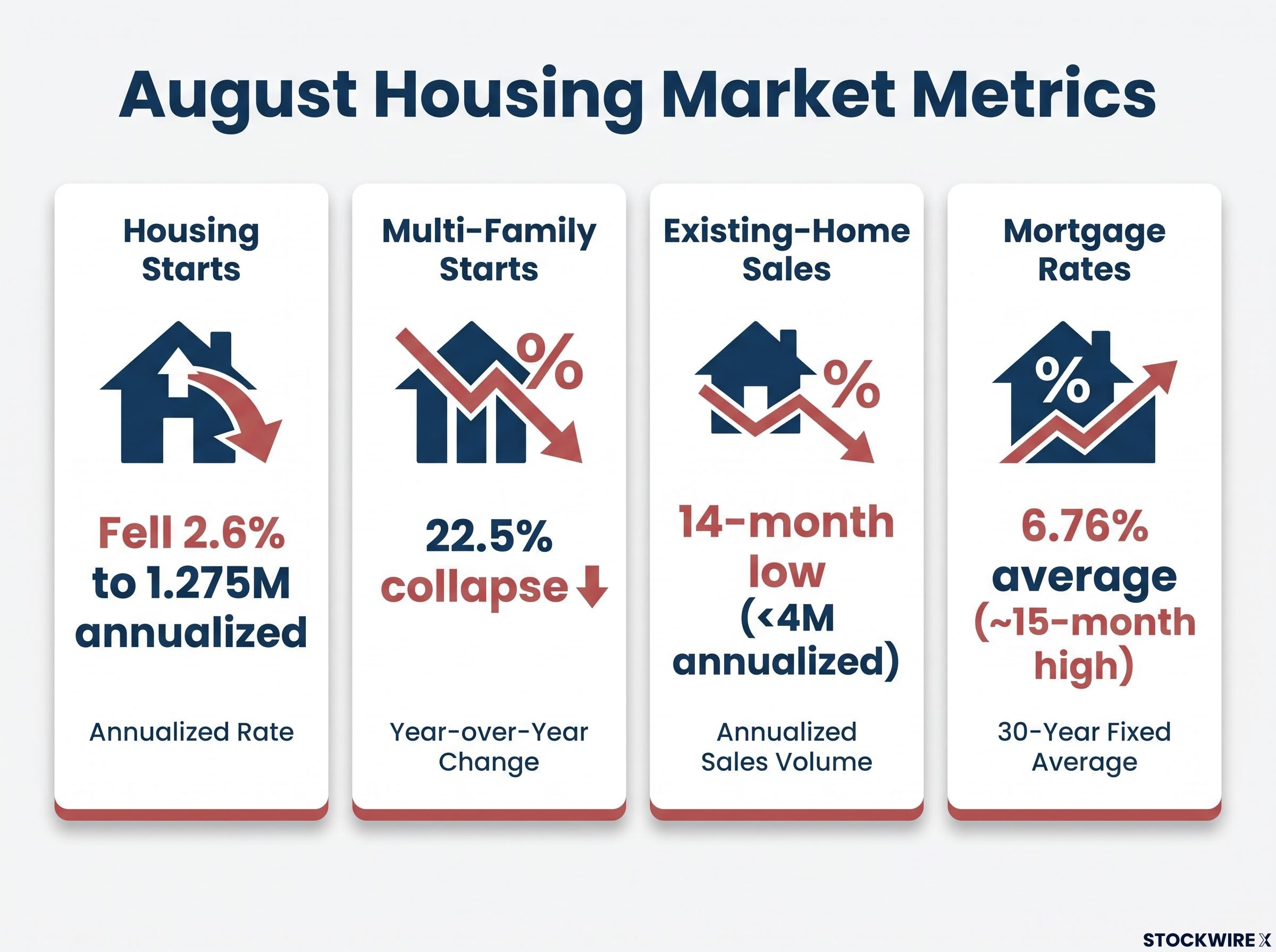
Read this as the canary in the coal mine. If rates keep climbing through mid-2027 as the market expects, housing is where consumer stress shows up first, which makes it the sector to watch for the earliest sign that tightening is biting the broader economy.
Labour market signals and the over-tightening risk investors are underpricing
The labour data looks reassuring at first glance, which is precisely why it deserves a second one. The Fed’s confidence in continuing to tighten rests on this strength, and the strength may be masking more fragility than the headline numbers admit.
Here is the evidence base the committee is leaning on:
- Initial jobless claims for the week ending 12 September 2026 fell 10,000 to 196,000, the lowest since mid-July and well below the consensus estimate of 208,000
- August payrolls added roughly 162,000 jobs, above consensus
- The Fed’s Beige Book noted strength in manufacturing, construction, and services
Now complicate it. Pantheon Macroeconomics’ chief economist suggested the unexpectedly low claims figure likely reflected distortions from Labour Day seasonal adjustments, meaning it may overstate the labour market’s health. The same Beige Book that flagged strength also noted weakening demand in retail and hospitality.
The over-tightening risk sits in the gap between those signals. If the Fed is tightening into strength that is partly a seasonal illusion, and the chair has removed the early-warning mechanism that forward guidance used to provide, the market bears the full adjustment burden when a pivot eventually arrives.
The over-tightening risk carries a historical pattern: underlying job creation running at just 16,000 per month on revised figures and a divided 9-3 vote at the prior meeting both pointed toward labour fragility before the September hike confirmed the committee’s hawkish direction.
That recalibration is already visible in analyst targets.
A concrete downward revision Ed Yardeni of Yardeni Research lowered his year-end S&P 500 target to 7,900 from 8,400, citing the prospect of two more hikes this year. When a bull trims his target by 500 points, it is a signal that the risk distribution has shifted.
For you, the asymmetry is the point. With a strong-looking labour market, a chair who will not signal in advance, and three more hikes priced by mid-2027, the danger is a data softening that outpaces the dot plot’s assumptions. If that happens, the correction would be sharp and largely unannounced, which is exactly the scenario a risk-management framework should be built around now.
What this rate cycle means for positioning through mid-2027
The September hike is the opening move, not the conclusion. By the market’s own pricing, this cycle runs through mid-2027, and the investors who navigate it well will be those who identify which variables signal a regime change before the chair confirms one.
The pace of the tightening cycle matters more than its direction: historical data shows S&P 500 returns ranging from gains of 18% in mild cycles to losses of roughly 6% in aggressive ones, a 24-percentage-point spread driven by how quickly discount rates compress earnings multiples and tighten credit conditions.
Three variables will determine whether the base case of controlled tightening holds or the risk case of over-tightening takes over. Watch them in this order:
- Inflation trajectory: whether price data falls faster or slower than the dot plot’s 4.125% assumption
- Labour deterioration signals: the direction of jobless claims and payrolls once seasonal noise clears
- Housing transmission: whether housing stress spreads into broader consumer balance sheets
The key market level to monitor is the 10-year Treasury yield, which settled near 4.95% after the decision having briefly topped 5.0% beforehand. Its direction will tell you how the bond market is reading the same data.
The base case and the risk case side by side
The base case looks like this: inflation falling faster than the dot plot assumes, tech and utilities leadership widening on confirmed AI demand, and a controlled tightening path that lets equities hold near the 7,638 baseline. Deutsche Bank’s projection of 50 basis points of further tightening by year-end fits inside this scenario without breaking it.
The risk case has observable triggers. Housing stress spreading beyond starts and sentiment, jobless claims rising above 220,000 on a sustained basis, and Beige Book weakness broadening beyond retail and hospitality. In that scenario, Yardeni’s 7,900 target becomes the marker for how far sentiment could unwind.
Your job is not to predict which plays out. It is to ensure your portfolio is not fatally exposed to the risk case, which means knowing your rate-sensitive holdings, your duration exposure, and your reliance on sectors where the structural demand story has not yet been confirmed by earnings.
This article is for informational purposes only and should not be considered financial advice. Investors should conduct their own research and consult with financial professionals before making investment decisions. Past performance does not guarantee future results. Financial projections are subject to market conditions and various risk factors, and forward-looking statements are speculative and subject to change based on market developments.