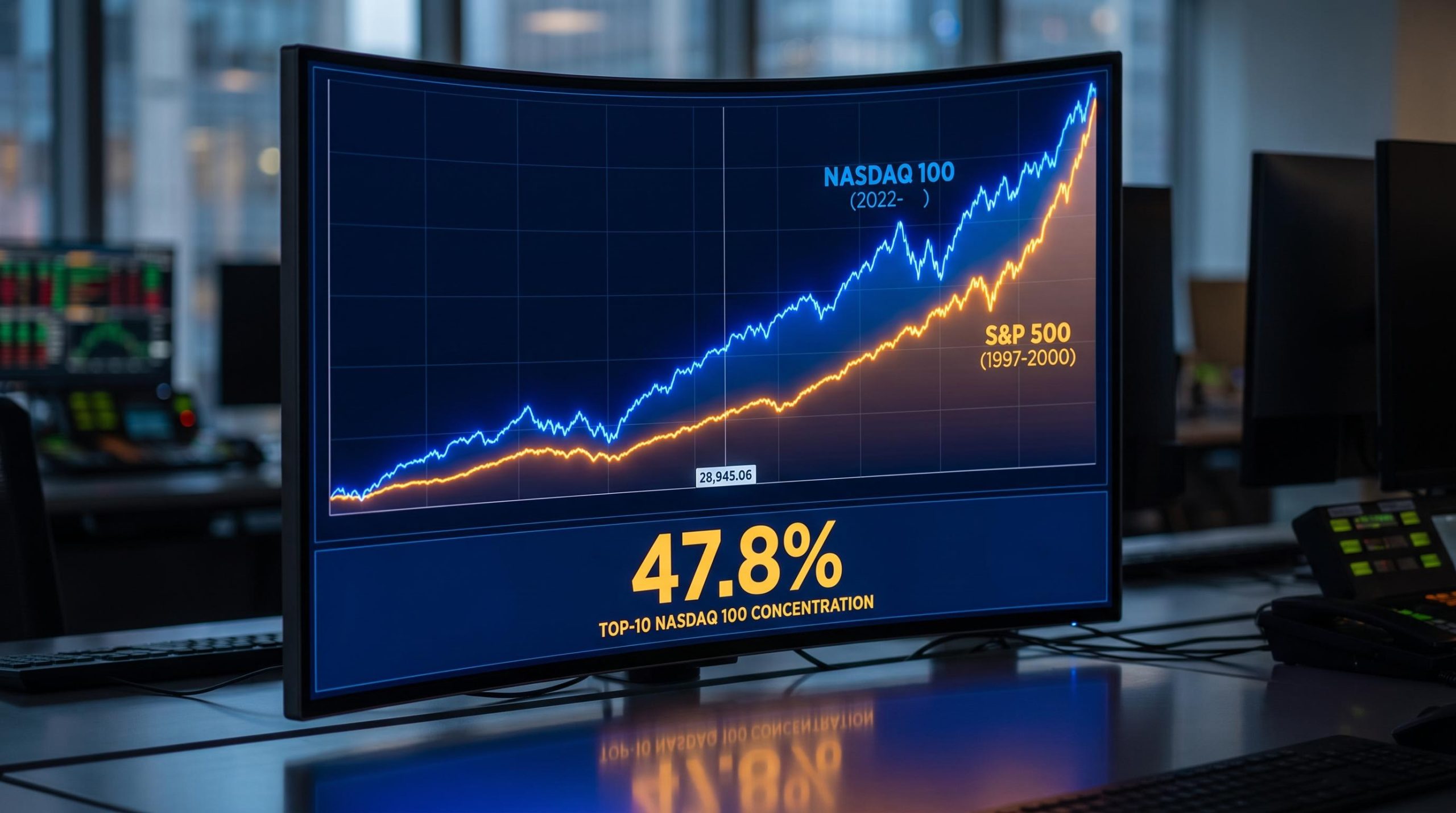
Line up a chart of the Nasdaq 100 since late 2022 against the S&P 500 from July 1997 to March 2000, and the resemblance is unsettling. The same steepening curve, the same relentless climb, the same handful of names doing most of the heavy lifting.
That is why the NASDAQ 100 1997-2000 parallel has become one of the most argued-over comparisons in markets right now. As of 16 September 2026, with the index closing at 28,945.06 and concentration sitting at historic extremes, analysts are split between two readings: a structural new era built on real earnings, or a fragile late-cycle run priced for perfection.
The chart similarity is real. Whether it means what the bears think it means is a different question entirely.
This piece gives you a working framework for judging the actual risks buried in your tech-heavy portfolio, moving past surface-level chart overlays to the market mechanics that determine how much a correction would really hurt.
Deconstructing the late 1990s market pattern
The overlapping charts are the starting point, and they genuinely do rhyme. Technicians line up the current advance against the old one and see the same shape emerging, which is exactly why the comparison refuses to die.
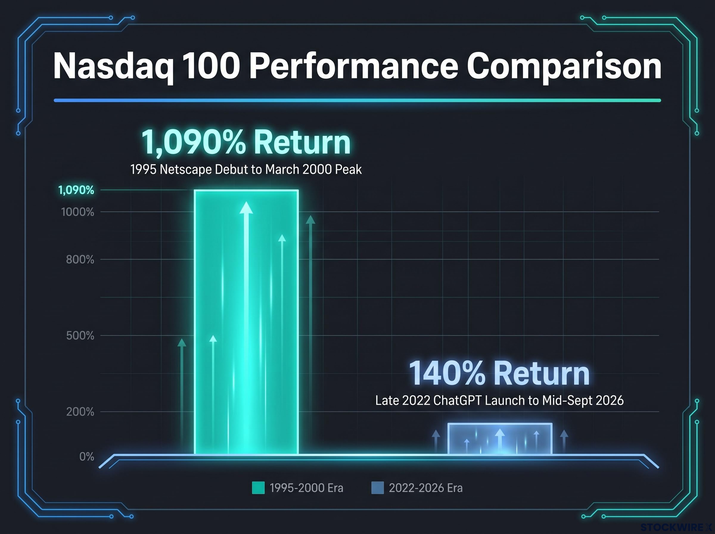
But the scale of the two runs could not be more different. From Netscape’s public debut in 1995 to the peak in March 2000, the Nasdaq 100 delivered a return of roughly 1,090%, according to LPL Financial’s Jeff Buchbinder. That was a near-vertical melt-up fuelled by speculation on internet infrastructure, much of it attached to companies with little revenue and no profit.
The current run looks tame by comparison. Since ChatGPT’s launch in late 2022, the Nasdaq 100 has gained approximately 140% through mid-September 2026, as cited by Fortune and Zacks.
The gap that matters Then: roughly 1,090% from Netscape to the March 2000 top. Now: roughly 140% since late 2022. Same chart shape, wildly different magnitude.
Understanding this history helps you separate a genuine structural warning from routine market noise when you look at your own index positions. The original bubble also did not climb in a straight line. It absorbed multiple fear-driven pullbacks along the way, including reactions to the Asian financial crisis and the collapse of hedge fund Long-Term Capital Management, before the final blow-off top arrived.
The anatomy of a technical chart parallel
When technicians say the 2023-to-peak move closely resembles the 1997-2000 S&P 500, they are talking about structure, not the underlying technology. Chart parallel analysis looks for recurring shapes in how price momentum builds and then accelerates.
The logic is that human behaviour repeats. Rapid momentum phases tend to mirror each other because the psychology driving them, greed, fear of missing out, then eventual doubt, follows a familiar sequence regardless of whether the story is internet routers or AI accelerators.
That is the value of the comparison and also its limit. A shape can rhyme without the outcome being fixed, which is why the chart alone settles nothing.
When big ASX news breaks, our subscribers know first
How mega-cap concentration reprograms market mechanics
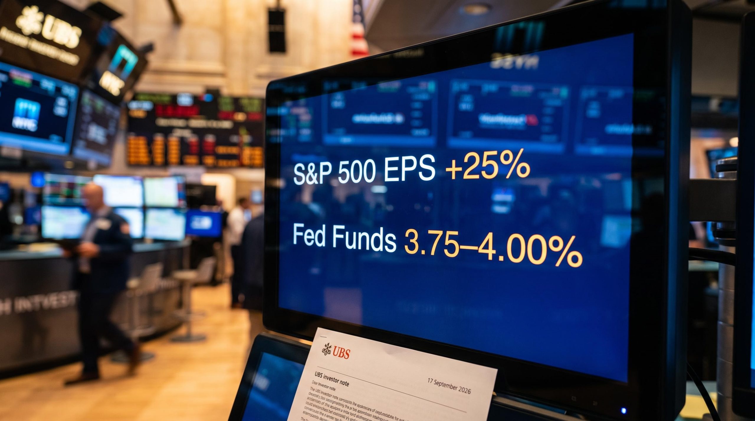
Here is the statistic that should focus your attention. As of June 2026, the top 10 constituents of the Nasdaq 100 account for 47.8% of the entire index’s weight, according to ChartRow. NVIDIA, Apple, Alphabet, Micron and Microsoft sit near the top of that cluster.
The S&P 500 tells a similar story. ChartRow puts the top 10 S&P 500 stocks at 37.9% of index weight as of June 2026, while Columbia Threadneedle notes the 10 largest companies now command around 39% of market cap, well above the 27% seen at the 1999-2000 peak. The Magnificent 7 alone represent roughly 33.5% of S&P 500 market capitalisation as of mid-September 2026.
| Metric | Dot-com peak (1999-2000) | Current (2025-2026) |
|---|---|---|
| S&P 500 top-10 concentration | ~27% | ~37.9-39% |
| Nasdaq 100 top-10 weight | N/A | 47.8% (June 2026) |
| Magnificent 7 / S&P 500 share | N/A | ~33.5% |
| Nasdaq 100 forward P/E | ~58x | ~25x |
The mechanical part is where it gets uncomfortable. Passive vehicles now channel roughly 40 cents of every dollar flowing into S&P 500 funds toward a handful of mega-cap names, according to concentration analysis cited across the sector. Every automated contribution reinforces the largest positions regardless of valuation.
The practical takeaway is blunt. You are almost certainly carrying more concentrated risk in your broad-market index funds than your diversification strategy intends, because the index itself has quietly become a bet on ten stocks.
Passive indexer exposure to this cluster is larger than most investors realise: Morgan Stanley data shows passive vehicles collectively hold roughly 50% of S&P 500 exposure via ETFs, meaning concentration risk is not confined to active stock pickers but is baked into the default retirement portfolio.
The passive selling cascade
Cap-weighted indices have a hidden asymmetry. On the way up, flows reward size. On the way down, that same mechanism works in reverse and with more force.
If one or two mega-caps miss earnings or absorb a macroeconomic shock, forced deleveraging and risk-parity adjustments can trigger mechanical selling across index and sector products. A 2025 paper in the Journal of Financial Services Research went further, hypothesising that the sheer market capitalisation of the Magnificent 7 poses genuine systemic risk when their prices show what it termed super-exponential growth.
The historical precedent is instructive. After the bubble burst around 2000, the S&P 500 fell almost 30% in a year while key tech names lost over 90%, showing how a sector-specific shock can spread into a broad-market drawdown when leadership is this narrow.
Decoding the semiconductor versus software divergence
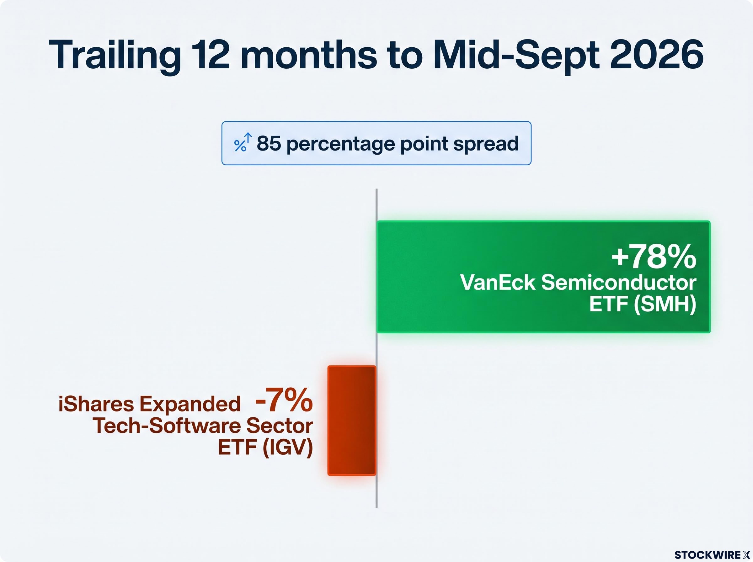
Beneath the headline “tech rally” sits a fierce battle for capital, and the two sides are pulling in opposite directions. Over the trailing 12 months to mid-September 2026, the VanEck Semiconductor ETF (SMH) is up roughly 78%, while the iShares Expanded Tech-Software Sector ETF (IGV) is down around 7%, according to ETFValuer.
That is a performance spread approaching 85 percentage points in a single year between two slices of the same sector.
The driver is the AI capex narrative. Investing.com describes semiconductors as the infrastructure layer through which every AI dollar must flow, the “picks and shovels” of the build-out. Capital has left high-multiple software and parked itself in the hardware companies supplying data-centre demand, with Gartner and Deloitte both pointing to AI workloads and GPUs as the engine of chip revenue growth.
There is a credible counter-view, though. The two camps break down like this:
- Structural hardware dominance: Every AI dollar routes through chips first, so semis capture spending regardless of which software application eventually wins. Investing.com frames this as a lasting rotation rather than a mean-reverting pair trade.
- Cyclical software recovery: The Philadelphia Semiconductor Index already took a 12% drawdown in July 2026 even while up 78% for the year. If AI leaders signal a slowdown in build-out, capital could rotate back toward software, where recurring subscription revenue is less exposed to a capex demand shock.
This tug-of-war shows you where institutional money currently believes the real AI value sits, which gives you a framework for auditing your own technology holdings. Traders are actively hedging the divergence using options on the Nasdaq 100, the index most correlated to the software-semiconductor dynamic. The lesson is to stop treating “tech” as one monolithic bet, because AI flows are quietly minting distinct winners and losers.
Hardware-software dispersion reached a documented 133-percentage-point spread between the top and bottom deciles of technology stock returns in 2026, the largest gap in Morningstar’s dataset, confirming that the capital rotation the semiconductor-software divergence section describes is not a short-term anomaly but a structural repricing of where AI value sits.
Why current fundamentals defy a direct dot-com comparison
Now for the part that should temper the alarm. The companies leading this run are not the pre-revenue internet startups of 1999. They are highly profitable incumbents throwing off tangible cash from enterprise cloud and AI infrastructure.
The valuation gap makes the point clearly. At the 2000 peak, tech traded around 58x forward earnings, according to Fortune. Today’s Nasdaq 100 sits closer to 25x forward earnings, less than half that extreme.
The Shiller CAPE ratio at 40-41 as of mid-2026 places the current market among the three most extreme valuation episodes in 155 years of data, exceeded only by the dot-com peak, which gives the chart parallel a valuation dimension that forward P/E multiples alone do not fully capture.
Momentum tells the same story. Business Insider’s analysis puts the three-month rate of change at the bubble peak near 257%, against a far tamer 45% today, evidence that the current advance is nothing like the vertical blow-off that preceded the crash.
The single biggest difference Reuters analyst Marty Fridson argues the defining contrast between then and now is earnings. The dot-com leaders often had none. Today’s leaders generate substantial, growing profits.
Recognising these cash-flow differences is what stops you from panic-selling established tech holdings on the strength of a flawed chart overlay alone.
Evaluating the earnings reality
Today’s dominant names sit on enormous capital reserves. Morgan Stanley analysts estimate the median cash flow and capital reserves of the top 500 US firms are around three times higher than during previous bubble periods, giving these companies room to absorb a shock rather than fold under one.
That balance-sheet strength is why a correction in 2026 or 2027 would likely look fundamentally different from the early-2000s unwind, when the Nasdaq Composite fell roughly 78% from its peak. A drawdown driven by profitable companies re-rating from high multiples is a different event from one driven by unprofitable companies running out of money.
None of this cancels the concentration risk. It simply means the two eras rhyme on the chart while diverging sharply on the fundamentals.
This article is for informational purposes only and should not be considered financial advice. Investors should conduct their own research and consult with financial professionals before making investment decisions. Past performance does not guarantee future results, and forward-looking scenarios are speculative and subject to change based on market developments.
Navigating top-heavy markets in an AI-driven era
The tension at the heart of this comparison is now clear. The chart parallel is real, but the fundamentals underneath it are not.
A repeat of the roughly 78% dot-com collapse looks unlikely, because today’s leaders are profitable, cash-rich incumbents rather than speculative startups burning through funding. That is the reassuring half of the story.
The mechanical risk is the half worth respecting. With top-10 concentration near 39% and passive flows funnelling capital into the same handful of names, a shock to one or two mega-caps could still cascade through your index funds far more violently than a “diversified” label suggests.
So evaluate your exposure on two axes. First, understand how much of your broad-market holdings are effectively a concentrated tech bet, and diversify deliberately if that weight sits higher than you intend. Second, watch the semiconductor-software balance, because that is where AI capital is actively choosing its winners. The strong earnings are your cushion. The concentration is your risk. Position for both.
Look-through concentration is the practical problem: investors holding both a US Total Market fund and an S&P 500 fund often carry near-identical top-five weightings rather than genuine diversification, a structural overlap that becomes visible only when the same five names move sharply in the same direction.