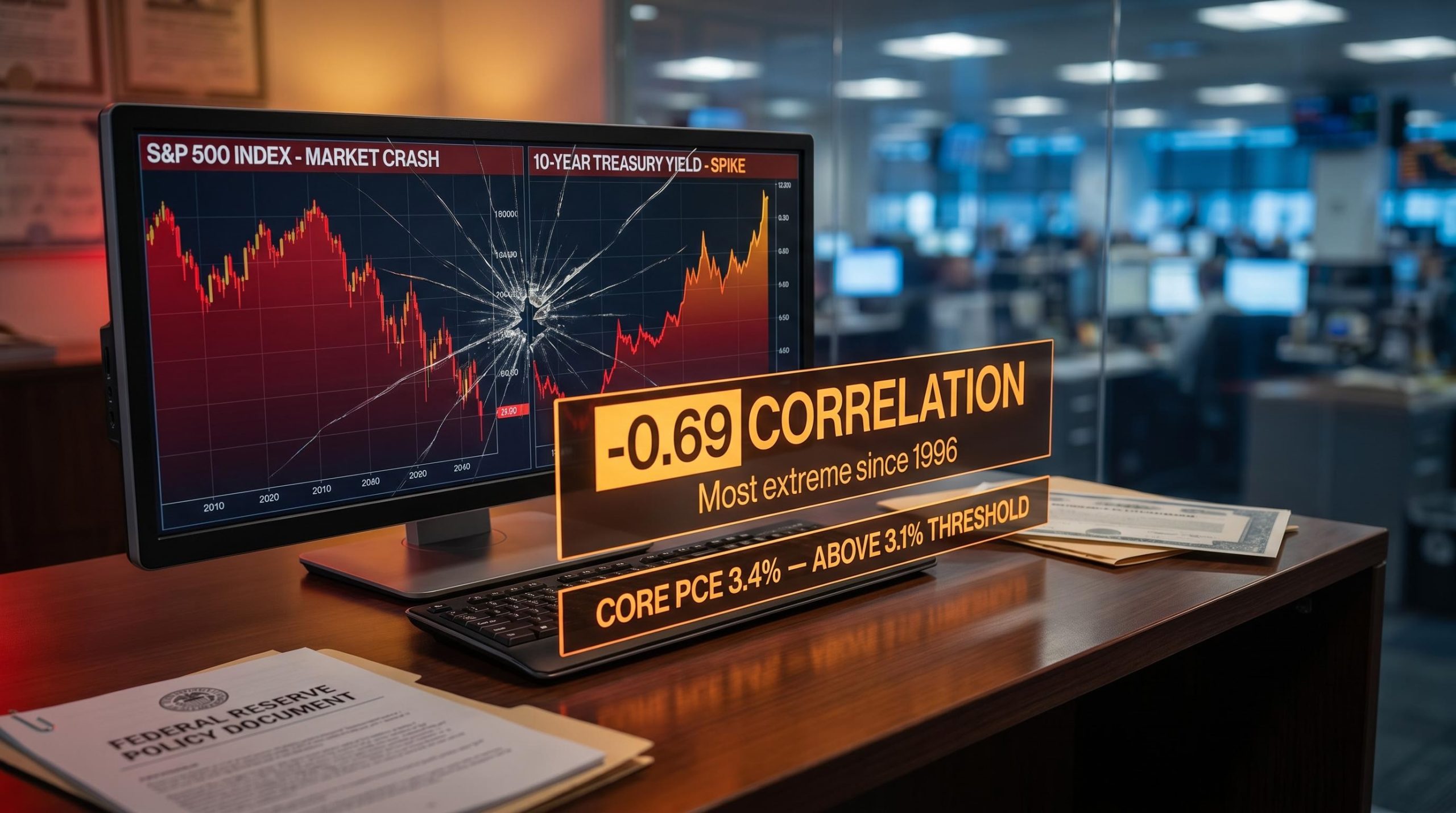
Stock-Bond Correlation Hits 30-Year Extreme, Rattling 60/40 Investors
11 hrs ago
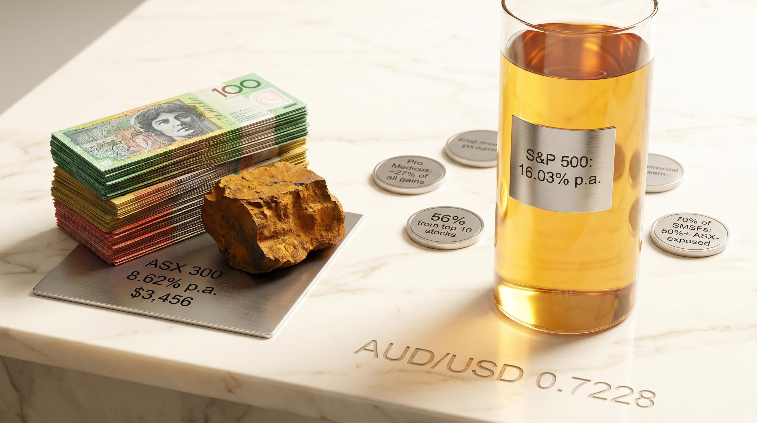
Over 15 years to approximately April 2026, a dollar invested in the S&P 500 grew at 16.03% per year in Australian dollar terms. The same dollar in the ASX 300 grew at 8.62%. That gap, compounded across a decade and a half, produces a dramatically different retirement outcome, and the explanation sits largely inside two sectors most Australian investors hold in abundance.
A Morningstar Australasia analysis covering 210 of the largest ASX-listed companies with full 15-year return histories has attached precise figures to a performance divergence that super funds and fund managers have been flagging with increasing urgency. The findings carry particular weight for self-managed super fund (SMSF) investors, who according to Australian Taxation Office (ATO) data remain heavily concentrated in domestic equities. What follows unpacks why the ASX has delivered roughly half the annualised return of the S&P 500 over that span, which specific banks and miners beat the benchmark and which did not, and what the structural pattern means for investors holding the market through index funds or direct shares.
The headline numbers are stark enough on their own.
15-year annualised total returns (dividends reinvested, franking credits excluded): S&P 500 in AUD terms: 16.03% | ASX 300: 8.62%
In dollar terms, $1,000 invested in the ASX 300 grew to approximately $3,456. The same $1,000 in the S&P 500, converted to Australian dollar returns, produced a materially larger sum over the identical period. Cash deposits returned 2.67% per year, turning $1,000 into just $1,484.
The compounding mechanics at work here are straightforward but easy to underestimate: the second decade of a reinvested return generates nearly double the dollar gains of the first decade on identical starting capital, which means a 7-percentage-point annual gap between the ASX 300 and the S&P 500 does not produce a 7% worse outcome over 15 years but a dramatically more severe divergence in terminal wealth.
Vanguard Australia’s home bias analysis cites ATO data showing SMSFs held approximately 29% of assets in ASX-listed shares against just 1.8% in overseas shares, a concentration ratio that makes the 15-year return gap between the two indices directly relevant to millions of Australian retirement savers.

The individual stock data is more sobering still. Across the 210 companies in the Morningstar dataset, the average annualised return was 7.11%, and the median was 6.73%, both below the ASX 300’s already-lagging 8.62% benchmark. Most investors holding individual Australian shares did worse than the index that itself trailed the S&P 500 by more than seven percentage points a year.
The return gap is not a quirk of any single year or commodity cycle. It reflects how the ASX is built.
Financials and materials together comprise approximately 45% of the ASX 300. In the S&P 500, financials account for roughly 13% and materials roughly 3%. Where the US benchmark is dominated by technology companies that reinvest earnings at scale, the ASX is anchored to banks whose lending growth is regulated and miners whose capital expenditure cycles consume cash.
| Metric | ASX 300 | S&P 500 |
|---|---|---|
| Financials + materials weighting | ~45% | ~16% |
| Average payout ratio | ~72% | ~38% |
| Dominant sector growth driver | Lending volume, commodity prices | Technology reinvestment, earnings growth |
The regulatory layer compounds the structural weight. APRA-driven constraints on bank lending growth, tightened further after the Hayne Royal Commission, have placed a ceiling on earnings expansion with no direct US equivalent. AMP Chief Economist Shane Oliver has estimated the regulatory drag at approximately 3-4% per year on ASX returns attributable to these lending constraints. Major bank net interest margins averaged 1.78% in the first half of 2026, stable versus the first half of 2025, according to KPMG’s Big Four Half-Year Results report.
The ASX’s high payout ratios, cited at approximately 72% by analysts including Westpac’s Bill Evans, return cash to shareholders but limit the capital available for internal reinvestment. The S&P 500’s 38% average payout ratio leaves US companies, particularly in technology, with substantially more earnings to reinvest in growth, buybacks, and acquisitions.
Franking credits partially offset this dynamic for Australian resident investors by boosting after-tax income. They do not, however, change the underlying capital appreciation trajectory. A company paying out 72% of earnings is structurally constrained in how fast it can compound its book value relative to one retaining 62%.
The stock-level scorecard among Australia’s five major banks splits cleanly.
Macquarie Group and Commonwealth Bank of Australia beat the ASX 300’s 8.62% annualised return over 15 years. ANZ, NAB, and Westpac did not.
| Bank | Beat ASX 300? | Key differentiator |
|---|---|---|
| Macquarie Group | Yes | Fee-based, globally diversified business model across asset management and advisory |
| Commonwealth Bank | Yes | Dominant retail franchise, sustained digital investment, premium market positioning |
| ANZ | No | Commoditised lending book, institutional banking exposure |
| NAB | No | Business banking focus, margin pressure from competitive lending |
| Westpac | No | Retail and institutional lending, operational remediation costs |
What separates the two groups is the source of earnings growth. Macquarie built a fee-based, globally diversified revenue stream that does not depend on Australian lending volumes. CBA leveraged a dominant retail position and digital investment to extract premium pricing. The three laggards operated more commoditised lending books in a market where APRA constraints and margin compression left limited room for earnings expansion.
Because financials represent such a large share of the ASX 300, three of five major banks trailing the benchmark created a measurable drag on the entire index. For investors holding the majors for yield and franking credits, the 15-year record prompts a direct question: has the income case provided sufficient compensation for the capital appreciation foregone?
Bank stock valuations add a further dimension to this structural picture: Morningstar has flagged all four major Australian banks as overvalued at current multiples, with CBA carrying a price-to-earnings ratio of approximately 16.5, meaning investors who hold the banks for future capital appreciation are paying a premium on top of an already-weak 15-year return record.
The mining scorecard follows a similar pattern.
Iron ore spot prices stood at approximately US$108.58 per tonne as of 5 May 2026, according to Trading Economics, up from approximately US$100.10 one year prior. Despite that price environment, the 15-year total return record for BHP and Rio Tinto still lagged the benchmark, underscoring that commodity price strength alone does not determine long-run returns for large-cap diversified miners.
Large-cap diversified miners face structural headwinds in total return terms: capital-intensive maintenance requirements, commodity price cycles that average out over long periods, and limited organic volume growth from an already-large installed base. Fortescue’s trajectory over the period was different in kind, a growth story layered on top of a commodity story, expanding production capacity rapidly during the window of peak Chinese steel demand.
Many Australian investors treat BHP and Rio Tinto as foundational portfolio holdings. The 15-year data suggests their role deserves explicit justification rather than assumed merit.
The concentration finding may be the most consequential number in the entire dataset.
The top ten stocks in the Morningstar analysis generated 56% of all wealth created across the 210 companies. Pro Medicus alone accounted for approximately 27% of total gains.
Pro Medicus, a medical imaging software company, contributed approximately 27% of all wealth created across the 210-stock dataset over 15 years.

A hypothetical equal-weighted portfolio of $210,000 (one stock per company at $1,000 each) grew to approximately $1.8 million over the period. Just over $1 million of that came from the top ten names.
Roughly 36% of the 210 stocks beat the ASX 300’s 8.62% return. More than 72% beat cash. The worst performer, Energy Resources of Australia, delivered approximately -25% annualised over 15 years, though the stock nearly doubled in the prior 12 months, a reminder that short-term price action can obscure long-term capital destruction.
The pattern mirrors findings from Hendrik Bessembinder’s US research, where the median US stock delivered a -6.87% buy-and-hold return and fewer than 48.33% produced a positive return.
Pro Medicus wealth concentration on the ASX is a pattern with global precedent: Hendrik Bessembinder’s US research found that fewer than 4% of listed US stocks accounted for all net wealth created in the market above Treasury bills, suggesting the extreme skew visible in Australian data is a property of equity markets broadly rather than an ASX-specific anomaly.
Market-cap weighting naturally concentrates the index in outperformers as they grow, while diluting exposure to underperformers. This is a rebalancing mechanism that individual stock portfolios rarely replicate.
Three implications flow from the concentration data:
This structural benefit compounds silently over 15 years and is underappreciated relative to concerns about index concentration risk.
The three-part structural argument points in one direction. Sector concentration in cyclical industries, a corporate culture that favours dividends over reinvestment, and stock-level underperformance among the market’s largest names all combined to deliver an ASX return roughly half that of the S&P 500 over 15 years.
ATO data indicates 70% of SMSFs remain more than 50% ASX-exposed. On the evidence of the past 15 years, that concentration has been unrewarded for investors who held it as a default rather than a deliberate choice. The AUD/USD exchange rate of approximately 0.7228 as of 6 May 2026 adds a further variable: currency movements can both amplify and dampen international returns, and investors relying on a weaker Australian dollar to boost offshore gains face a different calculus at current exchange rates.
Investors with a clear, articulated reason for their ASX overweight are in a different position from those whose allocation is inherited. A set of diagnostic questions can help distinguish the two:
For investors who have reviewed the 15-year return gap and want to act on it, our dedicated guide to S&P 500 ETF options on the ASX examines IVV’s 0.04% fee structure, its 14.15% five-year annualised AUD return, and the specific impact of AUD/USD movements on unhedged international positions, including how the Australian dollar’s strength in 2025 compressed a roughly 17.88% USD gain into a 9.20% AUD return.
The ASX’s 15-year underperformance versus the S&P 500 is not explained by a single bad year or an unlucky commodity cycle. It is explained by the structural weight of sectors and individual companies that, on the evidence, could not match the index they collectively defined. Three of five major banks trailed the benchmark. Two of three major miners trailed it. Most individual stocks underperformed.
There are legitimate arguments for maintaining ASX exposure: franking credits, currency matching, and income generation all serve specific portfolio objectives. Those arguments hold only when they are made deliberately rather than assumed.
The Australian evidence mirrors the Bessembinder finding from US markets: wealth is created by a small number of exceptional businesses, and the investors most at risk are those who built portfolios assuming the biggest names were the safest bets.
This article is for informational purposes only and should not be considered financial advice. Investors should conduct their own research and consult with financial professionals before making investment decisions. Past performance does not guarantee future results.
Home bias refers to the tendency of investors to overweight domestic assets in their portfolios. For Australian investors, ATO data shows SMSFs held around 29% of assets in ASX-listed shares versus just 1.8% in overseas shares, meaning the 15-year return gap between the ASX 300 (8.62% annualised) and the S&P 500 (16.03% annualised) has directly cost many retirement savers significant compounded wealth.
The ASX 300 has underperformed the S&P 500 primarily because financials and materials together make up around 45% of the ASX versus just 16% in the S&P 500, with Australian banks facing APRA-driven regulatory constraints on lending growth and miners exposed to commodity price cycles, while US markets are dominated by technology companies that reinvest earnings at scale.
Only Macquarie Group and Commonwealth Bank beat the ASX 300's 8.62% annualised return over the 15-year period, with Macquarie benefiting from a globally diversified, fee-based business model and CBA leveraging its dominant retail franchise and digital investment; ANZ, NAB, and Westpac all trailed the benchmark.
ASX companies pay out approximately 72% of earnings as dividends compared to around 38% for S&P 500 companies, which means Australian companies retain far less capital for internal reinvestment and compounding of book value, structurally limiting capital appreciation growth even when franking credits partially offset this for resident investors.
Pro Medicus alone accounted for approximately 27% of all wealth created across the 210-stock dataset, and the top ten stocks generated 56% of total gains, meaning index investors captured these outsized contributors automatically through market-cap weighting, while individual stock pickers faced long odds given that only 36% of the 210 stocks beat the ASX 300 benchmark.