You checked your portfolio after what looked like a strong year. Your robo-adviser published a return north of 14%. But the number on your personal dashboard said something closer to 4%. The gap felt wrong, like money had gone missing somewhere between the factsheet and your account.
This experience is more common than you might think, and it does not signal a problem. The financial year ending June 2026 delivered exactly this experience to thousands of Australian investors, particularly those who joined platforms like Stockspot partway through the year. The published portfolio returns looked impressive. The personal dashboard numbers, for many, looked underwhelming by comparison.
The reason is straightforward, and once you see it, the confusion disappears. Your dashboard and the fund’s published return are answering two entirely different questions using two different formulas. Here is what each number is actually telling you, how the gap between them forms, and how to use both correctly so you can read your returns with confidence rather than second-guessing them.
The dashboard number and the fund’s number are measuring two different things
The first thing to understand is that these two figures are not two versions of the same answer. They are answers to two completely separate questions.
Fund companies, including Stockspot, publish what is called a time-weighted return (TWR). This method strips out the effect of every investor’s deposits and withdrawals and asks one clean question: how did the investment strategy perform as if a single dollar had been invested at the start and held continuously to the end?
Your personal dashboard shows something different: a money-weighted return (MWR), also known as an internal rate of return (IRR). This is the return on your actual money, incorporating every deposit and withdrawal you made, weighted by the specific dates those cash flows occurred.
Both numbers are valid. Both are correct. They simply measure different things.
The TWR gap is just one layer of the mismatch: fund metrics for retail investors are also reported gross of your tax bracket, fees, and inflation, meaning the headline figure was never the return you could actually keep.
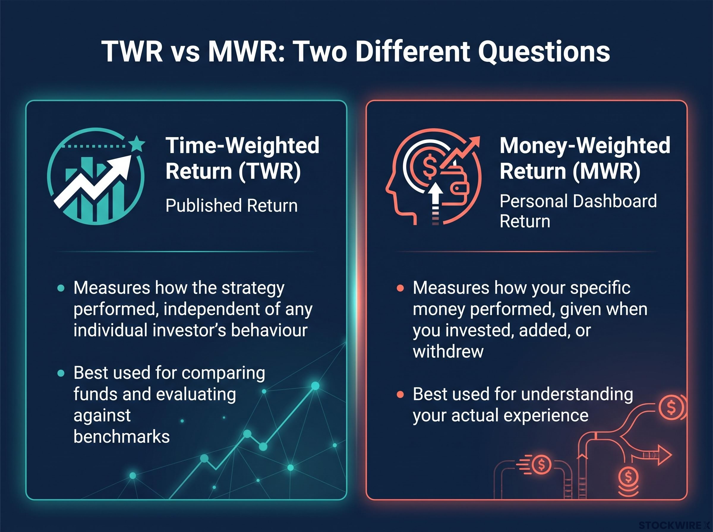
- Published return (TWR): measures how the strategy performed, independent of any individual investor’s behaviour
- Personal dashboard (MWR): measures how your specific money performed, given when you invested, added, or withdrew
If you had made a single lump-sum deposit on the very first day of the measurement period and never touched it, the two figures would be nearly identical. The moment your cash flow pattern differs from that assumption, which it almost always does, a gap opens up. That gap is not evidence of poor performance or a platform error. It is evidence that your timing differed from the standardised assumption the published number uses.
When big ASX news breaks, our subscribers know first
How time-weighted returns work, and why the industry uses them
A time-weighted return starts with a simple, standardised assumption: one dollar, invested at the start of the measurement period, held continuously to the end, with all distributions reinvested and ongoing fees already reflected in the result.
That assumption is deliberately artificial. Nobody actually invests exactly this way in real life. But the artificiality is the point. By stripping out individual investor behaviour, TWR allows two different funds, or a fund and its benchmark, to be compared on a level playing field. The method isolates the quality of the investment strategy from the timing decisions of any particular investor.
This is why factsheet returns are the right tool for comparing products and evaluating managers against benchmarks. They tell you how the strategy itself performed. They are the wrong tool for measuring your personal outcome, because they assume an investment that you almost certainly did not make.
ASIC Regulatory Guide 97 sets the official disclosure standards that Australian managed investment schemes and robo-advisers must follow when presenting performance figures in Product Disclosure Statements and periodic investor statements, which is why published returns on compliant platforms reflect a standardised calculation methodology rather than any individual investor’s experience.
The factsheet return assumes an investment pattern that no real investor follows, which is precisely what makes it useful for comparison. It measures the strategy, not the investor.
When you see a fund’s published return on a comparison site, an annual report, or a performance update, treat it as a scorecard for the investment approach itself, not as a target your personal account should have hit.
Why your entry timing can create a significant gap in a single year
Investment returns are not distributed evenly across a calendar year. Rather than accumulating at a steady pace, gains tend to cluster in short, intense windows while other stretches remain flat or move backward. That uneven distribution is what gives entry timing such a pronounced effect on your personal return across any given period.
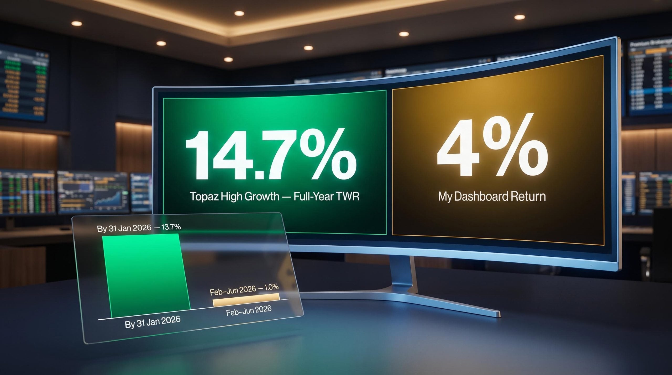
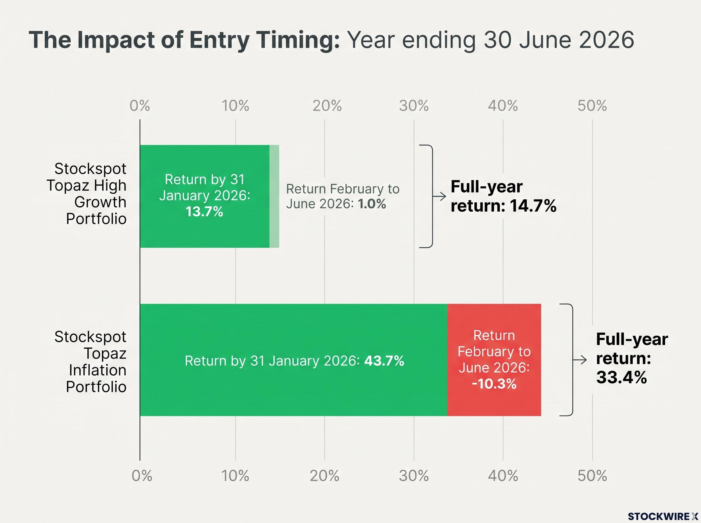
The Stockspot portfolios for the year ending 30 June 2026 illustrate this clearly. Consider two of the model portfolios and where the gains actually fell during the year:
| Portfolio | Full-year return (net) | Return by 31 January 2026 | Return February to June 2026 |
|---|---|---|---|
| Topaz High Growth | 14.7% | 13.7% | 1.0% |
| Topaz Inflation | 33.4% | 43.7% | -10.3% |
The distribution is striking. By 31 January, the Topaz High Growth portfolio had already captured 13.7% of its 14.7% full-year result, leaving just 1.0% to be earned across the remaining five months. The Topaz Inflation portfolio, which holds gold, silver, and gold mining equities, saw even sharper concentration: the first seven months produced gains of 43.7% before a 10.3% decline from February through June brought the full-year figure back to 33.4%.
According to Chris Brycki, Founder and CEO of Stockspot, the platform uses time-weighted returns for published results specifically because this method neutralises the effect of when individual clients deposited funds.
Anyone whose funds arrived after January had no exposure to those concentrated early gains. A personal return sitting well below the published annual figure in that scenario is not a sign of underperformance. It is the correct mathematical result for the period in which their capital was actually at work.
Research from Morningstar confirms this is not unique to any one platform or year. There is a consistent, documented gap between fund investment returns (TWR) and investor returns (MWR), driven primarily by the timing of purchases and sales.
The cost of market timing extends well beyond entry-point distortions in a single year: missing just 10 of the S&P 500’s best trading days over a decade can reduce a $272,000 portfolio to $153,000, a structural argument for staying invested rather than attempting to optimise entry points.
How adding new deposits makes your percentage return look smaller
Entry timing is one mechanism. There is a second one, equally common and equally misunderstood: the dilution effect from adding new money.
When you make an additional deposit into your portfolio, two things happen simultaneously. Your total invested base increases immediately, but the new capital has had little or no time to generate returns. Your dashboard then measures your gain against the entire amount you have contributed, including the fresh deposit that has barely started working.
The dollar gain from your earlier performance remains completely unchanged. It is the percentage calculation that looks diluted, because it is now being divided by a larger number.
Here is how that works in practice:
- Before deposit: You put in $10,000, which grows by $1,000. Your dashboard reflects a 10% return on that amount.
- After deposit: You contribute a further $10,000, bringing total deposits to $20,000. Your portfolio is worth $21,000, so your dashboard now shows roughly 5%, even though the dollar gain remains $1,000.
The underlying performance of your investment has not changed at all. Your portfolio generated the same dollar profit as before. The percentage reads lower because that same gain is now divided across a bigger contributed total.
The dollar amount you have earned does not change when you add new money. Only the percentage figure adjusts. Checking both together gives you the more complete picture.
This effect hits hardest for investors who make regular contributions, whether through automatic top-ups or dollar-cost averaging, which is one of the most common investing behaviours among Australian robo-adviser users. If your dashboard percentage dropped after a recent deposit, that is not evidence of a strategy problem. It is the expected mathematical consequence of adding money that has not yet had time to grow.
The dilution effect described above is built into the mechanics of dollar-cost averaging, where each new deposit at a different price point reshapes the percentage return displayed on your dashboard while leaving the dollar gain from earlier growth completely intact.
Which number to use, and when
Now that you understand what creates the gap, the practical question is: which number should you actually pay attention to, and in what context?
Each metric has a specific job. Using the wrong one for the wrong question is what leads to unnecessary anxiety and, worse, reactive decisions.
| Metric | Question it answers | Best used for |
|---|---|---|
| Time-weighted return (published) | How did the strategy perform? | Comparing funds, evaluating a manager against benchmarks, deciding which product aligns with your goals |
| Money-weighted return (personal dashboard) | How did my money perform, given my timing and behaviour? | Understanding your actual experience, including the impact of when you invested, added, or withdrew |
Use the published fund return to decide whether the strategy is worth staying in. Use your personal dashboard return to understand whether your own behaviour, your timing, your contributions, your withdrawals, is helping or hurting your outcomes.
After 12 months of continuous investment, Stockspot displays a money-weighted annualised return on your dashboard that accounts for the timing of each deposit you have made. That annualised figure becomes the most meaningful long-term personal performance metric, because it smooths out the early distortions from entry timing and contribution effects.
Research from Morningstar adds an important layer here: most of the persistent gap between investor returns and fund returns comes not from a single unlucky entry point, but from frequent trading and market-timing attempts. The gap between your MWR and the fund’s TWR tends to shrink over longer horizons as you participate in multiple market cycles, provided you stay invested and avoid reactive switches.
What returns look like over time, and why staying invested changes the picture
A poor or unlucky entry point has an outsized impact on your return in the first year. But it becomes a progressively smaller slice of a multi-year track record.
The reason is mechanical, not motivational. Every additional year you remain invested means your portfolio participates in new growth periods, recoveries, and compounding cycles. The single timing event that created the gap in year one gets diluted by the accumulation of subsequent returns. Over time, disciplined long-term investors tend to see their personal MWR converge toward the fund’s published TWR, because they have captured multiple market cycles rather than being defined by the one they happened to enter during.
Morningstar research reinforces this consistently: the investors who see the largest persistent gaps between their personal returns and published fund returns are those who trade frequently and attempt to time market entry and exit. Investors who stay the course and contribute steadily see the gap narrow.
Here is how to read your dashboard more effectively while the convergence plays out:
- Check your dollar gain alongside the percentage. The dollar figure tells you how much wealth you have actually built and is not distorted by recent deposits the way the percentage can be.
- Wait for your annualised MWR to appear on your Stockspot dashboard after 12 months of continuous investment. That number is a more meaningful comparison point than any short-period return.
- Avoid comparing a short-period personal MWR to the fund’s full-year TWR. They cover different time windows and incorporate different assumptions.
- Resist the urge to change strategy based on a dashboard percentage that dropped after a recent deposit or a late entry. That movement almost always reflects timing and cash flow effects, not a deterioration in the underlying strategy.
The most effective response to a lower-than-expected dashboard return is usually patience and continued contribution, not a switch.
Reactive switches in response to a lower-than-expected dashboard number sit alongside other common investing mistakes where the financial cost accumulates quietly: delaying the start of a 30-year horizon by a single year, for instance, erases approximately $28,000 in terminal wealth.
Reading your returns with clarity, not anxiety
The gap between your dashboard and the published fund return is not a warning signal. It is information. The published time-weighted return tells you how the strategy performed. Your personal money-weighted return tells you how your money performed, given the specific timing of your contributions and withdrawals.
For investors who entered a platform like Stockspot once the heavy lifting of late 2025 and early 2026 was already done, a reduced personal return is precisely what the numbers should show. It reflects the period for which capital was deployed, not a failure of the strategy or a miscalculation by the platform.
Going forward, monitor your annualised MWR once it becomes available after 12 months invested. Use the published TWR for product-level reviews and fund comparisons. Avoid making strategy changes based on short-term percentage movements distorted by recent deposits or entry timing. Every additional year you remain invested reduces the relative impact of any single timing decision and brings your personal return closer to what the strategy actually delivered.
This article is for informational purposes only and should not be considered financial advice. Investors should conduct their own research and consult with financial professionals before making investment decisions. Past performance does not guarantee future results.