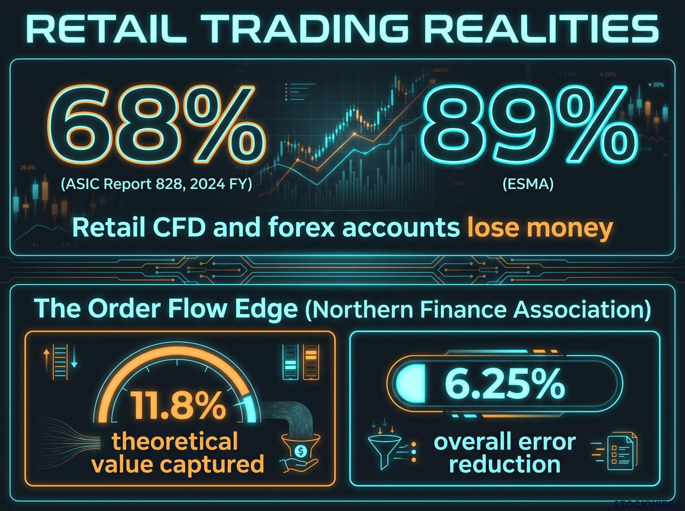
Somewhere between 68% and 89% of retail CFD and forex accounts lose money, depending on which regulator you ask. In Australia, ASIC’s Report 828 found 68% of retail CFD investors lost money in the 2024 financial year. In the EU, ESMA’s figures run as high as 89%. These are not fringe traders. Many of them study charts diligently, spot the same patterns everyone else does, and still end up on the wrong side of the trade.
ASIC Report 828 documented that retail CFD investors in Australia lost a combined total exceeding $458 million in the 2024 financial year, making it one of the most detailed sector-wide regulatory assessments of retail CFD distribution practices published anywhere in the world.
So here is the puzzle worth solving: if chart patterns genuinely work, why do so many disciplined pattern-readers lose so consistently? The problem is not usually skill or discipline. It is that the dominant retail method and the method large market participants use rest on completely different assumptions about what information matters.
What follows here is not a new set of shapes to memorise. It is a framework for reading the market the way its largest participants actually operate it, focused on who is moving price and why, rather than on the geometry of a candlestick. By the end, you should hold a more structurally coherent mental model than the one most retail traders start with.
Why chart patterns fail to explain what markets actually do
You probably treat a chart as a faithful picture of the market. It feels like one. But a candlestick is not a recording of what happened; it is a heavily compressed summary of it.
Each candle captures just four data points: the open, the high, the low, and the close for a given period. Everything else, the sequence of trades, the size of each order, who was buying and who was selling, gets stripped away. The chart tells you where price ended up. It tells you nothing about how it got there or who pushed it.
Price discovery is not a single event recorded in a candle; passive limit orders sitting in the order book contribute approximately 45% of it, meaning the visible candlestick captures less than half of the information that determined where price ended up.
That distinction matters more than it sounds. When a large participant enters aggressively or momentum flips inside a single bar, the event can begin and finish before your indicators register anything. By the time the candle closes and the “pattern” appears, the move you were trying to catch is already over.
There is a subjectivity problem on top of that. Two competent traders can look at the identical formation and reach opposite conclusions, and computational tests of charting rules have generally failed to show statistically significant outperformance against simple passive strategies. Researchers attribute much of that failure to data-mining and self-selection bias, meaning the winning patterns tend to look good in hindsight rather than in live conditions.
Here is the structural core of the issue, broken down:
- Intrabar invisibility: Charts hide what happens inside the bar. Momentum shifts and large entries can complete before the candle even closes.
- Subjectivity: Pattern reading is interpretive, not objective. The same shape produces conflicting calls from equally skilled traders.
- Predictive fallacy: If past prices are already embedded in the current price, a visual shape cannot hand you a durable informational edge.
Navin Prithyani, founder of Urban Forex, points out that large institutional participants and broker desk personnel do not rely on standard charting tools at all. Their attention sits on quantities, prices, and fill requirements. Charts, in his framing, exist primarily for the retail traders trying to decode them.
The takeaway for you is uncomfortable but clarifying. If your analysis tool cannot show you who is moving price or why, you are placing directional bets on incomplete information. Pattern failure, then, is not bad luck. It is the predictable output of the method itself.
When big ASX news breaks, our subscribers know first
What order flow trading actually measures (and what it does not)
If charts are the wrong lens, what is the right one? Start with the simplest possible fact about any market.
Every single price movement is the result of an imbalance between buy orders and sell orders. When buying demand exceeds the supply available at the current price, buyers have to offer higher prices to attract sellers, which pushes price up. The reverse pushes it down. Order flow analysis is simply the real-time observation of how that imbalance develops.
Order book mechanics sit beneath every price movement a chart records: the best-priced order is matched first, and when aggressive buyers exhaust all resting sell orders at a given level, price must step up to find the next available seller.
When buyers must offer higher prices to attract sellers, price moves upward. Order flow is the record of that decision as it happens, not a prediction of what comes next.
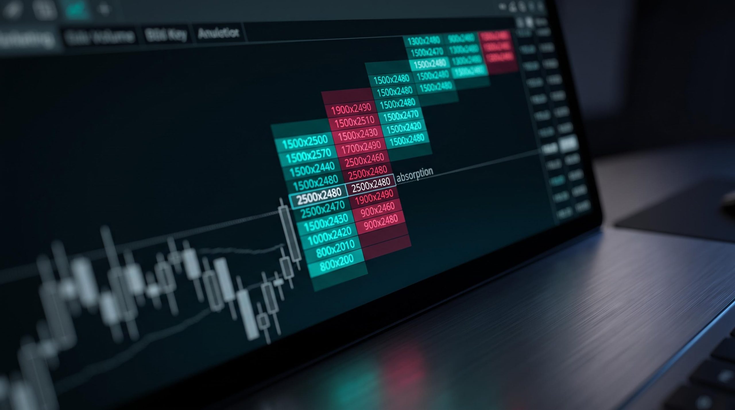
The tools that make this visible go beyond the candlestick. Depth of Market (DOM) shows the resting buy and sell orders queued at each price level. Time and Sales, often called the tape, lists every executed trade in sequence. Footprint charts display the actual bid-versus-ask volume traded at each price inside a bar. Each one reveals something about aggressive participation (traders crossing the spread to get filled immediately) versus passive participation (traders posting orders and waiting).
Here is how the three primary tools differ in what they can and cannot tell you:
| Tool | What it shows | What it cannot show |
|---|---|---|
| Depth of Market (DOM) | Resting buy and sell orders queued at each price level | Whether those orders are genuine or will be pulled before execution |
| Time and Sales | Every executed trade in sequence, with size and direction | The intent behind the trades or who placed them |
| Footprint chart | Bid-versus-ask volume traded at each price inside a bar | What price will do next; it only records past aggression |
Educational sources converge on the same definition. CMC Markets, Bookmap, Quantum Algo, and JournalPlus, in material updated between March 2024 and August 2026, all frame order flow as applied market microstructure: the study of how aggressive orders consume resting liquidity in real time.
Now the essential caveat, and you need it before anything else. Heavy sell volume or a visible imbalance describes what has already happened. It does not dictate what must happen next. Order flow is a context layer, not a signal generator.
The academic evidence keeps expectations grounded. A Northern Finance Association paper found that retail traders using order flow captured only about 11.8% of a fully optimising trader’s theoretical value, achieving an overall error reduction of roughly 6.25%. The edge is real, but it is modest and depends heavily on interpretation.
For you, that means order flow is best understood as a translation layer. It converts price movement from a visual abstraction into a record of decisions made by identifiable types of participants. Its value depends entirely on whether you can read what those decisions signal.
How institutions accumulate positions and what it looks like in practice
Here is where the framework stops being philosophical and starts explaining your losing trades. Large players face a constraint retail traders never think about: to fill a position of meaningful size, they must first locate enough opposing orders. That search for liquidity shapes price movement in specific, observable ways.
Institutions rarely announce themselves. They accumulate and distribute large positions through fragmented, deliberate mechanisms that a candlestick reader routinely misreads as clean trends or genuine breakouts. Three mechanisms drive most of this behaviour:
- Partial fills and iceberg orders
- Liquidity sweeps and stop hunts
- Absorption at defended levels
Learn to recognise these three, and much of what you once called a “false breakout” starts to look interpretable.
Volume confirmation is the nearest conventional tool to order flow reasoning available on a standard chart: a breakout bar carrying at least 1.5 to 2 times the 20-day average volume signals genuine participation, while thin-volume extensions carry fakeout probabilities exceeding 60%.
Partial fills, iceberg orders, and the illusion of momentum
Large participants instruct brokers to fill orders at a target price or better. When liquidity at that price is insufficient, the order fills in pieces, often routed across multiple venues and timeframes. To you, watching a candlestick chart, those staggered partial fills can look like continuous directional momentum, so you chase a move that is really just passive accumulation.
Iceberg orders deepen the illusion. These are limit orders that display only a small visible portion of the total size and refill automatically once the visible slice is taken. The result is a level that appears to hold thin liquidity while actually concealing substantial institutional interest.
Liquidity sweeps, stop hunts, and engineered reversals
The mechanical sequence is consistent. Price extends beyond a well-known stop-loss cluster, often sitting near round numbers or the prior day’s high or low, triggering a wave of clustered retail stops. Those triggered stops become the counterparty liquidity the institution needs to fill its entry or exit. Then price reverses sharply.
The tell is speed. These grabs typically reverse within 1 to 3 candles, accompanied by a volume spike at the extreme, both of which are readable on order flow tools but invisible on a standard chart. Worth noting: stop-loss hunting has historically been observed as more common in foreign exchange markets than in large equity indices.
Absorption and the defence of price levels
When price approaches a level an institution wants to defend, it posts large resting limit orders that quietly consume the aggressive flow hitting them. On a footprint chart, this shows up as anomalously high volume with almost no price movement.
That is the exact inverse of what a pattern reader expects. You see heavy trading at a key level and assume a breakout is loading, while the order flow is telling you the opposite: someone large is standing there, absorbing everything, holding the line.
When an institution accepts a partial fill and then raises its offered price to attract more counterparties, that willingness to pay more is a readable signal of directional intent, not random noise.
For you, this reframes the sting of being stopped out just before a reversal. That was not arbitrary volatility. It was often a predictable institutional liquidity event, and once you understand its mechanics, you can position around it rather than placing your stop right inside the pocket it targets.
The honest limits of order flow for retail traders
None of this makes order flow a magic key, and pretending otherwise would do you a disservice. The edge is genuine, but it is modest and hedged with practical barriers.
Start with cost and complexity. Retail-accessible order flow platforms typically run $100 to $200 per month, with top-tier institutional setups costing far more. These figures are approximate and vary by provider, but the learning curve is steep regardless of what you pay.
Then there is timing. Order flow imbalances are most predictive on ultra-short horizons, seconds or even milliseconds. That is precisely where retail data latency and execution delays make profitable exploitation structurally difficult, because by the time the signal reaches you and you act, the opportunity has often passed.
Latency advantages held by high-frequency trading firms, firms operating with co-located servers and custom execution platforms measured in microseconds, are a key reason why the order flow signals most legible to retail traders are those at higher timeframes rather than at the intrabar level where institutional algorithms dominate.
The data itself can mislead you. Three failure modes are worth holding in mind:
- Spoofing: Large fake orders placed to create a false impression of supply or demand, then cancelled before they execute.
- Off-exchange fragmentation: Dark pools and block trades keep a meaningful share of institutional flow hidden from the public tape entirely.
- Latency-driven noise: At retail speeds, much of the raw signal is stale by the time you see it, producing false reads.
The Northern Finance Association study found retail traders using order flow achieved an overall error reduction of about 6.25%. A real edge, but one that requires genuine skill and context to realise, not a switch you flip.
There is a structural insight that helps here. Timeframe matters for reliability, and higher timeframes tend to carry more robust signals. A larger population of participants watches a daily or weekly level than an intrabar one, so more orders concentrate there. Signals at those levels are sturdier than the noisy micro-timeframe data where retail traders are least able to compete.
So how do you use it productively? Treat order flow as a context layer, combined with an understanding of market structure: liquidity pools, institutional urgency, and timeframe dynamics. Used that way, it is a real upgrade over pure pattern recognition. Used as a standalone signal to follow mechanically, it simply swaps one set of rigid rules for another and invites overconfidence.
Building a trading perspective around participant behaviour, not pattern shapes
Pull the threads together and the shift becomes clear. A chart is not the market. It is a record of decisions made by participants with different sizes, urgencies, and constraints, and reading it well means reading that behaviour rather than the geometry on the screen.
This is where Prithyani’s timeframe principle earns its place. Timeframes are a conceptual construct, not a property of the market. A price level exists simultaneously across every timeframe you could view it on; the level is just as real on a 5-minute chart as on a daily one.
A price level exists simultaneously across all time frames. The difference is how many participants are watching it.
What changes with the timeframe is awareness. A price sitting at its daily, weekly, and monthly high at once draws the attention of far more participants than one that is merely elevated on an hourly chart. More attention means more orders concentrated at that level. That is order concentration, not chart magic, and it is why higher-timeframe levels tend to matter more.
So the practical move is not to hunt for a new indicator. It is to change the questions you ask when you open any chart. Three orientation questions do most of the work:
- Where is the liquidity concentrated? Which levels hold clustered stops or resting orders?
- Who has urgency here, buyers or sellers? Which side is willing to pay up to get filled?
- Is this move absorption, accumulation, or a genuine breakout? What are the participants at this level actually doing?
Return to that opening statistic for a moment. The 68% to 89% retail loss rate is not a law of nature. It is largely the outcome of a mismatch between the tool most retail traders use, pattern recognition, and the tool that actually explains market behaviour, participant analysis. Change the framework, and you change the odds you are playing against.
What changes when you stop trading the shape and start trading the participant
The core argument of this piece is simple, and it is structural rather than tactical. The limitations of chart pattern trading are information-level problems, not discipline problems, and analysing order flow and institutional behaviour addresses that information gap at its root.
Your next step is not a purchase. Before adding a single new tool, start watching markets through the three orientation questions from the previous section. Let the conceptual shift come first; the tools only make sense once you know what you are looking for.
Be honest about the asymmetry too. Institutional players will always hold advantages in information, execution, and latency that you cannot close. The goal is not to replicate institutional trading. It is to stop trading blindly against institutional behaviour and start positioning alongside it where you can.
The evidence says even partial adoption helps. Retail traders capture only about 11.8% of a fully optimising trader’s theoretical value, which sounds small until you remember the barrier is comprehension, not access.
Order flow is not overly advanced. It is simply poorly explained.
That is the whole point. The retail loss rate is not fixed, and the most valuable thing you can do the next time you open a chart is ask a different question: what are the participants at this level actually doing, and why?
This article is for informational purposes only and should not be considered financial advice. Investors should conduct their own research and consult with financial professionals before making investment decisions. Past performance does not guarantee future results, and trading outcomes are subject to market conditions and various risk factors.