
Most investors believe they are diversified. Look closer and you often find a portfolio making one silent bet on a single economic future.
If your holdings are 90% US growth equities, you have not built a diversified position. You have made a confident prediction: that AI-driven earnings keep expanding and that inflation stays contained. It is a forecast dressed up as a strategy, and most people have never realised they placed it.
The trouble is that at least four futures are genuinely plausible right now. Continued AI expansion. Persistent inflation. A recession. A broad market crash. Each would reward a completely different allocation, and nobody, including the strategists who do this for a living, knows which one arrives. Elevated valuations, a rate plateau, and unresolved inflation paths have widened the range of possible outcomes more than usual.
Here is the practical promise of this guide. By the time you finish, you will be able to hold your current portfolio against three diagnostic questions and map it against specific allocation ranges calibrated to your life stage. The aim is not to help you predict markets. It is to help you build resilient portfolio structures that do not require you to.
Why betting on one scenario is the most common portfolio mistake
Every portfolio is a prediction, whether you intended it or not. The moment you decide what to own and in what proportion, you have placed a bet on which economic environment rewards those choices. Investors who feel neutral are often the most exposed, because their concentration is invisible to them.
The clearest way to see your hidden bet is to walk through what each of the four plausible scenarios actually rewards. They are not four grades of disaster. They are four different worlds, each favouring a different set of assets.
- Continued AI expansion: growth equities and technology-heavy index exposure benefit most, as strong earnings justify elevated valuations.
- Persistent inflation with higher-for-longer rates: real assets, commodities, short-duration bonds, and dividend-paying equities tend to hold their ground better.
- Recession: high-quality bonds, cash, and defensive sectors provide the ballast that growth stocks cannot.
- Broad market crash: cash, gold, and deep-value holdings offer protection and the dry powder to buy when everything is cheap.
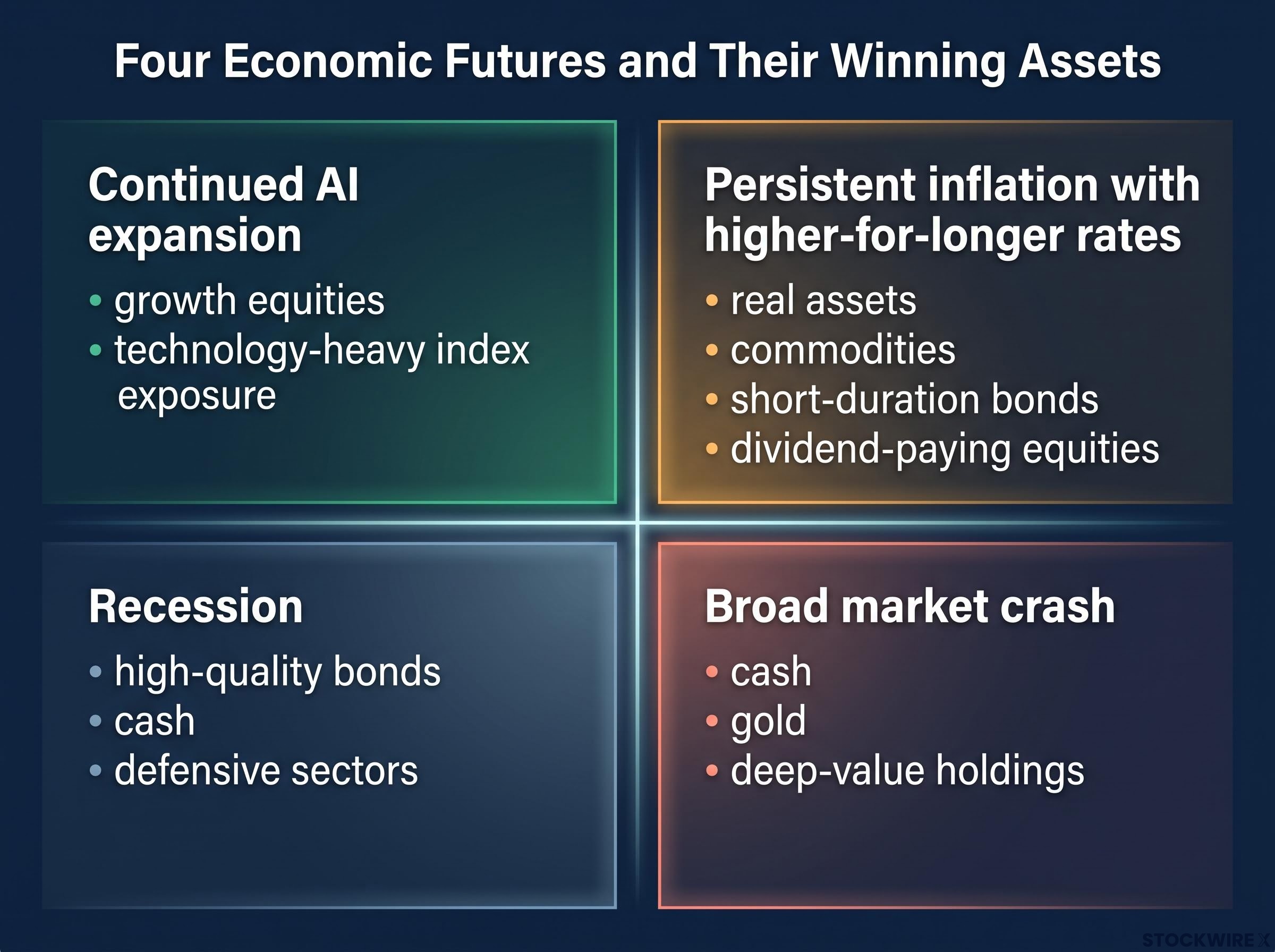
Notice the problem. A portfolio optimised for one of these columns is structurally fragile in the other three. The all-equity investor who thrives under AI expansion has no real defence against a prolonged recession, and the crash-fearful investor sitting in cash surrenders the upside that history rewards most.
This is not a criticism of any single allocation. It is a case for building across the scenarios rather than optimising for one of them.
The pressure on the old approach is real, not theoretical. Vanguard’s 2024 outlook argued that higher interest rates have substantially raised expected returns from fixed income while compressing the equity risk premium, the extra return investors demand for holding stocks over bonds. In plain terms, the “just hold stocks and ignore everything else” logic is under genuine strain in today’s rate environment.
The 2022 rate shock exposed a specific structural flaw in the 60/40 assumptions that underpinned four decades of conventional portfolio design: when inflation drives both stocks and bonds down together, the ballast that bonds were supposed to provide simply disappears.
Your current allocation is already a forecast. Understanding which forecast it represents is the first honest step toward resilience.
When big ASX news breaks, our subscribers know first
What the S&P 500’s long-term record actually tells you (and what it does not)
Before you restructure anything, you need the right anchor for your expectations. The long-run record of the S&P 500 offers genuine reasons for confidence, and it also carries warnings that most investors skip straight past.
Start with the headline. The S&P 500 has returned roughly 10% annually since the 1950s. Over the 20 years ending December 2025, a stretch that absorbed the global financial crisis, COVID-19, a US credit downgrade, and a burst of rapid inflation, the index still delivered around 11% a year, according to Fidelity’s June 2026 figures.
You will see different 20-year numbers depending on where you look, and the spread is explained by methodology, not by anyone being wrong.
| Metric | Value | Source | Period |
|---|---|---|---|
| 20-year annualised return | 11% | Fidelity | Ending Dec 2025 |
| 20-year annualised return | 10.39% | NerdWallet | Ending Dec 2025 |
| 20-year annualised return | 12.39% | Carry 2026 analysis | 2006-2025 |
| Long-term average since inception | ~10% | Historical data | 1950s onward |
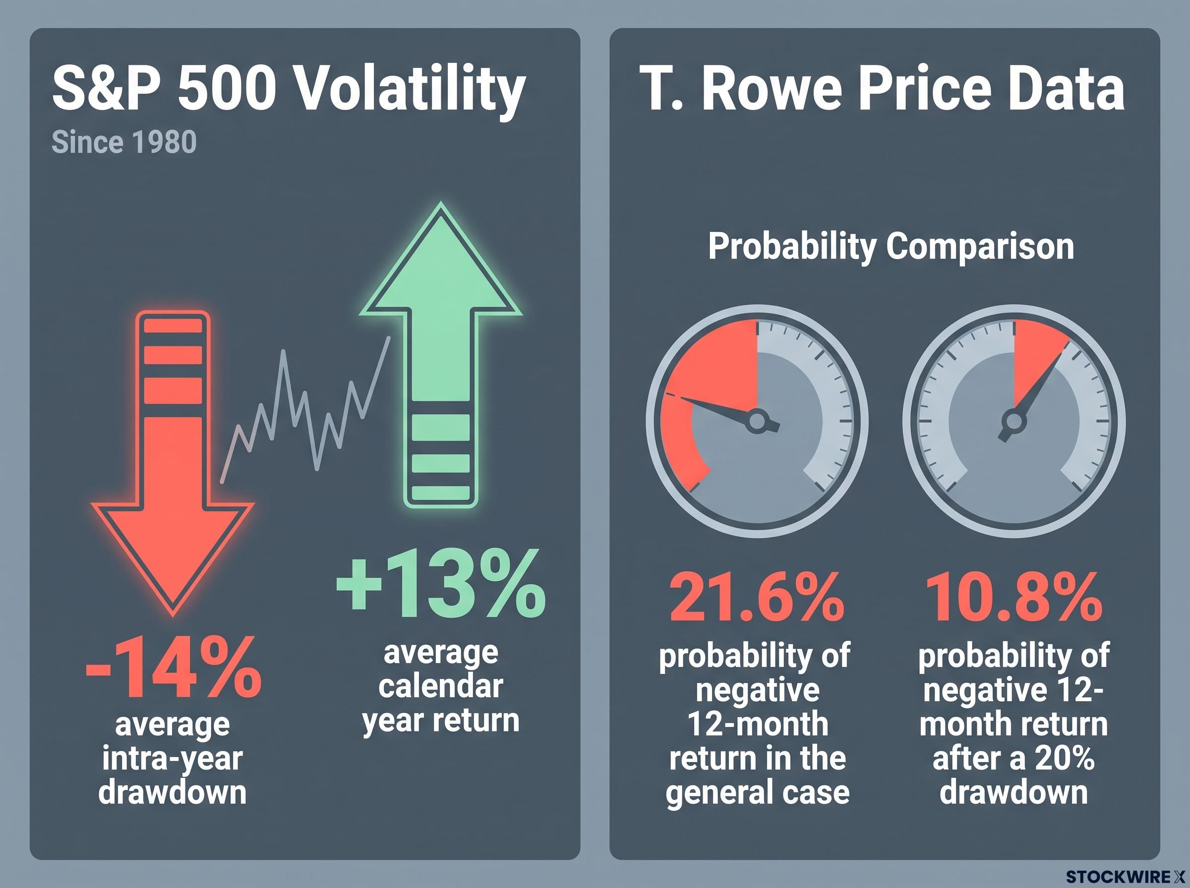
| Average intra-year drawdown | -14% | Historical data | Since 1980 |
| Average calendar year return | +13% | Historical data | Since 1980 |
| 12-month return after correction (under 20% decline) | +30% | Historical data, 1950-2022 | From trough |
| 12-month return after bear market | +37% | Historical data, 1950-2022 | From trough |
| 12-month return after bear market | +17.3% | T. Rowe Price, 1940-2025 | From trough |
| 12-month return after bear market | +17.0% | BMO Nesbitt Burns 2026 | From trough |
Here is the number that should reshape how you feel about losses. Since 1980, the index has dropped an average of roughly 14% at some point within each year, yet still finished the average calendar year up around 13%. Temporary pain is not a sign something has broken. It is the standard cost of the long-run return.
The recovery data is where you need to read carefully, because sources genuinely conflict. Original data covering 1950 to 2022 shows an average 37% gain in the 12 months following a bear market trough. T. Rowe Price, using 1940 to 2025, puts that figure at 17.3%, and BMO Nesbitt Burns lands near 17.0%. Capital Group’s eye-catching 70.9% covers only the five largest bear markets since 1929 and is not comparable to the broader averages. The gap reflects different time windows, different sets of bear markets, and different ways of measuring the exact bottom.
The single most useful statistic in this section comes from T. Rowe Price.
After a drawdown of 20% or more, the probability of a negative 12-month return falls to 10.8%, compared with 21.6% in the general case. The odds shift sharply in favour of investors who stay invested through major declines rather than selling out of them.
Why historical averages are a floor, not a forecast
Confidence is useful. Naivety is dangerous. The historical record tells you that staying invested through drawdowns has paid off, but it does not promise the next 20 years will copy the last 20.
Three structural shifts could pull future returns away from the past. Demographic aging changes savings and spending patterns across whole economies. AI-driven disruption could reshape corporate profitability in ways no historical series captures. And climate-related policy changes could alter costs and margins across entire sectors.
Rates matter too. Vanguard’s 2024 analysis makes the point that in a higher-rate world, the expected-return comparison between equities and bonds looks different than it did through the low-rate decade that flattered stock-heavy portfolios.
This is precisely why planning on scenarios beats planning on a single average. Use the historical record to build conviction in long-term equity exposure, then design the rest of your portfolio as though that average might not repeat.
Three questions to stress-test your portfolio right now
Put the data down and pick up your actual holdings. The next three questions are a diagnostic you run against your own portfolio in under five minutes. They are not a risk-tolerance survey. They are structural tests that expose whether your design survives a scenario you privately do not expect.
Work through them in order, and be honest about the answers.
- The liquidity stress test. If the market dropped 30% tomorrow, would you be forced to sell equities to cover living expenses? A yes means your stable-asset allocation is structurally insufficient, no matter how strong your long-run return expectations are.
- The upside participation test. If the market rose 30%, would your portfolio meaningfully take part? A no suggests crash anxiety has pushed you into a position that defends against downside while permanently surrendering the upside that history rewards most.
- The assumption stress test. Does your financial plan still work if your main economic assumption turns out to be wrong? This is the central resilience question, and the one most investors have never explicitly answered.
The liquidity test has a practical benchmark. For retirees, planners such as Wade Pfau and Morningstar’s Christine Benz typically suggest holding one to three years of spending in cash and short-term bonds. For accumulators the threshold is lower, because you are still saving and far less likely to be forced into selling at the bottom.
The upside test matters because exiting is costly. Both BMO Nesbitt Burns and Charles Schwab find that investors who sell during corrections and miss the recovery earn materially lower cumulative returns than those who hold through the volatility.
If you answered “wrong way” to any of the three, you have not found an emotional weakness. You have found a structural gap in the portfolio’s design, the kind that years of calm markets would happily keep hidden.
Beta-weighted position sizing makes the hidden concentration visible: a 50/50 dollar split between a high-beta technology ETF and a low-beta utilities ETF can produce a 90/10 risk split, meaning your brokerage statement tells you nothing useful about your actual market exposure.
Building the allocation: what the research supports by life stage
Diagnosis is useless without a prescription you can act on. The ranges below are a starting framework, not universal law. Treat them as guardrails that keep your portfolio inside the zone where it stays viable across scenarios, then position yourself within them based on your own liquidity needs and timeline.
For a wealth accumulator with a long horizon, the research supports 60-80% in broad market equities, 10-25% in diversifiers, and 10-30% in bonds and cash scaled by age and risk tolerance. Each sleeve is doing distinct work for scenario resilience.
The diversifier sleeve is where many investors get vague. You do not need all of these. Each one covers a different scenario in a different way.
- International stocks: reduce reliance on any single country’s policy, currency, and sector concentration.
- Small caps: add exposure to a different part of the economic cycle than mega-cap growth.
- Value holdings: tend to hold up better when inflation persists and growth multiples compress.
- Dividend-focused equities: provide income that cushions returns during flat or falling markets.
The bonds-and-cash sleeve is not only about safety. It is about optionality. It funds your living costs during a downturn without forcing equity sales at the worst possible prices, and it gives you the dry powder to rebalance into equities after a major drop. Vanguard’s 2024 work adds weight here: higher rates have materially improved the expected returns from high-quality bonds, which supports holding more of them now than the prior low-rate era suggested.
| Dimension | Accumulator | Retiree or near-retiree |
|---|---|---|
| Primary allocation range | 60-80% broad equities | Lower equity weight, larger stable buffer |
| Diversifier role | Broaden scenario coverage and capture upside | Add value and income-oriented ballast |
| Bonds and cash role | Optionality for rebalancing; 10-30% | Fund 1-3 years of spending without selling equities |
| Key risk to manage | Behaviour risk; selling in a panic | Sequence-of-returns risk |
On the diversifier split, institutions genuinely disagree. Vanguard and BlackRock lean toward global diversification roughly in line with world market-cap weights, while others, including Warren Buffett, accept a large home-country bias on the grounds that multinationals already provide global revenue exposure. There is no single correct answer, and this guide will not pretend otherwise.
Why retirees face a different problem entirely
If you are at or near retirement, your core risk is not low average returns. It is the order in which those returns arrive, a danger known as sequence-of-returns risk. When you withdraw a fixed amount for spending during a downturn, you are forced to sell more shares at depressed prices, which permanently shrinks your future income even if long-run averages eventually recover.
Sequence-of-returns risk is not equally distributed across a retirement timeline: the first five years of withdrawals are the highest-risk window, and simulations across 10,000 scenarios show that sequences averaging negative returns in those early years carried a 20% portfolio failure rate, while positive early sequences produced a 0% failure rate.
Pfau’s research on withdrawal rates shows that poor returns in the first decade of retirement are the dominant driver of portfolio failures. The same bad stretch early in your accumulation years barely matters, because you are a net buyer picking up cheaper shares.
The case studies make it concrete. Through the 2000-2002 and 2008-2009 bear markets, retirees who kept flexible spending and a liquidity buffer avoided permanent lifestyle cuts, while those who sold equities aggressively to fund fixed spending locked in losses they struggled to recover.
The practical tool is a drawdown order: spend cash first, then high-quality bonds, and only then equities. That sequence gives equity markets time to recover before you are forced to touch them.
Where strategists genuinely disagree, and what that means for you
You will keep encountering credible institutions that contradict each other. That is not a flaw in your research. It is the actual state of the field, and understanding it stops you second-guessing your allocation every time a new outlook lands.
Three disagreements are worth knowing in detail, because reasonable cases exist on both sides.
| Debate | Case for one side | Case for the other |
|---|---|---|
| Home-country vs global | Vanguard and BlackRock: global market-cap weighting reduces country, currency, and sector risk | Buffett: large US concentration is defensible because multinationals carry global revenue exposure |
| Bond allocation | Vanguard 2024: higher rates have improved expected bond returns and restored their ballast role | Aggressive allocators: the 2020-2022 rate shock justifies structurally lower bonds in favour of cash or short duration |
| Equity share for long horizons | Proponents of 90-100% equities cite the long-run dominance of real equity returns | Cautious planners prefer 60-80% even for the young, to limit behaviour risk and provide ballast |
The international sleeve shows the same split in miniature. Some institutions put roughly half of equity exposure abroad for currency and political diversification, while others keep a 20-30% international allocation, citing governance quality and the dominance of US large caps within global indices.
Here is the implication that matters. Because credible experts disagree, there is no universally correct portfolio waiting to be discovered. Resilience does not come from finding the single right answer. It comes from making a deliberate, internally consistent choice and holding it through volatility.
So how do you know your choice is sound? Return to the three diagnostic questions. A portfolio that passes the liquidity, upside, and assumption tests is structurally resilient regardless of where it sits within these debates. Recognising that experts disagree is not a reason for inaction. It is permission to make a deliberate choice that fits your circumstances and hold it with conviction.
Your next step is not a new prediction, it is a better structure
The argument running through this guide is simple. Resilience is not about predicting which of the four scenarios arrives. It is about making sure your portfolio holds enough exposure across all of them to survive the one you did not see coming.
The long-run record gives you grounds for confidence through that uncertainty. T. Rowe Price’s finding is the anchor worth remembering: after a drawdown of 20% or more, the chance of a negative 12-month outcome drops to 10.8%, against 21.6% in the general case. The odds systematically reward investors who stay diversified and invested through major declines.
Your next move is deliberately small and manageable.
- Run the three diagnostic questions against your actual holdings, honestly, in one sitting.
- Identify the single most exposed structural gap: insufficient stable assets, insufficient equity participation, or a plan that depends on one scenario being correct. Address that gap first, aiming to stay within the 60-80% equities, 10-25% diversifiers, 10-30% bonds and cash guardrails.
- Schedule a periodic review trigger, either annually or after any market move of 20% or more in either direction, so your portfolio does not drift back into a single-scenario bet.
If your circumstances are complex or you are close to retirement, professional guidance on withdrawal sequencing and tax-efficient rebalancing is worth the cost. The most important decision you can make right now is not to find a better prediction. It is to check whether your current structure survives the scenarios you have not predicted.
For readers wanting to map the four plausible scenarios in this guide against current macro conditions, our full explainer on the 2026 H2 investment outlook examines how the Sahm Rule, Conference Board LEI, and a 4% 10-year Treasury yield combine to define a specific amber-light positioning framework for the second half of 2026.
This article is for informational purposes only and should not be considered financial advice. Investors should conduct their own research and consult with financial professionals before making investment decisions. Past performance does not guarantee future results. Financial projections are subject to market conditions and various risk factors.