
The S&P/ASX 200 closed at 8,727.70 on Friday, 18 September 2026, barely moving from the previous session. If you glanced at that number and felt reassured, you read it the way most people do, and that reading is the trap.
A near-flat close feels like stability. In this case, it is closer to stasis: the index sitting still beneath a ceiling it could not break, with neither side willing to force the issue.
Here is why that distinction matters. A flat close below overhead resistance tells you buyers lacked the conviction to push higher, and sellers felt no urgency to get out. Both sides are comfortable, and that comfort favours the sellers.
The technical posture of the index shapes whether the next rally gets bought or sold. Get that reading right, and you know whether recoveries are worth chasing or fading.
After this, you will be able to read the ASX 200’s chart signals yourself, understand exactly what the current configuration implies for near-term risk, and know the two price levels that would tell you the picture has changed.
What a near-flat close actually tells you about market conviction
A casual observer sees 8,727.70, notes it is roughly where the market opened, and moves on. Nothing happened. The market held.
That is the surface reading, and it misses almost everything that matters.
Price on its own is an incomplete signal. To assess whether a market is healthy, you need context: where the close sits relative to key levels, which way the trend is pointing, and whether volume backed the move. Strip that context away and a closing number tells you very little.
Volume confirms whether a price move had real market participation behind it, which is why reading a stock chart means looking at the candle and the volume bar together rather than treating the closing price as the complete story.
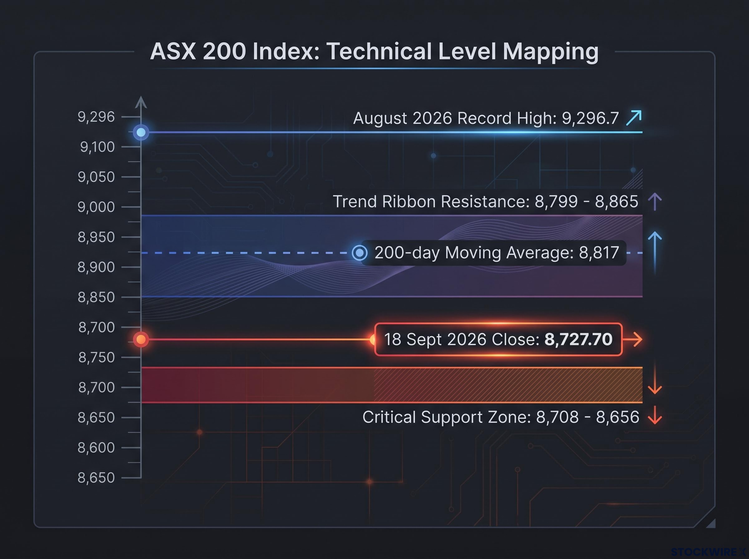
Look at where 8,727.70 actually sits. According to technical analysis from Carl Capolingua of Market Index ChartWatch, the ASX 200’s critical support zone runs from 8,708 to 8,656, with the long-term trend ribbon sitting overhead at 8,799 to 8,865. Friday’s close is inside that support zone, not comfortably above it. The index is resting on the floor, not standing well clear of it.
Now trace the week’s path.
| Date | S&P/ASX 200 close |
|---|---|
| 15 September 2026 | 8,672.50 |
| 16 September 2026 | 8,696.50 |
| 17 September 2026 | 8,732.40 |
| 18 September 2026 | 8,727.70 |
That sequence tells you the index bounced modestly off its low near 8,672.50 and then went nowhere on Friday. This is exactly what you would expect from a market where sellers are content to absorb recoveries rather than chase them higher.
Remember, this is a market that hit a record high of 9,296.7 in August 2026 and has since retreated. A flat close well below that peak, pinned to support, is not the market resting. It is the market failing to advance.
A flat close that holds well above resistance signals stability: buyers are in control and simply pausing. A flat close pinned to support beneath overhead resistance signals something else entirely: sellers are quietly absorbing every recovery. Same flat number, opposite meaning.
When big ASX news breaks, our subscribers know first
Trend ribbons explained: the difference between a floor and a ceiling
To understand why that flat close reads as weakness, you need the tool the whole analysis rests on: the trend ribbon.
A trend ribbon is a bundle of moving averages plotted together. A moving average is simply the average closing price over a set number of days, updated each session so it moves with the market. Technical analysts typically use two bundles: a short-term ribbon of roughly 21 to 34 periods, and a long-term ribbon of roughly 144 to 233 periods.
Bundled together, these averages form a band rather than a single line. That band acts as a zone of dynamic support or resistance, meaning a moving area the price reacts to rather than a fixed level. Which of the two it becomes depends entirely on the configuration.
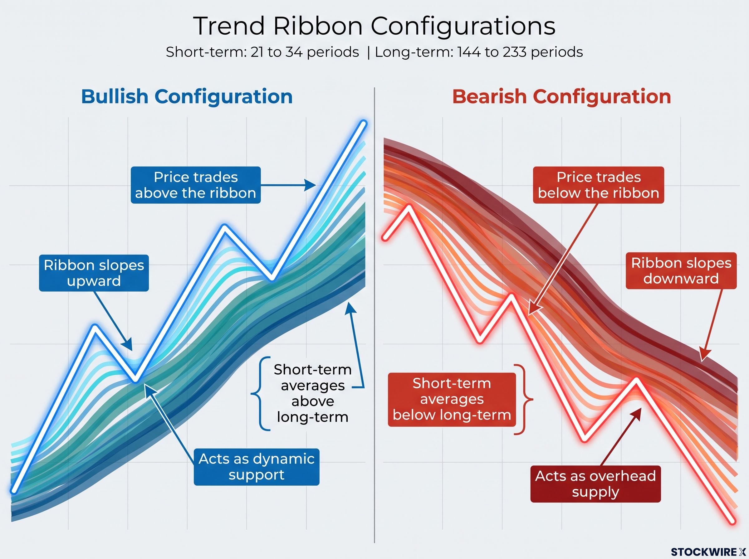
Bullish configuration:
- Price trades above the ribbon
- The ribbon slopes upward
- Short-term averages sit above long-term averages
- Pullbacks into the ribbon attract buyers, so the band acts as dynamic support
Bearish configuration:
- Price trades below the ribbon
- The ribbon slopes downward
- Short-term averages sit below long-term averages
- Rallies into the ribbon meet sellers, so the band acts as overhead supply
That last point carries the real weight. In a bearish configuration, the same band that once cushioned every dip now caps every rally. The market regime flips from “buy the dip” to “sell the rip,” which is precisely why technically-minded analysts turn defensive when they see it.
Here is the mechanism that makes it self-reinforcing. When the ribbon sits above the price and slopes down, every rally the index attempts is climbing into a zone packed with buyers who bought higher and are now underwater. Many of them sell into the recovery just to break even, which is why rallies in this environment tend to stall rather than extend.
What the ASX 200 ribbon is doing right now
Apply those criteria to the current chart and the picture is unambiguous. Price sits below the ribbon at 8,727.70. The long-term trend ribbon, estimated at 8,799 to 8,865, is overhead and acting as resistance. The index has also failed to reclaim its 200-day moving average, noted near 8,817, which reinforces that overhead cluster.
The bearish configuration was confirmed on the longer-term chart when the market retreated from its August 2026 record high of 9,296.7 and lost those key levels. Every criterion for a defensive posture is now present.
Why the Nasdaq tells a different story, and what that contrast means for you
To see what a healthy ribbon looks like, look across to the US. The Nasdaq Composite sits in a far more constructive configuration, and that contrast is what makes the ASX’s weakness legible.
On 17 September 2026, the Nasdaq gapped higher at the open, meaning it opened well above the prior session’s close rather than drifting up from it. It opened at 26,377.86 and closed near session highs around 26,418 to 26,421, a daily gain of roughly +1.69%, or about 440 points, on elevated volume of approximately 7.65 billion shares.
That volume is the signal. A high-volume gap-up is motivated buying: participants committing real capital aggressively rather than nudging price higher on thin trade. That is demand you can see.
Structurally, the Nasdaq’s price trades above its long-term trend ribbon, estimated at 24,340 to 25,215, which is providing dynamic support. That is the mirror image of the ASX 200, where price sits below the ribbon and the band caps rallies.
The comparison is not a one-sided cheerlead for the US. The Nasdaq carries its own overhead supply zone at 26,701 to 27,191, so “constructive” does not mean “unambiguously bullish.” It means the structural signals favour participation, with a known barrier ahead.
| Characteristic | S&P/ASX 200 | Nasdaq Composite |
|---|---|---|
| Price vs trend ribbon | Below the ribbon | Above the ribbon |
| Ribbon slope | Downward, acting as resistance | Upward, acting as support |
| Volume conviction | Flat close, no demand surge | High-volume gap-up on 17 Sep |
| Nearest overhead supply | 8,799-8,865 | 26,701-27,191 |
| Analyst risk exposure | ~33% invested | ~50% risk position |
This divergence flows straight into positioning. The original source analyst held roughly twice the risk exposure in US equities as in Australian equities, a 50% risk position on the Nasdaq’s constructive structure against just one-third invested on the ASX. The allocation is not about geography or preference. It is about where the signals favour showing up.
The ASX 200 vs Nasdaq divergence has been building for longer than a single week; as of late May 2026, the ASX 200 had delivered an effectively flat price return since June 2025, trapped between overhead supply and an underlying demand zone, while the Nasdaq continued trending cleanly higher.
The Nasdaq’s 17 September high-volume gap-up is exactly the kind of demand signal missing from the ASX 200 right now. That absence is what turns the Australian market’s flat close from consolidation into weakness. When you see the two side by side, the difference stops being abstract.
Sitting heavily in cash: the logic, the risks, and what changes the picture
That divergence explains why the analyst held two-thirds of the Australian equity book in cash and short positions, with only around 33% invested. When a trend ribbon acts as resistance rather than support, deploying capital means buying into a zone where recoveries get sold. Holding cash becomes a disciplined response, not a fearful one.
But cash is not a costless safe harbour, and the institutional counterargument is worth taking seriously. Large asset managers, including Vanguard, Schroders, and LGT Wealth Management, favoured a mild cash overweight at most through 2025-2026, preferring to rotate into fixed income for yield and potential capital gains rather than retreat entirely to cash.
The decision around holding cash versus staying invested is not uniform across portfolio stages: a 25-year-old accumulator and a 55-year-old preserving flexibility face very different opportunity costs from the same cash weighting, which is why the framework for evaluating a defensive position must account for where you are in your investment journey, not just what the chart is doing.
The ASX Investor Update sets out five real costs of a heavily defensive cash position, and each one bites harder in the current Australian environment:
- Inflation risk: if living costs rise faster than your deposit interest, the real purchasing power of that cash erodes over time.
- Interest-rate risk: cash income is variable, and if the RBA cuts rates, deposit yields can fall quickly and drag your portfolio income down with them.
- Liquidity trade-offs: chasing the best deposit rate often means locking money into a term deposit, which sacrifices the flexibility to redeploy fast.
- Opportunity cost: heavy cash weighting risks missing the recovery, and cash-heavy portfolios have historically underperformed diversified benchmarks by a material margin over the long run.
- Pass-through risk: banks adjust deposit rates quickly and unevenly, so the return you expect on cash is less certain than it looks.
Read together, these make the point clear. The cash position is an active bet that the cost of missing a recovery is lower than the cost of holding equities into a further decline. That bet has measurable costs, and they compound the longer the defensive posture is held.
What would change the technical picture
The signal to watch is specific. A regime shift would need the ASX 200 to reclaim and hold above the trend ribbon zone at 8,799 to 8,865 on clearly above-average volume, with the ribbon flattening and then turning upward. That would mean overhead resistance has converted back into support.
The downside trigger is just as concrete. A close below the 8,656 support floor would confirm the bearish case is extending rather than resolving, and would likely prompt further defensive action. Those two levels frame the entire near-term decision.
Reading the chart before you read the headline
The most valuable thing to carry out of this is not the analyst’s portfolio split. It is the habit of checking where price sits relative to the trend ribbon before drawing any conclusion from a day’s closing number.
The framework has three parts. First, a closing price only means something in the context of its position relative to key levels and the trend ribbon. Second, ribbon orientation, whether it acts as support or resistance, is the primary read on whether a market favours participation or defence. Third, a cross-market comparison sharpens the signal by giving you a live contrast, which is exactly what the Nasdaq provided against the ASX 200.
Right now, the ASX 200 sits below its trend ribbon, with that band acting as overhead resistance at 8,799 to 8,865 and nearest support at 8,708 to 8,656. Two levels are worth tracking from here:
- 8,799 to 8,865: the resistance zone the index must reclaim on strong volume to signal genuine improvement.
- 8,656: the support floor whose loss would confirm the downtrend is extending.
Where price sits relative to the trend ribbon is the first question to ask before you interpret any daily close. Answer it, and a flat number never reads the same way again.
This process is portable. It applies to the next ASX 200 update, to the Nasdaq, and to any index you follow. Technical literacy compounds, and you now hold the framework.
For readers wanting to build on this framework with a vetted set of tools, our dedicated guide to technical indicators that work covers the four indicators that survived 30-plus years of live trading and real capital, including Volume Market Profile and RSI divergence, with the evidence base explaining why each one made the cut.
This article is for informational purposes only and should not be considered financial advice. Investors should conduct their own research and consult with financial professionals before making investment decisions. Past performance does not guarantee future results. These statements are speculative and subject to change based on market developments and index performance.