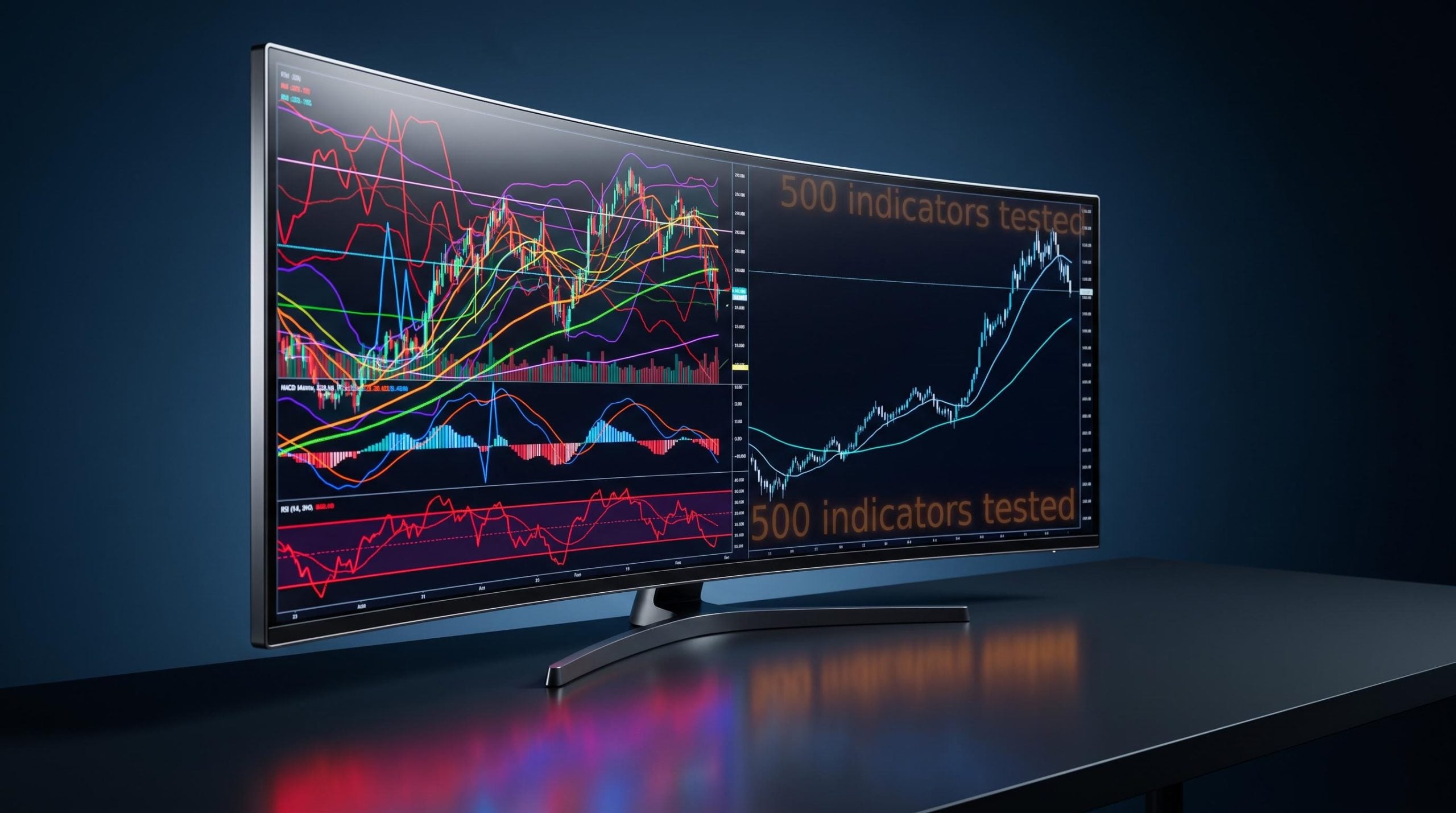
Here is the uncomfortable truth after testing more than 500 indicators with real capital across 30-plus years of live trading: adding more tools does not produce better results. The chart with fifteen overlays is not more informed than the chart with two. It is just noisier.
You already know this cycle, even if you have not named it. You discover a new indicator, back-test it enthusiastically, watch the equity curve climb on historical data, then load it live and watch it fail. The market today is drowning in TradingView scripts, indicator libraries, and YouTube strategies promising an edge, yet retail outcomes have not improved. The signal-to-noise problem is getting worse, not better.
This guide is not another list of technical indicators that work to bolt onto your chart. It is a framework for understanding why only four survived three decades of testing with real money when hundreds of others did not, and what that survival tells you about how each one should actually be used.
By the time you finish this, you will evaluate every tool on your chart differently. Not by whether it looks good on a back-test, but by whether it carries genuine signal or just dresses up redundancy as confirmation.
Why most indicators fail before you even open a live position
The failure is not bad luck. It is not poor timing. It is structural, baked into how most traders select and apply indicators in the first place.
Start with the biggest culprit: curve-fitting. When you tune an indicator until it produces an 85% win rate on historical data, you have not found an edge. You have taught the tool to memorise past noise. A comprehensive 2026 working paper from the CESifo/ifo Institute, titled Seven Pitfalls of Technical Analysis, names this problem directly, alongside data snooping, subjectivity, and the routine failure to account for transaction costs.
The SSRN research on data snooping bias in technical analysis strategies explicitly controls for the false discovery rate and factors in transaction costs, confirming that strategies which look profitable on historical data frequently lose their edge once real execution frictions are applied.
The CESifo/ifo Institute research identifies data snooping, over-optimising a strategy against historical data until it fits perfectly, as a primary reason technical systems that look excellent on paper collapse in live trading.
The second failure mode is quieter and more dangerous because it feels like discipline. Redundancy.
If your chart runs RSI and Stochastics and a third momentum oscillator all at once, you are not confirming a signal from three angles. You are reading the same underlying maths three times, complete with the same built-in lag. That is redundancy dressed as confirmation, and it manufactures false confidence rather than genuine signal diversity.
Here are the core reasons most indicators fail before you ever click buy:
- Curve-fitting: the indicator is optimised to historical data and memorises noise instead of finding a predictive edge.
- Redundancy: stacking multiple momentum tools tracks identical mathematics while increasing cognitive load and confirmation bias.
- Transaction cost blindness: back-tests routinely ignore commissions and slippage that erase live edge.
- Over-optimisation: the gap between a tuned back-test and messy live behaviour is where most strategies quietly die.
The evidence backs this up. A January 2025 study in the Indian Journal of Finance found that standard EMA, RSI, and MACD day-trading rules failed entirely to generate positive alpha compared with simply buying and holding.
For readers wanting to see how the structural failure of indicator-dependent active strategies sits within the broader performance record, our full explainer on active versus passive performance data walks through two decades of SPIVA evidence on why the underperformance is structural rather than cyclical.
So here is the filter to apply to every tool you own. Does it merely characterise past price, or does it carry forward-looking signal? Most oscillators only describe where price has been. If your chart is stacked with them, it is almost certainly producing the illusion of confirmation, not the reality of it. Keep that filter in mind for all four indicators that follow.
When big ASX news breaks, our subscribers know first
Outside Bar Finder: reading the market’s rejected auction
An Outside Bar is mechanically simple. It is a candle whose high rises above the prior candle’s high and whose low falls below the prior candle’s low, engulfing the entire preceding range, then closes in the direction of the reversal.
That definition is easy to memorise. The reason it works is not in the shape.
In Market Profile terms, an Outside Bar represents a failed auction. The market pushed to test a new price extreme, found no acceptance there, and aggressively rejected it. The close near the session’s extreme is the confirmation that the rejection stuck.
That reframe matters for you. A bullish Outside Bar forms when the current candle drops below the prior low, spikes above the prior high, then closes near the top of its range. A bearish Outside Bar exceeds both the prior high and low, then closes near the bottom, telling you buyers tried to break higher and got absorbed.
When a valid Outside Bar prints at a structural extreme with volume behind it, it is telling you something specific: the participants who tried to push price through that level failed. That is a materially different message than a candle that simply happens to be wide in the middle of a range.
Three conditions separate a genuine signal from noise:
- Structural location: the bar sits at a prior swing high, swing low, or major moving average, not in mid-range chop.
- Volume confirmation: for equities, the outside-bar candle carries at least 1.5 times the 20-day average volume.
- Close position: the candle closes near the extreme in the direction of the signal, not in the middle.
| Attribute | Bullish Outside Bar | Bearish Outside Bar |
|---|---|---|
| Trigger condition | Falls below prior low, rises above prior high | Exceeds prior high and prior low |
| Ideal close location | Near the top of the bar’s range | Near the bottom of the bar’s range |
| Volume requirement | At least 1.5x 20-day average (equities) | At least 1.5x 20-day average (equities) |
| Stop placement | Just below the bar’s low | Just above the bar’s high |
For risk management, enter on the close or a break of the bar’s extreme, place your stop just beyond the opposite end of the outside bar, and target 1.2-2.0R or a measured move to historical resistance. A widely used version, the Skywave TA Outside Bar Finder, is available in the TradingView library and marks both directions automatically. Understanding the failed auction logic is what stops you from firing on every wide candle you see.
RSI divergence: the one RSI signal that actually carries predictive weight
You almost certainly use the Relative Strength Index (RSI) the way most traders do: readings above 70 mean sell, readings below 30 mean buy. That application is where RSI goes to die.
RSI measures momentum on a 0 to 100 scale, usually over a 14-bar lookback. Because it only characterises past price, it lags. In a strong trend, it can sit above 70 or below 30 far longer than any counter-trend position can survive. A 2026 TradingView quantitative study, aptly titled 15 Million Tests, Zero Edge: The RSI, tested millions of parameter combinations and found no statistically significant edge for threshold-based strategies once corrected for multiple testing.
So drop the thresholds. The signal that carries weight is divergence.
Bullish divergence forms when price makes a lower low but RSI makes a higher low, a sign that downside momentum is fading beneath the surface. Bearish divergence is the mirror: price makes a higher high while RSI makes a lower high. Divergence works because it exposes a loss of underlying momentum before price reveals it.
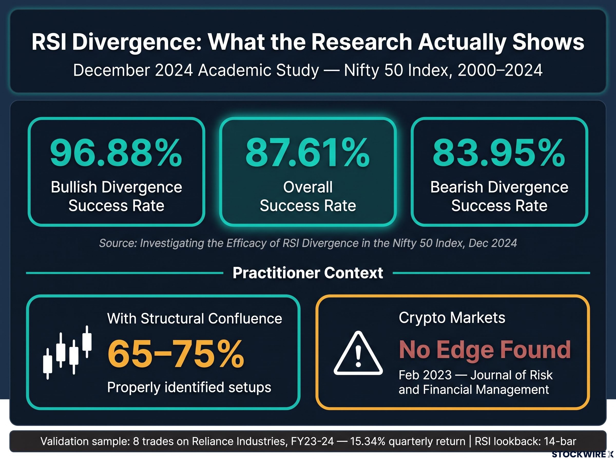
A December 2024 academic study, Investigating the Efficacy of RSI Divergence in the Nifty 50 Index, analysing Indian equities across three eight-year windows from 2000 to 2024, found an overall divergence success rate of 87.61%, with bullish divergences at 96.88% and bearish at 83.95%.
That number is compelling. It is also a trap if you read it as permission to apply divergence everywhere.
Where RSI divergence works and where it does not
The 87.61% figure comes from equities, and the context is everything. A validation phase in the same research executed eight trades on Reliance Industries in FY23-24 and generated a 15.34% quarterly return. Practitioner guides cite win rates of 65-75% for setups identified properly with structural confluence.
Now the other side. A February 2023 peer-reviewed study in the Journal of Risk and Financial Management found RSI divergences completely ineffective for timing cryptocurrency markets, flagging a high risk of failure.
The MDPI peer-reviewed study on RSI signals in crypto markets uses an algorithmic backtesting approach across multiple crypto-assets and finds that RSI-based strategies, including divergences, fail to produce consistent positive returns in that environment, reinforcing why the asset class context matters before you apply this tool.
Here is how to keep divergence on your chart without misusing it:
- Where it works: equities, especially at structural confluence such as prior swing levels or major moving averages.
- Where it works best: higher-timeframe divergences at structural extremes are the highest-probability setups.
- Where it fails: cryptocurrency markets, where the academic evidence shows no systematic edge.
- What to avoid: intraday divergence in isolation, which is not the same signal as a confluent higher-timeframe reading.
The takeaway for you is not to apply divergence mechanically. It is to apply it carefully where the research shows it works and to avoid it entirely where the research shows it does not.
Volume Market Profile: seeing the institutional footprint in the price structure
Institutions have a problem you do not. They cannot move size without moving price against themselves. A large order executed carelessly bleeds capital through slippage, so institutional activity naturally concentrates wherever the liquidity already is.
That constraint is exactly what makes their footprint visible. Volume Market Profile (VMP) plots volume horizontally across price rather than vertically across time, showing you precisely where the most trading has occurred.
The tool, released in October 2022 and developed by SamRecio on TradingView, gives you three reference levels that matter.
The Point of Control (POC) is the price with the highest traded volume. It behaves as a liquidity magnet, drawing price back toward it because that is where the most capital changed hands. The Value Area High (VAH) and Value Area Low (VAL) mark the boundaries of the accepted trading range for a session.
The same order book structure that governs how limit and market orders interact explains why Volume Market Profile’s Point of Control behaves as a liquidity magnet: the price level where the most volume traded is also where the deepest pool of resting orders historically concentrated.
Here is the counterintuitive part that VMP forces you to confront. Rising price does not mean more buyers than sellers.
A single 100,000-share market buy in NVIDIA can absorb staggered limit sell orders, lots of 10,000, 20,000, 35,000, and 45,000 shares stacked up to $232.00, driving price higher even though the individual sellers far outnumber the single buyer. Direction reflects aggressive volume, not headcount.
The four features to read are straightforward:
- POC: the highest-volume price level and the strongest liquidity magnet.
- VAH: the upper boundary of the accepted trading range.
- VAL: the lower boundary of the accepted trading range.
- Volume nodes: high-volume nodes flag accumulation or distribution; low-volume nodes flag imbalanced, fast-moving price.
| Level | What it measures | Day traders use it to | Swing traders use it to |
|---|---|---|---|
| POC | Price with highest traded volume | Track the developing daily or weekly POC as a magnet | Track monthly or higher POCs as major reference |
| VAH | Upper edge of accepted range | Fade or breakout above intraday value | Gauge where a swing extends beyond value |
| VAL | Lower edge of accepted range | Fade or breakout below intraday value | Identify swing support at the value base |
Treat the POC not as ordinary support or resistance but as the price where the most institutional capital committed. It exerts a pull that most traditional levels do not. One honest caveat: this volume transparency exists in equities but not in decentralised spot forex, so VMP loses its evidentiary value there.
Smart Money Concepts: a useful map, not a window into institutional order flow
Smart Money Concepts (SMC) has become one of the most popular retail frameworks going, and for good reason. It gives you a structured language for reading price action rather than a black box of arrows.
The LuxAlgo SMC indicator, rated 4.4/5 by TradingToolsHub and described by PineRadar as the most-used free SMC script on TradingView, maps the structure automatically. Encountered in the order you would read them on a chart:
- Break of Structure (BOS): confirmation that the prevailing trend is continuing.
- Change of Character (CHoCH): the first sign that a trend may be reversing.
- Order Blocks: the last opposing candle before an impulsive move, theorised as where institutions placed large orders they will defend.
- Fair Value Gaps (FVGs): price imbalances the market tends to return to fill.
It also flags equal highs and lows as liquidity sweeps and marks premium and discount zones. As a lens for understanding the shape of a move, it genuinely helps.
Now the honest limitation.
What the chart markup does not show you
SMC automates chart markup based on price action inference, not actual order flow data. Those BOS and CHoCH labels come from pattern recognition on the chart in front of you, not from data feeds inside institutional trading desks.
That distinction matters enormously for how you use it. The framework shows you where institutions may have acted, never where they will act.
Three things SMC cannot tell you:
- Actual order flow: it infers institutional behaviour from price; it does not read it.
- Whether a level will be defended: an auto-generated Order Block is a hypothesis, not a guaranteed defence zone.
- Whether a sweep reverses or continues: the tool marks the sweep but cannot resolve what happens next.
The CFA Institute notes that technical analysis becomes ineffective in illiquid markets and that retail traders over-rely on momentum signals relative to institutions. If you use SMC to understand structure and then confirm with higher-timeframe context and your own analysis before acting, it adds real value. Treat its markup as guaranteed institutional intent and it becomes a crutch it was never built to be.
SMC’s Break of Structure and Change of Character labels gain considerably more diagnostic power when paired with a systematic market structure classification framework that distinguishes bullish, bearish, and range-bound conditions through swing high and swing low sequencing before any indicator is consulted.
Applying these four indicators without turning your chart into a noise machine
Here is the mistake to avoid now that you have all four. Do not load them onto one chart and deploy them together on every trade.
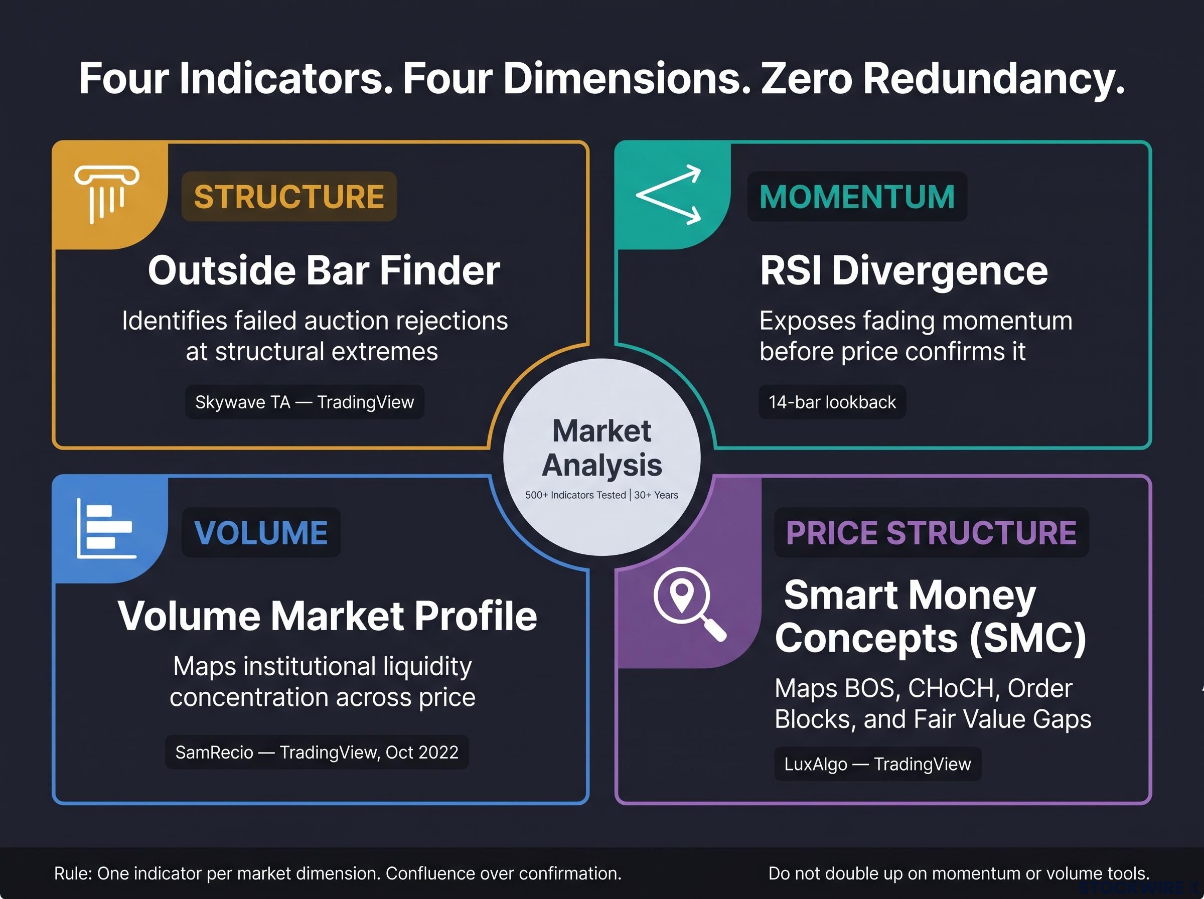
These four survived precisely because each addresses a different dimension of analysis: structure, momentum, volume, institutional positioning, and price action reversal. Stack them all simultaneously and you recreate the exact indicator overload this guide opened by warning against.
Instead, let them speak to each other selectively:
- VMP plus Outside Bars: institutional volume context paired with a structural rejection signal is a genuinely complementary combination.
- RSI divergence as a confirmation layer: use it to confirm momentum loss at a level, never as a standalone trigger.
- SMC as a location map: let it inform where you are looking, not whether you enter.
Whatever you use, treat all indicator output as probabilistic input, not mechanical instruction. FINRA Rule 2214 and Rule 2270 require firms to disclose the hypothetical nature of technical projections and to warn of commission drag, extreme risk, and total capital loss in hyper-active trading. That regulatory framing is a useful reminder that no signal is a certainty.
The single most important rule before committing real capital: out-of-sample testing. A strategy showing an 85% win rate on historical data frequently collapses live because it was curve-fitted. Only testing on data the strategy never saw validates genuine robustness.
Four practical integration rules:
- One indicator per market dimension. Do not double up on momentum or volume tools.
- Confluence over confirmation. Seek agreement across different dimensions, not repetition within one.
- Out-of-sample testing. Validate on unseen data before you risk capital.
- Position sizing for probability. Calibrate size to signals that are probable, not certain.
The reader who uses one or two of these well, with proper confluence and risk management, will outperform the reader who deploys all four at once and mistakes chart complexity for analytical rigour.
This article is for informational purposes only and should not be considered financial advice. Investors should conduct their own research and consult with financial professionals before making investment decisions. Past performance does not guarantee future results.
Trading with an edge means knowing when your tools are lying to you
These four indicators earned their place by surviving real capital over real time, not by looking flawless on a back-test. That is the whole point. None of them is infallible, and each is reliable only under the specific conditions this guide laid out.
Return to the paradox you started with. More indicators do not produce better results. Fewer indicators, understood deeply and governed by clear contextual rules, is the professional standard. That is the shift you have just made: from collecting tools to knowing which ones to trust and exactly when.
So here is your first step, and it does not require rebuilding your entire approach overnight. Pick one indicator from these four. Spend the next 30 days applying it only in the conditions specified here, correct asset class, structural confluence, volume confirmation, and assess its performance honestly before you add anything else.
The edge was never in the number of tools. It was in knowing when they are lying to you.
For readers who recognise the indicator-overload cycle as a behavioural pattern rather than a knowledge gap, our dedicated guide to behavioral investing discipline examines the specific cognitive mechanisms, including loss aversion and the impulse to act on paper losses, that drive over-trading and tool accumulation.