
One index is trending cleanly higher. The other has gone effectively nowhere for a year. As of 29 May 2026, the Nasdaq Composite and the S&P/ASX 200 are telling two sharply different stories about where capital wants to be, and the technical structures behind each chart explain exactly why an analyst might hold a full risk allocation in one market and barely a third in the other at the same time. Australian investors tracking both indices are accustomed to some degree of divergence, but the gap visible right now is unusually stark. The ASX 200 closed at approximately the same level it occupied around 22 June 2025, delivering what amounts to a lost year on a price-return basis. The Nasdaq, by contrast, has maintained a clearly defined uptrend with demand persistently outpacing supply. What follows is a breakdown of the technical chart structure of both indices using a supply-and-demand framework, the specific price levels that matter most, and the signals that would indicate when either market changes character.
The Nasdaq’s clean uptrend in numbers: what the chart is actually showing
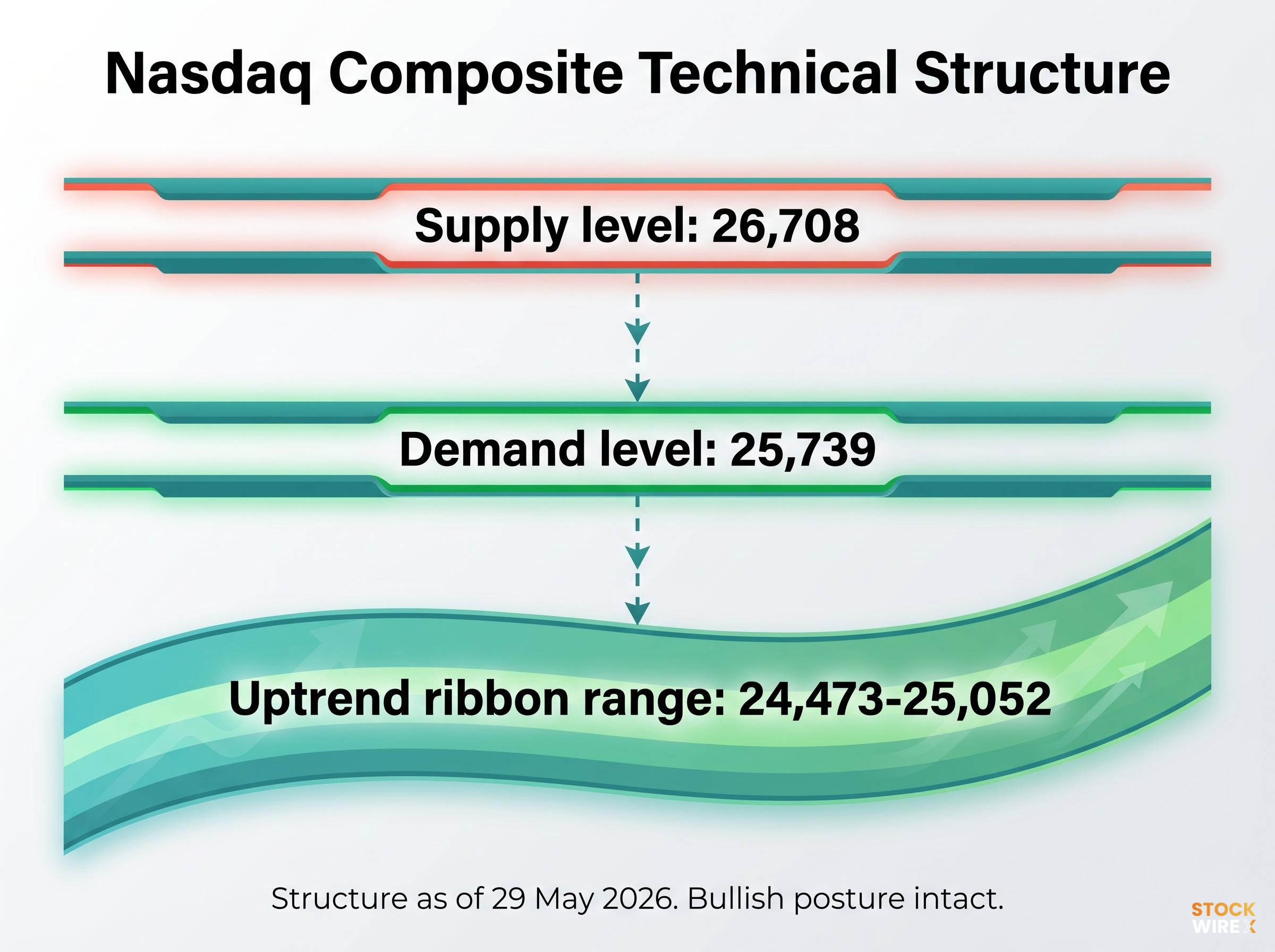
The Nasdaq Composite’s bullish posture as of 29 May 2026 is not a matter of sentiment or headline optimism. It is visible in the price structure itself: demand continues to exceed supply, and the index is rising in line with a prevailing uptrend that has not been technically challenged.
Three levels define the current structure:
- Supply level at 26,708: The nearest overhead price point where sellers have previously acted. A move toward this level would test whether buyers can absorb the selling pressure.
- Demand level at 25,739: The closest price zone where buyers have demonstrated willingness to step in. This is the first line of structural support beneath the current price.
- Uptrend ribbon range at approximately 24,473-25,052: The short-term trend band that captures the prevailing momentum direction. A daily close below this range would be the first concrete signal that supply-side control is returning.
What sustains the bullish read is what has not happened. Supply-driven reversal candles, large bearish candles accompanied by elevated, above-average volume, have not materialised. Without that signal, the technical evidence supports continuation rather than caution.
The technical case for the Nasdaq’s uptrend sits alongside a separate valuation risk at current resistance: the Nasdaq 100 rallied approximately 18% from its April lows to reach the 26,583-26,900 zone, pushing momentum indicators into overbought territory at precisely the level where Magnificent Seven earnings must now deliver concrete AI revenue proof to justify the premiums embedded in current prices.
Key invalidation signal: A daily close below the 24,473-25,052 uptrend ribbon range would indicate probable supply-side control returning and would represent the specific technical condition that challenges the current bullish thesis.
For Australian investors with US equity exposure, these are not abstract chart markings. They are the levels that separate a trend worth riding from one that may be rolling over.
When big ASX news breaks, our subscribers know first
A lost year on the ASX 200: reading the range-bound structure
The ASX 200 on 29 May 2026 sits at approximately the same level it occupied around 22 June 2025. For investors holding passive Australian equity exposure over that period, the headline return has been effectively zero on a price basis.
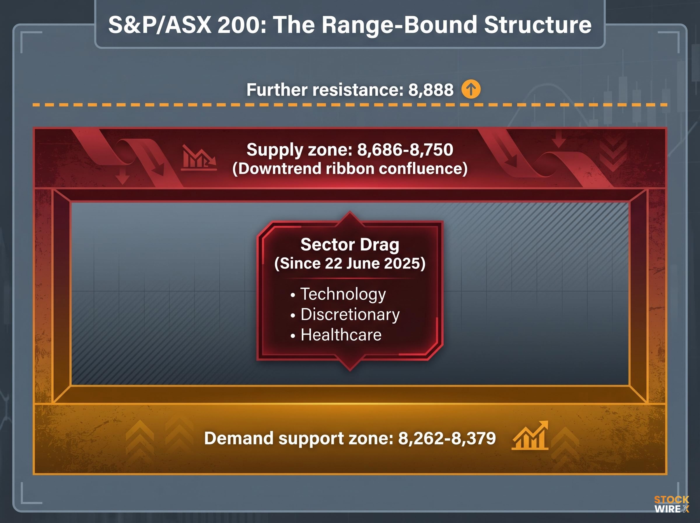
The chart structure explains why. Unlike the Nasdaq’s clean uptrend, the ASX 200 is trapped within a defined range, bounded by supply overhead and demand support below, with no sustained directional breakout in either direction.
ASX market breadth data from mid-May 2026 sharpens the picture considerably: 84.5% of ASX 200 constituents were trading at least 10% below their 52-week highs even as the headline index sat only approximately 2% below its year-start level, a divergence driven by the same capitalisation-weighting mechanics that allow mega-caps such as CBA and BHP to anchor the index while widespread constituent damage accumulates beneath the surface.
| Level | Price Zone | Technical Significance |
|---|---|---|
| Supply zone | 8,686-8,750 | Confluence of short- and long-term downtrend ribbons; structurally stronger resistance than a single price level |
| Further resistance | 8,888 | Next overhead barrier if supply zone is cleared |
| Demand support zone | 8,262-8,379 | Price area where buyers have previously stepped in to absorb selling pressure |
The 8,686-8,750 supply zone is particularly significant because it represents a confluence: both the short-term and long-term downtrend ribbons converge at this level. When two independent momentum measures align at the same price area, the resistance is structurally heavier than a single line on a chart. Price has to push through two layers of overhead pressure rather than one.
Why Technology, Discretionary, and Healthcare dragged the index
The headline index number masks a more complex internal picture. Technology, Discretionary, and Healthcare sub-portfolios have underperformed materially within the ASX 200 during the period under review, contributing disproportionately to the index’s lack of net progress. Sector-level drag of this kind explains why the “lost year” has felt particularly frustrating for investors with overweight positions in growth-oriented Australian equities.
Understanding supply and demand zones: the framework behind both readings
The readings above rely on a specific technical framework. For investors encountering supply-and-demand analysis for the first time, the core vocabulary is straightforward, and the two indices already discussed provide live illustrations of every concept.
- Supply zone: A price area where sellers have previously acted decisively, creating a cluster of selling activity. Future price tends to stall or reverse when it returns to these levels. The ASX 200’s 8,686-8,750 zone is a current example.
- Demand zone: A price area where buyers have previously stepped in with enough force to halt declines and push price higher. The Nasdaq’s 25,739 level and the ASX 200’s 8,262-8,379 range both function as demand zones.
- Uptrend ribbon: A visual band that captures the prevailing short-term or long-term momentum direction when price is rising. The Nasdaq’s 24,473-25,052 band is a live example; price trading above it confirms the uptrend remains intact.
- Downtrend ribbon: The equivalent band when momentum is falling. The ASX 200’s supply zone at 8,686-8,750 represents the confluence of two downtrend ribbons, which is why it acts as heavier resistance.
The critical signal that links these concepts is the supply-driven reversal: the specific candle-and-volume pattern that indicates sellers are returning in force.
The invalidation signal: Large bearish candles accompanied by elevated, above-average volume indicate that supply has returned to the market. This is the single most important pattern to watch when assessing whether a bullish trend is breaking down. Its absence in the Nasdaq sustains the bullish case; its potential appearance at the ASX 200’s overhead zone is what keeps the cautious read alive.
This framework applies beyond indices. The same analytical lens works for individual stocks, ETFs, and other asset classes, making it a skill with lasting utility rather than a one-off reading.
How the divergence translates into allocation decisions
Chart analysis that does not connect to positioning decisions is observation without application. The divergence between the Nasdaq and ASX 200 translates directly into materially different allocation sizing, and the logic connecting the two is replicable.
According to Carl Capolingua, Lead Writer and Presenter at Market Index, writing in the ChartWatch analysis on 29 May 2026, the allocation contrast is explicit: a full risk position for US equities (Nasdaq) versus one-third of his personal allocation limit for Australian equities (ASX 200).
| Dimension | Nasdaq Composite | S&P/ASX 200 |
|---|---|---|
| Trend characterisation | Bullish, uptrending | Choppy, range-bound |
| Supply signals | Absent | Persistent zone overhead |
| Approx. 12-month price return | Positive (uptrend intact) | Approximately flat (“lost year”) |
| Analyst allocation | Full risk position | One-third of limit |
| Sentiment status | Consensus bullish | Uncertain, awaiting confirmation |
| Confirmation required | No (trend intact) | Yes (further directional movement needed) |
The logic is disciplined rather than subjective. A high-conviction trend with absent supply signals warrants fuller allocation because the probability of continuation is technically supported. A range-bound market with overhead resistance warrants reduced exposure until the chart provides confirmation that the balance has shifted.
The ASX 200 did produce a recent constructive signal: a solid daily candle and a weekly close at the high. In isolation, that is a positive short-term development. It is not, however, sufficient on its own to shift an allocation stance that is waiting for sustained directional confirmation above the supply zone.
What to watch next: the signals that would change the picture
Every level identified in this analysis doubles as a forward-looking trigger. Rather than speculating on direction, the supply-and-demand framework provides pre-defined conditions that would signal a genuine change in character for either index.
- ASX 200 bullish breakout signal: A sustained close above the 8,686-8,750 supply zone on constructive candle-and-volume evidence. This would indicate buyers have absorbed the overhead selling pressure created by the confluence of downtrend ribbons.
- ASX 200 breakout confirmation: A follow-through move above the 8,888 further resistance level. Clearing the supply zone alone may not be sufficient; the second level provides confirmation that the breakout has genuine momentum. On the downside, the 8,262-8,379 demand zone remains the level to monitor for deterioration.
- Nasdaq invalidation signal: A daily close below the 24,473-25,052 uptrend ribbon range. This alone would raise the alert.
- Nasdaq invalidation confirmation: That close below the ribbon accompanied by large bearish candles on above-average volume, the supply-driven reversal pattern. Without the volume confirmation, a single close below the ribbon may be a false signal rather than a genuine trend break.
All levels are sourced from Carl Capolingua’s ChartWatch analysis published 29 May 2026.
The underlying principle: Objective criteria over opinion-driven forecasting. Pre-defining the conditions that would change a thesis removes the psychological pressure of reactive decision-making and is the discipline that separates rules-based technical analysis from emotional market participation.
Two indices, two stories: what this divergence means for Australian investors right now
The Nasdaq’s bullish uptrend and the ASX 200’s range-bound stall are not contradictory signals. They are two different chapters of the same global capital allocation story playing out simultaneously. Capital has a preference right now, and the chart structures make that preference visible.
For Australian investors holding both domestic and US equity exposure, this divergence makes relative positioning decisions, how much US versus domestic equity, more consequential than absolute market-direction calls. Three takeaways anchor that decision:
- The Nasdaq’s uptrend remains intact as of 29 May 2026, with a full risk allocation technically supported and no supply-driven reversal signals present.
- The ASX 200’s lost year is structurally explained by the 8,686-8,750 overhead supply zone and sector-level drag from Technology, Discretionary, and Healthcare. A reduced allocation of one-third reflects that uncertainty.
- The specific watch levels identified above provide a pre-built checklist for reassessment as conditions evolve over the coming weeks.
Technical analysis does not predict where markets will go. It provides a structured, repeatable process for deciding when chart evidence justifies increasing or reducing risk in either direction. That distinction is the difference between reacting to price and reading it.
Investors wanting to examine the longer-term structural forces behind the ASX 200’s underperformance will find our deep-dive into Australian equities home bias covers four compounding headwinds: a 6-10 percentage point ROE deficit versus US markets, an iron ore demand ceiling from China’s property contraction, stagflationary domestic conditions, and a decade-long annual underperformance gap of 3-4 percentage points versus the MSCI World Index.
This article is for informational purposes only and should not be considered financial advice. Investors should conduct their own research and consult with financial professionals before making investment decisions. Past performance does not guarantee future results, and technical analysis levels are subject to change as market conditions evolve.