
US 30-year Treasury yields at approximately 5.1% have produced crisis-level commentary across the financial press. The number sounds alarming if the frame of reference is the last decade. It sounds entirely unremarkable if the frame of reference is 2003. That gap, between the headline reaction and the historical record, is the subject of this analysis. Government bond yields have risen, bond prices have fallen, and the narrative has settled on a single interpretation: something is wrong. The data tells a more complicated story. What follows is an evidence-based framework for separating genuine bond market stress from recency bias, drawing on four decades of yield history, central bank balance sheet mechanics, current inflation readings across major economies, and auction demand data from five sovereign debt markets.
What the numbers actually show about today’s yield levels
The US 30-year Treasury yield stood at approximately 5.1% as of 18-19 May 2026, according to FactSet. The 10-year yield closed at 4.57% on 21 May 2026. Both figures have generated sharp commentary. Both figures would have drawn little attention two decades ago.
The yield curve repricing that produced the May 2026 selloff reflected a specific inflation trigger, with a Strait of Hormuz oil disruption pushing Brent crude approximately 50% above pre-war levels and forcing markets to reassess central bank rate paths across three continents simultaneously.
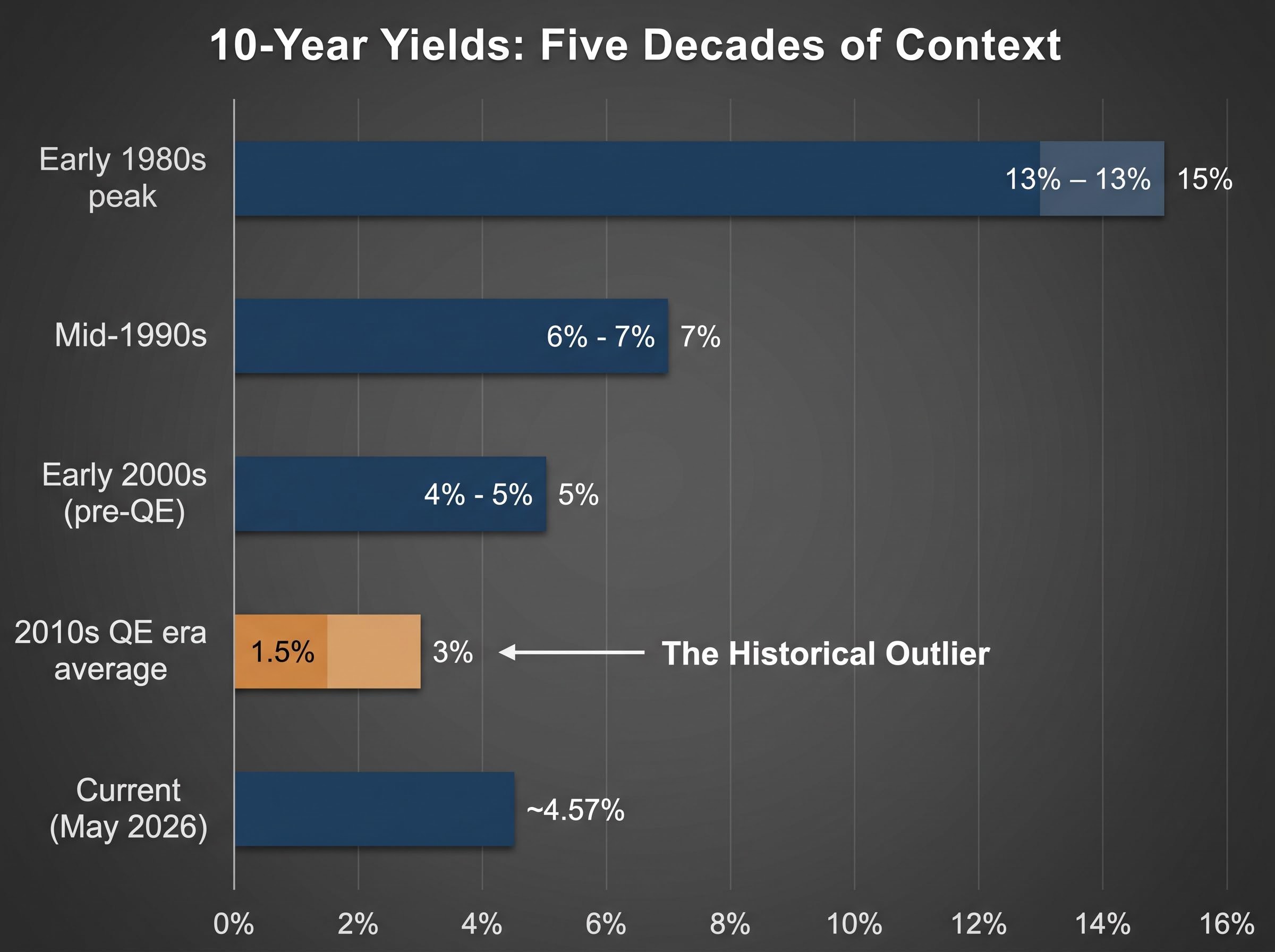
| Period | Approximate 10-Year Yield | Prevailing Conditions |
|---|---|---|
| Early 1980s peak | 13-15% | Volcker-era rate hikes, double-digit inflation |
| Mid-1990s | 6-7% | Post-recession expansion, moderate inflation |
| Early 2000s (pre-QE) | 4-5% | Low-to-moderate inflation, no large-scale asset purchases |
| 2010s QE era average | 1.5-3% | Central bank bond purchases suppressing yields |
| Current (May 2026) | ~4.57% | Post-QE normalisation, moderate inflation |
Reading the long-run yield record
The table reveals one period that does not belong with the others. The 2010s, not the 2020s, are the outlier. Yields between 1.5% and 3% were the product of specific central bank intervention at unprecedented scale. Current levels sit squarely within the range that prevailed for decades before quantitative easing existed, and well below the double-digit readings of the early 1980s. The question is not why yields are this high. The question is why anyone expected them to stay where they were.
When big ASX news breaks, our subscribers know first
How central banks manufactured a decade of artificially cheap money
Quantitative easing, in plain terms, is a programme in which central banks purchase sovereign bonds at scale to push long-term yields below where market pricing would naturally place them. The mechanism is direct: a large, price-insensitive buyer enters the market and bids up bond prices, which mathematically forces yields down.
The Bank of Japan initiated the first major QE programme in 2001. The US Federal Reserve followed in November 2008 in response to the global financial crisis. The European Central Bank and the Bank of England launched their own versions subsequently. The combined effect was a decade in which sovereign yields across developed markets traded at levels that no market-only pricing mechanism would have produced.
The wind-down has been substantial:
The Federal Reserve balance sheet mechanics underlying quantitative tightening confirm that the reduction from the 2022 peak is a deliberate policy reversal, not a market-driven disruption, with the central bank actively allowing maturing securities to roll off rather than being reinvested.
- Federal Reserve: Total assets approximately $6.71 trillion as of mid-May 2026, down from above $8.9 trillion at the 2022 peak
- ECB: Eurosystem assets approximately €6.4-6.5 trillion as of early May 2026, down from above €8.8 trillion in 2022
- Bank of England: Asset Purchase Facility gilt holdings reduced to roughly $500-525 billion equivalent from a peak near $875 billion equivalent
- Bank of Japan: Assets approximately ¥730-740 trillion in early 2026; tapering of bond purchases initiated March 2024
The recency bias mechanism: Investors who entered bond markets after 2008 experienced suppressed yields as the baseline. When that suppression lifts and market-based pricing reasserts itself, yields that are historically normal register as abnormally high. The distortion is in the expectation, not the yield.
As these balance sheets shrink, yields are not rising because something broke. They are rising because the artificial suppression stopped.
Understanding the mechanics of bond yields and why prices move the other way
Bond prices and yields move in opposite directions. This is not a market quirk; it is an arithmetic consequence of how bonds work. The logic follows three steps:
- A bond pays a fixed coupon, set at issuance. A bond issued at 3% pays 3% for its entire life regardless of what happens in the broader market.
- When new bonds begin offering higher yields (say 4.5%), the older 3% bond becomes less attractive by comparison. No rational buyer would pay full price for a 3% coupon when 4.5% is available.
- The older bond’s price falls until its effective yield, accounting for the discount, matches the prevailing market rate. The bondholder has not lost money from the coupon; the market price of their holding has declined.
This mechanical relationship explains the negative price returns generating headlines. The ICE BofA 7-10 Year US Corporate and Government bond index posted a year-to-date price return of -2.6% through 21 May 2026, according to FactSet. Over the same period, the S&P 500 returned 9.3% in price terms, making the bond figure appear particularly poor by contrast.
Why negative returns do not mean the bond market is broken
Price return is only half the picture. Total return includes coupon income, which at current yield levels provides meaningfully more income than during the 2010s. Bond price swings have also remained smaller in magnitude than equity market fluctuations over the same year-to-date period. The March 2026 equity correction produced a larger drawdown than any bond market decline recorded in the same period, meaning bonds continued to serve their stabilisation function within diversified portfolios.
What inflation data says about whether current yields are justified
If current yields are a return to pre-QE norms, the inflation environment should bear some resemblance to the pre-QE period. In the ten years before the Fed’s first QE move in November 2008, US CPI averaged 2.8% year-over-year. Yields near current levels coexisted comfortably with that inflation rate.
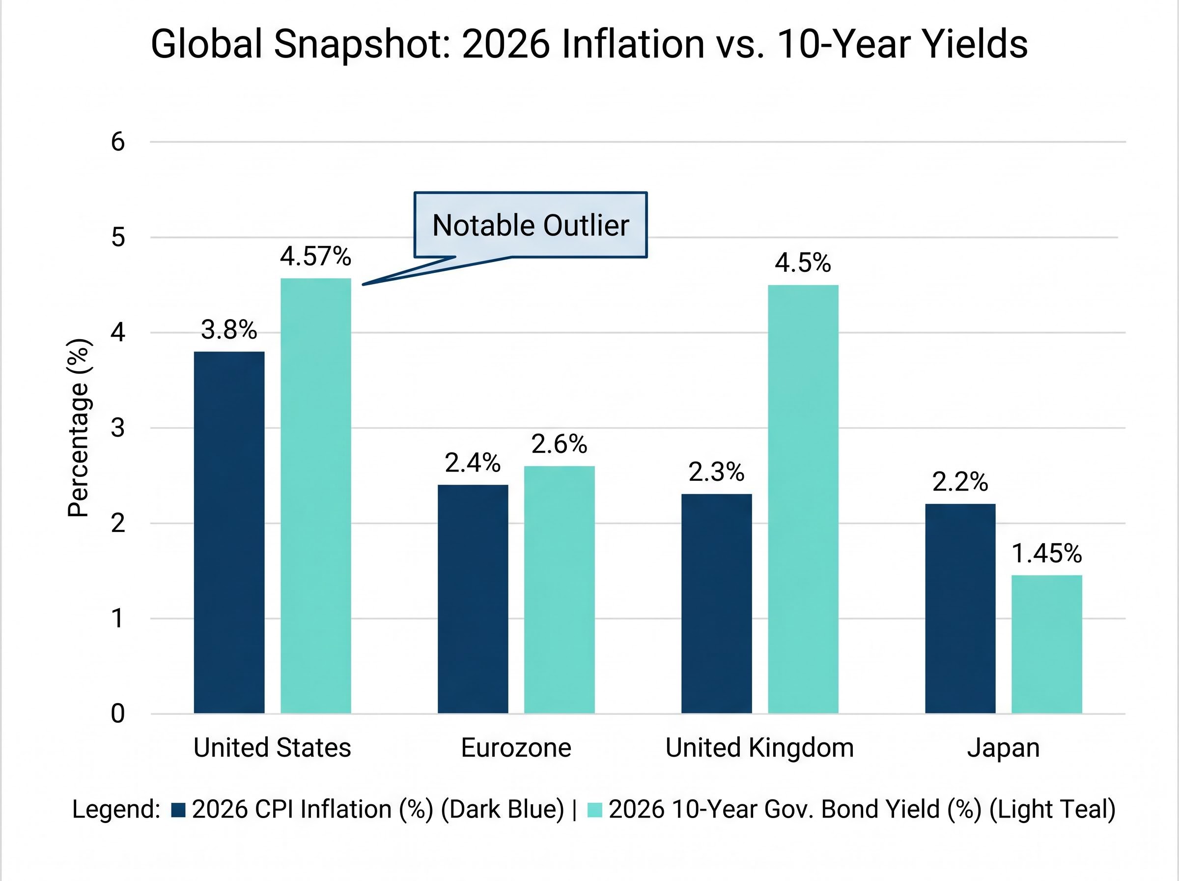
| Economy | Current CPI (2026) | 2027 Forecast | 10-Year Yield (approx.) |
|---|---|---|---|
| United States | 3.8% (April) | ~2.2-2.4% | 4.57% |
| Eurozone | 2.4% (April flash) | ~2.1-2.2% | ~2.5-2.7% |
| United Kingdom | 2.3% (April) | ~2.0% | ~4.4-4.6% |
| Japan | 2.2% (March) | ~1.5-2.0% | ~1.4-1.5% |
The eurozone, UK, and Japan all show inflation readings close to central bank targets, with official forecasts from the IMF and respective central banks projecting convergence toward approximately 2% over 2027. The US remains the notable outlier. At 3.8% year-over-year for April 2026, headline CPI sits meaningfully above the Fed’s 2% target.
This complicates a clean normalisation narrative. The pre-QE comparison holds structurally (yields near 4.5-5% coexisted with 2.8% inflation), but US inflation has not yet returned to that range. The Fed’s Summary of Economic Projections from March 2026 and the IMF’s World Economic Outlook from April 2026 both project convergence toward approximately 2-2.4% over 2027, a forecast that, if validated, would place current yields firmly within historically justified territory.
Energy-driven CPI acceleration explains much of the gap between US inflation and the rest of the developed world: Brent crude rising above $111 per barrel following Strait of Hormuz disruption contributed a 3.8% monthly surge in energy costs to the April 2026 CPI reading, making US inflation an event-driven outlier rather than a structural divergence from the normalisation path.
US CPI has averaged approximately 3.3% since 1914 and approximately 3.5% in the postwar period, according to FactSet data through April 2026. Current yield levels have historically coexisted with higher inflation than markets are now projecting.
Auction demand data: what happens when real money votes on bond market health
If sovereign bond markets were genuinely in crisis, the evidence would show up where capital is actually deployed: at auction. The record tells a different story. Bid-to-cover ratios at recent bond auctions across the US, UK, Germany, Japan, and Italy were at or above their respective decade-long averages as of 21 May 2026, according to Fisher Investments editorial staff citing respective debt management offices.
Four auctions illustrate the pattern:
- US 30-year bond, 9 May 2025: Soft demand, below-average bid-to-cover, and a tail relative to the when-issued yield. This was the episodic exception, reflecting supply sensitivity rather than systemic rejection.
- US 10-year note, 12 November 2025: Above-average bid-to-cover with strong indirect bidder participation, indicating robust demand at elevated yields.
- UK 30-year conventional Gilt, 18 March 2025: High bid-to-cover relative to prior year average, with the UK Debt Management Office reporting strong domestic and overseas demand.
- Japan 10-year JGB, 2 July 2025: Above-average bid-to-cover as investors anticipated gradual Bank of Japan policy normalisation.
When auctions do show stress
The US May 2025 30-year result and a tepid German Bund auction in February 2025 demonstrate that sovereign auctions are sensitive to supply conditions and fiscal signals. Investors occasionally demand more compensation for duration risk, and bid-to-cover ratios soften when issuance is heavy or fiscal concerns are acute. Episodic weakness in specific auctions is a pricing signal, not evidence of structural market impairment.
Where the genuine risks sit and what investors should actually watch
The normalisation argument holds on its own terms: yields are historically appropriate, inflation data broadly supports the range, and auction demand confirms that markets are functioning. None of this means the environment is without risk. The risk, however, is not the one the crisis headlines describe.
The genuine tension is fiscal. Economists including Olivier Blanchard, Kenneth Rogoff, and Mohamed El-Erian have argued that mid-single-digit yields applied to current debt-to-GDP ratios create a structural pressure that did not exist when yields were last at these levels. Howard Marks, co-chairman of Oaktree Capital, framed it directly in a March 2025 client memo: debt levels are materially higher than in the 1990s or 2000s, meaning “moderate” yields carry more fiscal weight than they once did.
The IMF Fiscal Monitor from April 2025 warned of rising interest-to-GDP ratios in advanced economies without consolidation. Fitch and S&P have both noted that higher interest costs are eroding fiscal space and informing sovereign risk profiles. Japan’s 30-year government bond yields reaching all-time highs relative to data back to 1999, according to FactSet through 19 May 2026, offer a case study in how normalised yields interact with structural debt burdens.
Academic research places debt-to-GDP thresholds for meaningful fiscal stress above 140%, not at 100%, and international evidence from the UK and Japan shows that crossing symbolic milestones has not mechanically produced sovereign market crises, a distinction that matters when evaluating how much weight to assign current US fiscal headlines.
Normalised yield levels, abnormal debt loads: this is where informed opinion converges. The yield is not the crisis. The fiscal arithmetic at that yield, applied to larger debt stocks than existed in any prior period of comparable rates, is where the genuine uncertainty resides.
Three variables warrant monitoring:
- Inflation trajectory relative to central bank targets: If US CPI does not converge toward 2-2.5% as projected, yields may need to move higher still
- Primary deficit trends in major economies: Persistent deficits at current yields compound debt-service costs in a way that low-rate deficits did not
- Term premium signals from the yield curve: A rising term premium, distinct from rate expectations, would signal that markets are pricing fiscal sustainability risk rather than just inflation
Duration management presents a practical consideration. Shorter-maturity bonds carry lower sensitivity to further yield movements, but repositioning after yields have already risen risks being caught offside if rates subsequently decline. The timing question is genuinely uncertain, and the honest assessment is that no consensus view currently resolves it.
Bond yields are back where they belong, with caveats worth watching
Current government bond yields represent a return to historically recognisable territory, not a market crisis. The evidence supports this reading across three dimensions: the QE era was the anomaly that distorted baseline expectations, inflation data across major economies supports the current yield range as broadly appropriate, and auction demand confirms that institutional capital is pricing sovereign debt competitively rather than fleeing from it.
The calibrated caveat is fiscal. Mid-single-digit yields applied to debt-to-GDP ratios substantially larger than those of the early 2000s create a more demanding arithmetic than the headline yield alone suggests. This warrants monitoring, not panic.
The framework the reader now holds is straightforward. When the next bond yield headline arrives, the question worth asking is whether the concern it generates is grounded in a 40-year historical view, or in a 10-year recency window shaped by central bank intervention that has now ended.
For readers who want to follow the political and fiscal consequences beyond the portfolio level, our deep-dive into how Treasury yields now drive White House policy examines why Wolfe Research, Apollo, and Mohamed El-Erian have each concluded that bond market pressure has displaced equity selloffs as the primary forcing mechanism on executive decision-making, and what that shift means for interpreting the next yield move.
This article is for informational purposes only and should not be considered financial advice. Investors should conduct their own research and consult with financial professionals before making investment decisions. Past performance does not guarantee future results. Financial projections referenced are subject to market conditions and various risk factors.