
Most investors watching the bond market ask one question: are yields going up or down? According to BCA Research‘s study of S&P 500 returns since 1948, that question tells you surprisingly little about stocks. A different question separates an 11.8% annualised return from a loss of 1.3% a year, and it concerns the level of real yields rather than their direction.
Doug Peta, BCA’s chief U.S. investment strategist, makes the case in a note covered by Investing.com in early October 2026. His argument is that the level of real 10-year Treasury yields compared with the economy’s potential growth rate (about 2%) is the better guide.
The timing matters. The 10-year Treasury Inflation-Protected Securities (TIPS) yield closed at 2.91% on 9 October 2026, and nominal 10-year yields sit near 5.2%. Those are readings that put the framework to an immediate test.
Here is what you need from it: which yield signal deserves your attention, why no single magic rate exists, and which credit indicators would show the risk turning real.
Why does the level of real yields beat the direction?
Start with two definitions. A real yield is the nominal yield on a bond minus expected inflation, which is what TIPS prices capture. Potential growth is the pace the economy can sustain over time without overheating, which BCA estimates at about 2%.
When you hear that real yields have surged, the cause matters: policy-rate expectations, a resilient economy and heavy AI investment can each lift real yields while inflation expectations stay put.
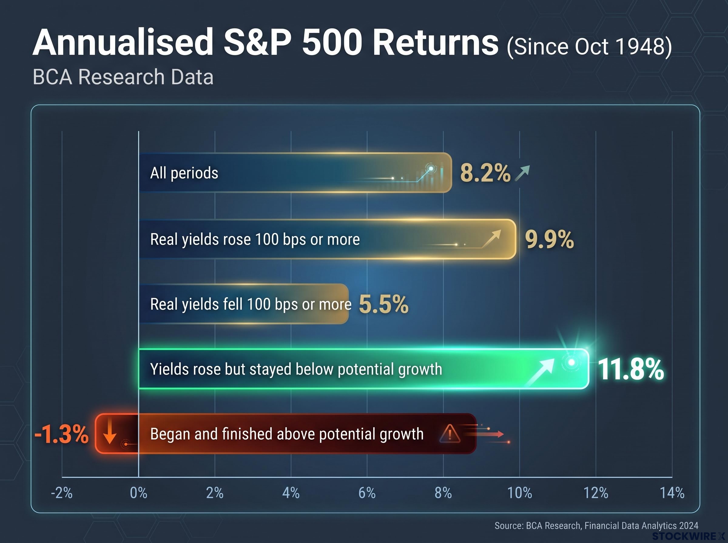
Now test the common belief that rising yields hurt stocks. According to BCA’s data, reported by Roushni Nair at Investing.com (BCA’s own note is not publicly available), the S&P 500 returned 8.2% annualised across all periods since October 1948. When real 10-year yields rose by 100 basis points or more, returns climbed to 9.9%. When they fell by the same amount, returns slipped to 5.5%.
The assumption does not hold up. The rule that replaces it appears when you sort the same history by level instead.
| Condition | Annualised S&P 500 return |
|---|---|
| All periods since October 1948 | 8.2% |
| Real yields rose 100 bps or more | 9.9% |
| Real yields fell 100 bps or more | 5.5% |
| Rose but stayed below potential growth | 11.8% |
| Moved from below to above potential growth | 8.6% (average) |
| Began and finished above potential growth | -1.3% |
The gap that matters Rising real yields that stayed below potential growth delivered 11.8% a year. Real yields that started and ended above it delivered -1.3%.
One-year forward returns tell the same story. Stocks returned 7.9% after rising real yields and 8.6% after falling ones, a near tie. When real yields sat under potential growth, though, returns averaged 9.6%, against 5.9% when they sat above it.
So a “yields jump” headline is not, by itself, a reason to sell. The question worth asking is where real yields sit against roughly 2% growth.
When big ASX news breaks, our subscribers know first
How the mechanics work: discount rates, earnings and the stock-bond collision
The intuitive story runs through the discount rate, the rate used to convert future profits into today’s value. When rates rise, a dollar of earnings ten years out is worth less now, so share prices should fall.
That is only half the picture. Real rates often rise because the economy is strengthening, and a stronger economy tends to bring upward earnings revisions. If profits grow faster than the discount rate bites, your shares can still rise. Which channel wins depends on what is pushing yields higher:
- Growth-driven rises: stronger demand lifts earnings expectations, and equities can absorb the move, especially while real yields remain below potential growth.
- Term-premium or policy-driven rises: fiscal worries, uncertainty or aggressive Federal Reserve tightening push yields up without lifting profits, so valuation multiples compress. The term premium is the extra return investors demand for holding longer-dated bonds.
History bears this out. In 1994, long rates rose sharply but growth held up and equities digested the move. In 2018, stocks held through much of the hiking cycle until late-year growth and policy fears took over, while in 2022 equities fell as yields surged, then recovered in 2023 as inflation eased despite yields staying high.
Starting level matters too. If real yields are already well above potential growth, a decline may not rescue your portfolio, because policy is very tight and credit-sensitive borrowers may already be under strain.
What a stock-bond collision looks like
BCA’s view is that activity and earnings should not suffer much damage from higher real rates unless those rates remain above potential growth for several months. If they do, a sequence can follow: borrowing costs outrun the economy’s capacity, activity slows, credit risk rises, and investors demand a wider equity risk premium (the extra return they expect from stocks over safe bonds). That combination pushes valuations down.
The equity risk premium has already been squeezed to roughly 2.1% by the combined effect of an equity rally and surging real yields, which leaves you less cushion if real yields climb further.
BCA describes this as the most probable route to trouble, not a forecast that it is under way. For you, the takeaway is that why yields rise matters as much as how far, and a brief overshoot is a very different event from a sustained one.
Why is there no single yield threshold that signals trouble?
The disappointing answer first: BCA found no universal rate level that marks danger for equities. There is no line you can draw on a chart and trade.
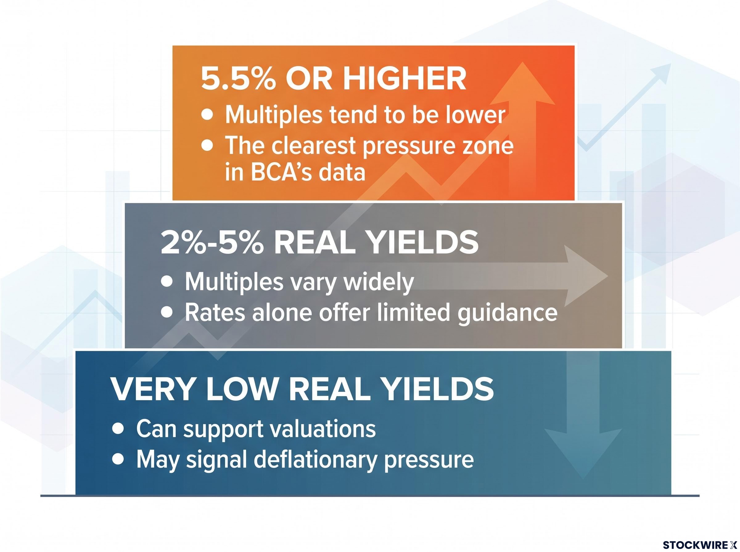
There is one zone where the evidence is clearer. S&P 500 valuation multiples tend to sit lower once real yields hit 5.5% or above, while between 2% and 5% they scatter widely.
| Real yield range | Valuation behaviour | Note |
|---|---|---|
| Very low | Can support valuations | May signal deflationary pressure |
| 2%-5% | Multiples vary widely | Rates alone offer limited guidance |
| 5.5% or higher | Multiples tend to be lower | The clearest pressure zone in BCA’s data |
You might expect investors to dump stocks for bonds once yields look attractive. BCA found otherwise.
No great rotation BCA found no systematic shift from equities to bonds as yields rise. Institutions are bound by mandates and regulation, while households tend to take their cues from how shares have done lately.
Where do today’s numbers sit? The 10-year TIPS yield closed at 2.91% on 9 October, with the nominal 10-year near 5.22%-5.24%. The BCA-based report cited a real yield of 1.59% in August, possibly nearing 2% once September price data arrived.
Those figures are not necessarily the same series. They may reflect a BCA-specific calculation versus the market TIPS quote, different dates, or both, and it is not clear which measure BCA would apply today. Both sit well below the 5.5% zone.
The 2% benchmark is itself an estimate, because potential growth cannot be observed directly. The Congressional Budget Office (CBO) projects 2.2% real GDP growth for 2026, and Vanguard expects 2.3%.
What this means for you: a single yield print cannot be traded mechanically. With market TIPS above 2%, the length of time yields stay there is the thing to watch.
Which credit-sensitive warning signs should you monitor?
If duration is the trigger, you need evidence of damage. BCA points to three areas where strain would show up first:
- Small-cap earnings and credit performance. Smaller firms lean on variable-rate loans, so higher rates hit interest costs quickly.
- Household delinquencies. Stretched consumers reflect tight credit conditions. Readings are elevated but steady.
- Private-equity delinquencies and restructurings. PE-backed firms rely heavily on private-credit facilities and have borrowed aggressively this cycle.
The exposure gap is structural. Large companies often locked in fixed-rate bonds at lower coupons, while smaller and PE-backed firms see higher rates squeeze interest coverage (how comfortably profits cover interest bills), net income and free cash flow.
| Indicator | Latest reading | Status |
|---|---|---|
| Household debt in delinquency (New York Fed) | 4.7% in Q2 2026, from 4.8% in Q1 | Elevated, edging lower |
| Credit card balances 90+ days delinquent | 12.8% in Q1 2026, from 7.6% in Q3 2022 | High, relatively stable since 2024 |
| Small-cap earnings and credit | Not yet reported | Monitor |
| Private-equity defaults and restructurings | Not yet reported | Monitor |
The credit card figure comes from the New York Fed’s Liberty Street Economics research. Treat index-level numbers with care too, since they can hide the gap between long-duration, leveraged firms and defensive, high-dividend sectors.
The read for your portfolio: household data is elevated but not deteriorating. The stronger warning would be these indicators worsening while real yields hold above potential growth.
Household credit stress has been migrating from subprime toward near-prime borrowers as pandemic buffers run down and card APRs sit in the low twenties, which is why delinquency trends matter alongside yields.
Putting the yield signal to work without overreading it
The combination that matters is specific: real yields above potential growth, held for months, alongside rising credit stress. Direction alone has rarely told you much.
The open questions are real. Real yield measures differ, potential growth is an estimate, and valuations may respond in non-linear ways once yields climb.
That leaves two things on your checklist. Track whether market real yields stay above roughly 2% month after month, and whether small-cap credit, household delinquencies or private-equity restructurings start to worsen. If both happen together, BCA’s framework suggests the risk to stocks is becoming concrete.
Past performance does not guarantee future results. Financial projections are subject to market conditions and various risk factors.
This article is for informational purposes only and should not be considered financial advice. Investors should conduct their own research and consult with financial professionals before making investment decisions.
—