The monthly jobs report is not a single surprise that lands at 8:30 on a Friday morning. By the time the Bureau of Labor Statistics (BLS) publishes its Nonfarm Payrolls figure, the market has already spent a week quietly repricing itself around a scattered trail of clues.
That week is where the real action happens. Bond yields drift, the dollar firms or fades, and positioning shifts across dealer desks, all based on a handful of preliminary signals that most retail investors either ignore or badly misread.
Learning how to read NFP forecasts properly means understanding that these early signals are measuring different things, and that the official consensus number is only one layer of what the market actually expects.
Here is the framework for interpreting the leading indicators, the consensus surveys, and the unofficial whisper numbers that shape how your portfolio reacts the moment the data drops.
The NFP report components that move markets most sharply are often not the headline payroll number: average hourly earnings and prior-month revisions routinely reshape the Fed policy narrative within minutes of the 8:30 a.m. ET release, yet most investors absorb only the top-line figure.
The anatomy of leading labour market indicators
On a jobs report week, a trader’s screen fills with numbers that are not the jobs report. Private payroll estimates land on Wednesday. Weekly jobless claims hit Thursday. Purchasing manager surveys scatter across the preceding days. Each one nudges the market before the official figure arrives.
These are the leading indicators, and they exist because the economy moves faster than the government’s monthly survey can capture. The trouble is that each one measures a different slice of the labour market, which is exactly why they trip people up.
Here are the three signals that matter most in the run-up to the BLS release:
- ADP National Employment Report: Produced by the ADP Research Institute in partnership with the Stanford Digital Economy Lab, this tracks private-sector employment using actual payroll transaction data from ADP’s client companies. According to the Richmond Fed’s February 2026 Economic Brief, it is benchmarked annually to the BLS Quarterly Census of Employment and Wages (QCEW), which covers over 95% of US employment. Its limitation: it reflects ADP’s client base, not the whole economy.
- Weekly jobless claims: This measures flows of people filing for unemployment insurance. The catch is that it only captures insured unemployment, missing gross hiring entirely and skipping workers in sectors with low insurance coverage.
- ISM employment sub-indices: Drawn from both manufacturing and services surveys, these gauge hiring sentiment among purchasing managers. They signal direction, not a payroll count, and their link to actual job growth bends with the business cycle.
The core difference between all three and the official BLS report comes down to method. The leading indicators are independent readings of labour conditions. The BLS figure is a survey-based national count with its own statistical adjustments.
This is why the ADP Research Institute explicitly states its report is not designed to forecast the BLS number. That caution is echoed by the Richmond Fed and CME Group, and it matters.
You should treat these early releases as puzzle pieces that reveal the shape of the broader economy, not as cheat codes for predicting the exact government jobs number. A weak claims print and a soft ADP reading tell you something is cooling, but they do not hand you the headline figure.
Understanding what each indicator actually measures is what stops you from making a panicked adjustment based on data that is tracking a completely different segment of the labour market.
When big ASX news breaks, our subscribers know first
The ADP illusion and why long-term correlation tricks investors
Over a decade, ADP and BLS track each other remarkably well. CME Group’s November 2025 analysis puts the numerical correlation at around 94% over the past ten years. Look at a long chart and the two series move together so closely that it is tempting to treat one as a preview of the other.
That is the illusion.
The structural reason the two align over time is that both are anchored to the same QCEW benchmark. But they get there by entirely different routes. ADP counts raw payroll transactions from its client firms. The BLS runs a statistical survey of employers, then applies its own seasonal adjustment and interpolation between benchmark points.
Those differing methods, combined with different sampling universes, are what produce the notorious month-to-month contradictions. And the contradictions are not small.
| Month | ADP Private Print | BLS Private Print | BLS Headline Print |
|---|---|---|---|
| June 2025 | -33,000 | Not reported separately | +147,000 |
| October 2024 | +233,000 | -28,000 | +12,000 |
In June 2025, ADP reported a loss of 33,000 private-sector jobs. Days later, the BLS reported a headline gain of 147,000. An investor who read the ADP print as recessionary and positioned accordingly was caught badly offside when the official data showed solid growth.
The October 2024 gap ran the other way. ADP showed a gain of 233,000 private jobs, while the BLS subsequently reported a private-sector loss of 28,000 and a headline gain of just 12,000. Anyone who extrapolated from the strong ADP figure misjudged the official picture entirely.
CME Group attributes these divergences to differences in coverage, timing, seasonal adjustment, and the distinction between counting jobs versus counting employed persons. The practitioner view is even blunter.
Payroll revisions compound the problem: July 2026 data flipped from a loss of 23,000 jobs to a gain of 21,000 between releases, meaning any position built on first-release figures rests on a draft number that the BLS will subsequently restate.
Reuters coverage of ADP releases through 2025 repeatedly quoted market economists stating that “there is no correlation” between the ADP and BLS employment reports in the short run.
That statement is not a contradiction of the 94% figure. It is a warning about timeframes. The series correlate over years and diverge over months.
Because ADP measures raw payroll transactions while the BLS relies on statistical surveys, you should view ADP as a contemporaneous snapshot of private enterprise health, not a crystal ball for the upcoming government data. It tells you how ADP’s clients are doing this month. It does not tell you what Friday’s headline will be.
This is the single most common retail trading mistake around the jobs report: assuming a strong ADP print guarantees a strong NFP print. More often than most expect, it leads straight to a poorly timed entry.
Official consensus versus market whisper numbers
Public forecasts are easy to find. Reuters, Bloomberg, and the Wall Street Journal all survey economists, compile their point estimates under consistent definitions and deadlines, and publish a single median figure with a range. This is the official consensus, and it is the formal benchmark against which the surprise is measured.
The surprise itself is defined simply: actual NFP minus consensus forecast. That gap drives the headline market reaction and feeds into trading models and post-release analysis.
But there is a second number the public rarely sees. The whisper number is an informal, sentiment-driven estimate that circulates across dealer desks and chat channels rather than through published surveys. It captures what traders actually expect and, crucially, how they are positioned going into the release.
Whisper numbers are more tactical than the official consensus because they fold in the very latest high-frequency data and the market’s own sense of positioning. They are not tied to a formal methodology or a single named compiler, which is both their strength and their weakness.
A documented September case shows how these layers stack up simultaneously ahead of a release:
- Official consensus: approximately +90,000, down sharply from the +162,000 recorded the prior month, establishing a clear slowdown narrative.
- Bloomberg whisper estimate: +84,000, sitting just below the official consensus and signalling that desk sentiment was slightly gloomier than the published survey.
- Leading-indicator composite: ADP private payroll data combined with Revelio Labs employment figures pointed to only about +67,000, the most pessimistic read of the three.
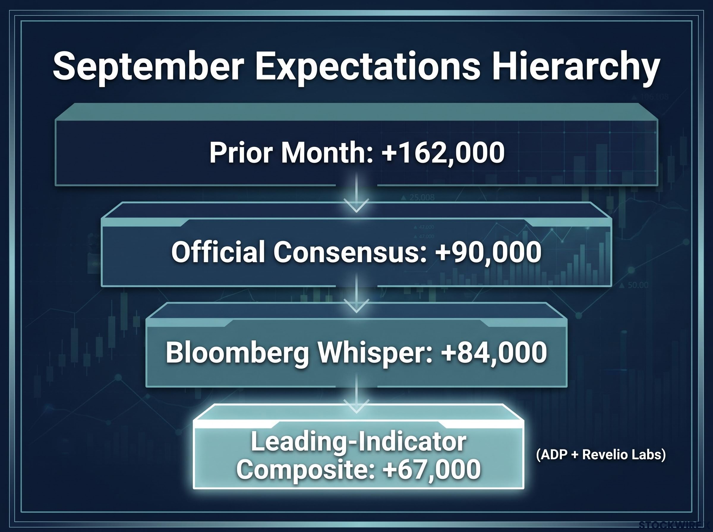
Notice the structure. The official consensus sits on top, the whisper sits below it, and the leading indicators sit lowest of all. Traders navigate all three at once.
Understanding where the whisper sits tells you exactly how offside the market is positioned, which in turn dictates how aggressively your assets might reprice on a surprise. If the whisper is well below consensus, the market has quietly braced for weakness, and even a disappointing headline may not move things much.
This is the professional-tier perspective that explains an outcome that baffles many investors: why an asset can sell off even when the officially published forecast is beaten.
Translating expectation gaps into market reactions
Here is where the theory becomes tradeable. When leading indicators run strong and risk assets rally ahead of the release, the market positions for a good number. If the actual print merely matches consensus but falls short of the whisper, the result feels like a disappointment even when the data looks objectively fine.
That is the “buy the rumour, sell the fact” reaction. In currency and bond markets it shows up as profit-taking and position unwinds the moment the number lands, because traders had already priced in something stronger than the official survey suggested.
Run the September example through this lens. With consensus at +90,000 and the whisper at +84,000, a print landing at, say, +92,000 technically beats the published forecast. Yet it misses the quietly held whisper, and a market positioned for strength starts to unwind. The dollar fades and yields drift lower despite a headline that reads as a beat.
The reverse holds too. When pre-release sentiment is pessimistic and the whisper sits below consensus, a modest upside surprise against both can trigger an outsized relief rally.
If you only watch the official consensus, you will frequently be caught off guard when your portfolio takes a hit on a seemingly positive print that quietly missed the unwritten whisper number. That single blind spot explains a great deal of the confusion around jobs-day moves.
Factoring in the broader Fed narrative
No jobs report lands in a vacuum. The prevailing Federal Reserve narrative acts as either a shock absorber or an accelerator for any NFP surprise.
During that September episode, the broader context was heavily tilted. According to Brown Brothers Harriman analyst Elias Haddad, the dollar’s uptrend remained intact despite a pause in momentum ahead of the release. Fed Funds futures were pricing roughly 75 basis points of additional rate increases over the following twelve months.
Fed rate expectations reprice continuously on data days rather than at FOMC meetings, with CME FedWatch probabilities derived from live 30-day fed funds futures contracts, which is why a single NFP surprise can shift hike odds by ten or more percentage points within a session and produce an immediate dollar move before any official Fed commentary arrives.
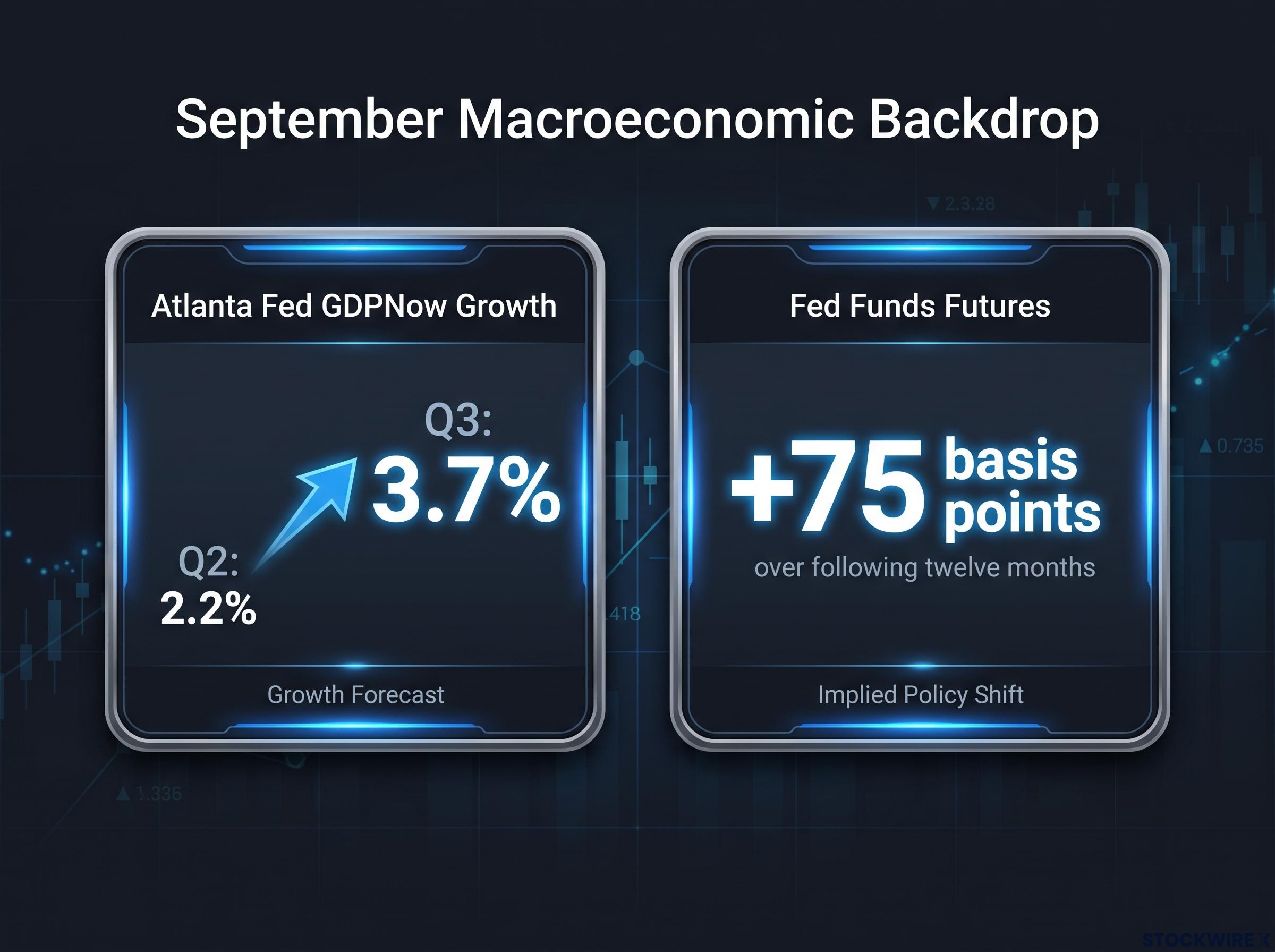
Underpinning all of it was growth. The Atlanta Fed’s GDPNow model projected annualised Q3 growth of 3.7%, up from 2.2% in Q2. With the economy running that hot, a soft employment print had limited power to drag the dollar down, because the wider tightening story stayed firmly in place.
That is the lesson. A weak jobs number inside a strong-growth, hawkish-Fed environment behaves very differently from the same number inside a slowing economy. The macro backdrop sets how far any surprise can travel.
Making informed calls in a noise-heavy release week
The hierarchy is now clear. Leading indicators such as ADP, claims, and ISM show the shape of the labour market but predict no single headline. The official consensus defines the formal surprise. The whisper number reveals where the market is actually positioned.
No single metric is a perfect predictor, and treating any one of them as a crystal ball is how investors get caught. The month-to-month divergences between ADP and BLS prove the point on their own.
What ultimately drives the market reaction is positioning against the whisper, not the raw data in isolation, and the whole thing plays out against the prevailing Fed and growth backdrop.
The practical takeaway for release week is to manage risk around the broader macroeconomic trend rather than betting on a binary data surprise. Read the indicators together, respect the gap between consensus and whisper, and keep the Fed’s direction in view.
For investors wanting a concrete case of how leading indicators, consensus, and the Fed backdrop interacted around a major miss in the opposite direction, our full explainer on reading large NFP surprises covers the May 2026 print that landed at 172,000 against an 85,000 consensus, including how revisions and PCE inflation shaped the policy reaction.
This article is for informational purposes only and should not be considered financial advice. Investors should conduct their own research and consult with financial professionals before making investment decisions. Past performance does not guarantee future results, and market reactions to economic data are subject to numerous risk factors.