The August 2026 jobs report landed 162,000 new payrolls on Friday morning, roughly three times what economists had penciled in. Markets did not celebrate.
Stocks slipped, Treasury yields jumped, and bets on a September Fed rate hike quietly repriced higher. The gap between what the headline announced and what markets actually did is the real story here.
Every month, the Bureau of Labor Statistics releases its Employment Situation report and the same choreography follows: analysts parse the number, retail investors update their view of the economy, and positions shift. The trouble is that non-farm payrolls, the figure at the centre of all this, is a lagging indicator. It measures where the economy has been, not where it is going.
That distinction changes everything about how a strong print should be read. Here is a framework for interpreting this jobs report and every one that follows: what the August data actually confirms, what it cannot tell you, and what the reaction of sophisticated market participants reveals about the right way to use employment data as an investor.
What the August numbers actually showed
The report crossed the wires at 8:30 a.m. ET on 4 September 2026, and the surprise was immediate. Economists surveyed by Reuters, CNBC/Dow Jones, and Bloomberg had clustered their forecasts in a narrow 53,000-56,000 band. The actual figure came in at 162,000.
That is a beat of roughly 108,000 over the midpoint of consensus, or close to three times what the market expected.
For scale, it was the largest monthly gain since March 2026, and it towered over the prior 12-month average monthly gain of just 31,000, according to BLS data. The unemployment rate held steady at 4.1%, with approximately 7.0 million people counted as unemployed, both figures unchanged from the prior month.
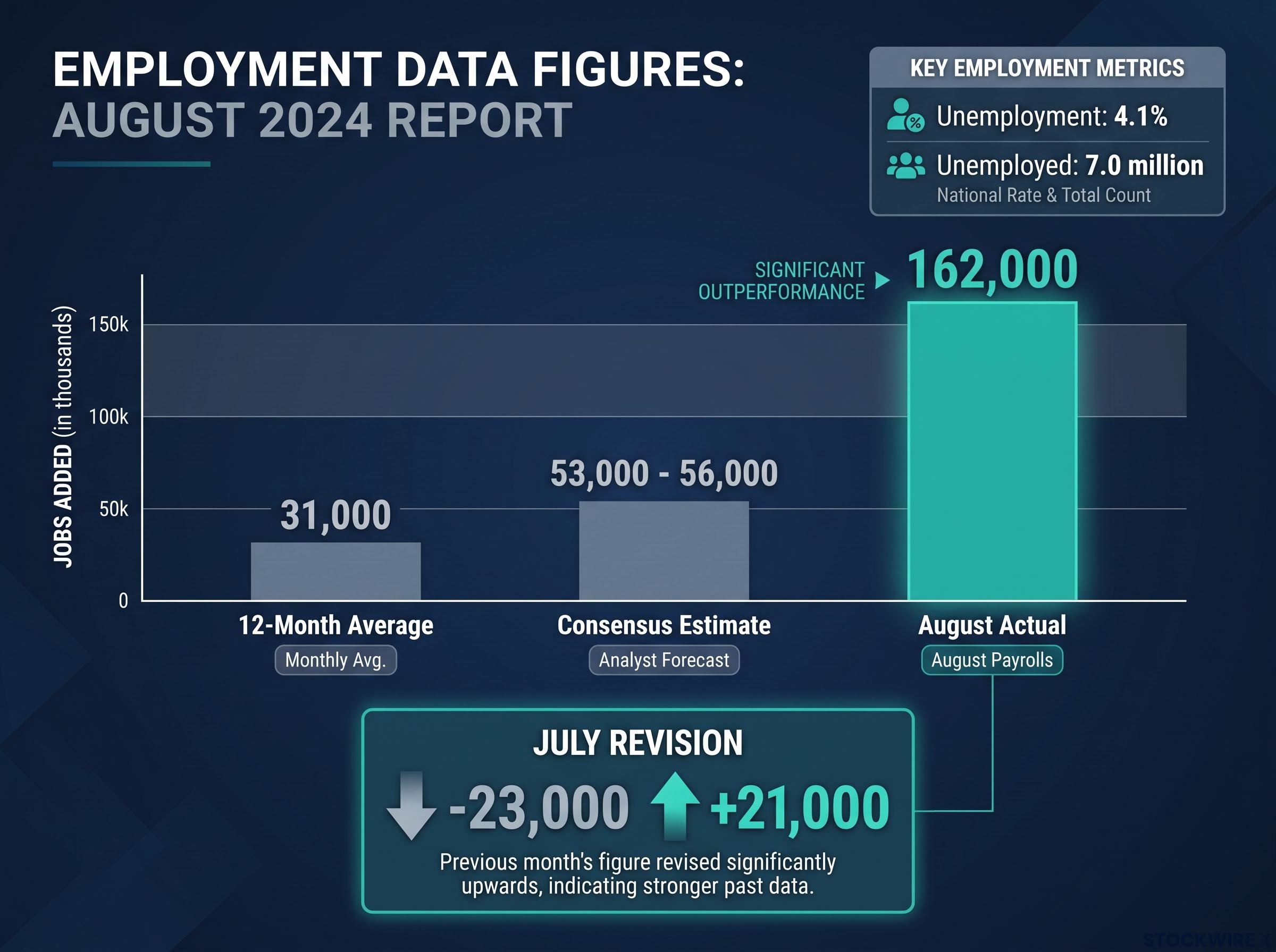
Then came the footnote that deserves more attention than most readers give it. July’s payroll figure, initially reported as a loss of 23,000 jobs, was revised up to a gain of roughly 21,000 (Reuters and Bloomberg). The sign flipped entirely, from negative to positive.
That revision is not housekeeping. A number that swung from -23,000 to +21,000 is a live demonstration that initial payroll prints carry substantial measurement error. If you traded off July’s headline the day it landed, you reacted to a figure that was later shown to be wrong in both direction and size. That alone is reason enough to hold the August headline loosely before layering any conclusion onto it.
| Metric | Consensus Estimate | Actual Result | Prior Month (July) |
|---|---|---|---|
| Non-farm payrolls | +53,000 to +56,000 | +162,000 | +21,000 (revised from -23,000) |
| Unemployment rate | ~4.1% | 4.1% | 4.1% |
| Unemployed persons | N/A | ~7.0 million | ~7.0 million |
Getting the raw data straight matters because most retail misreadings begin with an inaccurate sense of what the report actually said.
The NFP report mechanics that drive the initial spike, algorithmic headline parsing followed by a more durable move once wages, revisions, and unemployment are absorbed, explain why the first-minute reaction on 4 September was not the signal worth trading.
The frame that matters Fisher Investments described the report as “a historical snapshot rather than a leading indicator of where the economy is headed.”
When big ASX news breaks, our subscribers know first
Why payrolls tell you where the economy has been, not where it is going
To understand why a strong print looks backward rather than forward, look at what a business actually does before it hires anyone.
When orders pick up, a company does not immediately post job listings. It asks existing staff to work more hours, raises the intensity of their work, and waits to see whether the extra demand sticks. Only when management is confident the shift is durable does it commit to bringing on new people.
The reason is cost. Hiring and firing both carry significant fixed expenses: advertising, interviewing, onboarding, training, and, on the way down, severance. Because headcount changes are expensive to reverse, firms treat them as a last resort rather than a first response.
That logic runs in both directions. When demand cools, a company will trim hours, reassign tasks, and hold on to experienced workers well before it starts cutting jobs. The payroll number, in other words, moves after the real economy has already turned.
Leading versus lagging indicators behave differently across the business cycle: capital goods orders typically precede payroll growth by several quarters, which is why institutional analysts use both BLS employment data and Census Bureau order data together rather than treating either in isolation.
The adjustment sequence looks like this:
- Demand strengthens: firms first increase hours and work intensity for existing staff.
- Demand persists: once management is confident the change is durable, hiring begins.
- Demand weakens: firms trim hours and reassign tasks first, and only later reduce headcount.
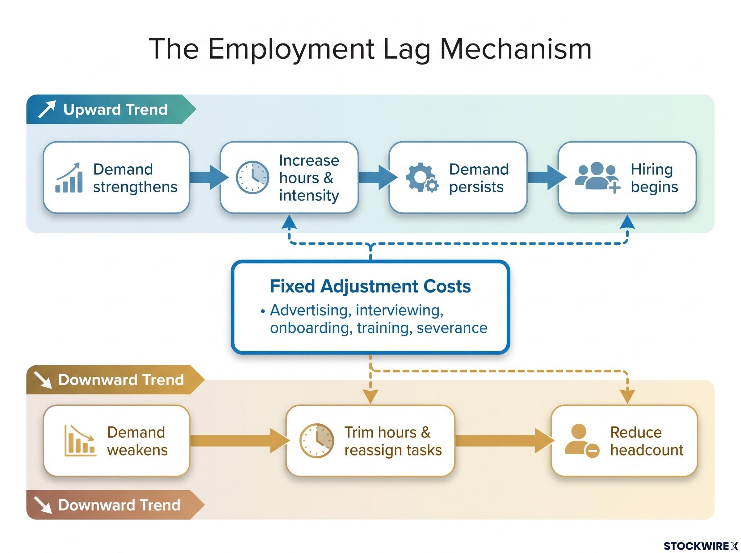
Once you see that firms hire only after they are confident demand changes will last, August’s strong print reads less like a forecast and more like a confirmation of conditions that already existed several months ago. That reframing is the single most useful upgrade you can make to how you read monthly employment data.
What economists and central banks have found
This is not opinion. It is an established property of payroll data.
NBER research by Chauvet and by Stock and Watson finds that payroll employment tends to lag the business cycle, with statistical residuals that are serially correlated, meaning payrolls respond only after output and income have already shifted.
Research built around Okun’s Law reaches the same conclusion through the cost channel: changes in real output lead changes in employment because firms face adjustment costs and delay headcount decisions until they are sure demand shifts are durable.
The Reserve Bank of Australia’s “Box B: Lags from Activity to the Labour Market” traces the mechanism directly, noting that firms raise hours before hiring and cut hours before firing, with mechanical delays like advertising and onboarding adding further lag of weeks to months.
ITR Economics puts it plainly: hiring decisions are “more often than not made retroactively,” once companies have already seen changes in orders, profits, or financial conditions. AMP’s Oliver’s Insights makes the same point, observing that companies persist with existing staffing plans even after demand has cooled.
What the market reaction actually told you on 4 September
The most informative part of the report was not the number. It was what markets did with it.
Stocks slipped, Treasury yields jumped, and the odds of a September rate hike climbed. That sequence, positive jobs data met with a defensive market response, is the professional interpretation made visible, and it deserves to be read as a signal in its own right.
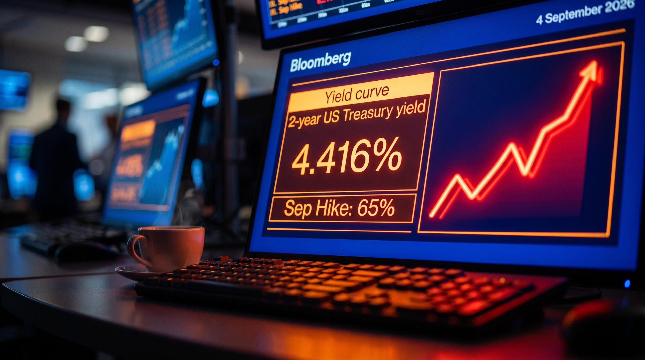
The primary mechanism was policy, not growth. The August beat mattered most as a message to the Federal Reserve. Fed funds futures shifted from pricing roughly a 55% chance of a September rate hike before the report to approximately 65% afterward, according to Reuters data. A hotter labour market gives the Fed cover to keep policy tighter, and the bond market repriced accordingly.
The three-channel reaction played out as follows:
- Treasury yields: the 2-year yield rose approximately 8 basis points to about 4.416%, its highest since January 2025, as traders braced for tighter policy.
- Equity indices: the Dow, S&P 500, and Nasdaq all traded down slightly, with Charles Schwab describing stocks as flat to lower while yields jumped.
- Fed rate-hike probability: the September hike bet moved from roughly 55% to 65%, the clearest forward-looking shift the report produced.
The fact that equities fell on a number three times the consensus estimate tells you that professional investors were reading the report through a policy lens, not a growth lens. They separated “good for the economy” from “good for equity prices,” a distinction retail investors frequently collapse into one.
How the pros read it Market commentary from Benzinga and Nasdaq framed strong payroll prints today as functioning primarily as a Fed signal, shifting rate expectations rather than reliably predicting future equity returns.
The historical pattern retail investors most often miss
Here is the part of the record that unsettles people when they first see it.
Strong jobs data and economic safety are not the same thing. In fact, robust employment often shows up right before the economy rolls over.
Brookings notes that in the 1990, 2001, and 2007-09 recessions, employment continued to grow right up to, or even into, the official start of the downturn. Payrolls kept climbing while the cracks were already forming underneath.
The BLS Monthly Labor Review recounts that by 2006 the labour market looked “healthy overall,” with low unemployment and expanding payrolls, even as vulnerabilities in housing and credit were quietly building toward the 2007-09 recession.
A St. Louis Fed analysis sharpens the point: employment typically increases appreciably in the peak month before a recession begins, and in only two of eight pre-recession periods did payrolls show any decline before the official start. Strong jobs numbers, in other words, are common at the top of the cycle, not evidence against a peak.
That makes the reading uncomfortable but clear. August’s 162,000 is entirely consistent with an economy approaching a peak. It is not proof that a downturn is off the table.
| Recession Period | Employment in Final Expansion Month | What Happened Next |
|---|---|---|
| 1990 | Still growing into the downturn | Recession began despite continued job gains |
| 2001 | Growing up to the recession start | Payroll strength gave way to contraction |
| 2007-09 | Expanding amid building housing and credit stress | Great Recession followed a healthy-looking labour market |
The three mistakes retail investors make after a strong print
The pattern above is only dangerous if you fall into one of three specific traps.
- Recency bias: anchoring to August’s 162,000 while discounting the 12-month average of 31,000 and the volatile revision history, which leads to reactive decisions based on the freshest headline rather than the longer trend. Investopedia describes this as overweighting recent data while underweighting long-run probabilities.
- Revision blindness: the July swing from -23,000 to +21,000 is the concrete case here, where markets reacted to a figure later shown to be wrong in both sign and magnitude, meaning any position built on the first print rested on a draft.
- Indicator confusion: treating a lagging indicator as a leading one, specifically using strong payrolls to wave away warnings from genuine leading indicators like new orders or credit spreads, which the CFA Institute flags as a common late-cycle error.
There is also a statistical wrinkle worth noting. Benzinga has estimated (a figure that remains unverified) that the 90% confidence range around monthly job growth can exceed plus or minus 130,000, which means the “beat” itself is far less precise than the clean headline suggests.
What August 2026 changes, and what it does not
Strip away the noise and one thing the report definitively updated stands out from everything it did not.
The report legitimately moved the probability distribution around the September Fed meeting. Rate-hike odds shifted from roughly 55% to 65%, and that policy channel is the most immediate and reliable signal the data produced.
What it did not update is the direction of the economy over the coming quarters. Payrolls are backward-looking by design, so a strong print cannot tell you whether underlying demand is accelerating or whether August reflected temporary or seasonal factors. Brookings’ observation applies directly: employment often grows right up to recession onset, so present strength does not rule out near-term deterioration.
Contradictory US economic signals in 2026, gold near record highs while copper prices reflect intact industrial demand and GDPNow has shed two percentage points in three weeks, illustrate exactly the kind of broader dashboard that payrolls alone cannot resolve.
The distinction matters for how you position around every future release. The reliable read is the policy read. The growth read requires a broader dashboard.
| What August 2026 confirms | What August 2026 cannot confirm |
|---|---|
| Labour market was firm in the recent past | Where the economy heads over coming quarters |
| A higher near-term Fed hike probability | Whether the apparent momentum is durable |
| Policy expectations have repriced hawkishly | A bullish outlook for equity prices |
Set against the 12-month average of 31,000, one exceptional month does not make a trend. Treating August as more than a single noisy input into a larger picture is a category error.
The closing anchor As Fisher Investments framed it, the August report is “a historical snapshot rather than a leading indicator of where the economy is headed.”
This article is for informational purposes only and should not be considered financial advice. Investors should conduct their own research and consult with financial professionals before making investment decisions. Past performance does not guarantee future results, and any references to historical patterns are illustrative rather than predictive.
Reading the next jobs report without making the same mistake
The August beat was real, its relevance is mostly about the timing of Fed policy, and its limits as a forward signal are structural rather than circumstantial. That is the whole argument in one line, and it is a framework you can reuse every month.
The mental model to carry forward is simple. Monthly payrolls belong firmly in the lagging-indicator column. When you are trying to read where the cycle is going, the leading-indicator column should carry more weight.
Watch these instead of, or at least alongside, the payroll headline:
- New orders (ISM Manufacturing and Services): measure demand entering the pipeline, which shifts before firms adjust staffing.
- Credit spreads: widen when lenders sense stress, often well ahead of the labour market.
- Corporate earnings guidance revisions: signal how management sees demand, which precedes hiring decisions.
- Initial jobless claims: move earlier than payrolls and offer a higher-frequency read on labour conditions.
The next data point that matters more than the next payroll print is the September Fed decision itself. Watching how the central bank interprets the August data will tell you more than the number already has. That is the shift from processing one report to holding a repeatable way of reading all of them.
For readers wanting to understand why the rate-hike repricing matters more than the jobs number itself, our full explainer on Fed policy transmission lags covers how Milton Friedman’s long and variable lags mean tighter policy takes well over a year to reach the real economy, sharpening the case for watching the central bank rather than the payroll print.