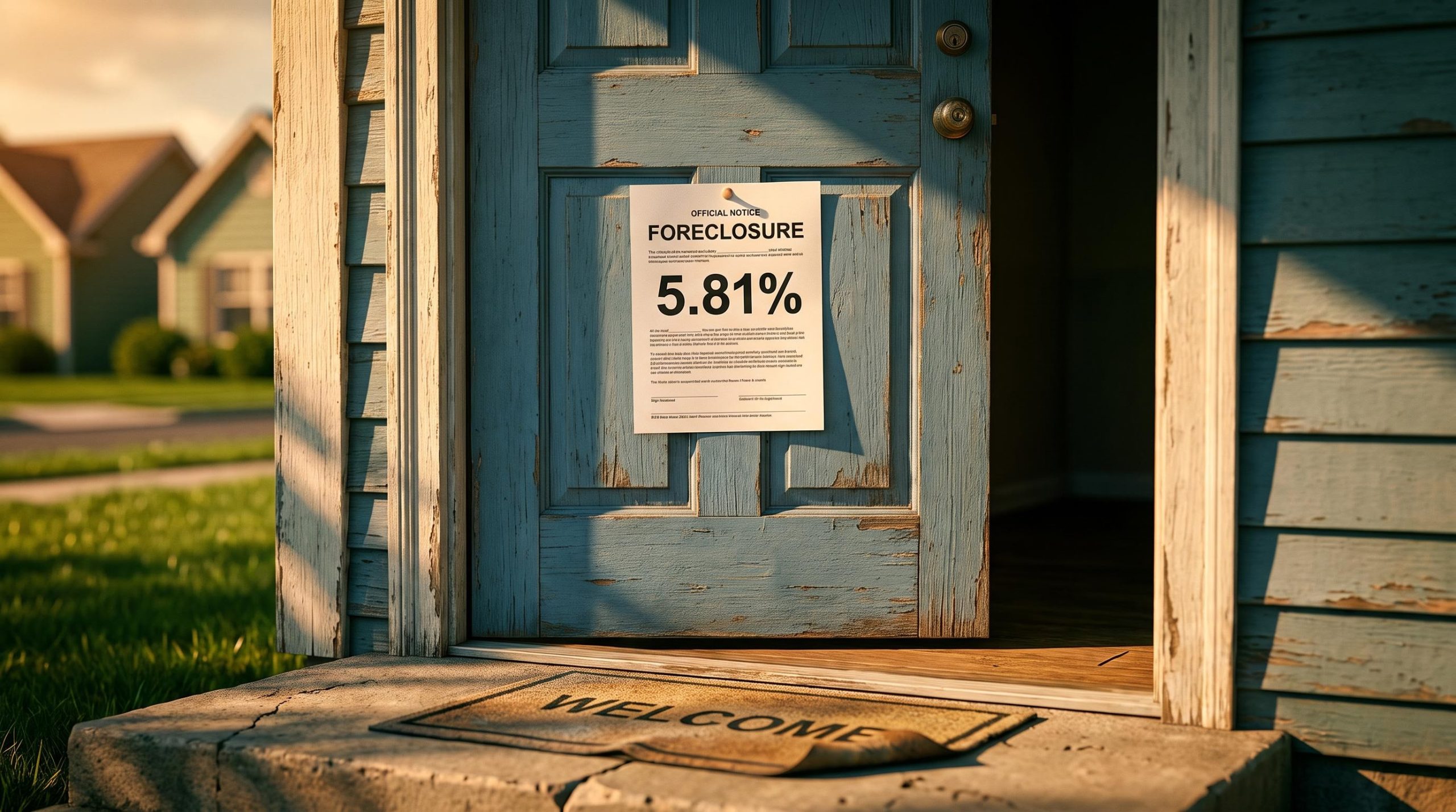
You feel it in your monthly payments, not in a market you have ever watched. The 10-year Treasury yield sits at roughly 4.74%, and in the same week, the average 30-year fixed mortgage rate crossed 7.03%.
Those two numbers are not a coincidence. They are the same story told twice, and the second one lands on your bank statement.
Since the onset of the Russia-Ukraine conflict, the U.S. Treasury bond market has been grinding through one of the most sustained declines of any major asset class in recent memory. This is not a passing dislocation. It is a multi-year shift, and it sets the floor for nearly every rate you pay.
Here is what the Treasury sell-off actually costs you, tracing the line from a market you have likely never traded to your mortgage statement, your credit card APR, and the government’s own borrowing bill. And here is why it is not over yet.
Why bond prices and interest rates move in opposite directions
The higher rate on your mortgage quote did not come from your bank alone. It came from a decision made by bond investors you will never meet, and understanding that link is the single conceptual key to everything that follows.
Bonds pay a fixed dollar amount. Picture a bond with a $1,000 face value that pays $40 a year. At that price, its yield is 4%.
Now suppose investors sell that bond and its price falls to $800. The payment has not changed; it is still $40. But $40 on an $800 purchase is a 5% yield. The price fell, the yield rose, and nothing about the bond itself changed.
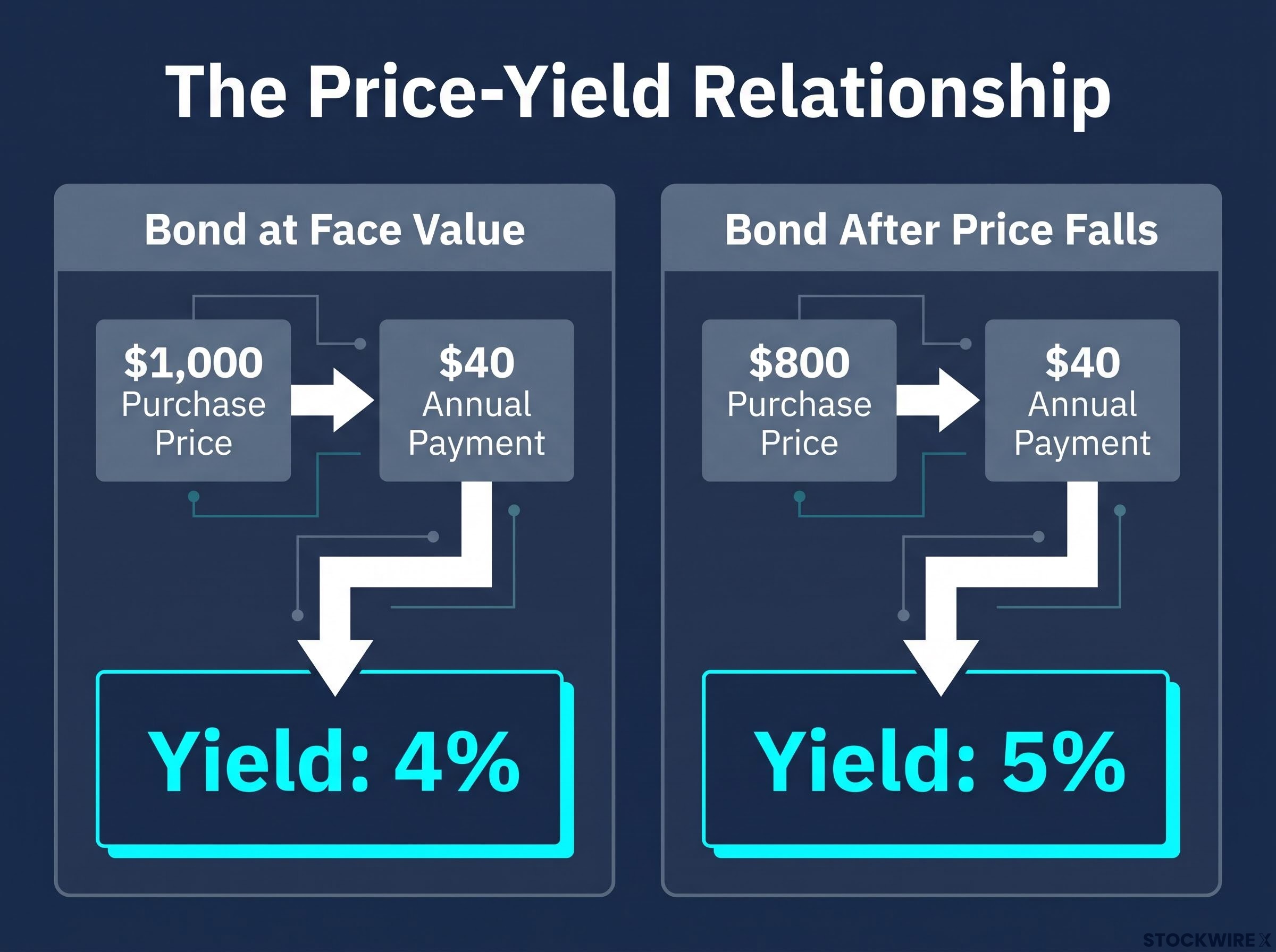
That is the inverse relationship, and it runs in one direction with total reliability. When investors sell Treasuries, prices drop and yields climb.
The inverse relationship between bond prices and yields is purely mathematical, rooted in bond yield mechanics that apply equally to a $1,000 Treasury note and a $40 trillion sovereign debt market: because the coupon payment is fixed, a falling price automatically produces a rising yield.
Those rising yields do not stay inside the bond market. Because U.S. Treasuries are treated as the risk-free benchmark, the safest place to park money, every other borrowing rate in the economy is priced above them. When the benchmark moves up, so does the cost of every mortgage, auto loan, and credit card.
This is not a technicality. Every time bond investors decide to sell Treasuries, they are effectively raising the cost of borrowing across America, and you are on the receiving end of that decision.
| Scenario | Bond price | Annual payment | Yield |
|---|---|---|---|
| Bond at face value | $1,000 | $40 | 4% |
| Bond after price falls | $800 | $40 | 5% |
What today’s yield levels tell you
Apply that rule to the live numbers. The 10-year Treasury yield at roughly 4.74% is the benchmark; the 7.03% mortgage rate for the week ending 24 September 2026 is what sits on top of it. The gap between them shows that Treasury yields anchor consumer rates without directly equalling them.
Both figures are multi-year highs. A year earlier, in mid-September 2025, the 30-year fixed rate averaged between 6.26% and 6.30%, according to Freddie Mac’s Primary Mortgage Market Survey. That is the pace of the shift: roughly three-quarters of a percentage point in twelve months.
Freddie Mac’s Primary Mortgage Market Survey is the standard benchmark for tracking weekly 30-year fixed mortgage rates, and its historical data makes the year-over-year shift from 6.26% to 7.03% easy to verify against official weekly readings.
When big ASX news breaks, our subscribers know first
The ETF evidence: how long-duration bonds have been punished
If the price-yield rule is the theory, exchange-traded funds are the scoreboard. Two funds track the sell-off more closely watched than any others.
The iShares 20+ Year Treasury Bond ETF (TLT) holds the longest-dated government debt, and the iShares 7-10 Year Treasury Bond ETF (IEF) covers the intermediate part of the curve. Both are the standard proxies retail investors use to gauge long-duration Treasury performance.
TLT’s return depends on who you ask. Yahoo Finance reported a year-to-date return of +6.19% as of 25 September 2026, while ETFCentral reported it down -3.39% as of 22 September 2026. That discrepancy is not an error: it reflects different cut-off dates, recent large price swings, and different treatment of dividend distributions across data vendors.
IEF tells a cleaner story. ETFCentral reported it down -2.64% year-to-date as of 22 September 2026. Earlier in the bear market, commentary from Tim Knight at tastylive had it down roughly 6%, with a firm resistance ceiling at $91.78, a level acting as a lid rather than a floor.
The return numbers matter, but the flow number matters more.
IEF year-to-date net outflows: -$778 million (ETFCentral, 22 September 2026)
That figure is behavioural evidence. Investors are not simply sitting on losses in these funds; they are pulling capital out. When money leaves Treasury ETFs at that scale, it is a vote of no confidence in a near-term recovery, and that vote feeds straight back into the yields that set your borrowing costs.
The damage extends beyond pure bond funds. The iShares U.S. Real Estate ETF (IYR) fell roughly 10%, from about $107 to around $96, from late July onward, a rate-sensitive equity sector reacting to the same yield pressure.
| Fund | YTD return | YTD net flows | Key observation |
|---|---|---|---|
| TLT (20+ yr) | +6.19% / -3.39% | Not reported | Source discrepancy on return |
| IEF (7-10 yr) | -2.64% | -$778 million | Resistance ceiling at $91.78 |
If you hold bond funds inside a 401(k) or brokerage account, you are directly exposed to these dynamics, and the flow data tells you where institutional money thinks the trend is heading.
What is driving the sell-off, and why it has lasted this long
Three forces are pushing Treasury prices down, and they are not running in parallel. They are locked together, each one reinforcing the others, which is why this bear market has outlasted every recovery attempt thrown at it.
- Higher-for-longer Fed policy: The Federal Reserve is expected to keep policy rates elevated while inflation stays above target, which puts a floor under yields across the entire curve.
- Geopolitical and energy shocks: Renewed U.S.-Iran hostilities lifted oil prices and inflation expectations, the proximate trigger MPA Magazine linked to a “global bond sell-off” and the recent move above 7% on mortgages.
- Fiscal imbalance: With gross national debt above $40 trillion and Treasury supply rising to fund record interest costs, the bond market faces a demand problem as much as a rate problem.
Treasury demand dynamics have shifted structurally beneath the headline yield figures: foreign reserve managers have plateaued at roughly 33% of outstanding debt, with more central banks now planning to reduce dollar allocations over the next decade than to increase them, leaving domestic commercial banks as the primary marginal buyer at record holding levels.
The 10-year yield at roughly 4.74% is the visible output of all three at once. There is no single catalyst the market is waiting to resolve. The trend will hold until at least two of these three drivers shift meaningfully, and none of them look close to shifting right now.
The debt-service spiral and what it signals to bond investors
The fiscal driver deserves closer numbers, because it feeds itself. Rising yields increase the cost of refinancing existing Treasury debt, which widens the deficit, which forces more Treasury issuance, which pushes yields higher still.
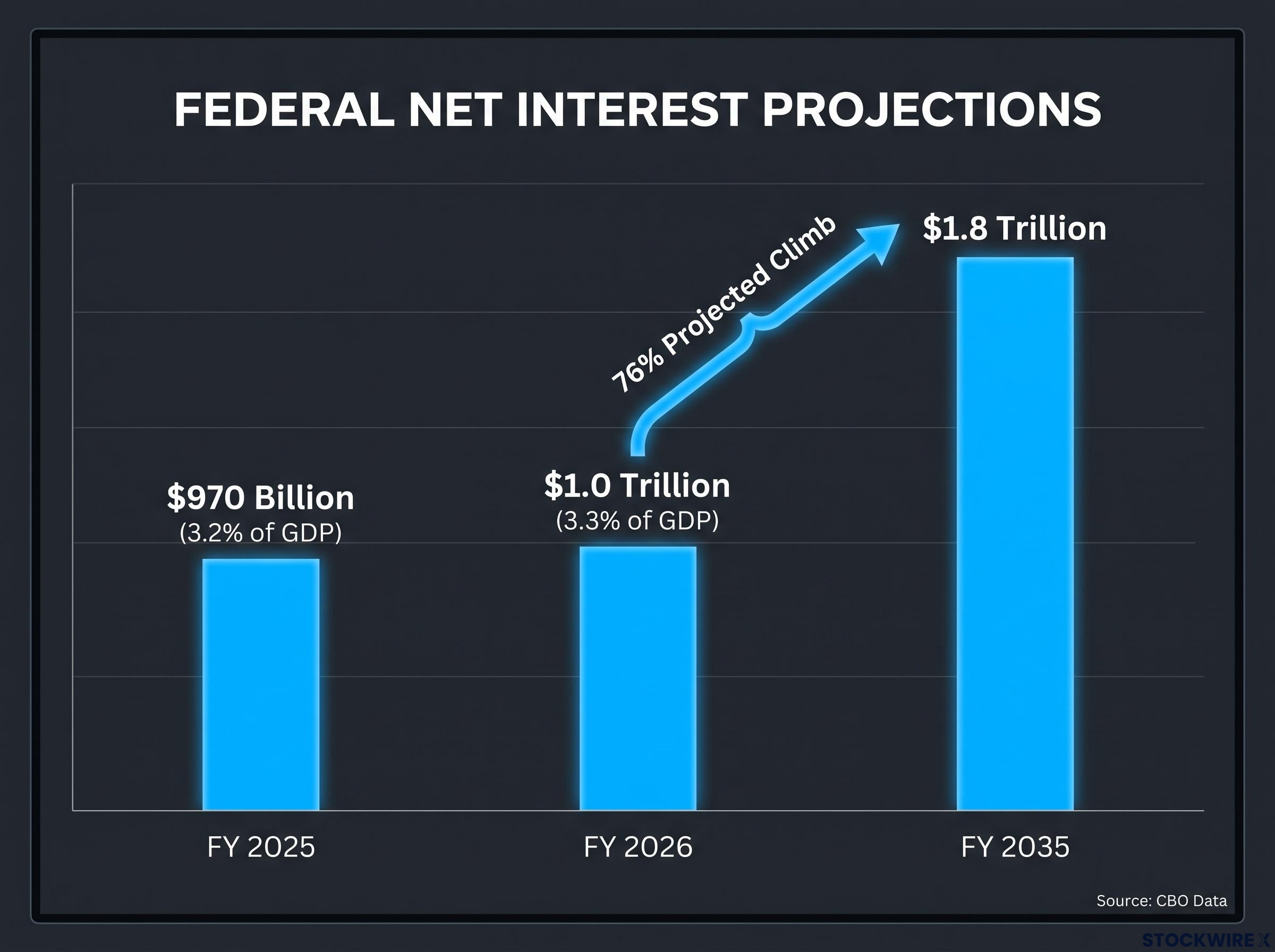
The figures show why bond investors are demanding a larger term premium, the extra yield they require to hold long-dated debt. Net interest hit $970 billion in FY 2025, equal to 3.2% of GDP, according to the Peter G. Peterson Foundation citing CBO data. That matched the prior record share last seen in 1991.
The debt sustainability arithmetic compounds the pressure: as maturing low-coupon Treasuries roll over at current yields, the weighted average interest rate on all outstanding debt rises even if the Fed holds its policy rate steady, meaning the fiscal drag is locked in across rollover cycles regardless of near-term monetary decisions.
The Congressional Budget Office projects interest payments will climb 76%, from $1.0 trillion in FY 2026 to $1.8 trillion by FY 2035. At 3.3% of GDP projected for FY 2026, this is structural pressure, not a cyclical blip that fades with the next downturn.
The CBO’s Budget and Economic Outlook projections establish the official baseline for federal interest cost forecasts through 2035, and the 76% rise in net interest payments they document is the clearest quantitative case for why the Treasury supply problem is structural rather than cyclical.
What this means for your mortgage, your credit cards, and your rent
Here is where the bond market stops being an abstraction and starts showing up in your budget. Each borrower category faces a specific cost, and you can find yourself in the numbers.
The mortgage market is the clearest transmission channel. At 7.03% for the week ending 24 September 2026, up from 6.26% to 6.30% a year earlier, this is the first sustained move above 7% since early 2025, confirmed by Fox Business. Realtor.com described the move as a “blow to homebuyers.”
For a household buying at the median U.S. home price, that jump from 6.3% to 7.03% is not a chart movement. It adds hundreds of dollars a month to the same loan, and that money flows straight to bondholders rather than into your own equity.
| Week | 30-yr fixed rate | Change |
|---|---|---|
| Mid-September 2025 | 6.26% – 6.30% | Year-ago baseline |
| 10 September 2026 | 6.76% | Rising |
| 17 September 2026 | 6.95% | +0.19 pts w/w |
| 24 September 2026 | 7.03% | +0.08 pts w/w, +0.73 pts y/y |
Three groups are absorbing the impact most directly:
- New mortgage borrowers: They face the full 7.03% rate, pushing many out of the market or into lower price tiers.
- Existing homeowners considering refinancing: Those who locked in at 3-4% cannot credibly refinance into cheaper debt, leaving them frozen in place.
- Variable-rate consumer credit holders: Credit card APRs and auto loan rates track the same Treasury dynamics, raising the share of household income eaten by interest.
The rate environment has “effectively closed the refinance window for most borrowers.” (MPA Magazine)
That lockout creates a two-tier housing market. Existing holders stay put to keep their cheap loans, which suppresses supply and props up prices for everyone else. Whether you own, rent, or are saving for a first purchase, the Treasury sell-off has already reshaped your options.
Rate-sensitive sectors and the broader market ripple
The bond market’s decline does not stay in the bond market. It radiates into equities in a pattern that tells you exactly which sectors carry the most rate risk, giving you a lens for reading the stock market through Treasury yields.
Two sectors are structurally exposed. Real estate is financed with debt, so higher rates directly compress property values and transaction volume. Utilities pay steady, dividend-like cash flows, and those flows are constantly measured against the risk-free Treasury rate, so when yields rise, utility shares look relatively less attractive.
The evidence is concrete. According to Tim Knight at tastylive, IYR fell roughly 10%, from about $107 to $96, beginning 28 July. The Utilities Select Sector SPDR (XLU) fell around -0.67% in a single session, and its most recent recovery attempt on 8 September failed to hold.
- IYR: iShares U.S. Real Estate ETF. Rate-sensitive because property deals depend on financing. Down roughly 10% since late July.
- XLU: Utilities Select Sector SPDR. Rate-sensitive because dividend-like yields compete with Treasuries. Failed its 8 September recovery push.
Both are downstream consequences of the same yield dynamics documented in the ETF data. They are not separate stories.
Equity rotation under rising yields follows a documented two-phase pattern: rate-sensitive sectors including real estate and utilities absorb the first wave of selling, then capital shifts into consumer staples and healthcare at the expense of technology and industrials, with each phase running on a lag of roughly four to six weeks as institutional positioning adjusts.
What rate-sensitive equity losses tell a portfolio holder
If your portfolio holds real estate investment trusts, utility stocks, or funds weighted toward these sectors, the red you see is not random market noise. You can trace it directly to Treasury yields.
That distinction matters for how you respond. Relief in these sectors is contingent on yields stabilising or reversing, not on company-specific fundamentals. Many equity-only investors do not realise they carry meaningful rate risk through sector exposure, and this is where it hides.
Where the bond market goes from here, and what to watch
The three structural drivers give you three variables to monitor. You do not need to trade bonds or predict Fed meetings; you need an early-warning framework for when the pressure might ease.
- Fed policy signals: Any pivot language around inflation would loosen the floor under yields and, in time, borrowing costs.
- Geopolitical and energy developments: A de-escalation that lowers oil prices and inflation expectations would remove the most recent trigger for the sell-off.
- Fiscal trajectory: CBO or Treasury announcements on issuance and deficits will tell you whether the supply pressure is intensifying or easing.
The trend has survived multiple counter-trend recoveries, including a June bounce that produced only a lower high. That pattern is why sustained relief depends on at least two of these three drivers shifting together.
The conflicting TLT return data, +6.19% from Yahoo Finance against -3.39% from ETFCentral, is a useful reminder. Short-term price moves inside a structural trend can mislead. The IEF outflows of -$778 million and the directional context matter far more than any single day’s number.
The CBO projects federal net interest costs will rise 76%, from $1.0 trillion in FY 2026 to $1.8 trillion by FY 2035.
That projection is the structural ceiling on any bond market relief. As long as the fiscal trajectory points that way, the demand problem for Treasuries does not simply resolve itself.
What the Treasury sell-off means for you, and what you can do with that knowledge
You now sit somewhere specific in this landscape. The rate on your mortgage, the yield your savings account earns, and the fixed-income sleeve of your 401(k) are all wired to the same market this piece has traced.
Two practical applications follow from that. First, the three-variable watchlist gives you a monitoring tool that flags when conditions might turn, without requiring you to time the market. Second, when the structural direction of rates remains upward, duration exposure in your bond funds is worth reviewing, because longer-dated holdings feel yield moves most sharply.
Some analytical habits worth keeping:
- Track the 10-year Treasury yield weekly as your single best barometer of the rate environment.
- Watch the Fed’s language on inflation at each meeting for any shift in the higher-for-longer stance.
- Review the duration exposure in bond funds held in your retirement accounts.
Honesty matters here. This bear market has run since the start of the Russia-Ukraine conflict, has outlasted repeated recovery attempts, and has surprised most professional forecasters on both duration and depth. The 7.03% mortgage rate and the $970 billion in FY 2025 federal interest costs are twin bookends: what the sell-off costs you and what it costs the government at the same moment.
The most useful thing to carry away is not a prediction but a map. You understand the mechanism now, so you can read the next headline with context rather than reacting to it blind.
This article is for informational purposes only and should not be considered financial advice. Investors should conduct their own research and consult with financial professionals before making investment decisions. Past performance does not guarantee future results. Financial projections are subject to market conditions and various risk factors, and forward-looking statements are speculative and subject to change based on market developments.