Most income investors put real effort into picking the right securities and almost none into the structural decisions made before a single stock enters the portfolio. Currency hedging policy, the split between domestic and international allocation, and sector-level options strategy each sit upstream of security selection, yet they rarely surface in fund marketing or standard due diligence.
That omission is expensive. Income fund performance data from 2024 through 2026 shows these construction variables can move multi-year returns by several percentage points on their own. The gap between the currency-hedged and unhedged share classes of the same U.S. equity income index reached nearly six percentage points in a single calendar year. Global utility funds and their domestic counterparts swapped leadership positions between 2024 and 2025. Healthcare covered-call overlays produced headline yields above 13% while capping equity upside and only modestly softening drawdowns.
These are not edge cases. They are the normal operating range of construction-level income fund portfolio decisions, and they deserve systematic evaluation. This piece gives you a framework for identifying which structural variables matter most, what the recent data reveals about each, and where the hidden trade-offs sit.
The currency hedging decision and its measurable cost
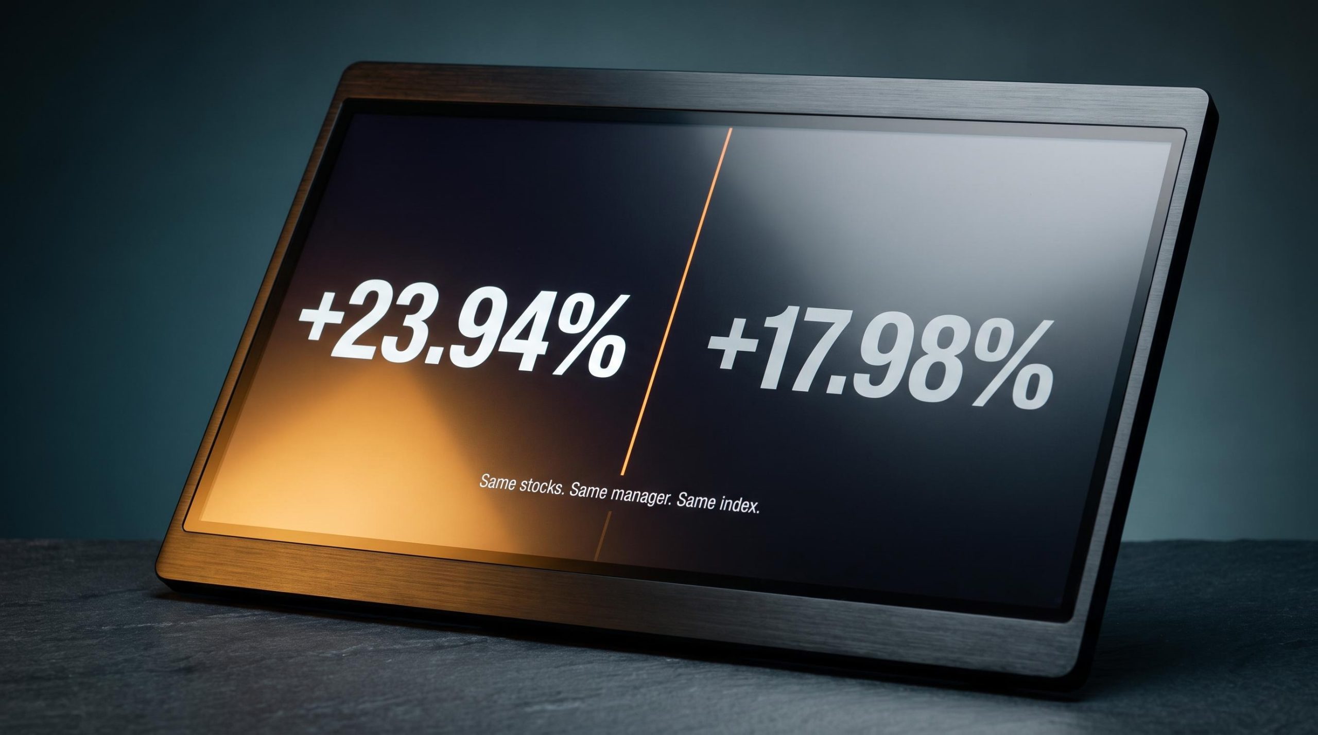
Start with a single number. In calendar-year 2025, the WisdomTree US Equity Income UCITS ETF Acc, the USD-denominated unhedged share class, returned approximately +23.94%. Its EUR-hedged sibling, tracking the identical underlying U.S. high-dividend index, returned approximately +17.98%.
Same stocks. Same weightings. Same manager. A gap of roughly 5.96 percentage points, produced entirely by the currency hedge and share-class mechanics rather than any difference in what the fund actually held.
The performance gap between hedged versus unhedged ETFs is not a quirk of 2025 data; HNDQ returned 40.2% against NDQ’s 27.2% over the year to May 2026, a 13-percentage-point spread produced entirely by AUD/USD movement, not by any difference in the funds’ underlying holdings.
| Fund share class | Currency | Hedge status | 2025 return |
|---|---|---|---|
| WisdomTree US Equity Income UCITS ETF Acc | USD | Unhedged | +23.94% |
| WisdomTree US Equity Income UCITS ETF Hedged Acc | EUR | Hedged | +17.98% |
What this tells you is direct: the structural choice made before you own a single dividend payer can outweigh the contribution of stock selection in any given year. It also tells you the gap is not a permanent verdict. It is the outcome of currency direction over one specific window, and it can invert when those trends reverse.
When hedging helps and when it becomes a drag
Three factors determine whether a hedge works for you or against you. The first is carry, the return difference between holding your home currency and the foreign one, driven by interest-rate differentials. Hedging tends to reward you when your home currency is strengthening and positive carry exists. It becomes a direct cost when carry turns negative.
The second is the direction and volatility of the currency pair itself. The third is your horizon. Rolling a hedge forward incurs spread costs and roll costs that compound quietly over multi-year holding periods, which is why these headwinds matter far more to a long-term income investor than to someone using a hedge for short-term cash-flow stability.
Vanguard analysis frames the asset-class distinction cleanly: hedging is generally preferable for fixed income and less so for equities, because currency risk makes up a smaller share of total risk in a higher-volatility equity portfolio.
A practical anchor point State Street Global Advisors 2025 guidance recommends a 40-60% hedge ratio for USD-based equity investors, while noting that 0-20% may be sufficient where negative carry outweighs the benefit.
The point for you is not that hedging is good or bad. A Bank for International Settlements bulletin recorded global equity funds pushing their hedge ratios sharply toward full hedge in April 2025 before partly retracing, evidence that even large institutions treat this as a moving decision. A long-term income investor in a low-yielding home currency, holding a high-yielding foreign equity income fund, faces a fundamentally different hedging calculation than someone chasing near-term stability.
When big ASX news breaks, our subscribers know first
Geographic allocation in utility income: why the same sector can produce different results
The tidy story would be that global diversification in utilities either helps or it does not. The data refuses to cooperate.
In 2024, U.S.-only utility exposure led. The Gabelli Global Utility and Income Trust (GLU) returned just 7.7% on a NAV basis against 23.4% for the S&P 500 Utilities Index. A year later the positions flipped: GLU delivered a 33.3% NAV total return for the year ended 31 December 2025, more than double the S&P 500 Utilities Index at 16.0%.
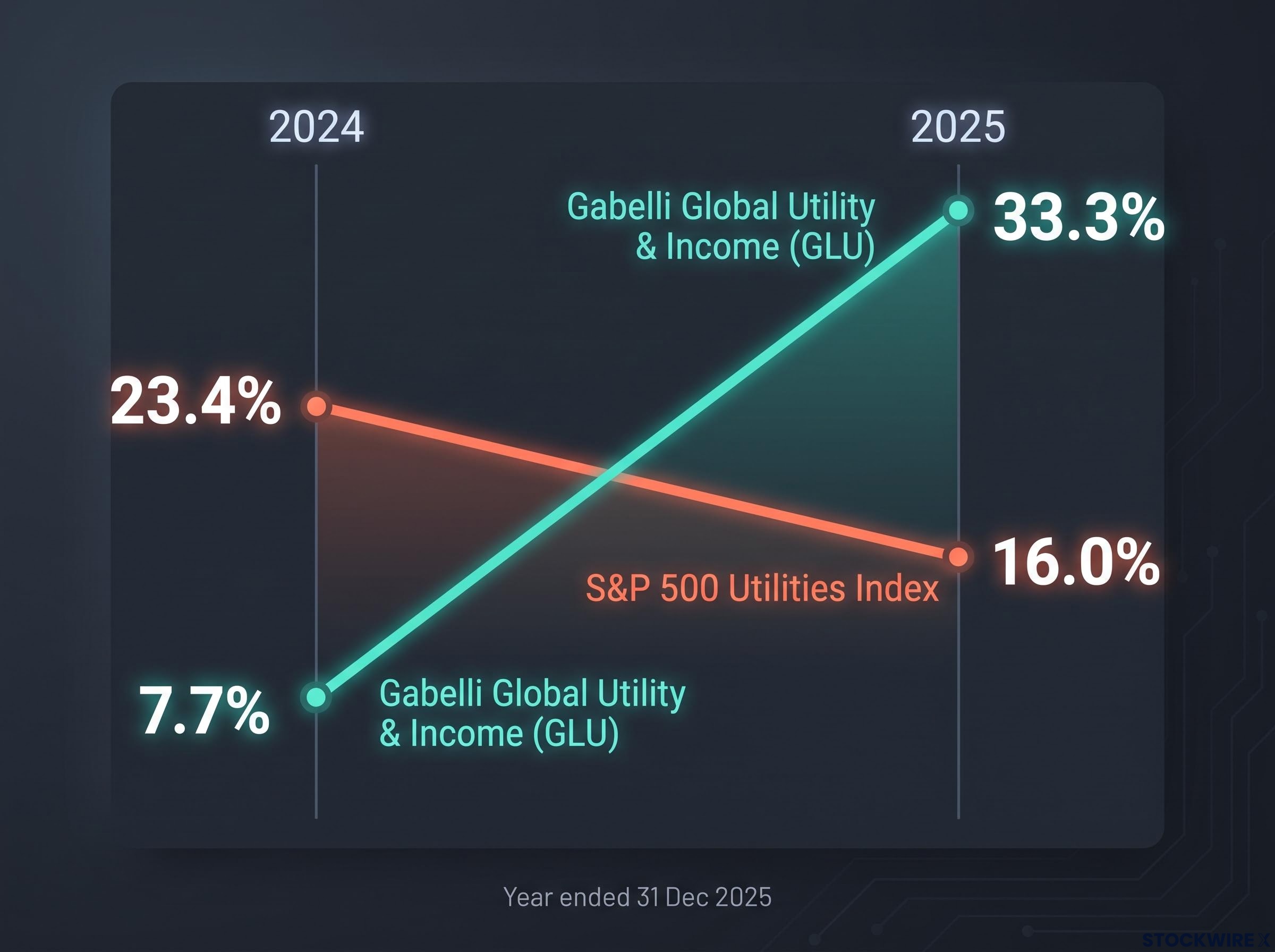
| Fund | Scope | 2024 return | 2025 return |
|---|---|---|---|
| Gabelli Global Utility & Income (GLU) | Global | 7.7% | 33.3% |
| iShares Global Utilities (JXI) | Global | ~13.0% | ~25.9% |
| iShares U.S. Utilities (IDU) | Domestic | ~23.24% | ~15.27% |
The JXI and IDU figures are directional reference points that warrant independent verification, but they trace the same arc: domestic ahead in 2024, global ahead in 2025. What this tells you is that the domestic-versus-global utility choice is a cyclical bet wearing the costume of a structural decision.
Over longer horizons the picture leans the other way. The U.S.-focused Utilities Select Sector SPDR Fund (XLU) has posted roughly +8.5% on a 10-year annualised basis against approximately +5.5% for the global peer JXI, again as directional figures rather than confirmed precision. Yet even that edge is not guaranteed to hold, and the Harvest Equal Weight Global Utilities Income ETF Class A, at 15.91% over one year against its MSCI World Utilities benchmark at 21.86%, shows global exposure can also lag its own yardstick.
What actually drives the divergence
Three structural forces decide which allocation wins in a given period.
- Regulatory and rate environment: U.S. utilities have historically operated within a clearer policy regime and favourable cost of capital, and regulated utilities do best where real rates stabilise and tariffs recover higher costs promptly.
- Legacy telecom and non-regulated drag: International utility indices often carry legacy telecommunications and merchant generation exposures that pull on returns, particularly where regulation is less supportive.
- Energy transition pipeline exposure outside the U.S.: According to Eurelectric (2025) and global listed infrastructure commentary, renewables developers and regulated networks with strong transition pipelines abroad have driven outperformance in certain years.
That last driver matters most for how you read the long-run numbers. The historical CAGR advantage for U.S. utilities was built largely in a pre-transition era. The forward-looking return from transition pipelines outside the U.S. simply does not appear in that data. Treating geographic allocation as an active decision, rather than a set-and-forget default, is the read the reversal pattern supports.
How covered-call overlays reshape the income and return profile in healthcare
A healthcare covered-call fund does not bolt extra income onto an ordinary equity return. It redesigns the return distribution itself, selling away the upper tail of equity performance in exchange for a higher current payout. When you buy an 8% or 13% headline yield in this corner of the market, that is the trade you are making.
A covered call is an agreement to sell shares at a set price if they rise to it, in return for an upfront premium. The design choices, how much of the portfolio is covered and where the strike sits, determine the shape of the trade-off.
The interaction between overwrite percentage and strike placement is where most of the yield engineering in covered-call funds actually happens; OptionMetrics research found 5% out-of-the-money strategies returned 26.14% annually against 14.06% for at-the-money structures, a gap that dwarfs most active manager alpha claims in the same sector.
| Fund | Overlay coverage | Strike type | Headline yield | Return reference |
|---|---|---|---|---|
| CI Health Care Giants Covered Call (FHI.B) | 25% of holdings | At-the-money | 8.12% | ~7.41% net yield after fees |
| Hamilton Healthcare Yield Maximizer (LMAX) | 30% of holdings | Overlay | ~13.31% | Estimated annualised yield |
| BMO Covered Call Health Care (ZWHC) | Overlay | Covered call | ~6.82-6.90% | -5.81% (6mth to 30 Jun 2025) |
The original research points to writing at-the-money options on roughly one-third of underlying assets as the optimal return design within healthcare, and real-world fund construction clusters close to that coverage level. The overlay produces three outcomes in sequence:
- An elevated current distribution, well above the roughly 0.7% yield of a passive healthcare index ETF.
- Capped upside participation, because gains above the strike are surrendered.
- Only a limited downside offset, which is where the yield story tends to oversell itself.
The BMO fund makes the third point concrete. ZWHC returned -5.81% for the six months to 30 June 2025, modestly better than the passive S&P 500 Health Care Index at -6.36%. The overlay cushioned the fall by roughly half a percentage point. It did not prevent a loss.
The peer-reviewed covered call strategy analysis published in the Journal of Risk and Financial Management (2026) confirms empirically that covered call overlays improve risk-adjusted returns in sideways and declining markets but surrender meaningful upside in trending rallies, a pattern the healthcare fund data above traces in real portfolio outcomes.
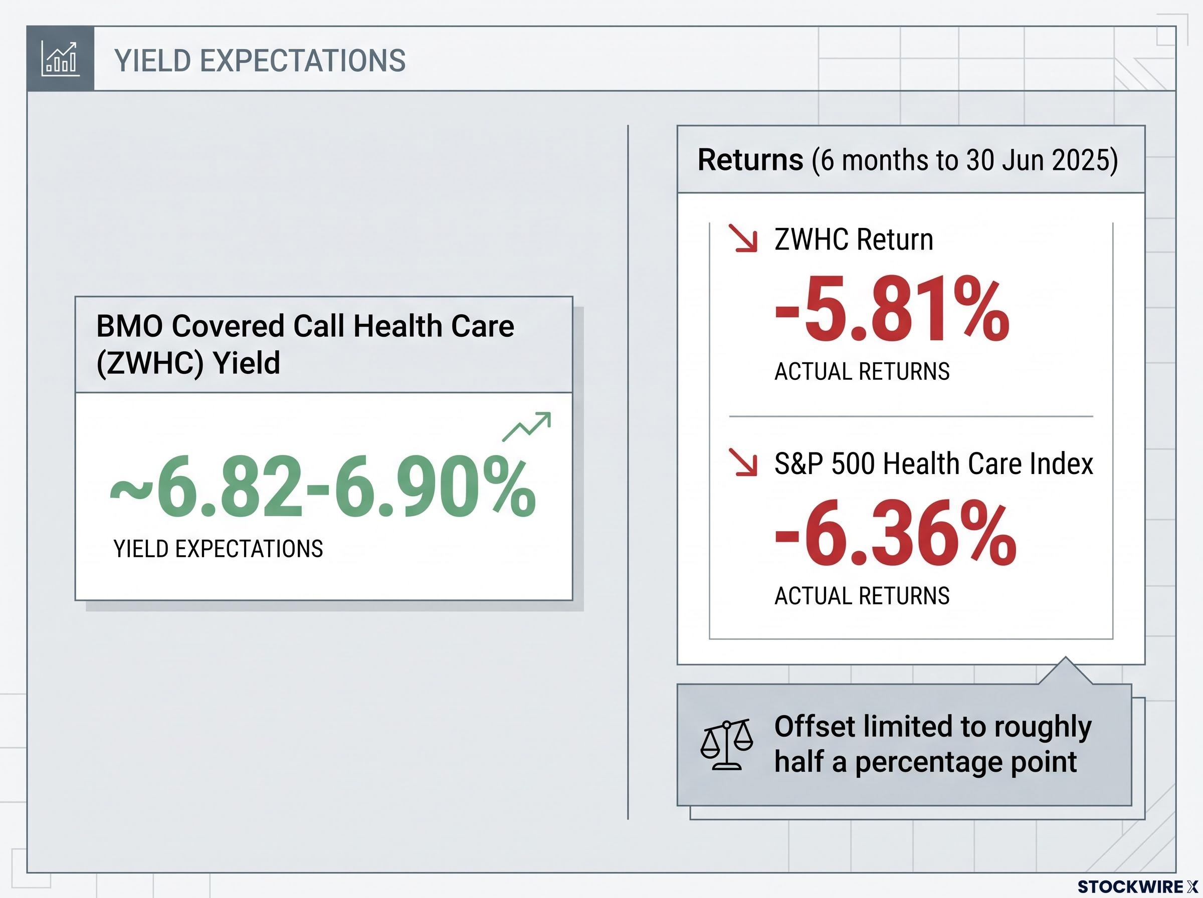
The protective limit, quantified Practitioner analysis suggests a derivative-income fund may offset only about 8 percentage points of a 20% market drawdown, leaving investors carrying the bulk of the equity loss.
What this tells you is that the high yield is compensation for equity risk, not a substitute for it. The construction determines what the fund actually does in a rising market versus a falling one, and neither behaviour is captured by the distribution rate on the fact sheet.
The construction trade-offs that income fund data consistently reveals
Line the three variables up together and a single argument emerges. Currency hedging redistributes return across time. Geographic allocation redistributes it across regions. An options overlay redistributes it across the equity return distribution itself. Every one of these is a deliberate trade, and each carries a cost that headline yield or a single-year return figure does not surface.
The clearest example is yield illusion. A high distribution in a covered-call or currency-hedged product can include return of capital, meaning some of what lands in your account is your own money handed back rather than genuine income. Schwab (2026), Morningstar (2025) and Global X analyses all note that covered-call strategies tend to lag in strongly rising markets, because calls get exercised or bought back at a loss, sacrificing exactly the returns that fund the long-term compounding.
NAV erosion is the mechanism that converts a high nominal yield into a weak total return; one analysis found a fund advertising 11% produced roughly $57,800 after three years against $78,300 from a broad equity index, a gap of more than $20,000 driven by the fund’s NAV declining approximately 6% annually while the distribution rate remained unchanged.
Sector concentration amplifies all of it. A concentrated utility or healthcare income fund that is also currency-hedged and runs an options overlay is stacking several structural choices whose interactions compound under stress. JPMorgan’s 2026 U.S. ETF midyear report flags how far benchmark concentration can run, with technology cited at around 40% of the S&P 500 and the smallest five sectors at roughly 13% combined, a reminder that even ostensibly diversified products carry concentrated risk.
Three comparisons that reveal construction costs
The costs are most visible in the data fund marketing rarely foregrounds. Three comparisons surface them.
- NAV total return versus distribution yield: if NAV is falling while the yield stays high, the distribution likely includes return of capital.
- Hedged versus unhedged share class of the same fund: the gap isolates the pure currency effect without any stock-selection noise, exactly as the WisdomTree pair did.
- Drawdown in a weak market period versus headline yield: if the fund lost far more than its yield in a bad stretch, the downside protection is thinner than the income implies.
Run these three checks and you see what the construction is actually delivering, rather than what the headline number advertises.
Reading construction decisions before selecting an income fund
The shift this analysis asks for is not a new checklist to memorise. It is a change in where you look first. Currency hedging, geographic allocation and options overlay design are active decisions that reshape the risk-return profile in ways performance headlines obscure, and the 2024 to 2026 data shows they have often mattered more than individual security selection in determining period returns.
The near-6 percentage point hedging gap, the utility reversal from domestic leadership in 2024 to global leadership in 2025, and the covered-call drawdown that softened a fall by barely half a point are three anchors worth carrying forward. Before you select an income fund, find the answers to three structural questions.
- What is the currency hedging policy, and what does the hedged-versus-unhedged performance comparison actually show?
- What geographic allocation model does the fund use, and which structural conditions favour or disadvantage that choice right now?
- Does the fund run an options overlay, and if so, what is the coverage ratio, the strike selection, and the NAV total return against the distribution yield?
Income fund selection is as much a framework problem as a security problem. Investors who treat it only as the latter are accepting construction risk they have never priced.
Treating dividend yield as a selection signal introduces a mechanical distortion that screener-based investors rarely price: a falling share price inflates yield without any improvement in the underlying fund, making high-yield results actively misleading as a quality proxy rather than a neutral data point.
This article is for informational purposes only and should not be considered financial advice. Investors should conduct their own research and consult with financial professionals before making investment decisions. Past performance does not guarantee future results. Financial projections are subject to market conditions and various risk factors.