
A 10-year Treasury yield above 5% sounds like a fire alarm, and most retail investors treat it exactly that way. But in the current data, that alarm may be the all-clear.
The distinction between a “good” and a “bad” yield rise is not academic hair-splitting. Investors who misread the signal tend to rotate defensively at precisely the wrong moment, cutting equity exposure and piling into long-duration assets that carry the very real-rate risk they are trying to avoid. The 10-year yield hitting its highest level since 2007 is the trigger for this misread, and the way you interpret it will shape every positioning decision you make this quarter.
Here is the analytical tool you will walk away with: the ability to look at any future yield movement and ask whether the breakeven or the real yield is doing the work, and what that answer means for where your money should sit. That is the same lens professional strategists use before every positioning call, and understanding the relationship between rising bond yields and economic strength puts it in your hands.
How to tell whether rising yields are a warning or a green light
Start with the one equation that unlocks the whole picture. A nominal Treasury yield, the headline number you see quoted, is simply the sum of two parts: the real yield plus expected inflation over the life of the bond.
The inverse relationship at the core of bond yield mechanics is purely mathematical: because the coupon is fixed, a lower purchase price automatically produces a higher yield, and a higher price compresses it, which is why price and yield always move in opposite directions in the secondary market.
Expected inflation has a market-based measurement called the breakeven rate. It is the difference between a regular Treasury yield and the yield on a Treasury Inflation-Protected Security (TIPS), a government bond whose principal adjusts with the consumer price index. When you strip the breakeven out of the nominal yield, what remains is the real yield: the return you earn after inflation.
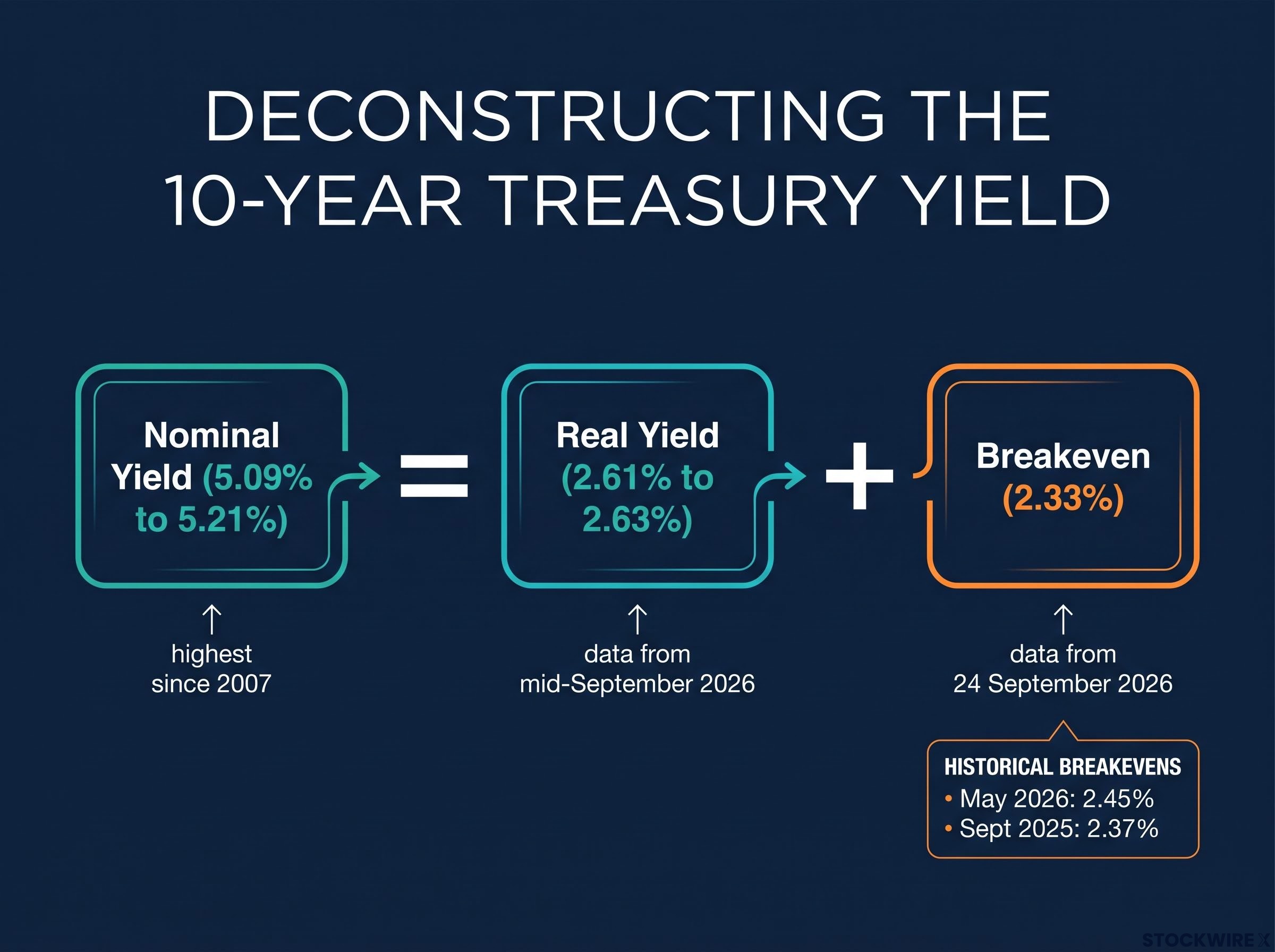
This is the diagnostic instrument. When nominal yields climb but the breakeven holds steady or drifts lower, you know the real yield is doing the work. When nominal yields climb because the breakeven is surging, inflation expectations are doing the work. Those are two entirely different stories.
| Signal | Bad yield rise | Good yield rise |
|---|---|---|
| What is driving it | Rising inflation fears or market stress | Stronger real growth and higher expected returns on capital |
| What the breakeven does | Surges higher | Stays anchored or drifts lower |
| What the real yield does | Stays flat | Rises |
So which one is happening now? As of late September 2026, the 10-year nominal Treasury yield sits at roughly 5.09% to 5.21%, its highest since 2007. Yet the 10-year breakeven stands at 2.33% (FRED series T10YIE, 24 September 2026), slightly below its September 2025 average of 2.37% and its May 2026 average of 2.45%.
10-year real yield: approximately 2.61% to 2.63% (Fed H.15, mid-September 2026).
Read those numbers together. Nominal yields have surged, but inflation expectations have actually drifted lower. That tells you the bond market is not pricing an inflation crisis. It is pricing a world where real returns on capital are genuinely higher, and that changes what the yield signal means for your portfolio decisions.
One more clue supports the reading. The selloff in government bonds has been worldwide, showing up in Germany and Japan as well as the United States, with China the notable exception. A repricing that broad is far more consistent with a global reset of real returns than with any US-specific fiscal or inflation scare.
When big ASX news breaks, our subscribers know first
What the current data actually show about US economic conditions
If the bond market is pricing higher real returns on capital, the economy underneath should show it. Three independent signals point in the same direction, and the case builds as you stack them.
- US PMI at 58.4, the highest reading since July 2021 (Reuters). Any reading above 50 signals expansion, and 58.4 is not a marginal beat. It is robust growth in business activity.
- Nonfarm productivity up 2.2% year-over-year (Q2 2025 to Q2 2026), with a 1.4% annualised rate in Q2 2026 (BLS release USDL 26-1434, published 3 September 2026). Output per hour is rising, which is the engine of non-inflationary growth.
- Unemployment at 4.1% in August 2026. Low enough to signal a healthy labour market, not so low that it screams overheating.
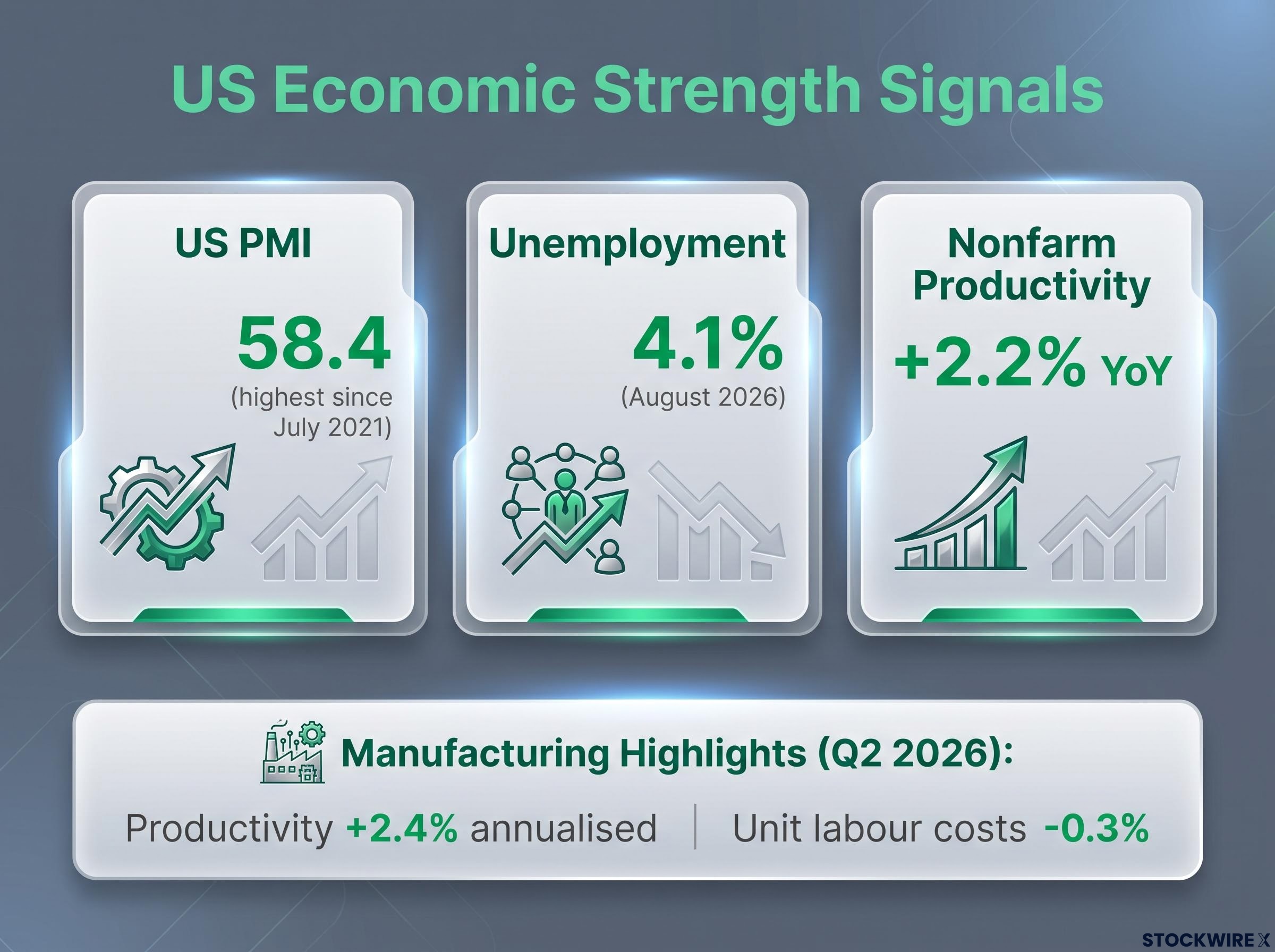
The sharpest data point is the manufacturing productivity figure. In the second quarter, manufacturing productivity expanded at a 2.4% annualised pace while manufacturing unit labour costs fell 0.3%.
Manufacturing productivity up 2.4% annualised; unit labour costs down 0.3% (BLS, Q2 2026).
That combination is the whole thesis in miniature. When output per hour rises while the cost of producing each unit falls, firms are getting more efficient, not paying up in a wage-price spiral. Across the broader economy, the original source characterises unit labour costs as rising only 1.4% year-over-year, comfortably below the pace of productivity gains.
Here is what that means for you directly. When productivity is outrunning labour costs in both the broad economy and manufacturing specifically, corporate margins have room to hold or expand even as borrowing costs climb. That matters to every equity holding you own. And the picture is not one strategist’s optimism: all 12 FOMC governors reached a unanimous bullish growth outlook extending through 2027 (FOMC press release, 16 September).
Why the jobs headline may be misleading right now
There is one wrinkle worth understanding before you weight monthly payrolls too heavily. A shift in migration policy has produced an estimated swing of roughly 5 million workers in the labour supply, and that swing has reduced monthly employment additions by approximately 200,000 jobs.
The effect is mechanical, not a sign of weakening demand. Fewer available workers means fewer jobs can be filled, which drags the headline number lower even when underlying demand for labour is strong.
The practical takeaway: if you lean heavily on nonfarm payrolls for your macro read, treat them with caution right now. The unemployment rate at 4.1% and the PMI at 58.4 are cleaner signals of current conditions than the monthly job-creation figure, which is being distorted by supply, not demand.
The case for caution: what higher yields genuinely do threaten
The framework so far builds a strong case that this is a “good” yield rise. But the framework is not a licence to ignore every warning light. It is a tool for separating signal from noise, and there are real risks the signal does not cancel out.
Three deserve your attention:
- Fiscal and term-premium risk. The Fed is still running quantitative tightening (QT), letting bonds roll off its balance sheet without reinvestment, while the Treasury issues heavily. Some portion of the yield rise may reflect that supply pressure and the extra compensation investors demand for holding long-dated debt, not pure growth optimism.
- Housing and consumer credit pressure. Higher 10-year yields feed straight into mortgage rates and long-term borrowing costs, squeezing housing activity and household balance sheets.
- Crowding-out risk. When the real risk-free rate sits in the mid-2% range and the government is issuing large volumes of debt, the cost of capital rises for everyone, discouraging marginal long-duration projects and pressuring leveraged private borrowers.
Fed Treasury runoff cap: $25 billion per month. Balance sheet: approximately $7.1 trillion (late 2024), down from a peak near $9 trillion.
The housing channel is the most tangible for the average balance sheet. According to the Congressional Research Service, mortgage-backed securities have been rolling off the Fed’s books below the cap because households are locked into low-rate mortgages and refusing to move. New mortgages get priced at today’s higher rates, turnover slows, and the housing market feels the strain.
There is also a caution buried inside the reassuring breakeven number. The JPMorgan Chase Institute notes that breakeven inflation is a market expectation of the consumer price index, but it also embeds liquidity and risk premia. A breakeven near 2.33% can look healthy while term premium rises underneath for less benign reasons.
Whether this real-yield level represents a cycle peak or structural reset is the question institutional managers are actively debating, with Bruegel data showing roughly 80% of the nominal yield surge since September 2024 is attributable to the real component, confirming the move as a discount-rate shock rather than an inflation-driven selloff.
Even the Fed’s own thinking allows for nuance here. Chicago Fed President Austan Goolsbee, in a London speech, argued that a supply shock from oil differs from demand-driven inflation and warrants a different response, and that the Fed’s core job is preserving long-term purchasing power rather than reacting to transitory price moves.
The practical implication is this: the “good yield rise” reading does not promise that rates stabilise here. It tells you the driver of the next move will decide whether risk assets hold. Watch the breakeven and fiscal issuance volumes, not just the headline yield.
Translating the yield signal into portfolio decisions
Now for the part you can act on. The framework points to two or three concrete moves you can evaluate this week, and each one flows directly from the distinctions already built.
Start with the most immediately actionable decision: TIPS versus nominal Treasuries. The 10-year breakeven of 2.33% is your personal decision point. If you expect your own inflation to run above 2.33% over the next decade, TIPS are favoured. If you expect it below, nominal Treasuries win.
The bigger story is the real yield itself. At roughly 2.61% to 2.63%, the 10-year TIPS offers a meaningful positive real return.
10-year TIPS real yield: approximately 2.61% to 2.63%. US government bonds offer a meaningful positive real return.
That is not a small thing. For most of the post-2008 era, holding government bonds meant locking in a return that inflation would quietly erode. A genuinely positive real yield changes the risk-adjusted calculus for how much fixed income belongs in a balanced portfolio.
On the equity side, higher real rates reshape which sectors work.
| Asset class or sector | Current signal | Positioning implication |
|---|---|---|
| TIPS | Breakeven at 2.33%; real yield ~2.6% | Favour if your inflation view exceeds 2.33% |
| Nominal Treasuries | High real yields available | Favour if your inflation view is below 2.33% |
| Financials and energy | Higher margins, anchored inflation | Tilt toward: margin support from the rate structure |
| Productivity-linked equities | Rising output per hour | Tilt toward: automation, software, industrials |
| Long-duration growth and leveraged credit | Higher discount rates, refinancing risk | Reduce exposure or apply selectivity |
Banks and financials tend to benefit from wider net interest margins when the yield curve is not deeply inverted. Energy and materials draw support from nominal growth and anchored but not low inflation. Productivity-linked names in automation, software and industrials can convert higher capital costs into efficiency gains and defend their margins.
The more exposed side is clear too. Long-duration, unprofitable growth stocks suffer as higher discount rates shrink the present value of distant cash flows, and high-yield or leveraged credit faces elevated refinancing and default risk while real rates stay high. One more layer: because US-specific QT dynamics may push US yields differently from other markets, there is a genuine case for holding non-US sovereign and equity exposure.
For investors wanting to see exactly how TLT, IEF, LQD, and XLU respond to this yield environment, our full explainer on rate-sensitive assets maps each instrument’s specific exposure and covers the barbell positioning institutional managers have adopted in response.
Where to sit on the yield curve right now
Within your fixed income sleeve, maturity choice matters as much as the TIPS-versus-nominal call. While QT continues and Treasury issuance stays heavy, short-to-intermediate maturities are favoured over long-duration bonds.
The reasoning is threefold: they carry less price sensitivity to further rate rises, they offer high current yields, and they sidestep much of the term-premium uncertainty that clouds the long end.
A bond ladder strategy spread across one-to-ten year maturities is the most broadly recommended structure for income-focused investors who want to capture today’s elevated yields without needing to call the exact peak in rates, a particularly useful tool when the short-to-intermediate part of the curve is already offering high current income.
High-yield and leveraged credit deserve selectivity given their refinancing exposure. Investment-grade, short-duration credit is the higher-confidence play here.
What the 10-year yield is telling you that most investors are getting backwards
Step back and the numbers rearrange themselves into a single reading. A nominal yield near 5.1%, a breakeven of 2.33%, and a real yield around 2.61% to 2.63% do not describe a crisis. They describe an economy where real returns on capital have reset higher, and where inflation expectations have stayed anchored through an oil shock and an ugly inflation print.
The mistake this framework corrects is treating the headline yield in isolation. The investor who sees 5% and reacts to the number alone, without decomposing it into real yield and inflation expectations, will make systematically wrong portfolio calls. The story lives in the composition, not the top-line figure.
The global evidence seals it. A bond selloff spanning Germany and Japan alongside the US is the clearest sign that this is a real-rate repricing, not an American fiscal or inflation scare.
The upgrade to your mental model is durable regardless of where rates go next. Instead of reacting to yield levels, you can now track what the yield is telling you and adjust before the consensus catches up. Watch these three indicators:
The FRED T10YIE breakeven series is the primary source for the 10-year breakeven inflation rate, updated daily using the spread between nominal Treasury and TIPS constant maturity yields, giving you a real-time read on where the bond market is anchoring its inflation forecast.
- The 10-year breakeven (FRED T10YIE). If it starts climbing meaningfully above 2.33%, the “good yield rise” thesis is fraying and inflation expectations are unanchoring.
- Treasury auction demand and bid-to-cover ratios. Weakening demand is your proxy for rising term premium and fiscal strain, signalling the yield rise is turning less benign.
- BLS quarterly productivity releases. As long as productivity outruns labour costs, the growth story holds; a reversal would undercut the case for higher real returns.
What a yield above 5% means for your next portfolio review
This article has spoken to two kinds of investors. The first saw 5% yields and reflexively rotated defensive. The second saw 5% yields and reflexively bought long-duration bonds, betting on a reversal. The data suggests both moves may be premature.
Here is the posture the framework supports. Use the 2.33% breakeven as your personal inflation forecast decision point. Tilt your equity exposure toward sectors with margin resilience at higher real rates. Favour short-to-intermediate duration in the fixed income sleeve. And keep your diversification intact rather than staking everything on a single directional bet about where rates go.
You now hold three specific indicators to monitor: the breakeven rate, Treasury auction demand, and BLS productivity releases. Together they will tell you whether the “good yield rise” thesis stays intact or begins to shift, well before the headlines do.
This article is for informational purposes only and should not be considered financial advice. Investors should conduct their own research and consult with financial professionals before making investment decisions. Past performance does not guarantee future results, and financial projections are subject to market conditions and various risk factors.