Most people assume the Federal Reserve holds the steering wheel. It sets the target range, it publishes its forecasts, and the market politely falls into line behind whatever the central bank says it plans to do next.
That is not what is happening right now.
As of the July 2026 meeting, the Fed is holding rates in the 3.50%-3.75% range, and its latest projections push the return to lower rates far into the future. Meanwhile, traders are betting real money that policymakers are not being tough enough, and that rates are heading higher than the official charts admit.
This piece gives you a working framework for reading the central bank’s signals, understanding why professional money is fading the official forecast, and adjusting your own portfolio for a rate environment where the two most important forecasting tools flatly disagree with each other.
The reality of delayed cuts and a higher baseline
The Federal Open Market Committee left the target range for the federal funds rate at 3.50%-3.75% at its July 2026 meeting. That decision came wrapped in some of the most upbeat economic language the committee has used in this cycle.
The policy statement did not describe an economy limping toward relief. It described one running hot enough to keep the pressure on.
Here is how policymakers characterised current conditions:
- Economic activity expanding at a solid pace
- Domestic spending described as resilient
- Productivity growth described as strong
- Capital investment upgraded from “strong” to robust
- Job growth keeping pace with a growing workforce
- Inflation acknowledged as still elevated
That last point is the one doing the heavy lifting. When inflation is still running above target and the economy is still expanding at a solid clip, the case for cutting rates soon simply is not there.
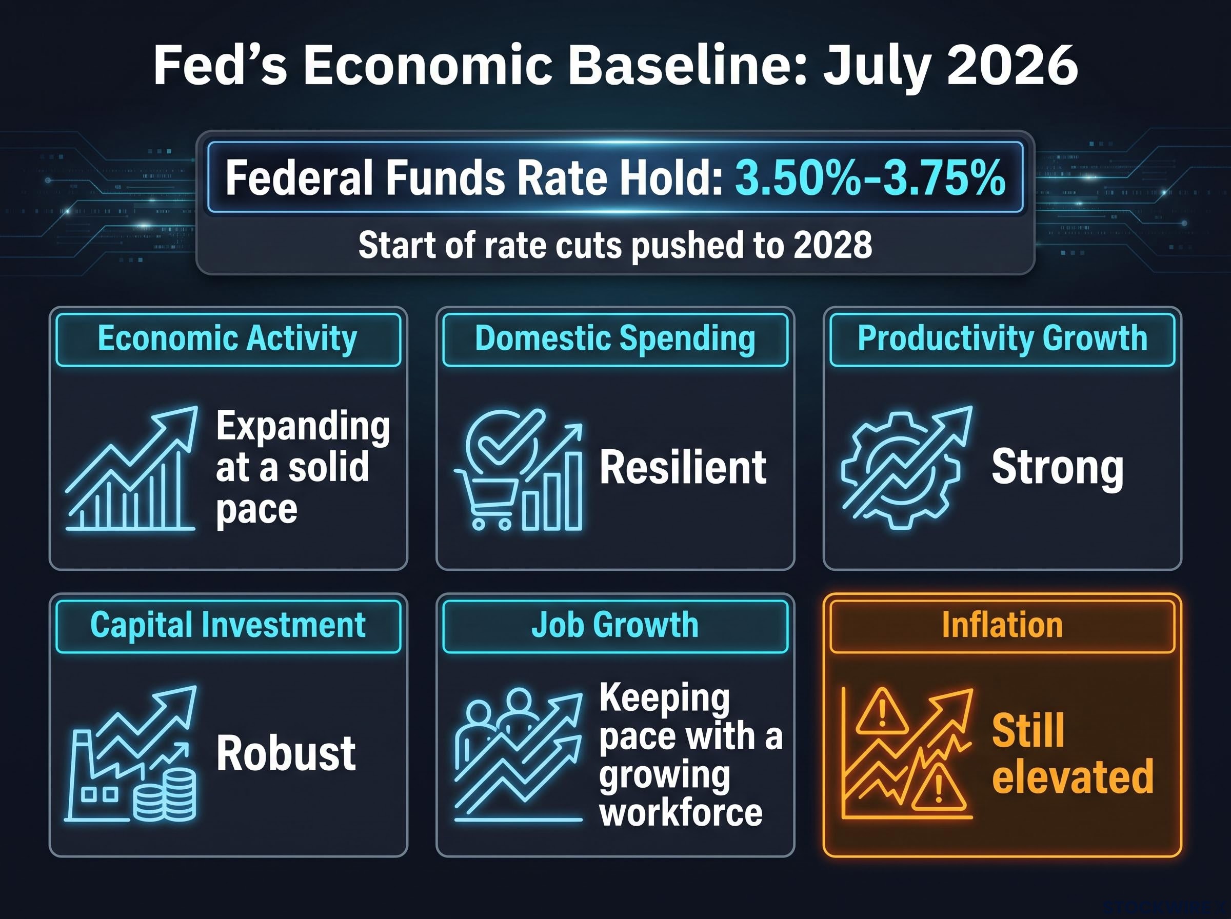
This is where the baseline matters. Coming into this cycle, only two committee members favoured holding at the lower 3.75%-4.0% starting point rather than tightening further, a signal that the hawks, not the doves, are setting the tone. The updated dot plot pushes the start of rate cuts out toward 2028, according to the fact-checked source material.
The read for you is straightforward. When the central bank delays projected relief that far out, it is telling you it will prioritise killing inflation over easing the cost of borrowing. You should plan for capital to stay expensive for the foreseeable future, not budget for a rescue that arrives next quarter.
Upward revisions to the economic baseline
The projections underneath that decision reinforce the message. Policymakers revised both headline and core Personal Consumption Expenditures (PCE) inflation forecasts higher for the current year. PCE is the Fed’s preferred measure of how fast prices are rising across the economy.
What makes this telling is what did not change. Long-run projections for GDP growth and unemployment were left untouched, while the projected long-run rate was nudged upward.
Translated: the Fed believes it now needs higher rates to reach the exact same economic destination it always aimed for. That is a quiet admission that this inflation has been stickier than the committee once hoped.
When big ASX news breaks, our subscribers know first
How to decode the structural gap between dots and futures
To understand why traders are betting against the Fed, you first need to understand that the dot plot and futures market are not measuring the same thing at all. They only look similar because both produce a number for where rates might go.
Start with the Fed’s own tool. The Summary of Economic Projections (SEP), which contains the dot plot, is a chart where each dot represents one policymaker’s personal judgment of where the appropriate year-end rate sits under their baseline outlook.
Each dot is one person’s best guess in a perfect world. It is not a committee vote, not a promise, and critically, not a probability of what will actually happen.
Milton Friedman’s concept of long and variable lags adds a further complication to the dot plot’s reliability: policy effects can take well over a year to reach the real economy, meaning the dots reflect a baseline that the committee will almost certainly revise before those projections ever become binding.
The Chicago Fed’s own research stresses that participants routinely move their dots from one meeting to the next as conditions shift. Yahoo Finance’s explainer on the tool makes the same point in plainer terms.
The dot plot shows how policymakers think they will move rates over the coming years. It is a point-in-time snapshot of their thinking, not a fixed schedule investors can bank on.
Now compare that to the futures market. Fed funds futures do not report anyone’s baseline view. They price a risk-weighted distribution of every plausible outcome, weighting each scenario by how likely traders collectively think it is.
That difference is everything. The dot plot answers “where does the median policymaker think rates should go under their base case?” Futures answer “where do investors think rates will actually go, once you account for everything that could go wrong?”
A 2026 Chicago Fed Letter examining how markets react to the dot plot confirms the mechanism. Investors absorb the dots as information, then layer on their own uncertainty and risk premia. When they see upside risks to inflation, the futures curve sits above the SEP path.
History explains why traders lean that way. During the 2022-2023 tightening cycle, early dot plots badly underestimated how far the Fed would eventually have to go. The San Francisco Fed documented how the funds rate climbed from near zero to roughly 5.1% by May 2023, with the market repeatedly pricing more tightening than the dots signalled before policymakers caught up.
Fiscal dominance, the condition in which debt servicing costs constrain how aggressively the Fed can tighten, is part of why traders believe the dots understate the required rate path; with federal debt at roughly 122% of GDP, each additional hike now imposes fiscal costs four times faster than the equivalent move did during the Volcker era.
So here is the lens to carry through the rest of this. View the dot plot as a picture of what the Fed wants to happen. View futures pricing as an aggressive insurance policy traders are buying against what could actually go wrong. Once you stop treating the dots as a guarantee, the divergence stops looking like a contradiction and starts looking like a warning.
Why the market is currently pricing in more pain
The numbers make the standoff concrete. Coming into the most recent meeting, Fed funds futures assigned roughly a 74% probability to at least one more rate increase by year-end, according to the source material. The remaining share was not betting on cuts. It was pricing in even more aggressive tightening.
That alone tells you traders are not buying the idea that the Fed is done.
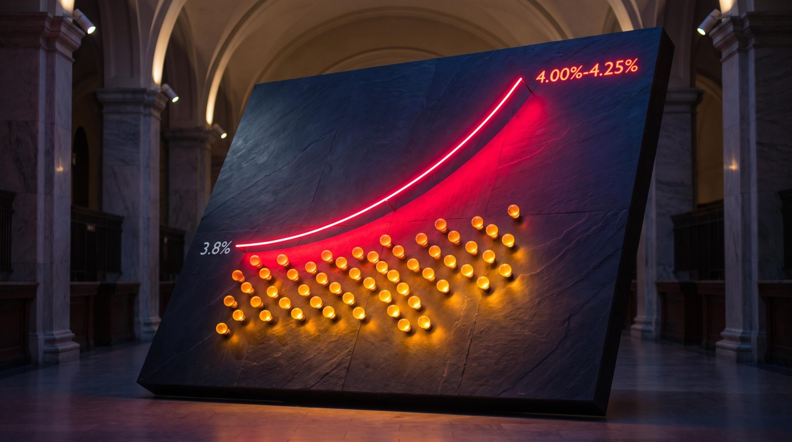
Look further out and the gap widens. According to CME FedWatch data reported by Benzinga in July 2026, investors assigned a near 98% probability that the federal funds rate would reach 4.00%-4.25% by June 2027. That implies roughly two additional hikes and pushes rates well past the 3.8% median peak the Fed itself projected in June.
FXStreet reporting from September 2026 put the total expected tightening at around 50 basis points by the end of 2026 and 80 basis points by the end of 2027. A basis point is one hundredth of a percentage point, so 80 basis points equals 0.80% of extra tightening on top of today’s range.
The divergence lays out cleanly:
| Timeframe | Federal Reserve projection | Futures market pricing |
|---|---|---|
| Year-end 2026 | Peak near 3.8% | ~74% odds of at least one more hike; ~50 bp priced |
| June 2027 | Drifting toward 3.6% | ~98% odds of a 4.00%-4.25% range |
| End 2027 | Modest easing under way | ~80 bp of total additional tightening priced |
The message from that table is hard to miss. The Fed sees itself easing while the market sees it hiking.
When traders commit to 50 to 80 basis points of extra tightening the Fed has not signalled, they are telling you that institutional money does not believe the current baseline is hawkish enough to finish the job on inflation. And this is not idle speculation. History shows markets have led the dots higher before, most recently across 2022, when futures priced a peak near 4% while the Fed’s March dot plot still sat far below it.
This matters to your finances directly. These futures bets are not abstract. They feed straight into the Treasury yields and mortgage rates you pay today, which means the market’s scepticism about the Fed is already shaping the cost of your borrowing.
Positioning your portfolio for policy risk
When the market consistently prices more tightening than the dot plot, one thing tends to follow. Bond yields drift up toward the futures-implied path, tightening financial conditions faster than the Fed’s own baseline would suggest.
That upward pull on yields is where the macro standoff becomes your problem.
The 2022-2023 cycle is the cautionary example. Real rates, meaning interest rates after adjusting for inflation, moved materially higher than initially projected, and the assets that suffered most were predictable. Long-duration growth equities, whose value depends on profits far in the future, and high-yield credit both underperformed as the cost of money climbed.
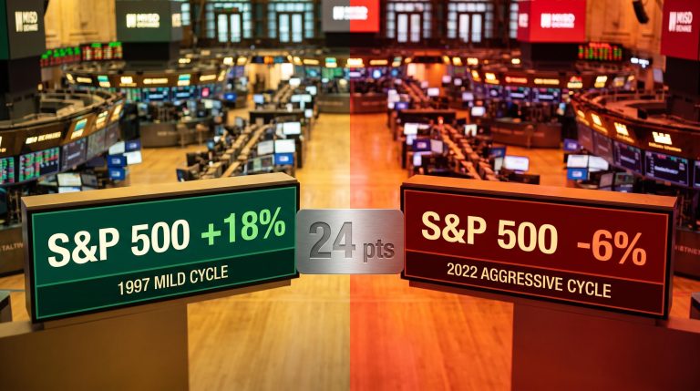
The pace of Fed hikes matters as much as the direction; the S&P 500 returned roughly 18% in the mildest modern tightening cycle but fell 6% in the most aggressive, a 24-percentage-point spread driven entirely by how quickly the Fed moved rather than by the fact that it moved at all.
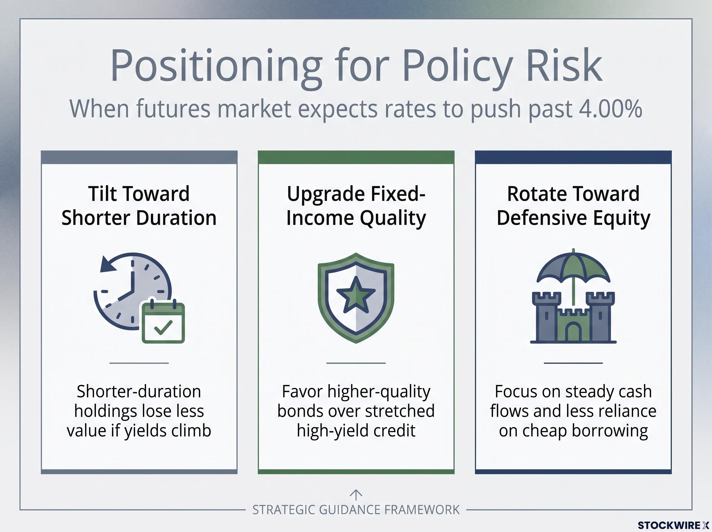
Strategists at MUFG Americas and Wilmington Trust have described this futures-above-dots configuration as a signal to reposition defensively when markets are pricing policy risk above the SEP baseline. Their guidance points in three practical directions.
Here are the moves worth weighing for this environment:
- Tilt toward shorter duration. Duration measures how sensitive a bond’s price is to rate changes. Shorter-duration holdings lose less value if yields keep climbing toward the market’s path.
- Upgrade fixed-income quality. Favour higher-quality bonds over stretched high-yield credit, which historically takes the heaviest damage when policy stays tight for longer.
- Rotate toward defensive equity sectors. Companies with steady cash flows and less reliance on cheap borrowing tend to hold up better than speculative growth names when rates grind higher.
The single most useful thing you can do is audit your portfolio for assets that depend on cheap borrowing. If the futures market is right and rates push past 4.00%, those specific holdings face the sharpest valuation pressure, precisely the outcome the Fed’s own projections are not yet pricing in.
This article is for informational purposes only and should not be considered financial advice. Investors should conduct their own research and consult with financial professionals before making investment decisions. Past performance does not guarantee future results, and these market-implied projections are speculative and subject to change based on incoming data.
Calibrating your exposure before the pricing gap closes
The core tension is now clear. The Fed’s official projections describe a patient hold followed by gradual cuts, while the futures market is bracing for rates to breach 4.00% before any relief arrives.
Gaps this wide never last. They resolve one of two ways: either the central bank hikes aggressively to meet the market, or the market capitulates as growth slows and inflation finally cools toward the Fed’s baseline.
History does not tell you which side wins. It only tells you the standoff will break.
For readers wanting the equity data behind that pattern, our full explainer on S&P 500 returns during rate hikes covers Goldman Sachs evidence showing the index averaged roughly 9% in the 12 months after the first hike of a cycle, alongside the four variables that determine whether the current cycle tracks the historical average or departs from it.
Your job is not to guess. It is to watch the one thing that decides the outcome: the incoming inflation data. If price pressures stay sticky, expect the dots to climb toward the market. If they ease, expect the futures curve to fall back toward the Fed.
Use both tools together. Track the SEP for what policymakers intend, track CME FedWatch for what traders expect, and let the data tell you which forecast is winning before the gap closes on its own.