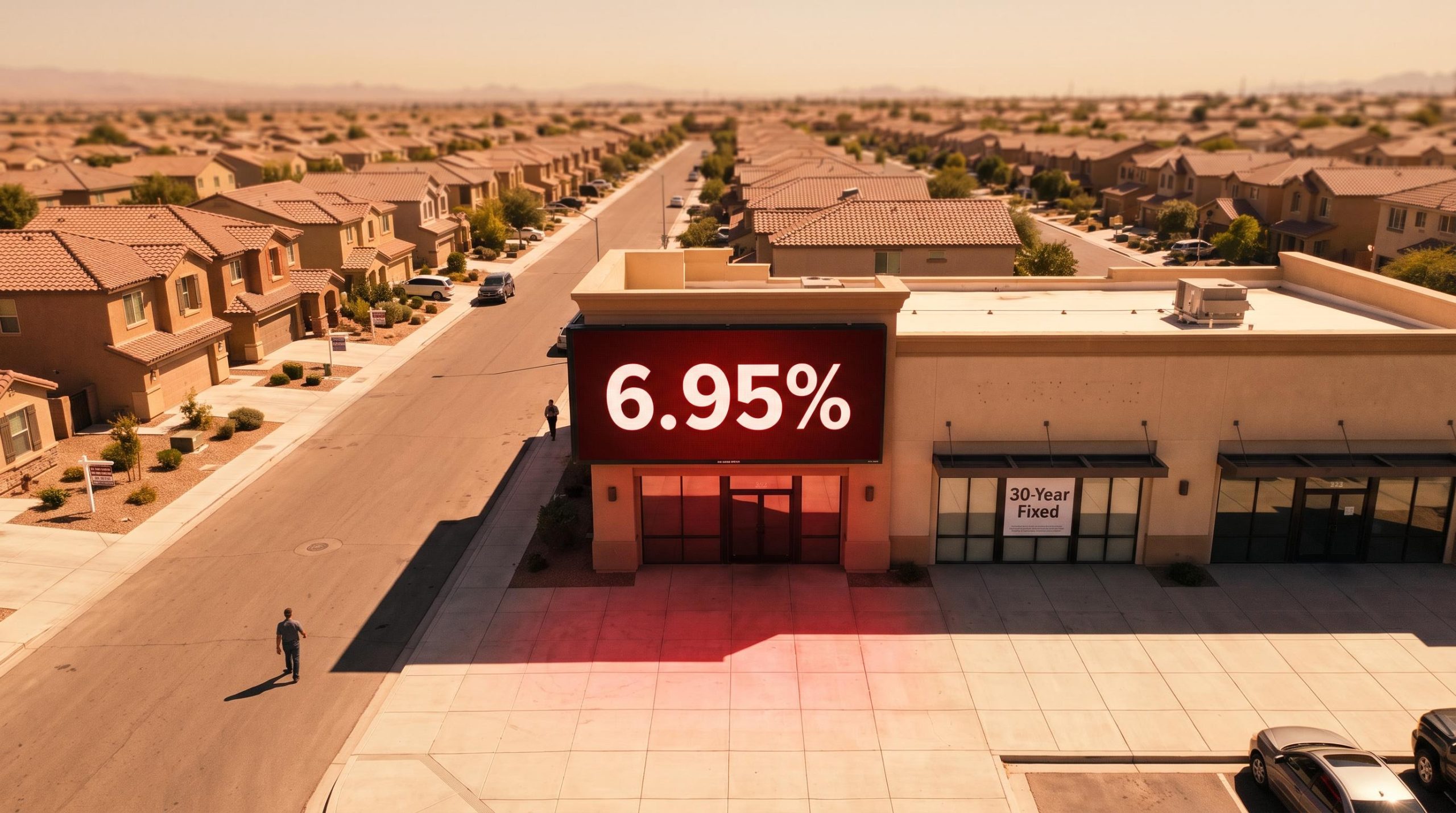
The Federal Reserve has cut rates repeatedly since late 2024, yet the average American shopping for a home is still staring at a 30-year fixed mortgage rate near 7%. That single fact breaks the assumption most buyers and investors are working from.
For roughly four decades, the cycle was predictable: the Fed eases, borrowing costs fall, and housing recovers. That transmission is not working this time. What is unfolding is not a garden-variety cyclical dip that lower rates will simply resolve.
It is a structurally distinct correction, shaped by a $2 trillion federal deficit, inflation that refuses to settle, and fifteen years of artificially cheap credit now unwinding. The 2026-2028 window is when these forces converge most sharply for anyone holding or evaluating real estate.
What follows is the map for navigating an asset class correction that most conventional forecasting frameworks are underequipped to explain: why the mechanism is broken, which markets face the deepest pressure, and what the trajectory actually looks like through 2028.
Why the Fed cannot rescue housing this time
The comfortable assumption is that the Fed controls mortgage rates. It does not, at least not directly. Mortgage rates track the 10-year Treasury yield far more closely than they track the Fed funds rate, and that distinction is the whole story of this correction.
The Fed has cut its benchmark rate by a reported 175 basis points since September 2024. If rate cuts flowed straight through to mortgages, borrowing costs would have collapsed. They have not.
The Freddie Mac Primary Mortgage Market Survey is the benchmark data source tracking weekly 30-year fixed mortgage rates, and its September 2026 readings confirm that rate cuts at the short end of the curve have not translated into meaningful relief at the borrowing level homebuyers actually face.
Freddie Mac 30-year fixed rate: 6.95% for the week ending 17 September 2026
The reason is what is happening at the long end of the curve. The 10-year Treasury yield has settled near or above 5% as a new baseline, and mortgage rates sit roughly two percentage points above that yield historically. As long as long-term yields stay elevated, mortgage costs stay elevated, no matter what the Fed does at its meetings.
The roughly two-percentage-point premium that mortgage rates carry above the 10-year Treasury yield is not arbitrary; Treasury yield spread mechanics have widened and narrowed across cycles, and the current spread near 2.0 points represents a normalisation from the 2022-2023 peak of 3.0 points, meaning even a modest yield decline could compress mortgage costs faster than the headline numbers suggest.
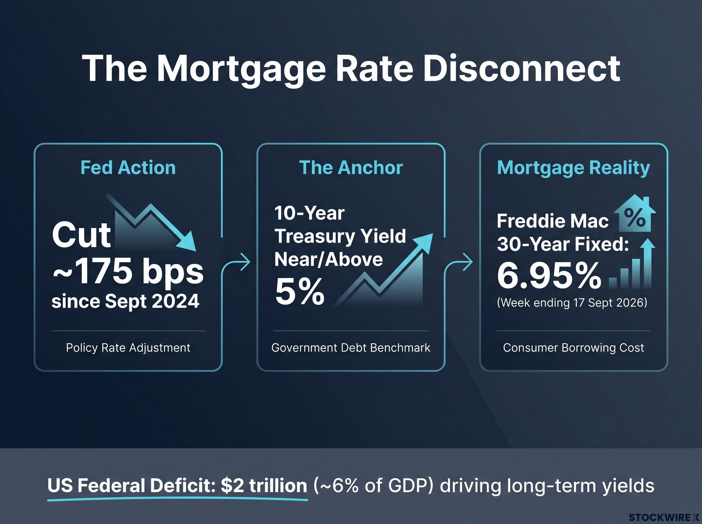
What is keeping those long-term yields high is fiscal, not monetary. The US runs a deficit of roughly $2 trillion, equivalent to around 6% or more of GDP, and that torrent of Treasury issuance is the dominant upward force on long-term yields. Against that, the Fed is a secondary player.
This is where the 1970s comparison earns its place, with a caveat. The persistence of today’s inflation echoes that era, but the origins are broader: geopolitical disruption, elevated energy costs, and businesses raising prices preemptively rather than a single oil shock.
| Reference point | Fed policy direction | 30-year mortgage rate |
|---|---|---|
| Since Sept 2024 | Cut ~175 bps (reported) | Held near 7% |
| Week ending 17 Sept 2026 | Easing bias | 6.95% (Freddie Mac) |
| Operative driver | 10-year Treasury near/above 5% | ~2 pts above 10-year yield |
The gap between what the Fed has done and where mortgage costs actually sit tells you something practical: waiting for rate relief to unlock affordability is a strategy built on a mechanism that is currently broken. If you are holding off decisions until the Fed cuts further, you are watching the wrong lever.
When big ASX news breaks, our subscribers know first
What the national price data actually shows (and what it hides)
Read the national headlines and you would think housing is fine. The figures are genuinely positive, and they deserve to be presented honestly before anyone dismisses them.
The national picture through mid-2026 looks like this:
- NAR median existing-home price in the $429,100-$434,900 range, with the single-family median at $434,800
- FHFA monthly gains of 0.3% and year-over-year appreciation of 2.1-2.2%
- 38 consecutive months of year-over-year national price increases through August 2026
- Prices reported higher in as much as 80% of metro markets
That last figure sits in direct tension with what is happening beneath the surface. Up to 80 to 105 of the 300 largest US metros have recorded year-over-year price declines, and several are in outright correction rather than a soft patch.
The sharper way to read this is real versus nominal. According to analysis from Goldman Sachs and First American, unadjusted US home prices sit 66.7% above the 2006 peak, but real, income-adjusted prices are actually 7.2% below that same peak. Nominal averages are papering over a purchasing-power correction that is already well underway.
Where the correction is deepest
The pain is concentrated in Sun Belt and Western markets that overshot most violently during the pandemic. Remote-work demand and speculative buying drove prices past what local incomes could support, and the reversal has been proportionally severe.
| Market | Peak-to-current decline (reported) | Regime |
|---|---|---|
| Austin | Down 23.6% | Deep correction |
| Phoenix | Down 10.4% | Correction |
| Tampa | Down 5.0-6.2% | Softening |
| Midwest / Northeast metros | Continued gains | Appreciation |
The retreat of institutional money reinforces the pattern. Mega-investor activity in the single-family market fell to a 14-year low in 2025, handing share to smaller investors who carry far more cautious appreciation expectations.
The housing market freeze playing out in transaction volumes is measurable in real-time corporate commentary: Home Depot CFO Richard McPhail described operating conditions as frozen at mortgage rates near 6.7%, and housing transactions fell approximately 6.3% in Q2 2026, providing ground-level confirmation of the macro transmission chain the national price indices are slow to capture.
If you own or are weighing a property in one of these markets, the national headline is nearly useless to you. The only question that matters is which of the two price regimes your specific geography sits in, because averages in a bifurcated market point in exactly the wrong direction.
How housing and mortgage markets are wired to each other during a correction
To understand why this correction is unlikely to resolve quickly, you need to see how the pieces feed each other. Elevated rates do not just dent affordability once; they set off a chain that reinforces itself over quarters and years.
Here is the loop, stage by stage:
- Elevated mortgage rates raise the cost of borrowing
- Affordability deteriorates, pushing marginal buyers out
- Financial stress lifts delinquency rates among existing borrowers
- Delinquencies feed a foreclosure pipeline over time
- Distressed supply arrives in the weakest markets, pressuring prices
- Lenders tighten credit, shrinking the buyer pool further
The current data sits early in that loop, and it is important to be precise about the starting point.
MBA Q2 2026 delinquency rate: 4.37%, up 44 basis points year-over-year
Across the various measures, delinquencies fall in the 3.0-4.37% range, with serious delinquencies (90 or more days past due, or in foreclosure) near 1.2%. These are elevated relative to recent lows, but well below crisis territory. The one number worth watching is foreclosure inventory at 0.4%, the highest in six years.
A foreclosure inventory at a six-year high does not signal crisis. It marks the opening of the distressed-supply pipeline that will eventually test nominal price floors in the markets where it concentrates. Because that pipeline runs on a meaningful lag, the price effect is still arriving, not already priced in.
Business failures and compliance stress as early-warning signals
The stress is not only on borrowers. When origination volumes swing and servicing margins compress under elevated rates, mortgage companies and settlement-services firms fail, and those failures are a leading indicator rather than a lagging one.
Origination volumes remain substantial, in the $500-$580 billion quarterly range, with Q1 2026 volume reported 49% higher year-over-year. Volume alone masks the margin squeeze underneath.
The compliance signals are worth attention. In one monitored $90 billion portfolio, a reported 46.6% of transactions were flagged for potential fraud or compliance issues, with license-related issues up 23.1% quarter-over-quarter. Historically, this kind of stress in mortgage portfolios has preceded broader credit tightening.
None of this is new to those inside the sector. Stan Middleman, a housing-industry insider reportedly on record predicting this correction roughly a decade ago, has been cited using his own Florida property listing as a broader market signal. The people closest to the plumbing saw the strain forming long before the headlines caught up.
The structural floor: why this is not 2008
For all of that, the correction has a genuine floor, and ignoring it leads to worse decisions than ignoring the correction itself. The forces holding nominal prices up are structural, not sentimental.
The starting point is supply. Goldman Sachs and First American estimate the US is short 3 to 4 million housing units against a total stock of roughly 150 million, and that shortfall props up nominal prices even as affordability worsens.
Structural undersupply estimate: 3 to 4 million units (Goldman Sachs and First American)
The contrast with 2008 is sharp on every axis that matters:
Housing and GDP decoupling is a counterintuitive feature of the current cycle: housing’s direct contribution to GDP has shrunk to the low single digits from a pre-GFC peak near 6.5%, which is why homebuilder equity indices and D.R. Horton shares remain positive year-to-date even as transaction volumes and affordability deteriorate sharply.
- Then: negative equity was widespread. Now: homeowners are largely equity-rich
- Then: origination standards were lax. Now: underwriting is tighter
- Then: the market was drowning in surplus inventory. Now: the market faces a structural shortage
Existing-home inventory sits at 1.5-1.6 million units, roughly 4.6-4.9 months of supply, moderate rather than crisis-level. New-home supply is looser at 9.6 months with around 488,000 units for sale, but that is one segment, not the whole market.
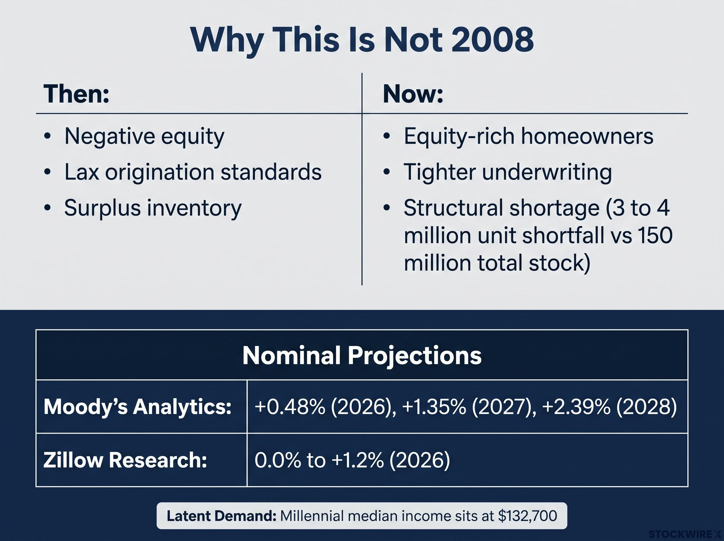
Demand is waiting in the wings too. Millennials carry the highest median income of any generation at a reported $132,700, and they represent price-sensitive buyers ready to re-engage if affordability improves even modestly. Combine that latent demand with the lock-in effect of owners clinging to low-rate mortgages and refusing to sell, and the distressed supply needed for a national nominal crash simply is not there.
The read for you is this: the correction will show up in real and affordability terms across most of the country, not in the nominal collapses that gutted equity in 2008. That distinction changes the calculus of holding versus selling, and treating this as a 2008 rerun will lead you into the wrong trade.
What the forecasts say about the road to 2028
Put the major forecasters side by side and a striking thing emerges: they disagree on the exact nominal number, but they agree on the direction. The correction runs primarily through real prices, not a nominal crash.
| Forecaster | Nominal projection | Real-price framing |
|---|---|---|
| Moody’s Analytics | +0.48% (2026), +1.35% (2027), +2.39% (2028) | Real prices track inflation for a decade |
| Zillow Research | 0.0% to +1.2% (2026) | Cyclical plateau in nominal terms |
| Goldman Sachs / First American | Nominal floor held by undersupply | Affordability correction, real prices below 2006 peak |
Moody’s Analytics: nominal gains of just 0.48% in 2026, 1.35% in 2027, and 2.39% in 2028
The mechanism these numbers describe is slow erosion. With nominal appreciation running below inflation for several years, real prices grind lower even as the headline index ticks up. Recall the anchor: nominal prices are 66.7% above the 2006 peak, while real, income-adjusted prices sit 7.2% below it.
The operative investment variable through 2028 is not the national average at all. Midwest and Northeast metros are expected to keep posting gains, while Sun Belt and Western markets stay under pressure, and the outcome for any single property depends far more on local supply, employment, and demographics than on any headline forecast.
The homebuilder equity breakdown is precise: analysts applied roughly 18% cuts to 2026 EPS estimates across homebuilder coverage, Lennar broke neckline support near $100 and now trades around $80, and Toll Brothers publicly warned that elevated rates are crushing demand, translating the macro yield pressure into named corporate evidence.
The consensus is neither bullish nor bearish; it is slow erosion in purchasing-power terms. If you bought at peak pandemic prices in a correction market, do not count on nominal recovery to bail out the position inside the 2028 window. Patient holding will not be rewarded uniformly, and the forecast range gives you the parameters to stress-test your own exposure.
What the correction changes, and what it does not
Strip it all back and the picture is clear. The US housing market is in a real and affordability correction that will run through at least 2028, showing up mainly in real terms nationally but in meaningful nominal terms across specific overbuilt markets.
The correction is real, but it is bounded. Structural undersupply, equity-rich homeowners, and latent Millennial demand stand between today’s conditions and a 2008-style nominal collapse across most of the country.
So the question was never whether a correction is happening. It is which markets and asset types sit in which regime, and what the 12-24 month delinquency-to-foreclosure pipeline means for when distressed supply actually lands.
Three variables will decide how the 2026-2028 window resolves: where long-term Treasury yields settle, how quickly regional distressed supply emerges, and when Millennials re-enter at scale. Reviewing your exposure against the regional divergence in the data is a more useful exercise than watching the national headline.
This article is for informational purposes only and should not be considered financial advice. Investors should conduct their own research and consult with financial professionals before making investment decisions.
Past performance does not guarantee future results. Financial projections are subject to market conditions and various risk factors, and are speculative and subject to change based on market developments.