On a single trading session in mid-September 2026, several major U.S. indices did something worth pausing over. They opened positive, climbed on the day, then reversed and closed negative. The turn happened right at the technical levels that chart-watchers had been tracking for weeks.
That kind of reversal, strength giving way to selling at a specific price point, is more telling than a market that simply opens weak. And it is not happening in isolation.
September is historically the softest calendar month for U.S. stocks. The 10-year Treasury yield is knocking on the door of 5% for the first time since October 2023. Semiconductor stocks, the engine of this year’s rally, are correcting hard. These three forces are arriving at once, and the simultaneity is the point.
The question this piece equips you to answer is not whether the market falls further. Nobody can hand you that. It is which specific signals would separate a brief seasonal air pocket from the early stage of a more durable shift in regime, and how much weight each one deserves right now.
When charts, calendars, and bond yields all break the same way
Convergence is what makes this moment analytically interesting. It is one thing for a chart to break support. It is another for the calendar, the bond market, and the technical picture to deteriorate on the same day. That alignment is rare, and it is worth feeling the weight of all three before examining any single one.
Start with the tape. The SPY, the S&P 500 tracking fund, completed what technical analysts call a right triangle breakdown, closing cleanly below a horizontal support level that had held across multiple sessions. It ended the observed session down roughly 0.33%, having reversed from earlier intraday gains.
The move was not uniform across indices, and that is the first clue. The IWM, which tracks small-cap stocks, fell close to twice the percentage decline of the SPY. The DIA, the Dow tracking fund, shed the equivalent of roughly 600 index points in the same session, well over 1%.
When large caps fall less than small caps, and the Dow falls harder than the S&P 500 on a percentage basis, the selling is not indiscriminate. It is concentrated in particular risk exposures. Reading which ones tells you far more about what is happening than the headline index numbers do.
Intra-market dispersion reached levels not seen since December 1999 in April-May 2026, with two stocks holding just 1.1% of ACWI weight generating roughly 17% of the index’s total return, a concentration extreme that makes the IWM’s steeper decline relative to the SPY in the September session analytically predictable rather than surprising.
The session confirmed a trend already underway rather than starting one. Over the prior month, the SPY declined 2-3% from a local high in the low-760s, yet held a year-to-date gain of roughly 10.6%. The IWM had slid from the 305 range to around 288-289 by 9 September 2026. The DIA posted a one-month decline of 2.1%, testing support near the 52,400 level, while the QQQ showed early-September intraday weakness in the 707-708 range.
| Index Fund | 1-Month | 3-Month | Year-to-Date |
|---|---|---|---|
| SPY (S&P 500) | -2% to -3% | +0.5% to +1.1% | +10.6% |
| QQQ (Nasdaq 100) | Weakness near 707-708 | Positive | Positive |
| IWM (small caps) | Fell to 288-289 | Negative | Lagging large caps |
| DIA (Dow) | -2.1% | +3.23% | Positive |
The original technical analysis cited a downside marker for the coming months, which frames just how much room a sustained breakdown could open up.
The ES futures (S&P 500 futures) downside target was cited at 7,150-7,200, described as an ambitious but plausible year-end level.
When big ASX news breaks, our subscribers know first
What semiconductor stocks are telling the rest of the market
Semiconductors are where the story gets more interesting, because the sector that led the rally is now leading the retreat. That reversal is what observers noticed first.
For most of the year, chip stocks showed relative strength. Then the breakdown arrived sharply. A bearish engulfing candlestick, a chart pattern where a single down day fully erases the prior up day, formed on the SOXX, one of the main semiconductor tracking funds. The SMH, another chip fund, looked technically indecisive following an earlier diamond pattern breakdown and a stretch of sideways drift.
The numbers put the deterioration in context. The SOXX fell 9.4% to 9.8% over one month and 20.6% to 20.9% over three months, including a reported single-day drop of 5.63% on 14 September 2026 (from 527.07 to roughly 497.40, a figure not independently verified). Even so, the fund held a year-to-date gain of 65% to 65.8%, a reminder that the correction is unfolding from a position of extraordinary strength.
Narrative risk in semiconductor stocks was already embedded before the September correction began: the SOXX had rallied roughly 60% year-to-date and was trading approximately 19% below its June peak, meaning the sector arrived at this episode structurally stretched rather than technically oversold from a neutral baseline.
Here is a detail that changes how you read the selling. According to Trefis analysis, the SOXX saw continued net capital inflows over the prior month even as prices fell. Money was still moving in.
That matters because it means the correction has not yet produced institutional capitulation, the point where large investors give up and sell in bulk. Without that, a breakdown has less fuel to extend. The distinction is central to gauging how far this move is likely to run.
Why watch chips so closely in the first place? Analysts flag semiconductors as a potential leading signal because the sector is highly sensitive to capital expenditure cycles, credit availability, and institutional appetite for risk. Weakness there can surface before it appears in the broad indices. It is worth noting that sources conflict here: the original technical analysis treated the SMH as a more important tell than the S&P 500 itself, while mainstream September 2026 commentary did not formally endorse that status.
Five corrections, five different macro contexts
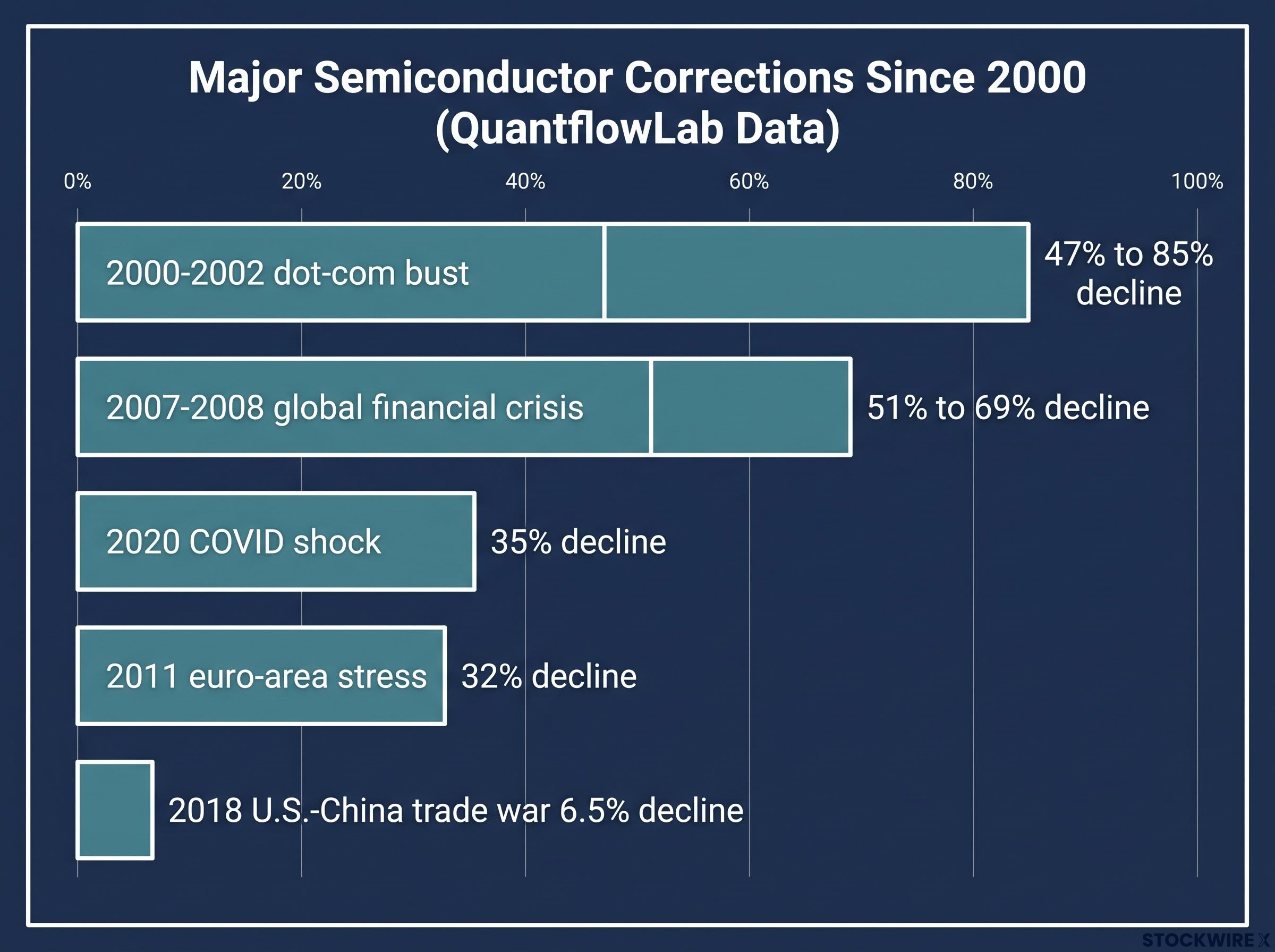
History gives the current pullback a yardstick. QuantflowLab data documents five major semiconductor corrections since 2000, and the magnitudes vary enormously.
- 2000-2002 dot-com bust: SOXX down 47% to 85%, driven by a collapse in technology valuations.
- 2007-2008 global financial crisis: down 51% to 69%, driven by the credit crisis.
- 2011 euro-area stress: down 32%, driven by sovereign debt fears in Europe.
- 2018 U.S.-China trade war: down roughly 6.5%, driven by tariff escalation.
- 2020 COVID shock: down 35%, driven by the pandemic.
The pattern in that list is instructive. In most of these episodes, the semiconductor correction reflected a macro stress that was already underway, not one the chip sector predicted out of a clear sky. That reinforces its value as a confirming signal rather than a purely leading one. The current 9-10% monthly drop sits at the mild end of that historical range, closer to a high-beta wobble than a structural bust.
Why a 5% ten-year yield changes the math on equities
The number to watch is the 10-year Treasury yield, and it is doing something it has not done in nearly three years. As of mid-September 2026, it reached 4.97% to 5.01%, the highest since October 2023, up from roughly 4.04% a year earlier. It climbed around 0.26 percentage points in September alone.
That number connects to the stocks in your portfolio through a chain of effects. Walk through it and the pressure stops being abstract.
- Discount rate compression. Higher yields reduce the present value of future earnings. A company’s stock price partly reflects profits expected years out, and when the rate used to value those future profits rises, the price-to-earnings multiple compresses. Long-duration growth stocks, whose value sits mostly in distant earnings, feel this most.
- Equity risk premium erosion. When safe government debt pays 5%, dividend-paying stocks look less compelling. The average S&P 500 dividend yield sits near 1.29%. That gap prompts capital to rotate from stocks toward bonds.
- Borrowing cost drag. Higher rates raise corporate debt burdens and slow consumer spending, which weighs directly on earnings. Rate-sensitive sectors such as real estate, utilities, and small caps carry the most exposure.
The size of the effect is not guesswork.
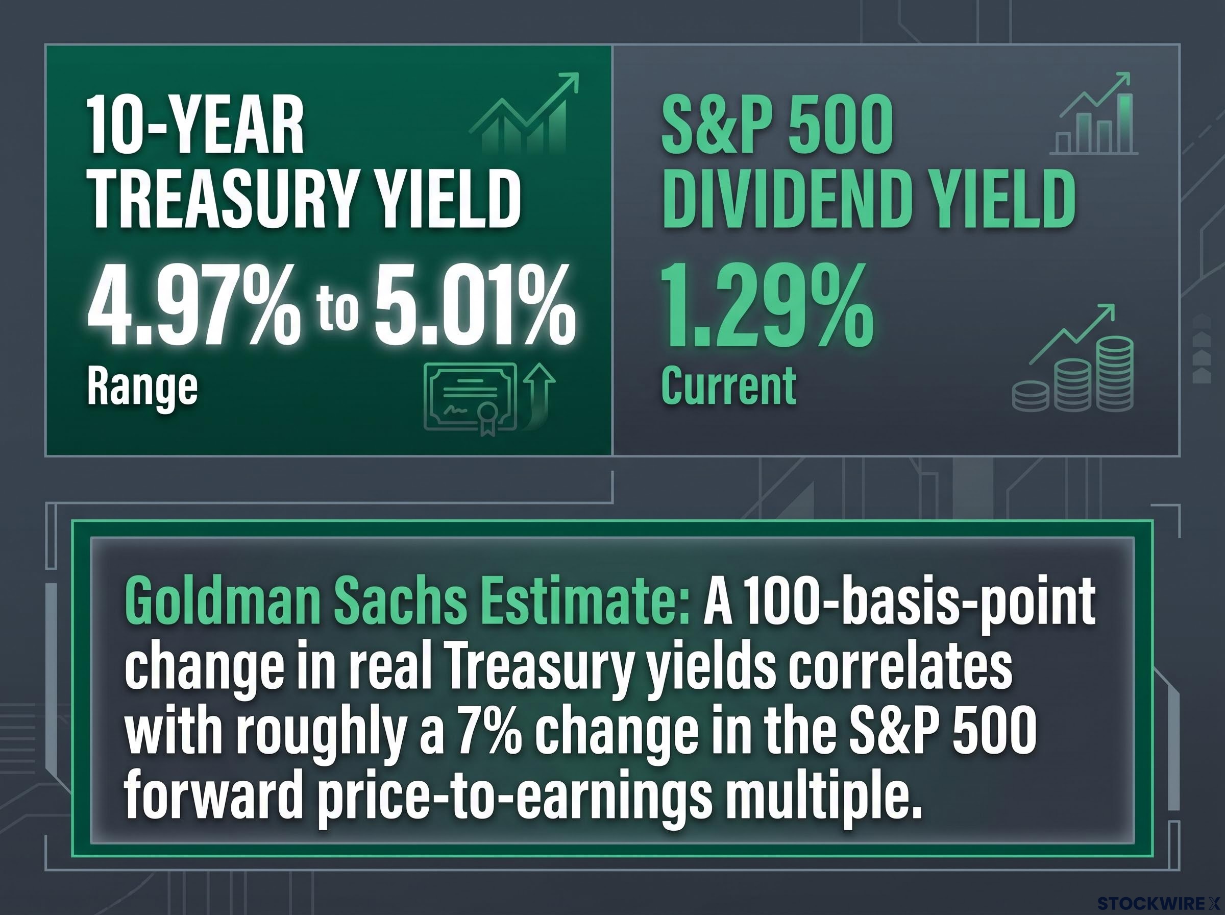
Goldman Sachs estimates that a 100-basis-point change in real Treasury yields correlates with roughly a 7% change in the S&P 500 forward price-to-earnings multiple.
When the risk-free rate crosses 5% and the average S&P 500 dividend yield sits below 1.3%, the mathematical case for holding stocks over Treasuries compresses hard. What would restore it is faster earnings growth, and that is exactly the counterargument the bulls lean on.
Equity risk premium compression has reached an extreme that reinforces the yield pressure described above: State Street Global Advisors measured the equity risk premium at just 0.19%, leaving investors with almost no excess return for holding stocks over Treasuries at a moment when the 10-year yield is still climbing.
According to State Street Global Advisors and Goldman Sachs, AI-driven profit expectations have so far outpaced the discount-rate drag in the 2026 cycle, letting valuations compress without ending the broader bull market. MarketWatch notes that rising rates helped end stock booms in 1987, 1994, 2000, and 2008, with the 2022 hiking cycle triggering another drawdown. Neuberger Berman adds a sharper warning: a loss of confidence in the long end of the yield curve could inflict structural damage that earnings growth alone cannot offset.
Near-term, the Federal Reserve holds the next move. Markets priced an over 94% probability of a 25-basis-point rate hike at the 15-16 September 2026 FOMC meeting, with Goldman Sachs, J.P. Morgan, and Morgan Stanley all forecasting a quarter-point increase.
Seasonal weakness as amplifier, not driver
September’s reputation for weakness invites a lazy conclusion: it is September, so stocks fall. The mechanism is more useful than the label, and it reframes seasonality as an amplifier of existing vulnerabilities rather than a cause in its own right.
The historical record is real but probabilistic. The S&P 500 averages a 0.6% to 0.7% decline in September, and the combined September and October figure sits near negative 0.6%. Yet 11 of the past 20 Septembers produced positive returns. The pattern is a tendency, not a rule.
What drives the tendency is a drain on demand rather than a surge in supply. September typically brings mutual fund tax-loss selling, thinner institutional participation after the summer, and a return of deferred decisions that had been parked over quieter months. Demand fades, and any existing weakness gets less support to lean on.
That is why the more important question is not whether September is soft. It is whether this September’s decline is seasonal noise washing through or the start of something structurally different. Technical experts at the UIA Institute and Swoopr Investment stress that support breaks are probabilistic, warning about “failed breakdowns,” where an asset drops below support then quickly closes back above it, trapping bearish traders. Distinguishing the two requires confirmation across multiple timeframes.
What a genuine breakdown confirmation looks like
A single close below support on average volume is a weak signal. A breakdown on heavy volume that holds below support across subsequent sessions carries far more weight. The multi-timeframe volume test is the first filter.
Volume confirmation on breakouts is the first filter the current signals must pass: valid breakouts, or breakdowns in this case, typically require at least 1.5 to 2 times the 20-day average volume on the trigger bar, a threshold that separates technically significant moves from low-conviction drifts.
Breadth is the second. If the number of stocks hitting new 52-week lows accelerates alongside the index decline, the selling is broad-based rather than confined to a handful of large-cap names. Narrow selling can reverse quickly; broad selling rarely does.
For the current signals to graduate from bearish market indicators into a confirmed structural turn, three things would need to deteriorate further: yields holding sustainably above 5%, the SOXX closing below the upward channel that dates from its 7 April 2025 low, and breadth weakness spreading beyond rate-sensitive sectors into the broader market.
What to watch before calling this a turning point
You do not need a market forecast to act intelligently here. You need to know which few observable data points will tell you whether these signals are converging into something durable or dissipating into a routine September reset.
The three threads, technical breakdown, semiconductor weakness, and rate mechanics, resolve into a watchlist rather than a call. Each signal is probabilistic on its own; together they define what to monitor.
- 10-year yield trajectory relative to the 5% threshold.
- SOXX channel support dating from the 7 April 2025 low, and whether it holds.
- The FOMC outcome from the 15-16 September meeting, carrying a 94% implied probability of a 25-basis-point hike.
- Breadth data, specifically the pace of new 52-week lows.
- The mid-October window that Goldman Sachs and others flag as a more favourable seasonal setup.
The FOMC decision is the near-term catalyst. It will either validate the rate-driven pressure on valuations or partially relieve it. Beyond that, mid-October becomes the test period.
If current technical levels hold through October and semiconductor flows stay positive, the seasonal correction thesis strengthens. If they break, the structural concern deserves more weight.
Professional opinion is spread, not unanimous. Goldman Sachs, Barclays, and Bank of America maintain constructive medium-term outlooks. RBC Capital Markets flagged a 5% to 10% pullback risk, and Standard Chartered recommended buying on dips. Neuberger Berman warns most sharply about confidence in the long end of the yield curve.
Reading the signals clearly without overreading them
The convergence is real. A technical breakdown, semiconductor sector weakness, and rising rates arriving at the same time is a genuine analytical signal, not market noise. That is worth stating plainly.
What it is not is a confirmed bear market. No single indicator and no seasonal pattern amounts to that call, and proportion matters. The SOXX remains up 65% year-to-date despite its correction, and continued net inflows show institutional investors have not capitulated.
The investor’s task is to sort the signals by how well established they are. The 10-year yield trajectory and the SPY technical break are firm and observable. The semiconductor leading-indicator thesis and the failed-breakdown risk are contested or preliminary. Weight them accordingly rather than treating all four as equal.
Ground the rate risk in something concrete: Goldman Sachs estimates a 100-basis-point yield move maps to roughly a 7% swing in the S&P 500 forward P/E multiple. That is the clearest quantifiable threat on the table.
Neuberger Berman’s warning about an “unanchored” long end of the yield curve is the tail risk that lifts this setup above routine seasonal noise. It is the variable that could turn a manageable correction into structural damage.
The value of tracking bearish signals is not to call the exact bottom. It is to avoid being surprised by deterioration that was visible well in advance.
This article is for informational purposes only and should not be considered financial advice. Investors should conduct their own research and consult with financial professionals before making investment decisions. Past performance does not guarantee future results. Financial projections are subject to market conditions and various risk factors, and forward-looking statements are speculative and subject to change based on market developments.