Most investors have a reflex when the market stops climbing: step back, wait for a clear direction, and do nothing until the index picks a side. That reflex costs you.
Because inside a flat headline number, the market is anything but still. While the S&P 500 sits roughly where it did four months ago, individual stocks are diverging sharply, some quietly doubling while others bleed out, and that gap is exactly where returns are hiding right now.
The index closed at 7,673.52 on 8 September 2026, a long-term ascending trendline has been cleanly broken, and Treasury bond futures are down roughly 8%. This is not a random pause. It is a specific, nameable regime with its own playbook.
Here is the diagnostic toolkit for reading it. After this, you will know how to spot when the broad market has changed regimes, which signals confirm the shift, and why the right response to a grinding index is to move down a level and pick stocks rather than bet on where the whole thing goes next.
What a stock picker’s market actually is (and what it is not)
The phrase “stock picker’s market” gets thrown around loosely, usually to mean nothing more than “things feel harder than usual.” That is not what it means here.
It describes a precise market structure, not a mood. A stock picker’s market is a range-bound regime: a major index oscillates within a defined band, often 10-15%, repeatedly bouncing between the same support and resistance levels without making net directional progress.
The distinction matters because this is neither a bear market nor a simple consolidation. The index is not falling, but it is not trending either, and that specific condition is what elevates intra-market dispersion.
Dispersion is the whole mechanism. When the headline number is flat but individual stocks move sharply in opposite directions, the spread between the best and worst performers widens dramatically. That widening spread is the gap active selection exploits, and it is why sitting on the sidelines leaves money on the table.
The numbers back this up. During sideways regimes, annual returns at the index level typically land in a modest 4-6% range, yet intra-market dispersion stays highly elevated, which is precisely the setup that rewards picking the right names over owning the whole basket.
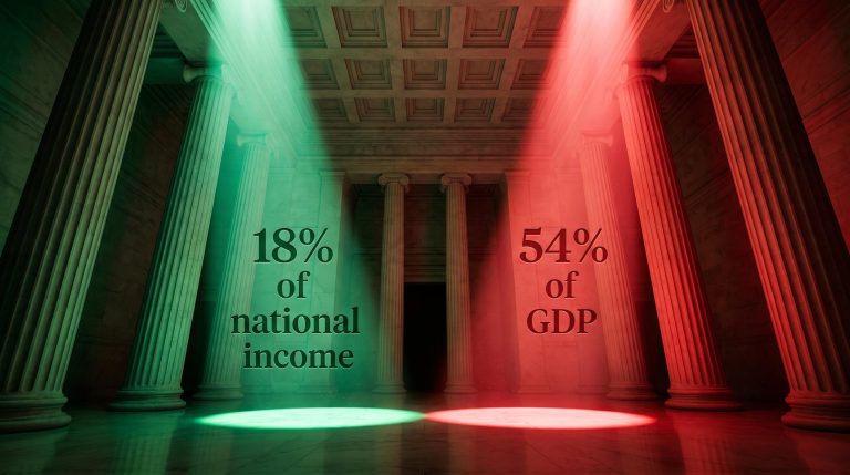
The scale of that spread matters: equity dispersion across global markets reached levels not seen since December 1999 in April and May 2026, with two stocks holding just 1.1% of ACWI weight generating roughly 17% of the index’s total return, a ratio of contribution to weight that illustrates precisely why passive ownership of the whole basket underperforms selective positioning in elevated-dispersion regimes.
Two historical templates worth studying
You do not have to take this on faith. Two recent regimes show the pattern clearly, and both carry the same lesson about how these markets end.
| Period | Trigger | Index Range | Approx. Band Width | Sectors With Relative Strength |
|---|---|---|---|---|
| 2011 | US credit-rating downgrade | ~1,120 to 1,210 | ~10% | Healthcare, consumer discretionary |
| 2015-2016 | China growth fears, oil collapse, Fed uncertainty | ~1,850 to 2,100 | ~13% | Sectors led once rates paused and oil stabilised |
In 2011, the S&P 500 chopped within a roughly 10% band after the downgrade, with healthcare and consumer discretionary showing relative strength that carried into the eventual uptrend. In 2015-2016, the index ground sideways across a 13% range until the Federal Reserve paused rate hikes and oil prices steadied.
The lesson sits in both cases. Resolution did not arrive because the index “decided” to break out on its own. It came when a decisive macro variable shifted, which tells you these regimes are recurring, identifiable, and worth learning to read rather than treating as random noise.
When big ASX news breaks, our subscribers know first
How to read the technical signals that confirm a regime shift
Recognising the regime is not a single glance at a chart. It is a sequence, and you read it from the broadest observation down to the most precise confirmation.
Here are the three signals, in the order you should look for them:
- Trendline violation (first-order signal): When a long-term ascending trendline is clearly broken, the presumption of a continuing uptrend is gone. The market enters an undetermined state, neither up nor down.
- Horizontal support testing (second-order confirmation): When a previously significant price level has held for several weeks with only brief tests, the count of those tests matters. Each failed push signals supply pressure building at that level.
- Stagnation duration (third element): When the index trades near the same level it held four months earlier, the sheer absence of net progress over that stretch is itself a data point confirming the regime.
That is exactly what the S&P 500 shows now. The index closed at 7,673.52 on 8 September 2026, down 0.58% on the session, near levels it has occupied for roughly four months. In the 9-10 September 2026 window, E-mini S&P 500 futures (ESU26) fluctuated between 7,597.00 and 7,606.00, with the underlying cash index near 7,592.93.
The technical picture is unambiguous: a broken ascending trendline and a key horizontal support level at risk of a sustained close below it. Both boxes, ticked.
Then there is the bond market, which adds a layer the equity chart alone cannot give you.
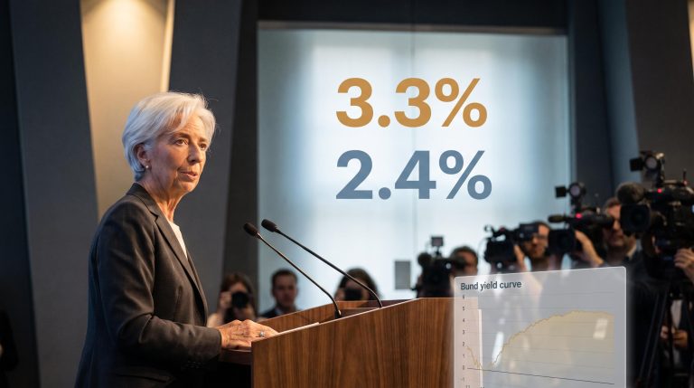
Treasury bond futures (ZB) are down approximately 8%. Rising rate pressure is not just a bond story. It is the equity chart’s technical warning confirmed from a second asset class, and that cross-market alignment adds real weight to the signal.
Here is the discipline that matters. One signal on its own is not enough to label the environment. If you see only a broken trendline, or only stagnation, stay cautious. It is when all three align, and the bond market nods along, that the framework earns its diagnostic teeth and you can act with confidence.
For readers wanting to operationalise the trendline and support signals described here, our dedicated guide to technical indicators that work in live trading covers RSI divergence at structural confluence levels, Volume Market Profile’s Point of Control, and why curve-fitted indicators consistently collapse when real capital is at stake.
The macro layer: how central bank decisions reshape the regime
Charts tell you what the market is doing. They do not tell you why, or for how long. For that, you have to read the forces that set the conditions the charts are drawing.
The core mechanism is straightforward. When rates rise, the risk-free return available to investors climbs, which raises the opportunity cost of holding equities. That compresses the multiple investors will pay for earnings growth, and a compressed multiple is what pins an index into a range instead of letting it trend higher.
Central bank rate mechanics transmit through bank funding costs into mortgage rates, business loan rates, and ultimately equity multiples, so the three-member FOMC dissent in July was not merely a procedural footnote: it signalled that the risk-free floor underpinning equity valuations could shift with a single meeting’s outcome.
That is precisely the configuration in place now, and it spans three major central banks.
| Central Bank | Current Rate | Most Recent Action | Directional Bias |
|---|---|---|---|
| Federal Reserve | 3.50-3.75% | Held on 29 July 2026, three dissents for a hike | On hold but hawkish |
| Bank of Japan | 1.0% | Raised on 31 July 2026 (8-1 vote) | Tightening |
| European Central Bank | Active meeting cycle | Engaged during this window | Live variable |
At its 29 July 2026 meeting, the Federal Open Market Committee (FOMC) held the federal funds rate at 3.50-3.75%, with interest on reserve balances at 3.65%. The detail that matters is the internal split: three members dissented in favour of a hike, and minutes noted that “several” policymakers were ready to raise rates if inflation did not trend toward the 2% goal.
The Bank of Japan adds a cross-border complication. On 31 July 2026, it raised its short-term policy rate to 1.0% by an 8-1 vote, its highest level since September 1995, with one board member favouring an even larger move to 1.25%. A tightening BoJ pressures the yen carry trade, and that feeds extra volatility straight into US equity regimes.
What would have to change for this regime to break
The 2015-2016 template gives you the clearest resolution signal: that sideways stretch ended once the Fed paused hikes. A confirmed rate pause or pivot is the most historically reliable trigger for breaking a range like this one.
Beyond that, watch for a decisive macro shift in one of a few forms: inflation trending clearly below 2%, or a yield-curve realignment. The August 2026 CPI release, pending on 11 September 2026, is the near-term catalyst most likely to move the narrative in either direction.
One caution on direction. Prolonged sideways markets have resolved upward when valuation multiples compressed to specific targets, and downward when an unexpected macro shock arrived. Resolution is not predetermined either way.
What this configuration tells you is about duration. With the Fed holding but hawkish, the BoJ tightening, and the ECB active, the macro pressure sustaining this range is unlikely to lift quickly. Calibrate your stock-picking horizon to a multi-month timeframe, not a breakout within weeks.
Where the risks in a stock picker’s strategy actually live
Recognising this regime is the easy part. Executing inside it is genuinely hard, and treating the framework as a licence to trade freely is how you lose money even when your read on the market is correct.
Four risks deserve your attention before you commit capital:
- False breakouts and whipsaws: Prices briefly push past support or resistance, trip your stop-losses, then reverse. The result is a string of small losses that erodes capital even when your macro thesis is right.
- Concentration and tracking error: Mega-cap names dominate passive benchmarks, so generating alpha forces active managers into concentrated bets outside the top holdings, sharply raising idiosyncratic risk and tracking error.
- Sector rotation mistaken for alpha: Systematic tilts toward low-beta or defensive sectors can look like stock-picking skill while actually reflecting risk reduction. These strategies often carry betas below one, meaning performance is driven by systematic factors, not genuine selection.
- Regime-end exposure: Position for endless sideways chop and you are structurally exposed to missing the early phase of the directional move that follows resolution, which historically delivers the largest single-session and single-week gains.
Volatility dispersion adds a further dimension to the concentration risk active managers face: when a cluster of AI and semiconductor names does the heavy lifting while other index components lag, index volatility is structurally suppressed even as single-stock risk premiums stay elevated, creating a gap the VIX alone cannot reveal and that passive exposure fails to price correctly.
The execution difficulty is not theoretical. A widely cited practitioner benchmark holds that broad indices outperform most active managers in around 80% of measured periods, including some historical sideways years. That figure is unverified and worth treating with caution, but the direction of the point stands: the theoretical edge does not guarantee the outcome.
Layer on the practical drag too, transaction costs, slippage, and the decision fatigue of constantly monitoring support and resistance. These are separate from strategy error and they compound.
Then there is the deeper disagreement about what this regime even is.
BlackRock, ClearBridge Investments and Schroders read the current stagnation as a structural regime shift, driven by secular reflation, fundamentally altered stock-bond correlations, and AI-led index concentration. J.P. Morgan, Piper Sandler and Morgan Stanley read the same tape as a cyclical consolidation, a normal digestion of prior gains likely to retest all-time highs. When institutions of that calibre reach opposite conclusions from identical data, that disagreement is itself a risk signal for anyone building conviction around either thesis.
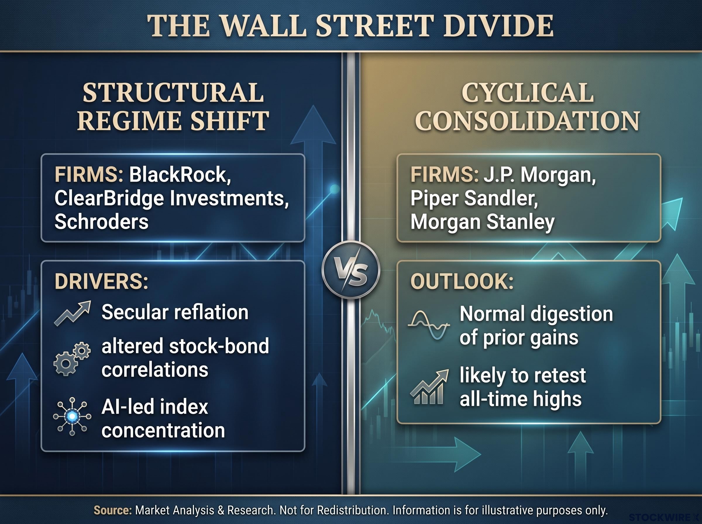
This split is not academic. It determines whether you build a multi-year stock-picking framework around this regime or treat it as a tactical window with a defined exit. Work out which camp’s logic fits your own horizon before you put money to work.
Positioning in an environment that rewards patience more than prediction
So what do you actually do with all of this? The current environment rewards a specific posture, and it is not prediction.
It rewards relative strength screening within sectors, disciplined entry near tested support rather than chasing strength, and position sizing that survives false breakouts instead of assuming clean directional moves. You are picking names and managing the whipsaw, not calling the index.
Two signals that would mark a genuine regime change
Watch these two variables, in this order of importance:
- Fed language on inflation. Look for a reduction in dissenting hawkish votes, or an explicit acknowledgment that the inflation trend is enough to drop the hike bias. That softening is the earliest tell.
- CPI trajectory. Look for a print that puts the year-over-year rate on a clear path toward 2% rather than stalling above it, sustained across at least two consecutive releases to avoid a false signal.
The nearest concrete test is the 11 September 2026 CPI release. Because three FOMC members actively wanted to hike in July, this print carries asymmetric weight: a hot number reopens the hike debate and likely extends the range-bound regime, while a soft number may be the single event most capable of tilting the institutional narrative toward the cyclical-consolidation view. Meanwhile, the BoJ’s guidance signalling room for further hikes on energy costs, yen weakness and AI-driven demand extends the cross-border pressure into the second half of fiscal 2026.
Here is the honest bottom line. The question of structural shift versus cyclical pause is not yet settled, so the correct posture is one that earns returns inside the range while keeping the flexibility to rotate into a trend-following approach the moment a macro variable resolves. Patience, not a prediction, is the edge.
This article is for informational purposes only and should not be considered financial advice. Investors should conduct their own research and consult with financial professionals before making investment decisions. Past performance does not guarantee future results, and these statements are speculative and subject to change based on market developments.