The VIX is sitting near multi-year lows. At the same time, single-stock volatility is pinned in the 98th percentile of its own history. Both of those things are true right now, and together they describe a market that is anything but quiet.
From 30,000 feet, September 2026 looks calm. Down at the execution level, the tape is chaotic, and seasonal weakness is expressing itself through congestion rather than collapse. The calendar says danger; the price action says range-bound.
Understanding why those two states coexist is the whole game this month. Here is what this tape structure actually requires of you as a trader or investor, and what would have to change for the next directional trend to take hold.
The tape that rewards selling strength and buying weakness
Watch a resistance breakout in this market and you learn the regime quickly. Price pushes through, momentum fails to follow, and within a session or two the move has reversed. Strength fades almost as soon as it appears.
Adaptive desk traders have already recalibrated to this. Profit targets have been pulled in from roughly two average true ranges (ATRs) down to one, because the follow-through that would justify a wider target simply is not there. An average true range measures how far a security typically moves in a day, so cutting the target in half is a direct admission that daily ranges are compressing.
The clearest illustration comes from desk trader Tom Preston, whose SPX iron condor was reported profitable in nearly every session across a two-week stretch. An iron condor is an options strategy that profits when a market stays inside a defined range, and it worked because the S&P 500 kept oscillating within roughly a 2% band in either direction.
This is the distinction that trips people up. It is not a low-volatility story at the individual stock level, where turbulence is high. It is a low-directionality, low-momentum story at the index level, and the two are easily confused.
The implied volatility spread between the Nasdaq 100 and the S&P 500 reached its widest reading in over two decades in mid-June 2026 before cooling sharply, a pattern that reflects the same idiosyncratic single-stock turbulence driving the COR3M record low and reinforces why index-level VIX readings are currently unreliable signals of actual portfolio risk.
What institutional correlation data confirms
The desk-level feel shows up hard in the institutional numbers. Correlation measures how closely stocks move together, and right now they are barely moving in step at all.
- COR1M (Cboe 1-Month Implied Correlation Index) rose more than 60% during August 2026 to close at 10.06.
- COR6M (the six-month index) rose 8.8% to 12.60.
- COR3M (the three-month index) set a record low of 7.19 on 10 July 2026.
A COR3M reading of 7.19 is the lowest since the index existed. It means the market is pricing almost no expectation that stocks will move together over the coming three months.
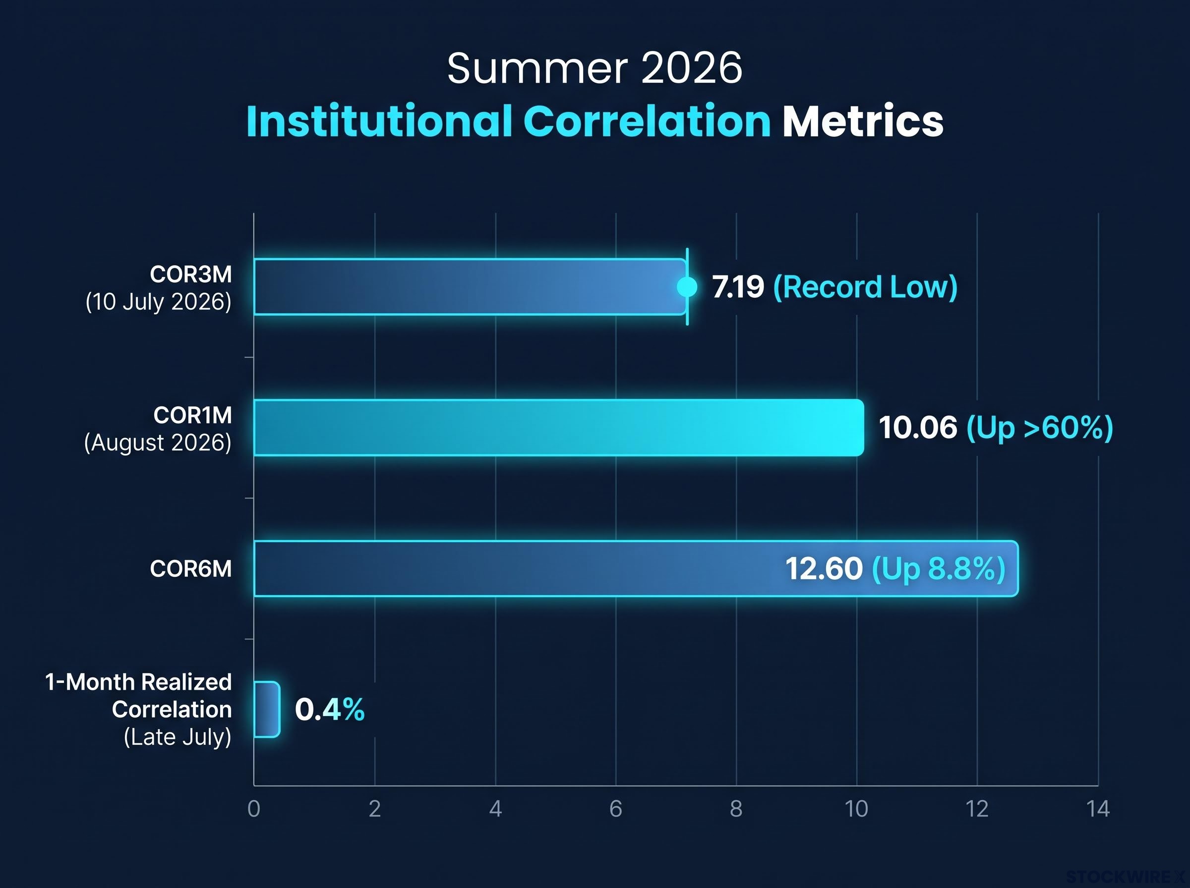
Even those readings understate how acute the disconnect became. Alpha Exchange noted that one-month realised correlation printed as low as 0.4% in late July, effectively near-total independence between individual names.
The divergence is visible across measurement windows, not just one index. Nationwide observed that the 63-day stock-to-index correlation sits roughly 1.5 standard deviations below its long-term average.
What all of this tells you is practical. The edge this month belongs to mean-reversion strategies, not trend-following ones, and positioning around that distinction is the first real decision the data demands. Chasing breakouts here means fighting the tape structure, and that usually costs you a string of small losses on failed momentum plays.
When big ASX news breaks, our subscribers know first
Record earnings as a structural floor, but not an all-clear signal
The strongest argument against a fundamental correction is simply how much money corporate America is making. FactSet reported a blended S&P 500 earnings growth rate of 47.4% year-over-year for Q2 2026.
That figure is not just an artefact of two dominant names. Strip out Alphabet and Amazon, and the blended growth rate still comes in at 28.8%. The breadth of the strength is genuine.
Profitability tells the same story. The blended net profit margin hit 16.9%, and excluding Alphabet and Amazon it held near 15.0%.
A net profit margin of 16.9% is the highest on record since FactSet began tracking the figure in 2009. This is the single clearest reason September 2026 does not resemble the setup for a 2008-style unwind.
Now the shadow underneath. In Q1 2026, operating margins contracted by roughly 370 basis points across the index, and the input-cost threats behind that squeeze have not gone away: raw materials, labour, energy, and tariffs.
| Metric | Q1 2026 | Q2 2026 | Historical reference |
|---|---|---|---|
| Blended EPS growth (YoY) | Positive, below Q2 | 47.4% (28.8% ex-Alphabet/Amazon) | Well above trend |
| Net profit margin | Below Q2 record | 16.9% (~15.0% ex-Alphabet/Amazon) | Highest on record since 2009 |
| Operating margin change | Contracted ~370 bps | Record margin level | US margins ~14% vs 11% median |
Hold both numbers at once. The record Q2 margin is why this is not a structural bear market, and the Q1 operating margin contraction is the early warning system that tells you exactly where the vulnerabilities sit if energy prices stay elevated or trade conditions deteriorate. Anchoring only on the headline figure is where investors get caught out.
September seasonality in 2026: statistical pattern or genuine structural risk?
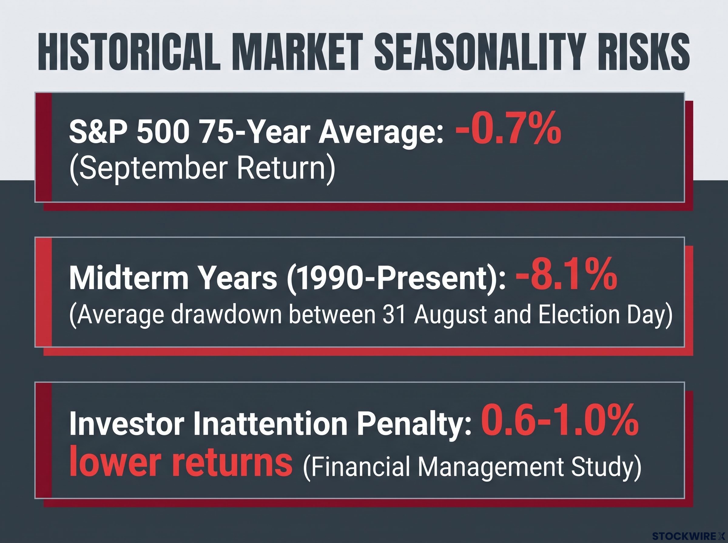
September carries a reputation, and the numbers give it some weight. Over the past 75 years, the S&P 500 has averaged a return of roughly -0.7% in September.
The midterm-year data looks more alarming still. From 1990 to the present, equities have seen an average drawdown of roughly 8.1% between 31 August and Election Day in midterm election years.
Yet plenty of serious analysts argue the pattern is largely noise. A J.P. Morgan research note contends that September seasonality lacks any consistent fundamental explanation. Fisher Investments takes a similar line, arguing that past September declines were driven by discrete macro shocks that happened to cluster on the calendar rather than by the calendar itself.
The September effect has a well-documented statistical record, but the median S&P 500 return for the month is actually +0.1% and more than half of all Septembers since 1925 closed in positive territory, which is precisely why the current tape structure matters more than the calendar date.
The case for structural mechanisms over calendar coincidence
The counter-argument is that real, identifiable behaviours push the market lower in this window. These matter because they tie to human decisions and institutional constraints, not just historical averages.
- Post-vacation portfolio rebalancing, as participants return and reset positions after the summer lull.
- Mutual fund tax-loss harvesting ahead of September fiscal year-ends, which mechanically pressures weaker names.
- Investor inattention during school holidays, where an academic study in Financial Management found delayed incorporation of negative news left returns 0.6-1.0% lower in the month that followed.
These mechanisms carry more analytical weight than a bare statistical average precisely because you can point to who is doing what and why. But in 2026, they may be partly suppressed by the record earnings buffer, which is exactly why the weakness is showing up as congestion rather than a directional decline.
What this tells you is that September deserves tactical awareness, not panic and not dismissal. The more useful lens is the tape structure already in place and the specific input-cost and trade risks flagged in the earnings picture, not the date on the calendar.
What it would take to break the range and force correlation higher
Start with what has already failed to break the range, because it is instructive. Nvidia reported record earnings and still retraced more than half of its prior advance. If a result like that cannot lift the broad tape, the catalyst threshold is higher than most participants assume.
The idiosyncratic responses tell the story:
- Nvidia: record earnings, yet more than half of the prior advance was given back.
- AMD: an approximate 3% single-session gain on its breakout.
- Meta: a roughly 6.5% surge following a prior 4.8% single-day advance.
Each moved on its own logic. None dragged the market with it, which is the definition of a low-correlation tape.
Sometimes the signal comes from sentiment rather than fundamentals. The forced exit of a heavily leveraged participant referred to as “Leopold,” with a reported book size of roughly $20 billion and a far larger indirect flow impact, functioned mainly as sentiment relief. Market participants drew the parallel to the FTX collapse and the arrest of Sam Bankman-Fried, which cleanly coincided with the ultimate bottom in Bitcoin, a case where removing a leveraged entity did the work a fundamental catalyst usually would.
Then there is the diversification problem sitting underneath all of this.
The rolling 52-week equity-bond correlation rebounded sharply to +0.44 in 2026, up from a January low of -0.33. When stocks and bonds move together, the bond side of a portfolio stops behaving like a hedge.
Macro forecasts frame a contained range, with one strategist capping the S&P 500 near 7,650, a base case of 7,300, and a bear case of 6,800. History suggests these congested tapes eventually resolve.
| Year | Congestion period | Resolution | Final-year return |
|---|---|---|---|
| 1999 | Early-year range-bound tape | Transitional | Not reported |
| 2005 | Early-year range-bound tape | Modest resolution | ~3% |
| 2006 | Early-year range-bound tape | Broke higher | ~14% |
The read for you is that no single mega-cap earnings event will restore correlation on its own. A genuine catalyst looks like a major earnings surprise across several names at once or a clear Federal Reserve policy shift that forces the whole tape to reprice. Chasing individual names expecting broad follow-through is a structural misread of this regime.
A Federal Reserve policy shift of the kind that would force broad tape repricing looks different now than it did under prior communication regimes: with Kevin Warsh having explicitly rejected forward guidance at his June 2026 press conference, each FOMC meeting carries genuine rate-direction uncertainty that the market previously had buffered by policy signals.
What this tape tells you about positioning through the rest of September
Pull the four threads together and a single framework emerges. A low-correlation regime, a record earnings buffer shadowed by margin risk, a seasonality debate that leans structural but not decisive, and a catalyst threshold higher than the market assumes all point the same way: the tape rewards mean-reversion until a qualifying catalyst appears.
That translates into concrete decisions. Adjust profit targets toward one ATR rather than fighting for the wider move. Reduce your reliance on bonds as a hedge, given the equity-bond correlation of +0.44 that has temporarily undermined traditional 60/40 diversification logic.
The equity-bond correlation shift undermining 60/40 diversification logic is not a recent development: UBS research from June 2026 put the two-month rolling correlation between the S&P 500 and the 10-year Treasury yield at -0.69, the most extreme negative reading since 1996, with core PCE sitting above the threshold at which bonds historically lose their cushioning function.
The baseline to measure against is the COR3M record low of 7.19. Any correlation recovery has to begin from there, and until it does, the congestion holds.
This article is for informational purposes only and should not be considered financial advice. Investors should conduct their own research and consult with financial professionals before making investment decisions. Past performance does not guarantee future results, and financial projections are subject to market conditions and various risk factors.
Three variables to watch before the tape resolves
Set clear criteria and let the tape tell you when the regime is turning. Three conditions would qualify.
- A Federal Reserve inflection point. The signal would be correlation indices lifting sharply off their lows as the whole market reprices to new policy language.
- A broad-based mega-cap earnings sweep. Watch for sector ETFs moving in the same direction on the same day, a sign cohesion is returning.
- A leveraged-participant exit event of Leopold scale. The tell would be options markets pricing wider daily ranges as forced flows work through.
The absence of these signals is itself information. Until one of the three arrives, the congestion regime remains intact, and positioning as though a trend is imminent is a bet against the evidence in front of you.