The Dallas Fed trimmed-mean PCE, the inflation measure built specifically to strip out statistical noise, sat at 2.3% for the 12 months ending July 2026. That is just 30 basis points above the Federal Reserve’s target.
Yet Chair Kevin Warsh is signalling multiple rate hikes into an economy where real GDP growth has slowed to roughly 1.5% and where payrolls just turned negative. The gap between what the data says and what policy appears to be doing is not a minor technical dispute.
This is a newly installed Fed chair, a commodity-driven inflation print, and a labour market that looks nothing like the 2021-2022 overheating episode that originally justified the tightening logic. The tension between the Fed’s stated metrics and its actual policy signals has direct consequences for asset prices, corporate margins, and household real incomes.
Here is the diagnostic tool you need: a framework for judging whether the Fed is responding to genuine demand-side inflation or chasing a headline number driven by a geopolitical oil shock. That single distinction determines how damaging a Fed rate hike policy error would actually be, and it is the thread that runs through everything below.
What Kevin Warsh’s inflation metrics actually reveal
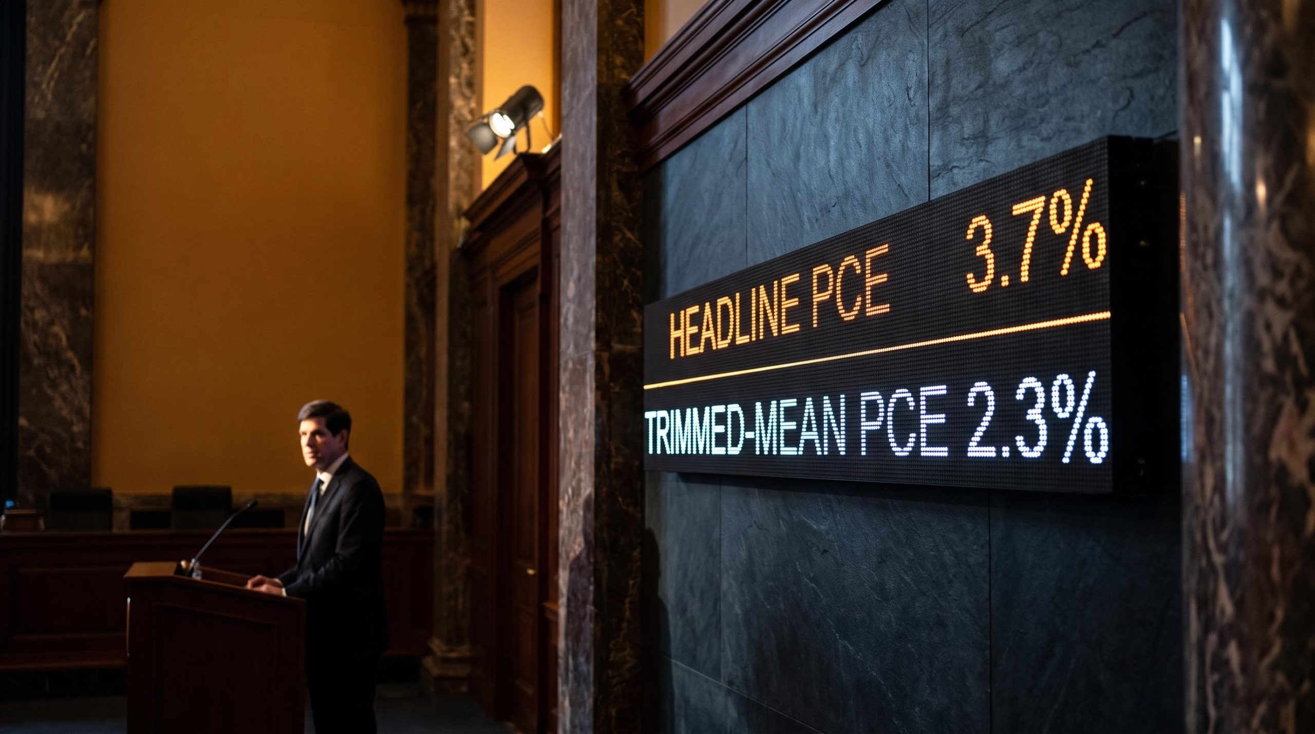
Start with the two numbers that sit at the centre of the entire debate. Headline PCE inflation ran at 3.7% over the 12 months to July 2026. The Dallas Fed trimmed-mean measure, over the same window, ran at 2.3%.
The metric that matters Headline PCE: 3.7%. Trimmed-mean PCE: 2.3%. The trimmed-mean figure strips out the most extreme price moves in either direction, so a 1.4-percentage-point gap between the two tells you the inflation the Fed is officially alarmed about is concentrated in a handful of volatile, energy-sensitive categories.
Here is the fuller picture across the four gauges worth tracking:
- Trimmed-mean PCE (2.3%): the underlying trend once the outliers are removed. Barely above target.
- Headline PCE (3.7%): the number Warsh cites. Includes the full force of the energy spike.
- Core PCE ex food and energy (3.3%): elevated, but pressured by goods and tariffs rather than services.
- 5-year, 5-year forward inflation expectation (approximately 2.3% in late August 2026): the market’s read on long-run inflation. It has not moved in a way that justifies a full tightening cycle.
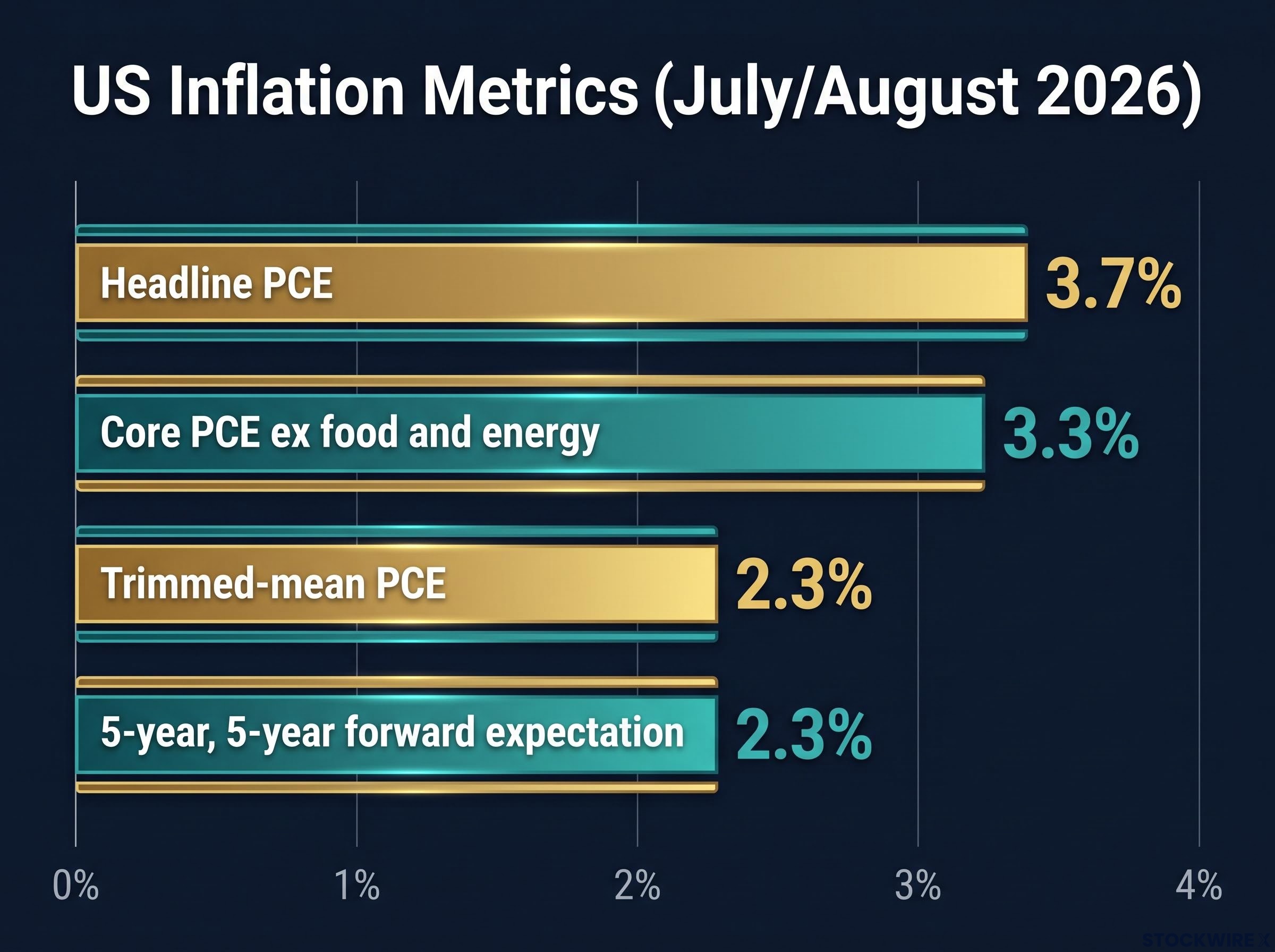
Read together, these do not describe a broadly overheating economy. They describe a supply-side price shock layered on top of an underlying trend that is close to where the Fed wants it.
The Dallas Fed trimmed-mean and Cleveland Fed median are the PCE inflation gauges that carry the most diagnostic weight in the current cycle, precisely because they filter out the energy-spike distortion that dominates the headline figure Warsh has been citing at FOMC meetings.
The breadth argument and why it overstates the inflation signal
At his Jackson Hole address on 28 August 2026, Warsh leaned on a different figure: breadth. He noted that 54% of the goods and services in the PCE basket showed price increases above 3% over the past year.
The problem is that component breadth counts every category equally, regardless of how much households actually spend on it. A price surge in a minor category inflates the breadth reading without materially affecting aggregate consumption, so breadth systematically overstates how widespread meaningful inflation really is.
The 54% figure is also falling. It sits well below the post-pandemic peak near 77% and remains above the roughly 32% typical in the two decades before the pandemic. A breadth reading that is declining from its peak is a disinflationary signal embedded in the very data Warsh cited to argue the hawkish case.
There is a deeper inconsistency here. Warsh’s own task forces to overhaul inflation measurement favour trimmed-mean and median metrics precisely because they filter noise, yet his near-term hawkishness leans on headline figures and breadth, the exact measures those reforms are designed to move away from. When you evaluate the next FOMC statement, that contradiction is the first thing to weigh.
When big ASX news breaks, our subscribers know first
Why a weak labour market changes the inflation calculus
The strongest case against further tightening comes from the part of inflation the Fed can actually influence. Services make up roughly 60% of the consumption basket, and services inflation is driven primarily by wages. So the question becomes simple: are wages and hiring accelerating, or fading?
The data says fading. Here is the causal chain that dismantles the wage-price spiral narrative:
- Wages are the dominant driver of services inflation, which is around 60% of the basket.
- Labour demand is falling. Nonfarm payrolls averaged monthly gains of about 34,000 over the prior 12 months, then turned to a decline of roughly 23,000 in July 2026 (released 7 August 2026).
- Wage growth is decelerating as hiring cools faster than firing.
- Services disinflation is therefore already underway across housing services, utilities, telecom, education, and healthcare.
- Rate hikes at this point target a mechanism that is already correcting on its own.
For you, the implication is direct. The one part of inflation that rate hikes can genuinely address is already losing its fuel, which makes additional tightening primarily a demand-destruction exercise rather than a targeted remedy.
What the quit rate is signalling about the cycle ahead
The quit rate is the piece of this that looks forward rather than back. Workers quit when they are confident they can walk into a better-paying job, so the rate at which people voluntarily leave captures wage-bargaining power before it shows up in payrolls.
That rate peaked in 2021-2022, alongside the genuine wage-price spiral of that period, and has trended consistently lower since. Alongside it, the hiring rate is now falling faster than the firing rate, another leading signal that wage growth has further to soften.
Warsh has publicly dismissed wage growth as an unreliable inflation indicator. That dismissal is difficult to square with the well-documented link between labour market slack and services disinflation. If you hold equities in labour-sensitive sectors or watch credit quality in consumer-facing industries, the takeaway is twofold: the deterioration weakens the self-correcting mechanism bulls rely on, and it simultaneously erodes the inflation justification for the hikes.
Tightening into an oil shock: the policy error mechanism explained
To see why the current combination is so damaging, you need one distinction: cost-push versus demand-pull inflation. They look similar in a headline number but call for opposite responses.
The cost-push versus demand-pull distinction runs through nearly every major inflation episode since the 1970s, and the June 2026 data released on 30 June offered one of the clearer natural experiments for separating an energy-driven uptick from a genuine demand spiral.
| Inflation type | Typical cause | Wage response | Appropriate policy tool |
|---|---|---|---|
| Cost-push | Supply disruption, geopolitics, commodity spikes | Weak pass-through to wages | Patience; rate hikes are counterproductive |
| Demand-pull | Excess spending power, overheated demand | Strong wage acceleration | Tighter policy to cool demand |
The current goods-sector impulse is squarely cost-push. Consider the sequence of dominoes.
The magnitude of the shock WTI crude climbed from roughly $57 per barrel at the start of 2026 to approximately $113 per barrel by April 2026, and stayed elevated into the summer. Gasoline prices rose about 37% since February 2026.
That price surge functions as a geopolitical tax on real household income, not evidence of excess demand. Macroeconomic analysts including David Rosenberg argue the pass-through from energy shocks to nominal wages is weak, which means higher pump prices drain discretionary spending rather than trigger the wage acceleration that defines demand-pull inflation.
The supply drivers reinforce the point: Russia-Ukraine disruption to food shipments, potential Strait of Hormuz effects on fertiliser, and El Niño weather patterns. Layered on top, realised tariffs are estimated to add roughly 0.5 percentage points to core PCE, with research suggesting goods prices peak around 1.2 percentage points above baseline two years after a tariff shock.
Crucially, commodity prices carry only about a 10% correlation with final consumer inflation. That weakens any claim that an oil spike reliably foreshadows persistent, broad-based inflation.
Here is what this means for you. Raising rates does not lower the price of oil or food. It lowers the spending power of households already squeezed by those prices, compounding real income destruction rather than addressing the price level the Fed says it is worried about. That is the mechanism by which a hike into a supply shock turns a mid-cycle slowdown into a margin squeeze.
What 1997 teaches about “insurance” hikes and systemic risk
New Fed chairs have a habit of meeting a crisis early. The cleanest precedent for a single-hike cycle is early 1997, and it is worth running as a live stress test on today’s conditions.
The facts first. On 25 March 1997, the FOMC under Alan Greenspan raised its policy rate by 25 basis points as insurance against lingering demand, and held that stance until late 1998. Even without further nominal hikes, falling inflation pushed ex-post real rates to roughly 3%.
That single move set off a cascade:
- The March 1997 insurance hike.
- Ex-post real rates climb toward 3%.
- The US dollar strengthens.
- Capital flows exit emerging markets.
- The Asian Financial Crisis breaks out in July 1997.
- Russia defaults on its debt.
- Long-Term Capital Management (LTCM) nearly collapses in 1998.
The fragility that mattered LTCM operated with roughly 30 dollars of debt for every dollar of capital. In a highly leveraged, dollar-dominant system, a sustained real-rate squeeze does not need to be large to become systemic.
Where the 2026 parallels hold and where they diverge
Three parallels line up uncomfortably well. The dollar is strong, reinforced by higher-for-longer expectations. Global leverage in credit strategies is elevated. And real policy rates may be tighter than nominal figures suggest once you account for trend growth slowing toward 1.5%, with the 2-year Treasury yield near 4.4%.
Three differences cut the other way. Exchange-rate regimes are more flexible now, bank capital ratios are stronger, and many emerging markets hold larger foreign-reserve buffers than they did in 1997.
Those divergences genuinely reduce the odds of a 1998-style sudden stop. What they do not remove is the risk of a sustained real-economy slowdown transmitted through dollar strength and widening credit spreads.
For you as a risk manager, the 9-3 FOMC vote on 29 July 2026 and the roughly 38-42% futures-implied odds of a September hike matter less as a rate call than as a signal. The real question is not whether one hike causes a US recession, but whether a prolonged real-rate squeeze in a leveraged global system eventually returns to US markets through credit spreads or emerging-market stress. That reframes the debate from macro theory into a monitoring discipline.
How the tightening transmission hits portfolios in practice
If the Fed does tighten into a weakening economy and oil-squeezed real incomes, the damage will not spread evenly. It travels through specific channels, and each one lands on a specific part of a portfolio.
| Channel | Mechanism | Asset class most exposed | Leading indicator to monitor |
|---|---|---|---|
| Duration risk | Rising yields cut bond prices | Long-dated Treasuries and corporates | 10-year Treasury yield direction |
| Multiple compression | Higher discount rates lower valuations | Growth and long-duration equities | Real yields and equity risk premium |
| Credit spread widening | Higher funding costs stress weaker issuers | High-yield credit | Credit-default swap indices |
| Emerging-market stress | Strong dollar drains capital, raises debt costs | EM equities and global credit | Dollar index and EM spreads |
Start with duration, the most quantifiable channel. Bond mathematics dictate that a bond with a duration of 2 falls roughly 2% in price for every 100 basis points of yield increase. The 10-year Treasury yield already moved about 30 basis points higher following Warsh’s first FOMC meeting on 17 June 2026, so this is not hypothetical.
Equity multiple compression is a discount-rate story. Higher rates raise the rate at which future earnings are discounted, and growth and long-duration equities suffer most because their cash flows sit furthest in the future.
The assumption that bad news is good news — meaning weak payrolls reliably shifting rate odds and lifting equities — broke down structurally once the Fed publicly anchored policy on inflation rather than employment, a shift with direct implications for how growth and duration equities price in any softening of the labour market.
The emerging-market channel is where US investors are exposed indirectly, often through international equity or global credit allocations. IMF research estimates that a 10% appreciation in the US dollar reduces emerging-market output by roughly 1.9% after one year, with the drag persisting for more than two years.
The practical watchlist:
- 10-year Treasury yield direction
- Credit-default swap index moves
- Emerging-market spread levels
- The dollar index trend
What this means for you personally is that a policy error concentrates its damage. Long-duration bonds, growth equities, high-yield credit, and EM allocations all sit directly in the blast radius, while short-duration instruments and commodity-linked assets occupy a different risk profile entirely.
This article is for informational purposes only and should not be considered financial advice. Investors should conduct their own research and consult with financial professionals before making investment decisions. Past performance does not guarantee future results. Financial projections are subject to market conditions and various risk factors, and forward-looking statements here are speculative and subject to change.
What the September FOMC decision will actually tell you
The 15-16 September 2026 FOMC meeting is best treated as an information event, not a binary rate outcome. Futures currently split roughly 58-59% toward a hold and 38-42% toward a 25-basis-point hike, but the number itself is the least revealing part.
Three signals will tell you whether a full tightening cycle is genuinely underway:
- The rate decision and the vote count, read against the 9-3 split on 29 July 2026 as a gauge of internal pressure.
- The dot plot’s year-end projection, measured against the Fed’s June figure of 3.8%, which implies one further hike from the current 3.50-3.75% range.
- The FOMC statement’s language on the labour market and growth, which reveals whether the July payroll decline is registering.
The policy-error thesis is testable. If the Fed hikes in September despite the July 2026 payroll drop and a trimmed-mean PCE running at 2.3%, that is the clearest empirical evidence that backward-looking headline metrics are dominating forward-looking labour and growth data.
The disconnect in one number The Fed’s June projection put full-year 2026 real GDP growth at 2.2%. The actual four-quarter trend is running closer to 1.5%. That gap is the most concrete illustration of data diverging from communication.
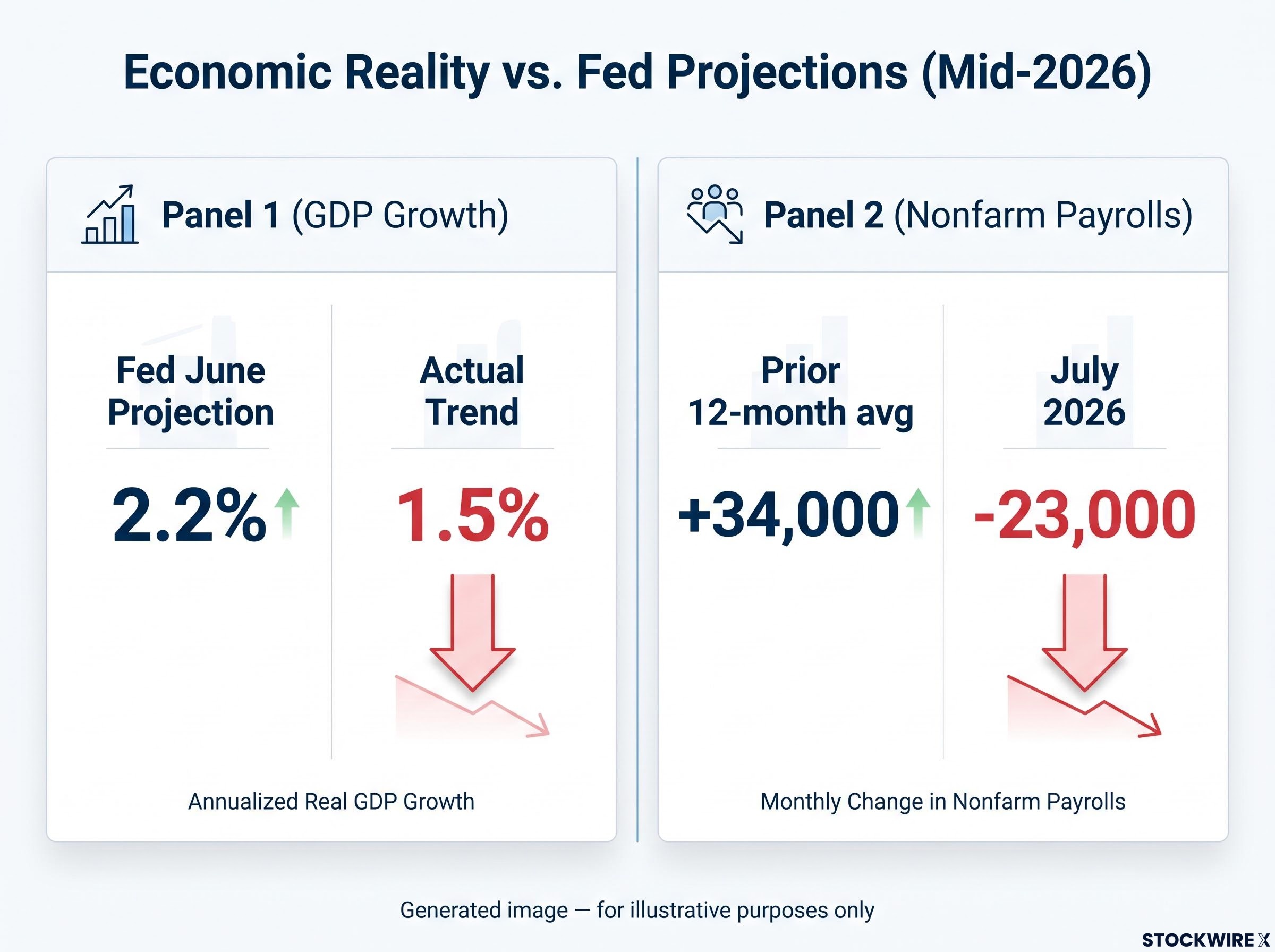
For you, September is not really about whether rates move 25 basis points. It is about whether the Fed shows it can distinguish a supply-shock inflation event from a demand-pull one. That answer has a far longer shelf life than the rate decision, and knowing what to watch on 16 September lets you update your own risk assessment in real time, before the market has finished pricing the signal.
For investors wanting to translate the policy-error risk into concrete portfolio decisions, our dedicated guide to defensive positioning during rate hikes covers sector rotation logic, quality factor criteria, and liquidity buffer sizing specifically calibrated to geopolitical energy shocks layered on tight monetary policy.