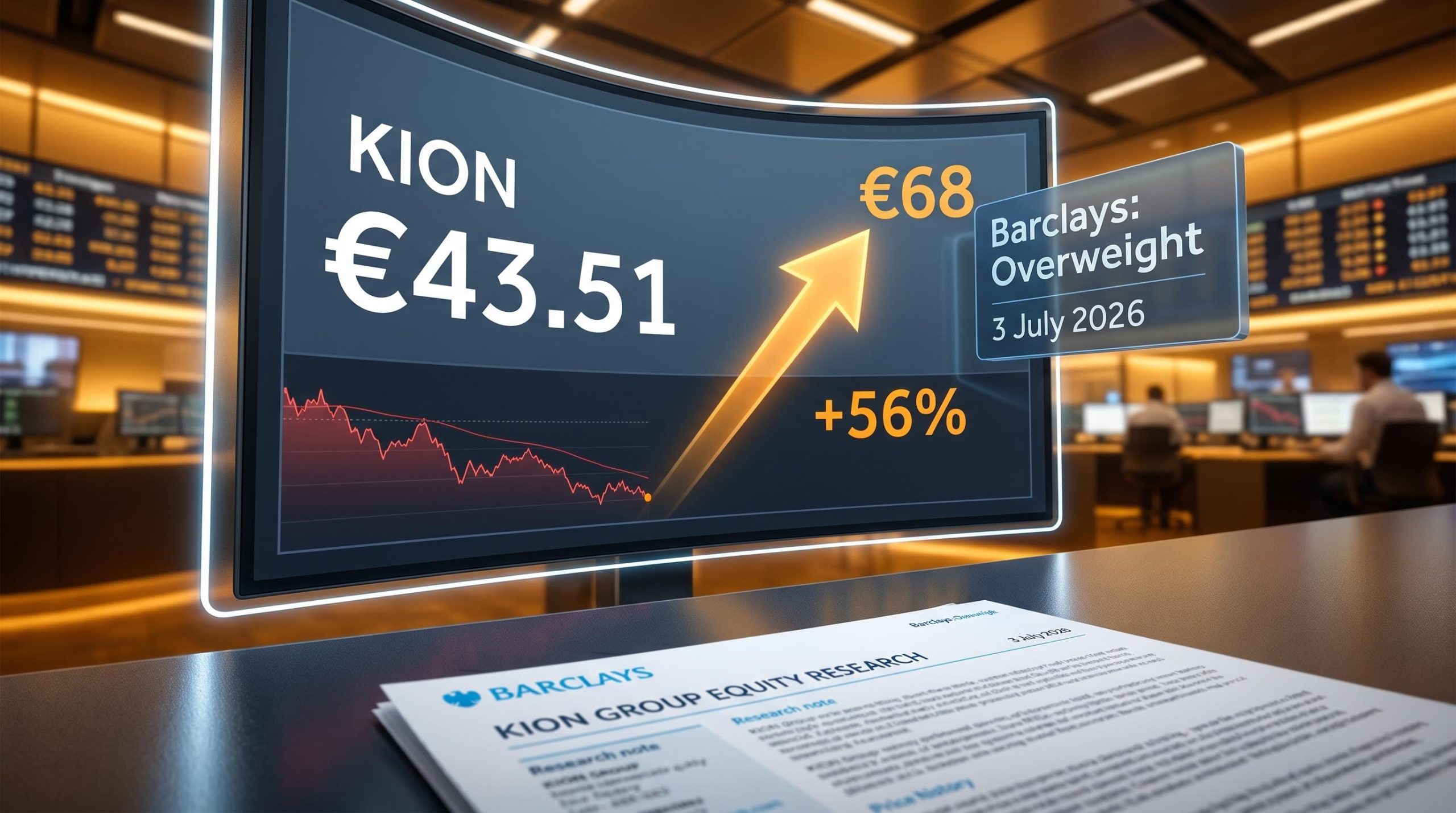
Why Barclays Sees 56% Upside in a Beaten-Down Automation Stock
2 hrs ago

The Federal Reserve held rates at 3.50%-3.75% at its June 2026 meeting, and Wall Street’s initial read was relief. Barclays’ read, published 3 July 2026, is more precise: this is a pause with a live reload, not a ceasefire.
One day after June payroll data showed only 57,000 new jobs added and labour force participation dropped to a more-than-five-year low, Barclays analysts Jonathan Millar and Marc Giannoni released a research note framing the Fed’s posture as explicitly conditional. The dot plot already signals a median year-end rate of approximately 3.8%, meaning at least one more hike is built into the Fed’s own projections.
Investors treating the pause as the end of the cycle are reading a different document than the one the Fed published. Here is a clear framework for reading the Barclays thesis, understanding exactly which data points would trigger the next hike, and translating that into concrete positioning decisions across bonds, equities, and cash.
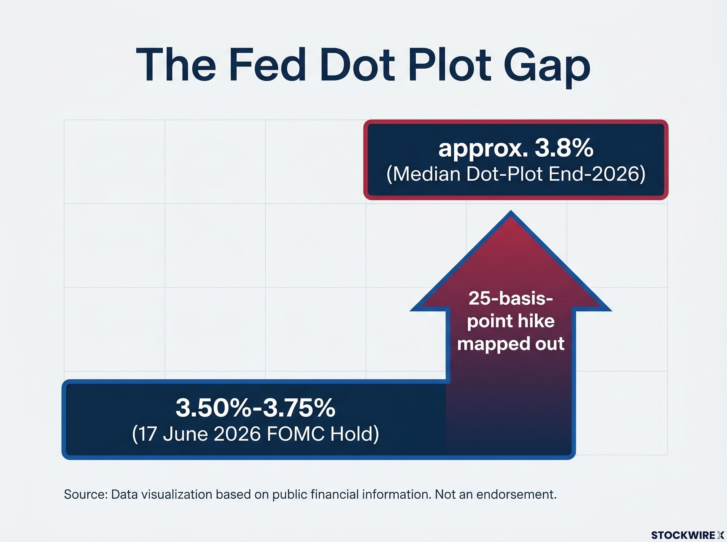
The 17 June 2026 Federal Open Market Committee (FOMC) decision confirmed what markets expected: rates stayed at 3.50%-3.75%. What markets largely glossed over was the document sitting underneath the decision.
The FOMC statement preserved explicitly conditional language around future tightening. Policymakers left the door open to another move, framing the hold as a deliberate delay rather than a resolution. The Fed is comfortable waiting as long as inflation and the labour market keep easing, but it has not taken a hike off the table.
The detail that matters most sits in the Summary of Economic Projections (SEP), published alongside the decision.
The dot plot revision from 3.4% to 3.8% at the June SEP represents more than a technical update: it placed at least one 25-basis-point hike into the Fed’s own published baseline, reshaping how every subsequent data release should be read against official policy signals.
Fed funds target: 3.50%-3.75%. Median dot-plot end-2026 projection: approximately 3.8%.
The dot plot is a chart showing where each FOMC member expects the federal funds rate to be at the end of each calendar year. It is not a commitment or a promise; it is a policy signal that markets and analysts treat as directional guidance.
The gap between the current rate floor (3.50%) and the median dot (approximately 3.8%) tells you the Fed has already mapped out a possible 25-basis-point hike on paper. Any investor positioning purely for cuts is betting against the Fed’s own published numbers.
The June payroll report, released 2 July 2026 by the Bureau of Labor Statistics, landed well below expectations. The headline number was the first signal. The composition was the second, and the more important one.
The June payroll internals tell a more precise story than the headline: the unemployment rate fell to 4.2% not because employers were hiring but because the labour force participation rate dropped 0.3 percentage points to 61.5%, with the employment-to-population ratio slipping alongside it, a configuration that signals workforce withdrawal rather than demand strength.
| Metric | Value | What it signals |
|---|---|---|
| Nonfarm payrolls | +57,000 | Hiring has slowed sharply from prior months |
| Unemployment rate | 4.2% | Decline driven by falling participation, not strong hiring |
| Labour force participation | More-than-five-year low | Workers leaving the labour force, shrinking the available pool |
A falling unemployment rate that comes from workers leaving the labour force rather than from employers hiring is a warning sign for demand, not a green light. That distinction is exactly why Barclays used this report to support the pause, not challenge it.
Barclays characterised the dynamic as “moderation,” not stress, and identified three structural signals in the data:
This jobs report is the empirical foundation of the Barclays pause thesis. Knowing how to read its components, not just the headline number, is what lets you evaluate whether the next jobs report supports or undermines that thesis.
The Barclays base case, published by Jonathan Millar and Marc Giannoni on 3 July 2026, is not a directional bet. It is a conditional chain where each link has to hold for the pause to persist.
The logic runs through three stages:
The reason Barclays calls this a “prolonged pause” rather than simply a hold is that the forces cooling the economy are structural, not cyclical. A deceleration in immigration constrains the worker pool independently of hiring demand. Firms face limits on headcount growth even when order books are stable. That means the Fed gets incremental disinflation and labour market cooling without needing to force more pain through higher rates.
The combination of below-expectations payrolls and a participation-led unemployment decline fits this framework precisely. The cooling is happening through supply constraints, which means the Fed does not need to act, and the structural nature of those constraints means they are slower to reverse. That gives the Fed more runway before it needs to make another decision.
Understanding the mechanics behind a bank’s forecast lets you evaluate how durable it is. If you know which links in the chain Barclays is relying on, you can watch for breaks yourself rather than waiting for a revision note.
The base case only holds if those three links stay intact. According to Barclays, the single most significant upside risk to rates is a scenario in which hiring and consumer spending pick up pace again at a time when worker availability remains structurally limited.
The feedback loop runs in a specific sequence. Hiring picks up, but the worker pool is still limited by supply constraints. Wages rise because employers compete for a smaller available workforce. Sticky services inflation, which never fully cooled, reignites. The Fed finds itself under pressure to deliver the hike already implied in the dot plot rather than letting the pause extend.
The services inflation trajectory matters most here: headline CPI reaching 4.2% in May 2026 was energy-driven, but the 1.3 percentage-point gap between headline and core CPI signals the second-round effects that concern the Fed have not yet spread through core goods and services, which is precisely the condition that makes the Barclays pause thesis viable.
The three conditions that would end the pause:
Barclays flagged the combination of renewed momentum in jobs and spending alongside persistently tight labour supply as the central scenario in which rate increases would return to the agenda.
Energy-driven price pressures could amplify this path. If headline inflation picks up alongside services inflation, the political and analytical case for inaction at the Fed becomes harder to sustain.
If July and August payrolls come in materially above expectations alongside wage acceleration, the market’s current pricing of a prolonged pause would need to reprice fast. That repricing is where portfolios built on the “Fed is done” assumption absorb the most damage.
The Barclays macro thesis translates into differentiated positioning across three asset classes. The key distinction is between assets that are buffered against a one-more-hike scenario and those that are not.
| Asset class | Positioning rationale | Key risk to monitor |
|---|---|---|
| Bonds (2-5 year range) | Enough yield to earn carry, limited duration exposure if the Fed hikes once more | Dot-plot hike materialising would hit long-duration holdings disproportionately |
| Equities (quality tilt) | Strong balance sheets and pricing power buffer against tightening; earnings must drive returns, not rate expectations | Cyclicals, real estate, and small caps carry elevated exposure to a one-more-hike scenario |
| Cash and short-term instruments | Policy rates anchored at 3.50%-3.75% make short-duration carry attractive with full optionality to reposition | Opportunity cost rises if the pause extends longer than expected and longer-duration assets rally |
A “pause” is not a pivot to easing. Equity rallies driven purely by “Fed is done” optimism are fragile without underlying earnings momentum. Support from falling discount rates is limited in this backdrop, which means indices need actual margin resilience and revenue growth to sustain gains.
Barclays frames the quality tilt explicitly: strong balance sheets, stable cash flows, and pricing power remain the characteristics that matter most if the Fed has to tighten into a constrained labour market. Cyclicals, real estate, and small-cap equities sit on the wrong side of that equation.
In a pause-with-risk environment, the drag from potential rate increases falls unevenly. Long-duration bonds and rate-sensitive equities absorb disproportionate pain if the Fed moves, while short-duration instruments and quality equities are far better buffered.
The Barclays forecast is not a single-outcome call. It is a conditional probability structure with three branches, and incoming data will shift the weights between them.
The specific data releases that will move the probability weights:
Treating the next payroll release as a binary Fed-hikes-or-does-not event misses the point. Your job is to track whether incoming data is shifting the probability weights between these three scenarios, because that shift will price into markets before any official Fed announcement.
A probability-distribution mindset protects against over-rotating a portfolio toward either extreme when the honest answer is that incoming data has not yet resolved the question.
The central insight from the Barclays analysis, published by Jonathan Millar and Marc Giannoni on 3 July 2026, is this: the pause is real, but it is explicitly conditional, and the conditions are measurable.
That gives you something more useful than a macro opinion. It gives you a monitoring framework. The Fed’s own dot plot median of approximately 3.8% is the benchmark against which every incoming data point should be assessed. Barclays’ positioning posture, neutral-to-short on duration, quality tilt on equities, carry mindset on cash, follows directly from that conditional structure.
The Barclays call is not a prediction of cuts. It is a prediction of patience contingent on data behaving in a specific way, and that distinction has direct consequences for duration risk and equity sector allocation.
Fed independence under Warsh adds a layer to the conditional pause that purely data-driven analysis can miss: if White House pressure to cut rates intensifies as growth slows, the Fed’s demonstrated willingness to hold against political headwinds becomes a variable in its own right, with bond markets using dollar moves and term premiums as real-time independence gauges.
The Barclays note frames the current hold as a temporary equilibrium that depends entirely on incoming data continuing to behave as expected, rather than as confirmation that the tightening cycle has run its course. (Barclays, July 2026)
The next two jobs reports will tell you more about the Fed’s 2026 path than any current forecast, including Barclays’. Investors who treat the prolonged pause as a settled state will be slower to reposition when the data shifts. Those who have internalised the conditional structure can move with more confidence and less reaction lag.
This article is for informational purposes only and should not be considered financial advice. Investors should conduct their own research and consult with financial professionals before making investment decisions. Past performance does not guarantee future results. Financial projections are subject to market conditions and various risk factors.
The dot plot is a chart published by the FOMC showing where each member expects the federal funds rate to be at year-end. The June 2026 dot plot revised the median end-2026 projection to approximately 3.8%, meaning the Fed has already mapped at least one more 25-basis-point hike into its own published baseline.
The June 2026 payroll report showed only 57,000 new jobs added, and the unemployment rate fell to 4.2% because labour force participation dropped to a more-than-five-year low, not because employers were hiring. Barclays used this data to support a prolonged pause thesis, arguing that the cooling is structural rather than demand-driven.
According to Barclays, three conditions would end the pause: nonfarm payrolls accelerating materially above expectations in July and August, sustained wage growth exceeding productivity gains, and a revival of services inflation driven by the wage-price dynamic.
Barclays recommends a neutral-to-short duration posture on bonds (favouring the 2-5 year range), a quality tilt on equities prioritising strong balance sheets and pricing power, and a carry mindset on cash given that policy rates are anchored at 3.50%-3.75%. Cyclicals, real estate, and small-cap equities carry elevated exposure if the Fed delivers the hike already implied in the dot plot.
A pause means the Fed holds rates steady while keeping future hikes explicitly on the table; a pivot signals a shift toward cuts. The Barclays note frames the current hold as a temporary equilibrium contingent on incoming data, not confirmation that the tightening cycle has ended, which means equity rallies built purely on 'Fed is done' optimism remain fragile without earnings momentum.