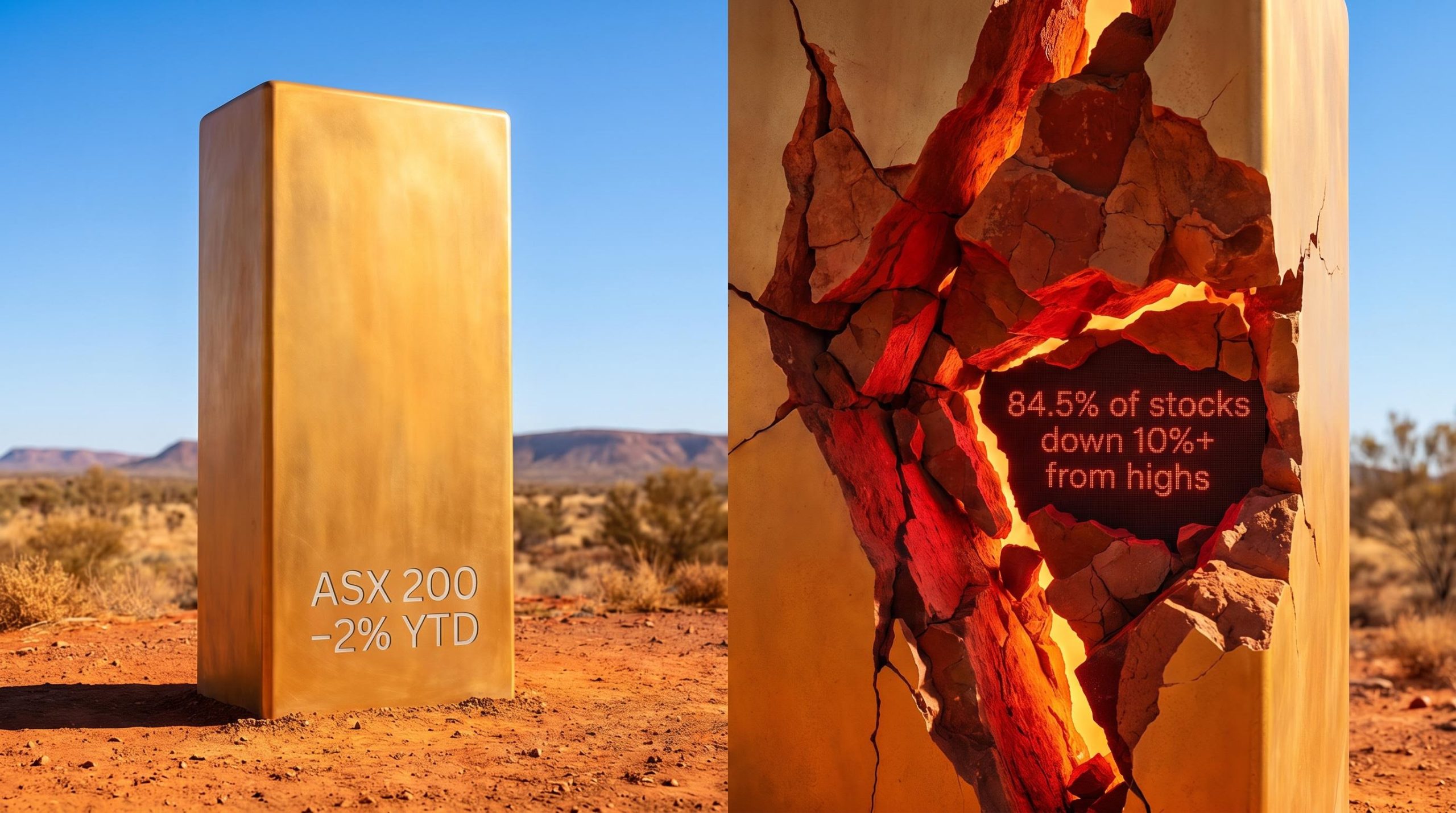
On the most recent trading day, 84.5% of ASX 200 stocks were sitting at least 10% below their 52-week highs. More than half were down over 20% from their peaks. The index itself was off roughly 2% for the year.
That arithmetic gap is not a rounding error. It reflects a structural divergence between how a capitalisation-weighted index is designed to behave and what is actually happening to the companies inside it. With the Reserve Bank of Australia (RBA) having raised the cash rate to 4.35% in May 2026 and money markets pricing at least one further hike, the macro conditions sustaining that divergence show no sign of easing.
What follows is an examination of what ASX market breadth is actually measuring right now, why the current reading is historically unusual, which sectors and companies are absorbing the most damage, and what the divergence means for investors assessing portfolio risk beyond the headline number.
The gap between the ASX 200’s face value and its internal reality
The ASX 200 is down approximately 2% year-to-date and up just 2.8% over 12 months. On its own, that looks like a flat, unremarkable market. The constituent-level data tells a different story.
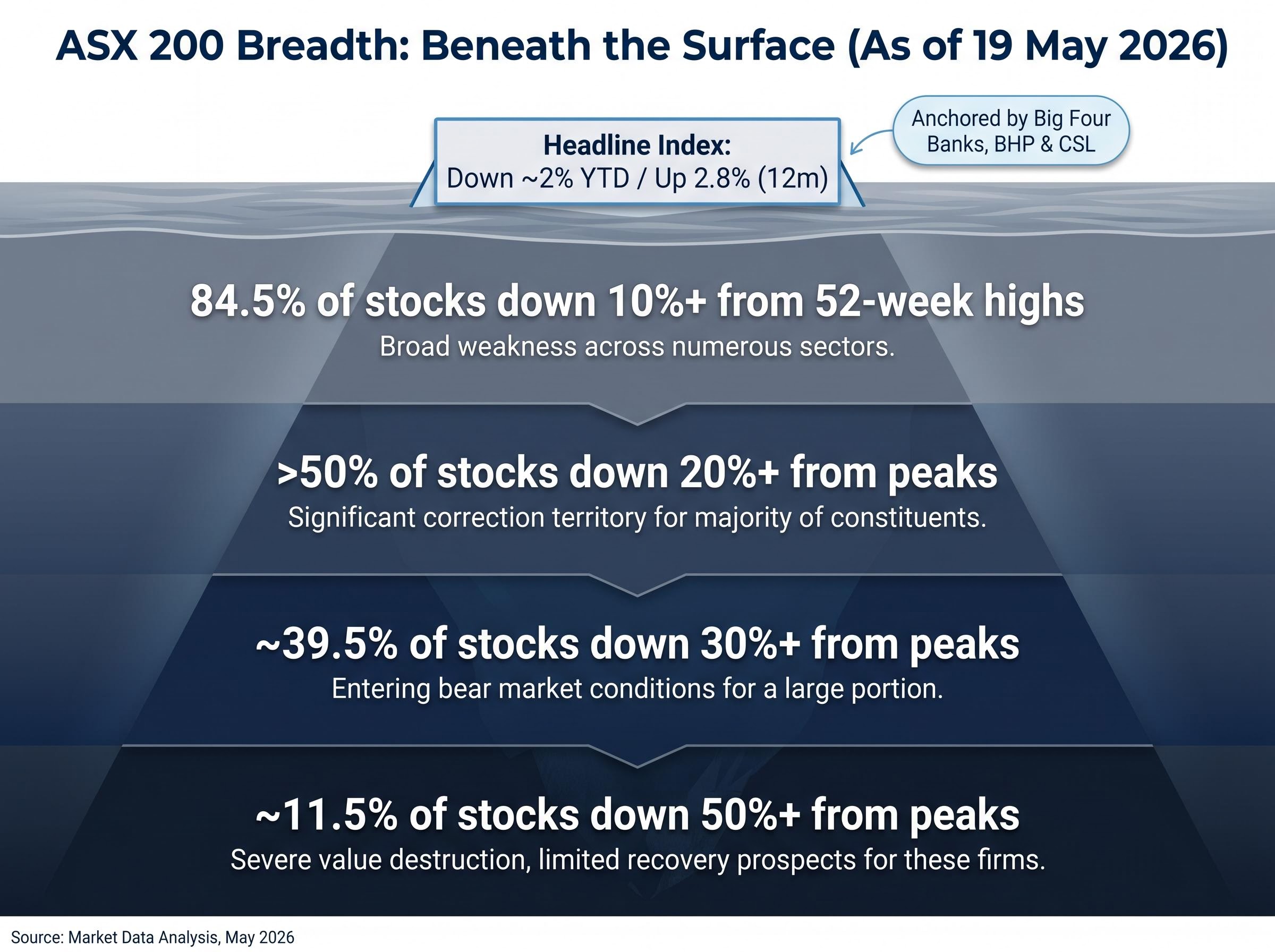
84.5% of ASX 200 stocks were trading at least 10% below their 52-week highs as of 19 May 2026.
The drawdown distribution across the index breaks down as follows:
- 84.5% of constituents were down 10% or more from their 52-week highs
- More than 50% were down over 20%
- Approximately 39.5% were down more than 30%
- Approximately 11.5% were down more than 50%
The gap between those figures and the headline index return exists because of how capitalisation-weighting works. A cap-weighted index allocates more influence to the largest companies by market value. When the big four banks, BHP, and CSL hold relatively steady, they anchor the index near its recent levels, regardless of what the other 190-odd constituents are doing.
The S&P/ASX 200 float-adjusted market capitalisation methodology published by S&P Dow Jones Indices specifies that constituents are weighted by their freely available market value, which is the structural rule that concentrates index influence in the largest names and produces the divergence between the headline number and the average constituent experience described throughout this article.
The result is that the number an investor checks on a broker app reflects the performance of a handful of mega-caps, not the average experience of the market. In the current environment, those two things are sharply different.
ASX 200 concentration risk is more extreme than the 200-stock label suggests: financials and materials alone account for more than 50% of the index by market-cap weight, meaning a single large-cap event, such as CBA’s record single-day fall of 10.4% in May 2026, can produce a measurable drag on the entire benchmark.
When big ASX news breaks, our subscribers know first
What market breadth actually measures, and why it matters
Market breadth measures how many stocks within an index are participating in its direction, whether that direction is up, down, or sideways. It is distinct from the headline index return, which tells you the weighted average outcome but not the distribution underneath.
When breadth is healthy, a rising index is being driven by a wide base of companies gaining ground. When breadth deteriorates, the same index level is being held up by fewer and fewer names, a structure that is inherently more fragile because it depends on a small group continuing to perform.
One of the simplest ways to observe this in practice is to compare a capitalisation-weighted index against an equal-weight version of the same index. In an equal-weight calculation, every constituent counts the same regardless of size. When equal-weight performance lags cap-weight by a meaningful margin, it signals that the largest stocks are masking weakness across the rest. According to Market Index analysis from 30 April 2026, the ASX 200’s equal-weight performance had been meaningfully worse than its cap-weighted counterpart, a direct signal of concentration risk.
How analysts measure breadth in practice
Three measurement tools capture different angles of the same underlying condition:
- Advance-decline line: Tracks the cumulative difference between the number of stocks rising and falling each day. A declining advance-decline line alongside a flat or rising index is a warning signal.
- New 52-week highs versus new lows: Counts how many stocks are hitting fresh peaks compared to fresh troughs. According to Market Index commentary from 3 May 2026, the number of ASX 200 stocks making new 52-week lows had consistently outnumbered new highs despite the index being only modestly off its peak.
- Equal-weight versus cap-weight performance: The most accessible breadth proxy for retail investors, available through platforms such as Market Index. A widening gap between the two readings indicates narrowing leadership.
Of these, the equal-weight comparison and the new highs versus lows ratio are the most straightforward for retail investors to monitor using publicly available Australian data.
Sector by sector: where the pain is concentrated
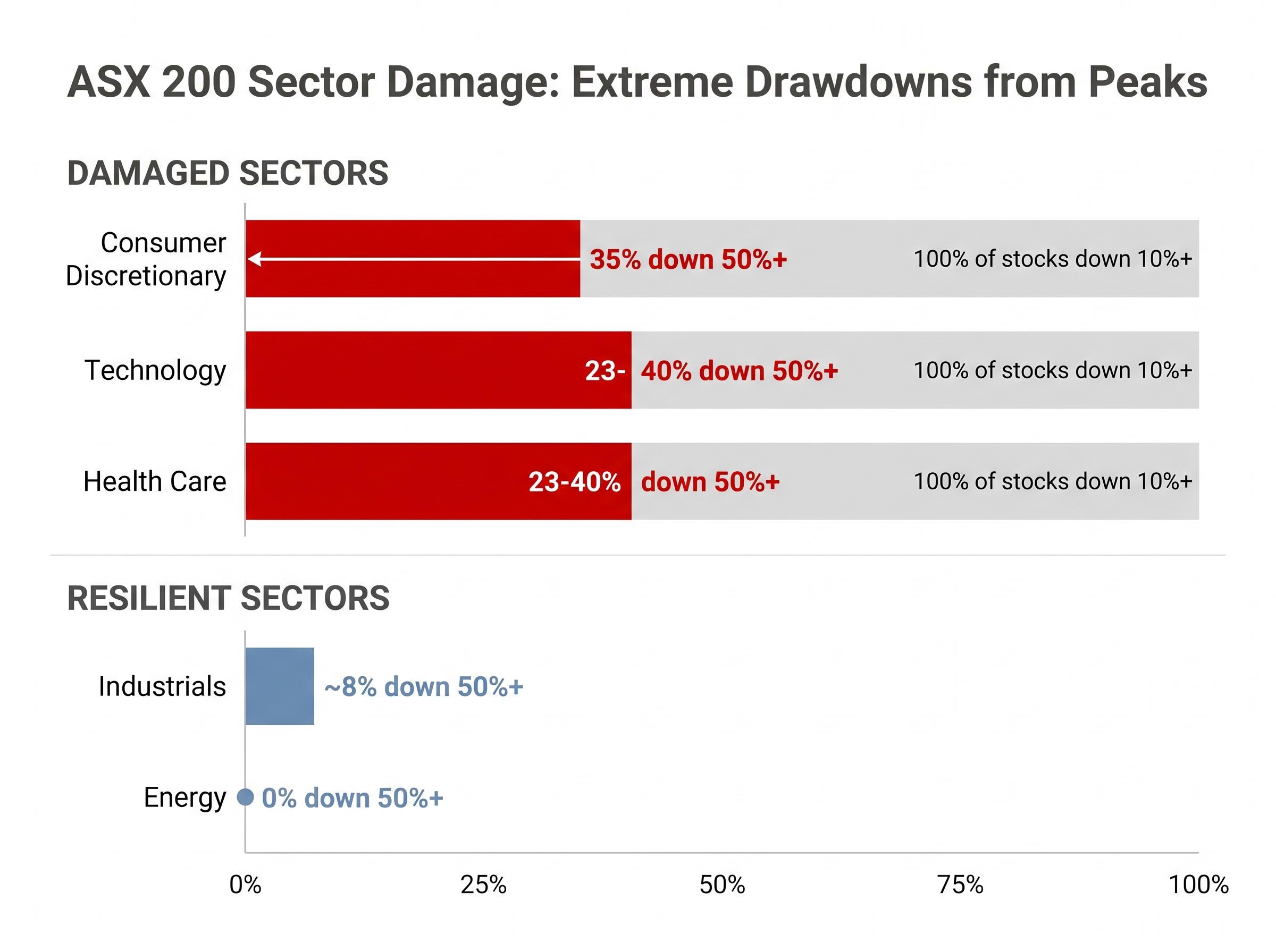
Consumer Discretionary stands out as the most damaged sector in the ASX 200. According to Market Index data from Kerry Sun published on 20 May 2026, 85% of the sector’s constituents were down more than 30% from their 52-week highs, and 35% were down more than 50%. Every single stock in the sector was below its peak by more than 10%.
Technology and Health Care follow a similar pattern. Between 23% and 40% of individual stocks in those sectors had fallen more than 50% from their peaks, and every constituent in both sectors was trading at least 10% below its high.
The contrast with other parts of the market is stark. Energy had no constituents down more than 50%, and only 8% of Industrials members had fallen that far.
| Sector | % down 10%+ from highs | % down 30%+ | % down 50%+ |
|---|---|---|---|
| Consumer Discretionary | 100% | 85% | 35% |
| Technology | 100% | Data not confirmed | 23-40% |
| Health Care | 100% | Data not confirmed | 23-40% |
| Energy | Data not confirmed | Data not confirmed | 0% |
| Industrials | Data not confirmed | Data not confirmed | ~8% |
The sector map reads as a macro signal. The most damaged sectors, Discretionary, Technology, and Health Care, are precisely the parts of the market most sensitive to interest rates and consumer spending pressure. The resilient sectors, Energy and Industrials, carry less duration risk and less dependence on domestic consumption. The breadth data is pricing in a specific set of macro stresses, not distributing pain randomly.
The defensive sector rotation visible on 19 May 2026 illustrates how narrow the rally base remains: Consumer Staples surged 3.00% to lead the index while Materials and Information Technology both finished in the red, and the ASX 200 continued to trade below a key supply zone at 8,686-8,750 that would need to be cleared to signal a genuine trend reversal.
The earnings reset validating the breadth signal
The breadth deterioration is not a purely technical phenomenon driven by sentiment or positioning. A rolling wave of earnings downgrades across April and May 2026 has provided fundamental confirmation.
The pattern spans multiple sectors and includes some of the ASX’s largest names. Cochlear cut its net profit after tax (NPAT) guidance by approximately 30% on 22 April 2026, and shares fell roughly 40%. CSL missed revenue consensus by 4% and NPAT guidance by approximately 7% on 11 May 2026; shares dropped 15.9%. Commonwealth Bank of Australia (CBA) reported third-quarter NPAT flat on the prior quarter on 13 May 2026, triggering a 10.4% decline in the company’s largest single-day fall on record.
| Company | Approx. share price decline | Nature of the miss |
|---|---|---|
| Cochlear (Health Care) | ~40% | NPAT guidance cut ~30% |
| CSL (Health Care) | 15.9% | Revenue missed by 4%, NPAT guidance missed by ~7% |
| CBA (Financials) | 10.4% | Q3 NPAT flat QoQ; largest single-day decline on record |
| Brambles (Industrials) | ~20% | Underlying profit guidance cut from 8-11% to 3-5% growth |
| Domino’s Pizza (Discretionary) | ~12-15% | Profit warning on slower sales and cost pressures |
| Lendlease (Real Estate) | ~10% | Profit downgrade on slower project starts |
| Sonic Healthcare (Health Care) | ~6% | Weaker diagnostics volumes and margin pressure |
The connecting thread is that the sectors generating the largest guidance cuts, Discretionary, Health Care, and industrial cyclicals, are precisely the sectors where breadth data shows the widest drawdowns. When breadth deterioration is accompanied by a wave of earnings downgrades rather than valuation de-rating alone, the signal shifts from a technical warning to fundamental confirmation. The two together carry more weight than either in isolation.
Why this breadth reading is historically unusual, and what it has preceded
Placing current conditions on a historical spectrum helps calibrate the severity. The comparisons range from moderate to severe, depending on which segment of the market is examined.
- 2018 tightening phase and 2022 RBA tightening cycle: According to Market Index analysis from 30 April 2026, the current gap between equal-weight and cap-weight ASX 200 performance is closer to the 2022 tightening cycle than to the milder 2018 episode, though not yet at COVID-era severity. These periods preceded range-bound or weaker index performance before macro conditions improved.
- 2020 COVID selloff: Stockhead reported on 7 May 2026 that the ratio of new 52-week lows to new highs had not been this skewed since the 2020 COVID selloff. That breadth deterioration preceded a sharp index decline before policy intervention triggered a recovery.
- Late 2007-2008 (pre-GFC): A fund manager featured on Livewire Markets on 2 May 2026 noted that the dispersion between winners and losers resembled late 2007-2008, when resources held up while much of the rest of the market was already in a bear market. That pattern preceded the full GFC drawdown.
“You’d think the market is fine looking at the index, but it doesn’t feel that way when you look stock-by-stock.” — Fund manager, Livewire Markets, 9 May 2026
The macro engine sustaining the current breadth deterioration is the RBA’s tightening cycle. The May 2026 hike to 4.35% was an active tightening decision (an 8-1 board vote), and money markets were pricing approximately 60-70% probability of a further 25 basis point increase, according to the Australian Financial Review on 6 May 2026. The implied terminal rate sat at 4.60-4.70%, with no cuts fully priced within 12 months. That rate trajectory directly pressures the same sectors already showing the widest drawdowns: consumer discretionary, technology, health care, and property.
The RBA’s May 2026 cash rate decision confirmed an 8-1 board vote to raise the cash rate target by 25 basis points to 4.35%, providing the official policy backdrop against which the sector drawdowns documented throughout this article are unfolding.
In each of the named historical episodes, internal market deterioration of this kind preceded either a sharper headline index decline or a significant leadership rotation. Neither outcome is benign for portfolios positioned around the assumption that a flat index means a stable market.
What the breadth divergence means for how investors should read the market right now
The practical risk for passive index investors is that exchange-traded fund (ETF) exposure to the ASX 200 concentrates capital in a small number of mega-caps. As the Australian Financial Review noted on 3 May 2026, investors may be “over-exposed to a narrow set of macro risks” through index funds without realising it. Apparent diversification across 200 names may be narrower than it appears when a handful of stocks are doing all the anchoring work.
The current environment is one where the headline index number is a less reliable signal of portfolio health than normal. This is particularly relevant for investors with meaningful exposure to mid-cap or sector-specific names in Discretionary, Health Care, or Technology, the segments where drawdowns of 20-50% from peaks are common despite the index sitting only modestly below its own high.
For investors who recognise that their index fund exposure may be narrower than it appears and want to act on it, our comprehensive walkthrough of ETF portfolio construction for Australian investors covers asset allocation frameworks, the trade-offs between cap-weighted and equal-weighted funds, fee impact modelling, and practical guidelines for keeping a portfolio manageable across periods of market volatility.
Three breadth signals retail investors can monitor without a Bloomberg terminal
Monitoring breadth does not require institutional data tools. Three publicly accessible signals can provide a clearer picture:
- Equal-weight versus cap-weight performance: Available through Market Index. A widening gap where equal-weight lags indicates narrowing leadership and deteriorating breadth.
- New 52-week highs versus new lows ratio: Available through the ASX website and most broker platforms. When new lows consistently outnumber new highs while the index holds steady, it signals distribution beneath the surface.
- Sector-level drawdown data: Available through broker platforms and Market Index sector pages. Checking what percentage of a sector’s members are 20% or more below their peaks provides a view the index number alone cannot offer.
Australia also lacks the meaningful artificial intelligence (AI) sector exposure that has supported breadth in the United States, South Korea, and Taiwan, reducing the probability of a technology-driven breadth recovery domestically.
The structural ASX sector skew that allows mega-caps to anchor the index today is the same force that has produced roughly half the annualised long-run return of the S&P 500: with financials and materials comprising around 45% of the ASX 300, the index is anchored to regulated lending growth and commodity cycles rather than the technology-driven reinvestment that powered US returns over 15 years.
The index is not the market: investors need a wider lens in 2026
The ASX 200’s apparent stability is a product of capitalisation-weighting mechanics, not broad-based market health. Three reinforcing factors make that unusually clear right now: narrow mega-cap leadership concentrated in the big four banks, BHP, and CSL; a rolling earnings reset across domestic sectors spanning health care, consumer discretionary, industrials, and real estate; and an active RBA tightening cycle with further hikes priced in by money markets.
As of 19 May 2026, approximately 39.5% of ASX 200 constituents were down more than 30% from their 52-week highs, while the index itself was off just 2% for the year.
Breadth conditions could improve if macro circumstances shift. Clearer rate-cut visibility, evidence of inflation peaking, or easing geopolitical supply disruptions could each widen participation. As of 20 May 2026, none of those catalysts had materialised. Until they do, the headline index number understates the stress that most portfolios are actually experiencing.
This article is for informational purposes only and should not be considered financial advice. Investors should conduct their own research and consult with financial professionals before making investment decisions. Past performance does not guarantee future results.