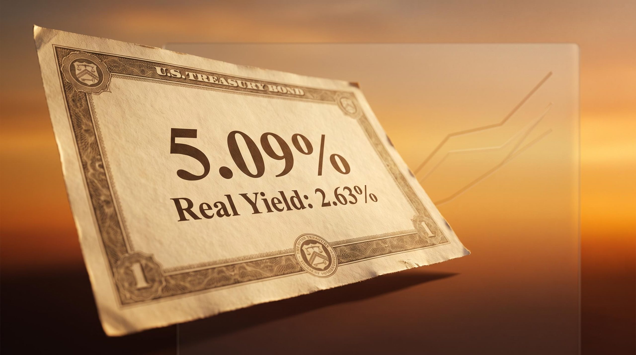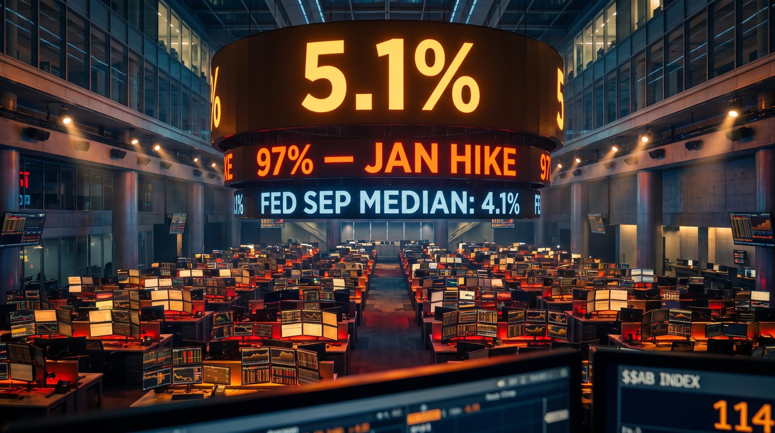
The Federal Reserve’s own economists expect the federal funds rate to sit at 4.1% by the end of 2026. The market thinks they are being far too optimistic. As of late September 2026, market-implied pricing puts the odds of a January rate hike at roughly 97%, and a further hike in April at 87%, well beyond anything the Fed’s September projections signalled. That gap between the institution setting policy and the investors pricing it in real time is not statistical noise.
It is a substantive disagreement about where the U.S. economy is heading, and it is already reshaping asset prices. The 10-year Treasury yield has climbed to roughly 5.1-5.2%, a level last seen in July 2007, and the dollar keeps strengthening as capital chases higher American yields. This is not a theoretical debate confined to economists. It is an active repricing with direct consequences for anyone holding bonds, equities, or foreign currency exposure.
Here is what is driving the gap between the Fed and the market, why the stakes of misreading it are higher than at almost any point in the recent cycle, and what the two ways this resolves would mean for your positioning in bonds and the dollar.
How far apart the Fed and markets actually are
Start with the raw numbers, because the distance between them is the whole story.
After its meeting on 16 September 2026, the Federal Reserve set the federal funds target range at 3.75-4.00% following a 25-basis-point hike. Its Summary of Economic Projections, the quarterly document where officials plot out where they expect rates to go, put the median at 4.1% for year-end 2026. That implies one more hike this year and then a long pause.
The September hike to 3.75%-4.00% is only one of the active Fed policy tools in play; the balance sheet, still contracting through Quantitative Tightening at roughly $6.75 trillion, operates as a second simultaneous tightening lever that the dot plot projections do not fully capture.
The full projected path is a study in patience. The median holds at 4.1% through 2027, eases to 3.9% in 2028, drifts to 3.6% in 2029, and settles at a longer-run rate of 3.2%. In the Fed’s own baseline, no cuts arrive before 2028.
Now place the market’s view alongside it. Market-implied probabilities point to a 71% chance of an October hike, a near-certain 97% in January, an 87% chance of another in April, and close to 80% odds of a third subsequent increase by September 2027. CME FedWatch data around 23 September 2026 showed similar readings, with October hike odds above 70%.
Markets are assigning a 97% probability to a January rate hike, an outcome the Fed’s own dot plot does not signal at all.
| Horizon | Fed SEP median | What the market implies |
|---|---|---|
| End-2026 | 4.1% (one more hike) | Multiple hikes priced (Oct 71%, Jan 97%) |
| 2027 | 4.1% (no change) | Further hikes (Apr 87%, Sep 2027 ~80%) |
| 2028 | 3.9% (modest easing begins) | Higher path assumed |
| 2029 | 3.6% | Higher path assumed |
| Longer run | 3.2% | Neutral seen higher (see below) |
What makes this striking is that the September dot plot was already a hawkish shift. According to JPMorgan Chase commentary, the Fed revised its median higher at every horizon versus June: 2026 from 3.8% to 4.1%, 2027 from 3.6% to 4.1%, and 2028 from 3.4% to 3.9%.
The Federal Reserve’s September SEP shows the median funds rate held at 4.1% through all of 2027 before any easing begins, a path that implies the institution sees current policy as broadly calibrated, even as market pricing runs well ahead of it.
So the Fed moved decisively toward tightening, and the market looked at that move and concluded it still was not enough. A dot plot signalling one more hike sits against a market pricing four or more. That tells you professional investors have made a specific bet: that the Fed’s own forecast will prove too optimistic about inflation falling. Deciding whether to share that bet is the first thing you have to work out.
When big ASX news breaks, our subscribers know first
What is actually driving market skepticism of the dot plot
The market’s position is not a hunch. It rests on a set of structural arguments that compound on one another.
The first is services inflation. Unlike the supply-chain price spikes that dominated the early 2020s, services inflation is driven by wages, housing, and healthcare costs. Those do not unwind quickly, which is precisely why the market treats them as harder for the Fed to dismiss as temporary. The original analysis from Ilya Spivak at Macro Money identified services as the fastest-growing component of the overall price picture.
Before the analytical detail, here are the four drivers the market is leaning on:
- Persistent services inflation that is wage-, housing-, and healthcare-driven and resistant to quick reversal
- A higher neutral rate than the Fed’s own longer-run estimate
- Accelerating economic activity, with S&P Global PMI data showing the strongest pickup since 2021
- AI infrastructure investment feeding into the persistent portions of inflation
Each of these deserves a closer look, but the second is the one that quietly does the most work.
The structural difference between dot plot versus futures pricing is that the dots reflect each policymaker’s single baseline scenario, while futures markets price a probability-weighted distribution across all plausible paths including the worst-case inflation outcomes that the Fed’s median deliberately excludes.
The neutral rate question the Fed has not fully answered
The neutral rate is the level at which policy neither stimulates nor restrains the economy. Where you think it sits determines how many cuts you can plausibly expect.
Deutsche Bank economists, reported via Yahoo Finance in September 2026, put their neutral rate estimate at 3.5-3.75%. The Fed’s own longer-run median is 3.2%. BBVA Research has noted that private-sector neutral rate estimates consistently run above the Fed’s figure.
That gap of 25 to 55 basis points matters more than it looks. If neutral is genuinely higher than the Fed admits, then fewer future cuts are warranted regardless of what the dots say. Investors who accept the higher number are effectively being told by their own analysts that the Fed’s endpoint is too low, which means any bond or dollar position built on the dot plot rests on an assumption the market has already rejected.
The demand data reinforces the case. S&P Global’s Purchasing Managers’ Index, a survey-based gauge of business activity, showed the strongest acceleration since 2021 in the days before the original broadcast. The Fed itself nudged its 2026 real GDP growth forecast up from 2.2% to 2.3% in September. Strong demand does not argue for the Fed to ease; it argues for the tightening to persist.
Layered on top is a newer factor: the scale of AI infrastructure spending, which the original analysis flagged as an emerging contributor to sticky inflation. Taken together, these are not short-term noise. They are arguments about the equilibrium level of rates and the durability of inflation, which is exactly why the market feels comfortable pricing against the Fed.
What the 2021 policy error tells us about the stakes today
There is a reason this particular disagreement carries weight, and it is not far in the past.
In 2021, the Fed characterised inflation as supply-shock-driven and therefore transitory. It delayed tightening on that reasoning, then was forced into one of the fastest hiking cycles in its history once inflation proved persistent. Investors who trusted the “transitory” framing were caught badly offside.
The argument that today’s inflation is supply-side and does not warrant further hikes closely resembles the Fed’s own reasoning in 2021, reasoning that later proved incorrect.
The mechanism that failed in 2021 was the anchoring of inflation expectations. Once households and businesses started to expect higher prices, that expectation became self-reinforcing and much harder to break. That same risk is present now, and policymakers appear aware of it, which is part of why the September projections were revised higher at every horizon.
The lesson cuts in both directions, though, and that is what makes it genuinely cautionary rather than a one-sided warning. Some analysts now worry the Fed could over-correct, holding restrictive rates well after inflation has begun to converge and triggering an unnecessary slowdown or credit market strain.
For an investor, the two-sided risk breaks down cleanly:
- The Fed validates market pricing, hikes further, and those positioned for the dot plot are caught short.
- The Fed over-tightens, holds too long after inflation cools, and those positioned for relentless hikes are caught the other way.
The real takeaway from 2021 is not that the Fed always tightens too late. It is that the central bank can misjudge the persistence of inflation in either direction, and markets price in insurance against that uncertainty. For a bond investor today, that history is a specific, probability-weighted reason to take market-implied odds more seriously than the dots. When the Fed’s projections and the incoming data have diverged, the data has tended to win.
What the divergence is doing to yields and the dollar right now
None of this is waiting for the argument to be settled. The repricing is already visible in every Treasury quote and dollar trade.
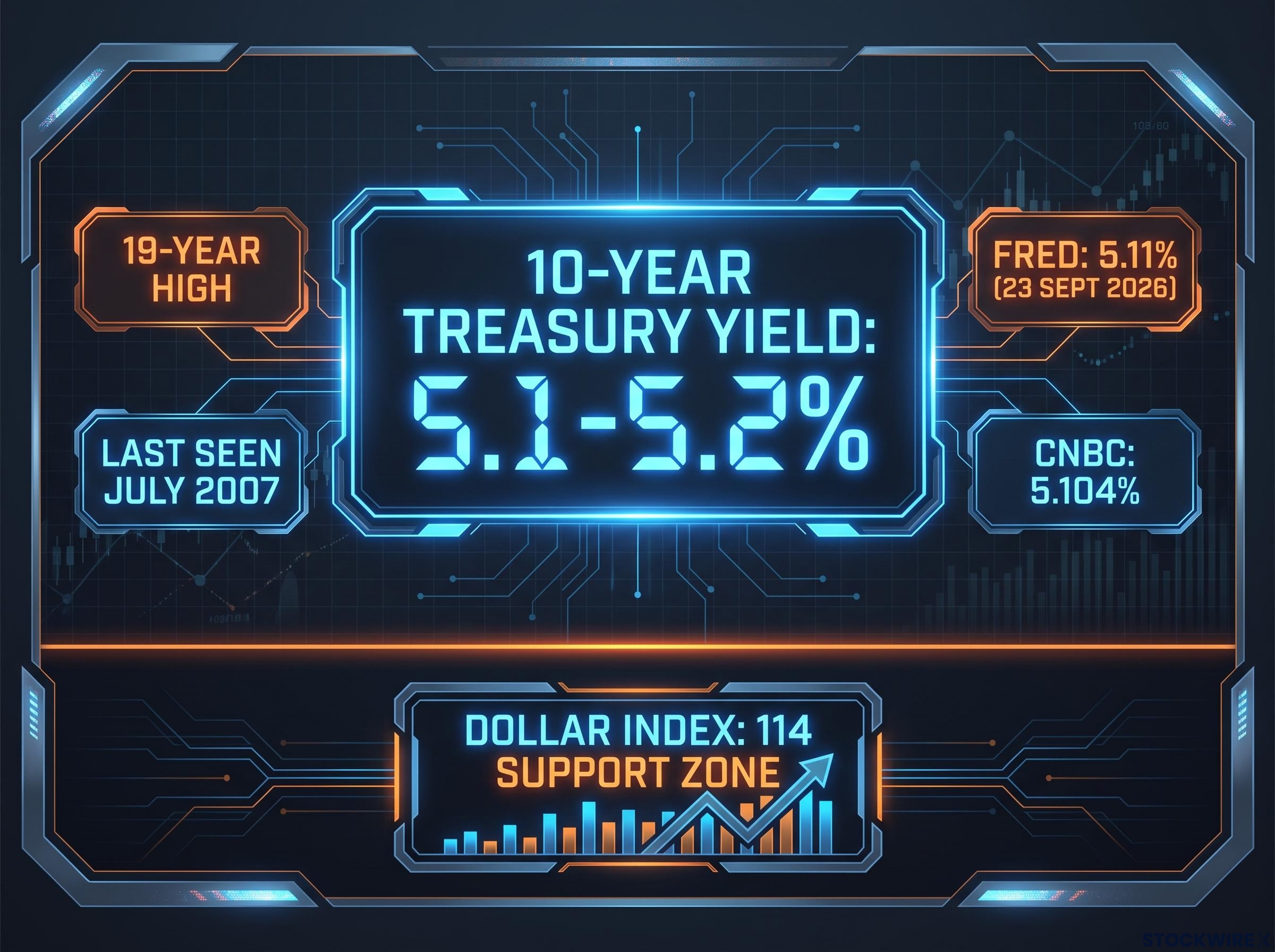
The 10-year Treasury yield reached roughly 5.1-5.2% across 23-24 September 2026, with CNBC citing a jump of more than 13 basis points to 5.104%, a 19-year high, and FRED data at 5.11% on 23 September. That level reflects two forces at once: expectations of higher policy rates, and an elevated term premium, the extra yield investors demand to hold long-dated bonds given inflation risk and heavy Treasury supply.
The dollar has strengthened in step. Wider U.S. yield differentials relative to other major economies pull capital into dollar-denominated assets, which supports both the currency and Treasury prices at these elevated yields. The original analysis noted the dollar index being watched around the 114 support zone, with the euro sliding as the rally broadened.
Beyond bonds and the dollar: who else is exposed
If you do not trade Treasuries or currencies directly, the effects still reach you.
Sustained yields near or above 5% compress equity valuations, hitting long-duration growth stocks hardest because more of their value sits in distant future earnings that get discounted more heavily. The gap between what equities and safe cash yield narrows, making stocks less compelling on a relative basis.
Credit markets feel it too. High-yield borrowers face refinancing risk as maturing debt rolls over into higher coupons, a concern repeatedly flagged in high-rate environments. And emerging markets face capital outflows and currency pressure as U.S. Treasuries offer close to 5% at lower perceived risk, drawing money away from riskier destinations.
How this resolves comes down to two scenarios:
| Scenario | Fed action | 10-year yield | Dollar | Risk assets and EM |
|---|---|---|---|---|
| A: Market pricing validated | Higher for longer sustained, more hikes | Elevated or rising | Stays strong | Equity/credit headwinds, EM outflows continue |
| B: Fed eases earlier | Cuts sooner than market expects | Bullish steepener, yields fall | Softer | Relief for risk assets and EM |
With the 10-year at a 19-year high and the dollar index sitting on a watched support level, this has moved from a forecasting dispute into a live repricing event. The practical implication is direct: you need to decide which scenario your portfolio is positioned for before the resolution arrives, not after it has already moved prices against you.
For investors wanting to stress-test how much further yields could move, our deep-dive into a 6% Treasury yield scenario quantifies the equity multiple compression, mortgage rate trajectory, and institutional positioning shifts that a move from 5% to 6% would trigger across the curve.
Where investors go from here in a market that has already decided
Step back and the tension is clear. The Fed delivered a genuinely hawkish pivot in September, lifting its projected path at every horizon, and the market looked at that and decided it still was not enough. Both positions have real-world precedent, and both carry real risk.
Three variables will settle the argument, and they are worth watching directly:
- The pace of services-sector inflation, the single variable most likely to determine which scenario materialises
- Whether the neutral rate is closer to Deutsche Bank’s 3.5-3.75% or the Fed’s 3.2%, given the longer-run dot moved up only to 3.2% from 3.1% in June
- Whether AI infrastructure spending feeds persistent rather than temporary inflation
For bond investors specifically, the decision has an asymmetric shape. Locking in yields near 5% offers a strong payoff if the Fed over-tightens and is eventually forced to cut faster than the dots suggest, because bond prices rise as yields fall. Staying short duration protects you if the market is right and yields climb further still. Structuring a portfolio that survives both outcomes is the more defensible stance when the evidence genuinely points in two directions.
The dot plot is a forecast, not a commitment. The most expensive mistake of the recent cycle came from treating a central bank projection as a reliable anchor for positioning, and the 2021 episode is the reminder that when forecasts and data diverge, the data decides.
For investors rebuilding their rate-expectations toolkit, our full explainer on the end of Fed forward guidance examines how Chair Warsh’s explicit rejection of the forward-guidance regime changes the weight investors should place on the dot plot as an anchor for portfolio positioning.
This article is for informational purposes only and should not be considered financial advice. Investors should conduct their own research and consult with financial professionals before making investment decisions. Past performance does not guarantee future results. Financial projections are subject to market conditions and various risk factors, and forward-looking scenarios are speculative and subject to change based on economic developments.